Nabarro LLP
Clarity Matters
A clear brand strategy creating clear commercial difference.
Our biggest, longest running and arguably most successful strategy project started before just before Neon even existed, and ended recently when the client’s brand name disappeared as part of the largest merger ever seen in the UK legal sector. Read More…
User-friendly law, a clear differentiator – Clarity Matters.
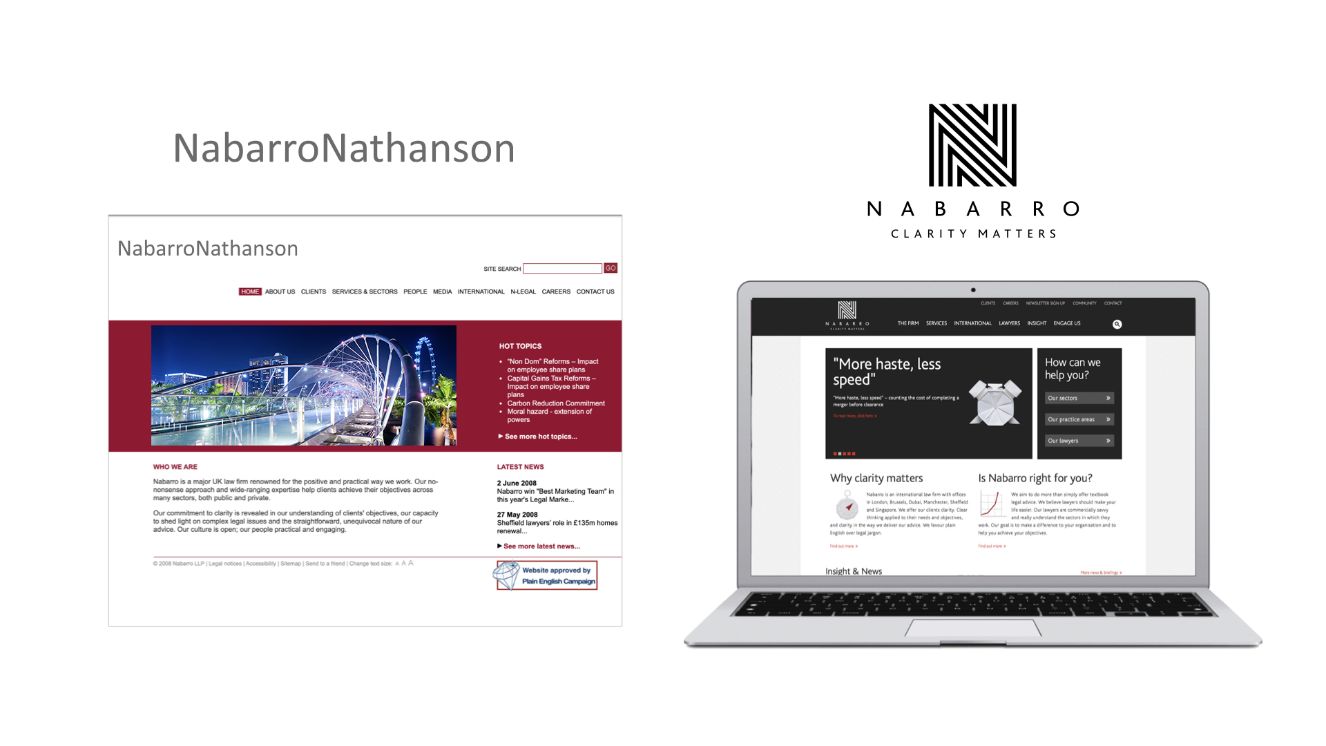
The first step in updating the brand was to cut the firm’s slightly cumbersome name in half. And for the rather snappier Nabarro a new positioning was developed, based on the proposition “user-friendly law”, and reflected in the big bold executional theme of clarity – a rare and precious commodity in legal circles. This was distilled down into the line ‘Clarity Matters’ which also gave a nod to the language of Law of project being called ‘matters’ (activities involved in managing all aspects of the corporate legal practice).
Lawyers who firmly promised not to obfuscate with gobbledegook, but instead to shed light with lucid thinking and clearly expressed advice… whatever next? Nabarro loved it; their clients loved it; and the rest of the legal sector sat up and took notice. So imagine how flattered and happy we were that, when Neon opened for business in 2008, Nabarro became one of our very first clients – entrusting us, in our role as brand guardians, with a series of highly varied and increasingly important projects (some of which you can see on this site).
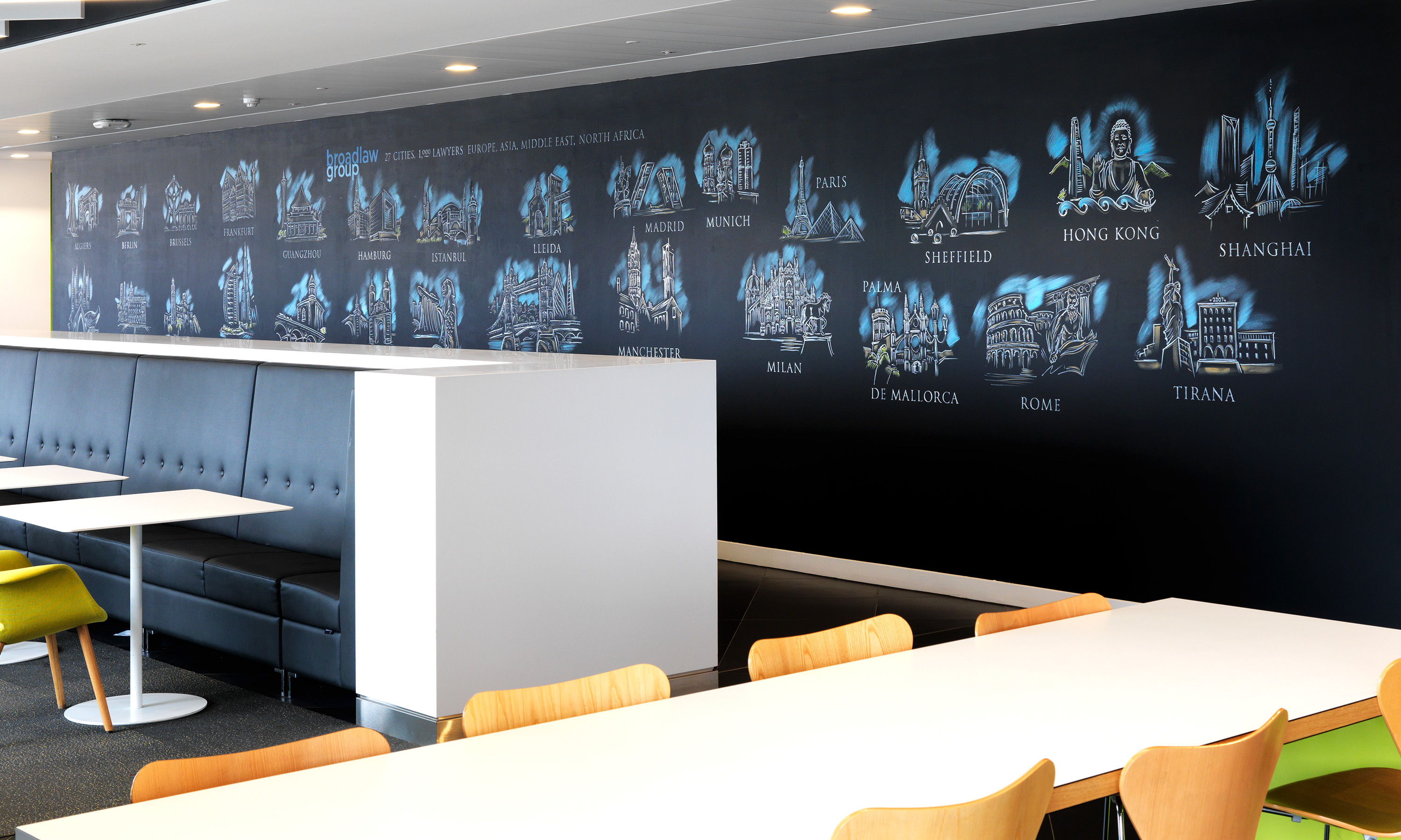
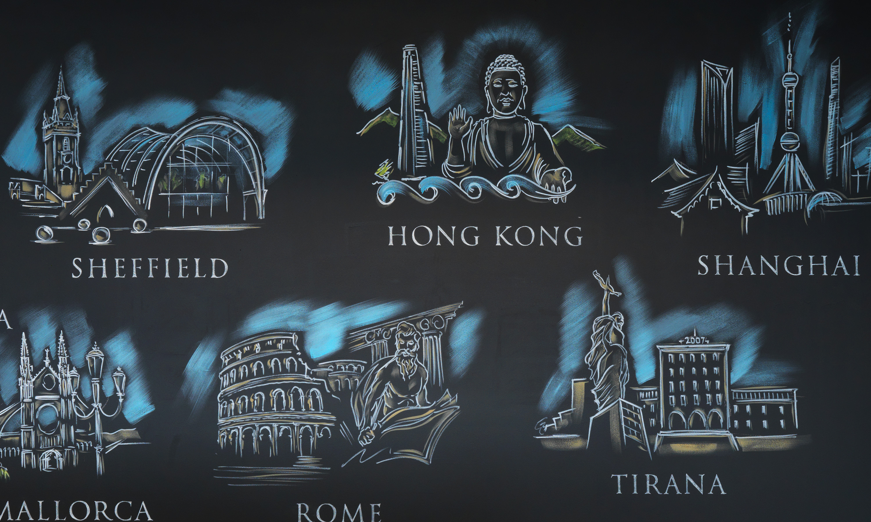
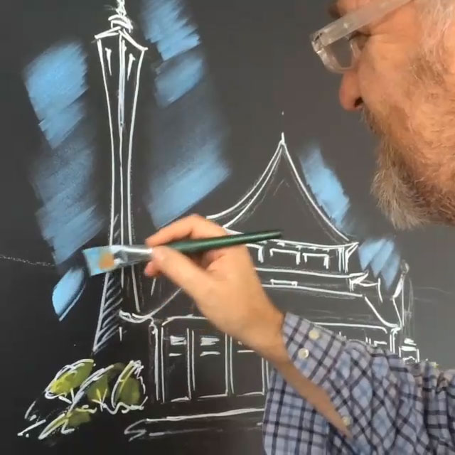
Building the brand… and branding the building
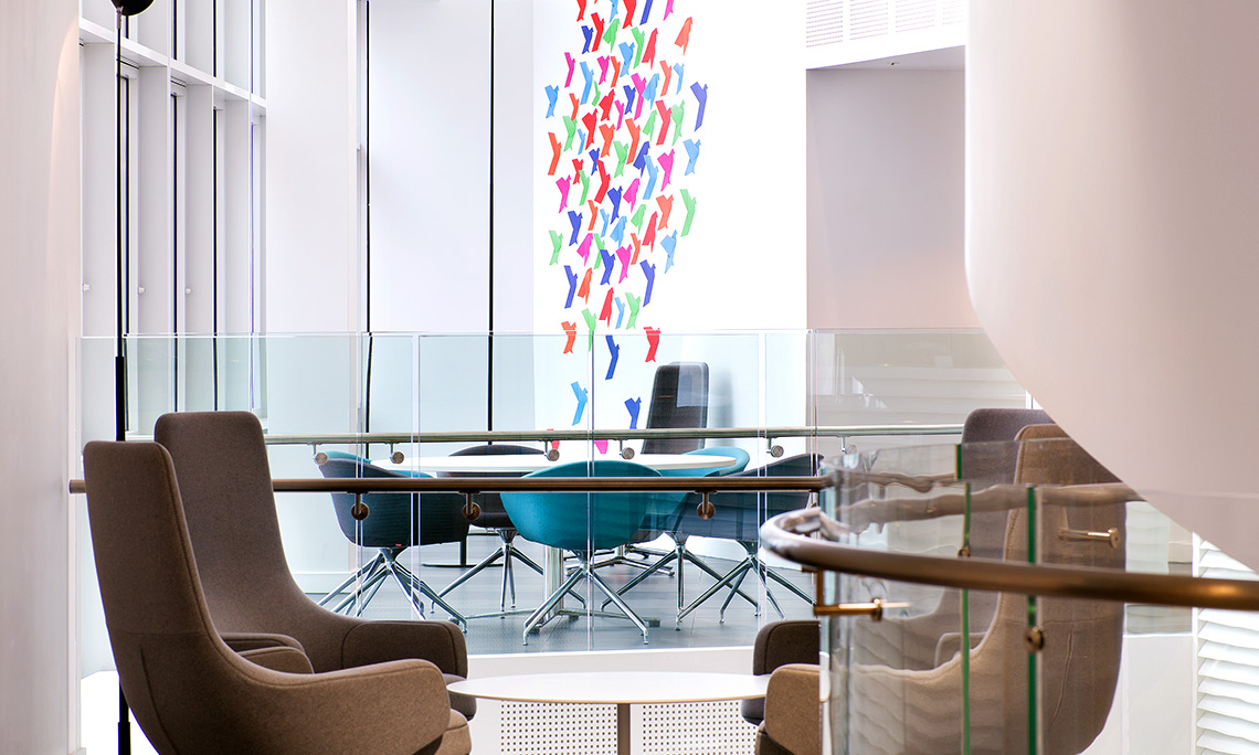
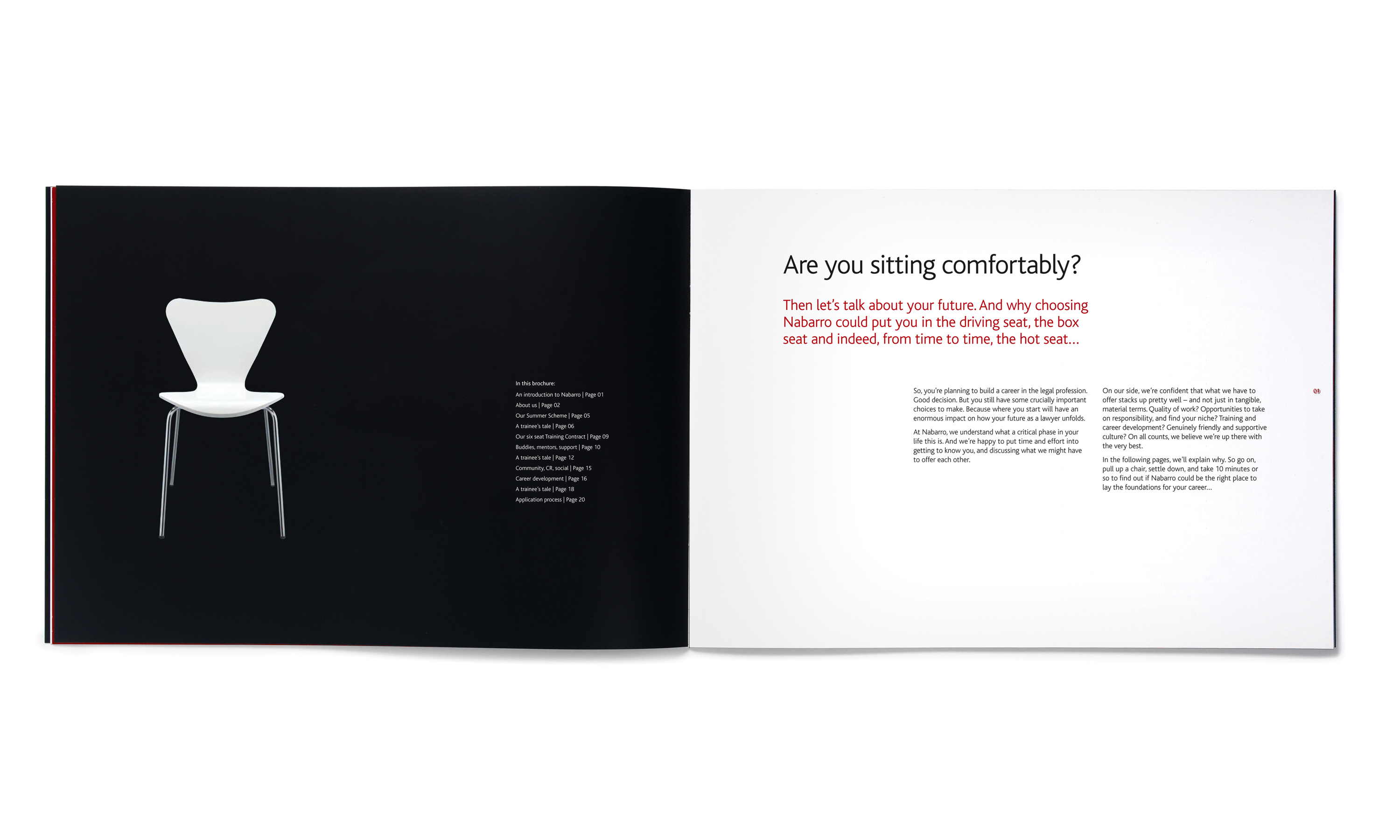
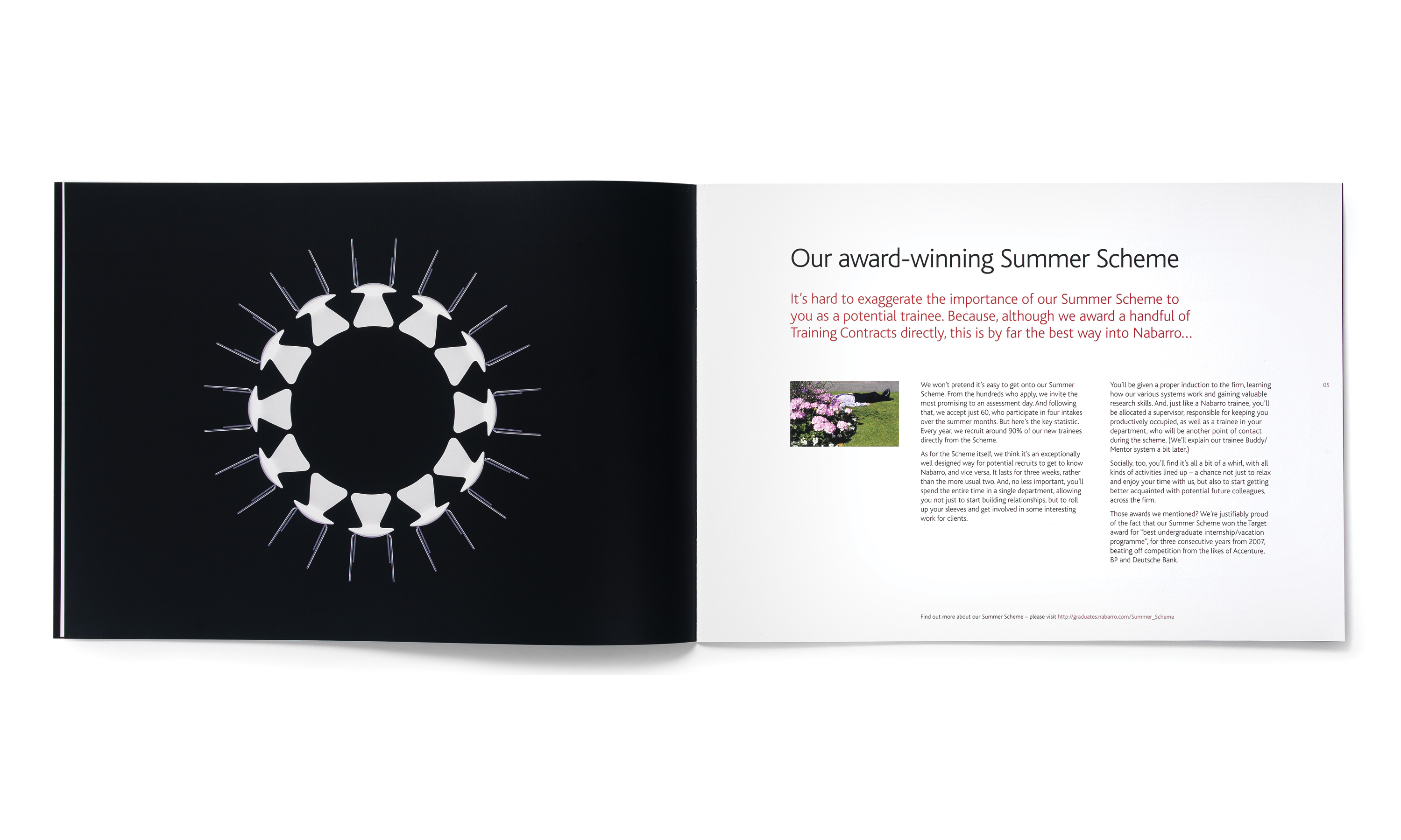
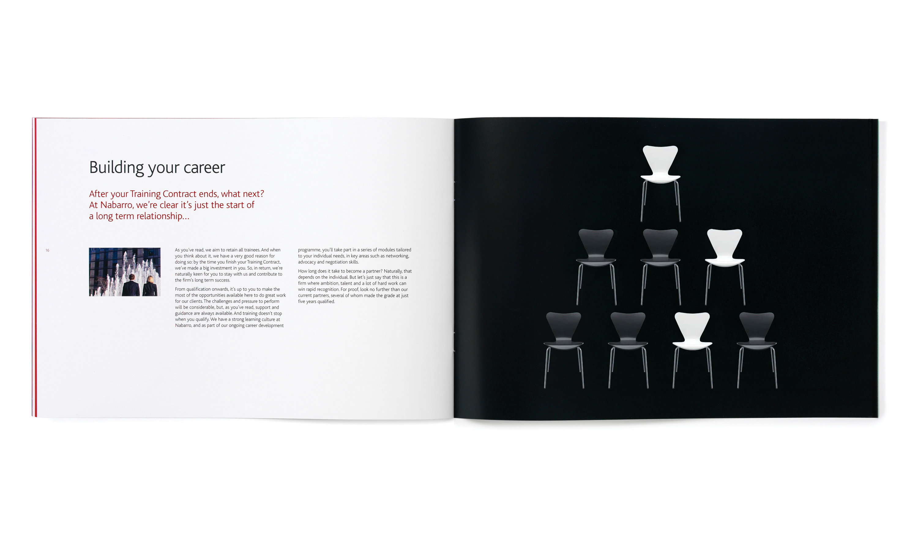
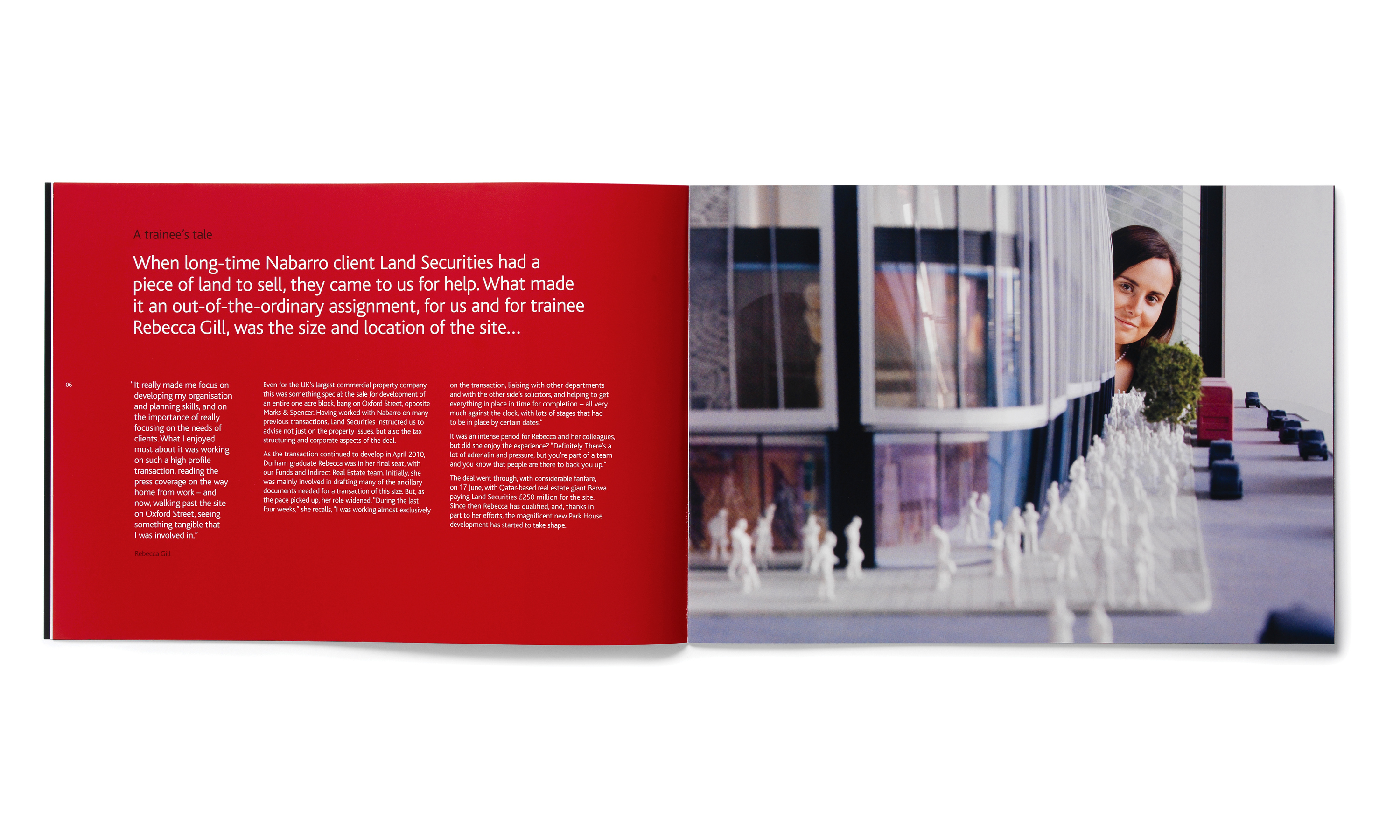
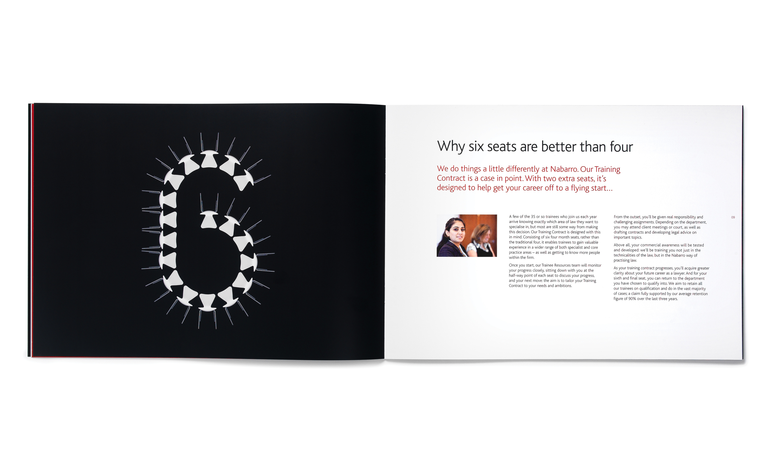
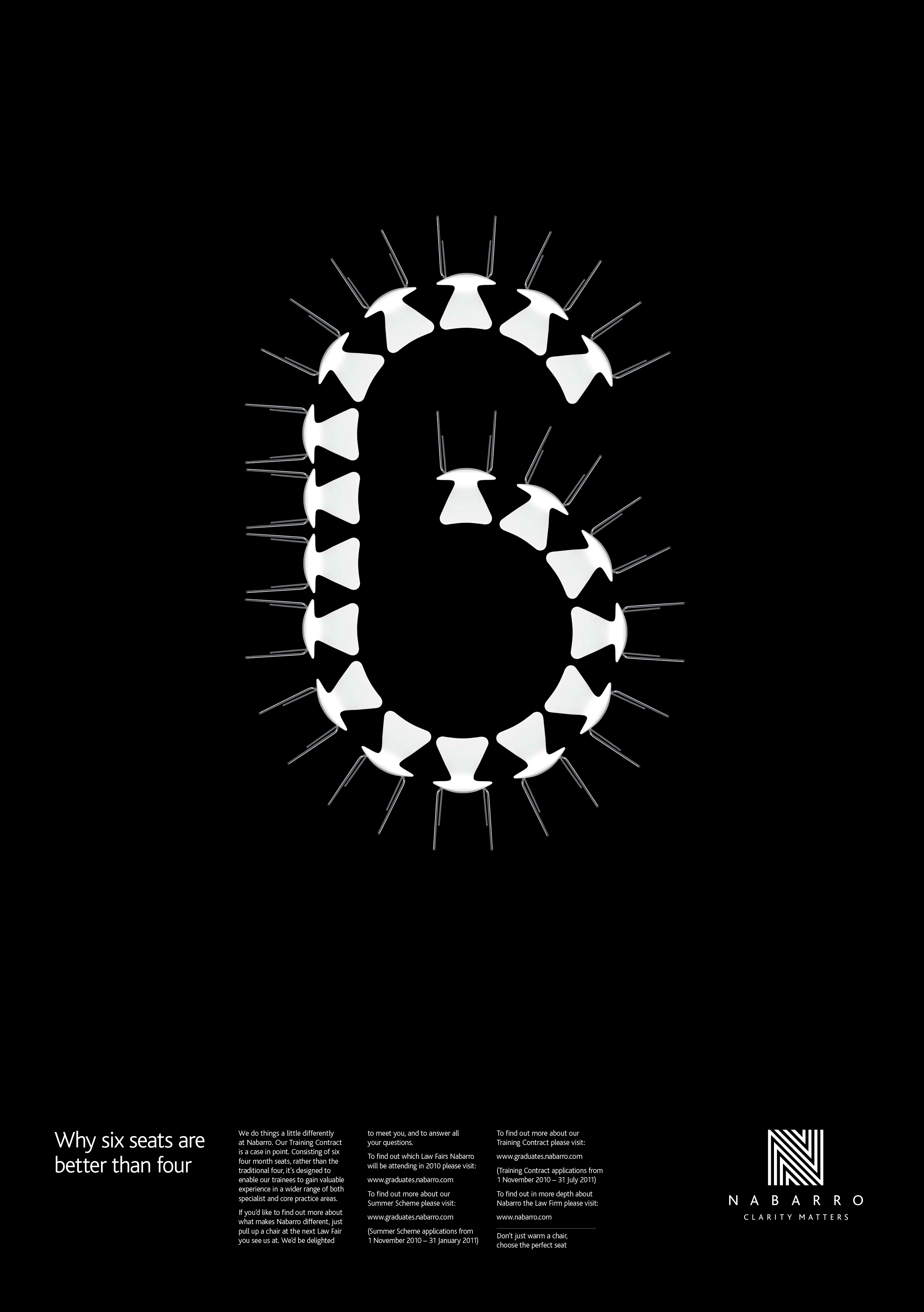
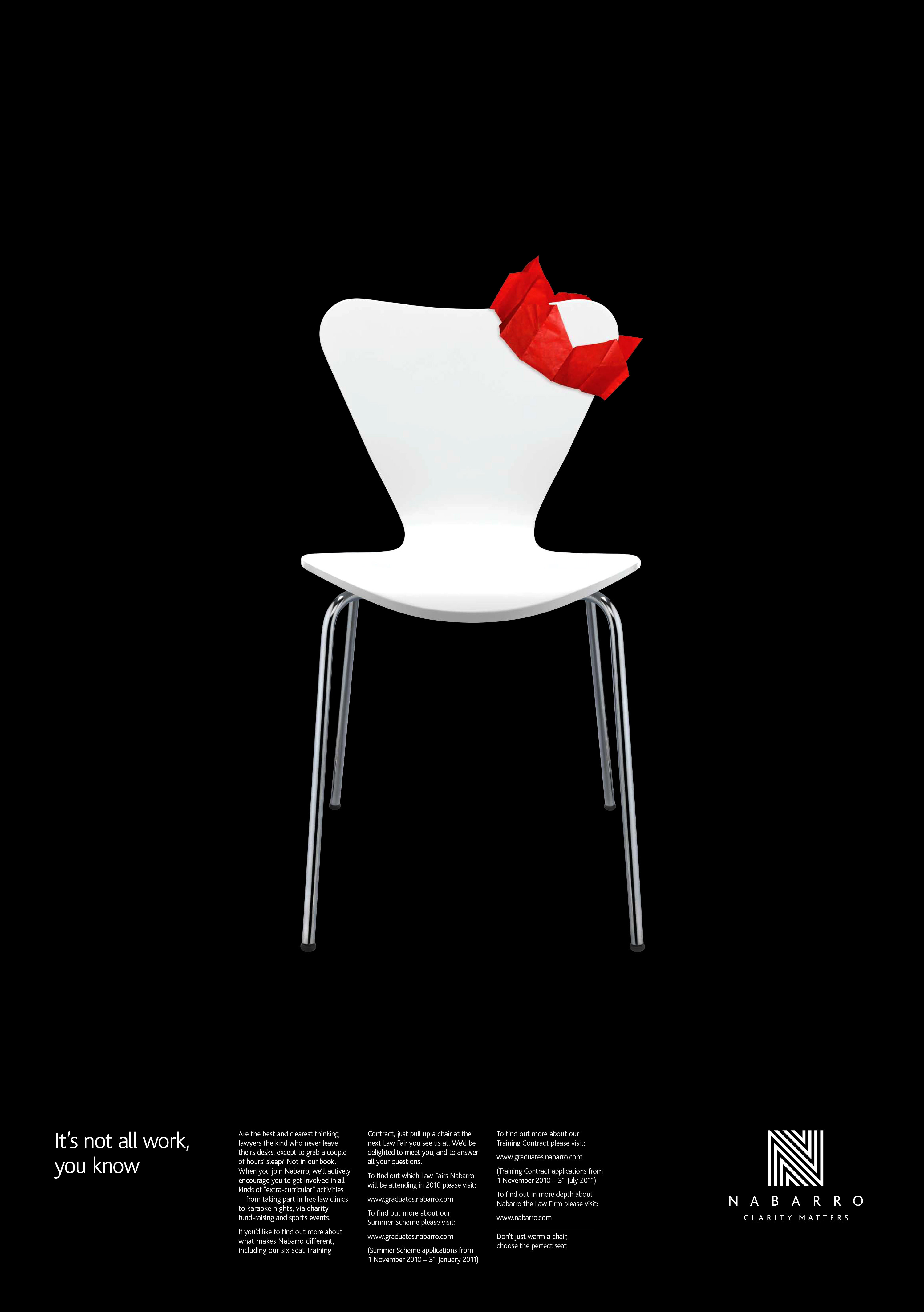
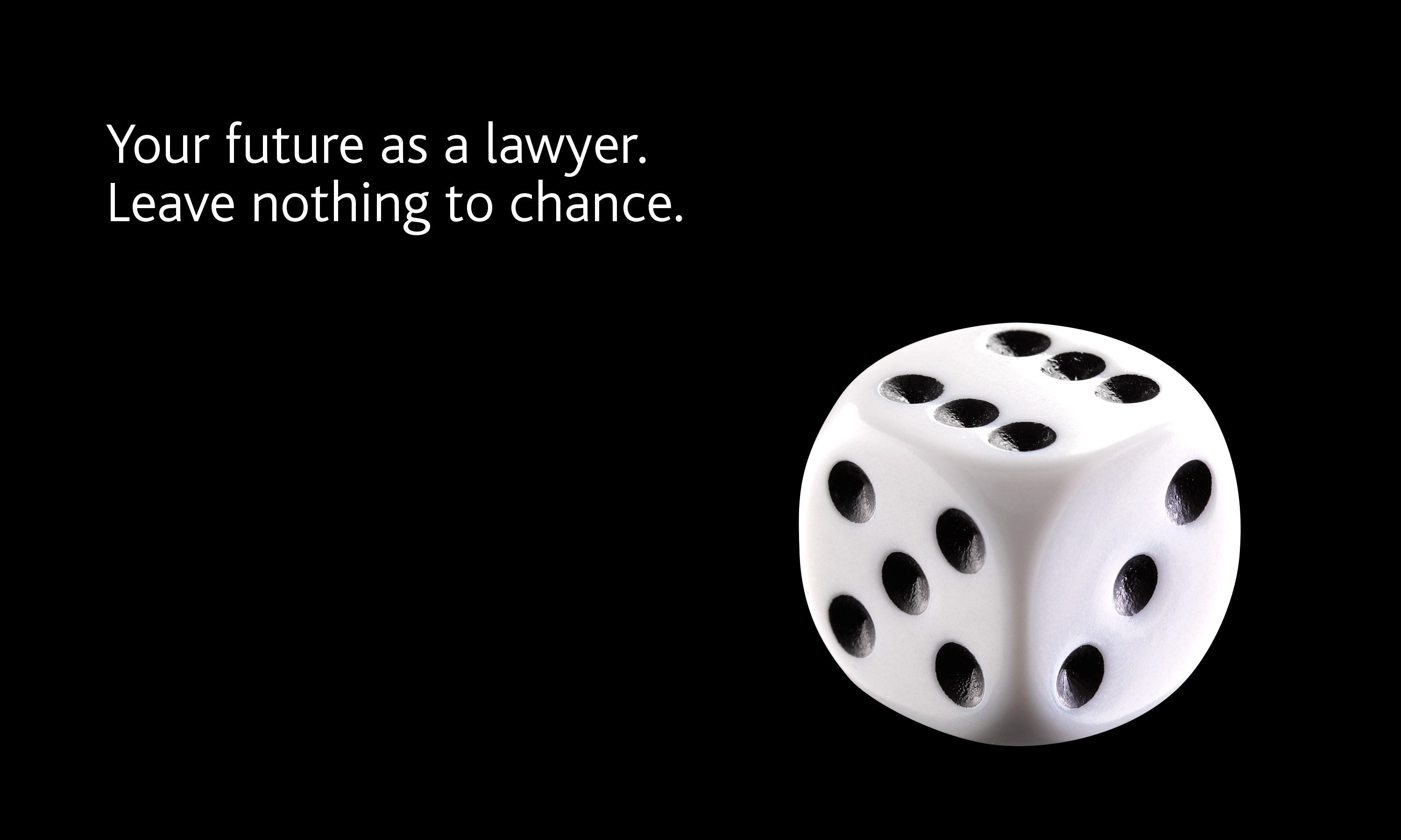
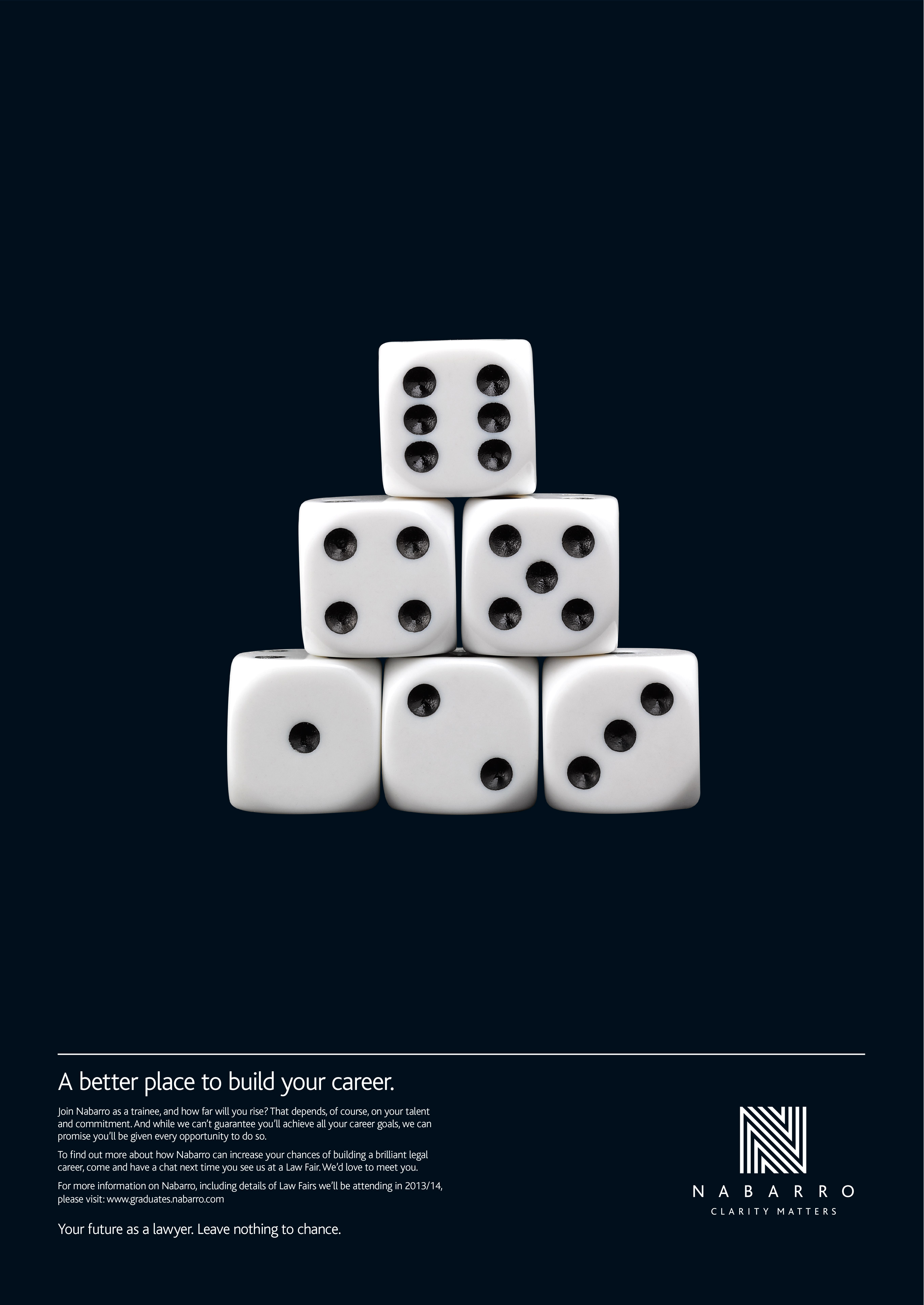
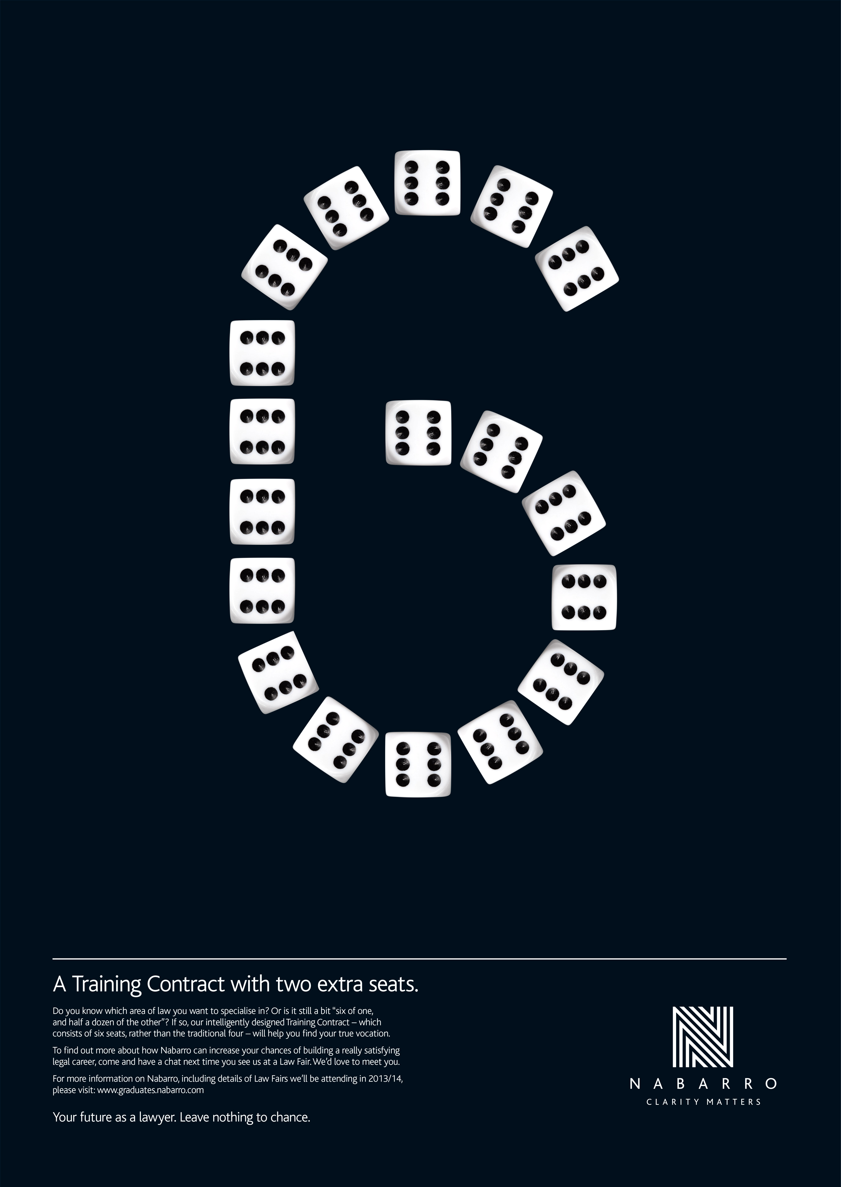
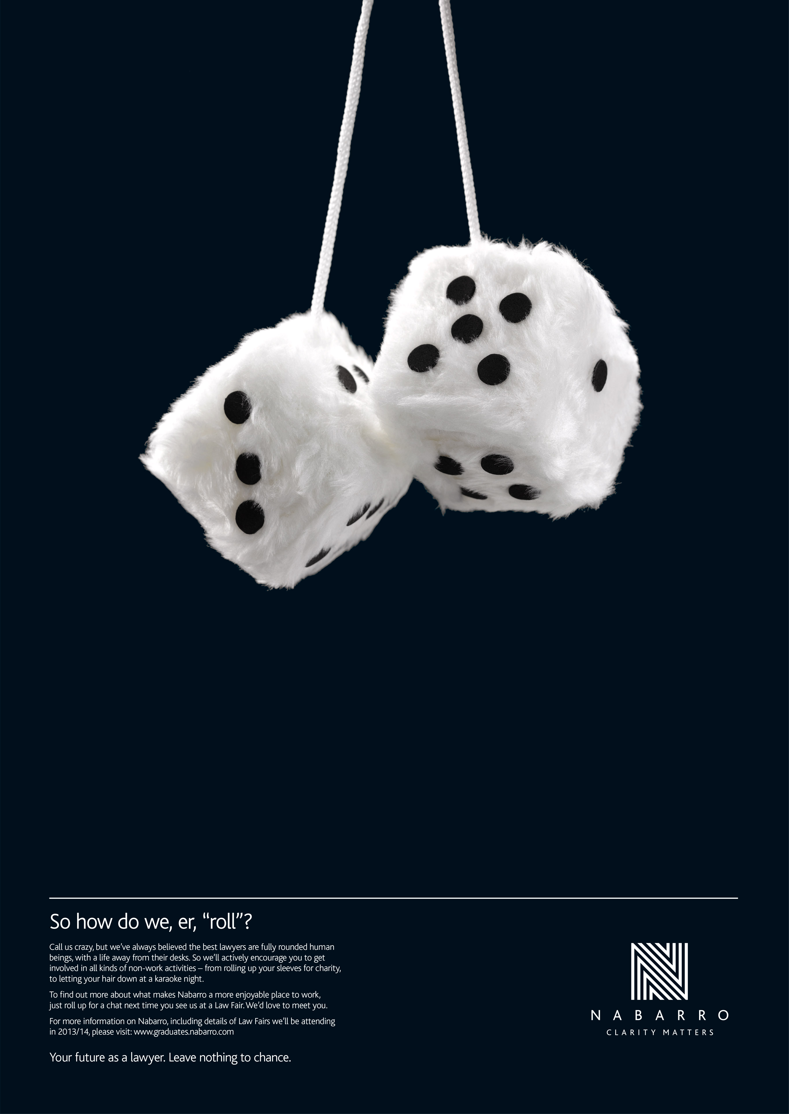
Building on the foundations of that original strategy, we developed a versatile black-and-white based visual language, to reflect the firm’s clear-cut “no grey areas” thinking. We produced brand communications across all media, including highly effective and award-winning recruitment campaigns “Don’t just warm a chair. Find the perfect seat” and “Your future as a lawyer. Leave nothing to chance“. And when Nabarro moved to a beautiful new building in the heart of the City, we took charge of creating a total branded environment.
Onwards and upwards…
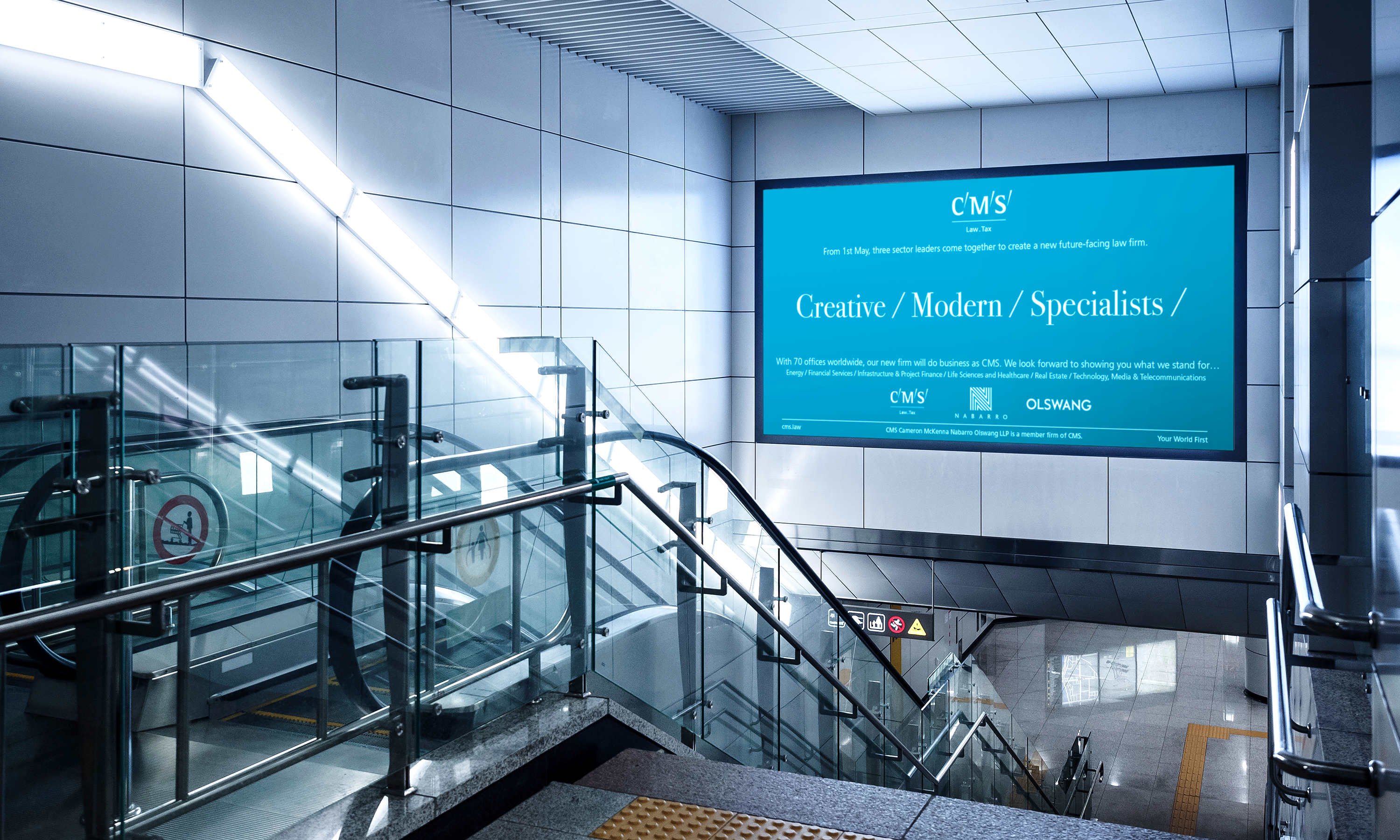
The happy-though-also-slightly-poignant ending of the Nabarro/Neon story? In May 2017, the firm joined forces with CMS and Olswang in a mega-merger, to form a new legal powerhouse – the sixth biggest law firm in the world – under the CMS banner. Of course, we were sorry to say goodbye to Nabarro. But we were very happy indeed that, largely on the strength of our work on their brand, we were appointed to handle the launch of the super-firm. And we very much hope we’ll have an equally long and productive relationship with CMS.
(Read Less...)
Kind words…
“Dana from Neon lives and breathes our brand. Read More…
ALEX BELLINGER
Head of Communications
Nabarro LLP
(Read Less...)
To find out more: [email protected] or call +44 (0)20 3289 1733 Share this: Email, LinkedIn, Twitter, Facebook, Download PDF, follow us on Instagram or view our animations and movies on Vimeo
LAW
Branding
PROJECT SUMMARY
Brand identity
Brand positioning
Brand guardianship
Art direction
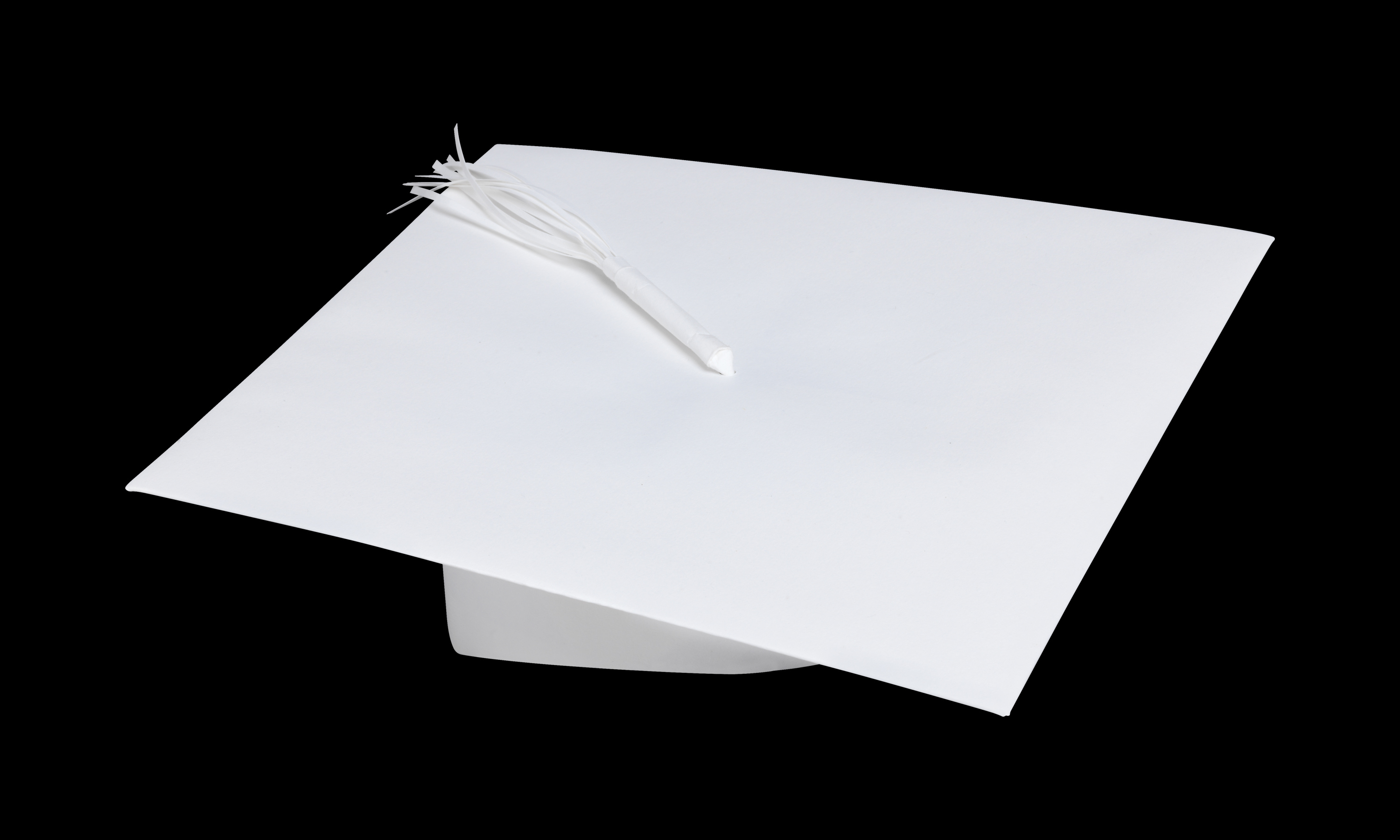
Graduate recruitment campaigns
Graduate recruitment showcase movies
Brand advertising campaigns
Brand environments
Brand movies
Guidelines
Signature images library
Copy writing
Literature system
Website
Portrait photography
Digital comms
On-line animations
Digital templates
PowerPoint templates
Nabarro LLP brand mark.
Bird & Fortune Clarity Matters - 'The law, ungobbledegooked' (YouTube shorts)
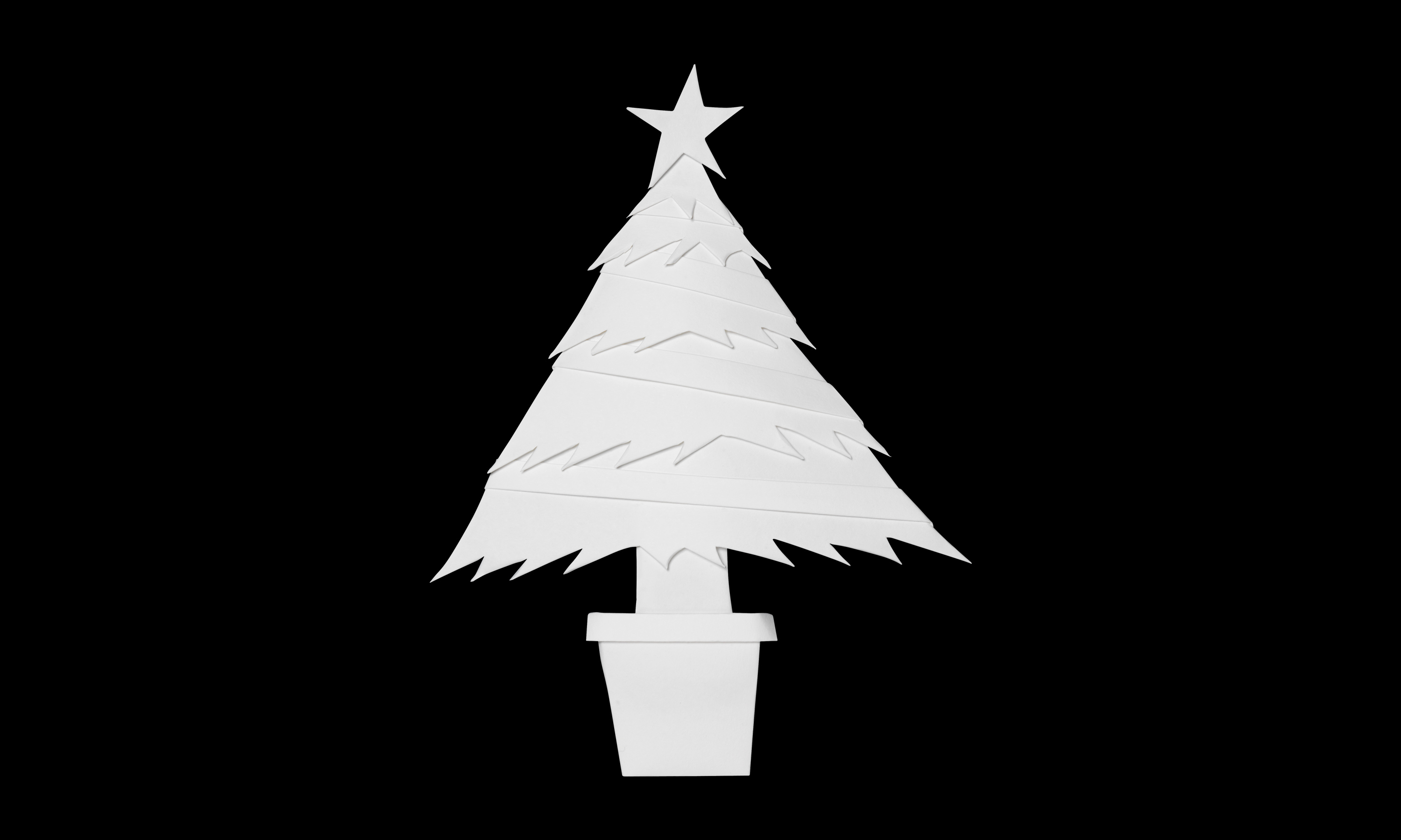
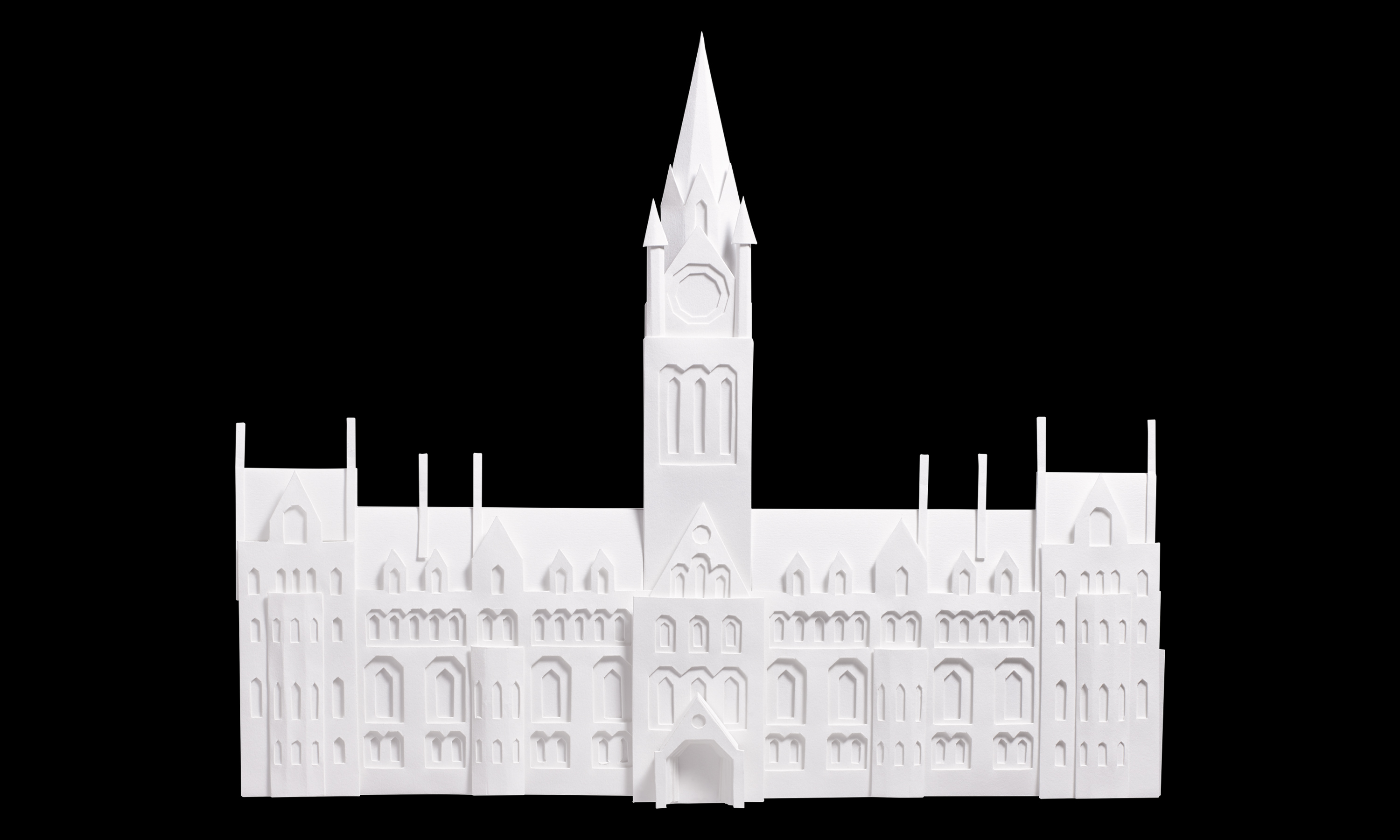
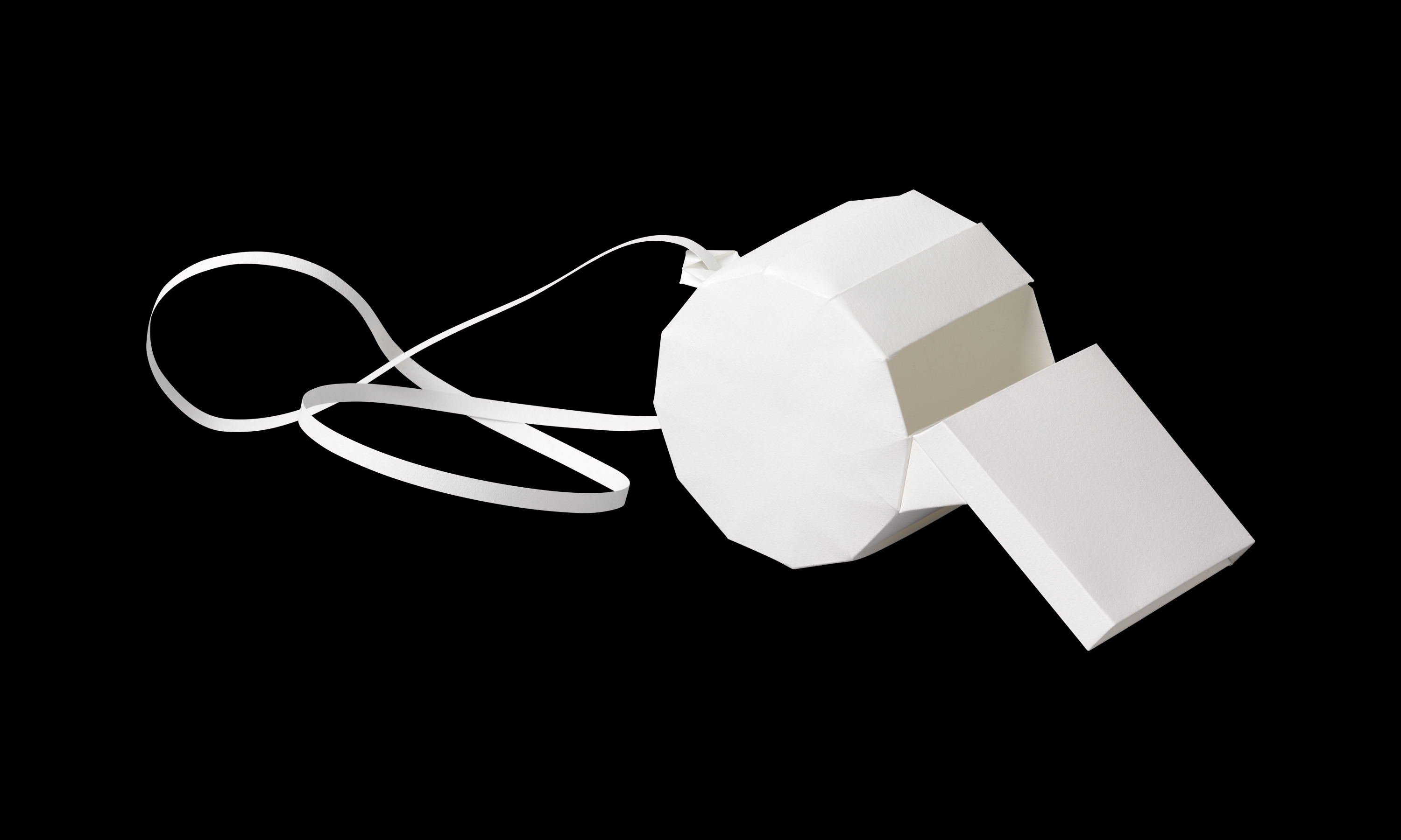
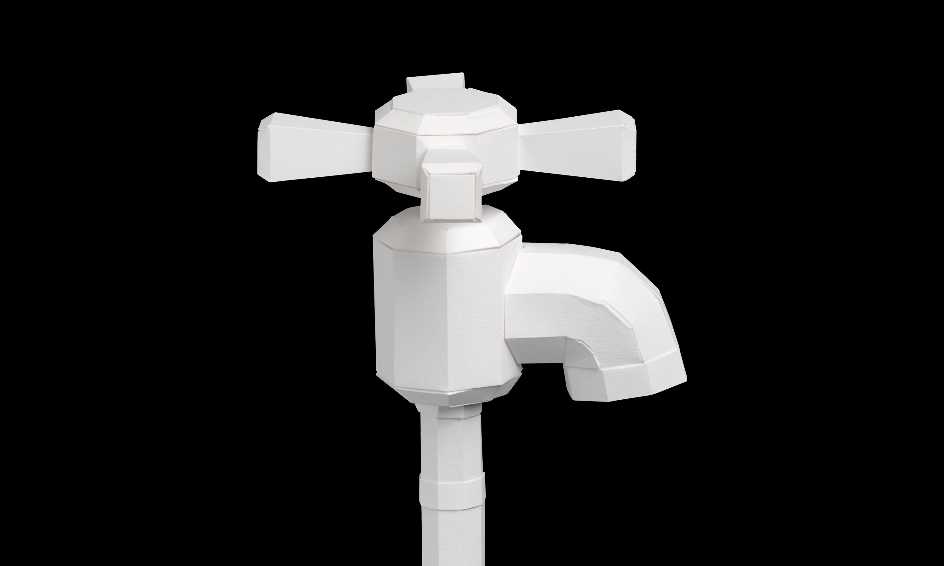
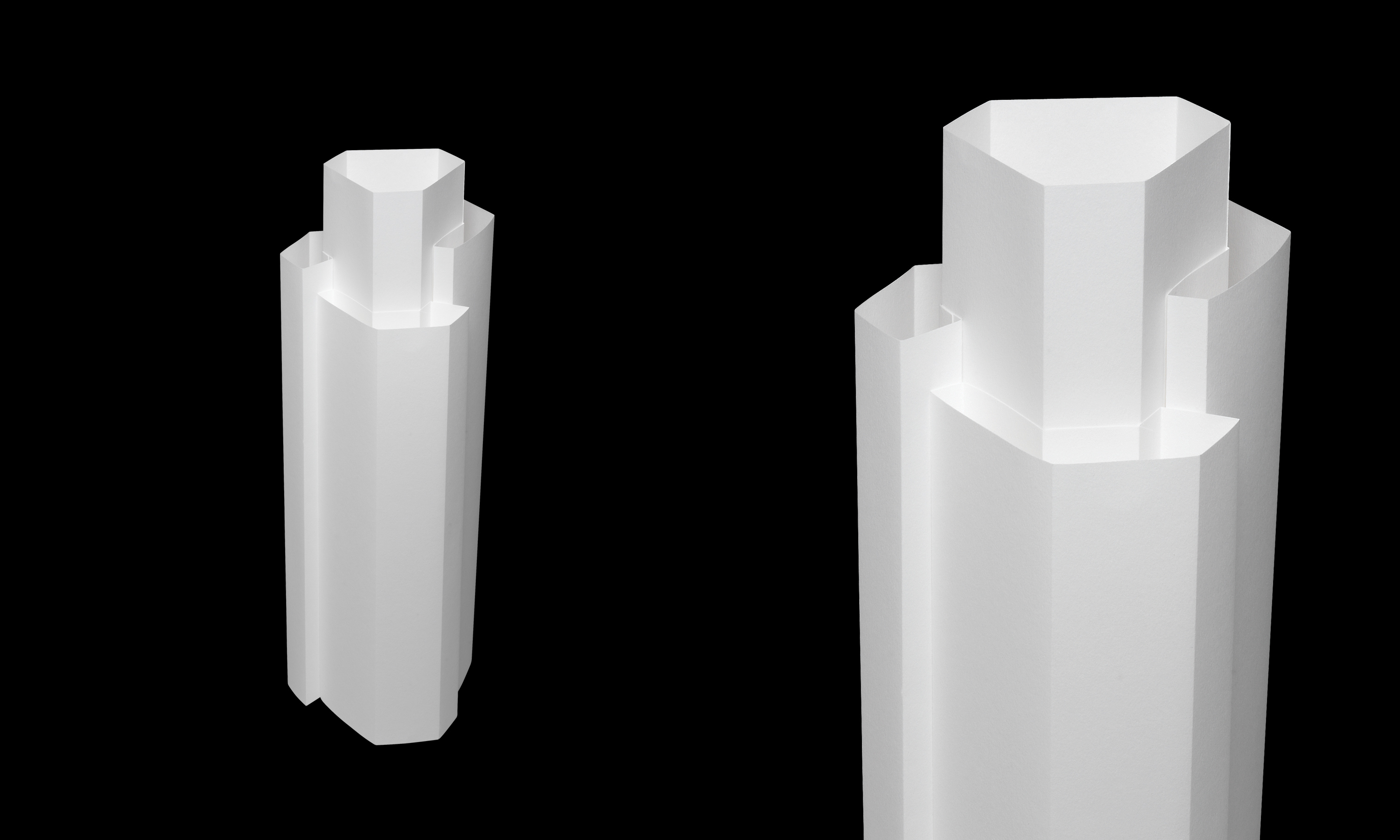
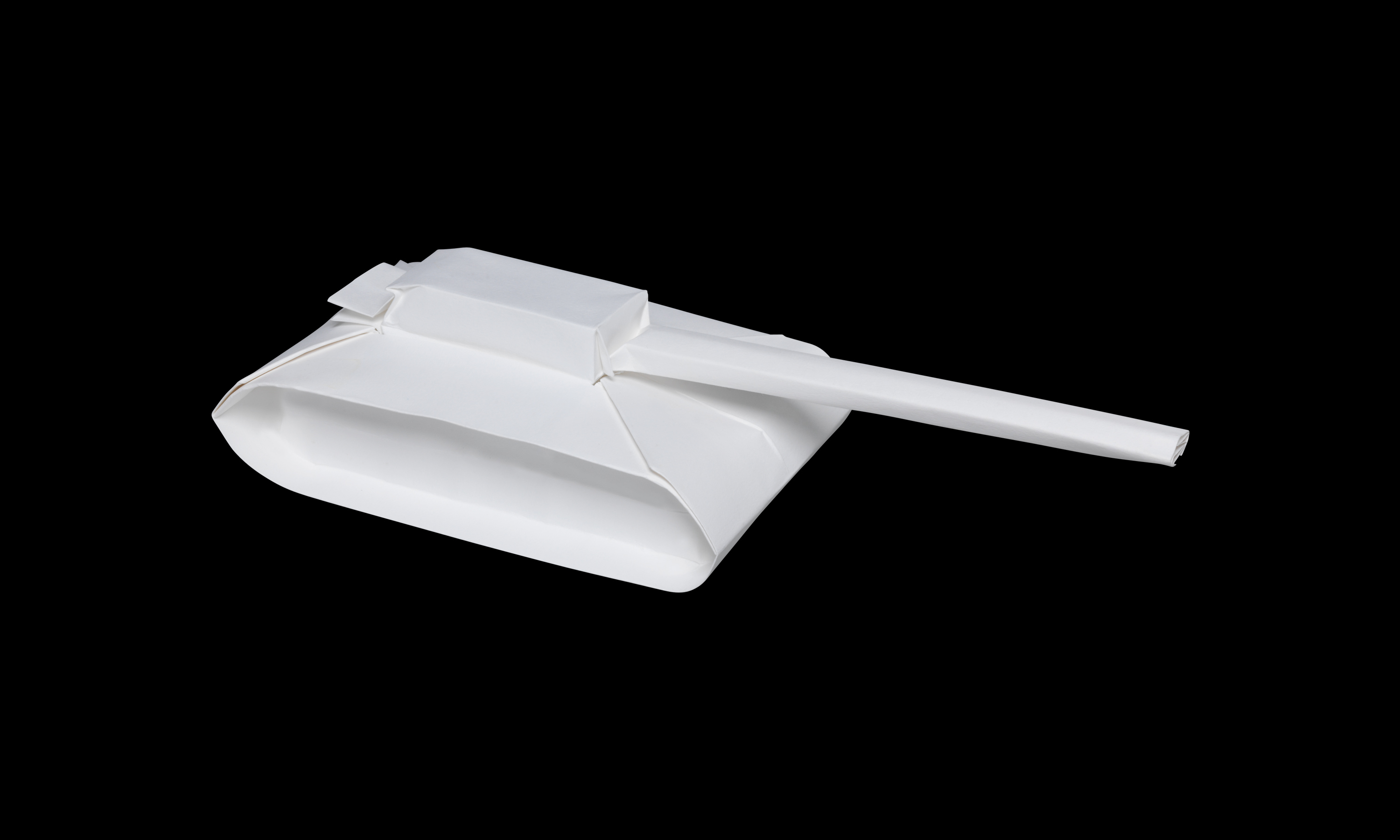
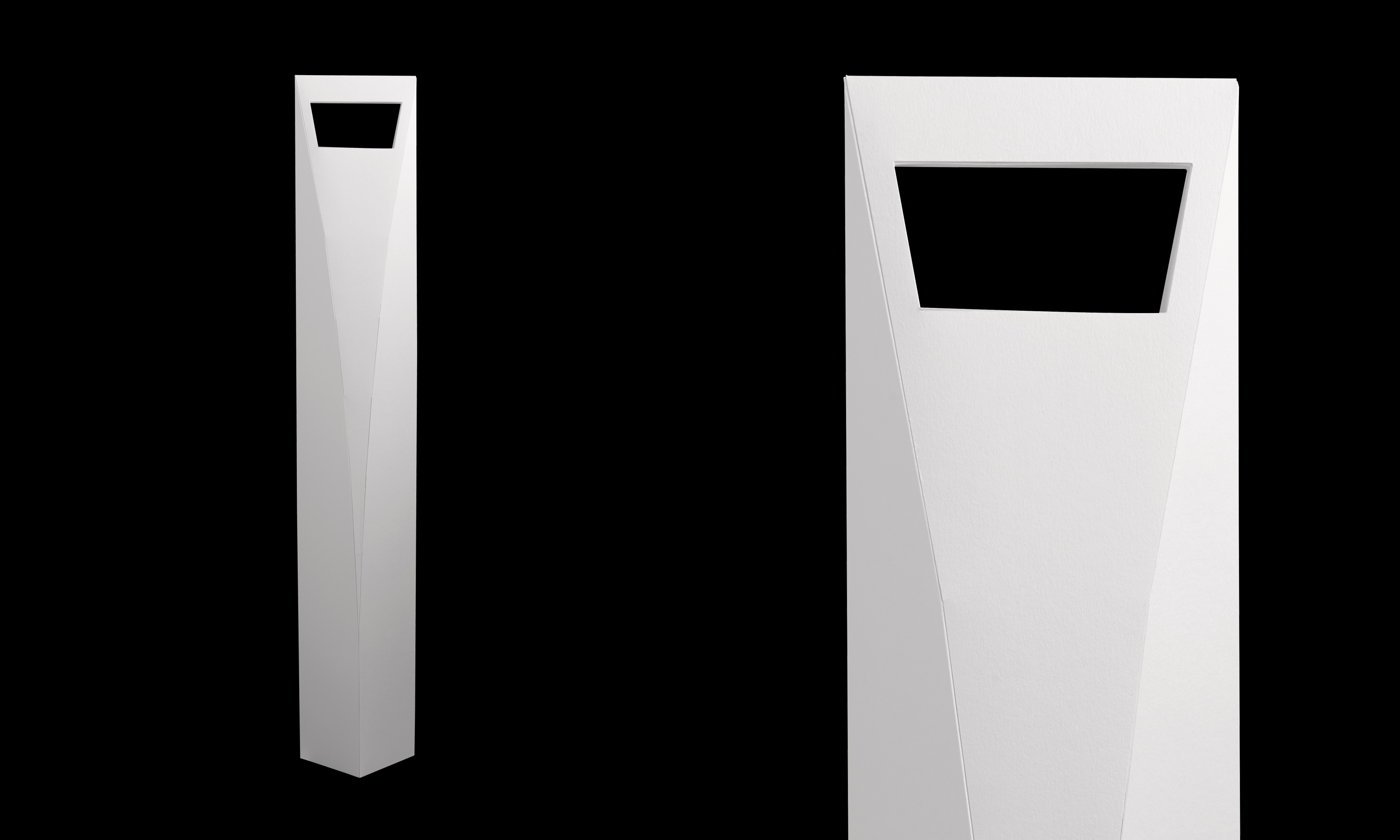
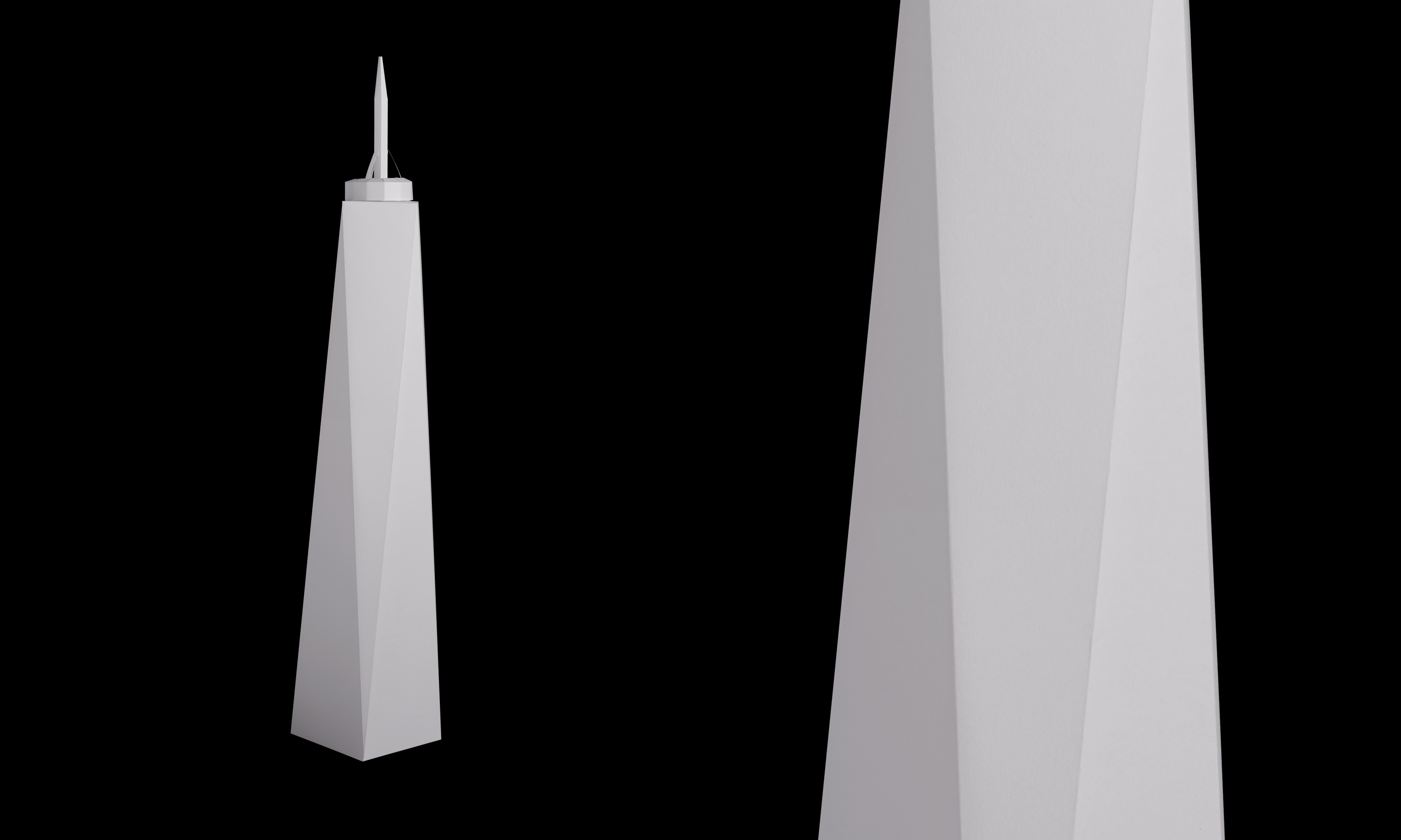
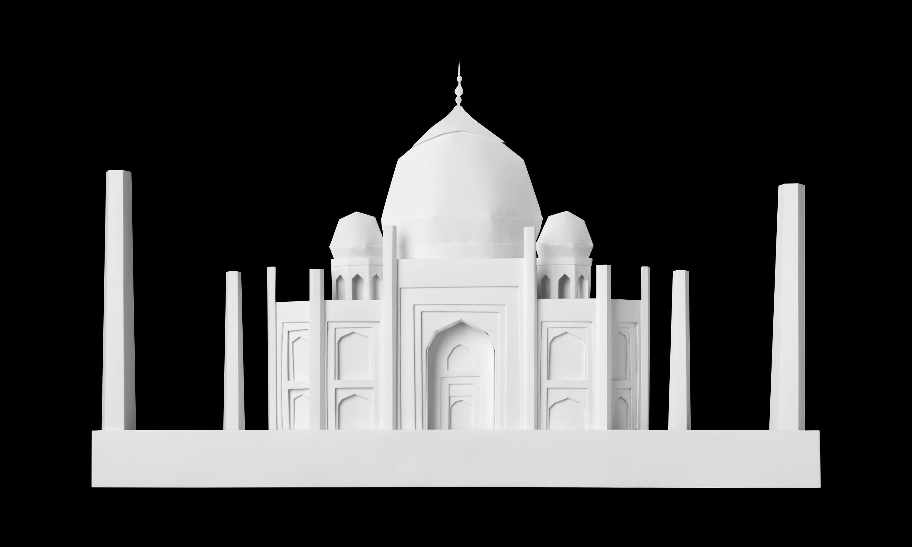
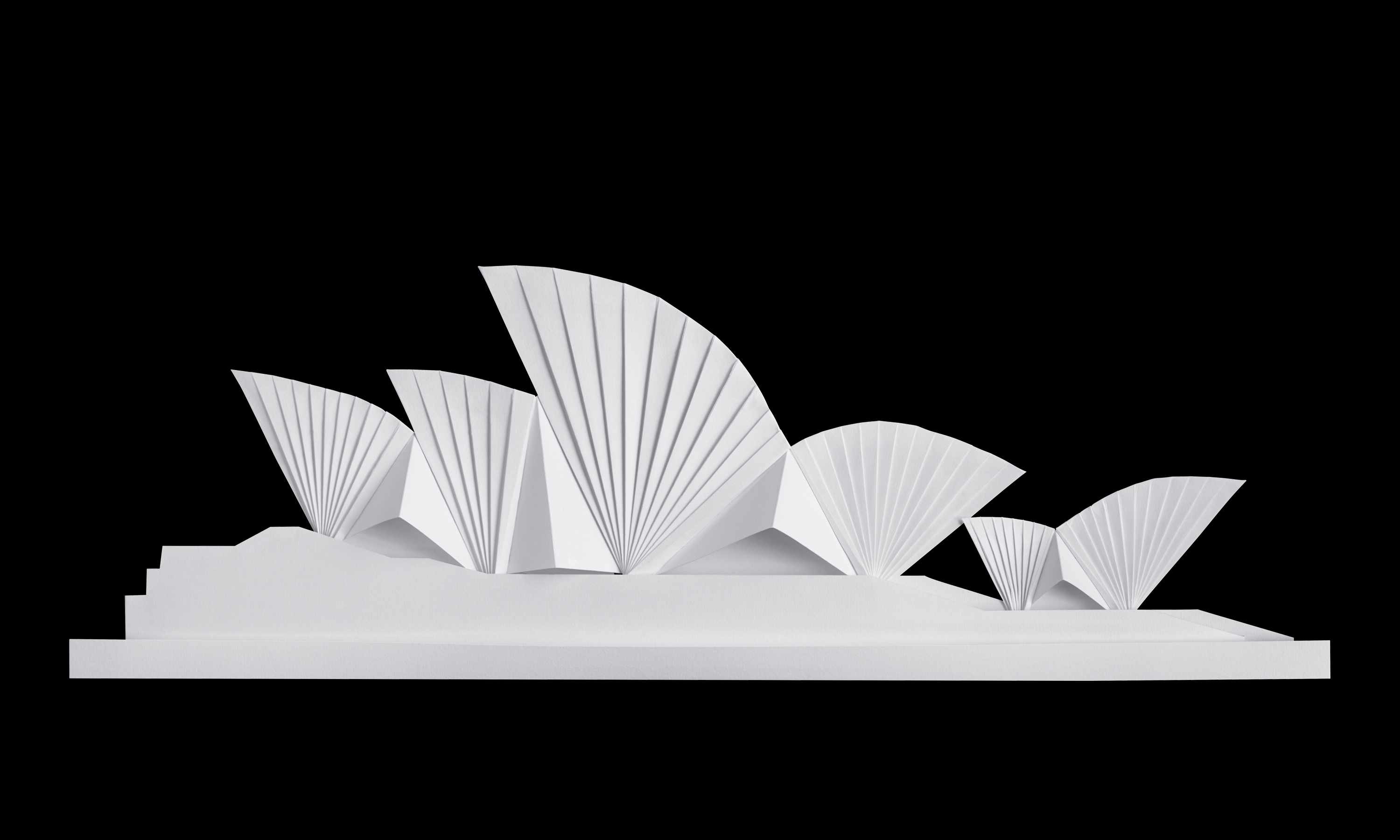
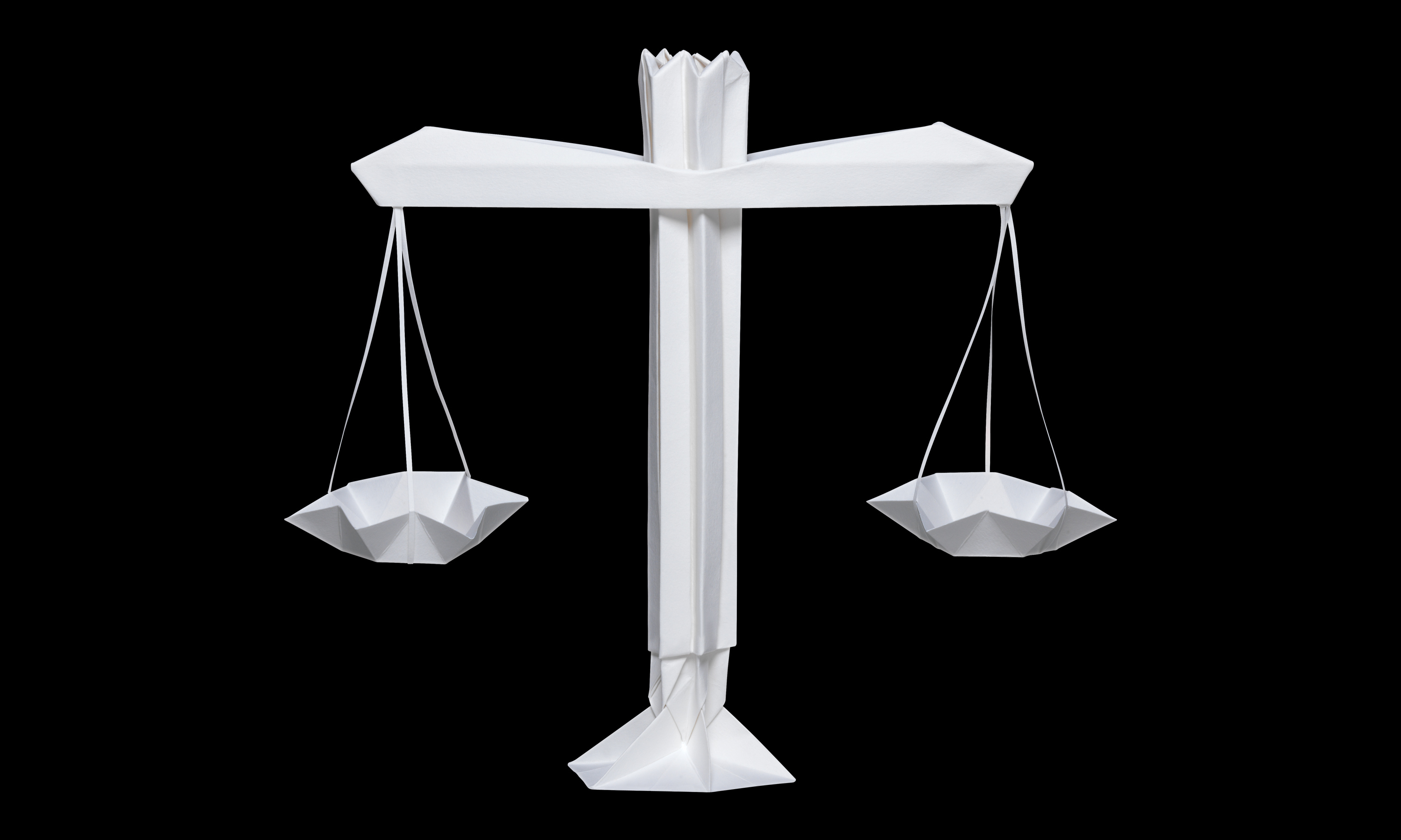
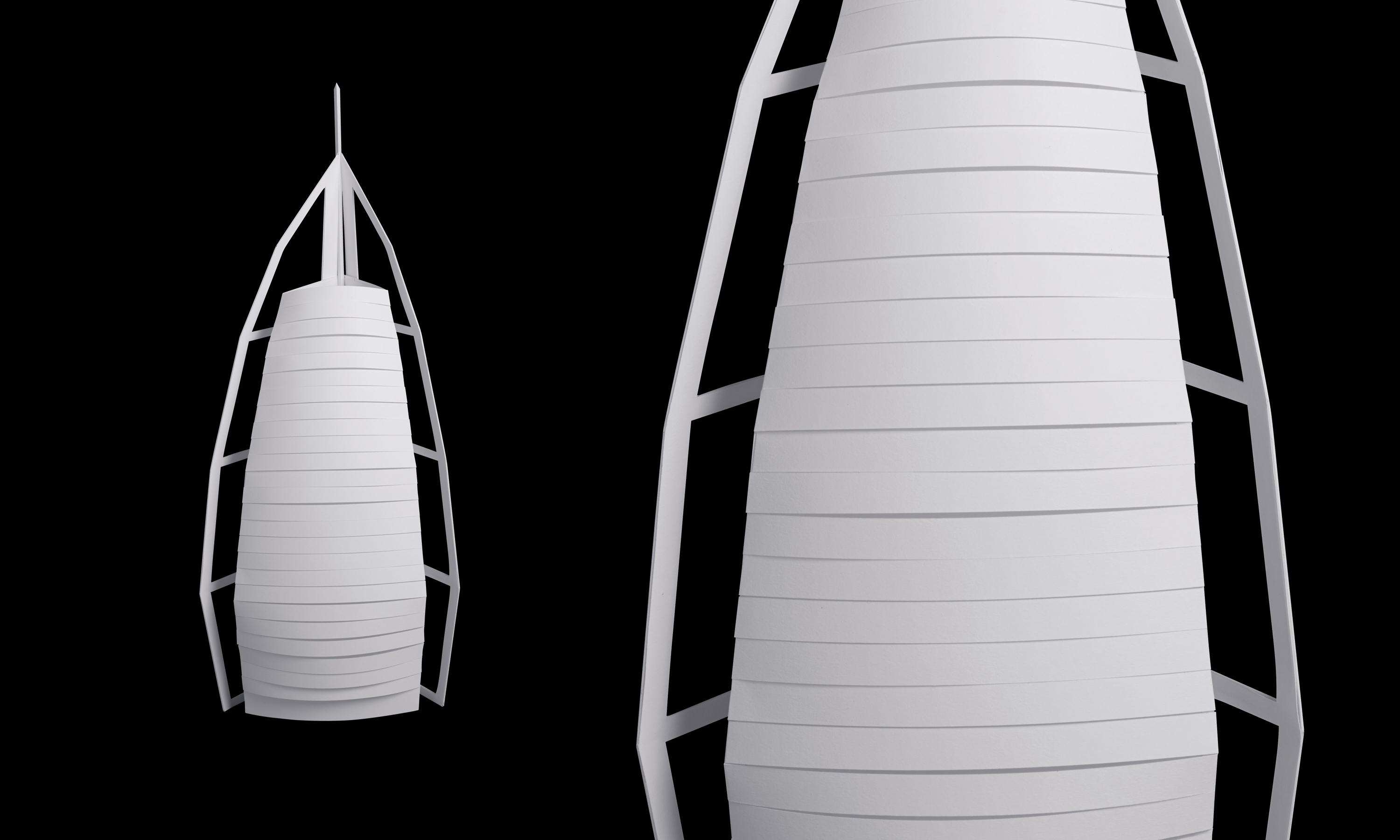
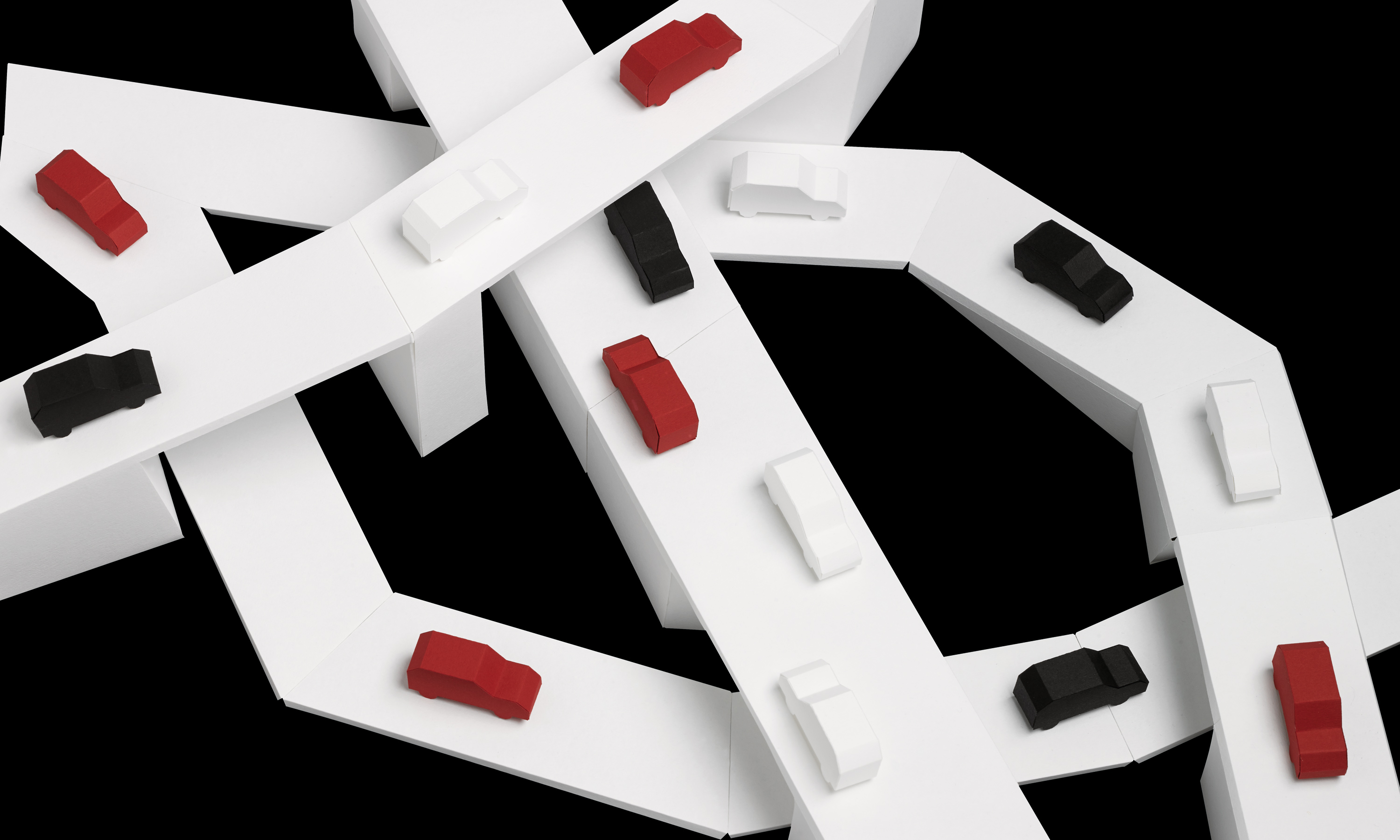
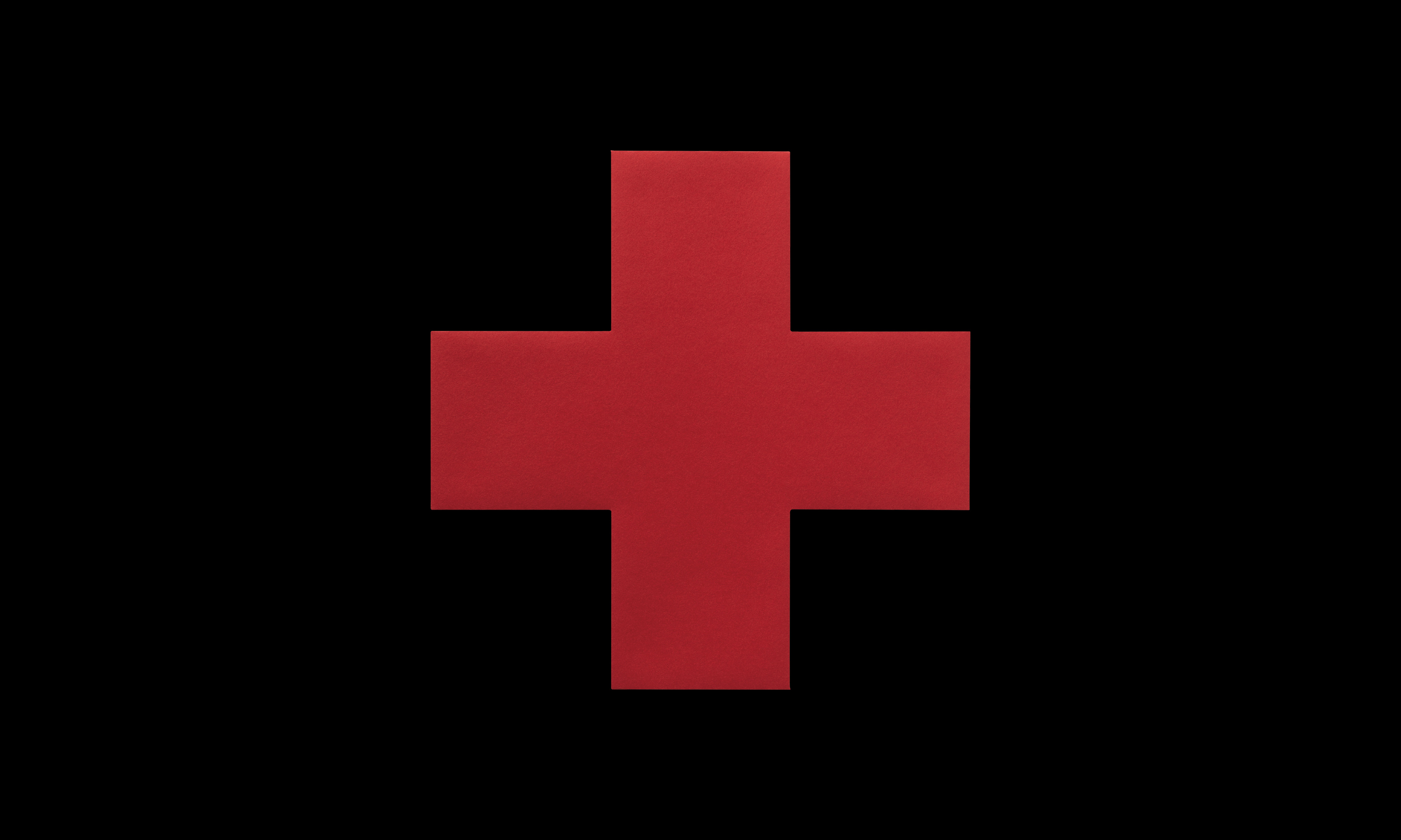
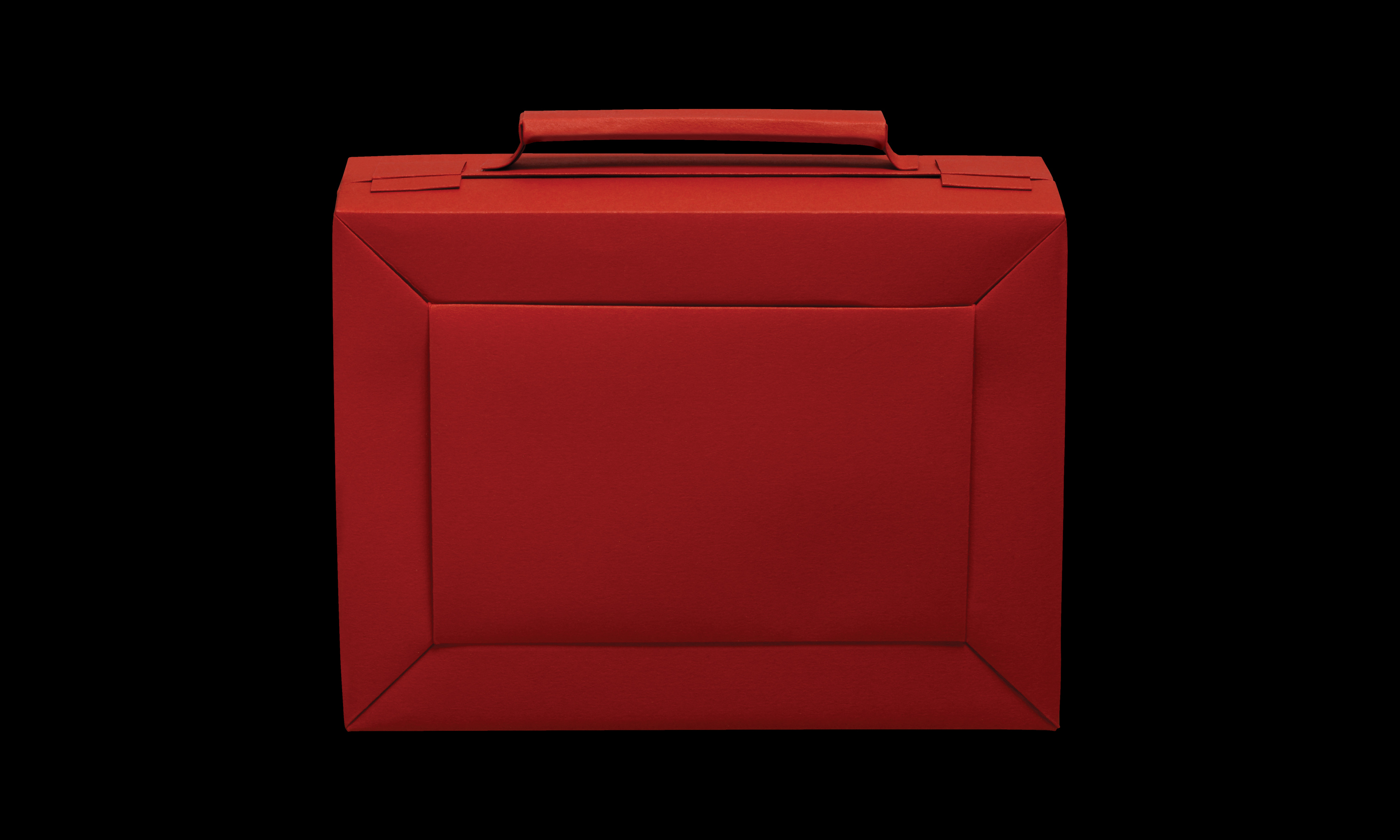
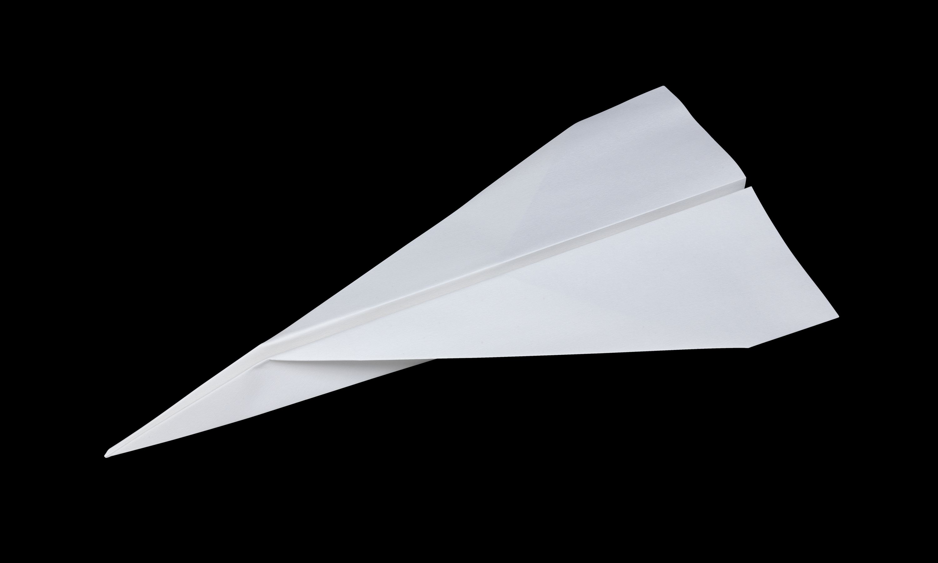
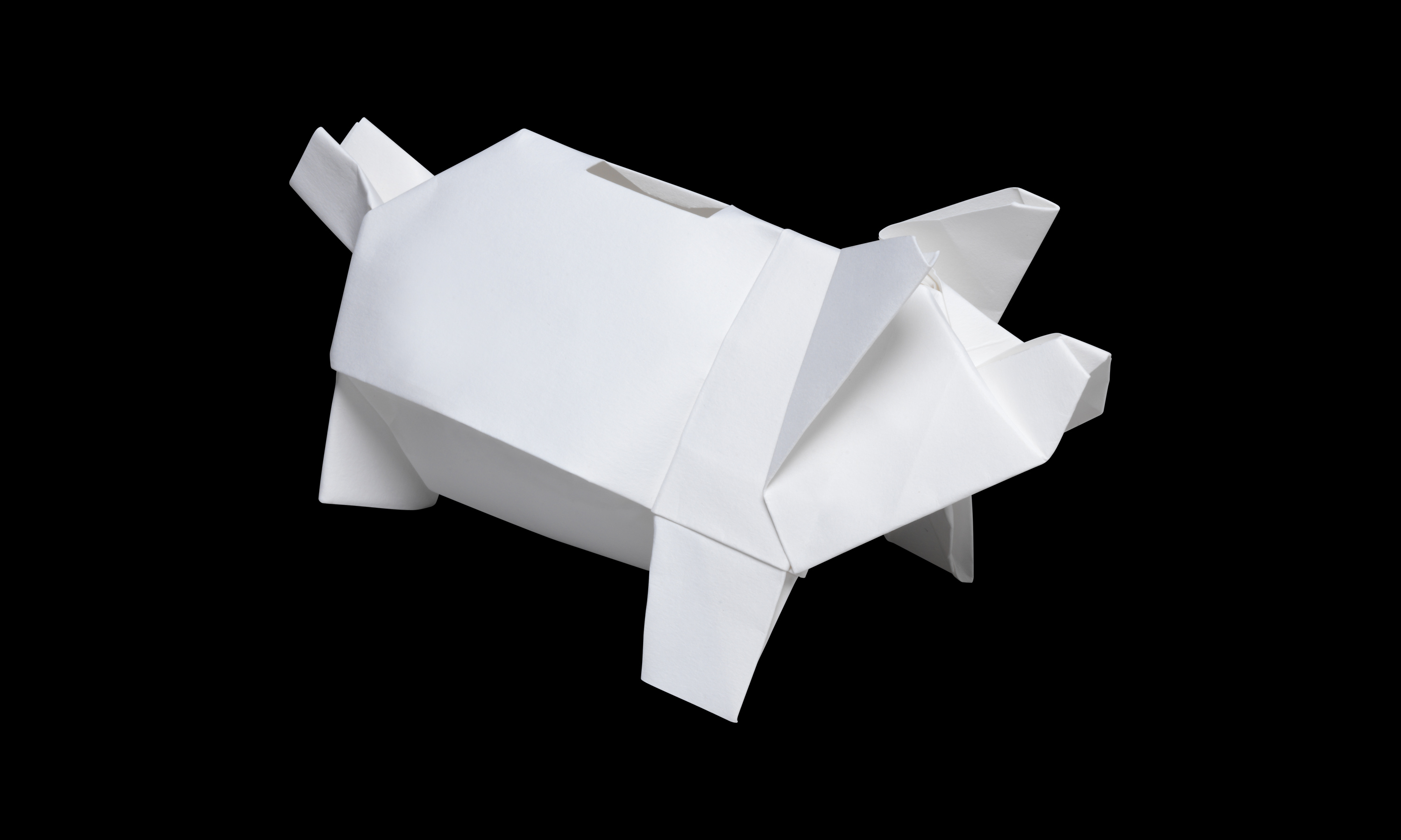
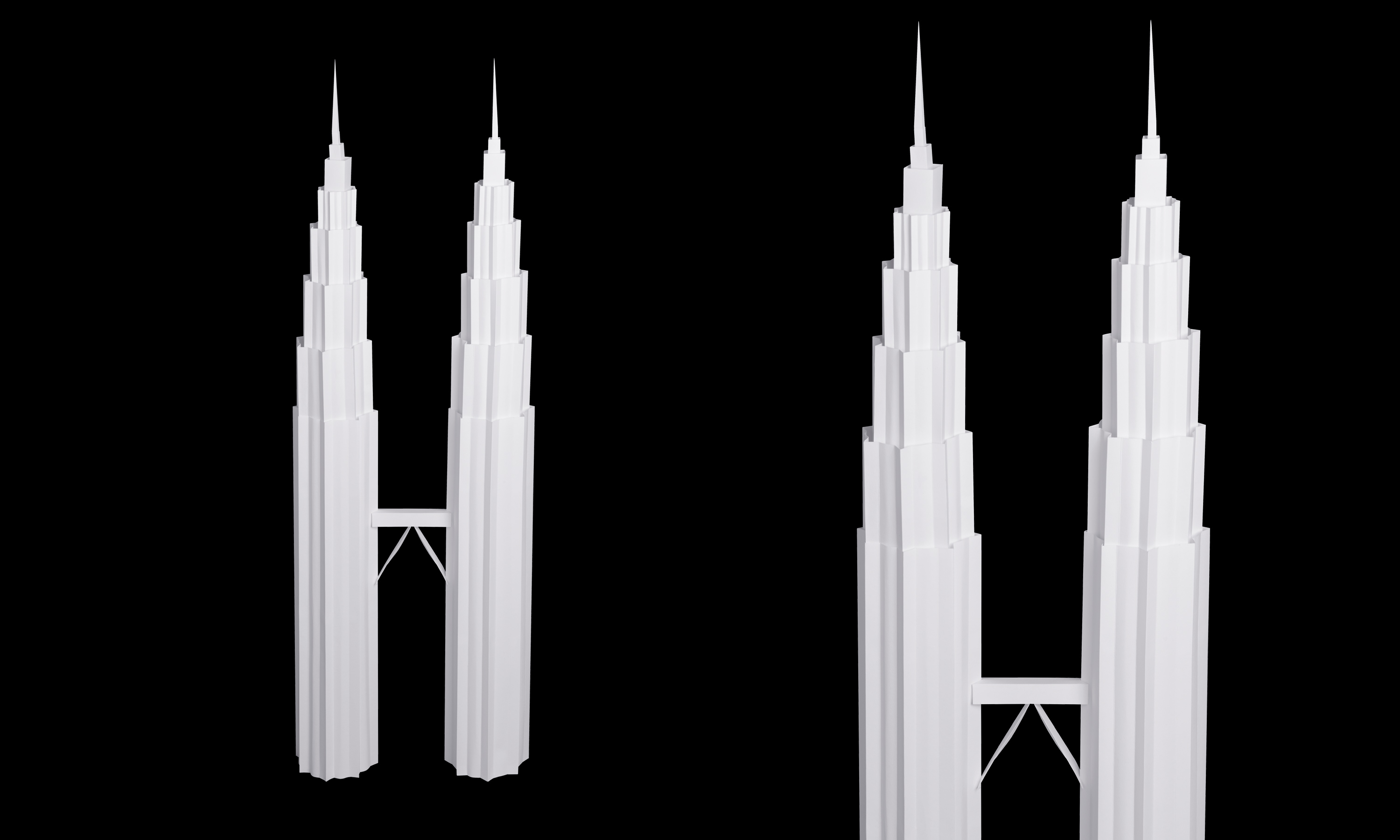
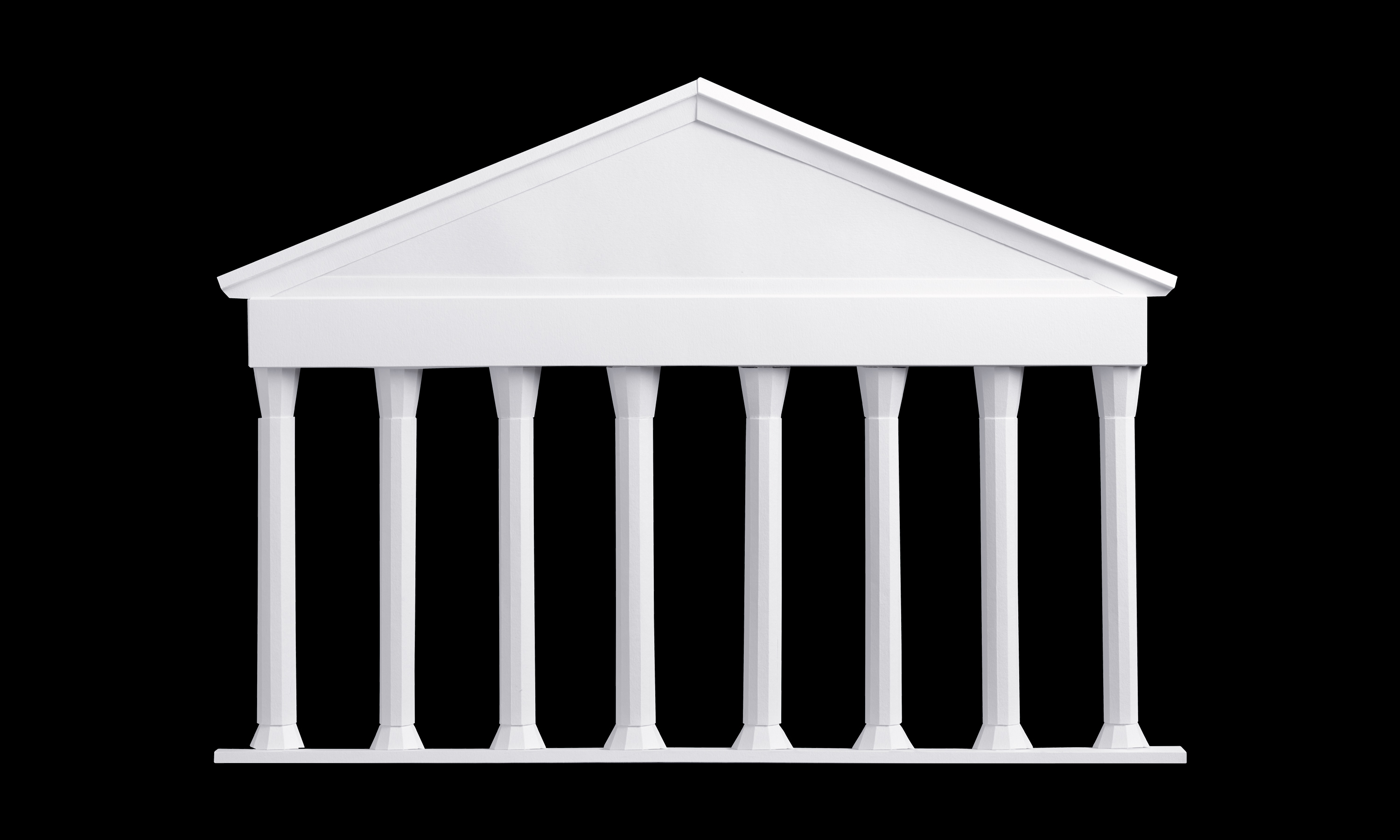
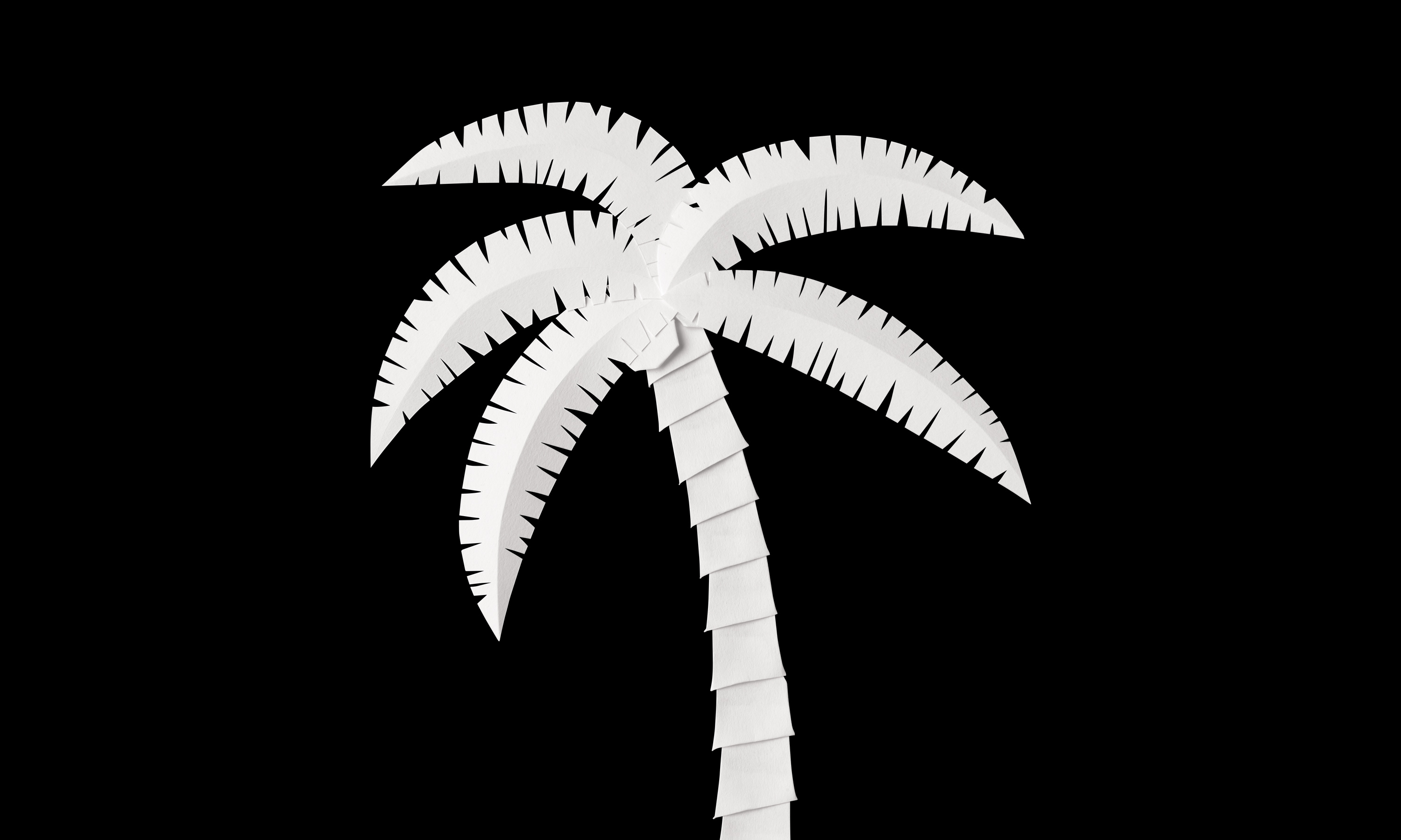
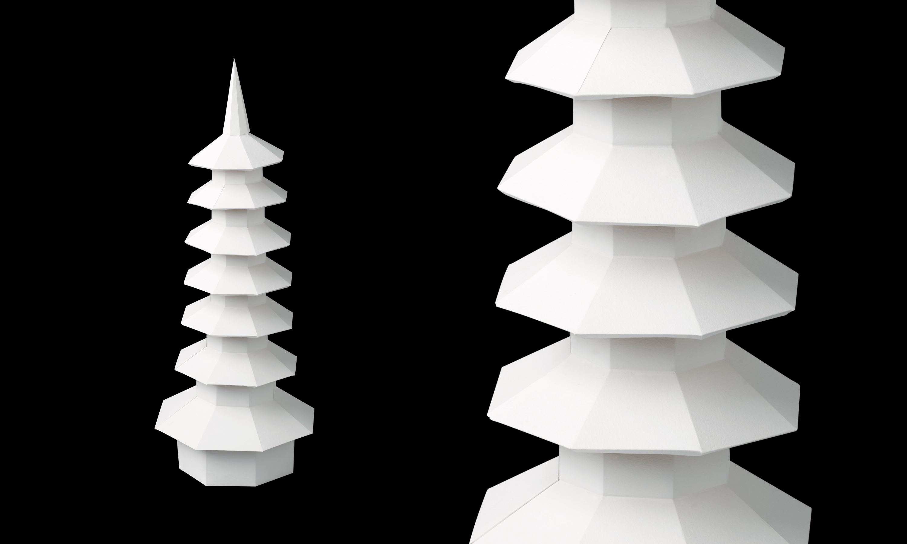
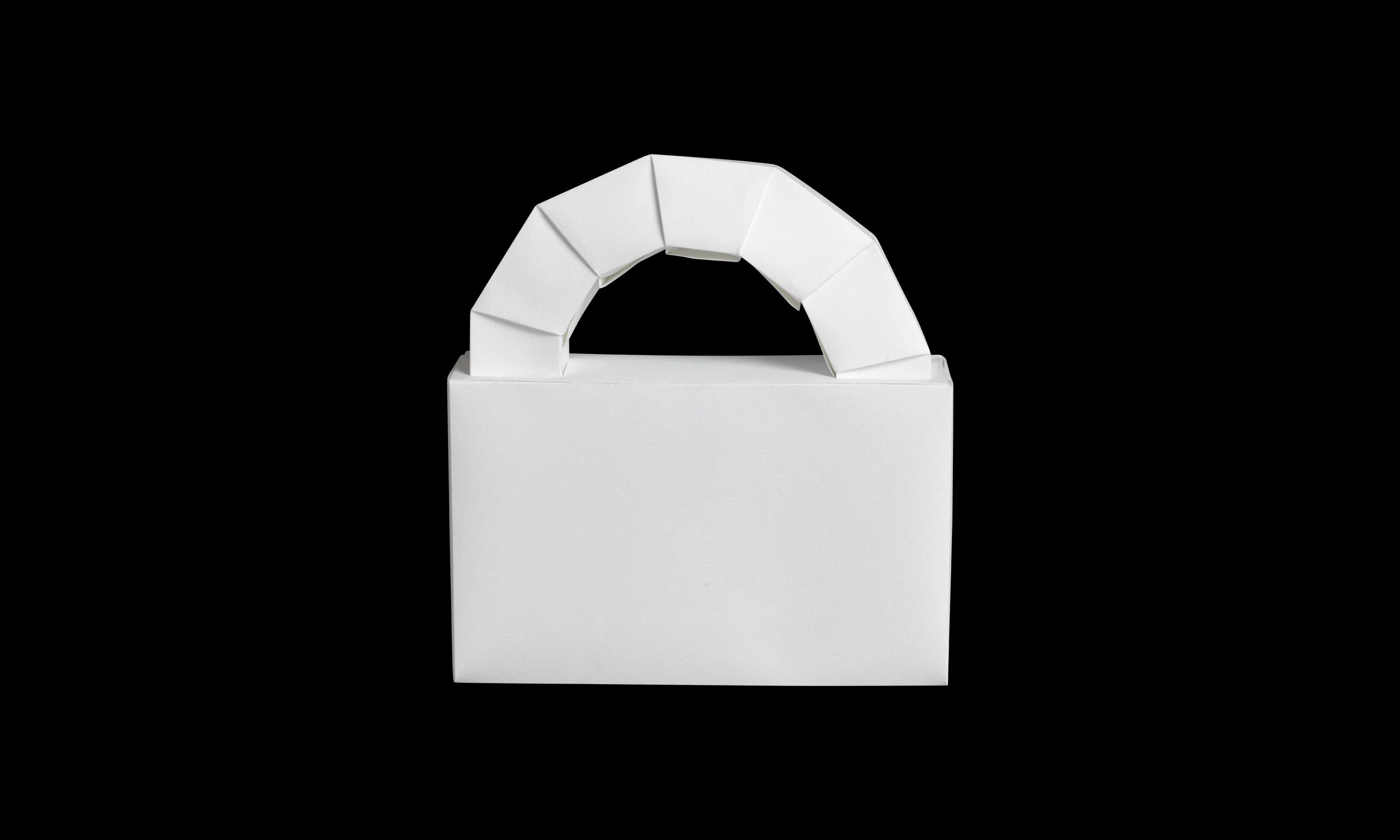
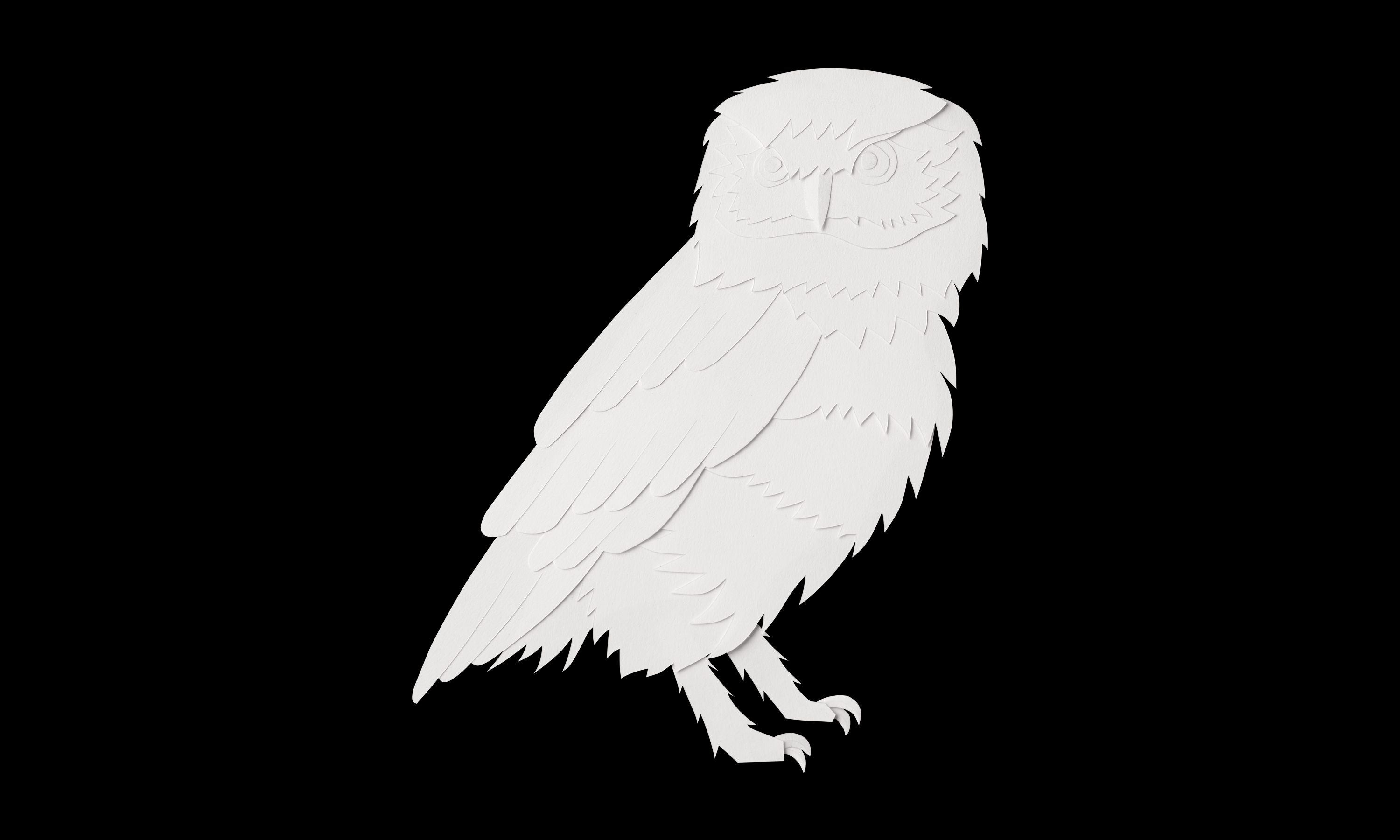
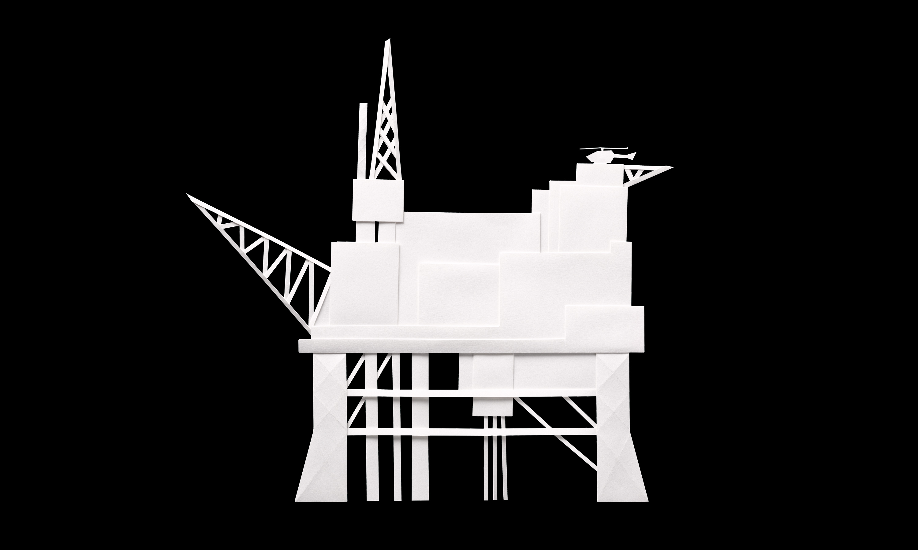
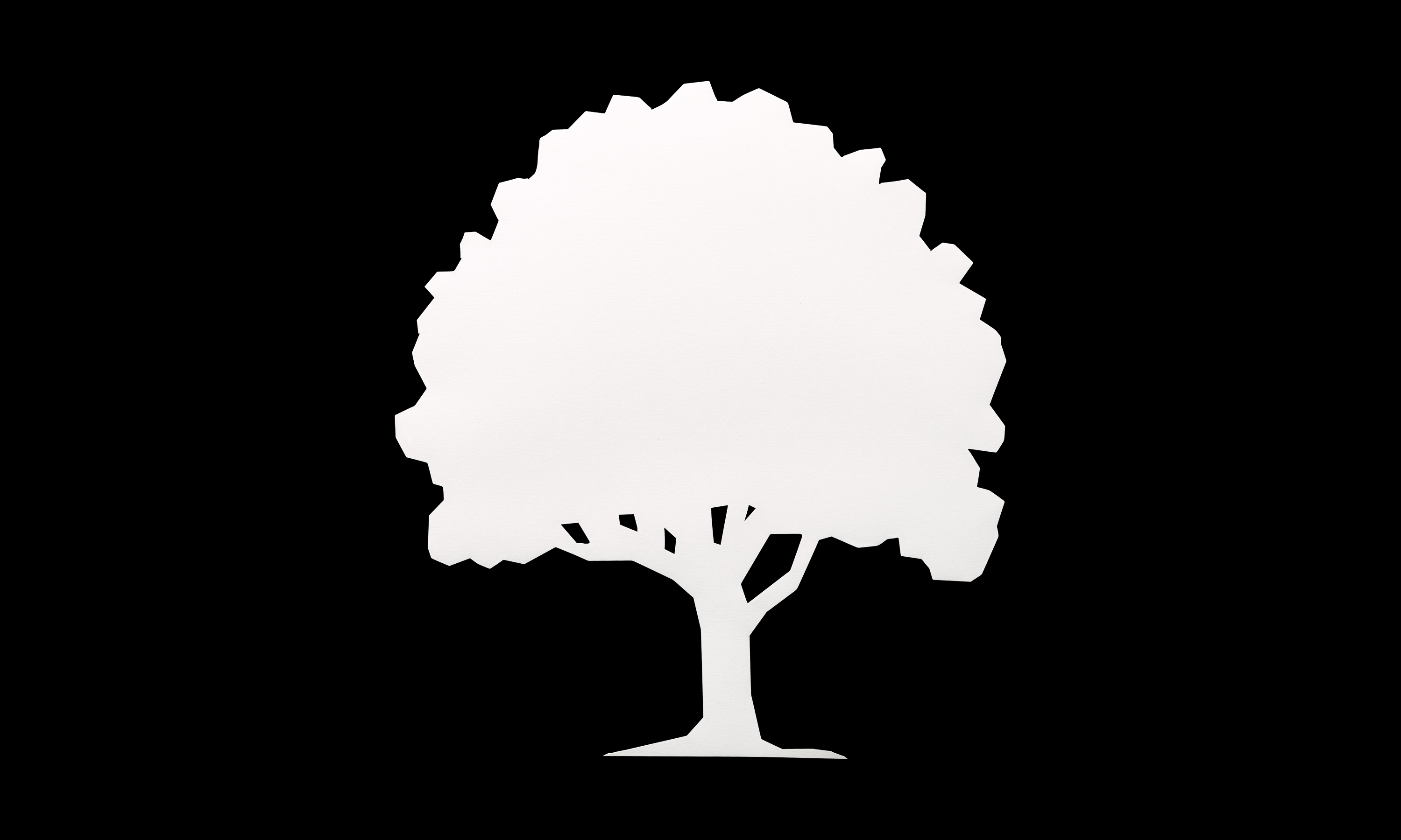
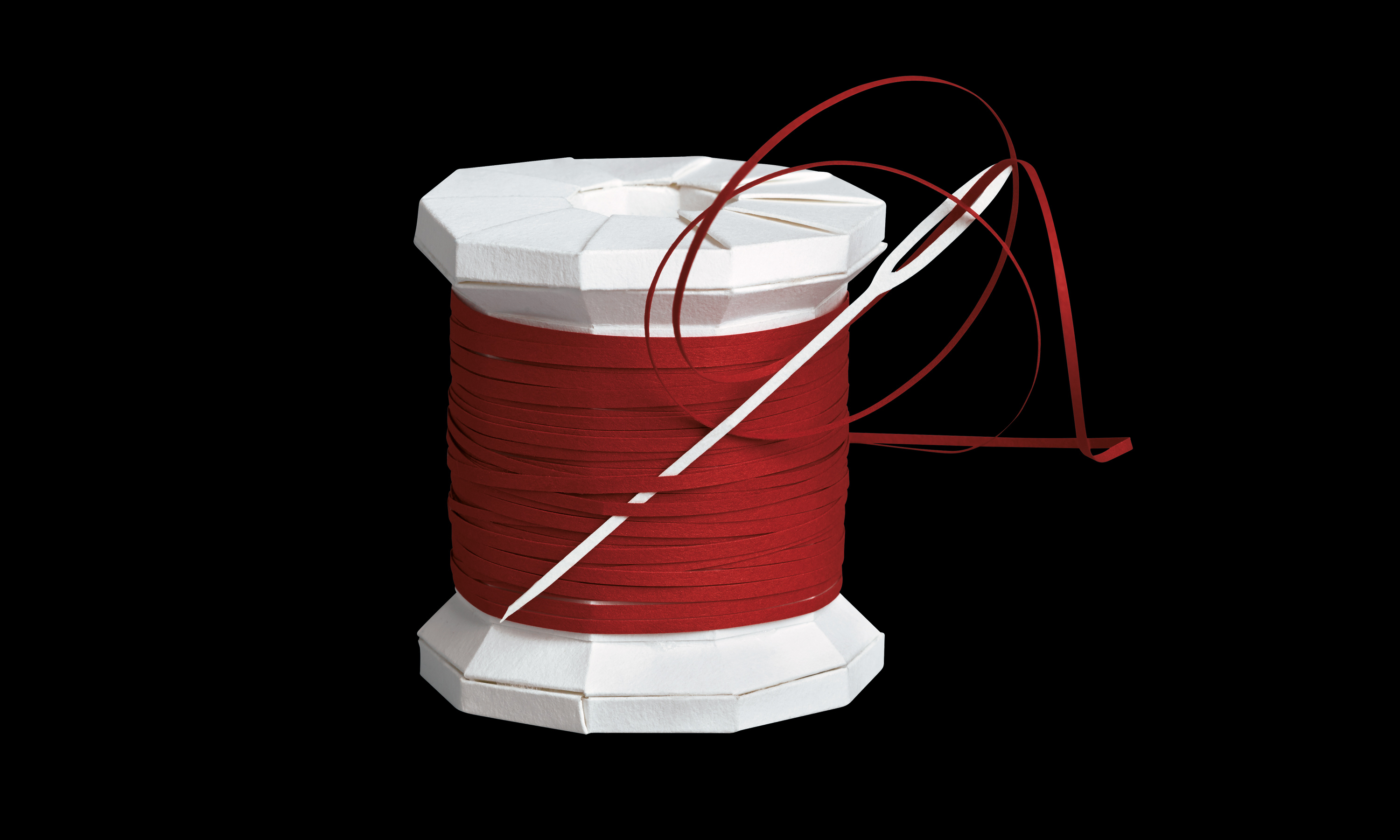
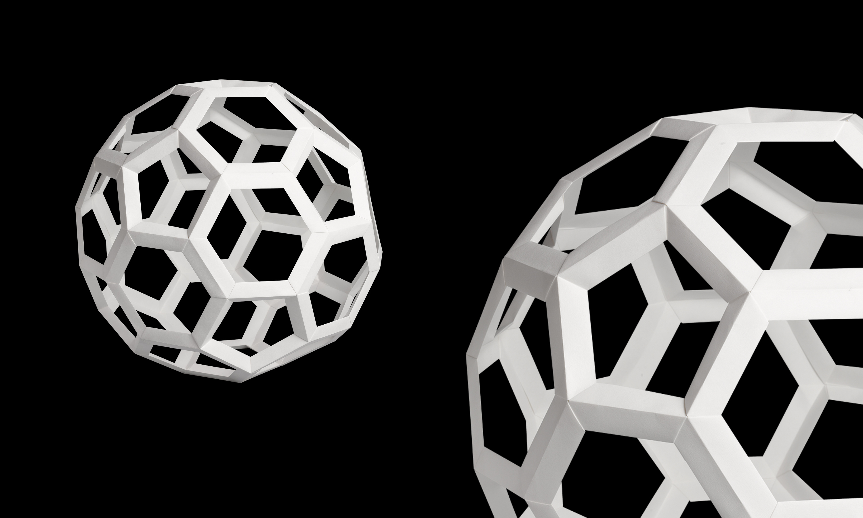
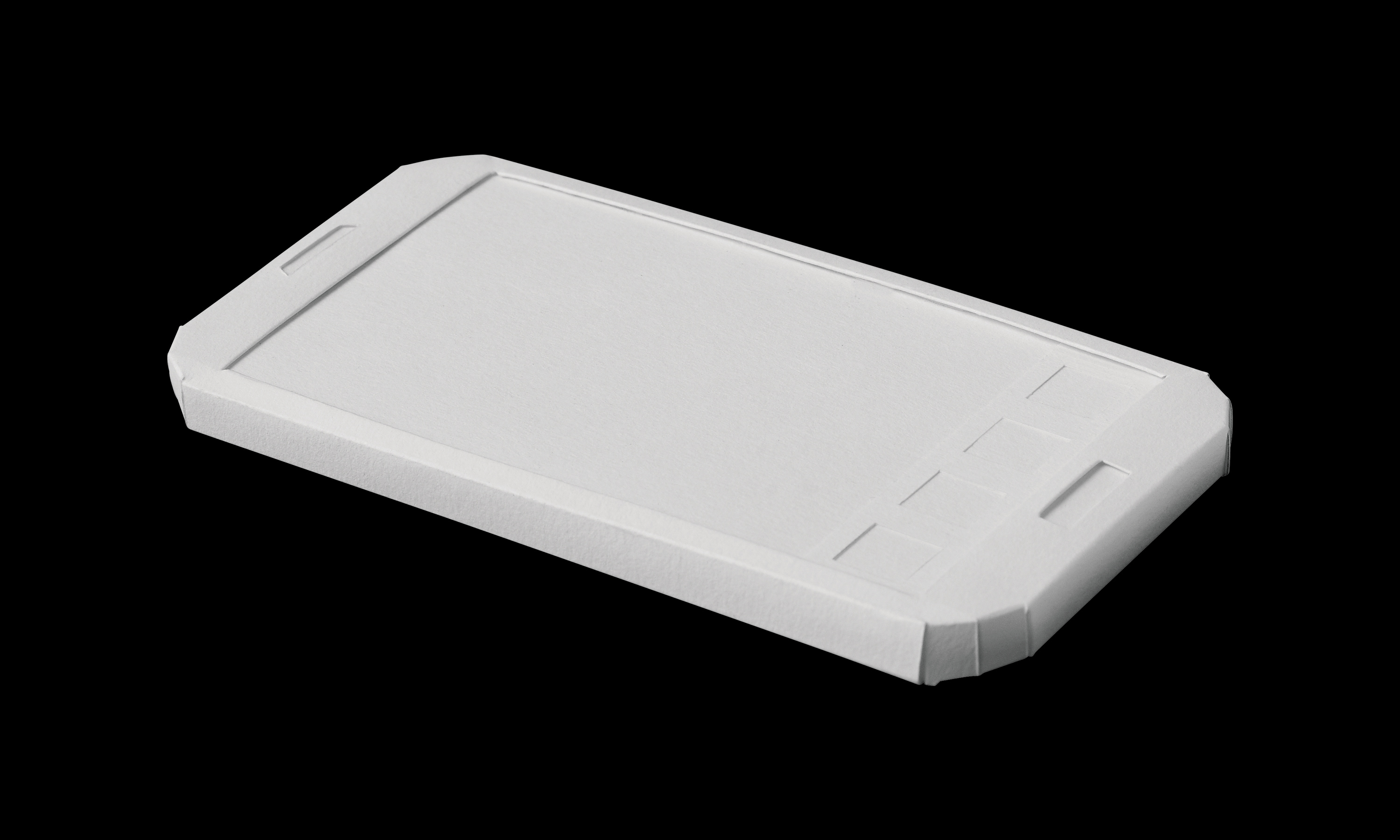
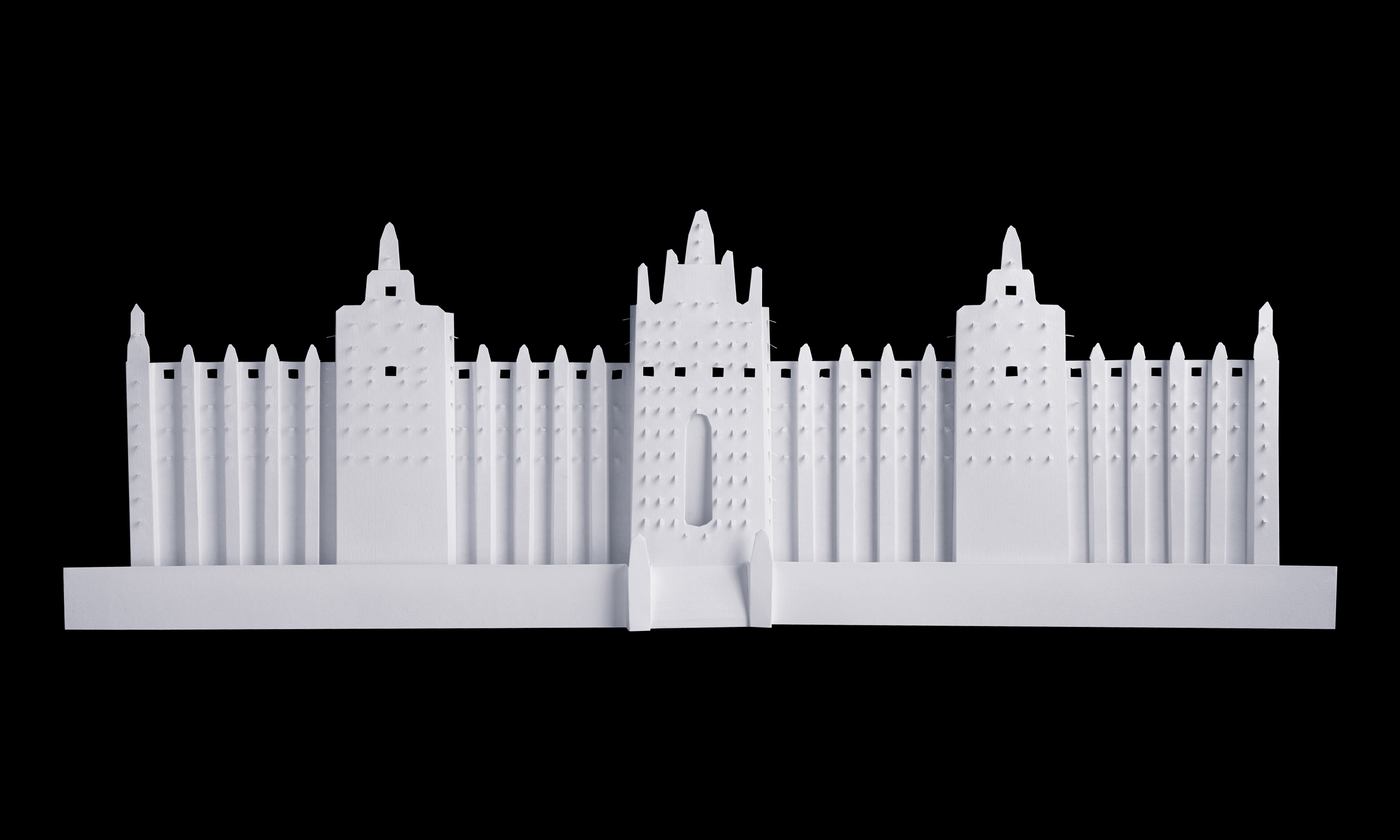
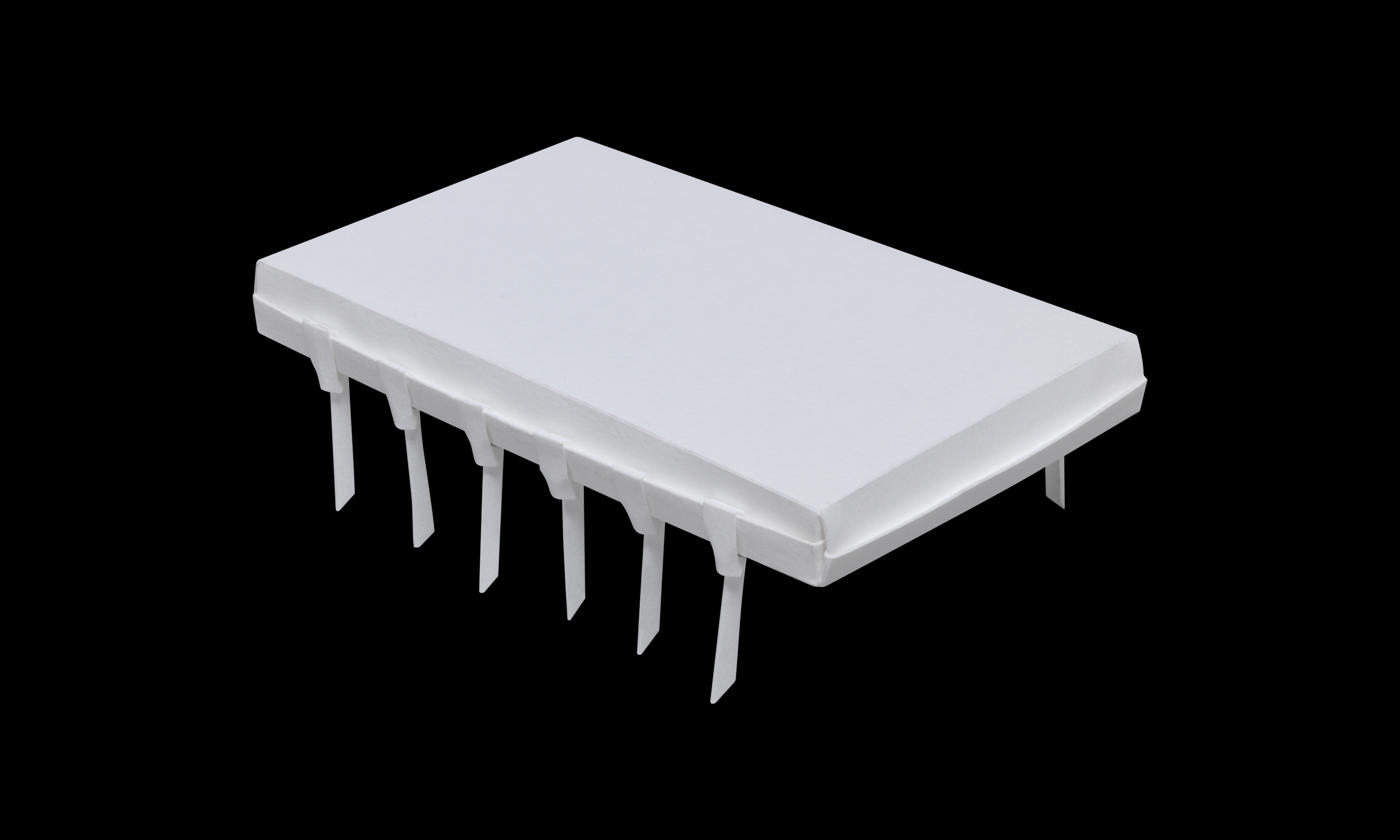
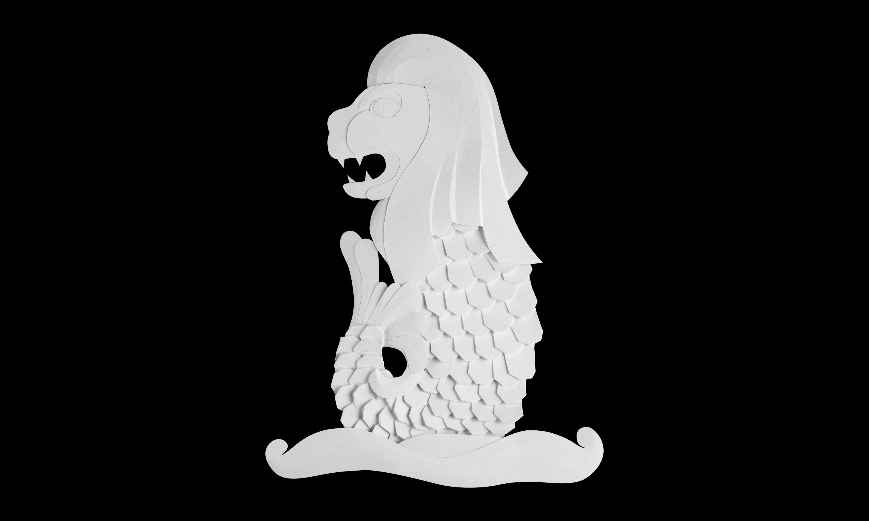
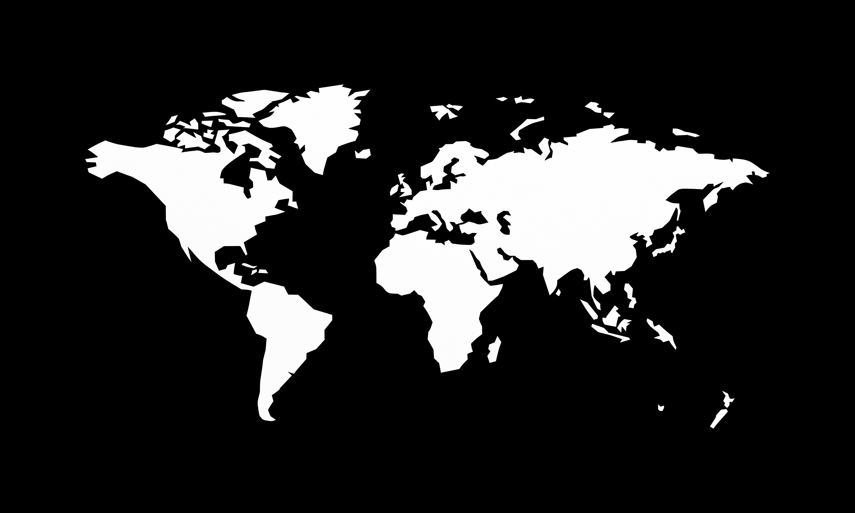
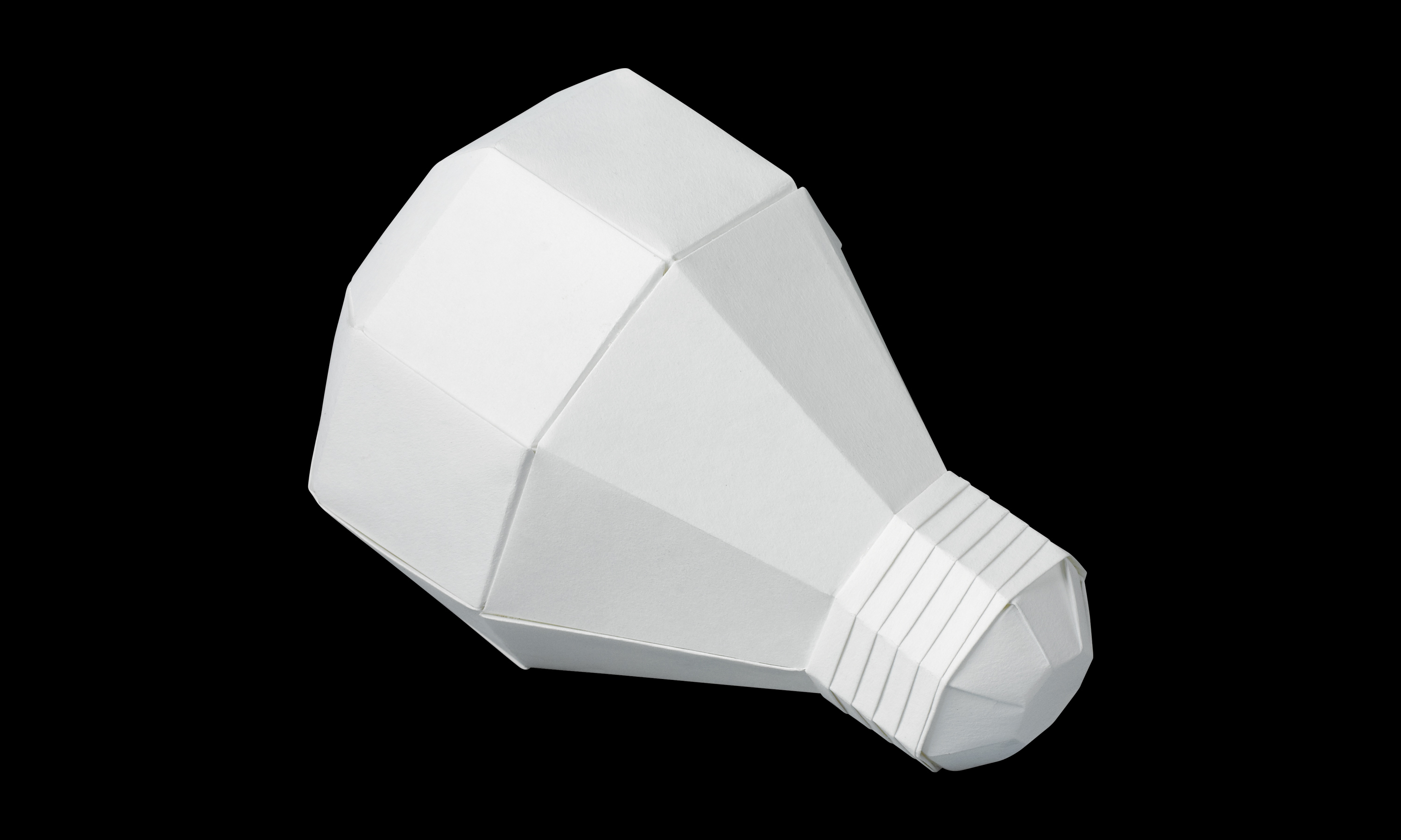
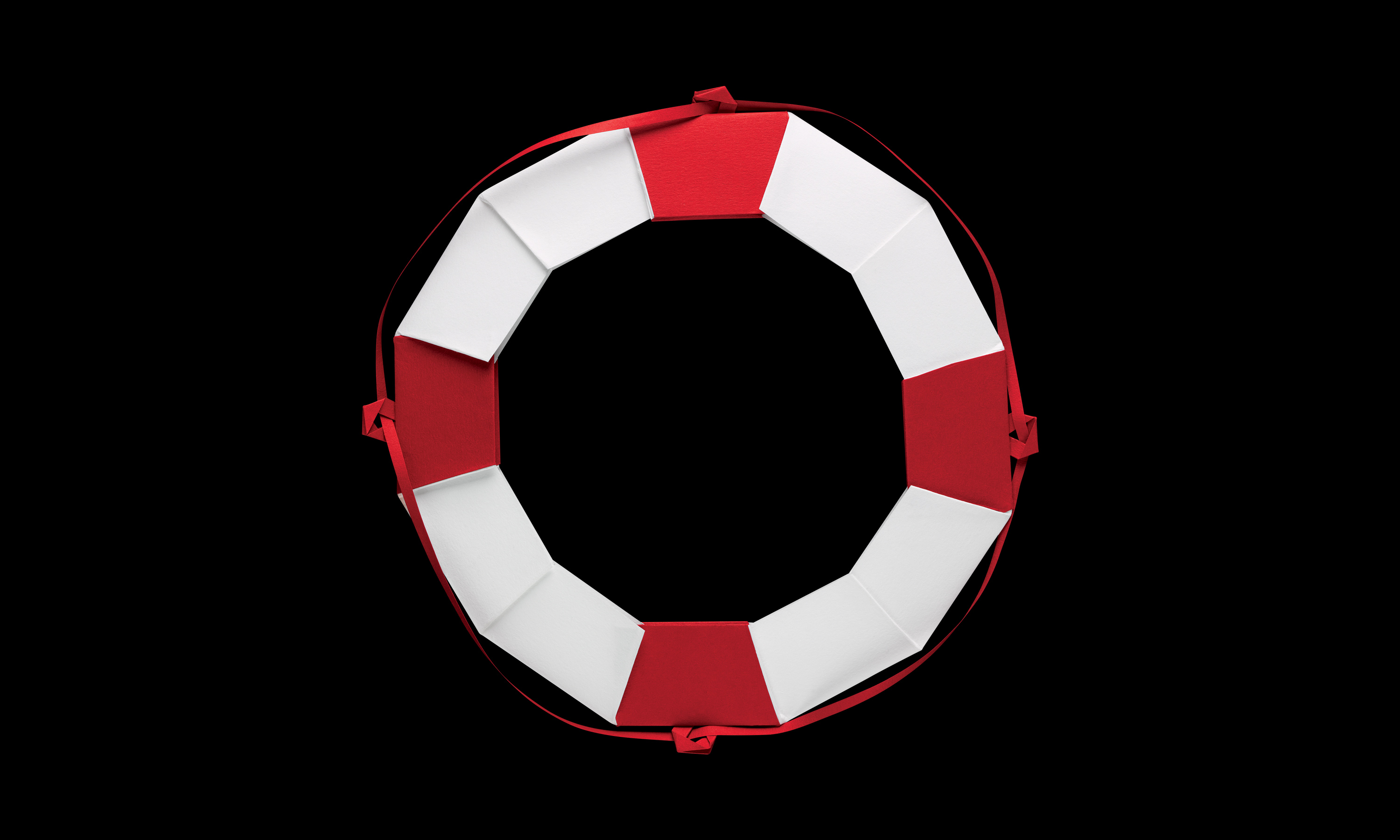
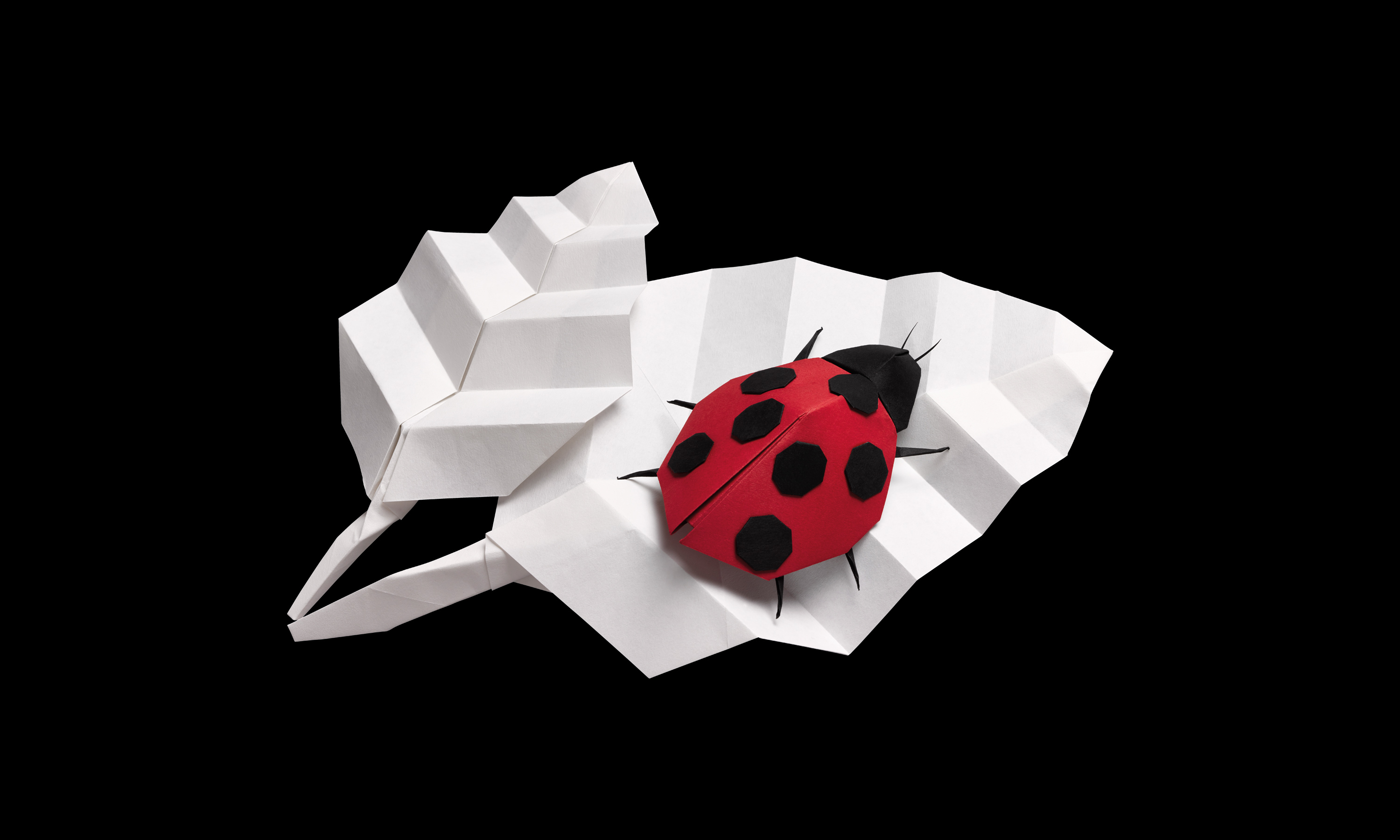
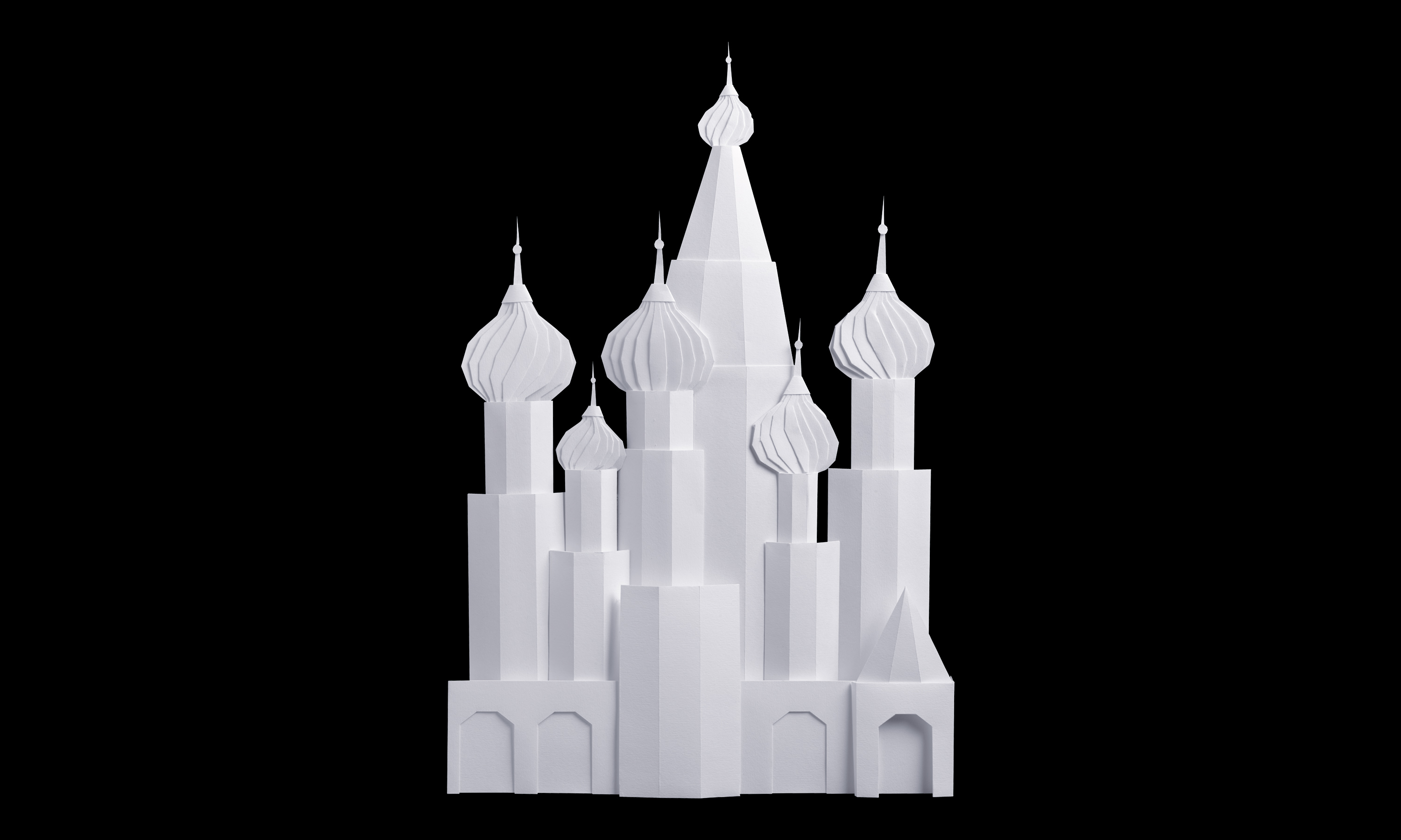
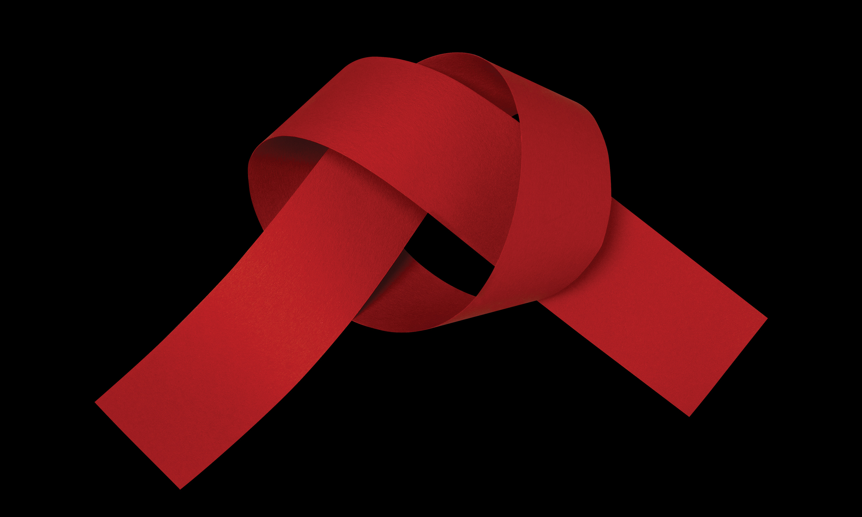
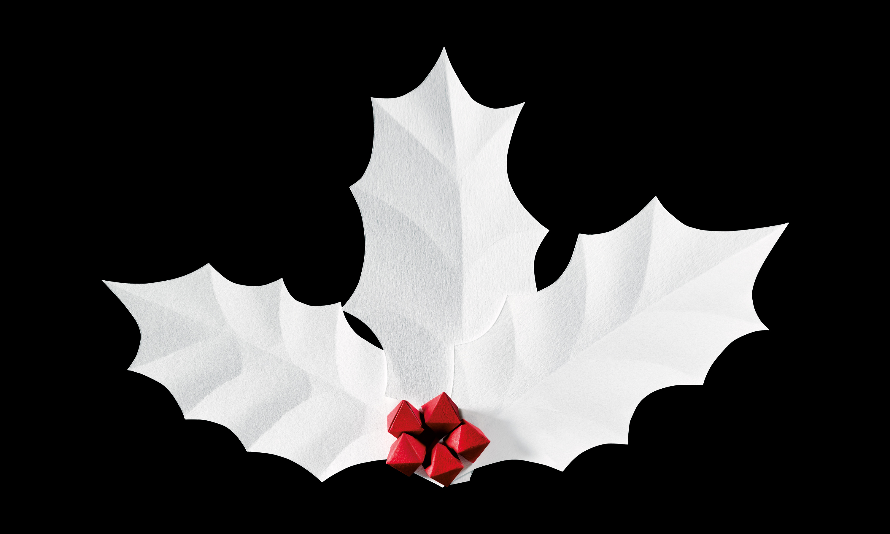
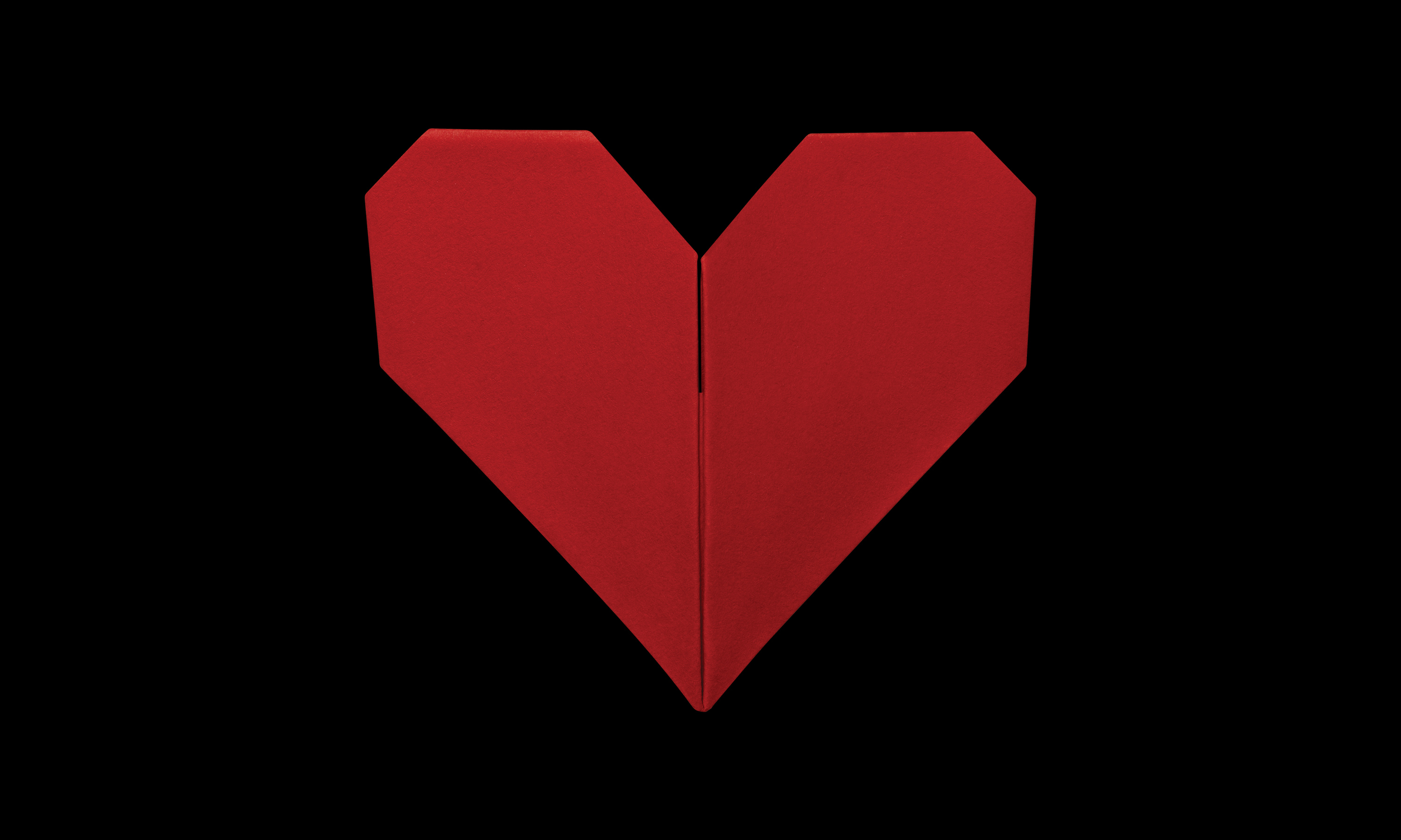
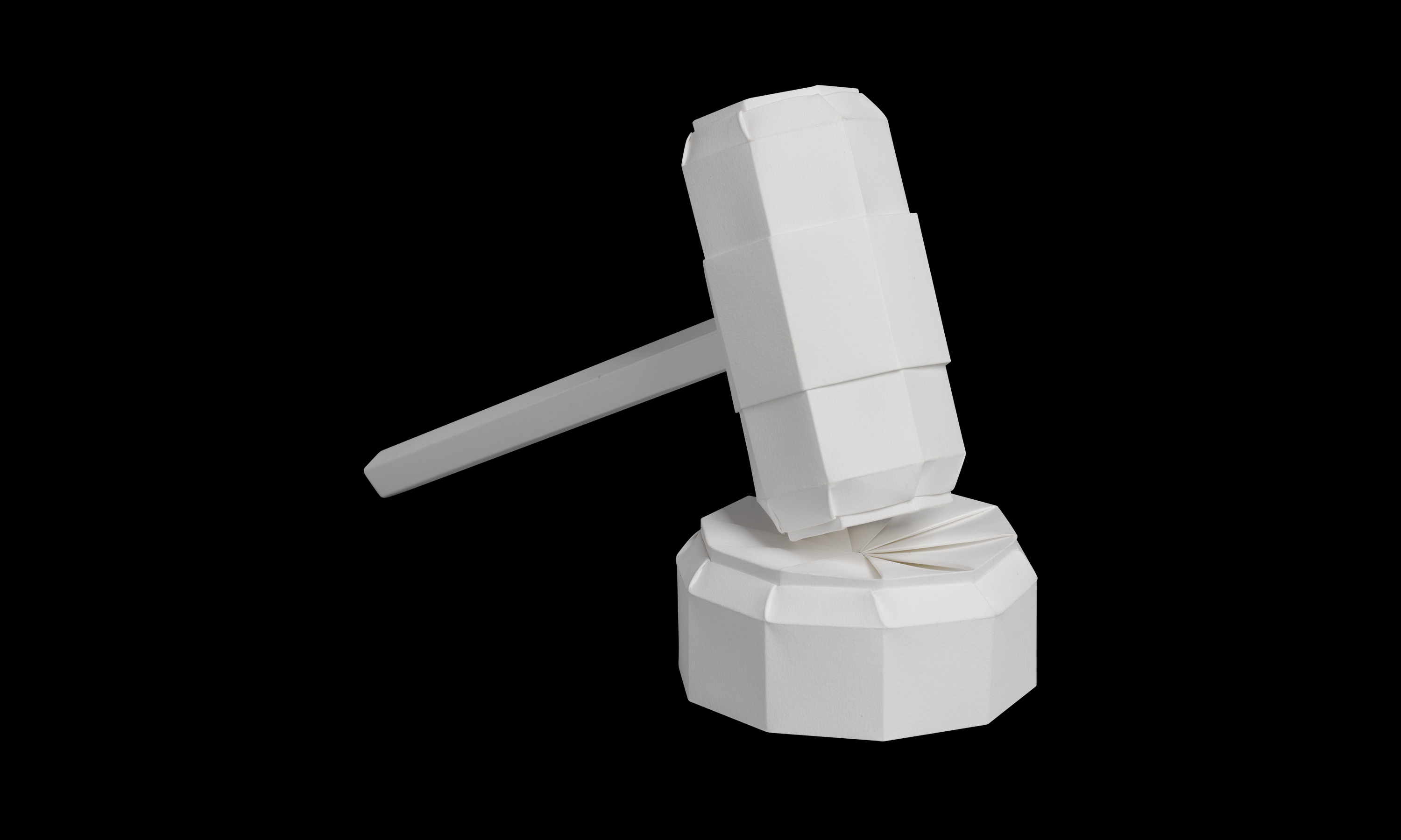
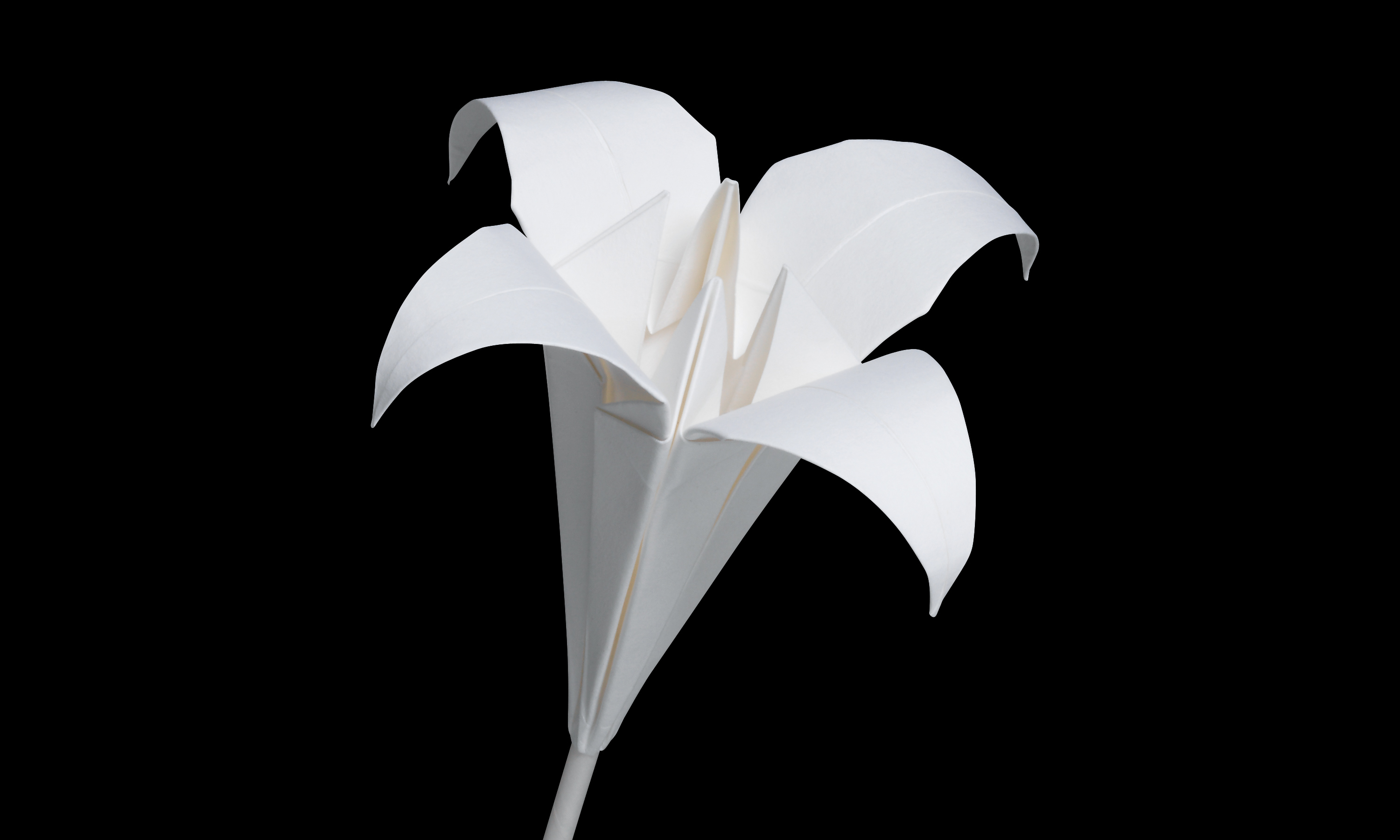
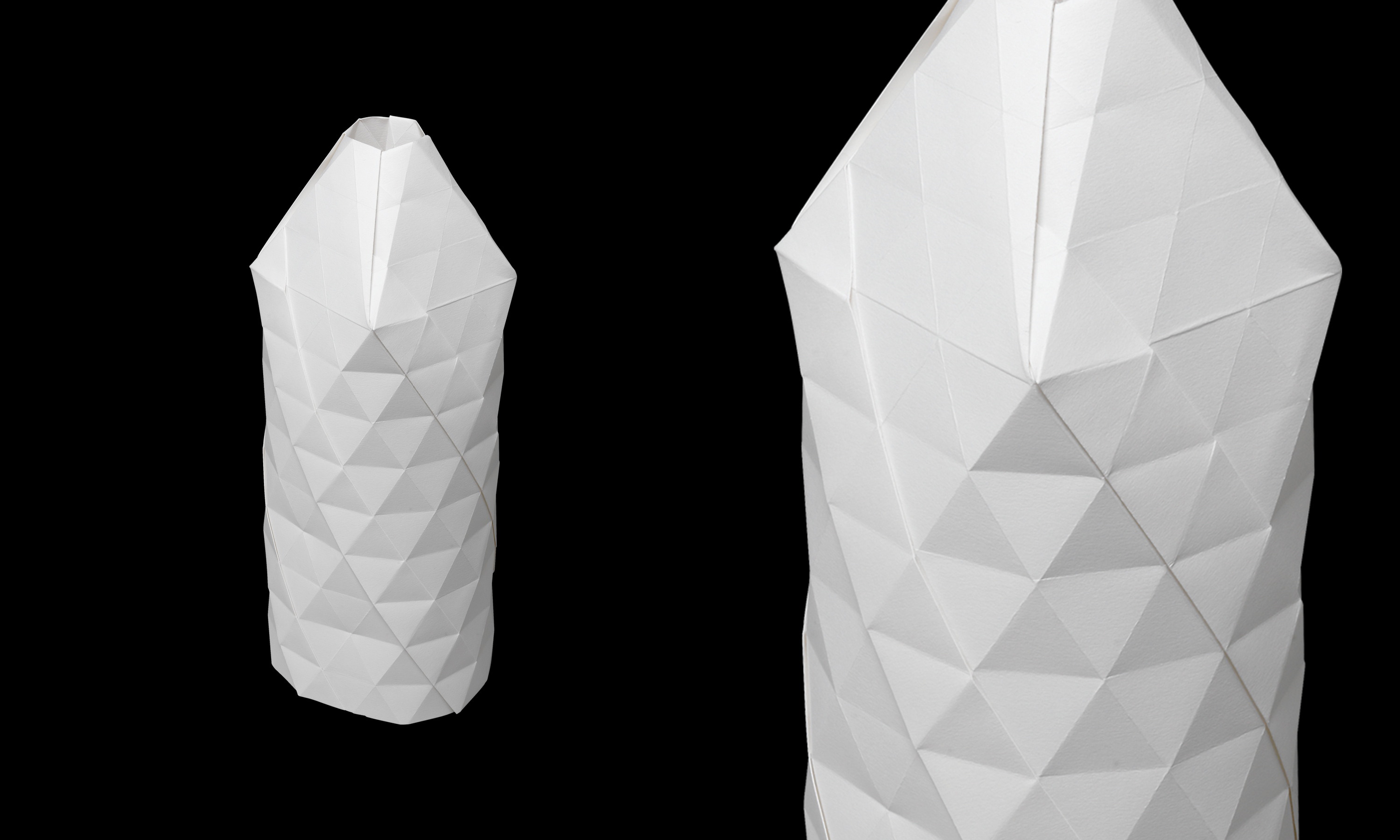
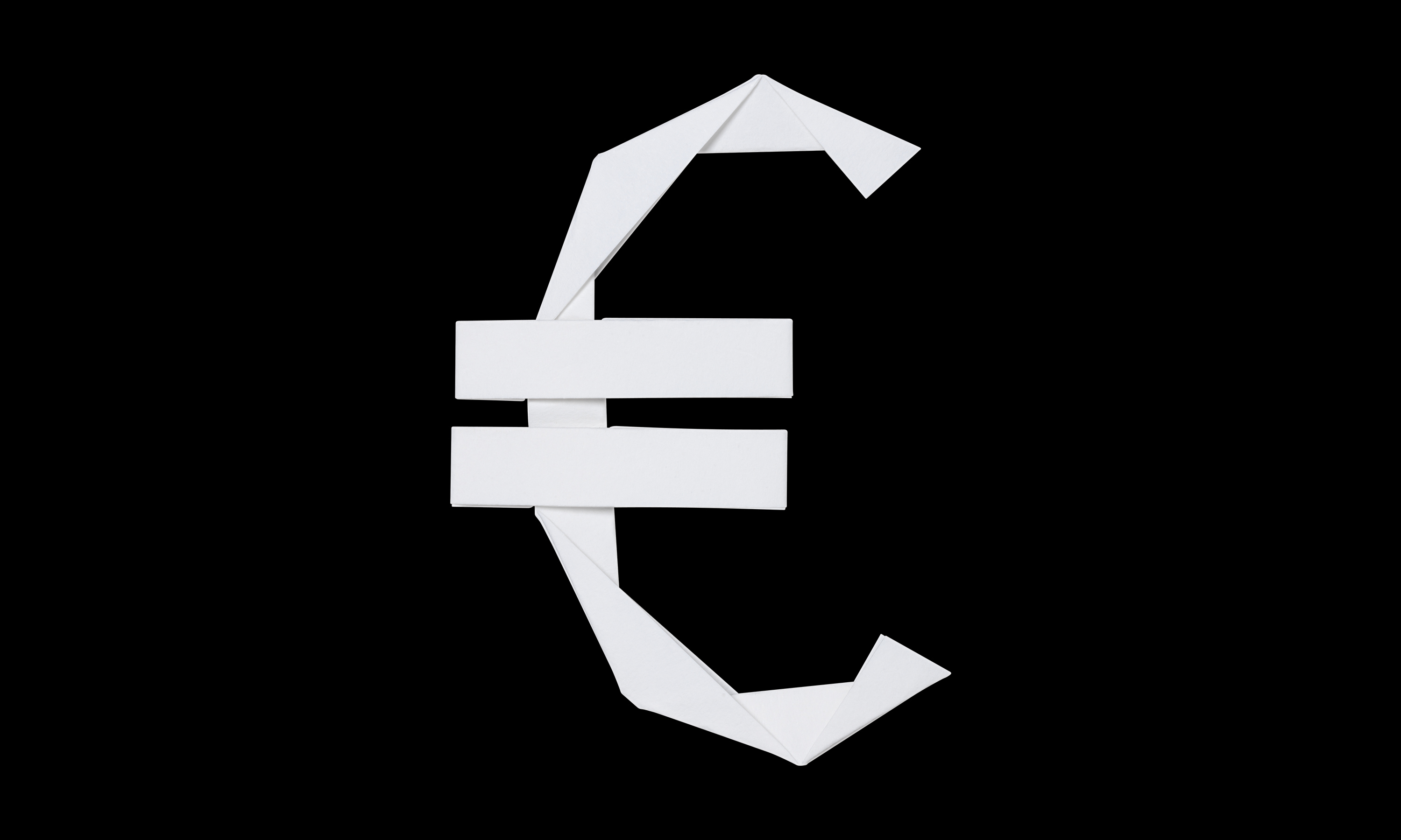
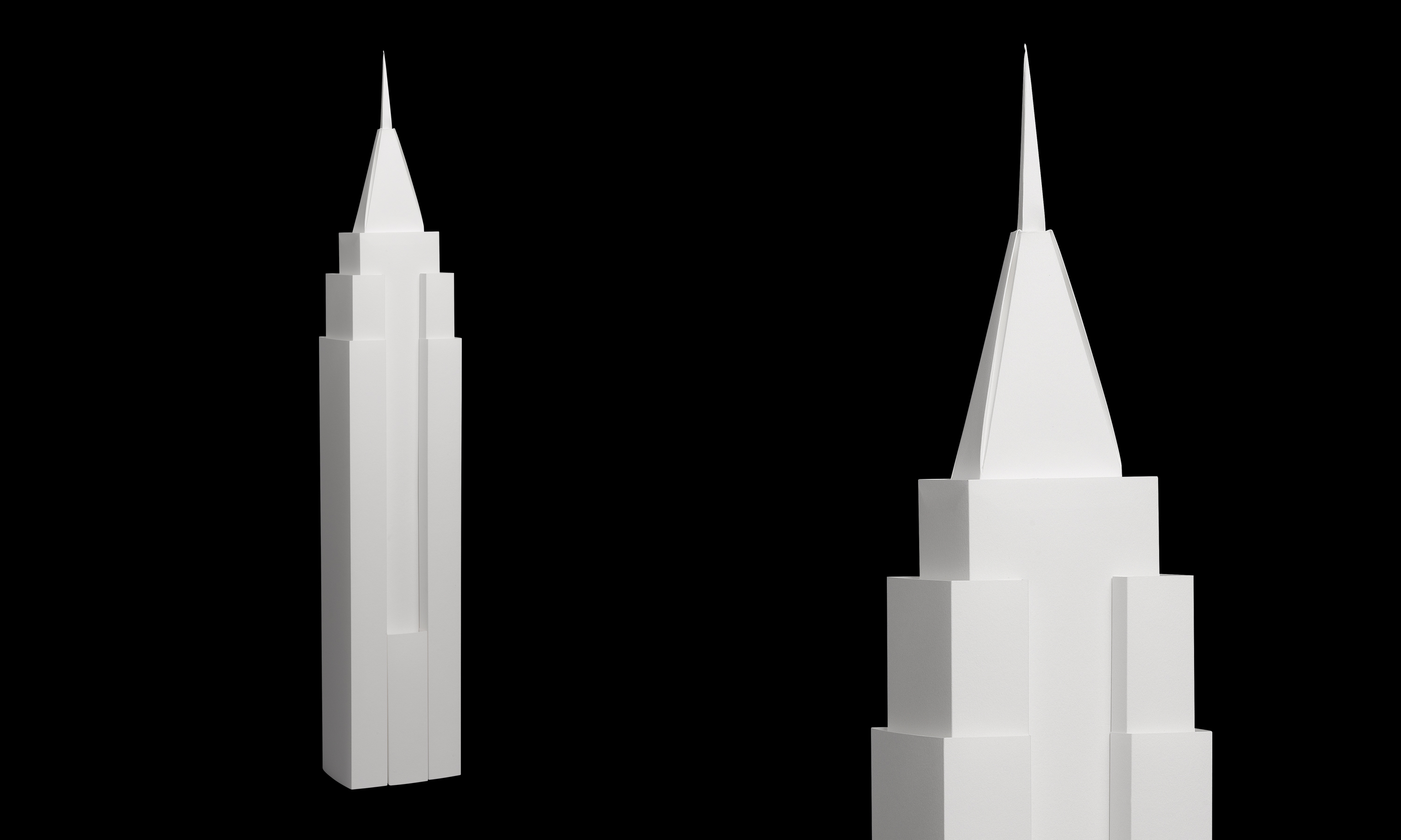
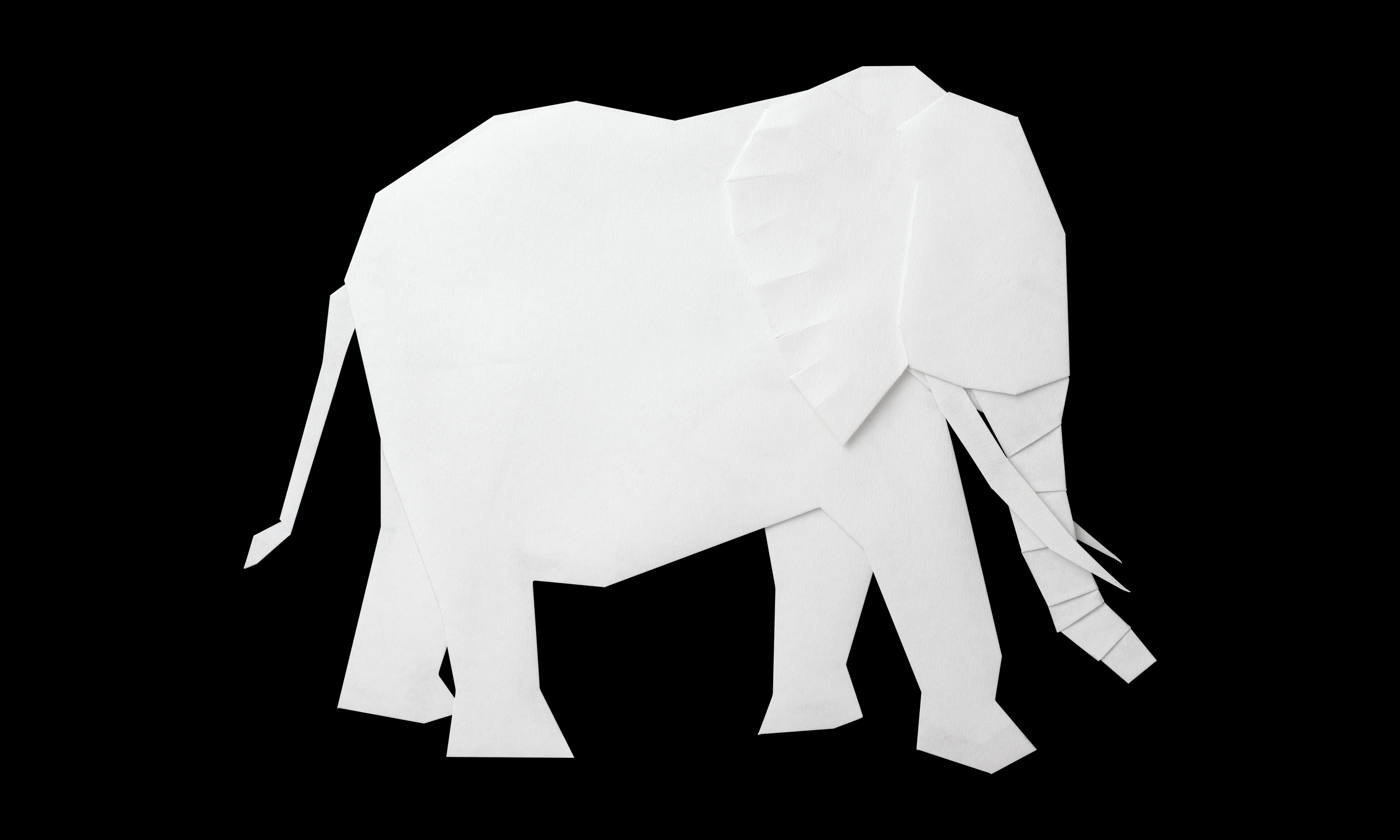
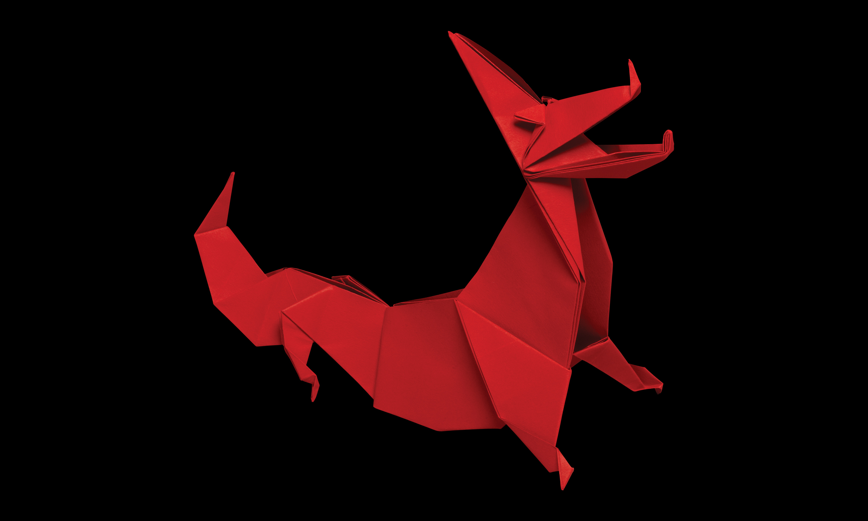
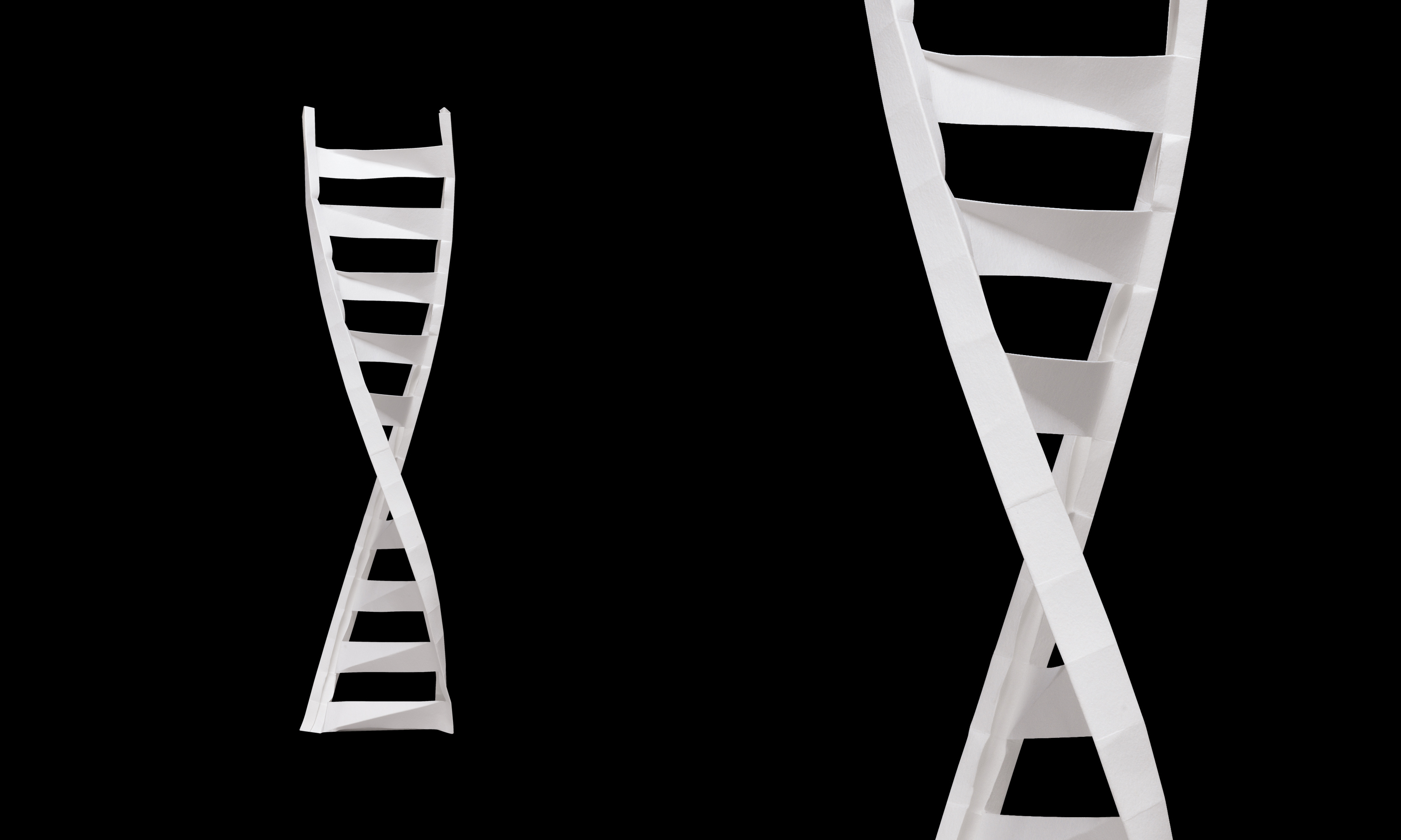
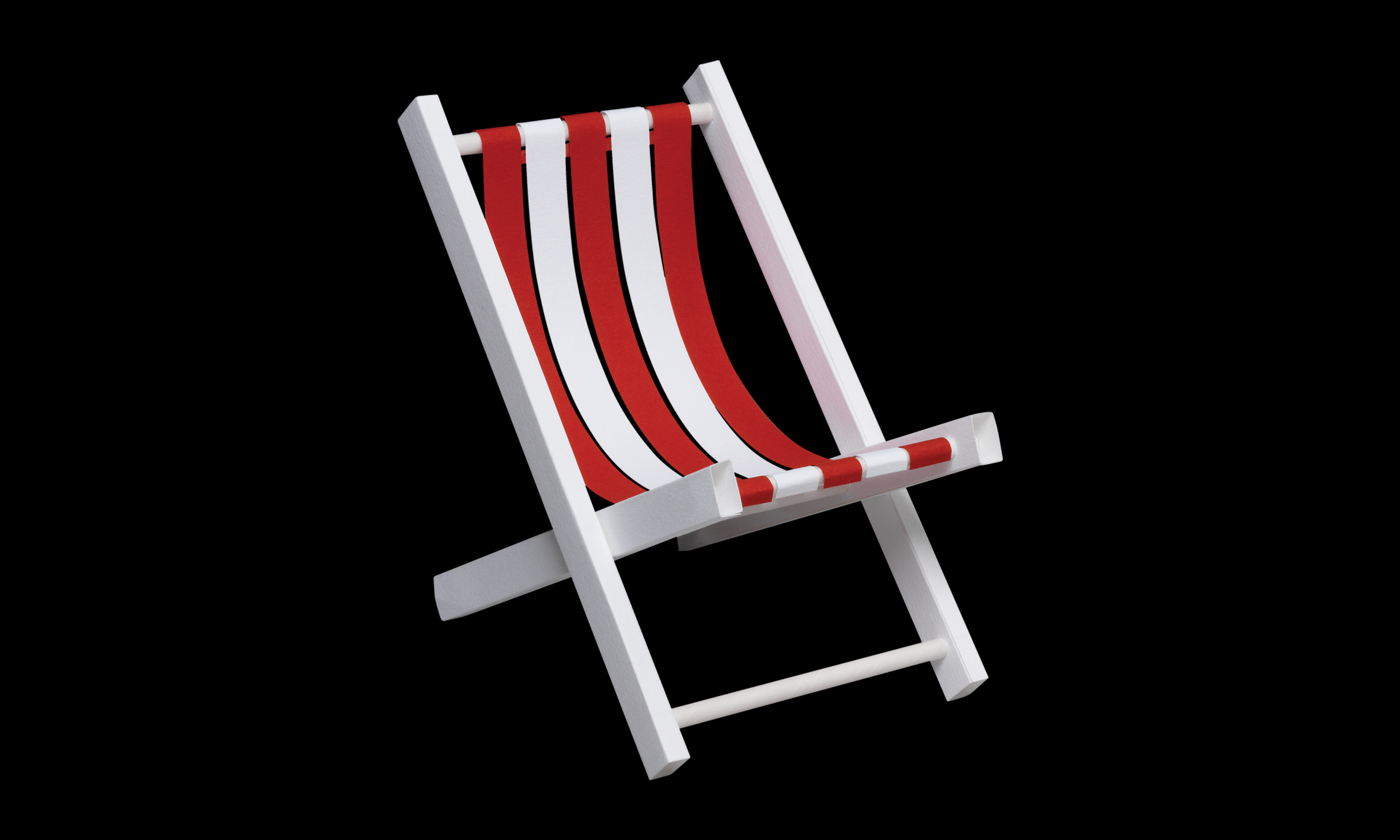
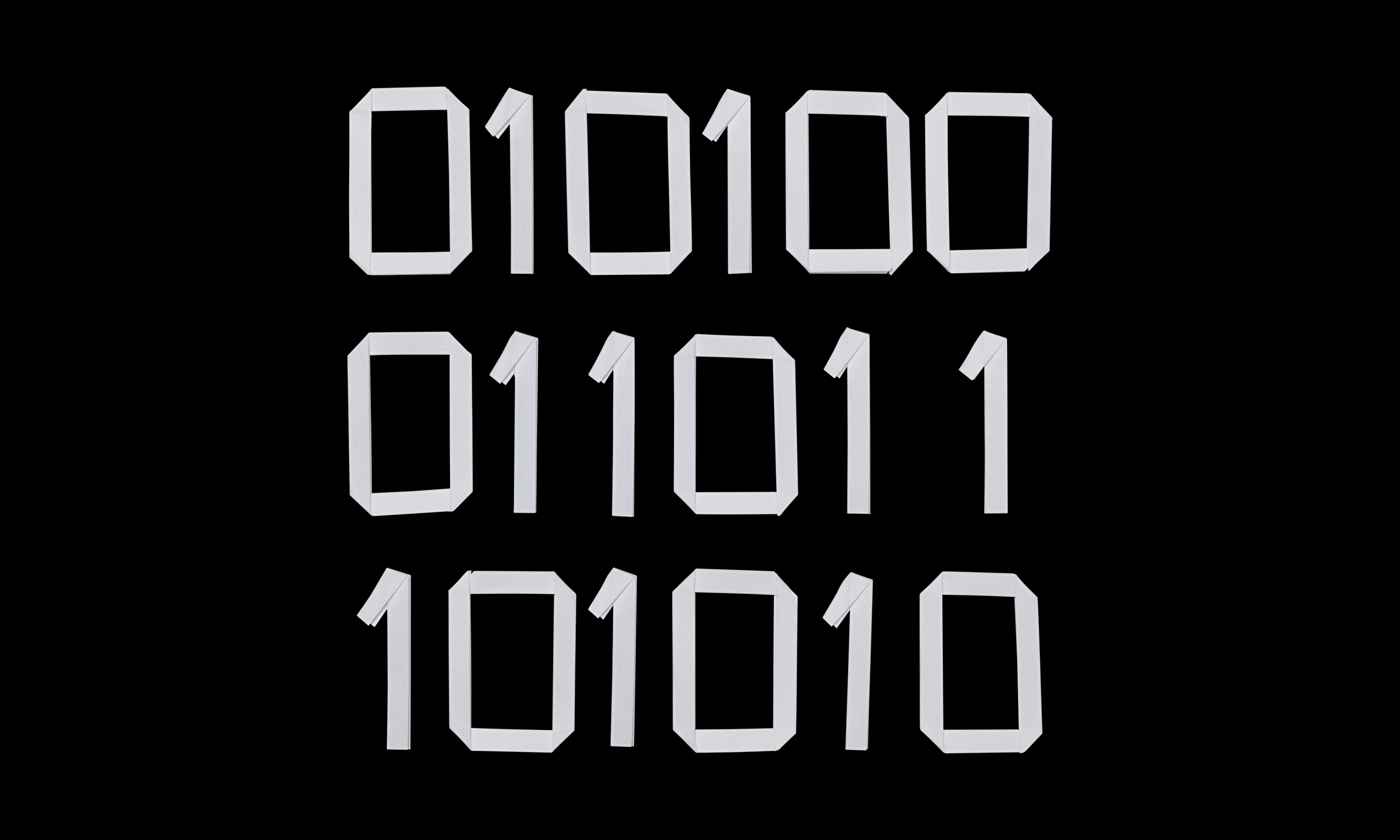
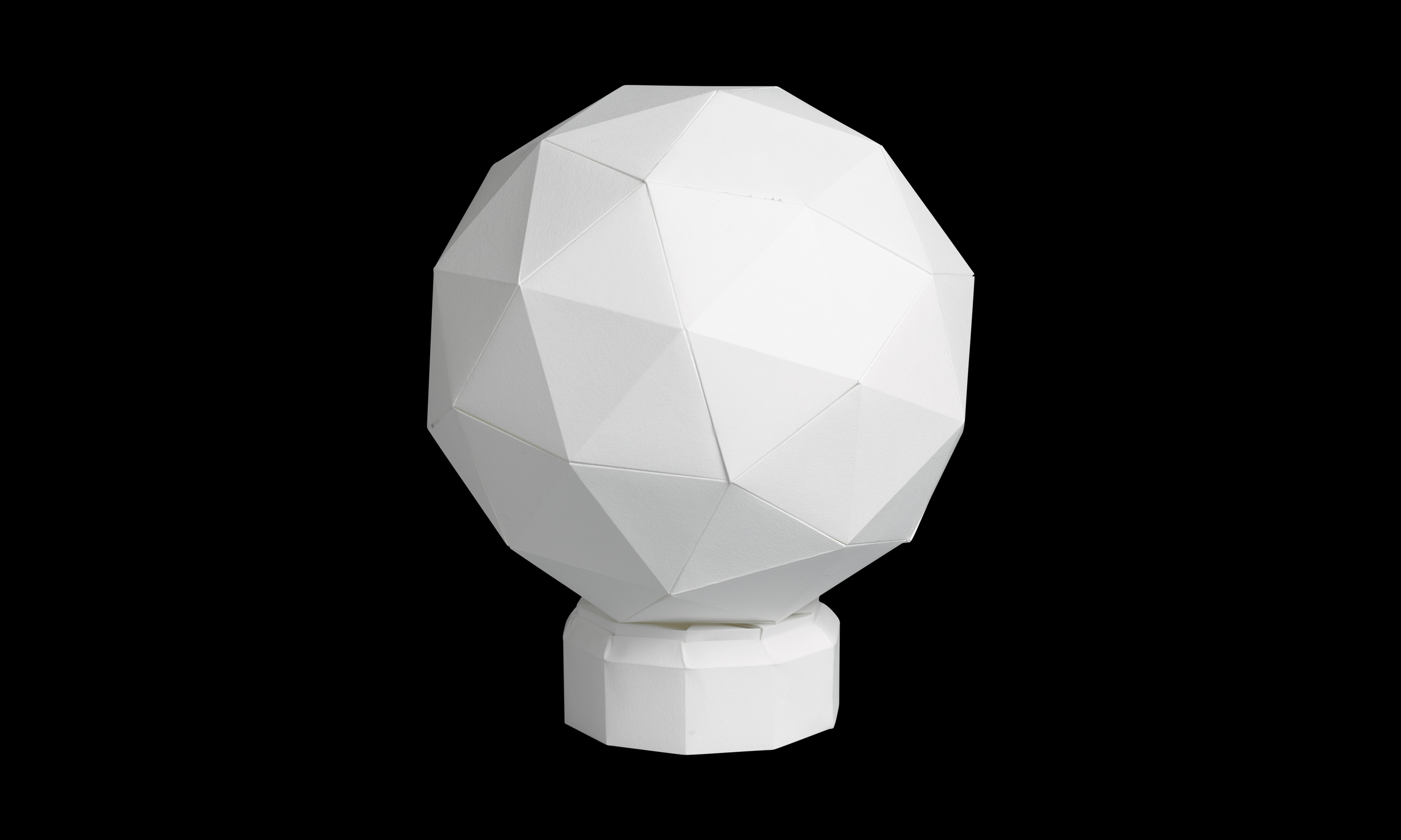
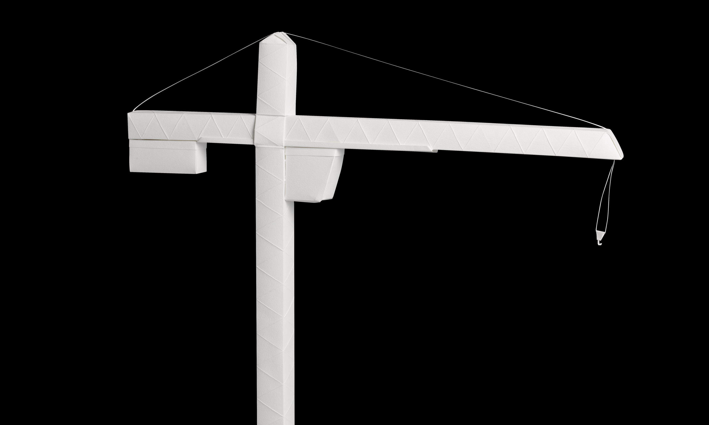
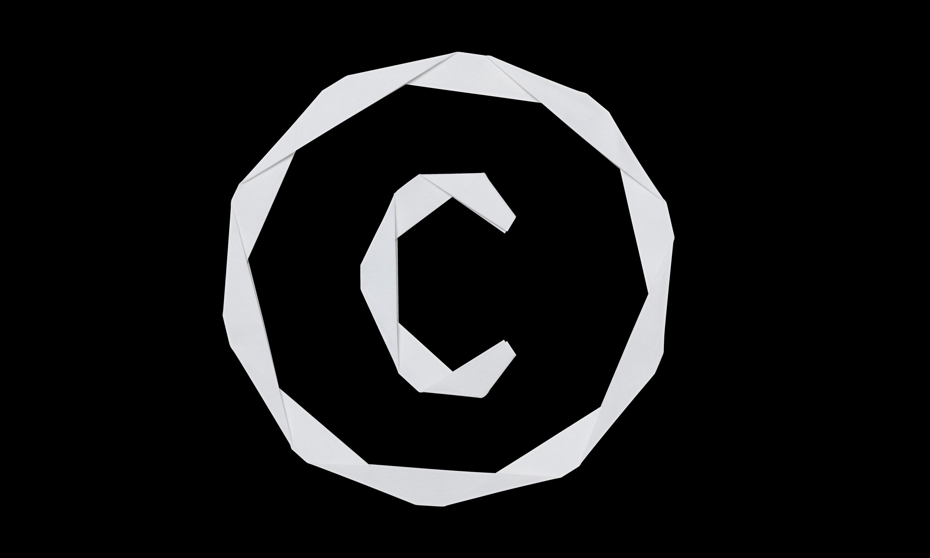
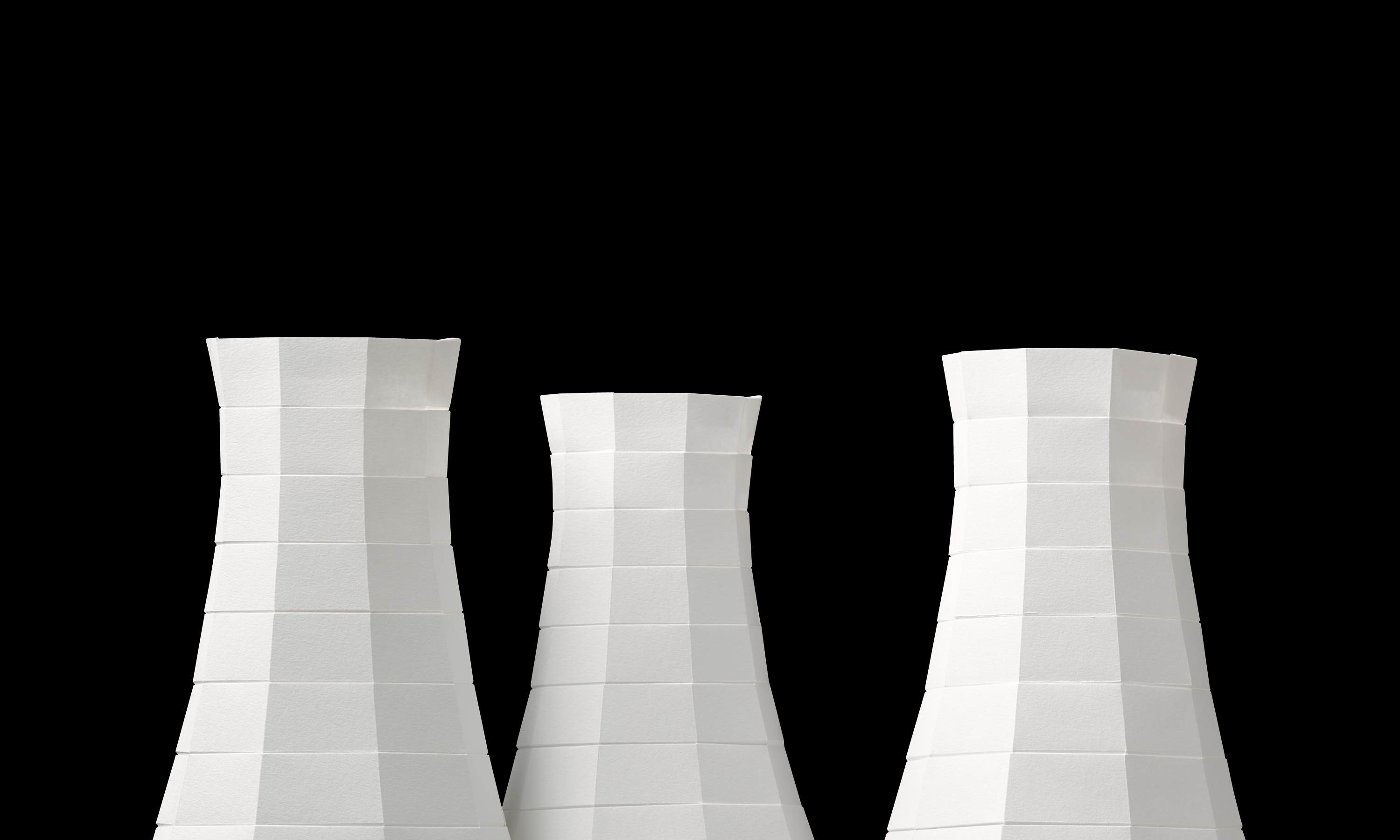
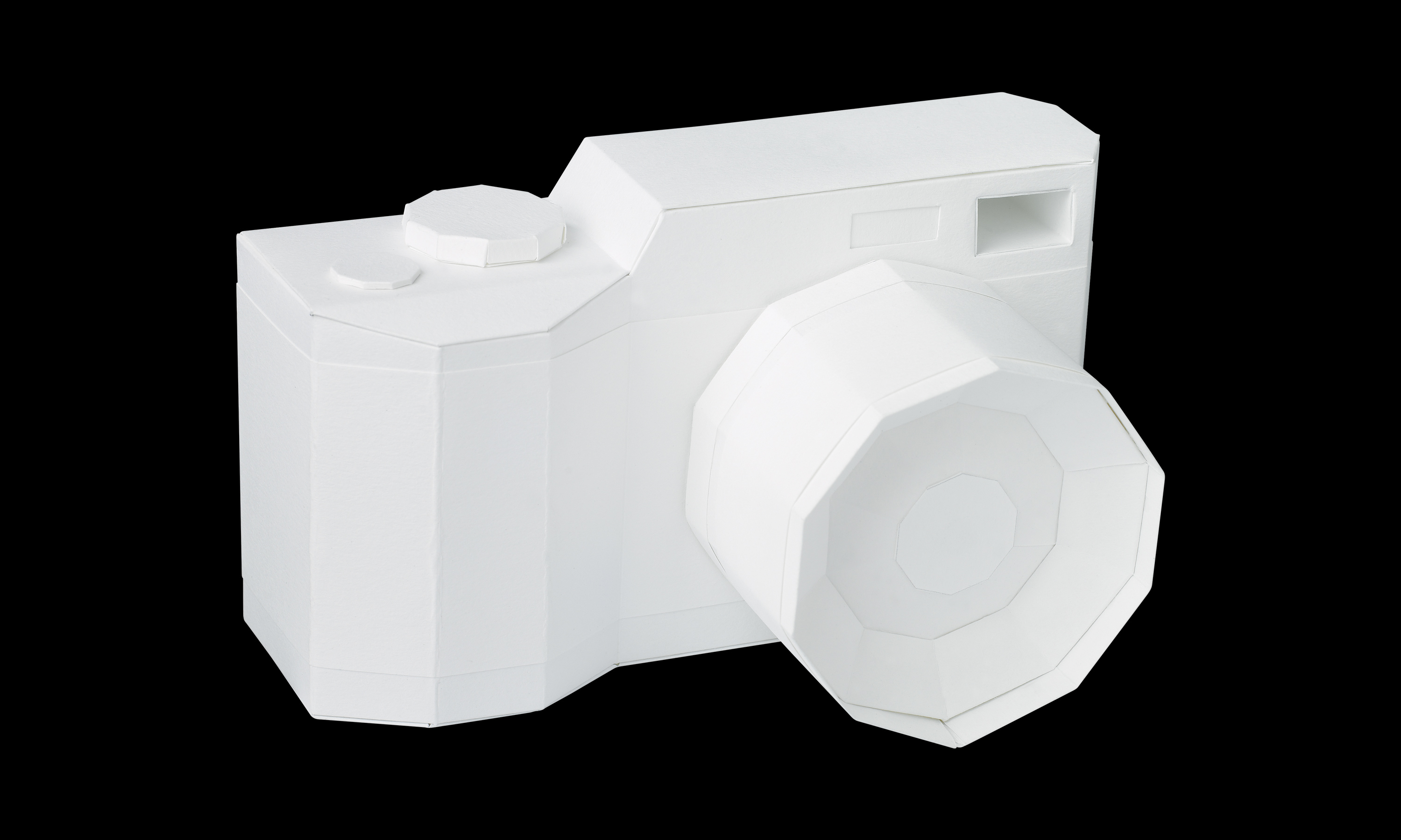
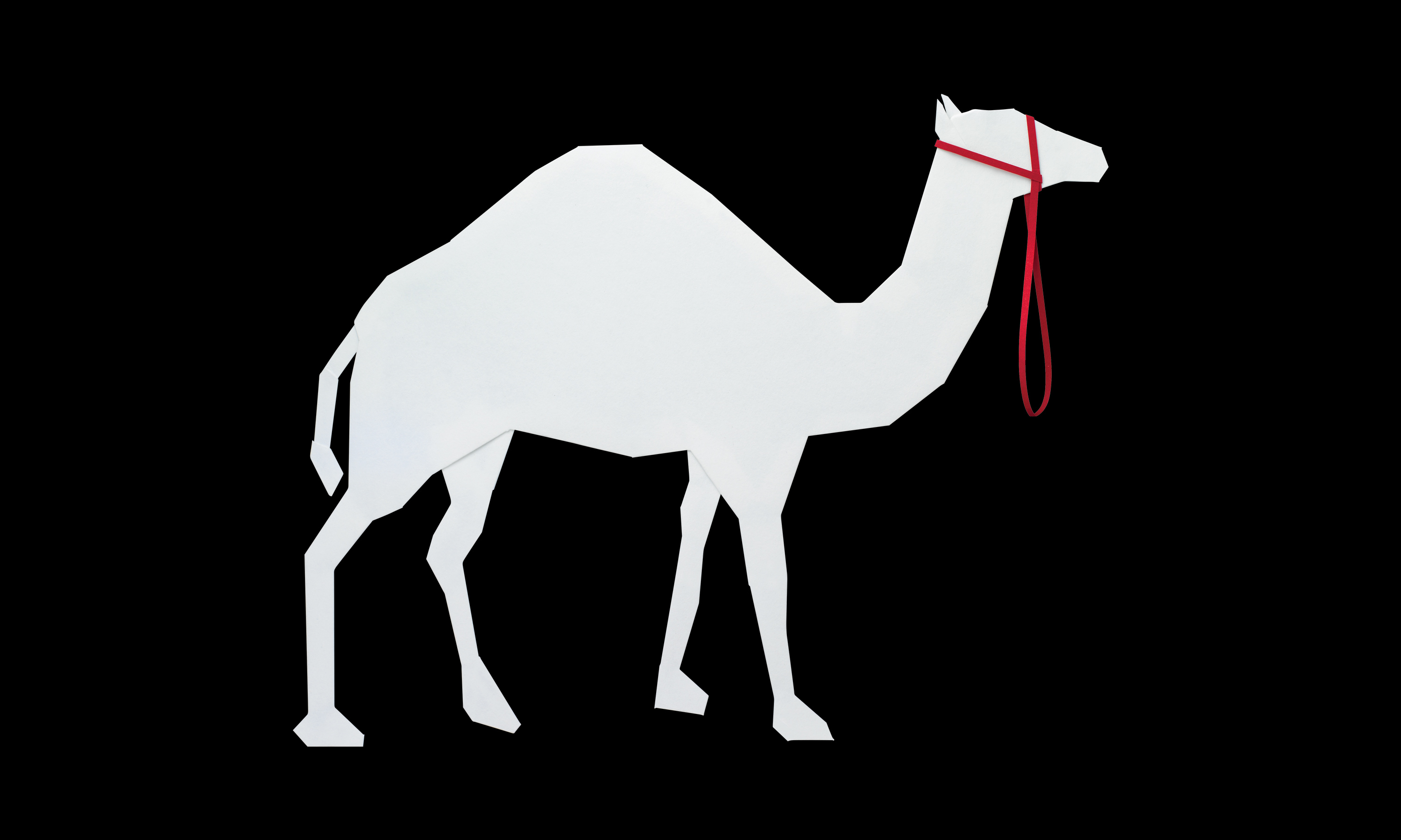
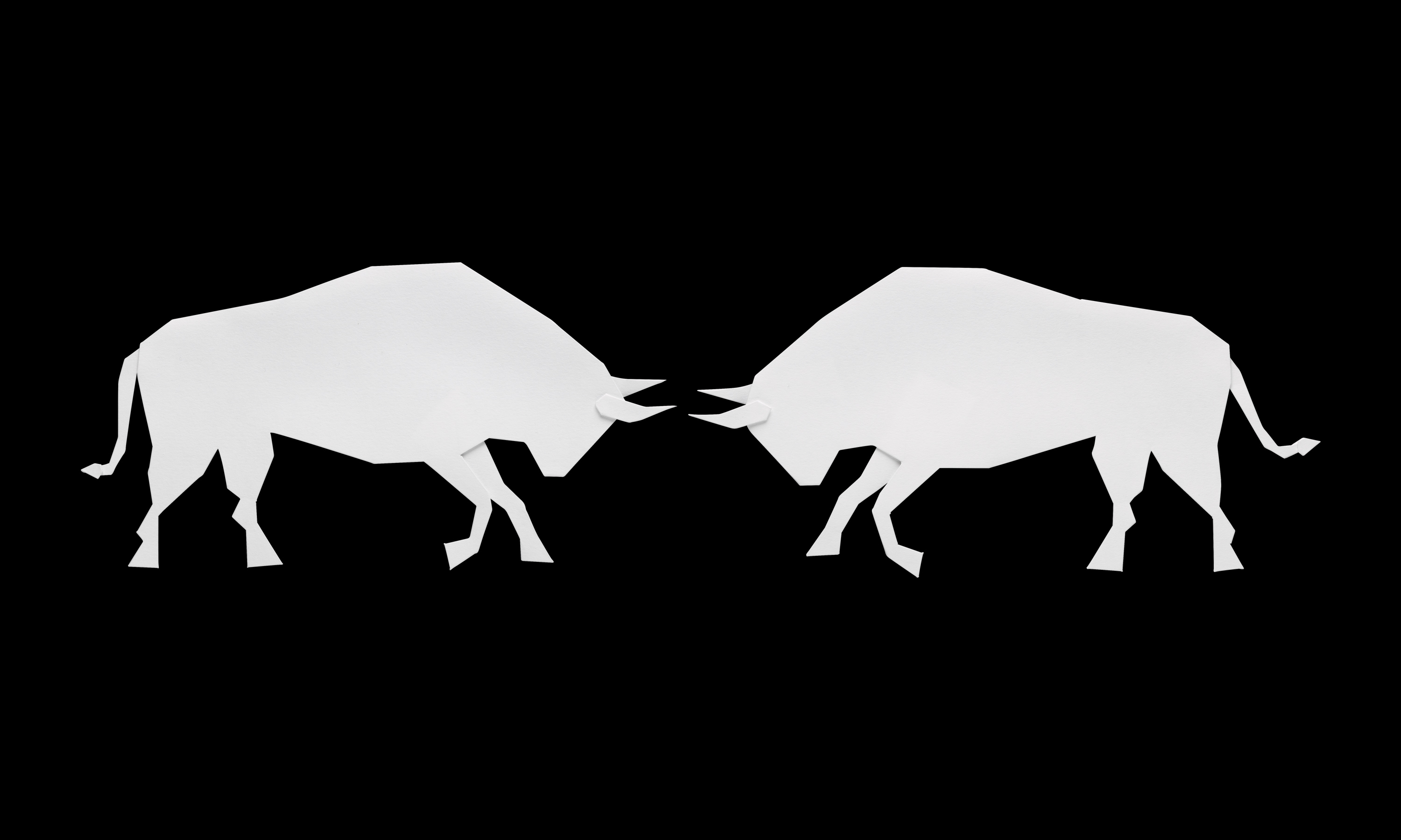
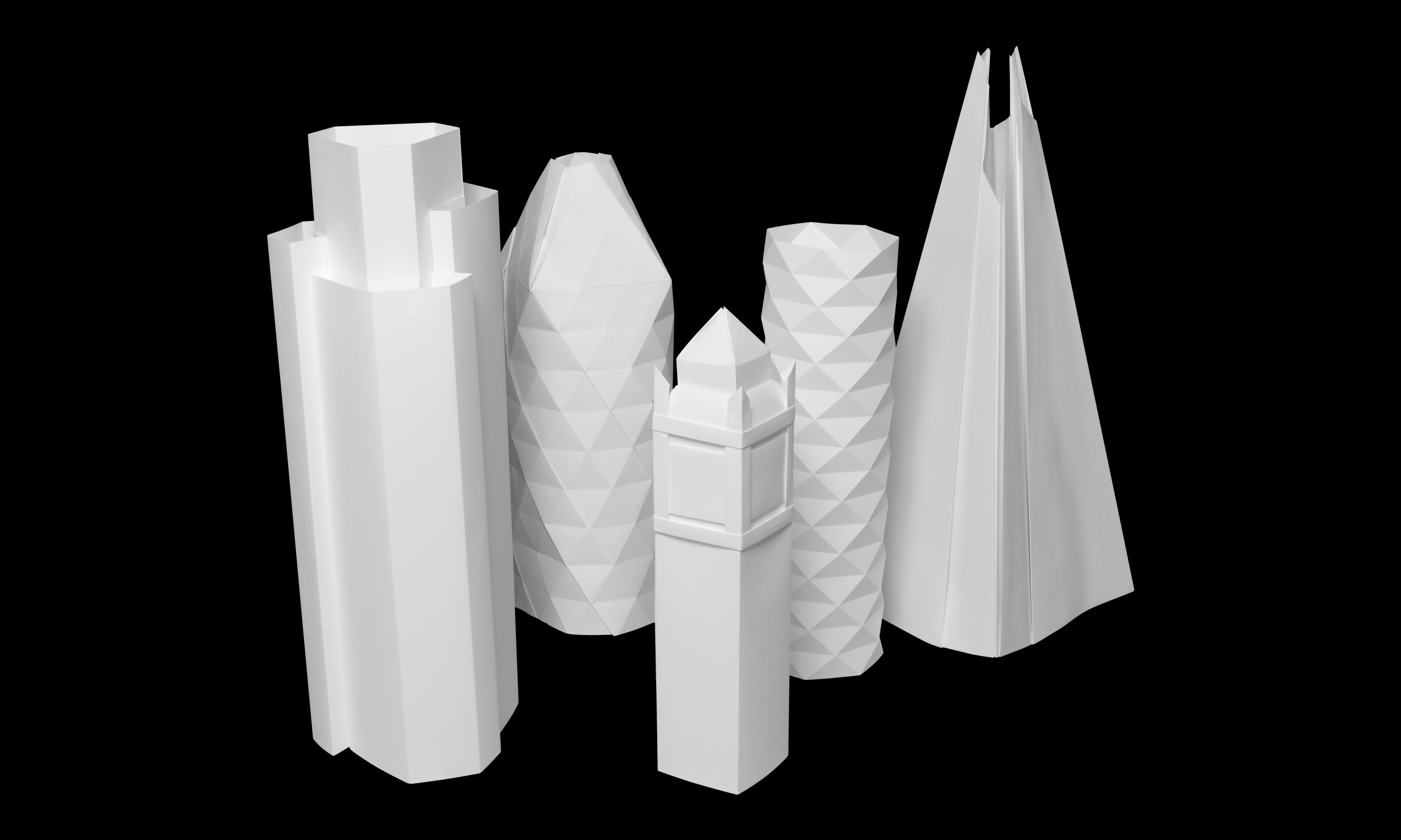
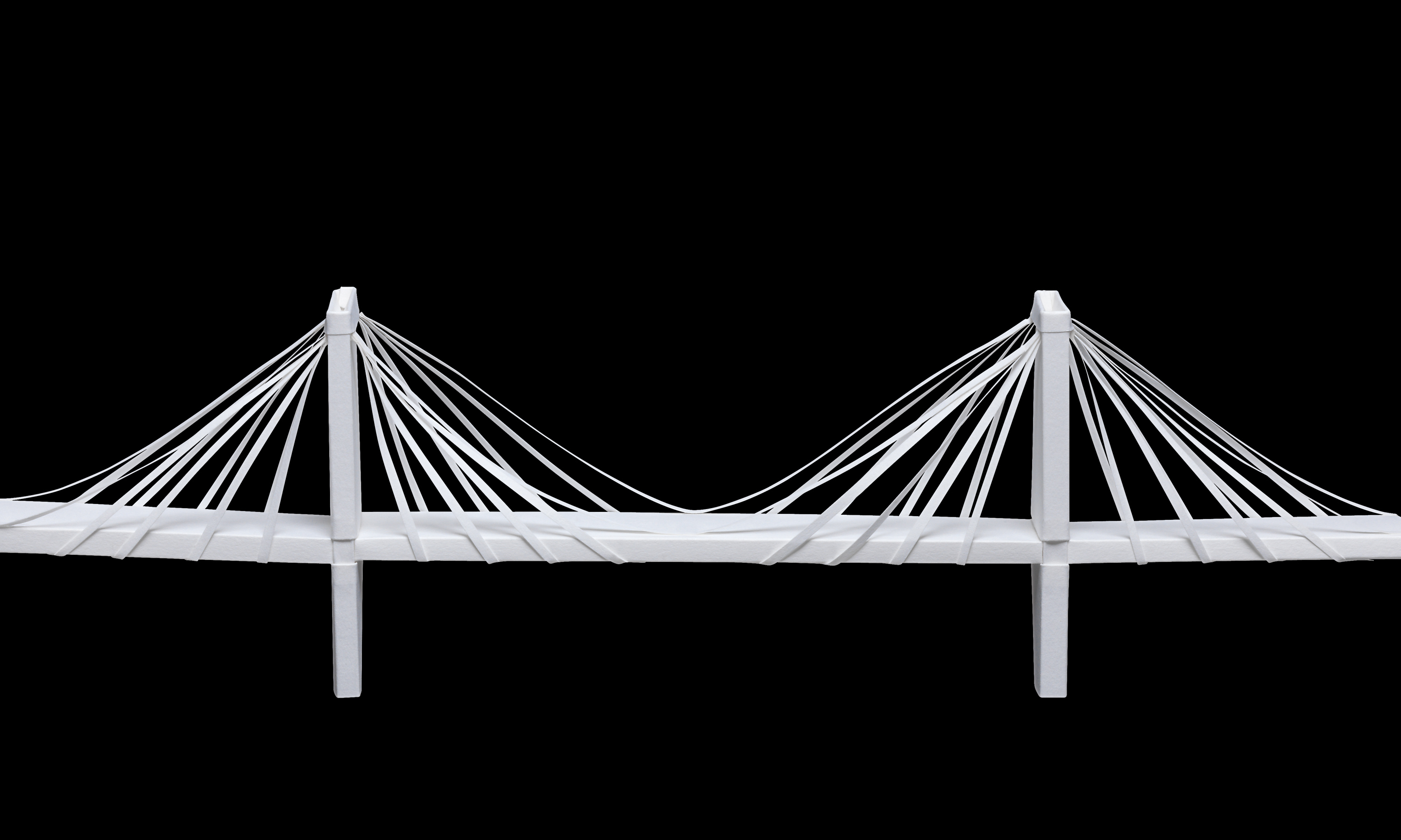
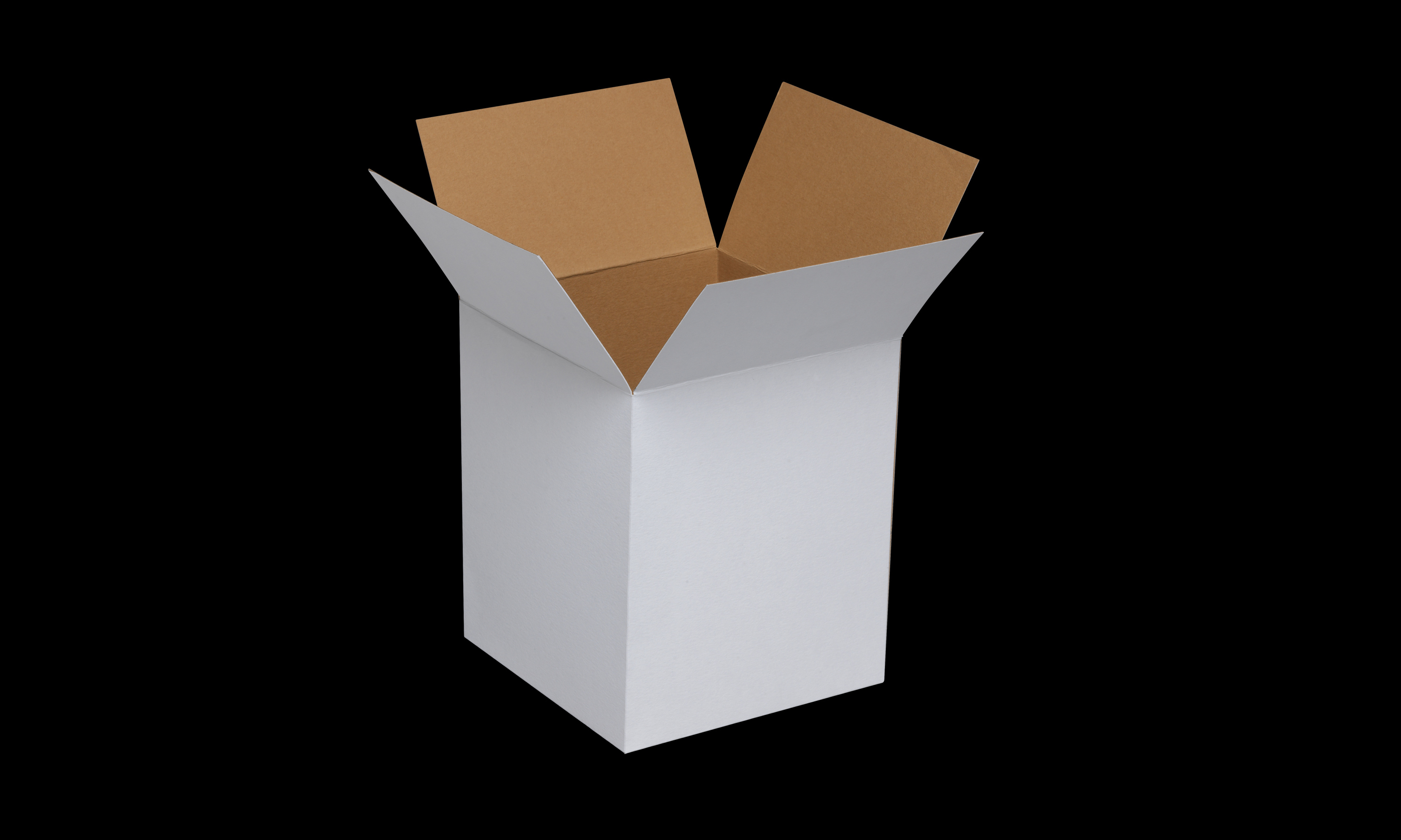
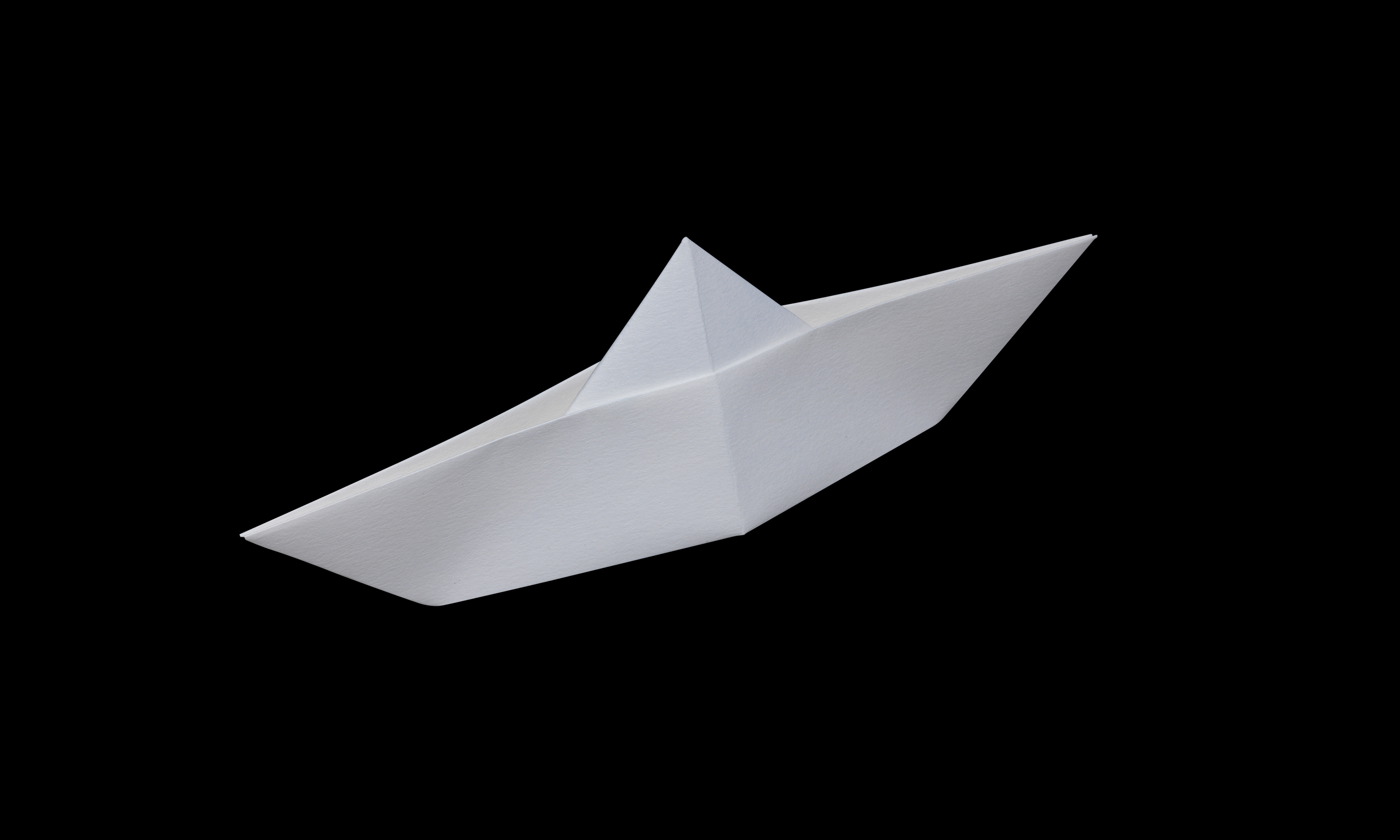
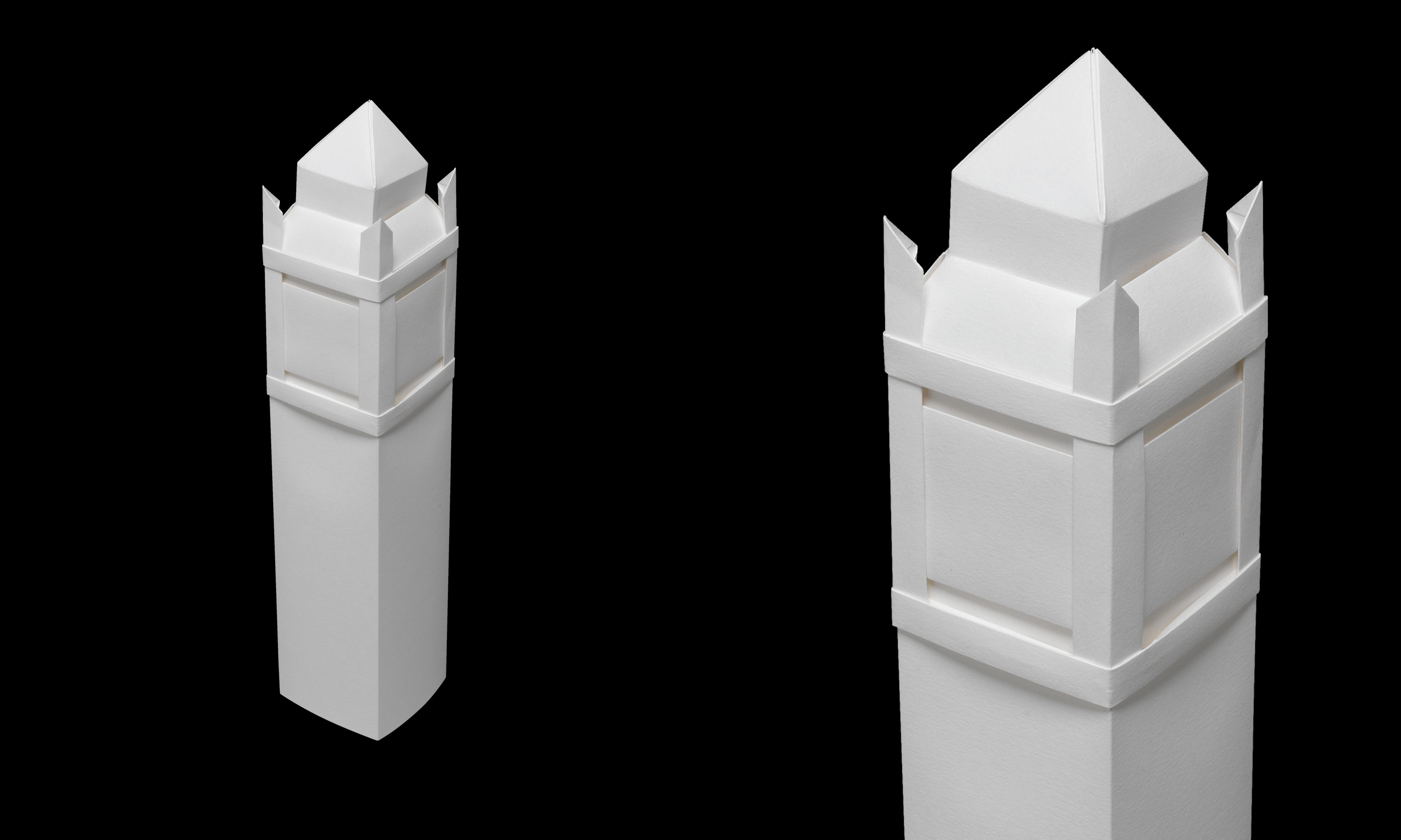
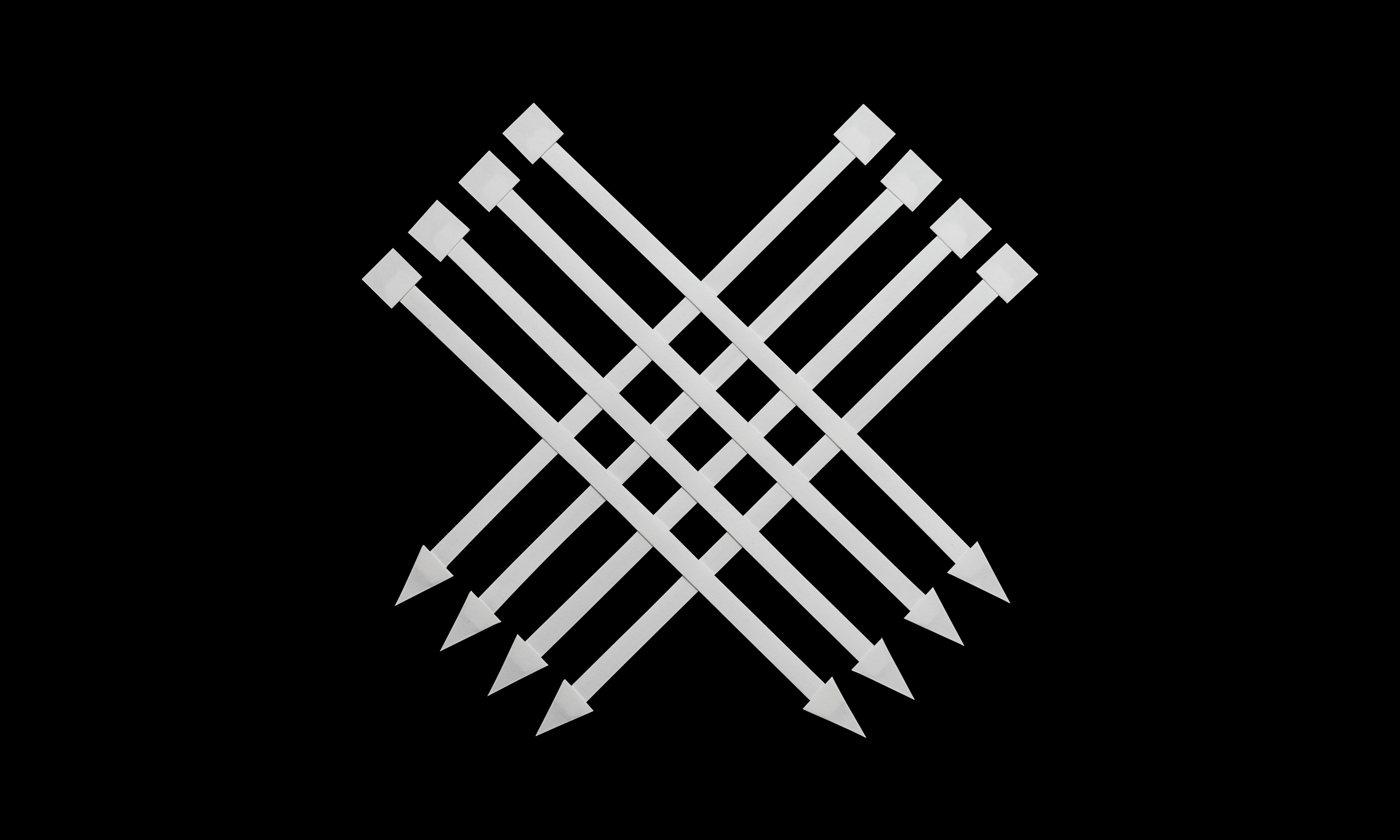
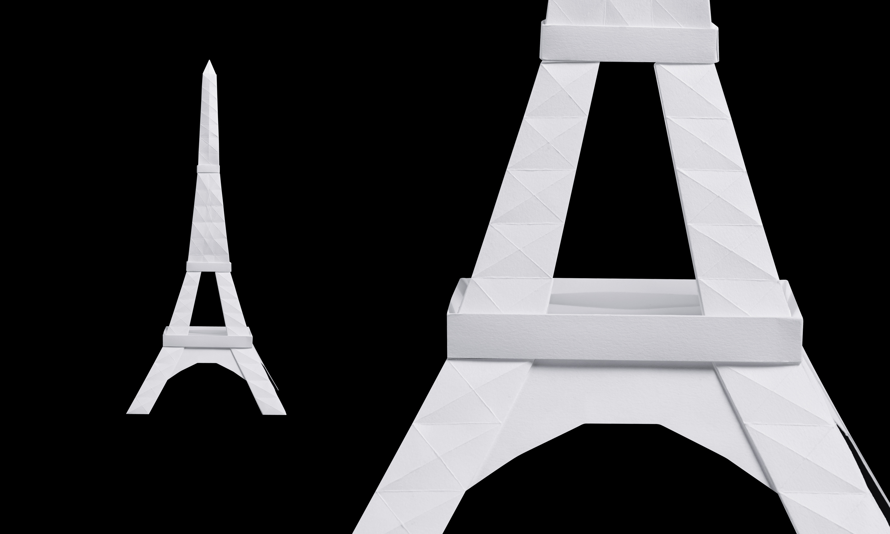
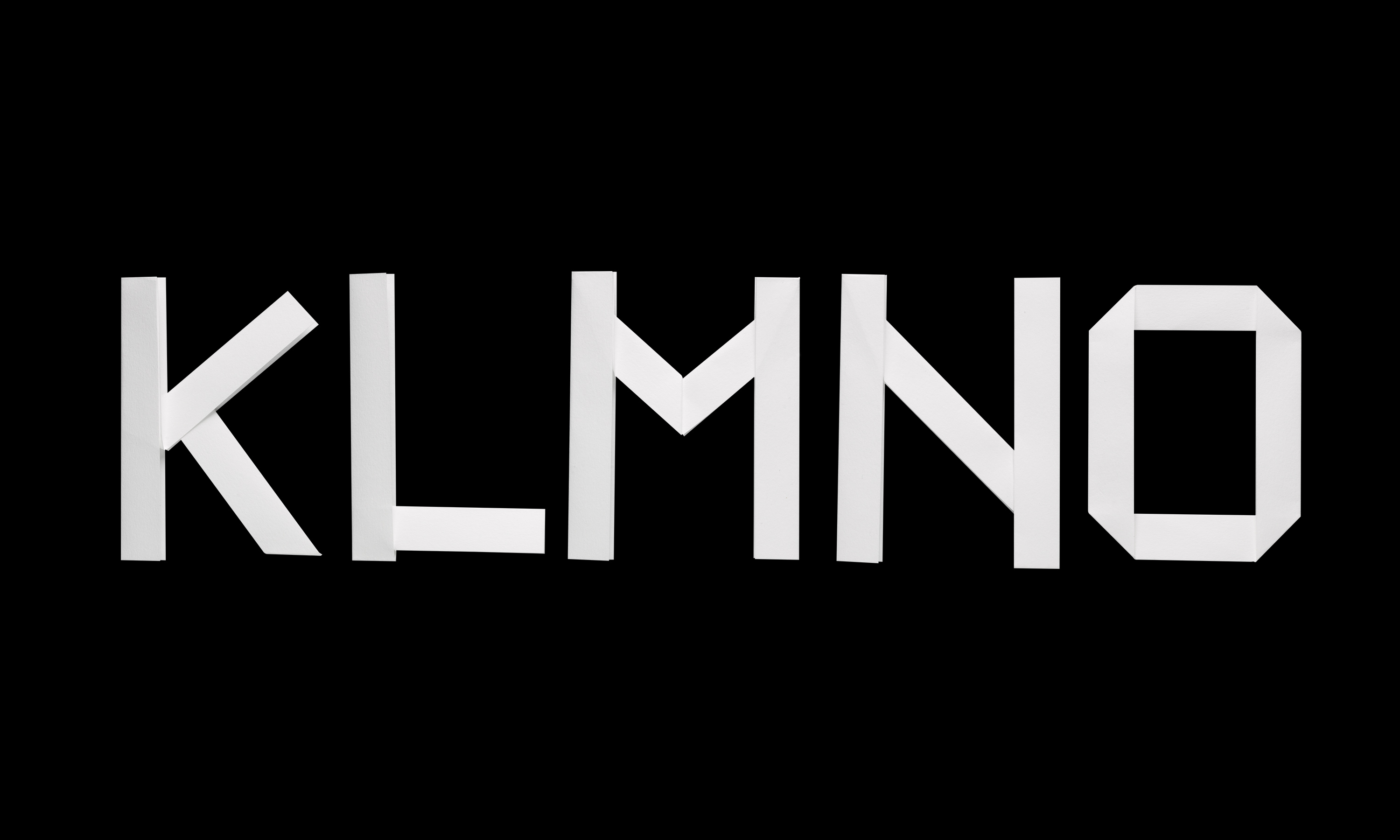
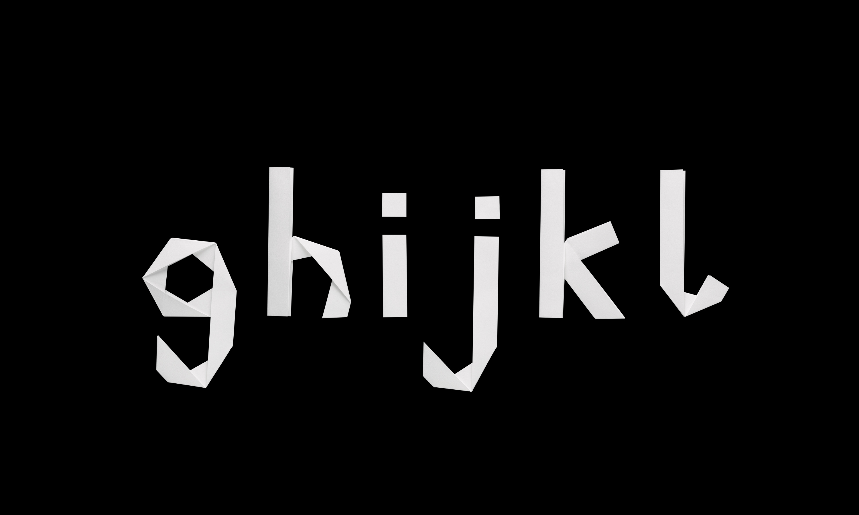
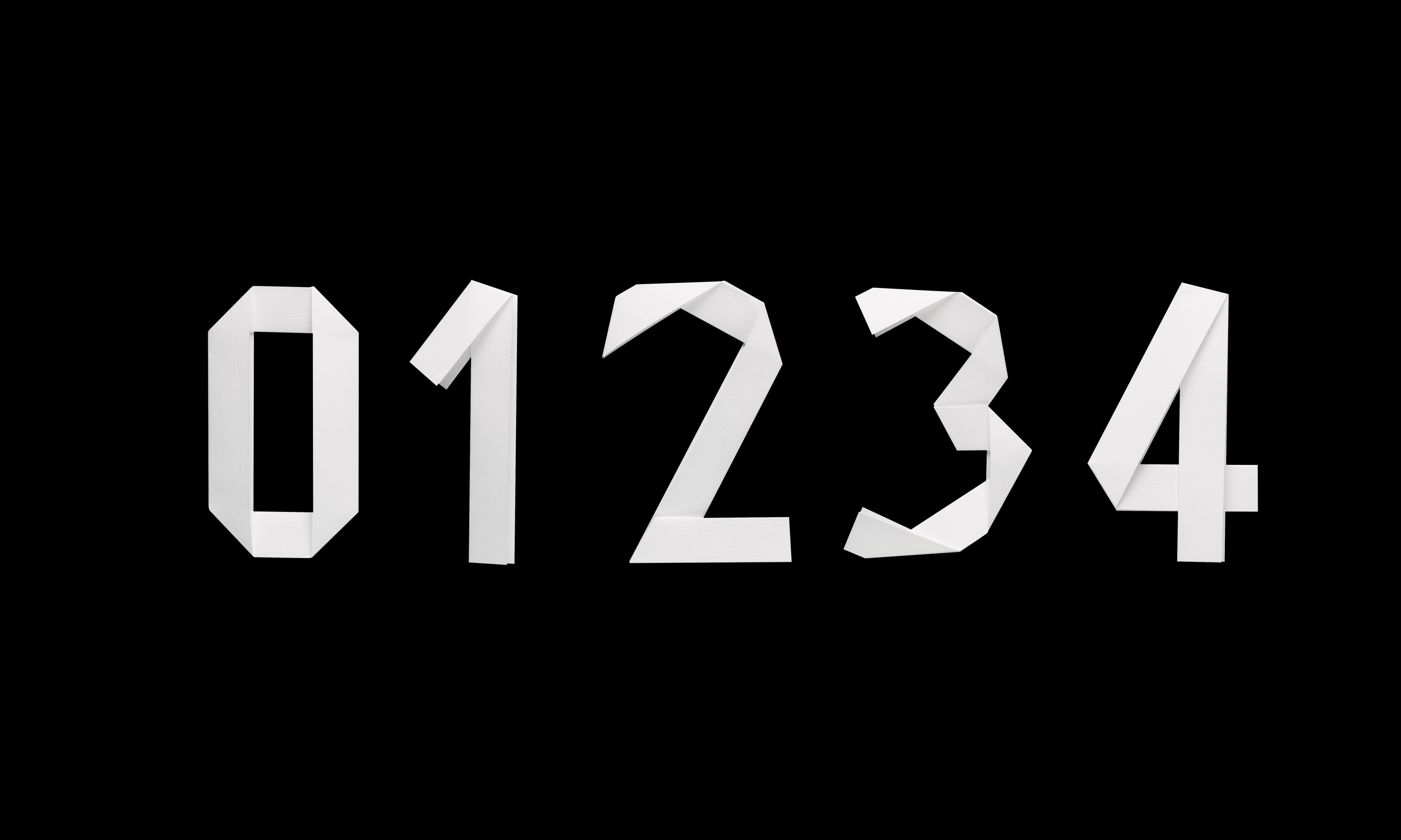
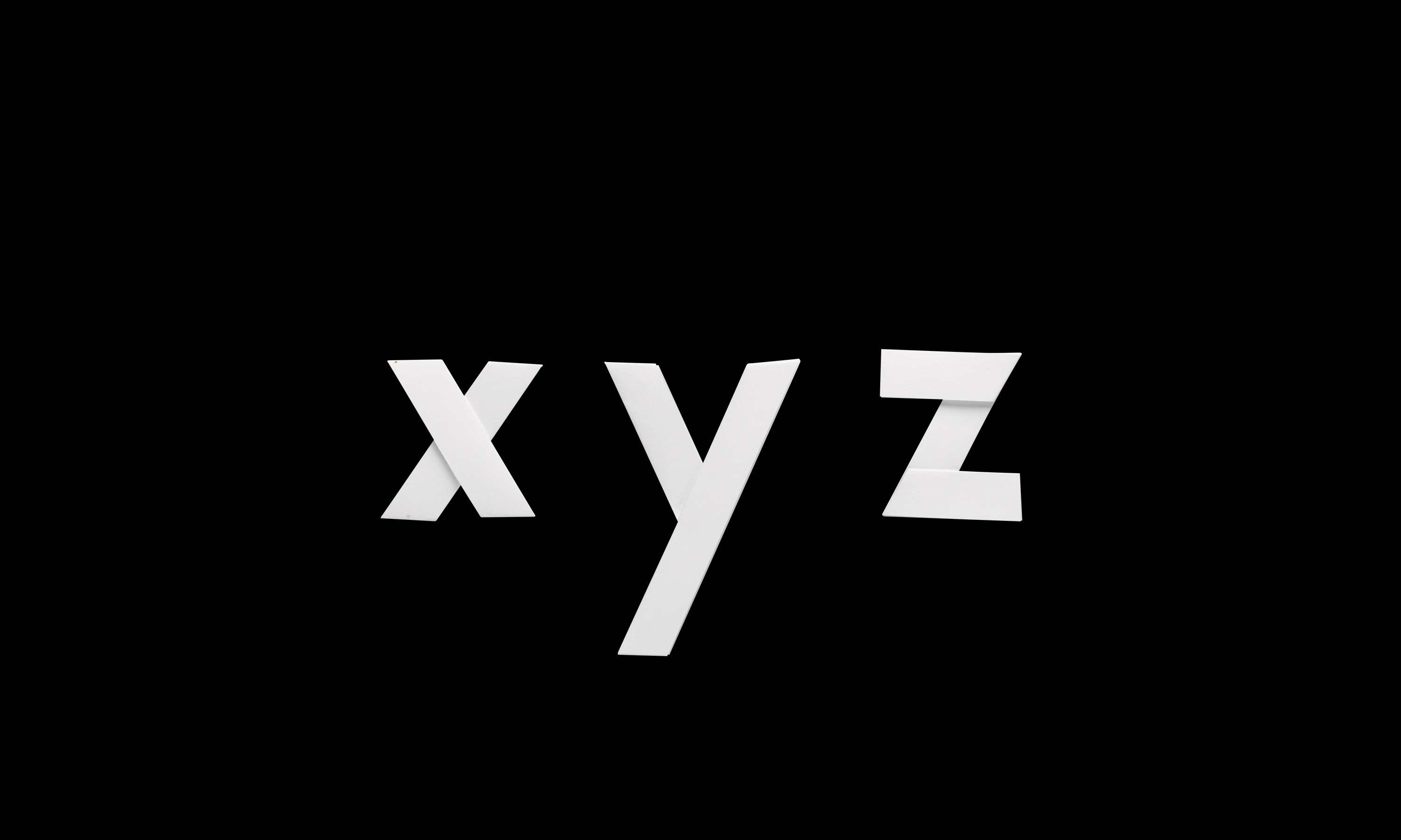
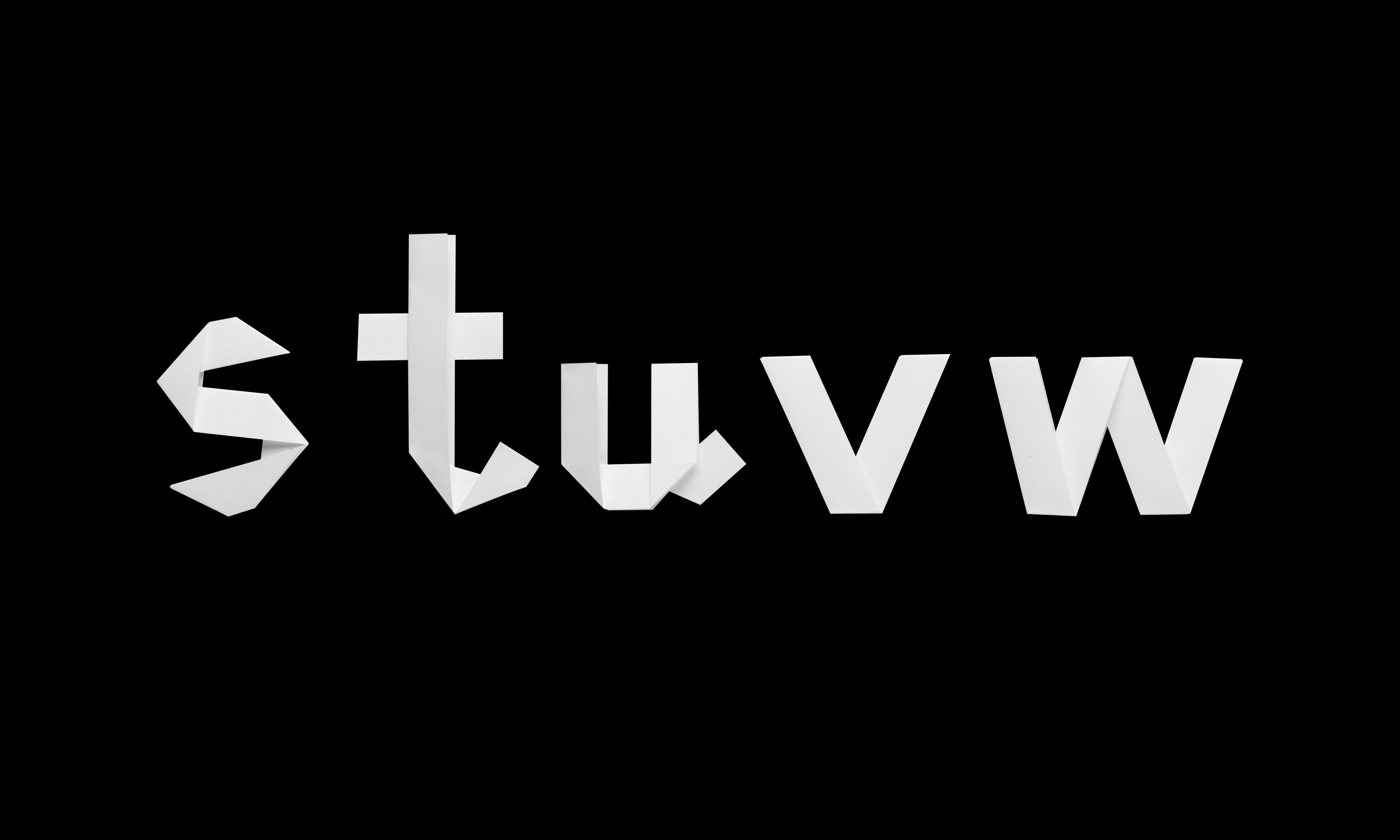
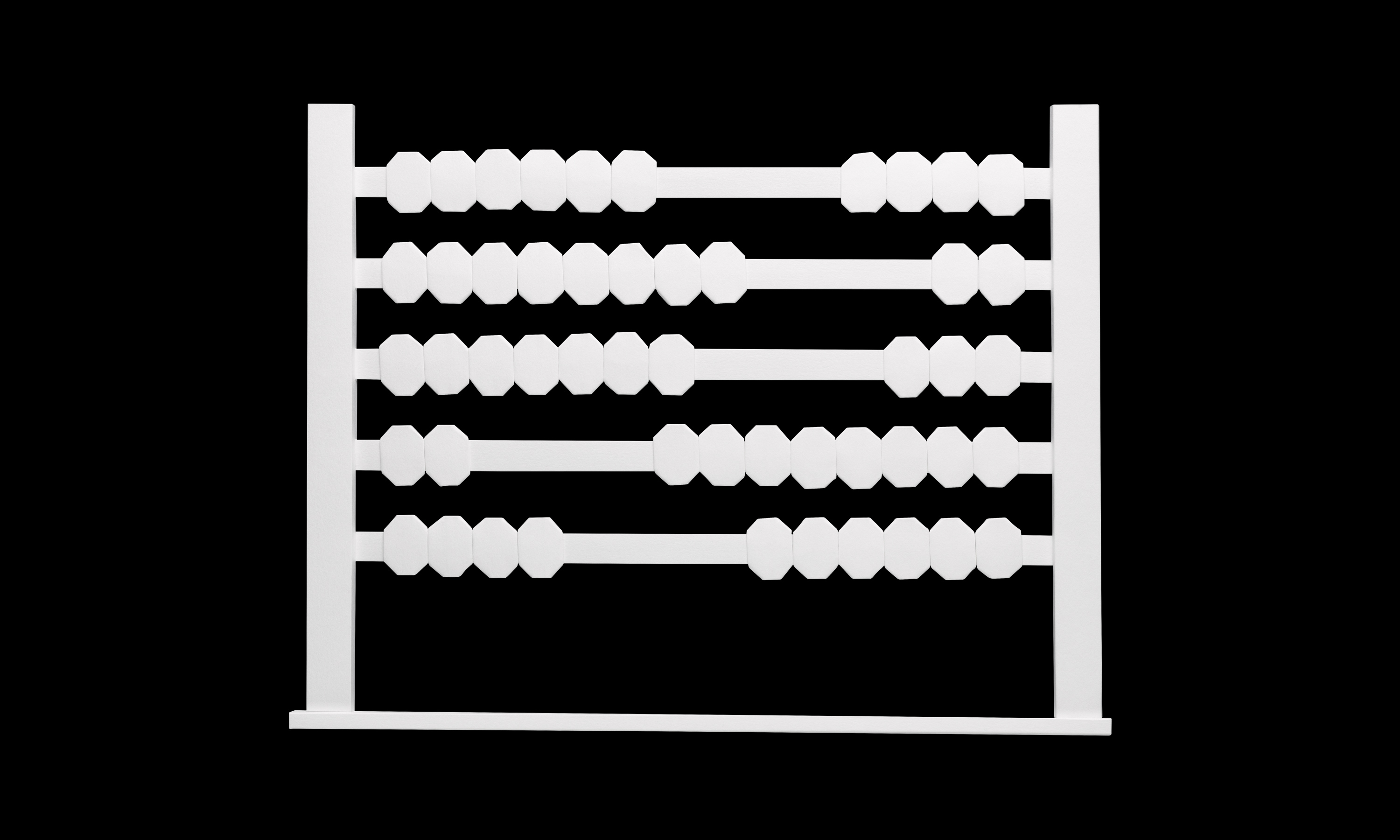
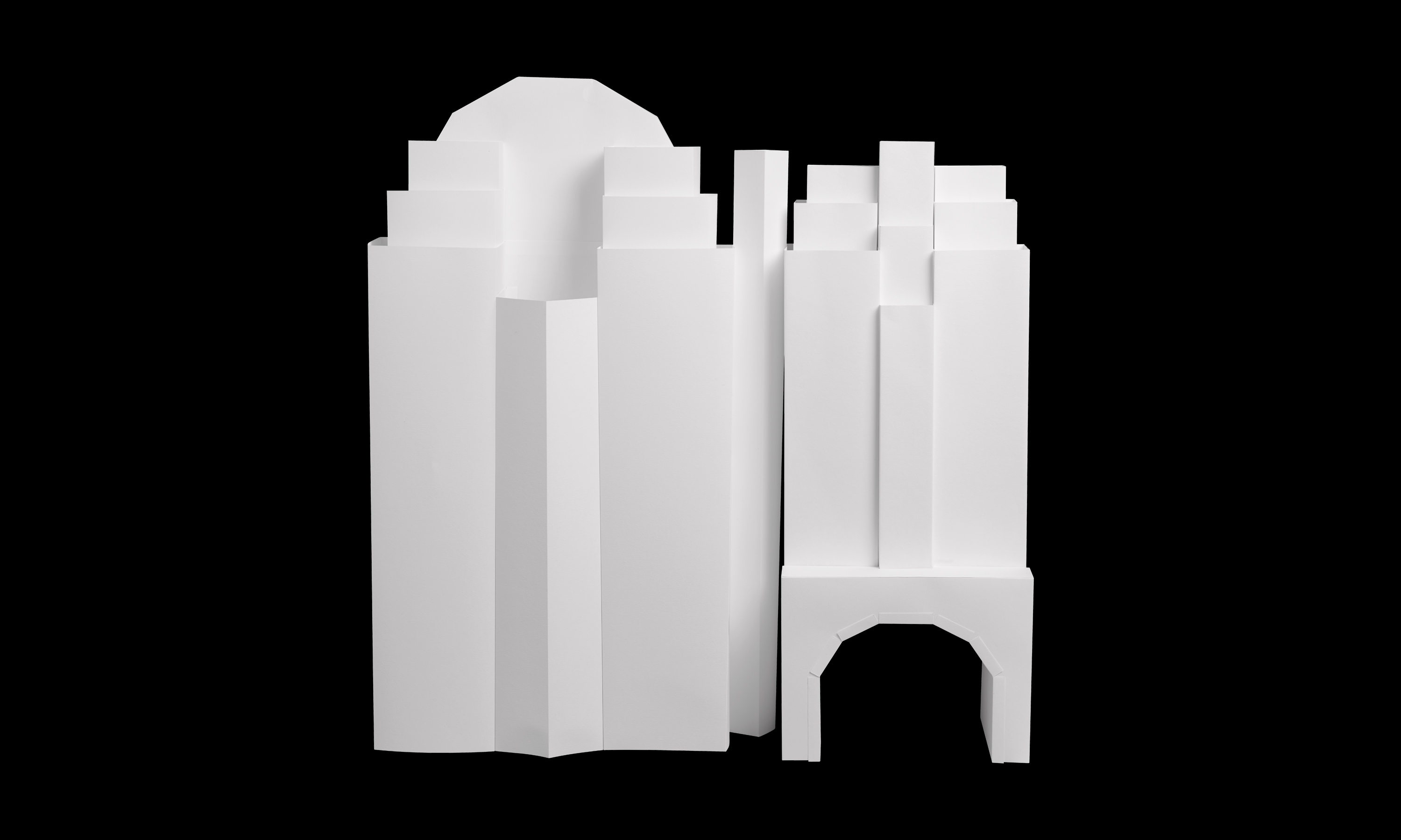
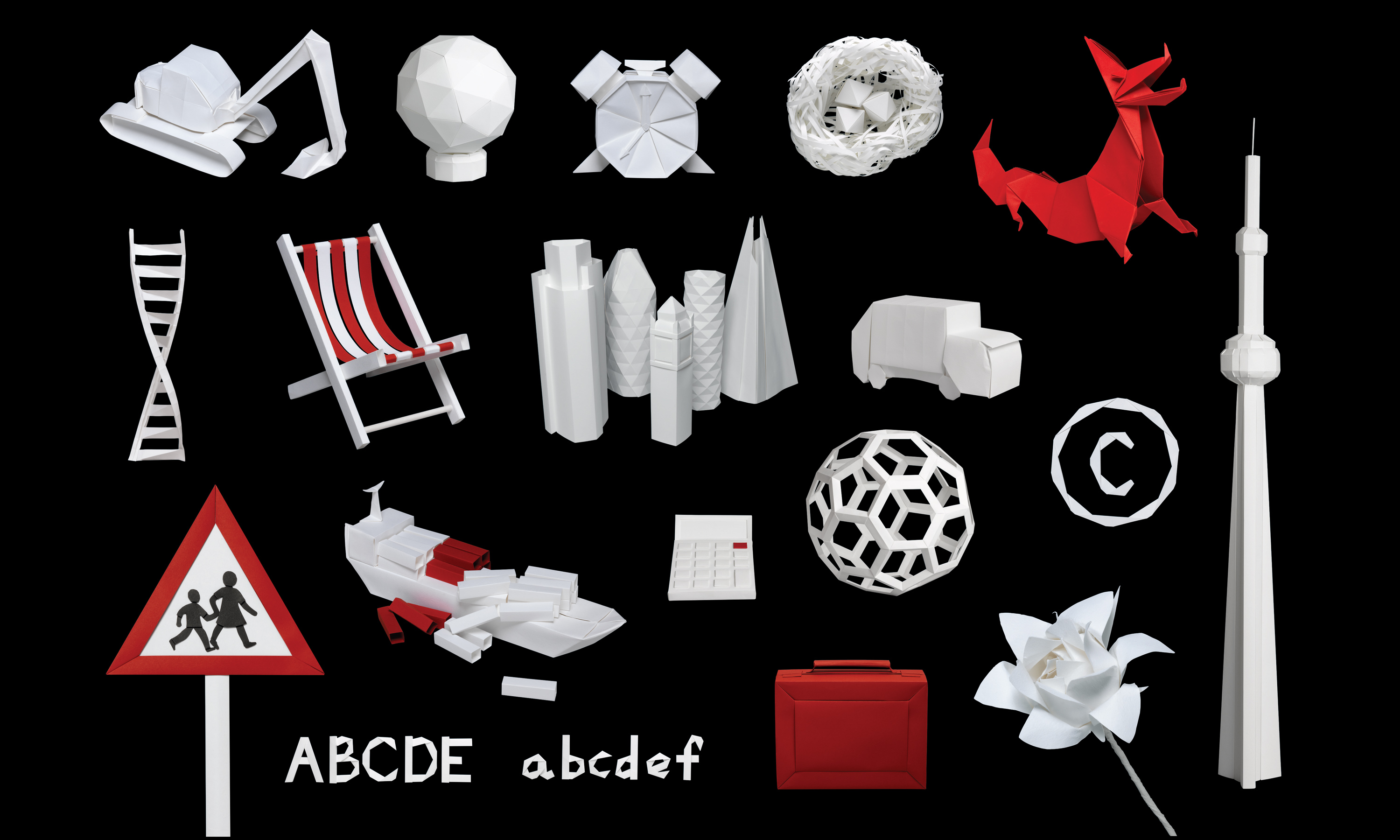
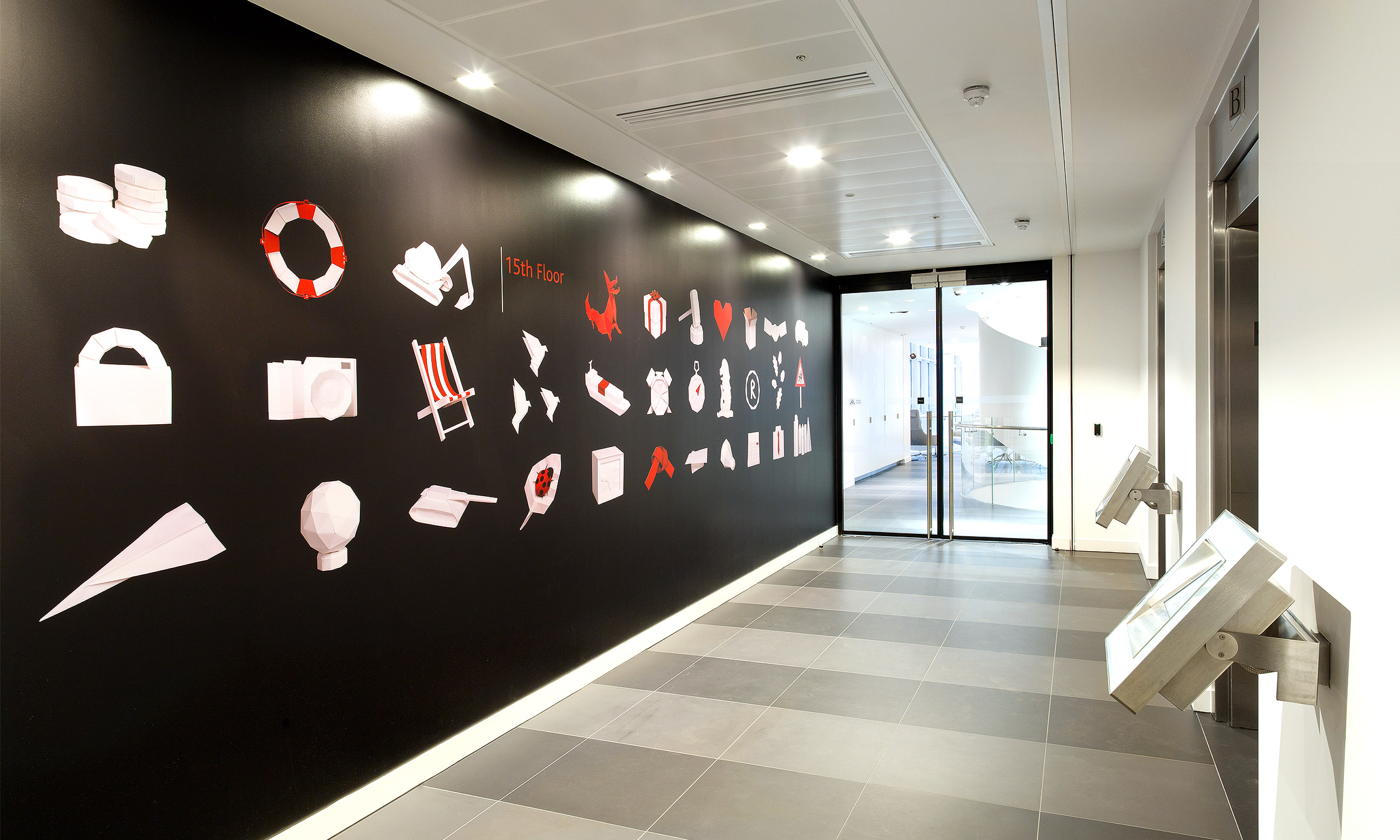
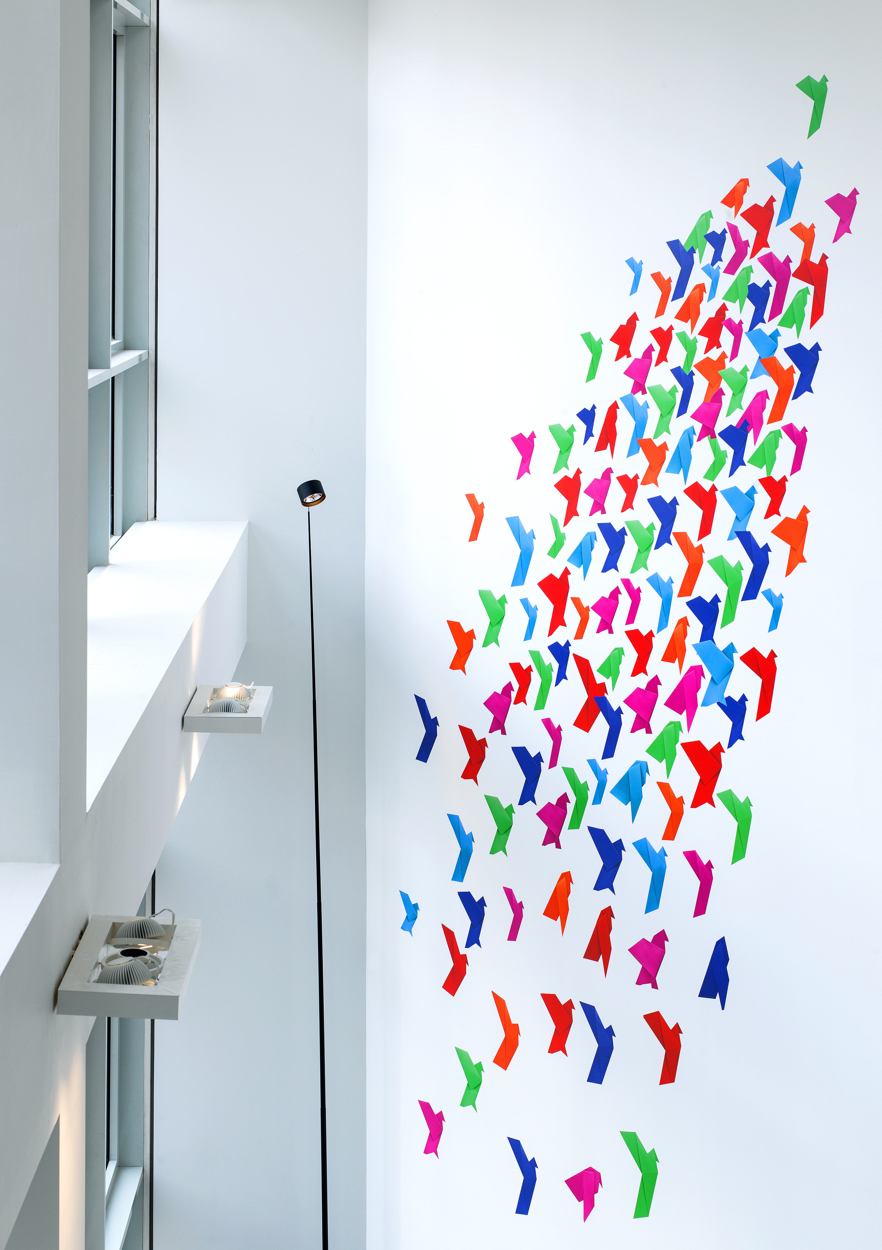
Nabarro brand visual style refresh – animated gallery of a selection of paper models.
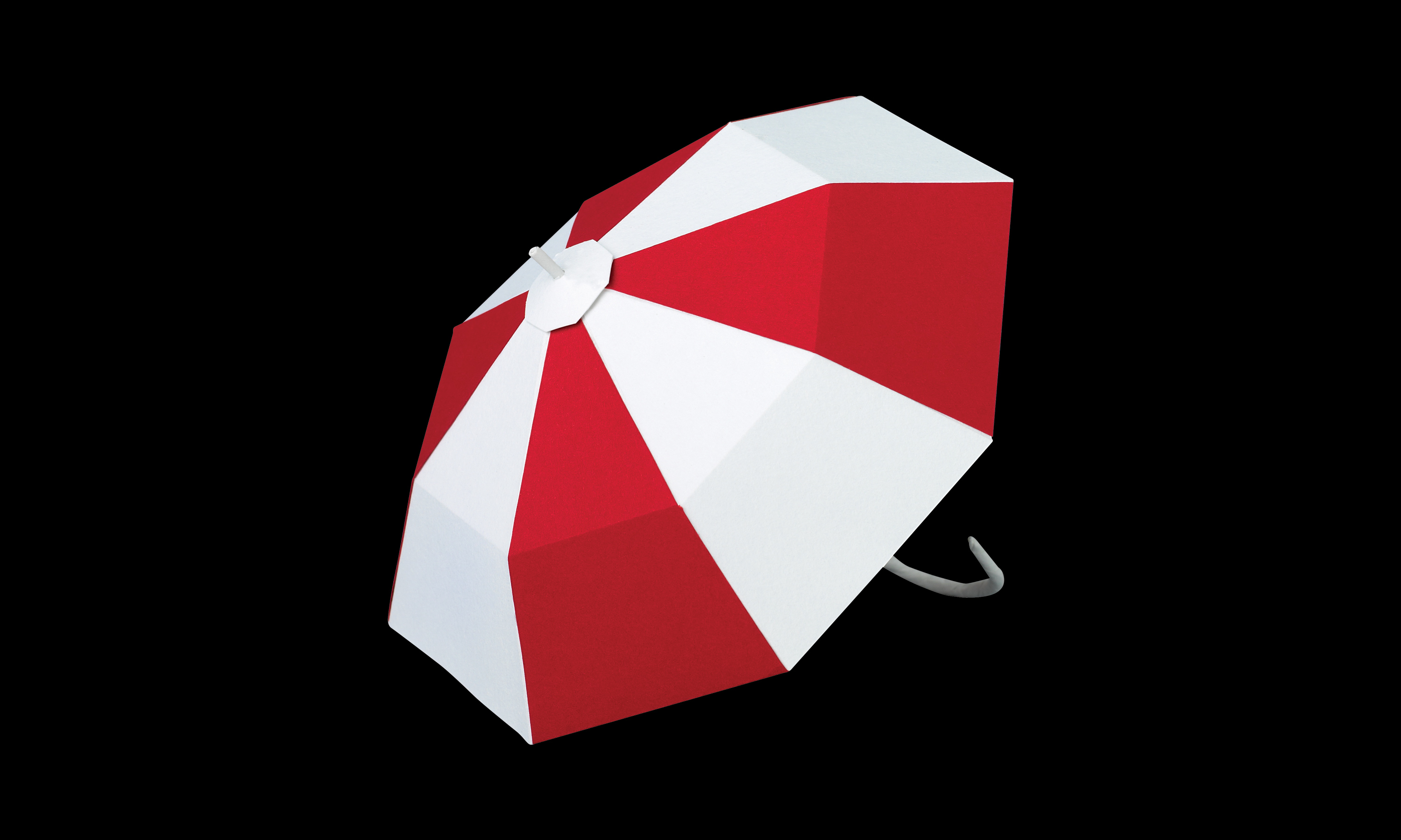
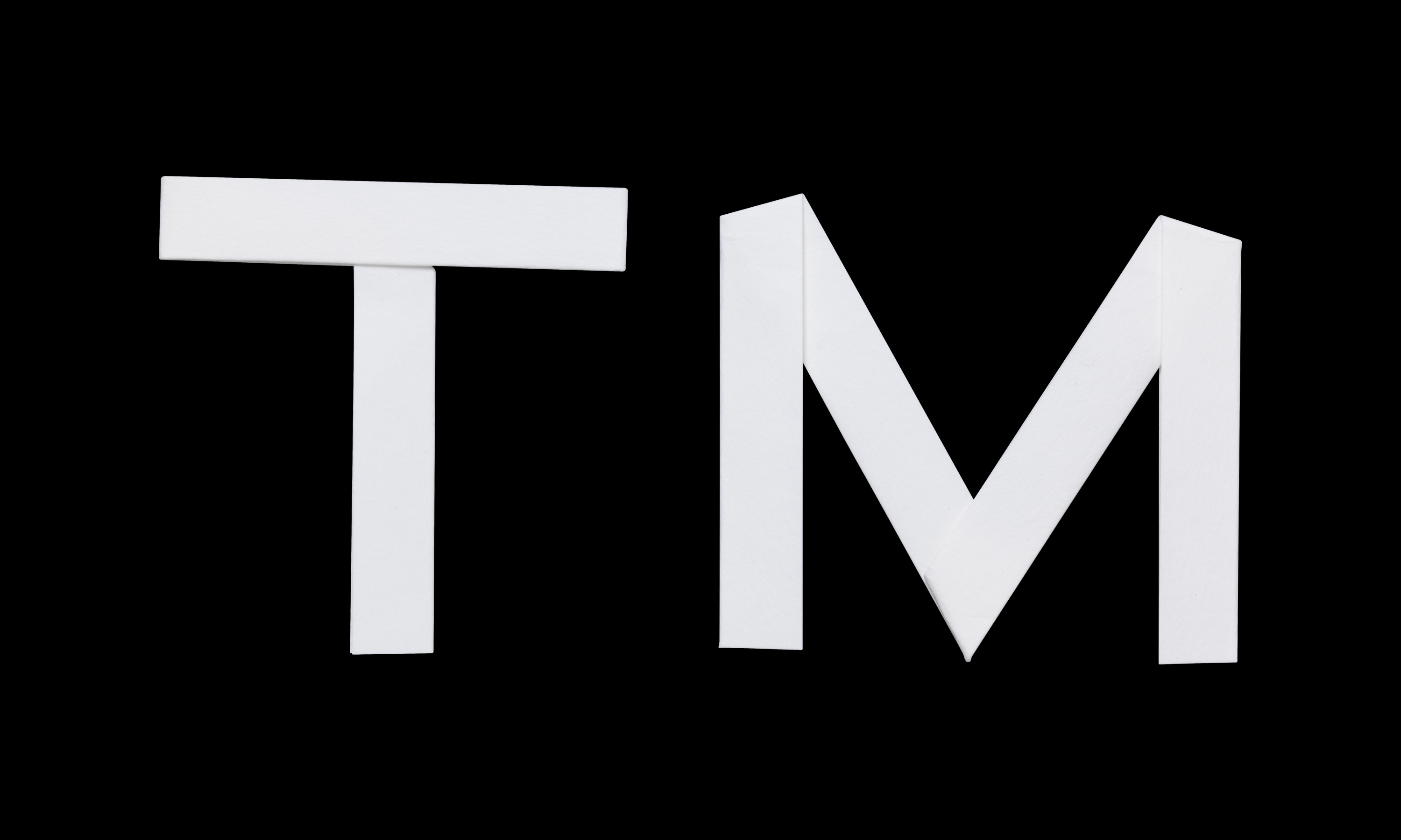
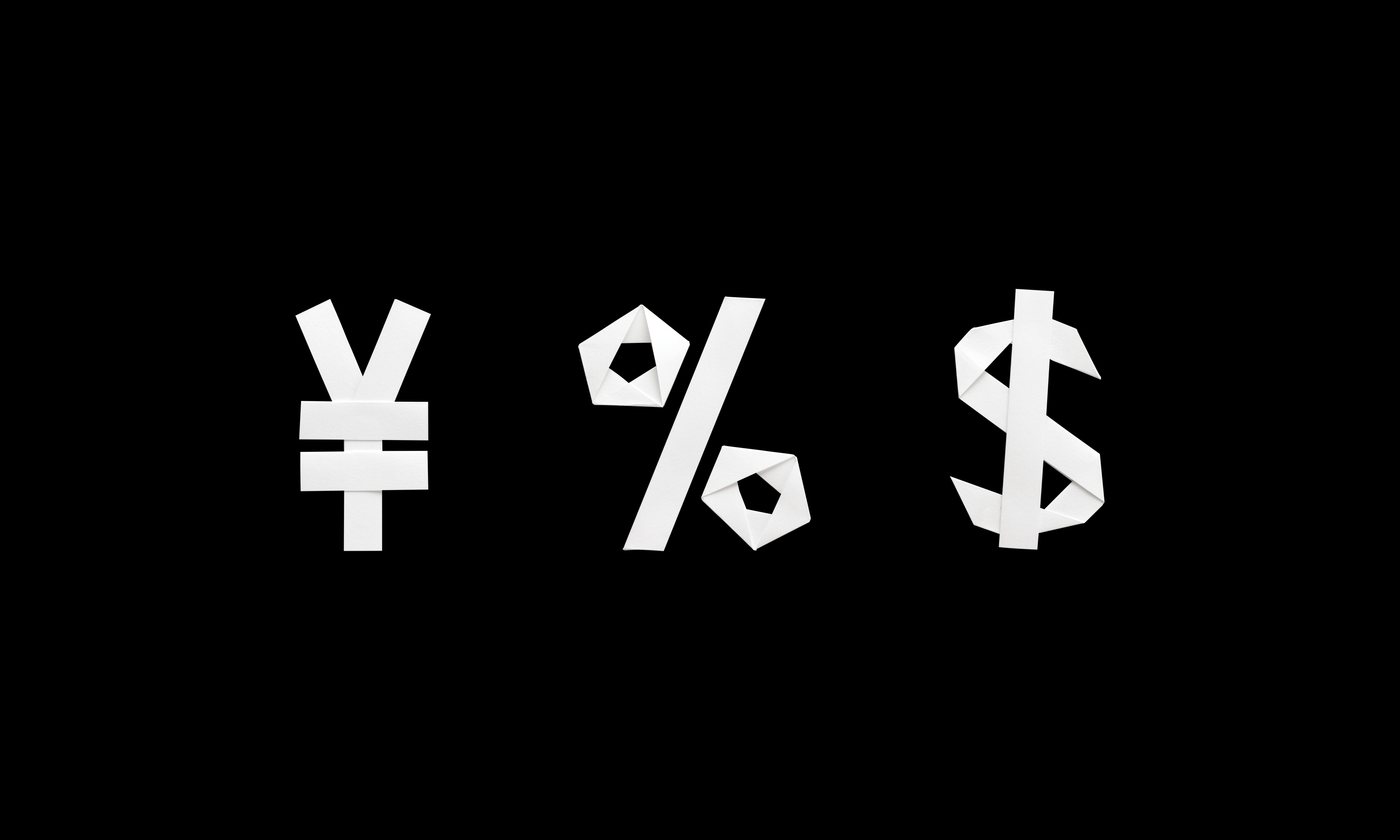
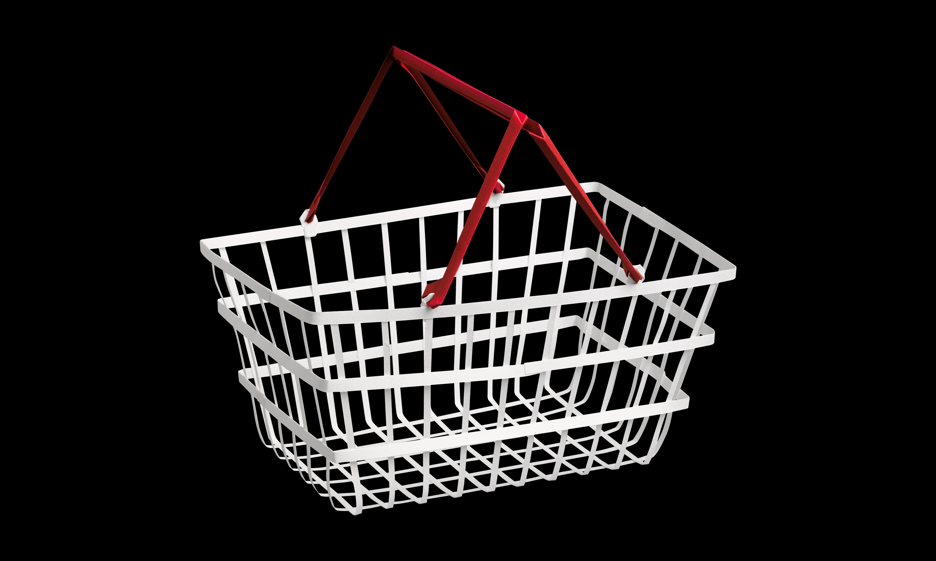
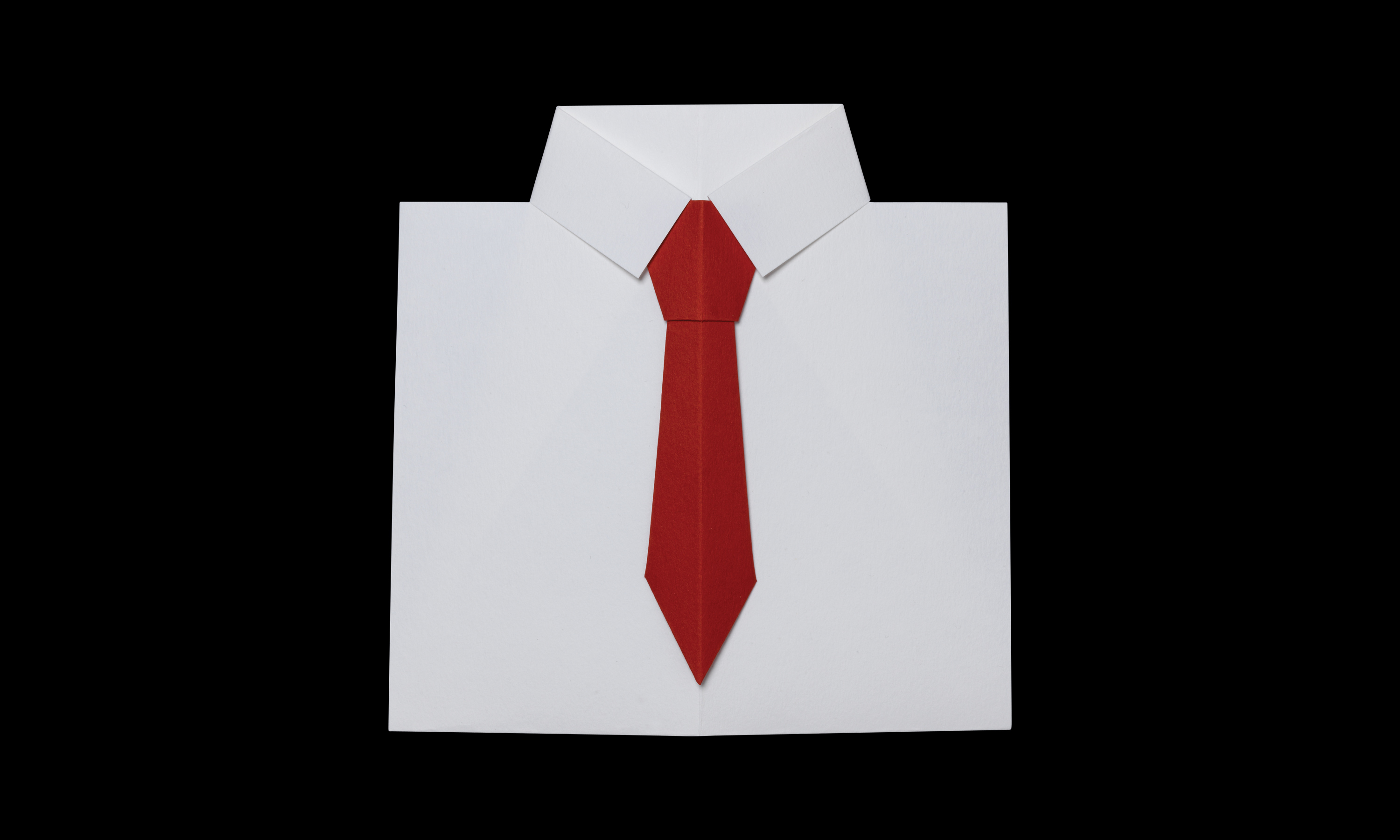
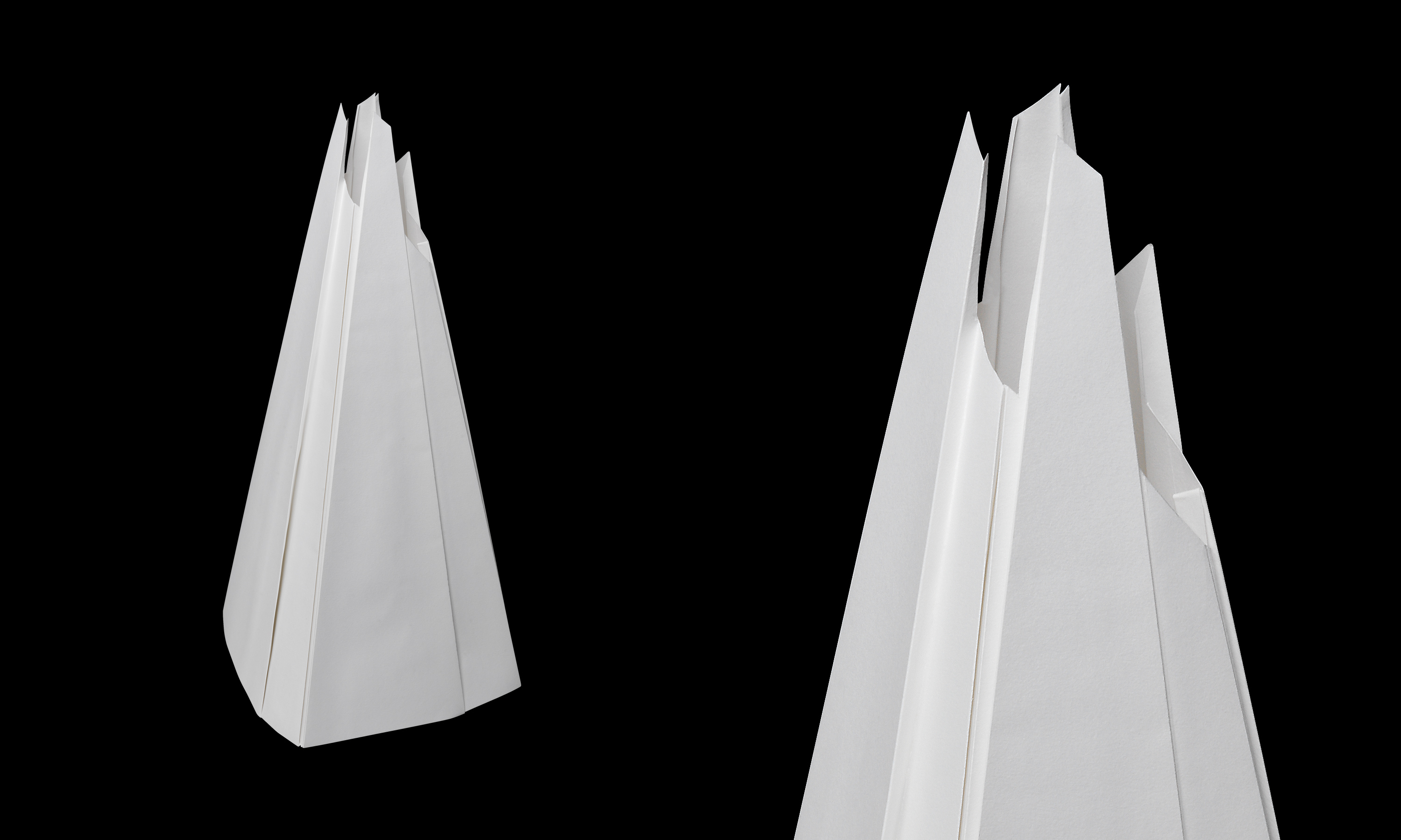
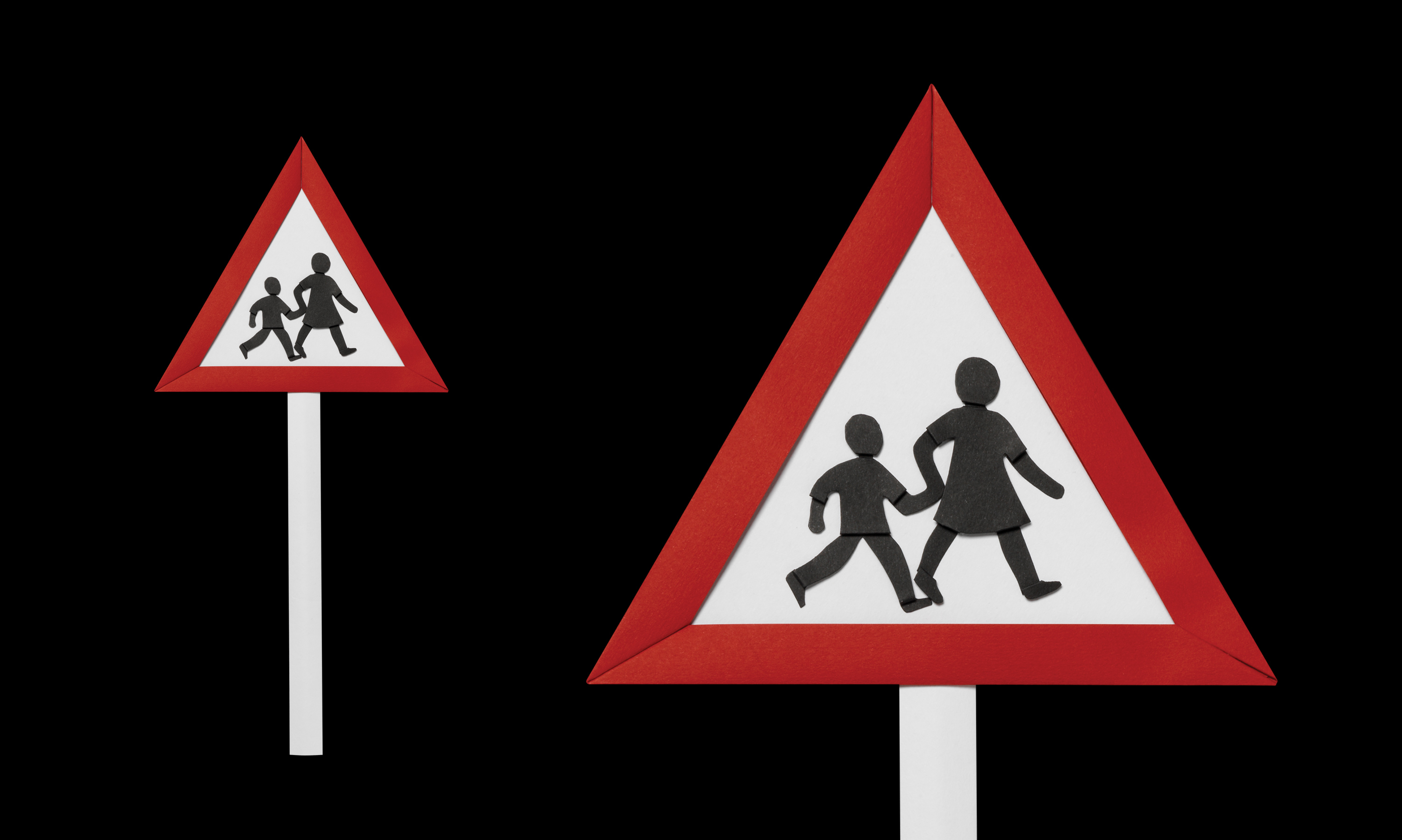
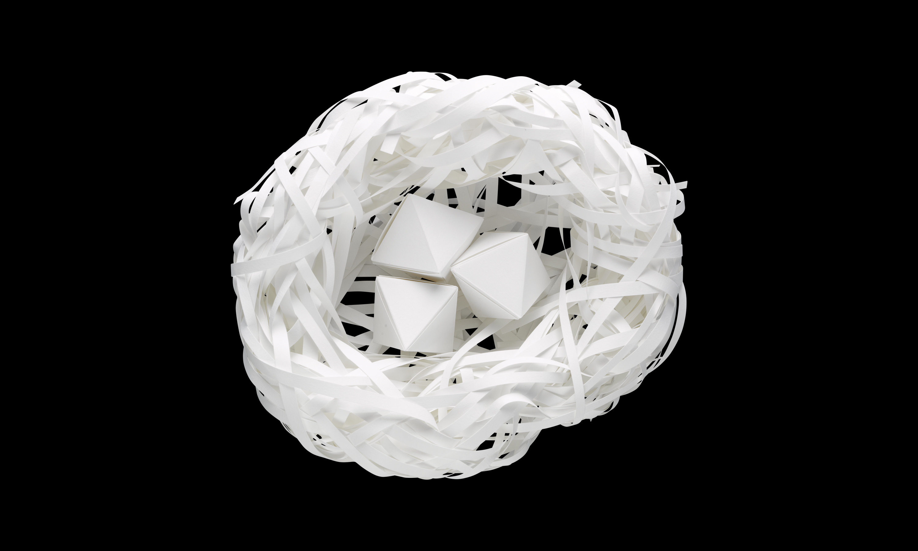
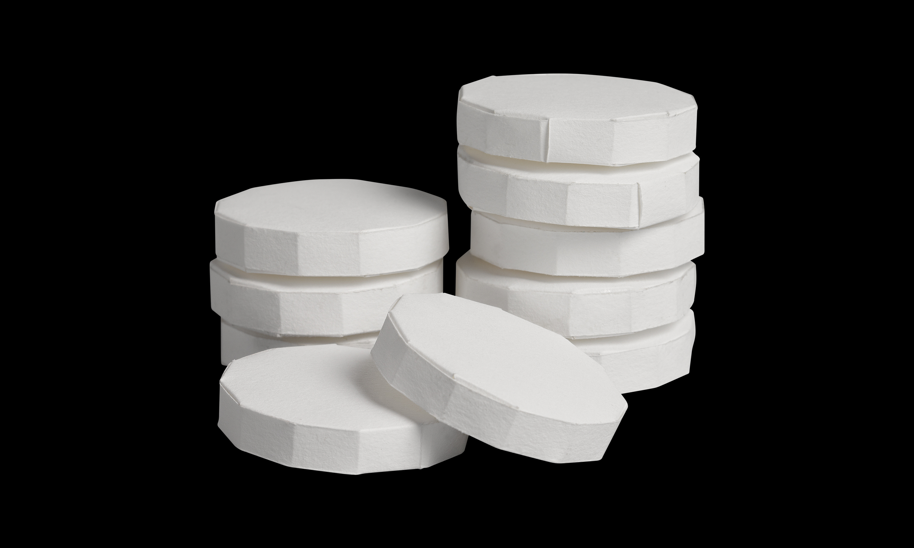
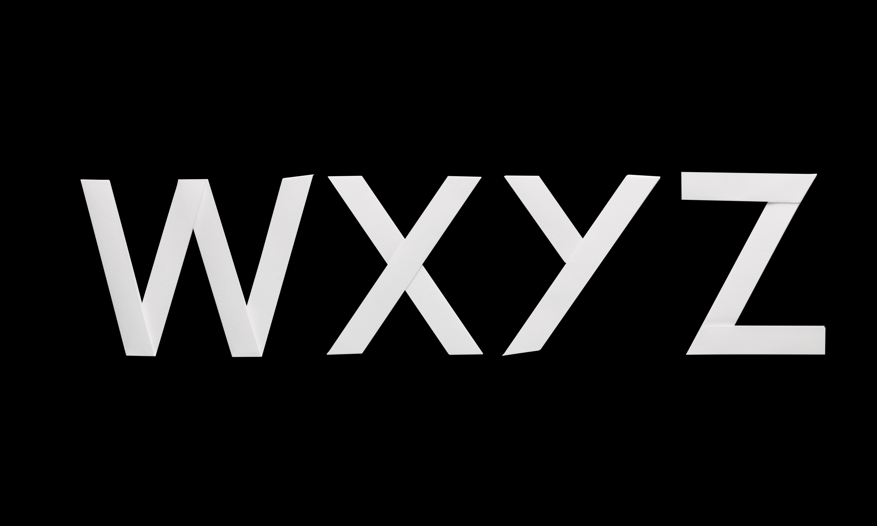
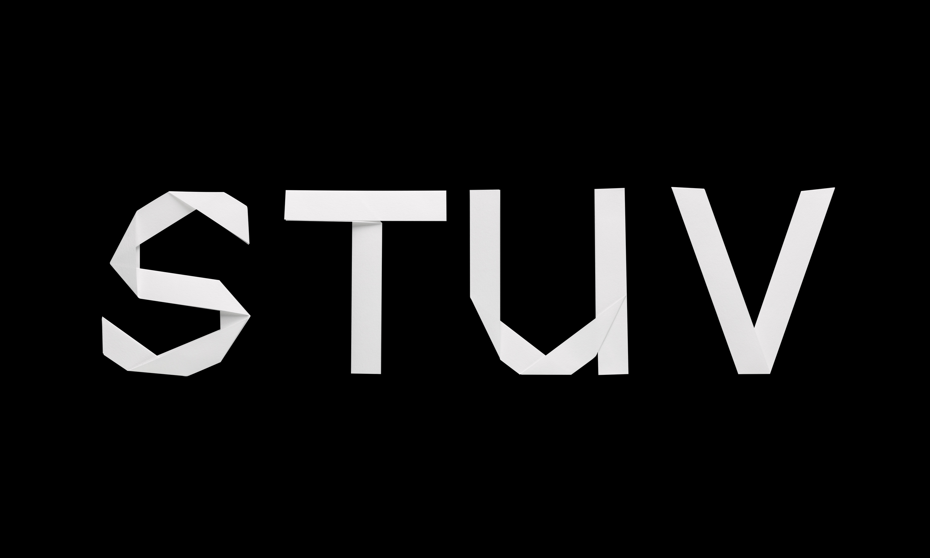
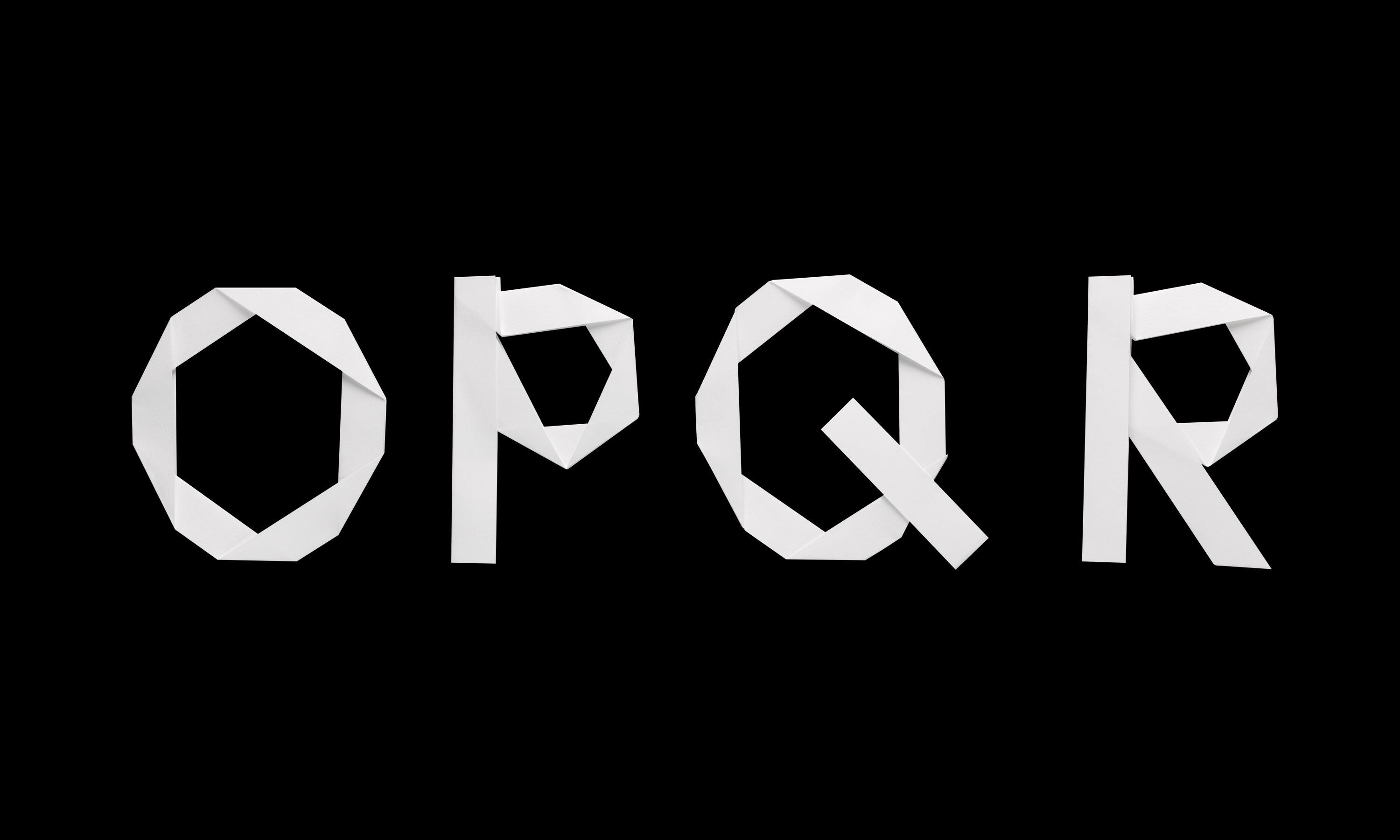
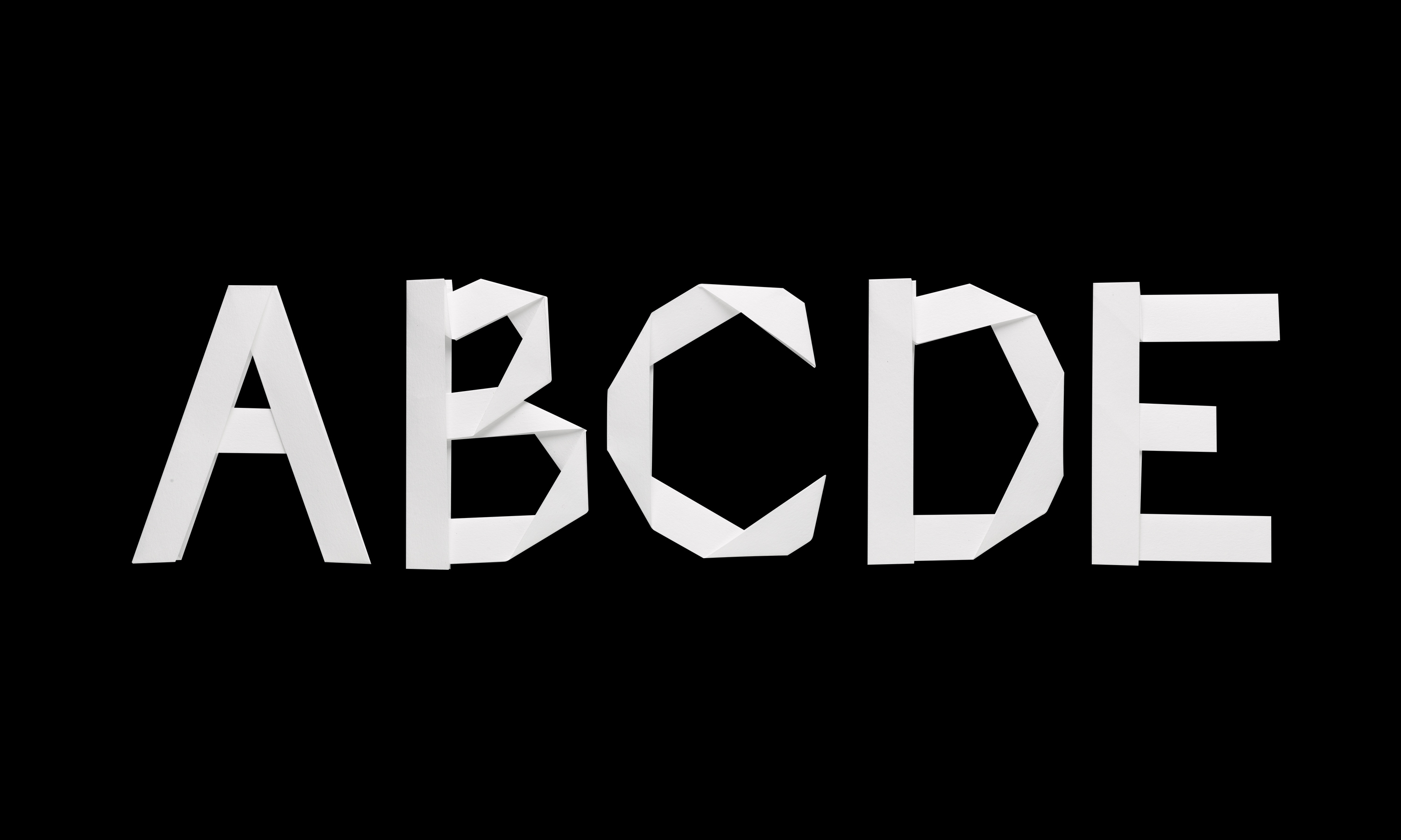
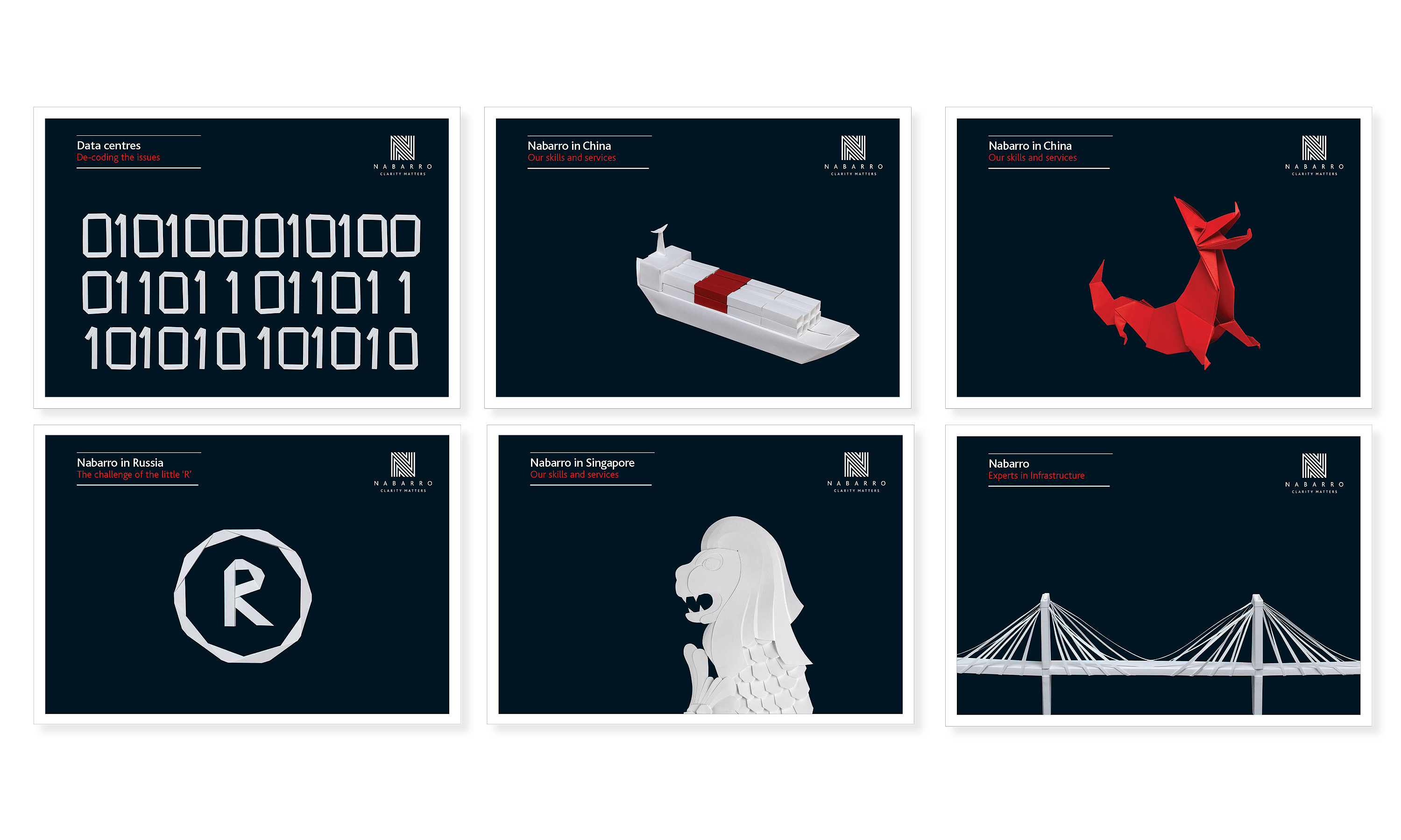
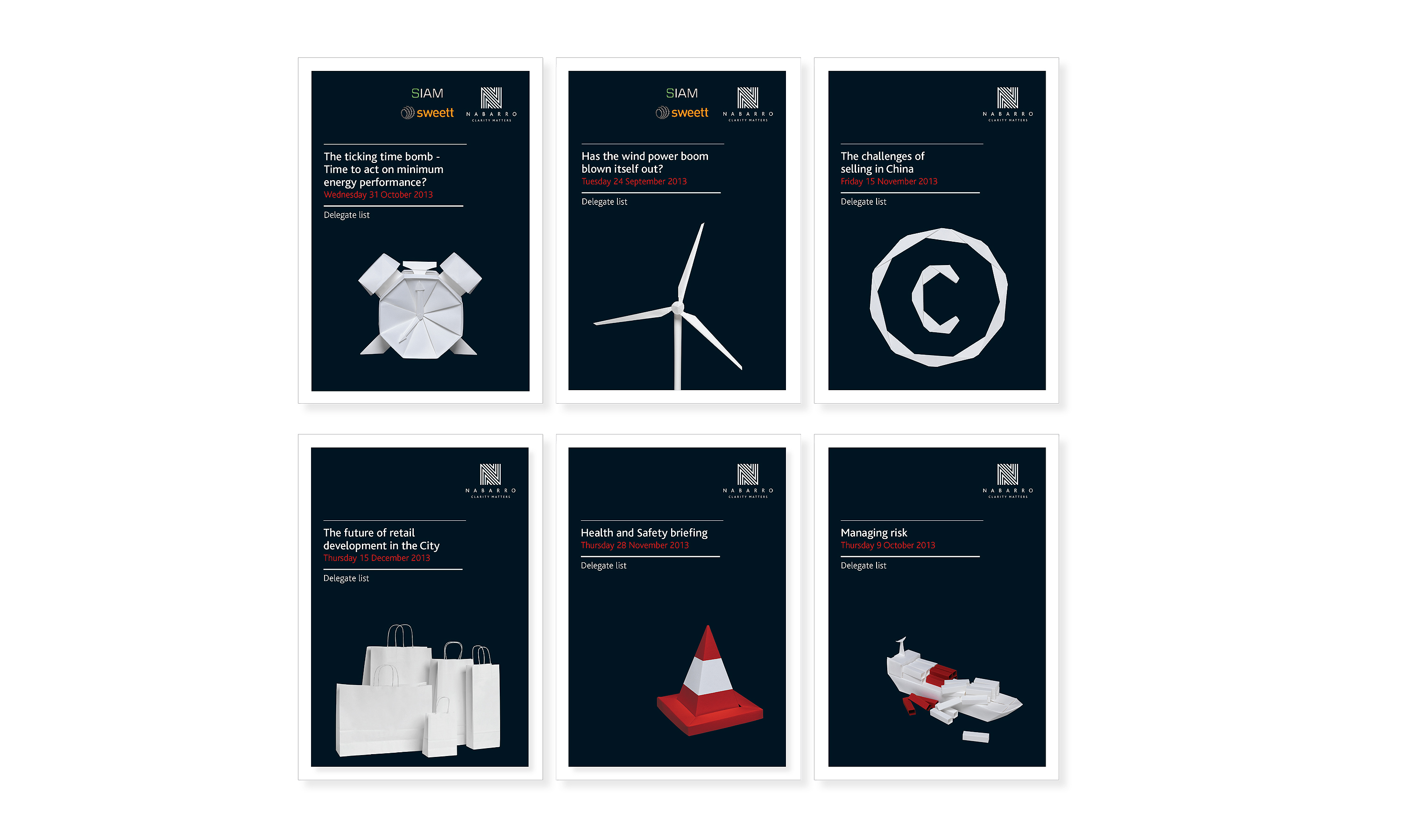
Nabarro brand visual style refresh – paper models snapshot gallery.
Nabarro brand visual style refresh – literature system.


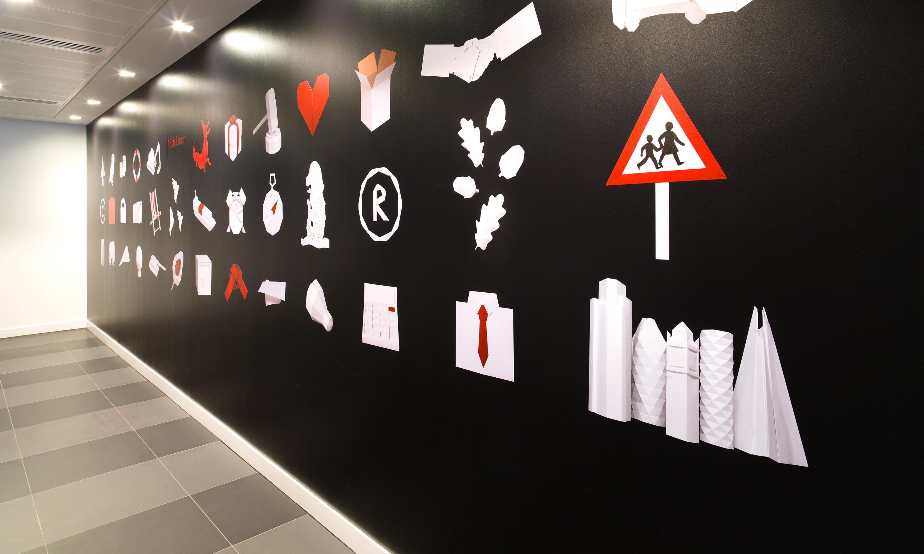
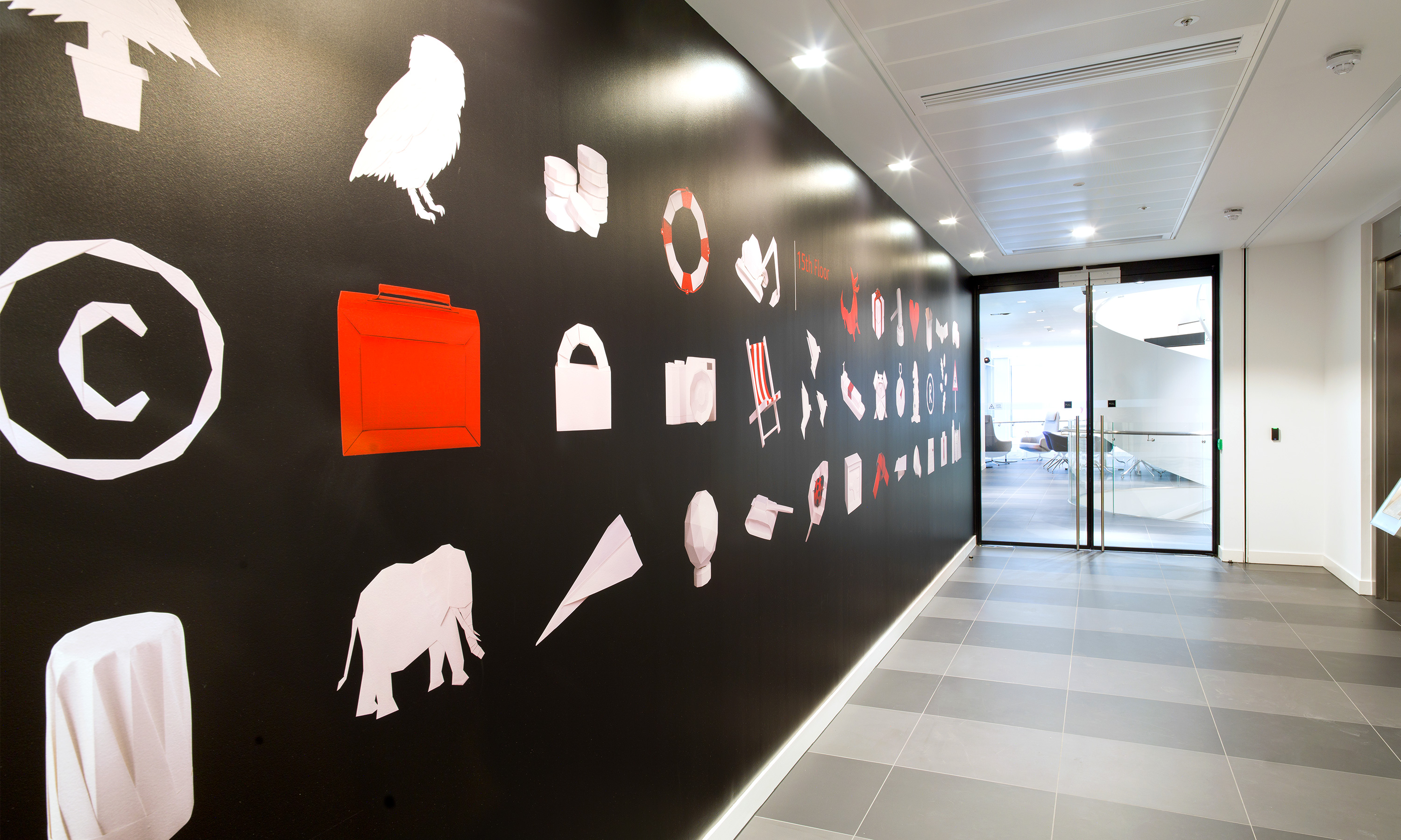
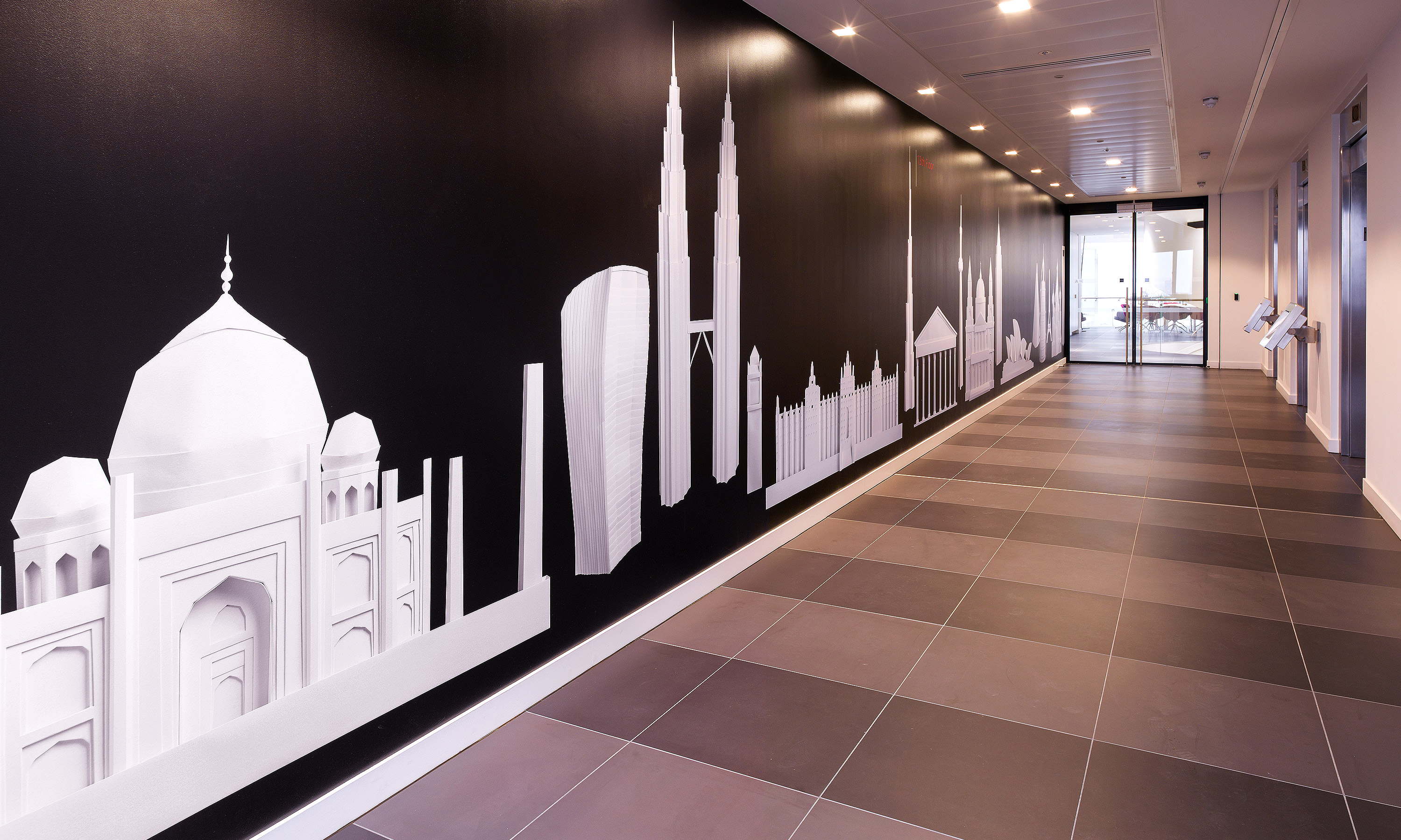
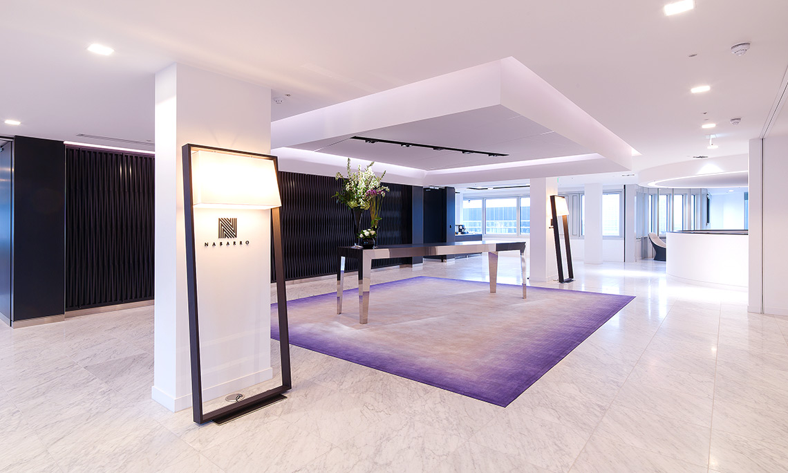
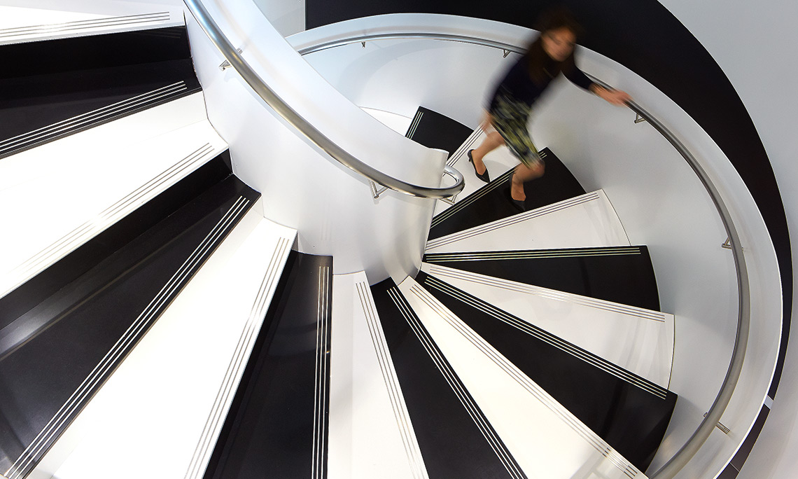
Nabarro brand visual style refresh – 125 London Wall office graphics.

Nabarro brand visual style refresh – Firm credentials snap shot movie.
Nabarro brand visual style refresh – event invites email graphics.
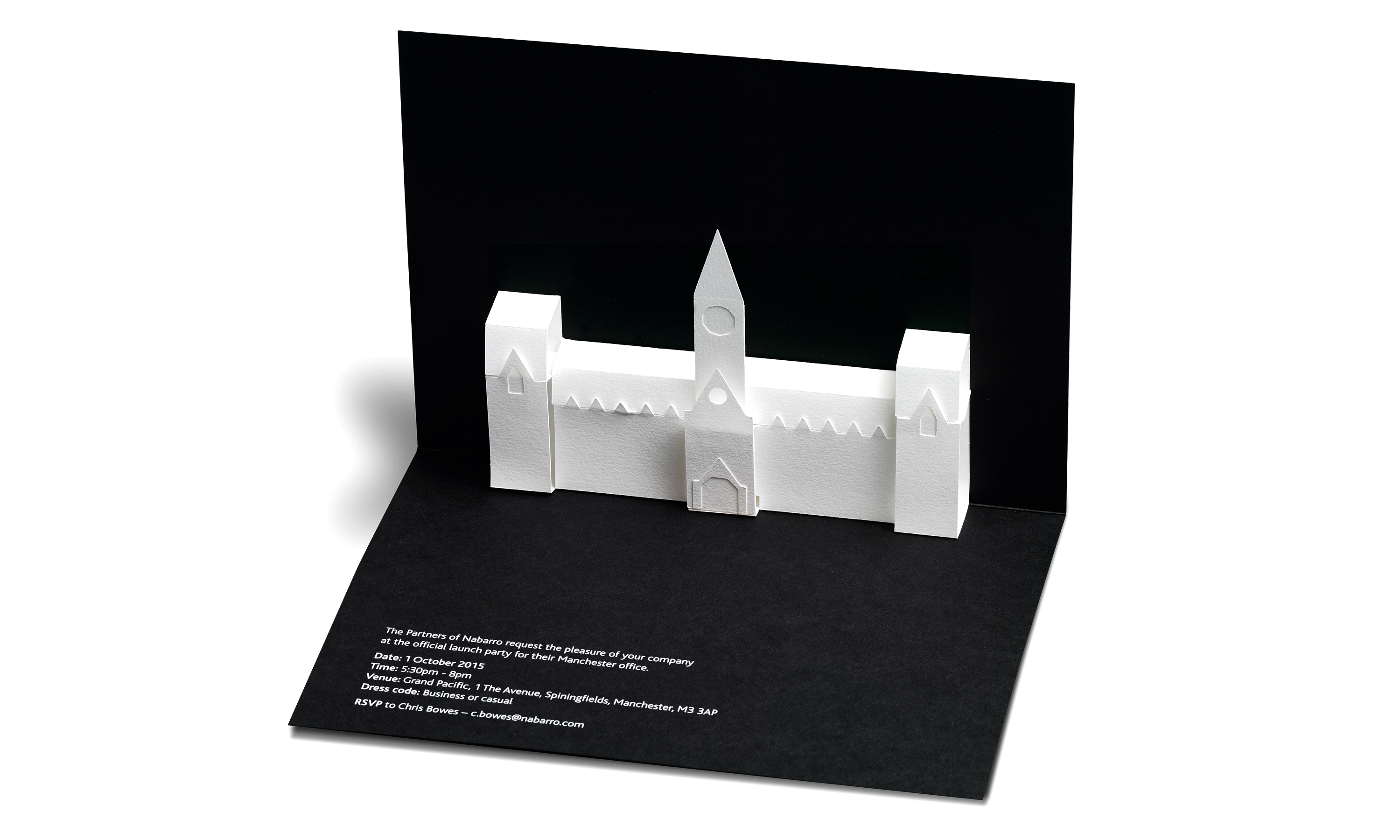
Nabarro brand visual style refresh – A5 pop-up event invites.
Nabarro brand visual style refresh – Nabarro.com art direction & website graphics.
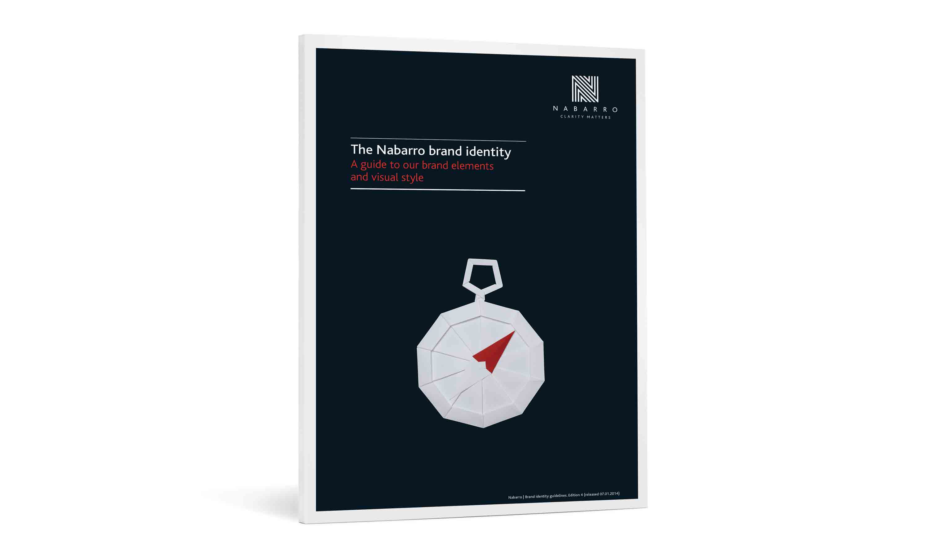
Nabarro brand visual style refresh – guidelines.
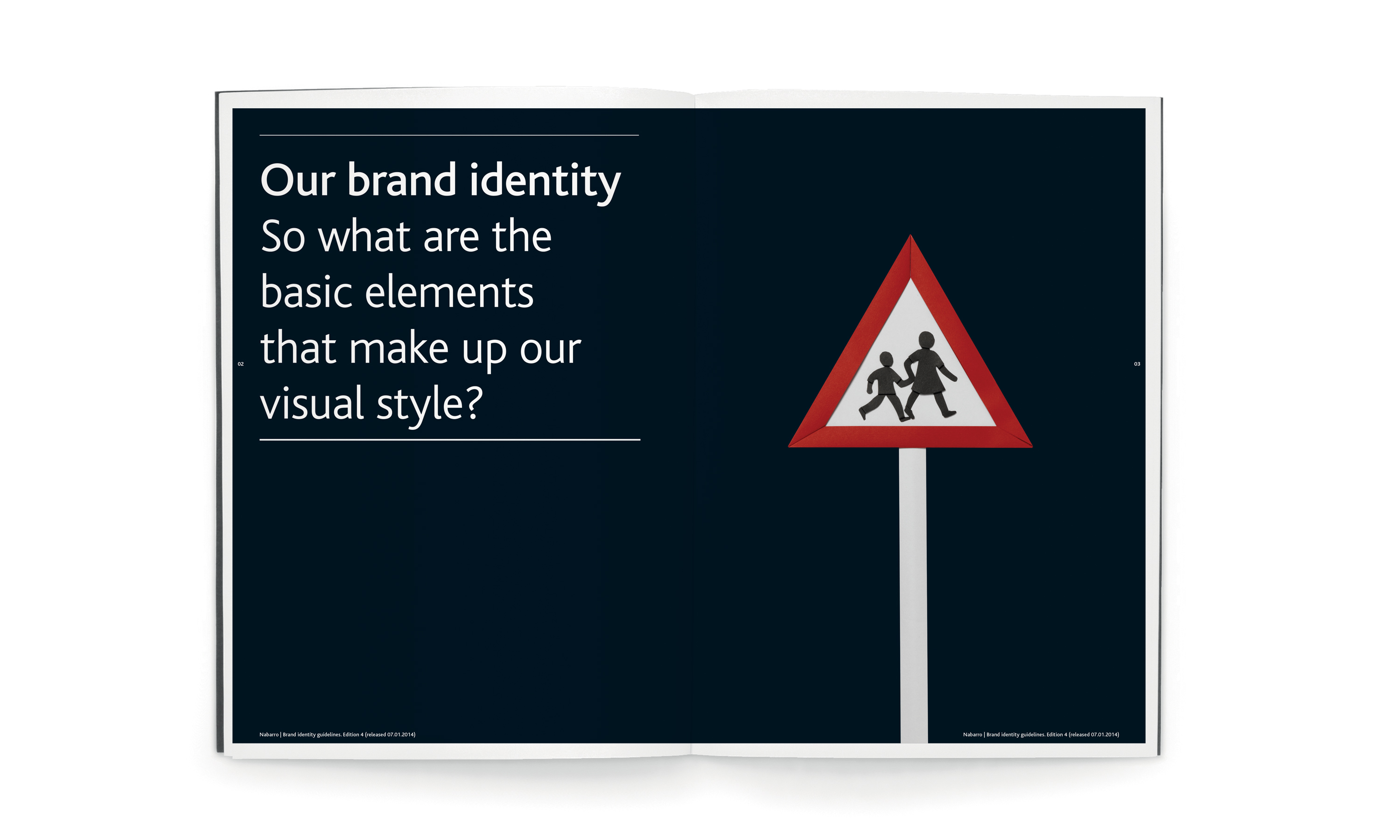
Nabarro brand visual style refresh – guidelines sample spreads.
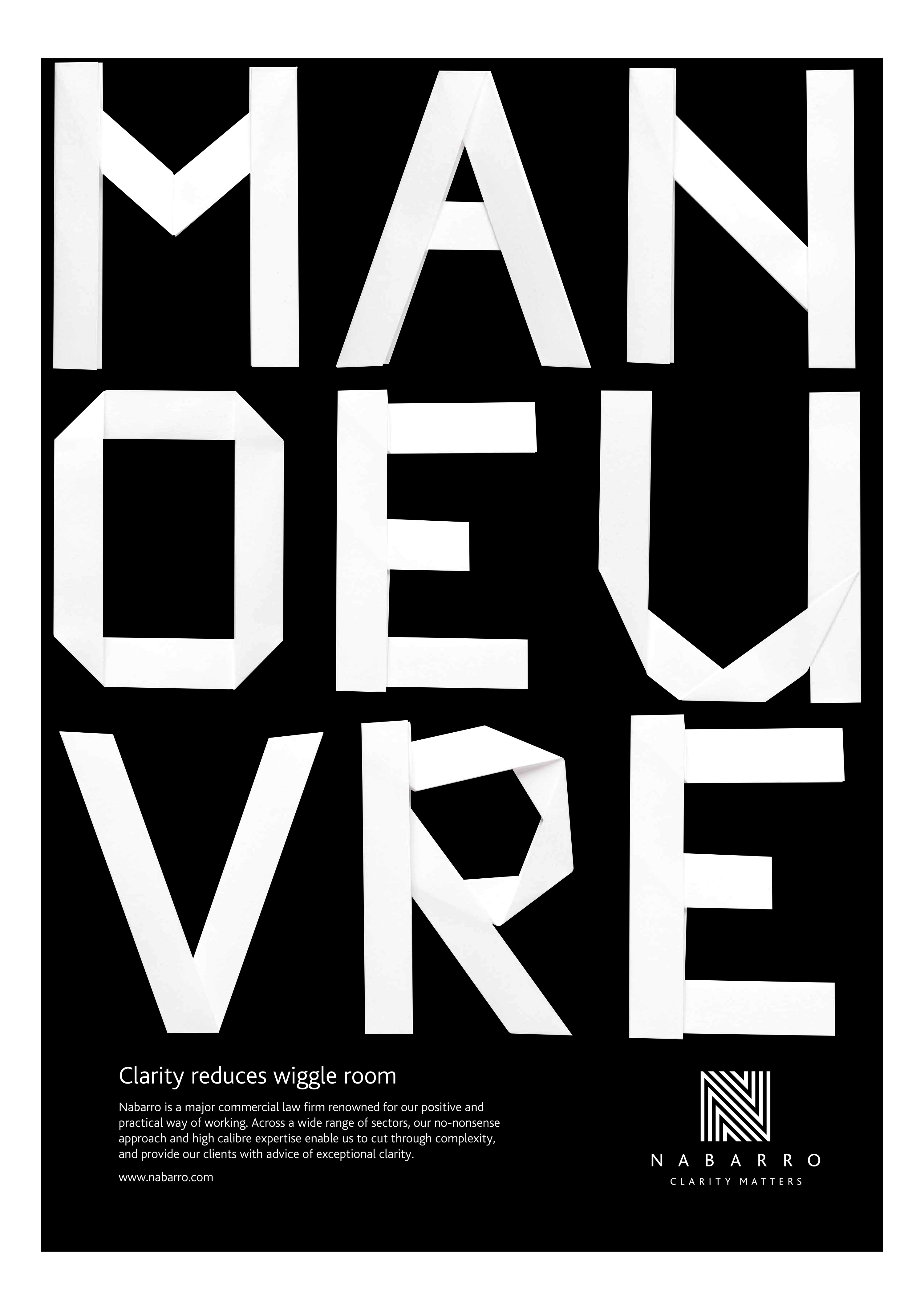
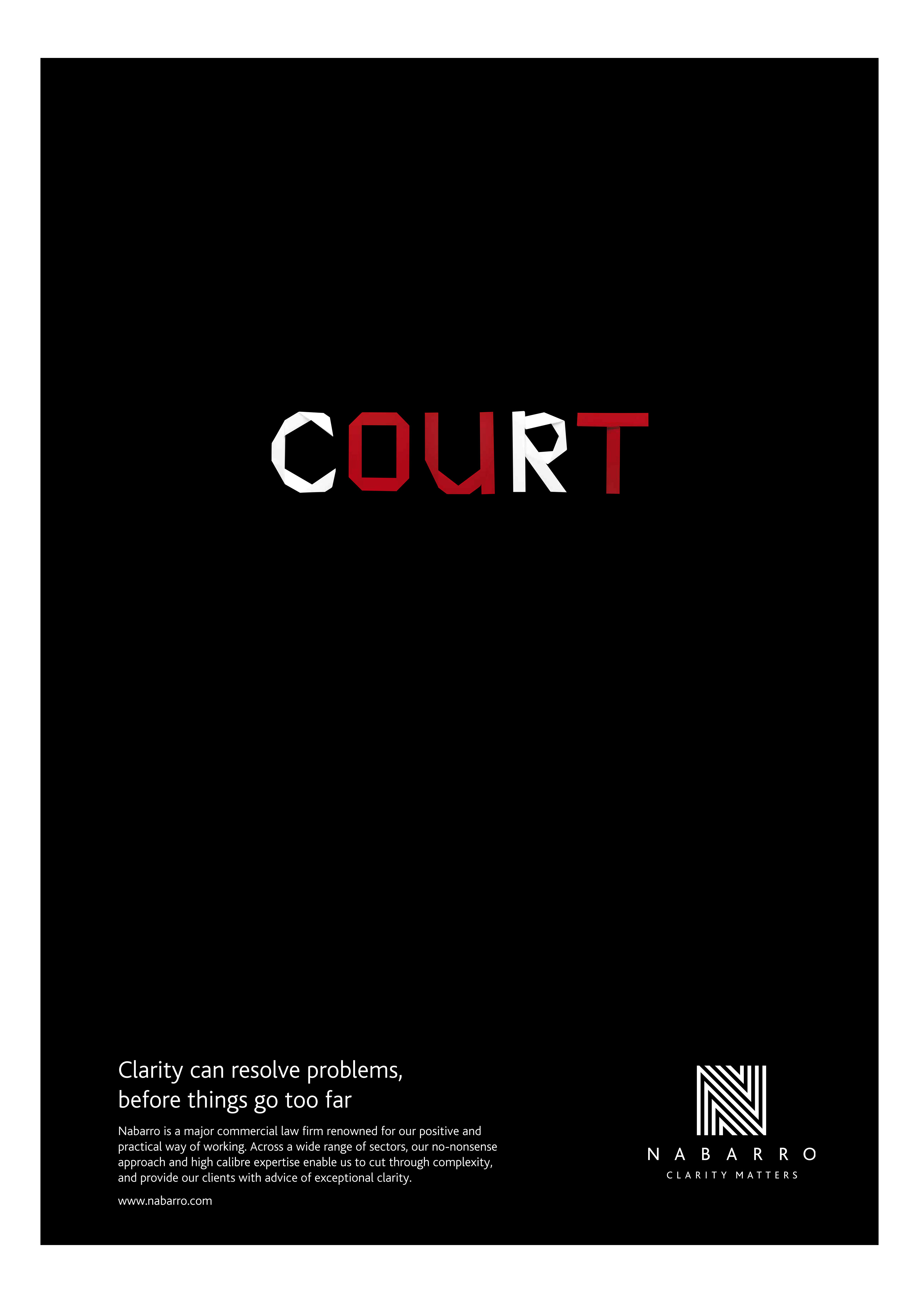
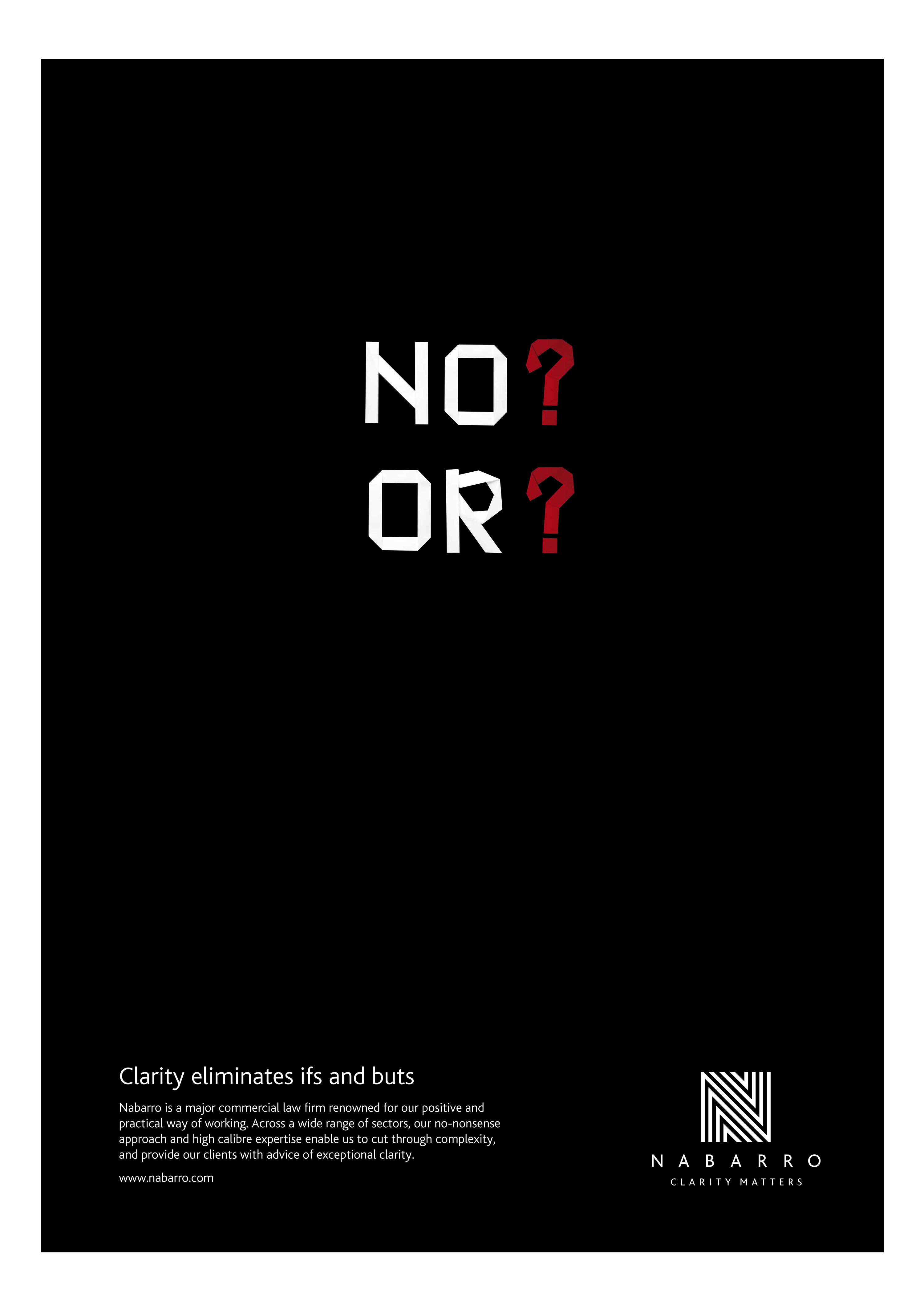
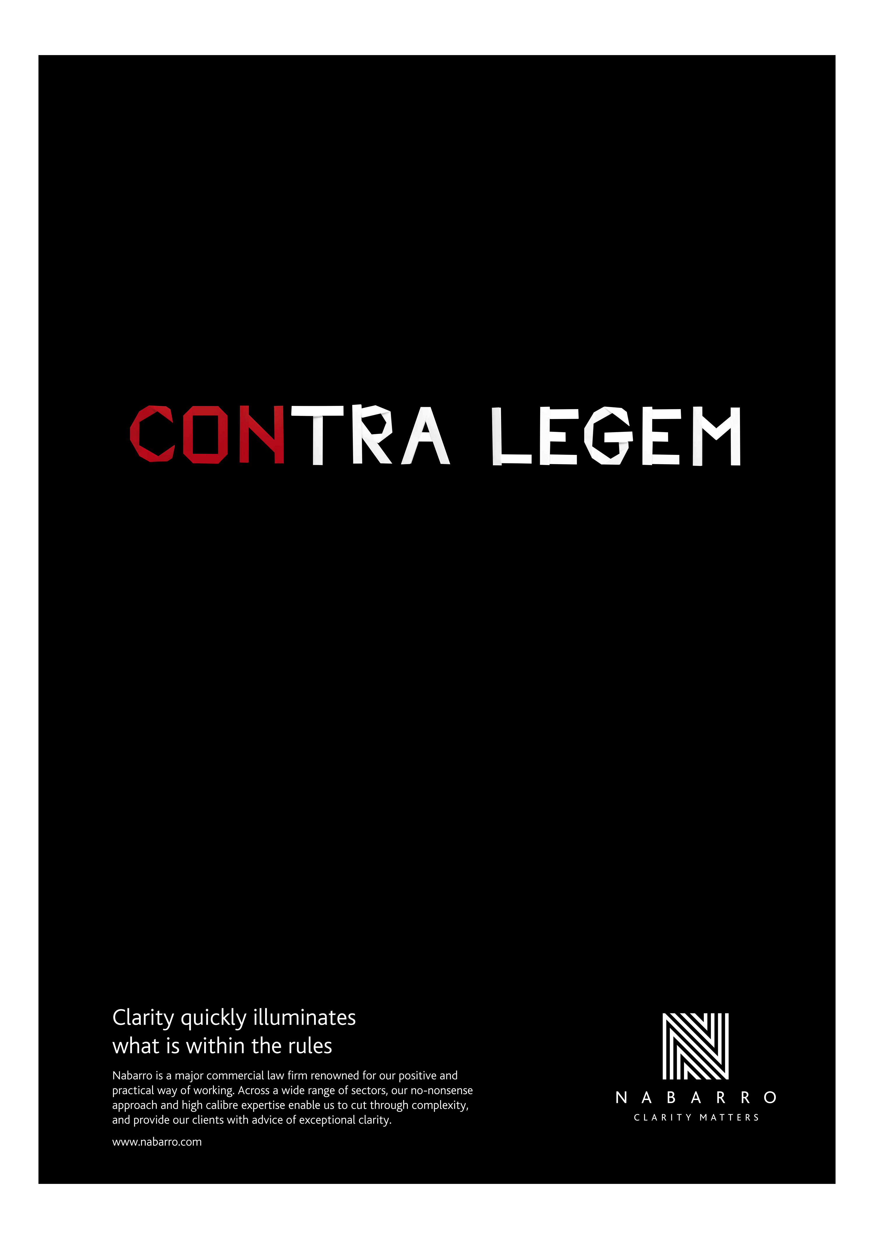
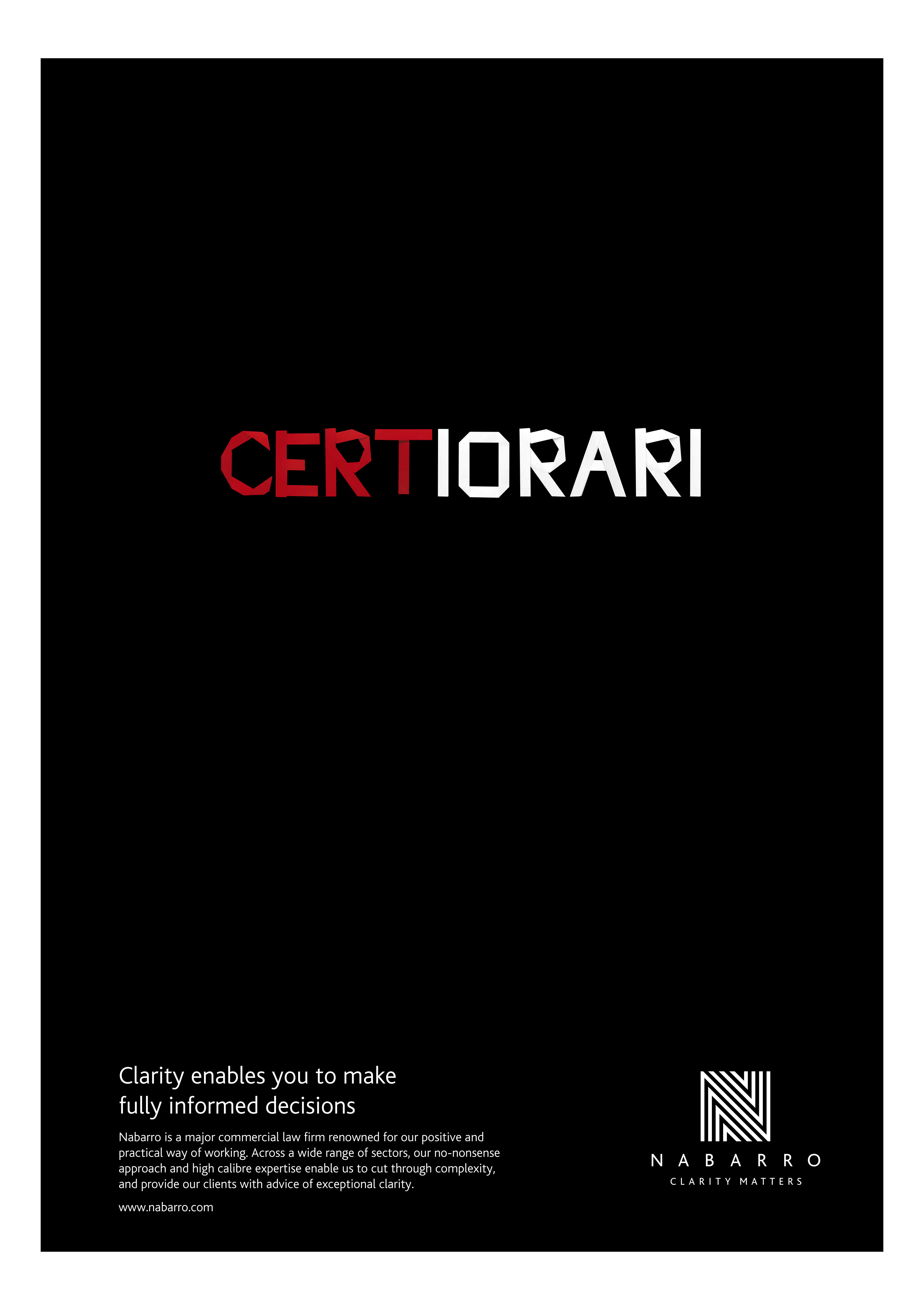
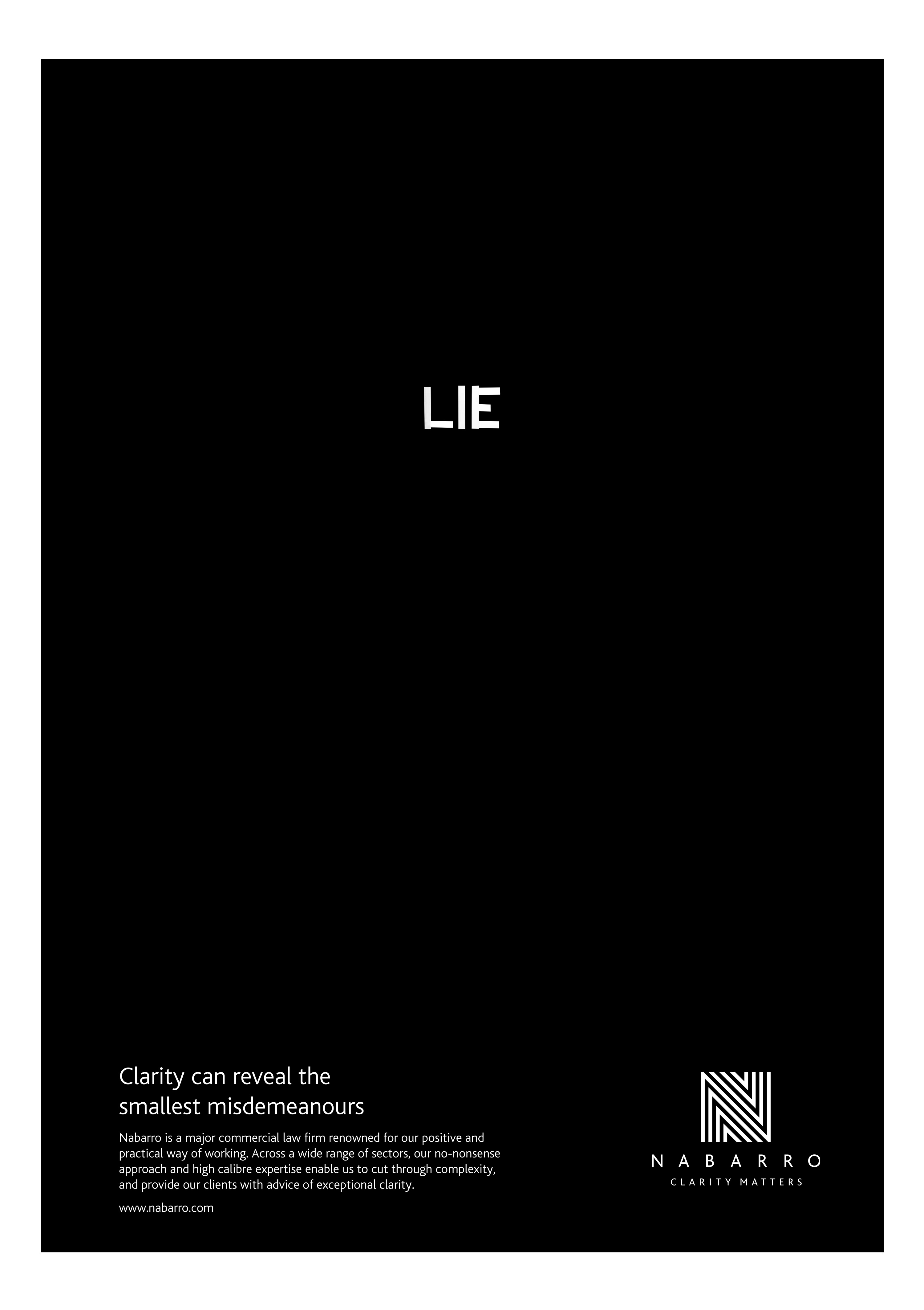
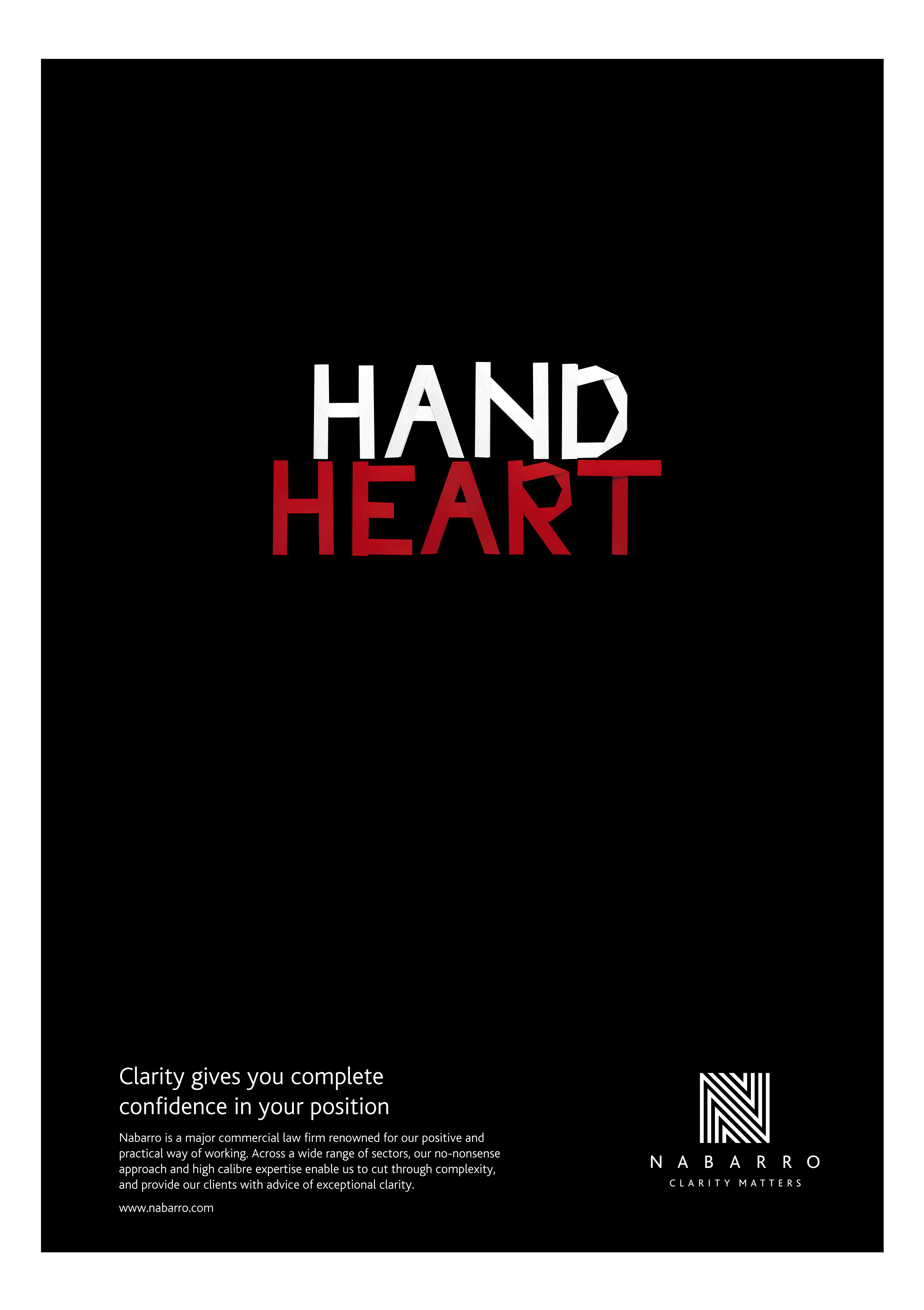
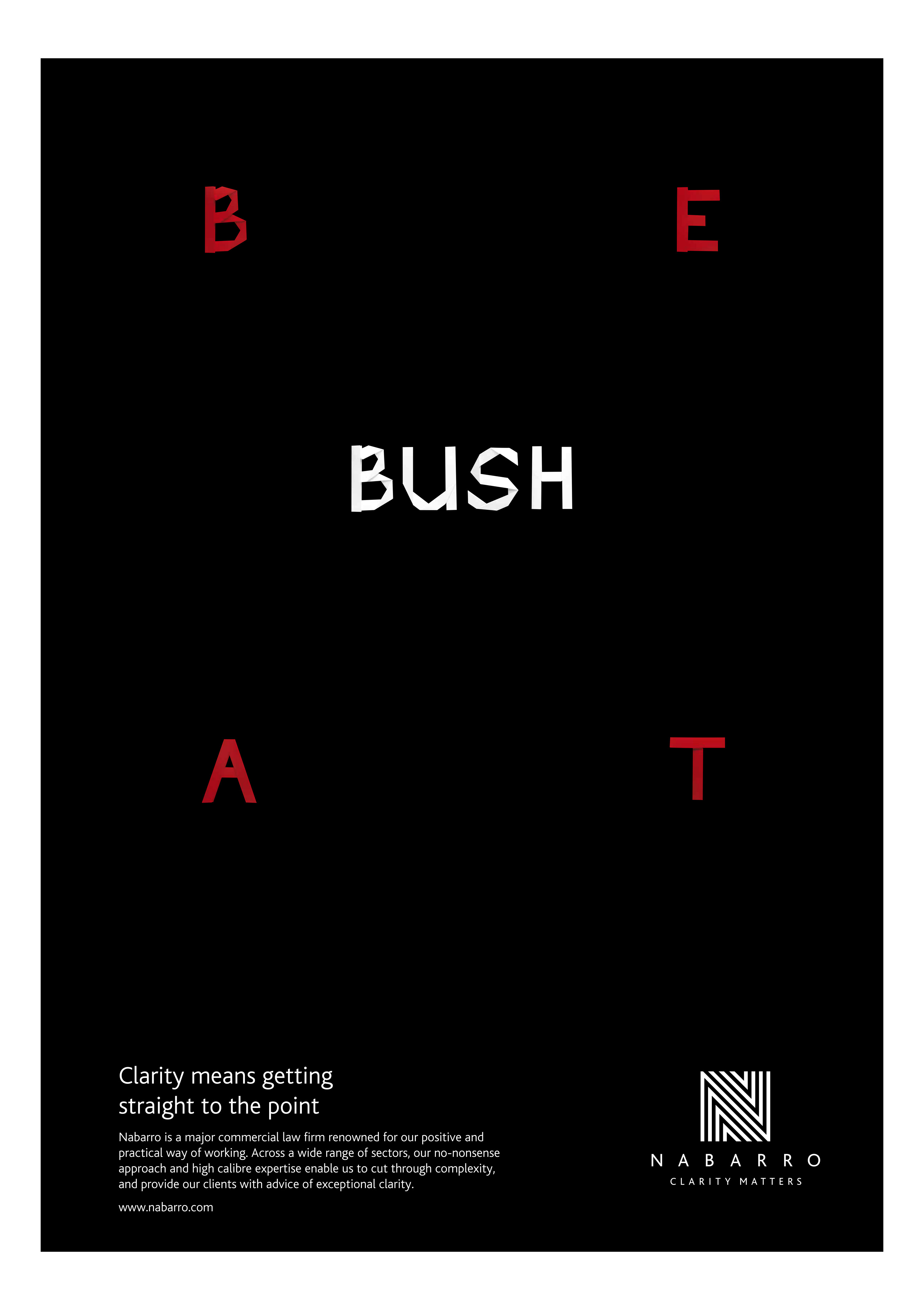
Nabarro 'Clarity Matters' typographic conundrums brand advertising.
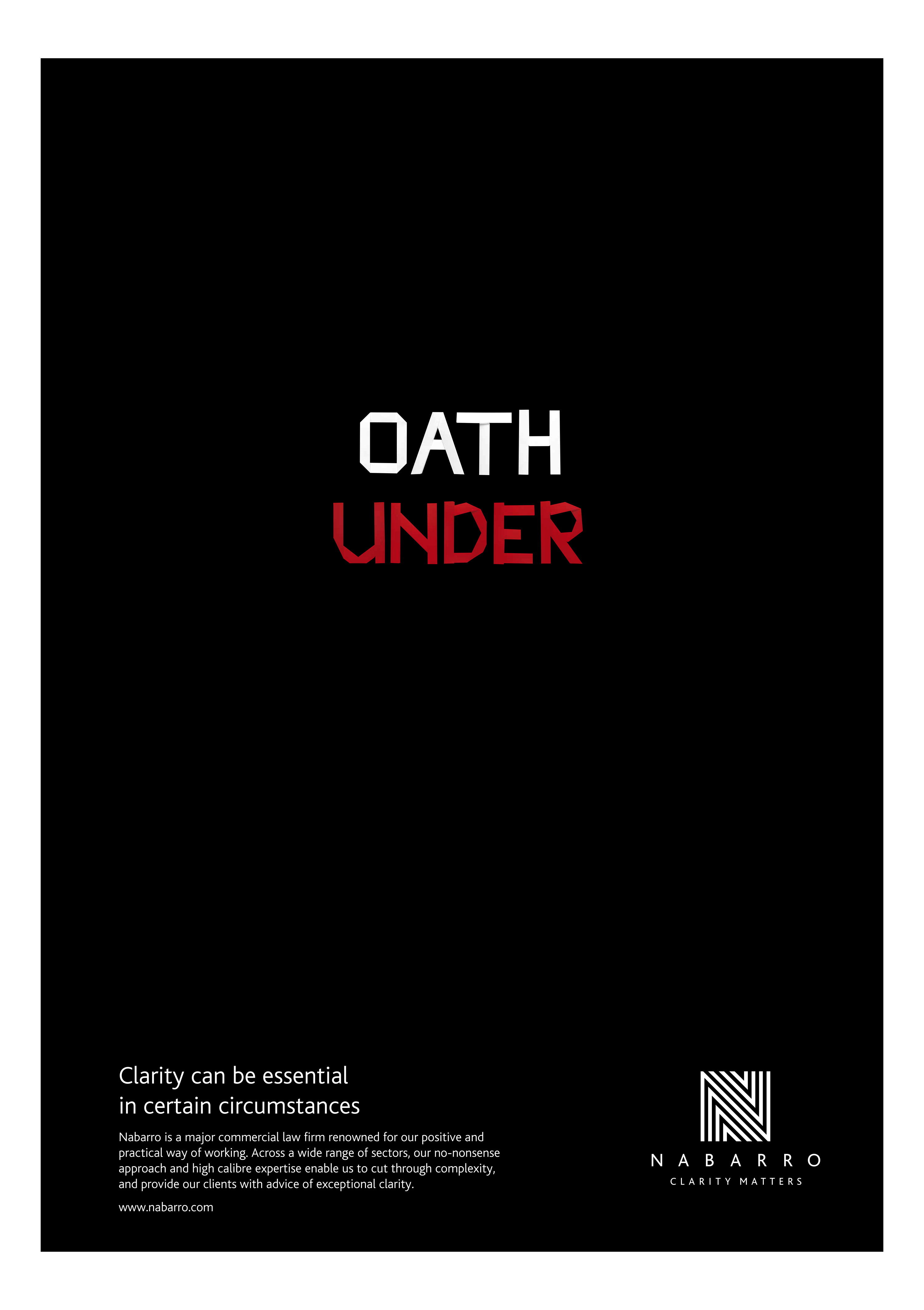
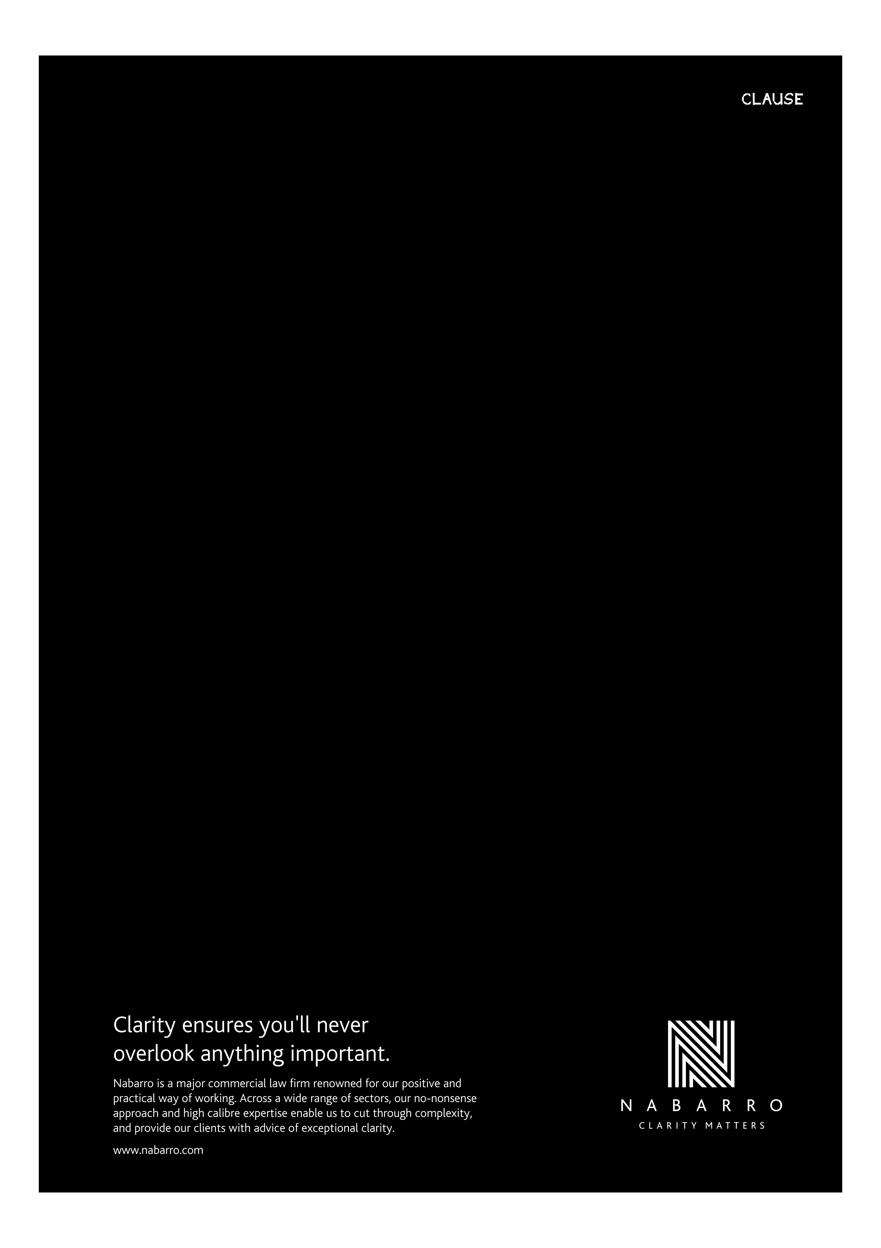
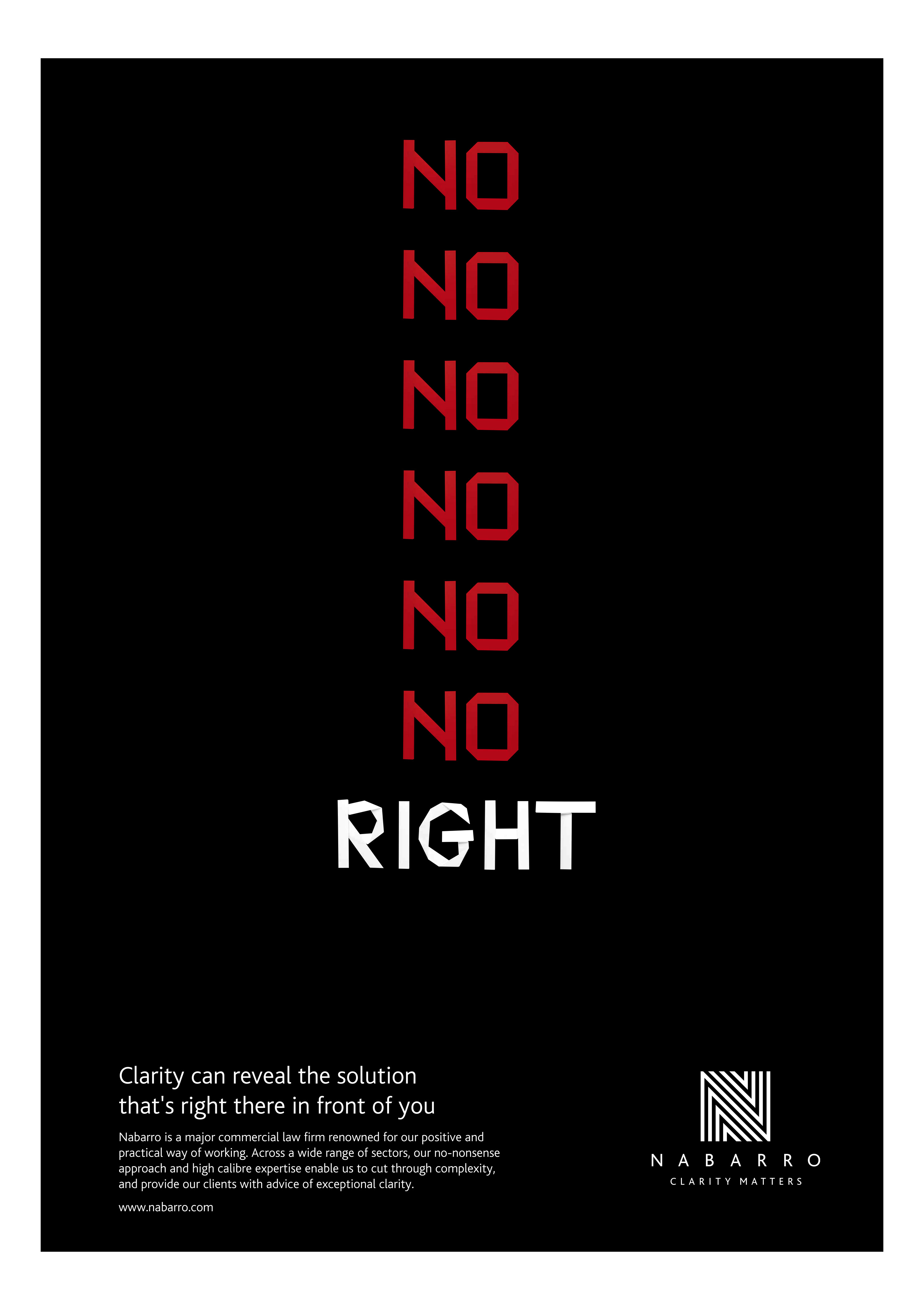
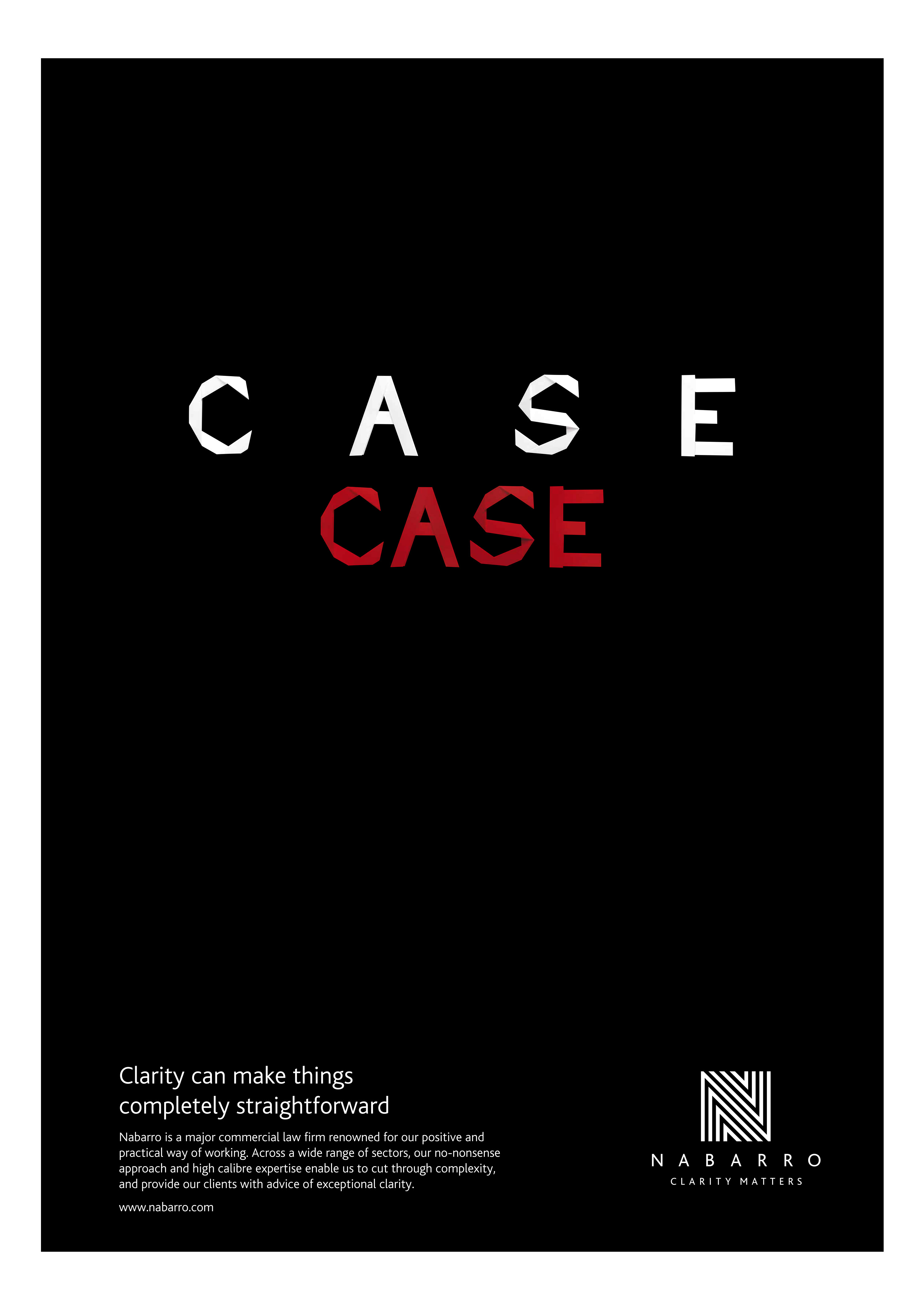


Nabarro 'Clarity Matters' typographic conundrums brand advertising – animations.
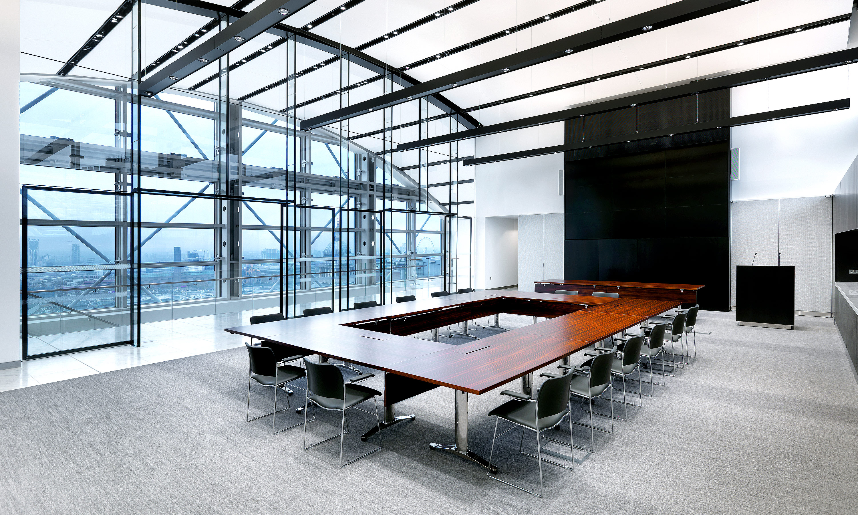
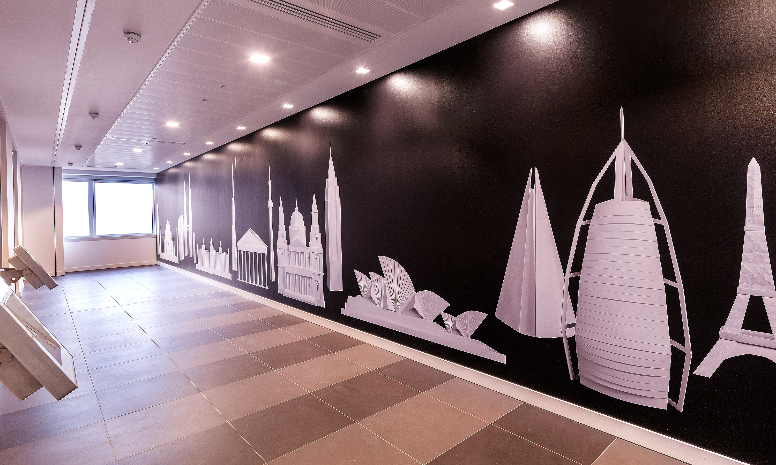
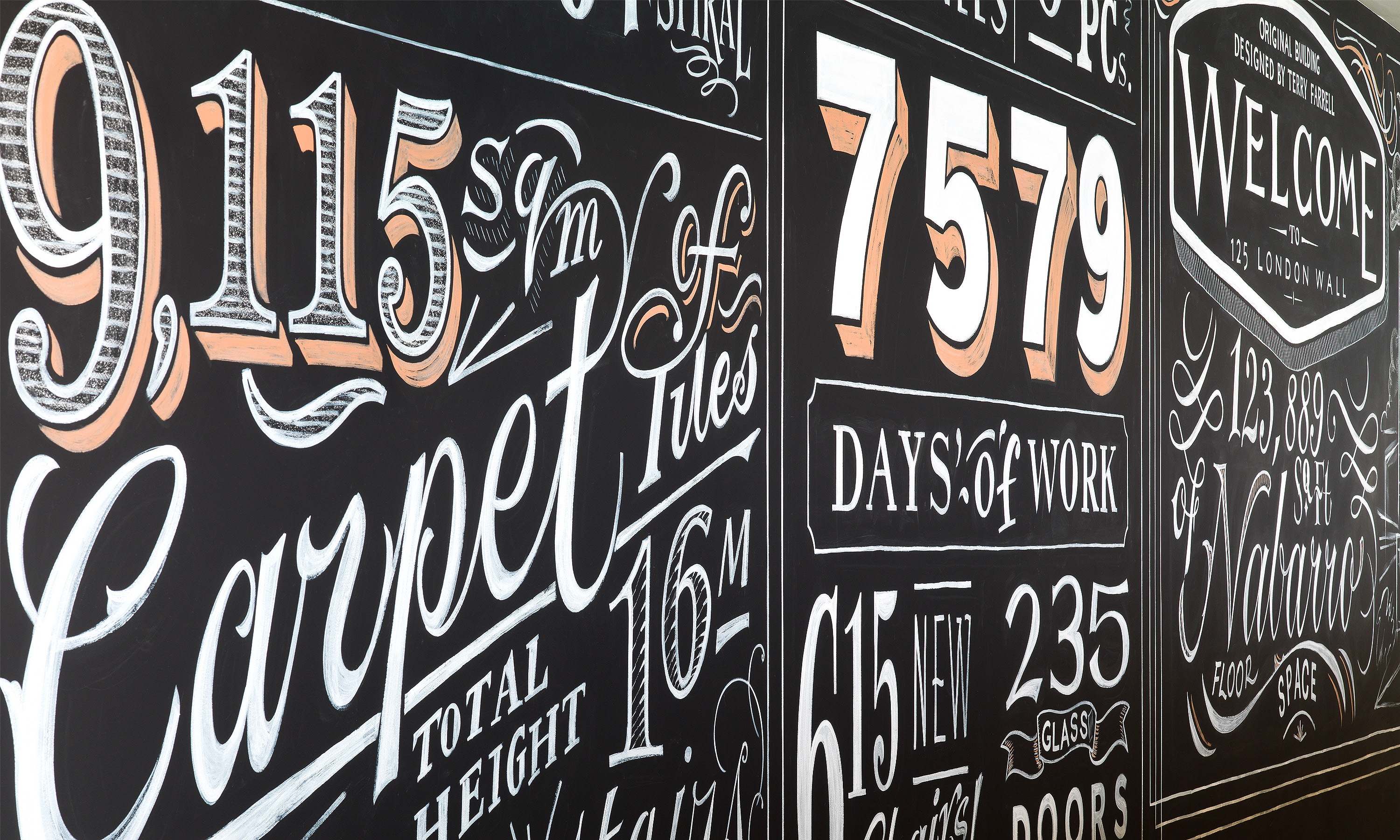
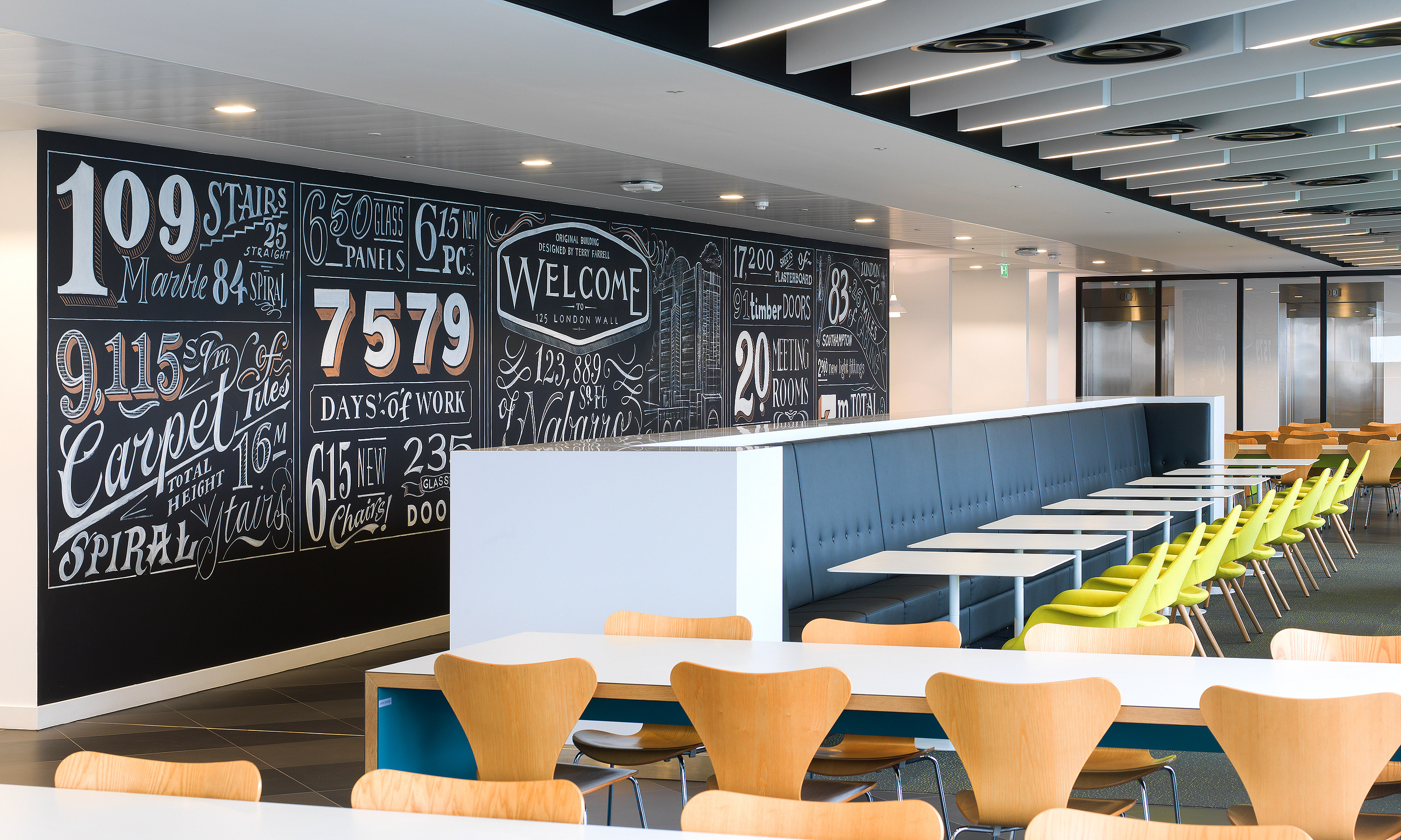
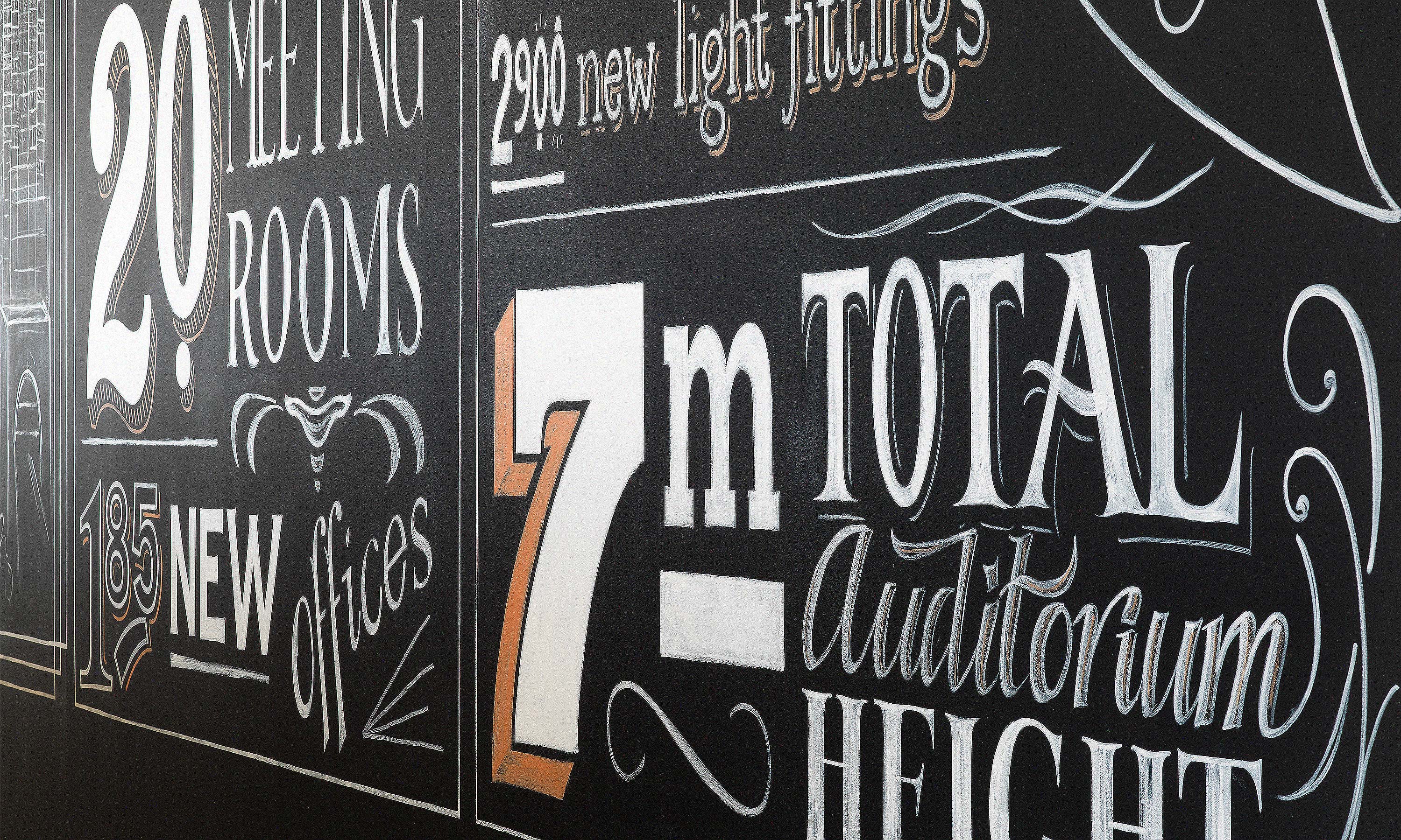
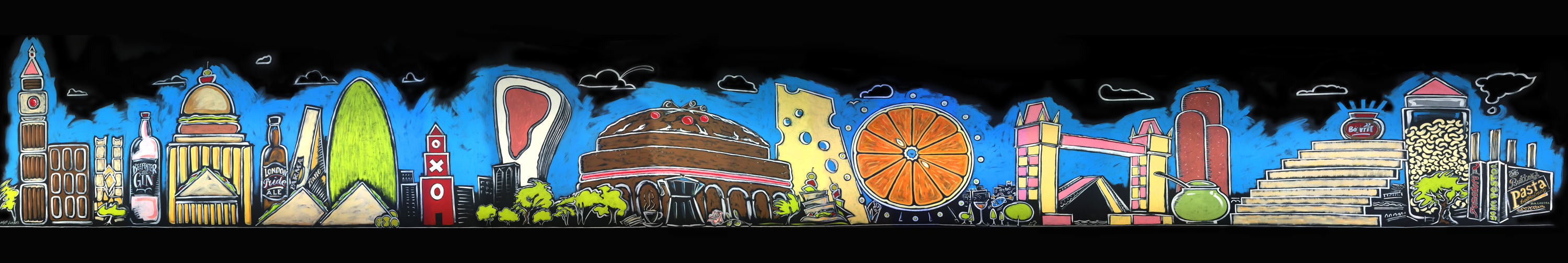
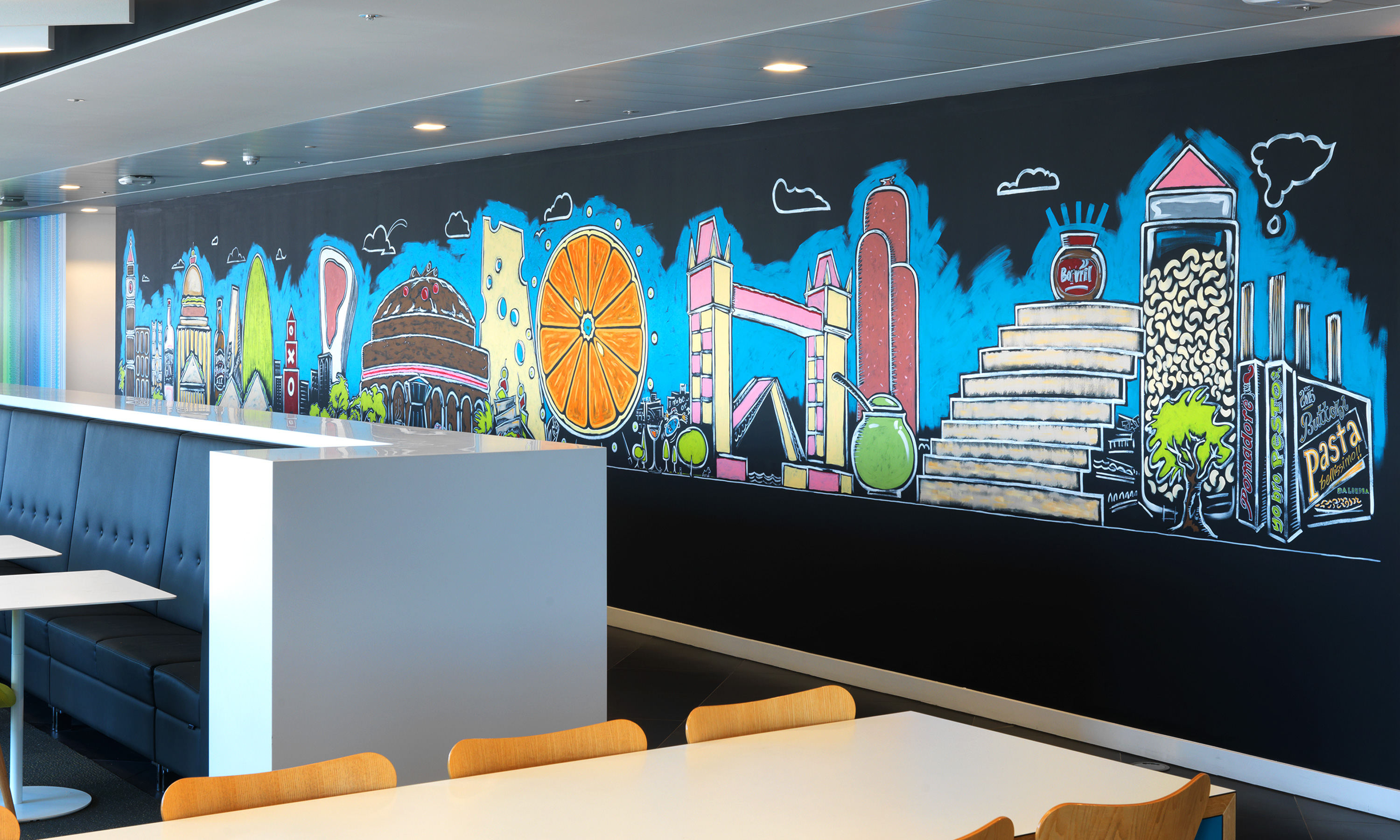
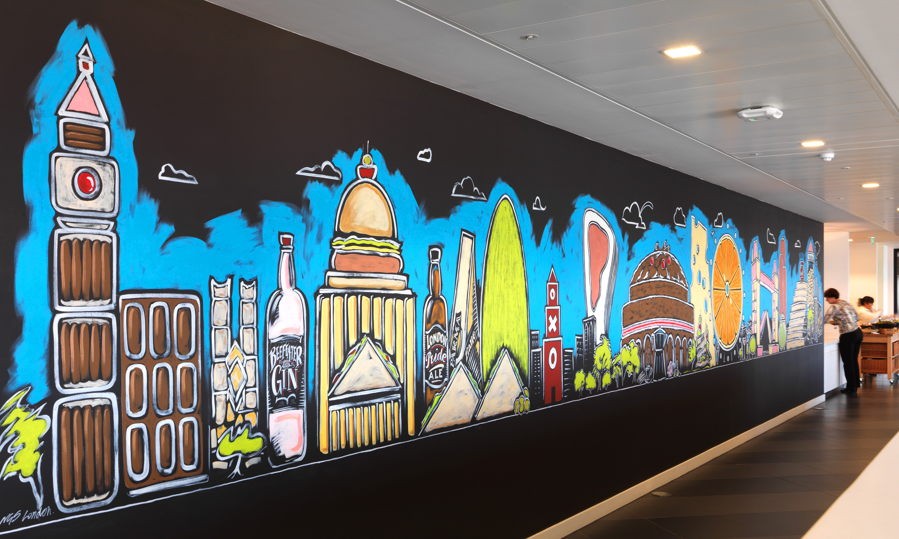
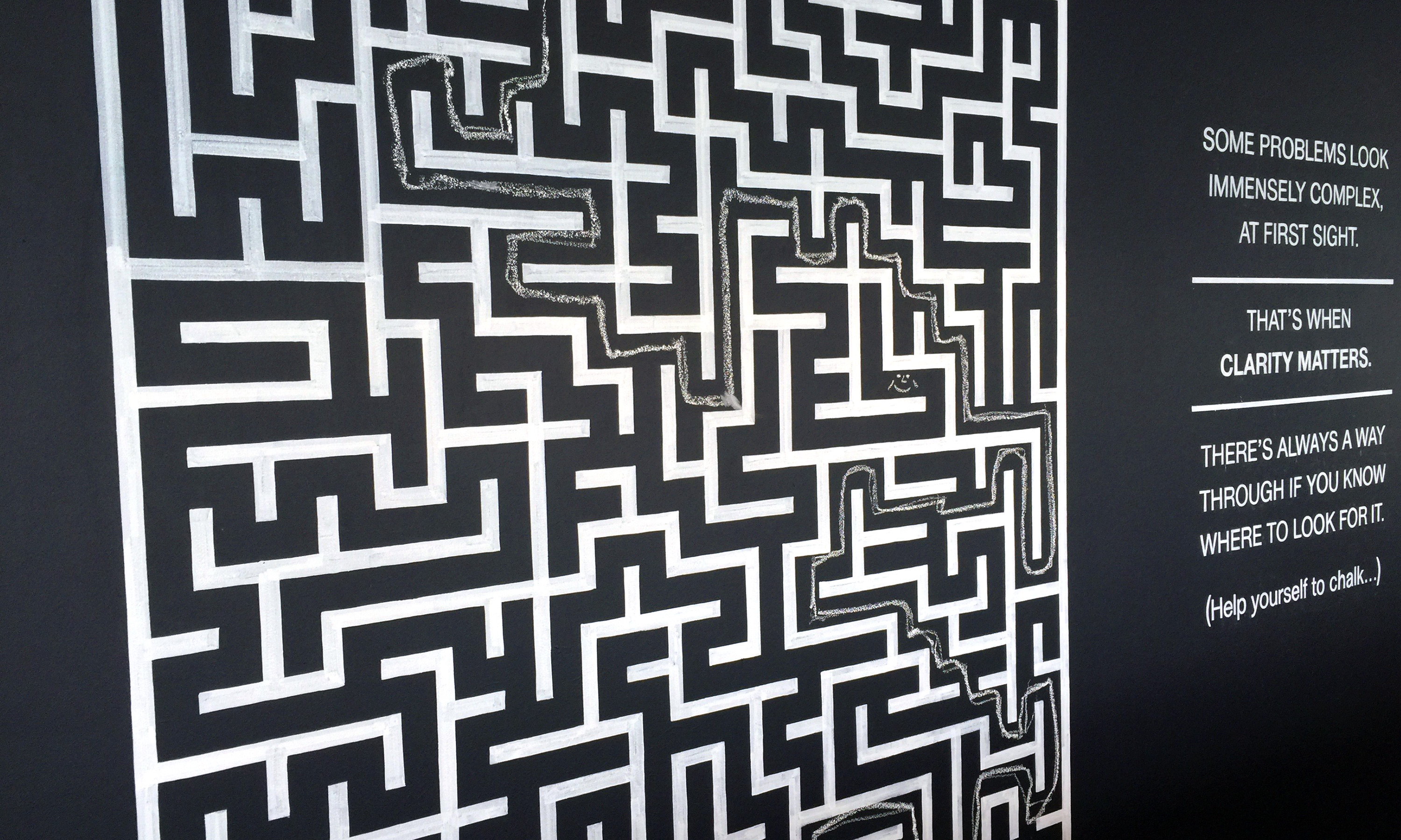
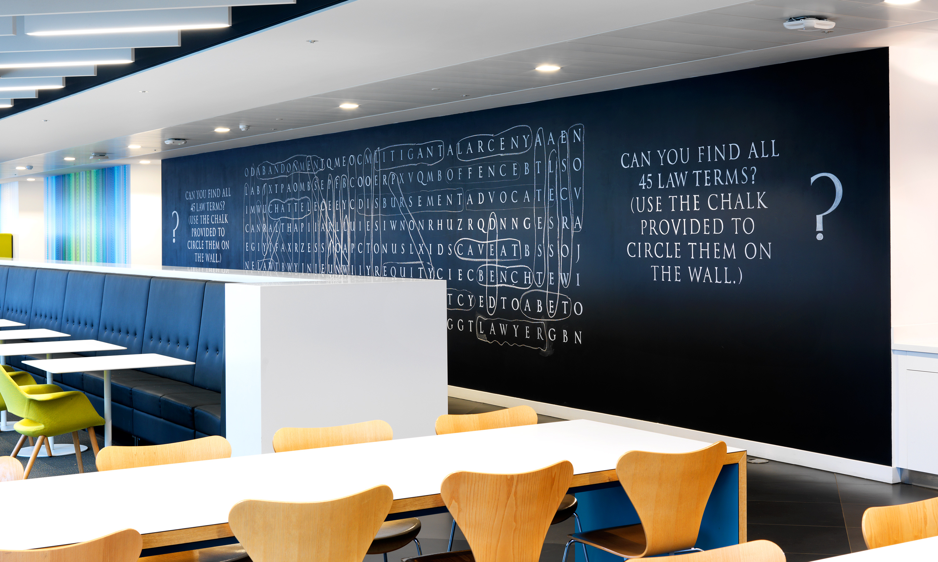
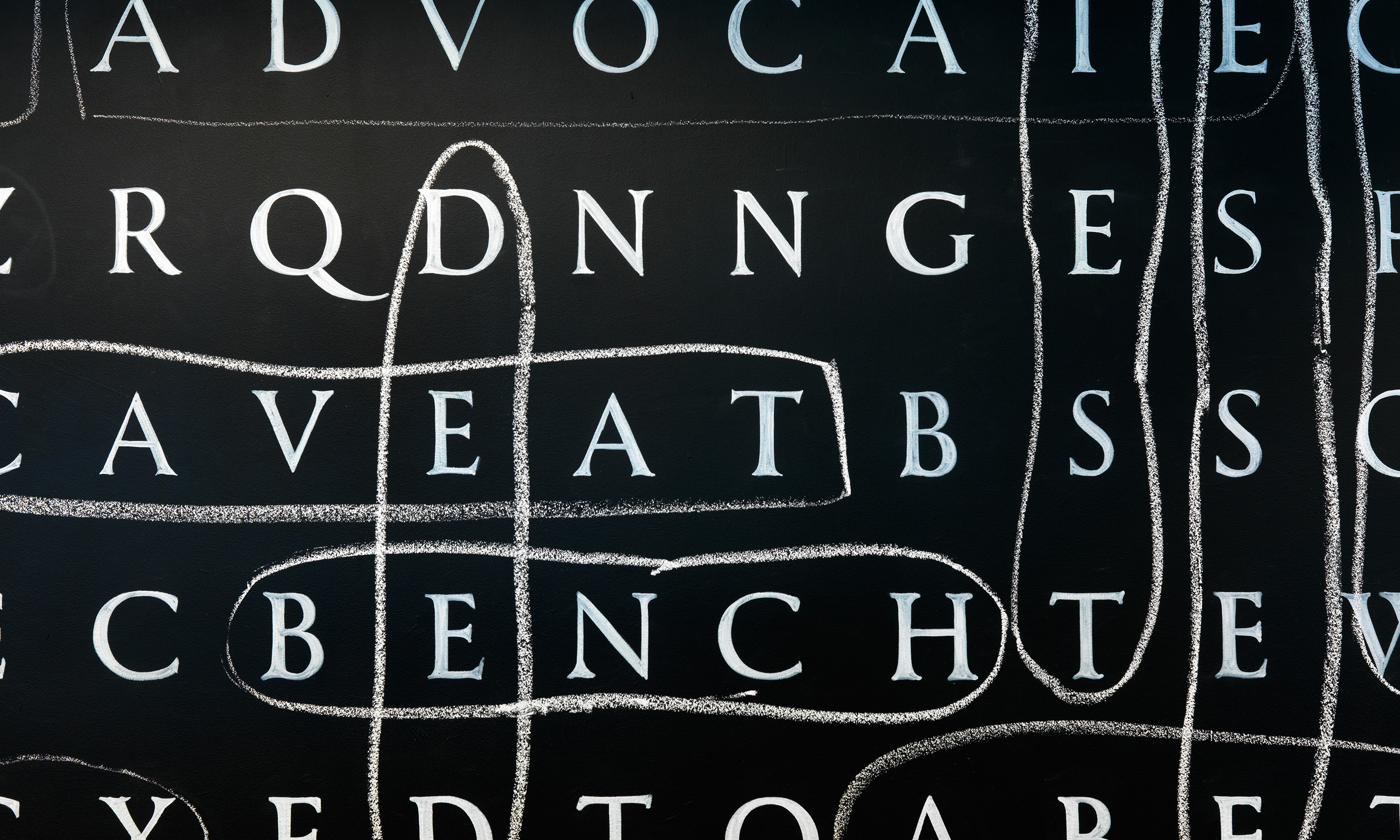
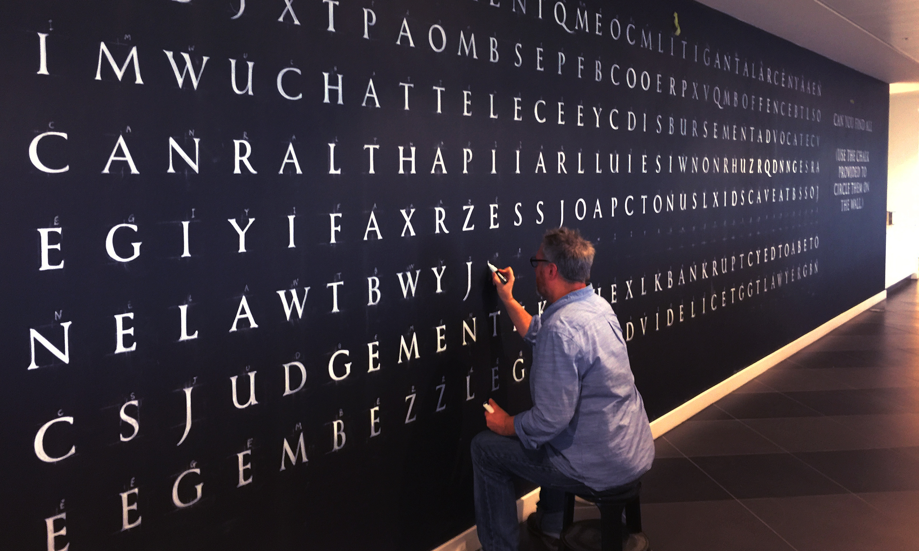
Nabarro 125 London Wall branded interior details.


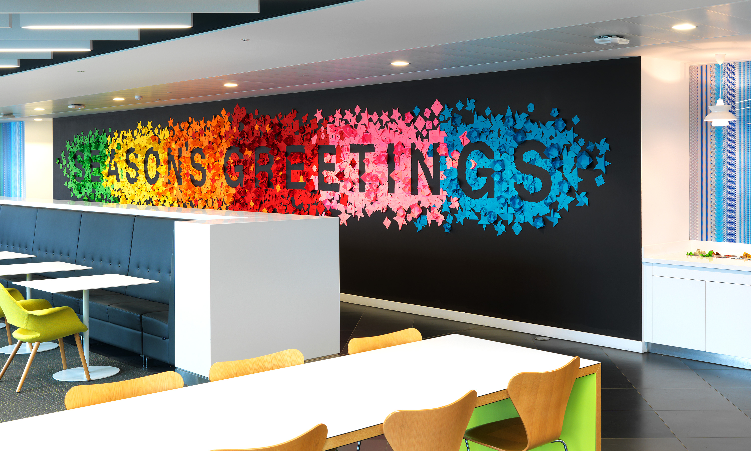
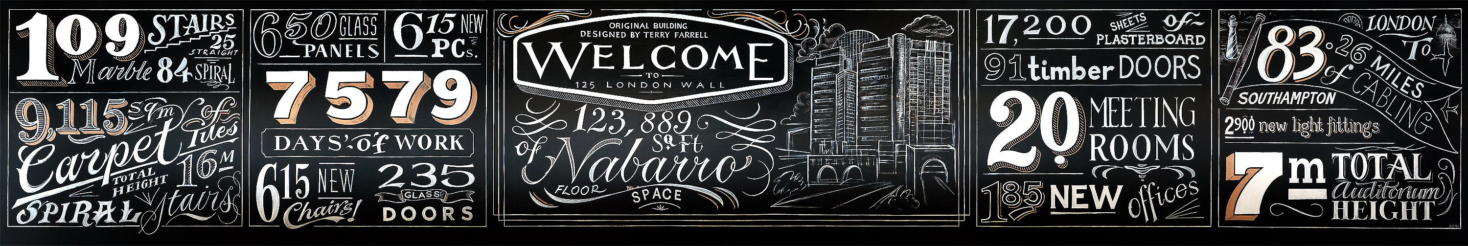
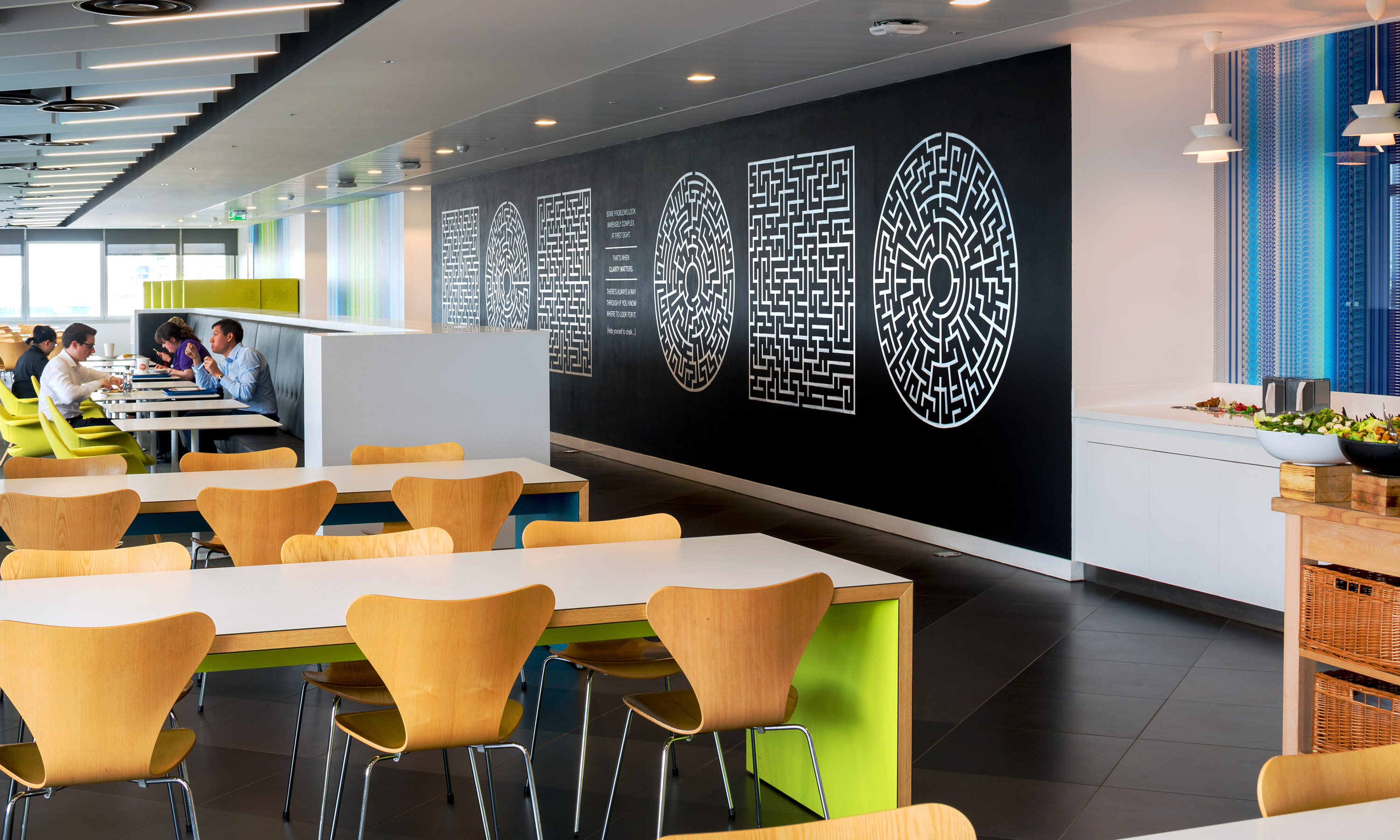
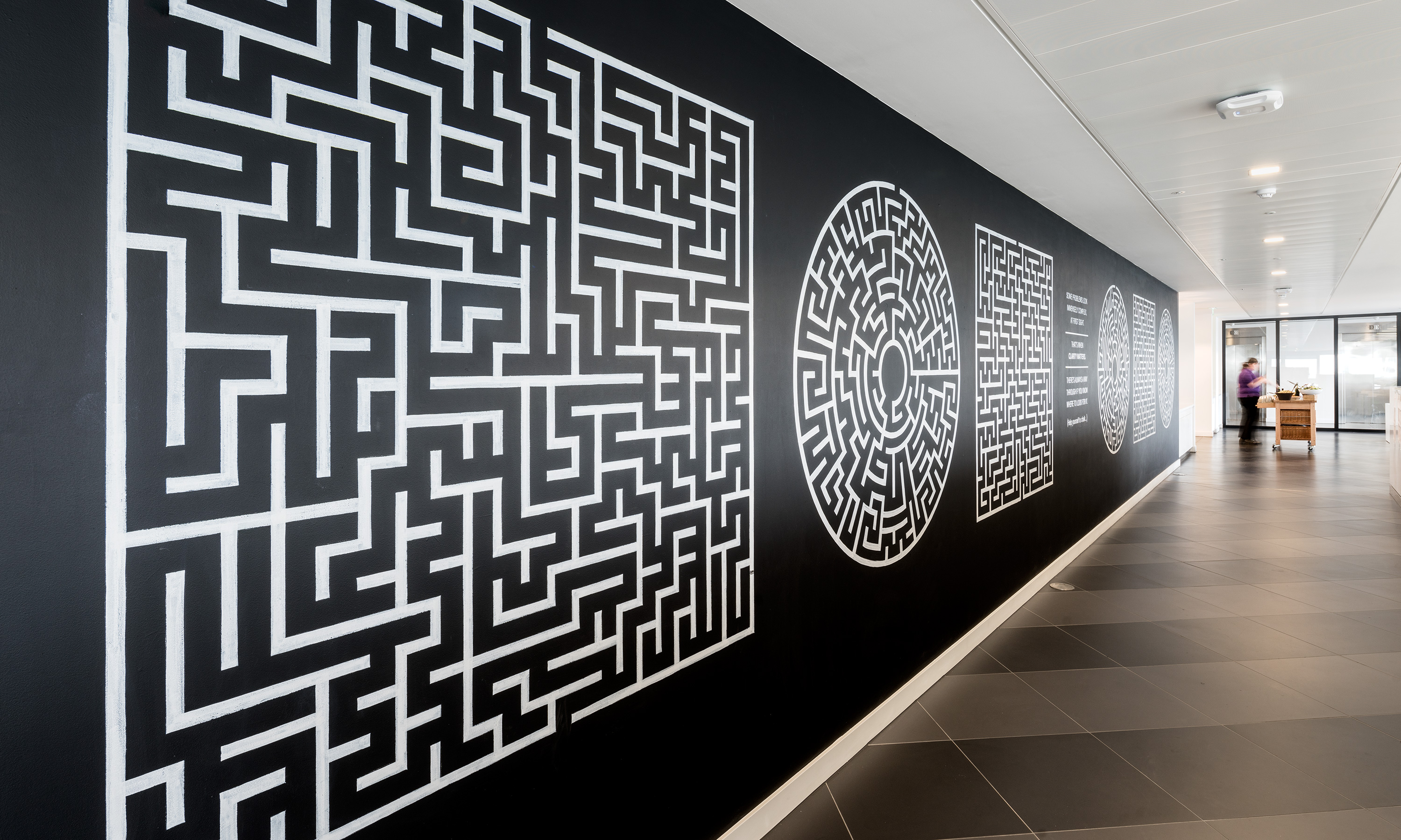
Nabarro LLP. 125 London Wall, canteen wall typographic 'Welcome Wall' time lapse hand rendering highlights.
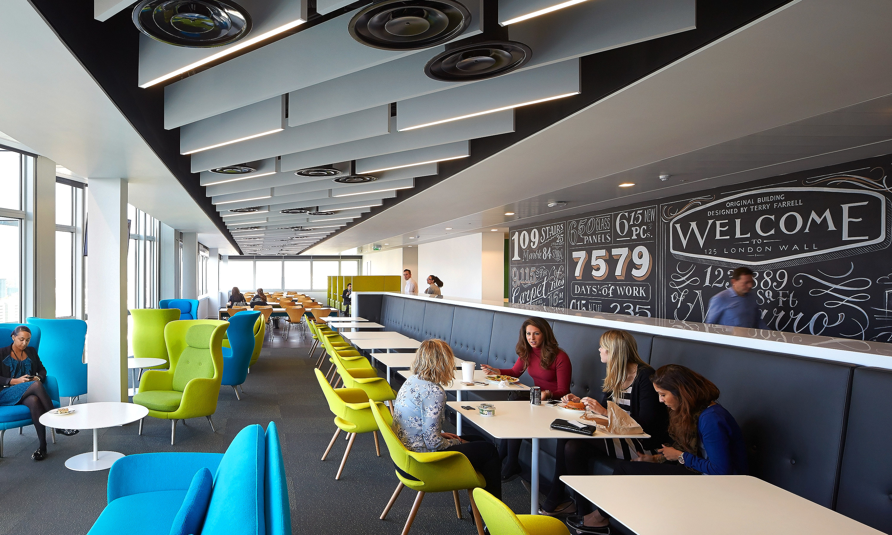
Nabarro 125 London Wall canteen 'wonderwall'.


Nabarro LLP graduate recruitment campaign. Don't just warm a chair. Find the perfect seat.
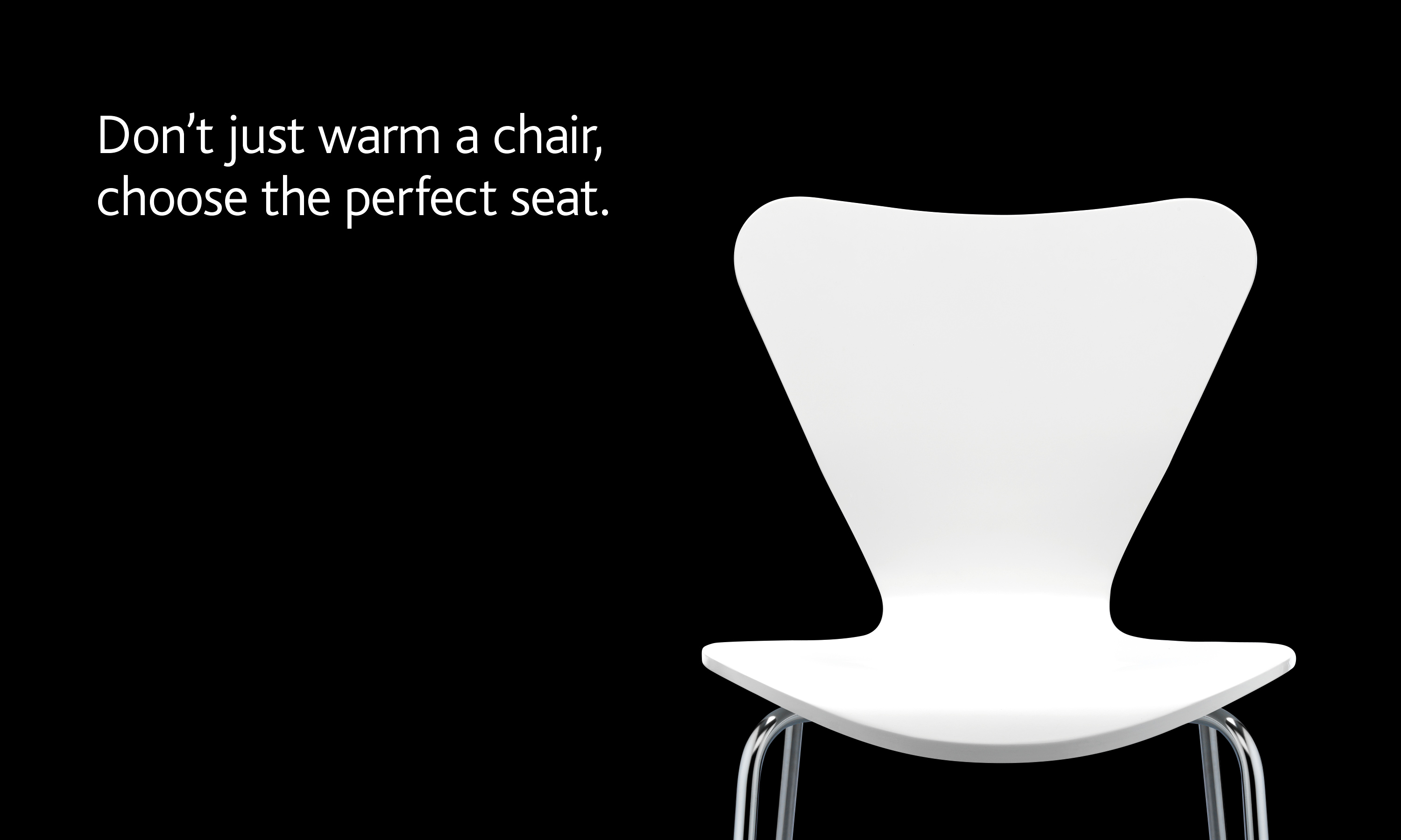
Nabarro LLP graduate recruitment campaign. Don't just warm a chair. Find the perfect seat. – animations.
Nabarro LLP graduate recruitment campaign. Don't just warm a chair. Find the perfect seat. Posters.


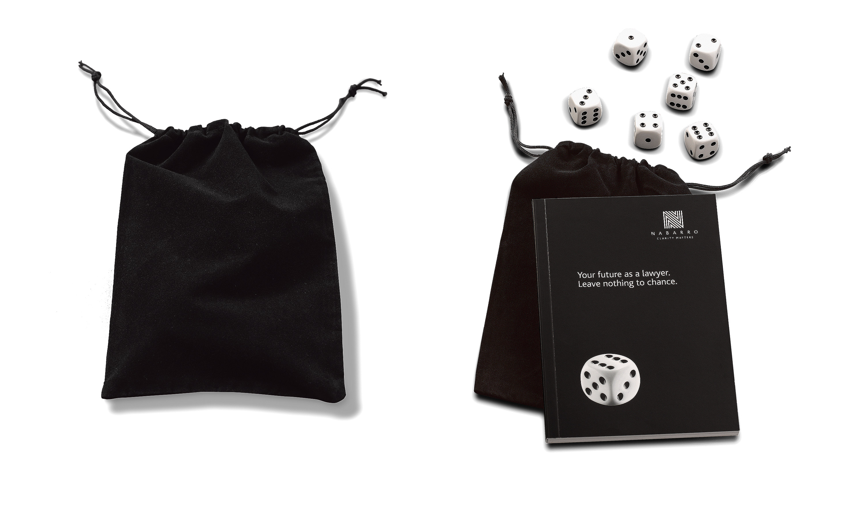
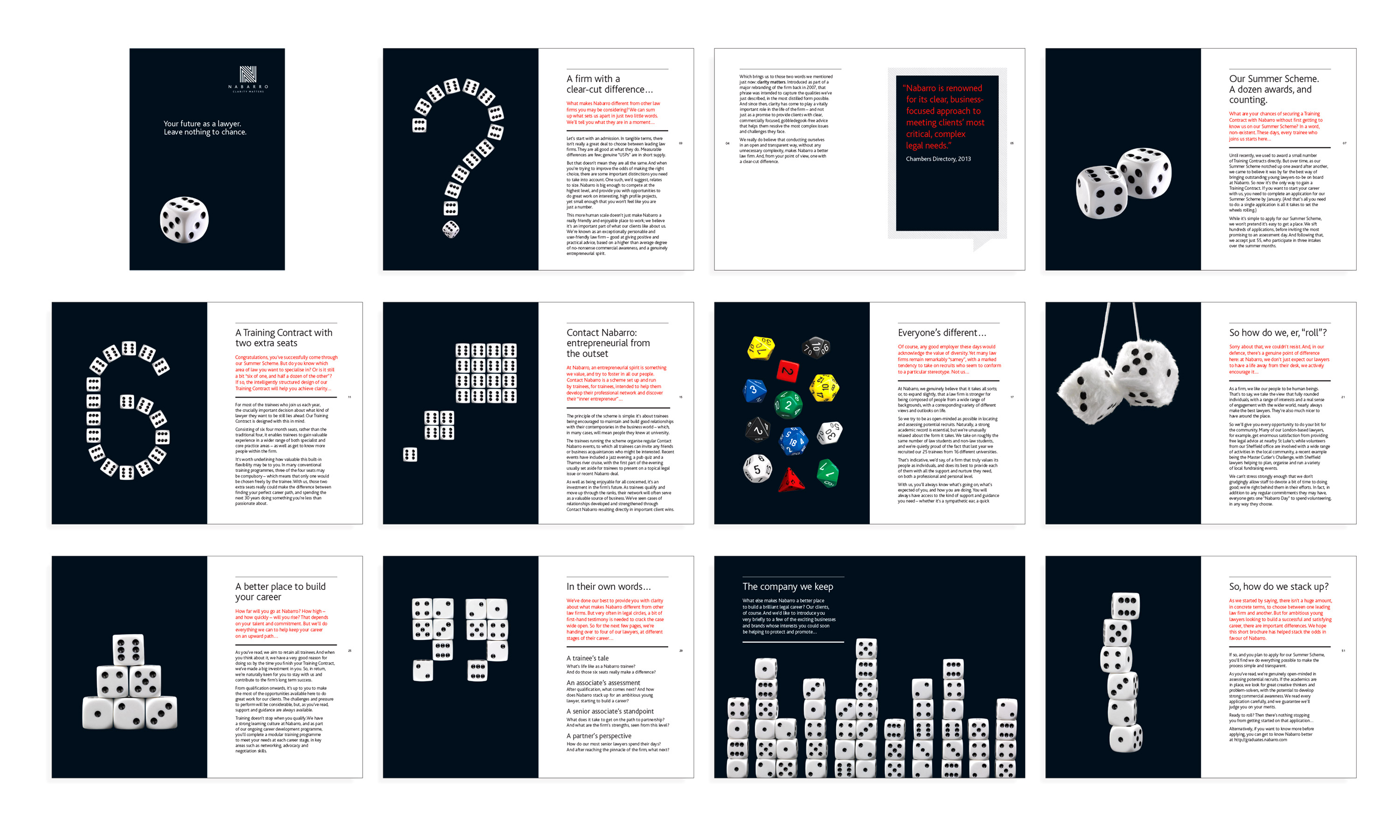
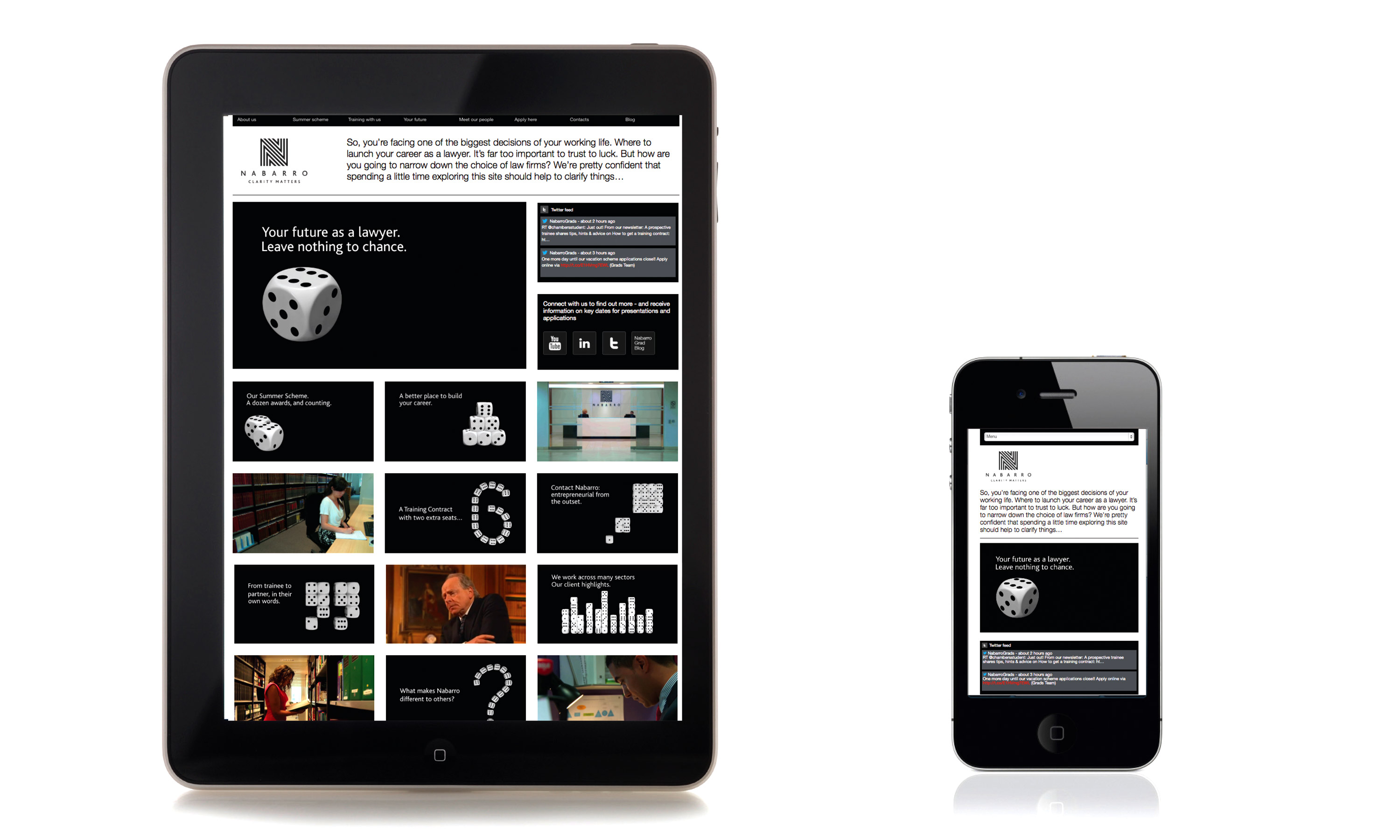
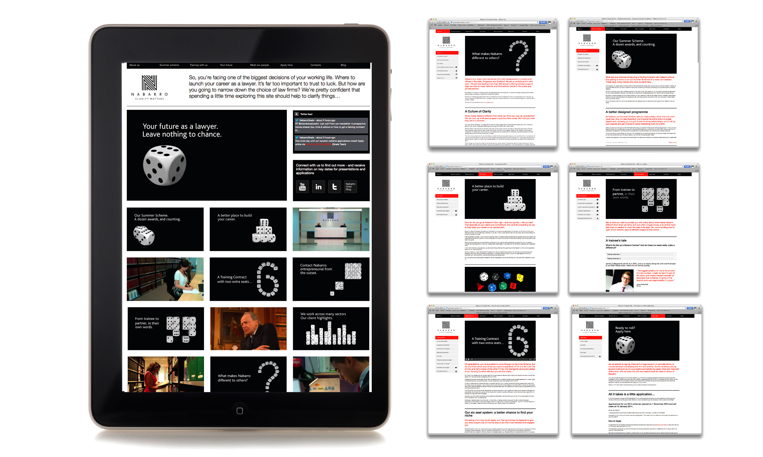
Nabarro LLP graduate recruitment campaign. Your future as a lawyer. Leave nothing to chance.
Nabarro LLP graduate recruitment campaign. Your future as a lawyer. Leave nothing to chance – animations.
Nabarro LLP graduate recruitment campaign. Your future as a lawyer. Leave nothing to chance. Brochure.
Nabarro LLP graduate recruitment campaign. Your future as a lawyer. Leave nothing to chance. Website.
Nabarro LLP graduate recruitment campaign. Your future as a lawyer. Leave nothing to chance. Posters


Nabarro LLP graduate recruitment short films.
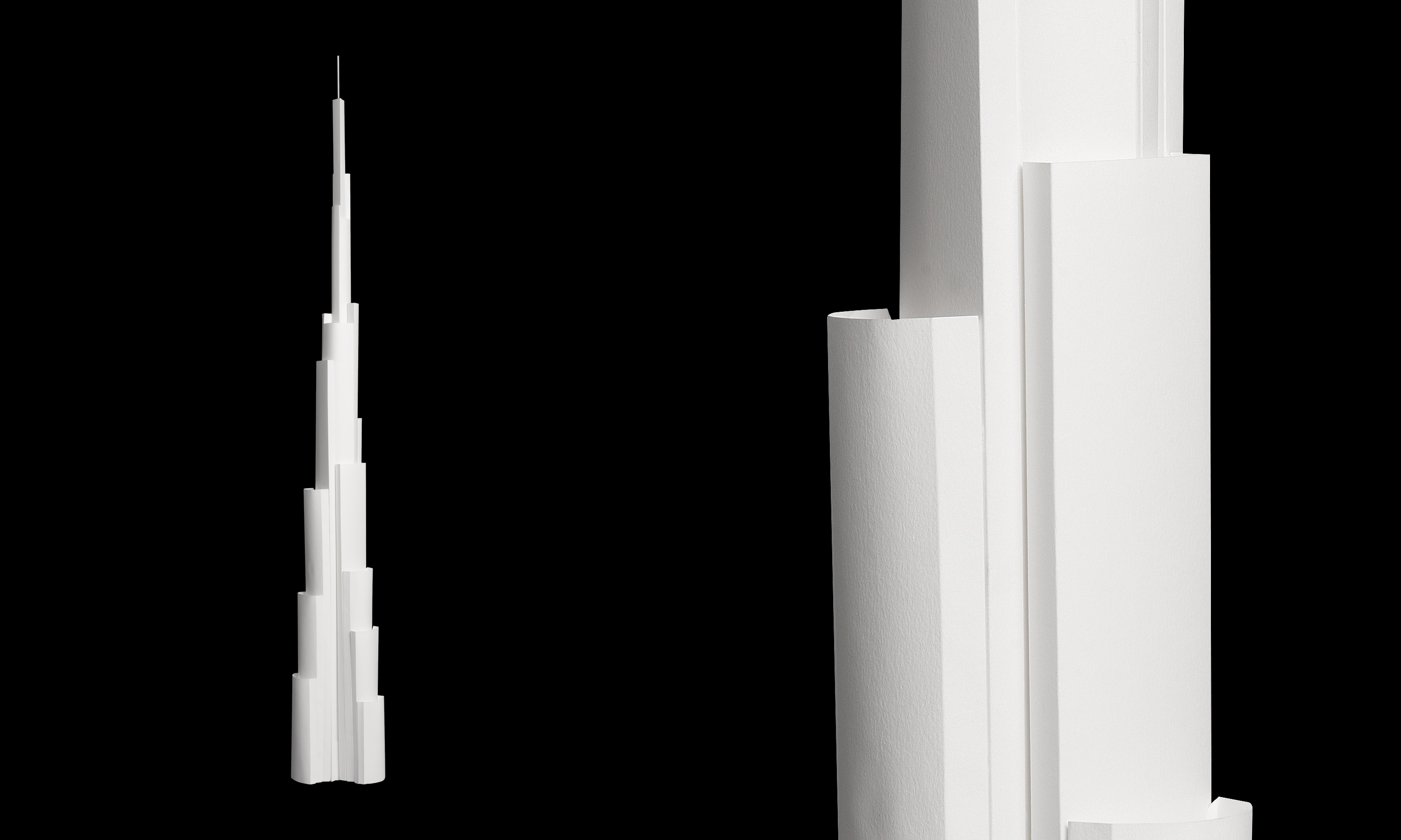
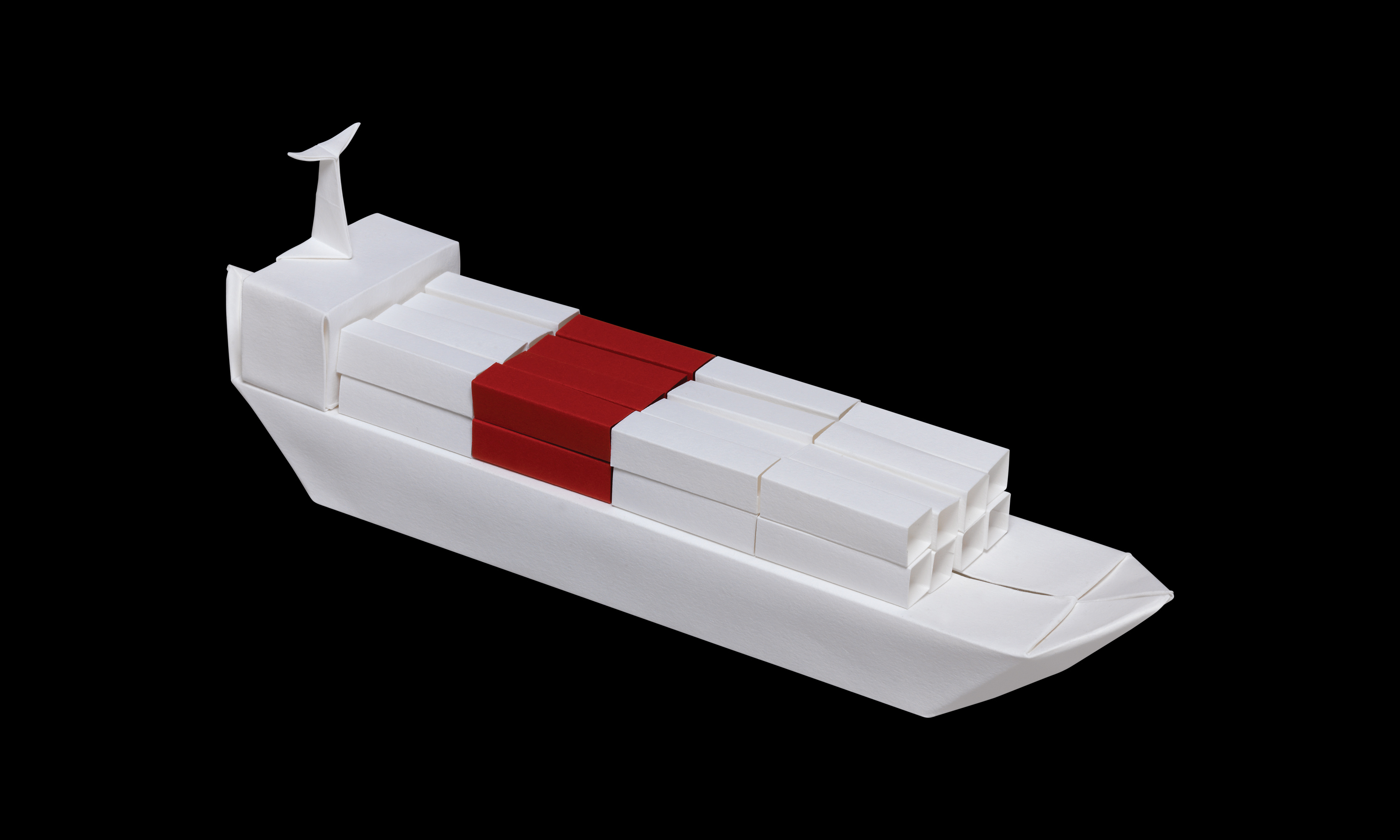
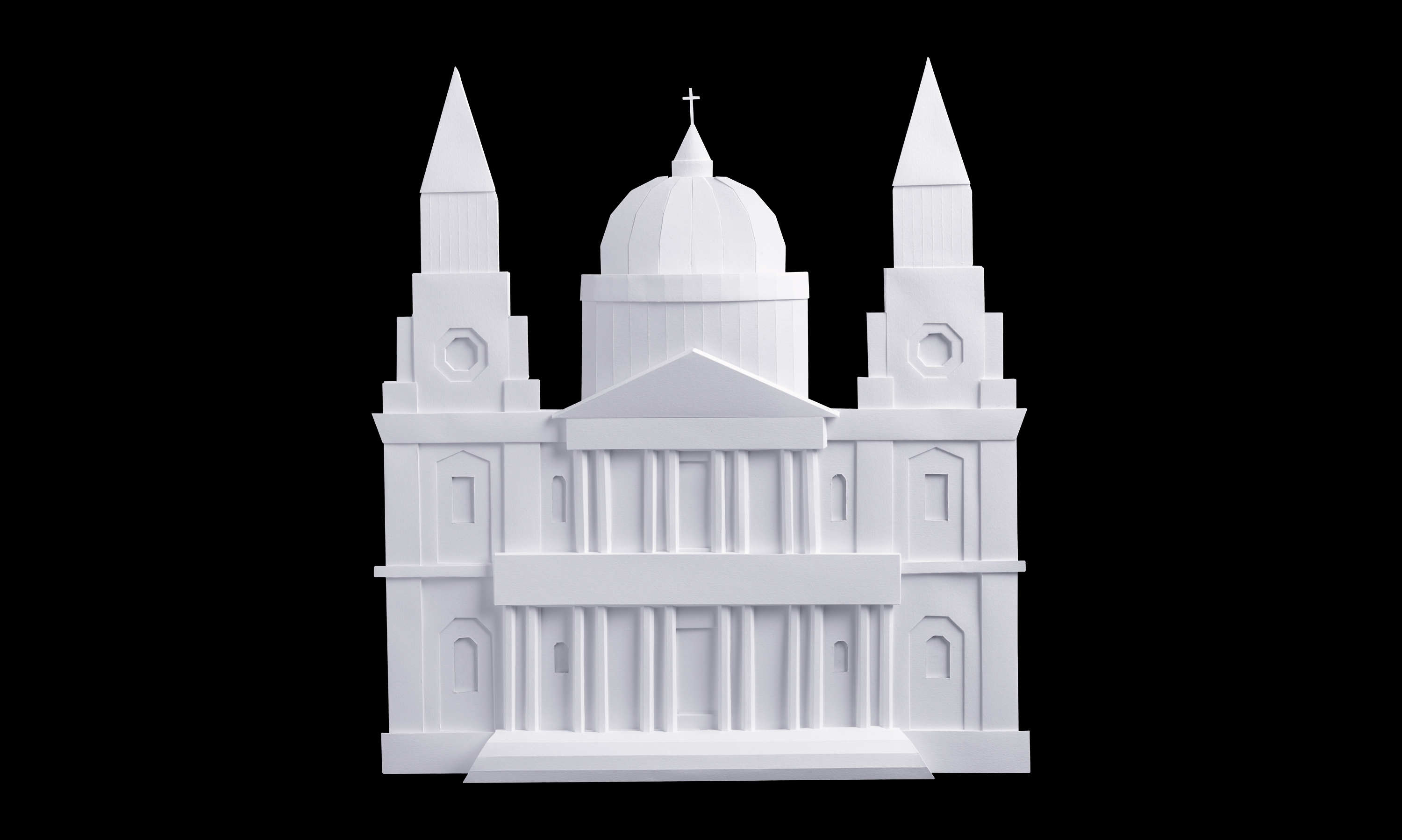
Nabarro brand visual style refresh – paper models current full library gallery.