Lane4
Brand positioning
& identity
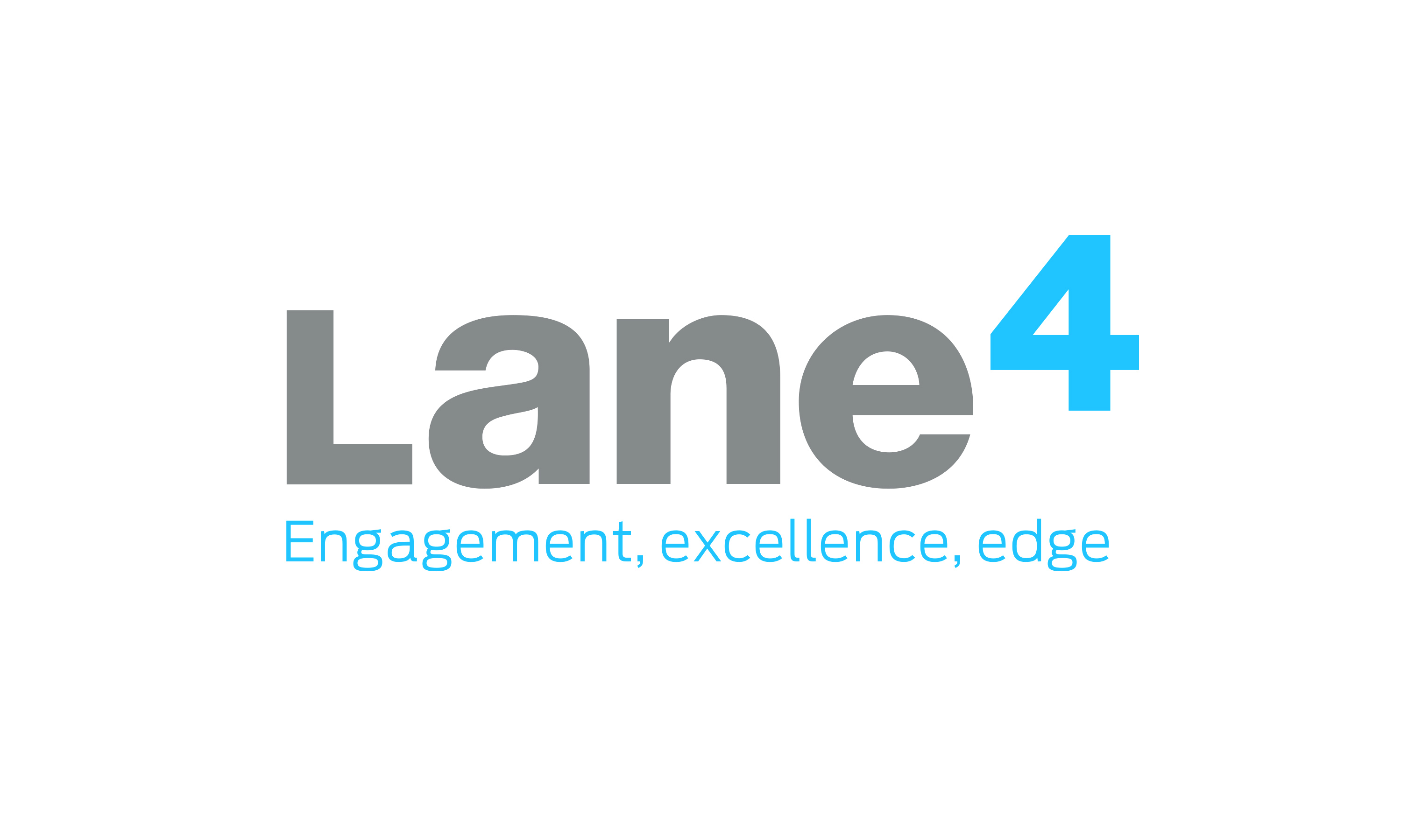
Engagement, excellence, edge.
Founded by Olympic gold medallist Adrian Moorhouse, Lane4 is a leader in the field of human performance. Based in the UK, they work with a wide range of organisations, helping individuals and teams around the world reach their fullest potential, to build sustainable competitive advantage. Read More…
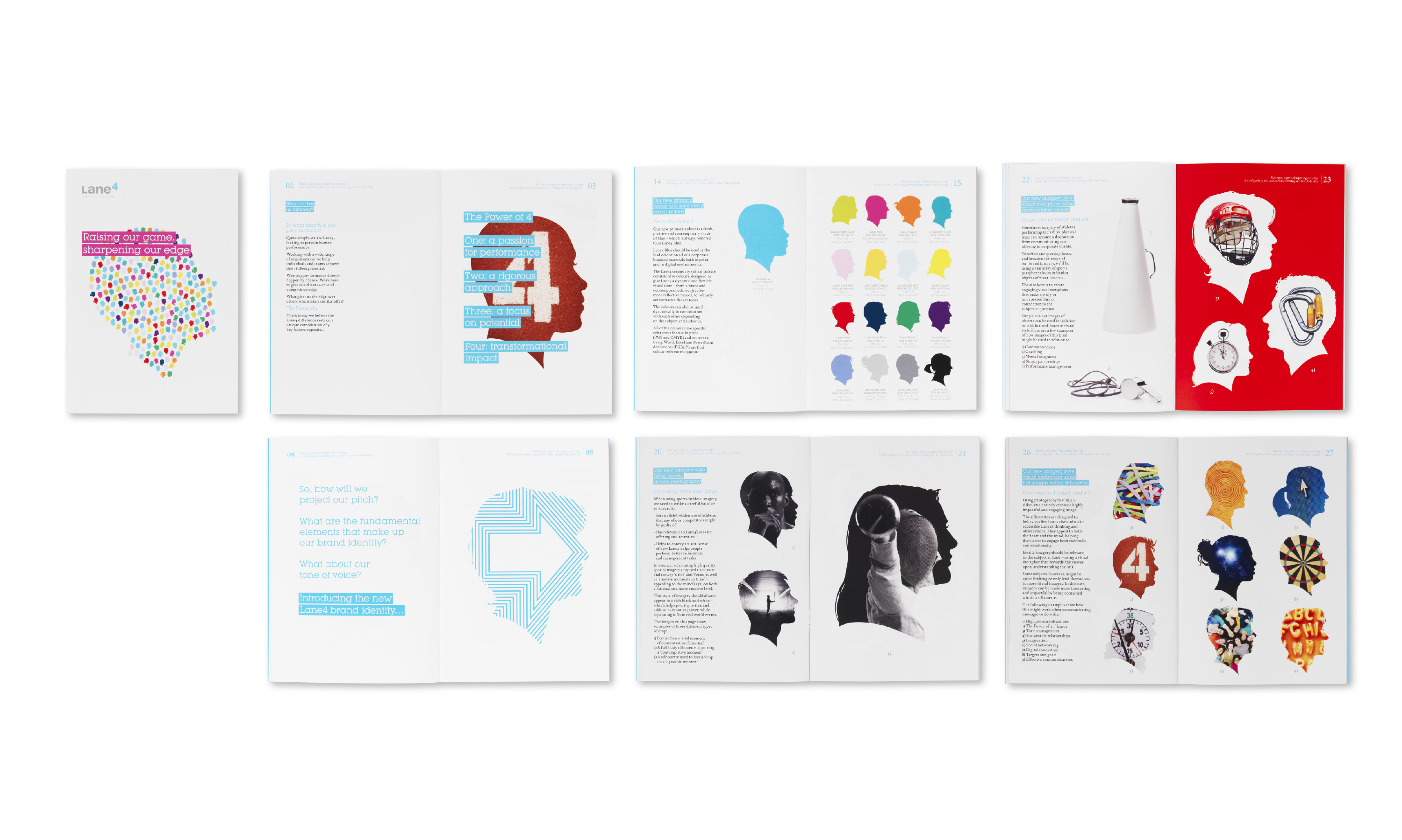
Brand idea: The Power of Four.
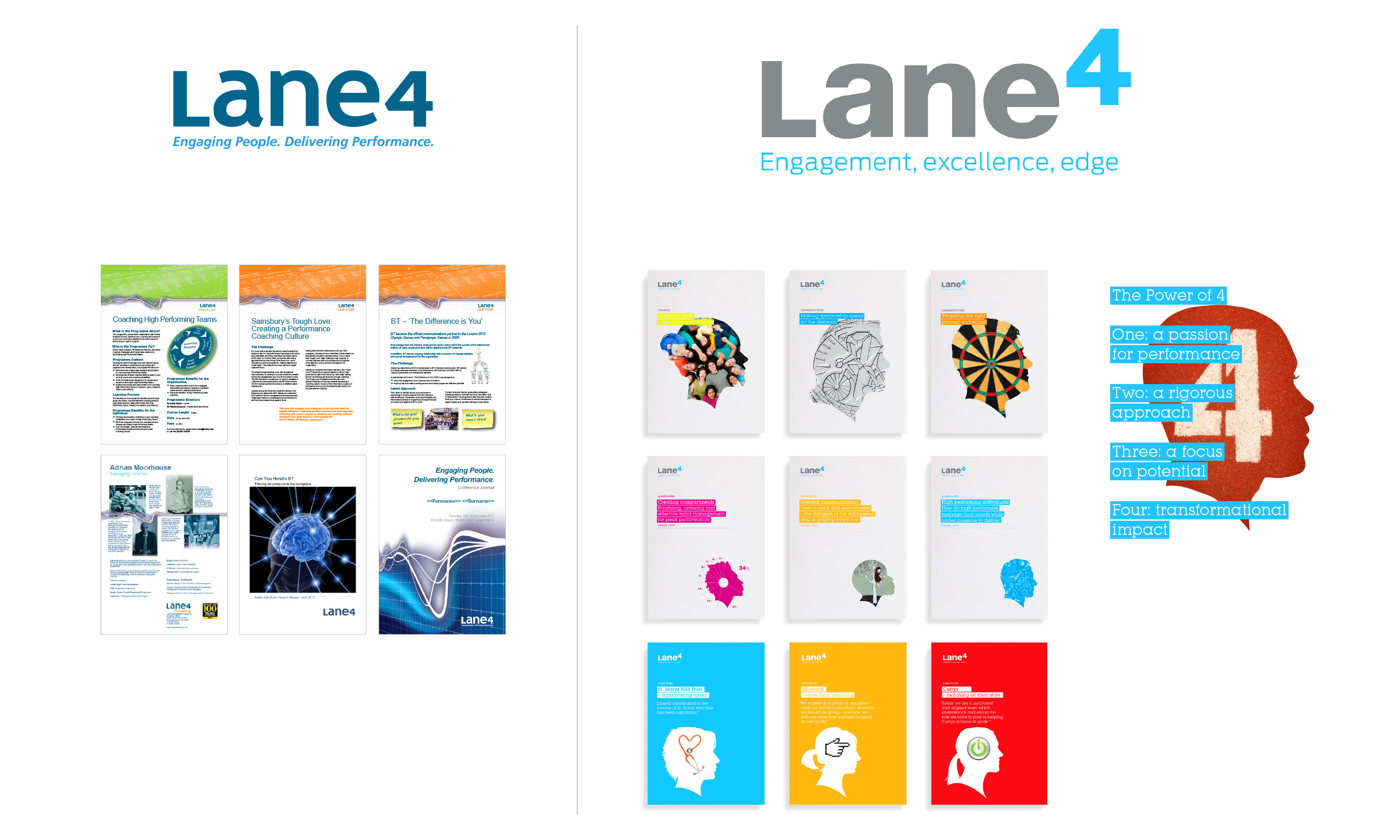
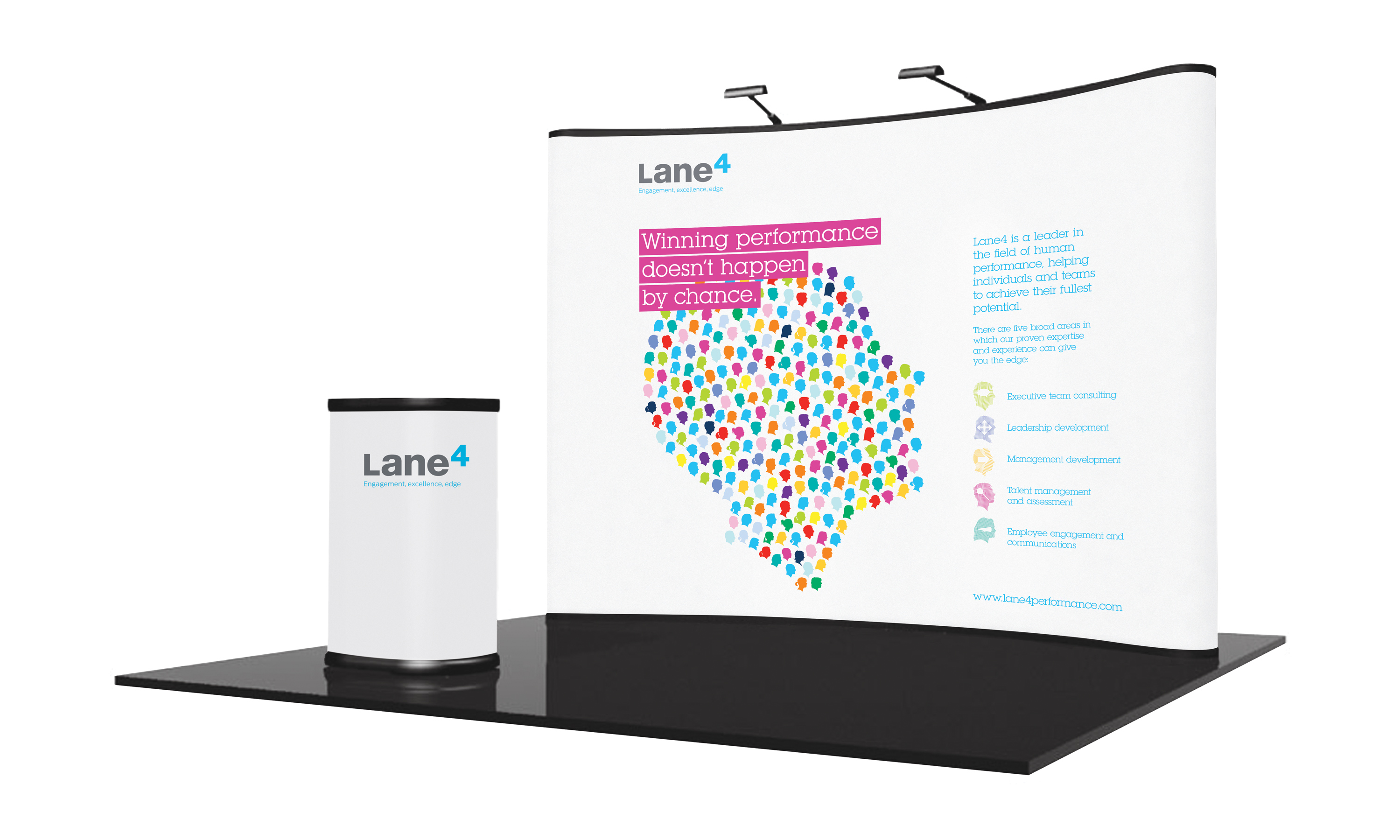
Lane4 exists to help give its clients a crucial competitive edge. So what was it that gave Lane4 the edge over its rivals? How could the company memorably articulate and project its distinctive approach and commercial offering? Through… The Power of 4. Neon’s view was that the Lane4 difference was based upon a unique combination of four key factors: a passion for performance, a rigorous approach, a focus on potential, and transformational impact.
Based on this, we evolved the existing Lane4 brand mark (which the client wanted to preserve) to reflect the idea of The Power of 4 by raising the number within a refined and updated version of the mark. We also evolved the existing strap line, to make it a stronger distillation of both what the Lane4 brand stands for, and their distinctive offering to clients: Engagement, excellence, edge.
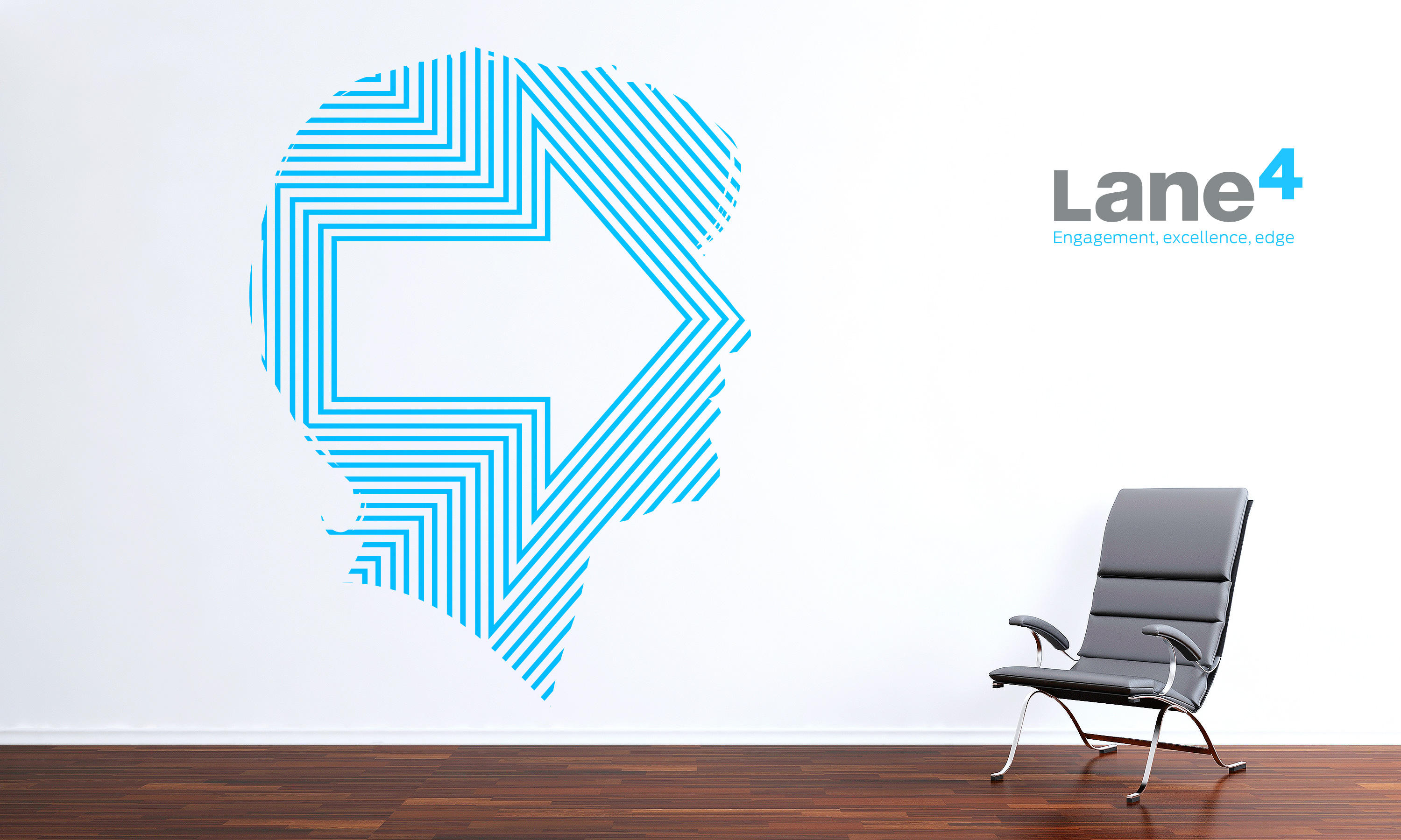
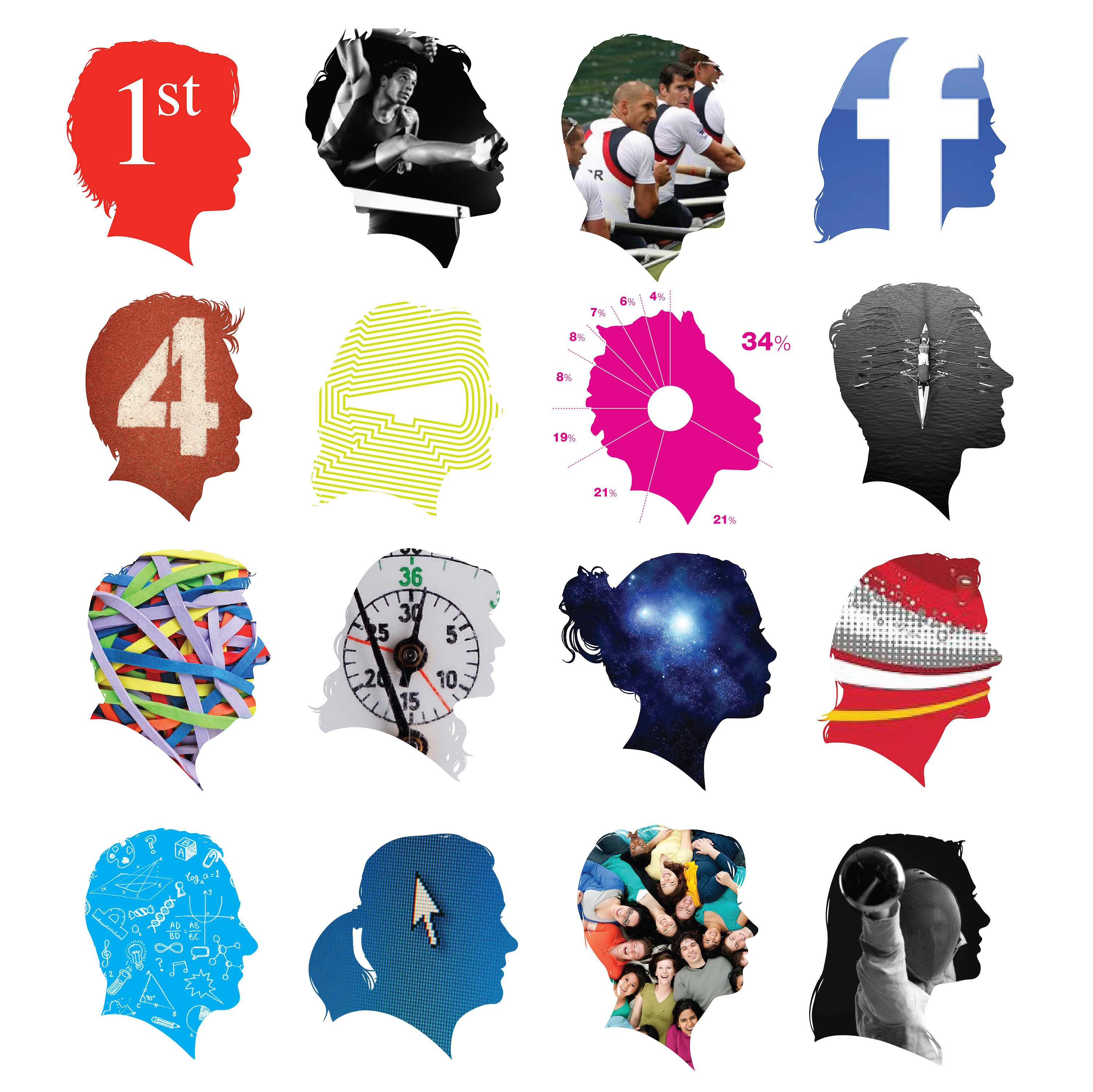
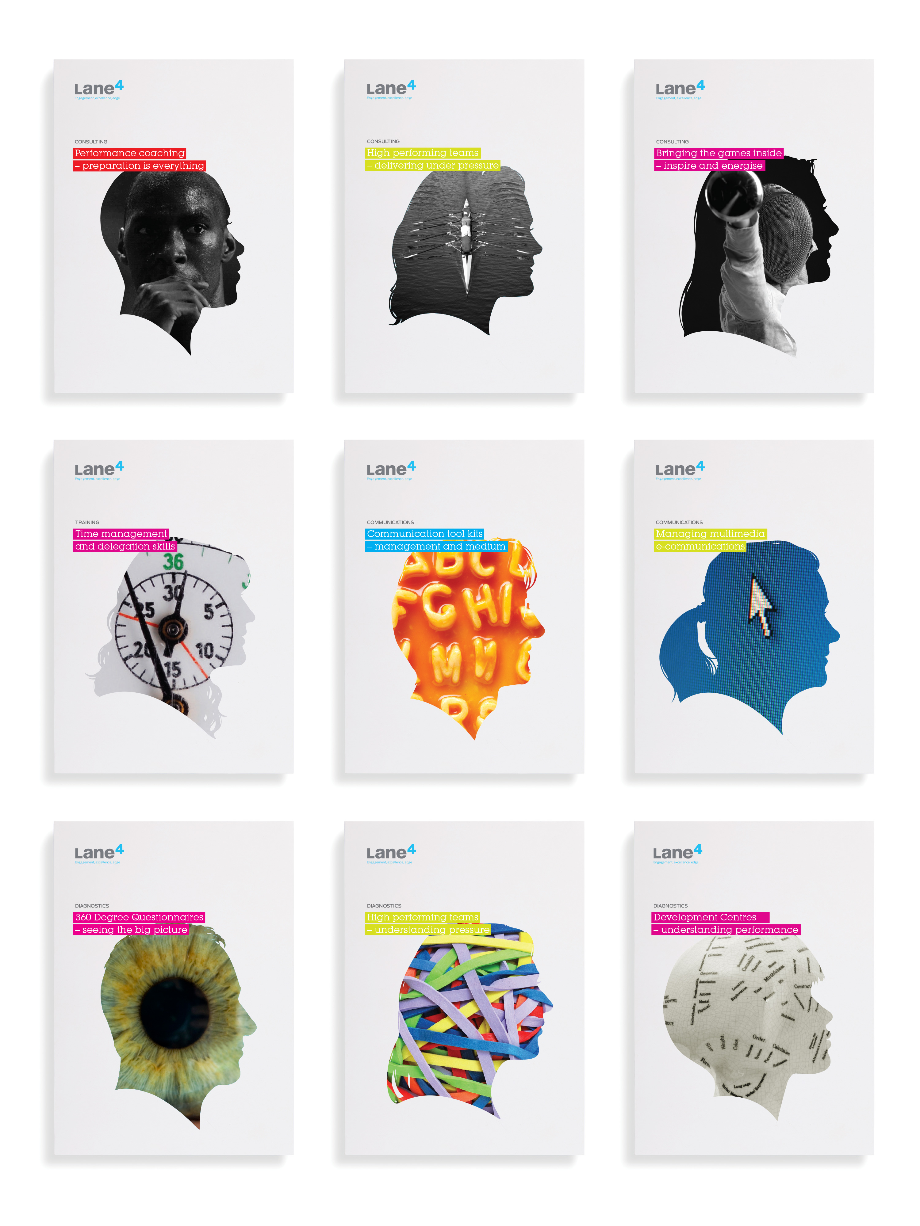
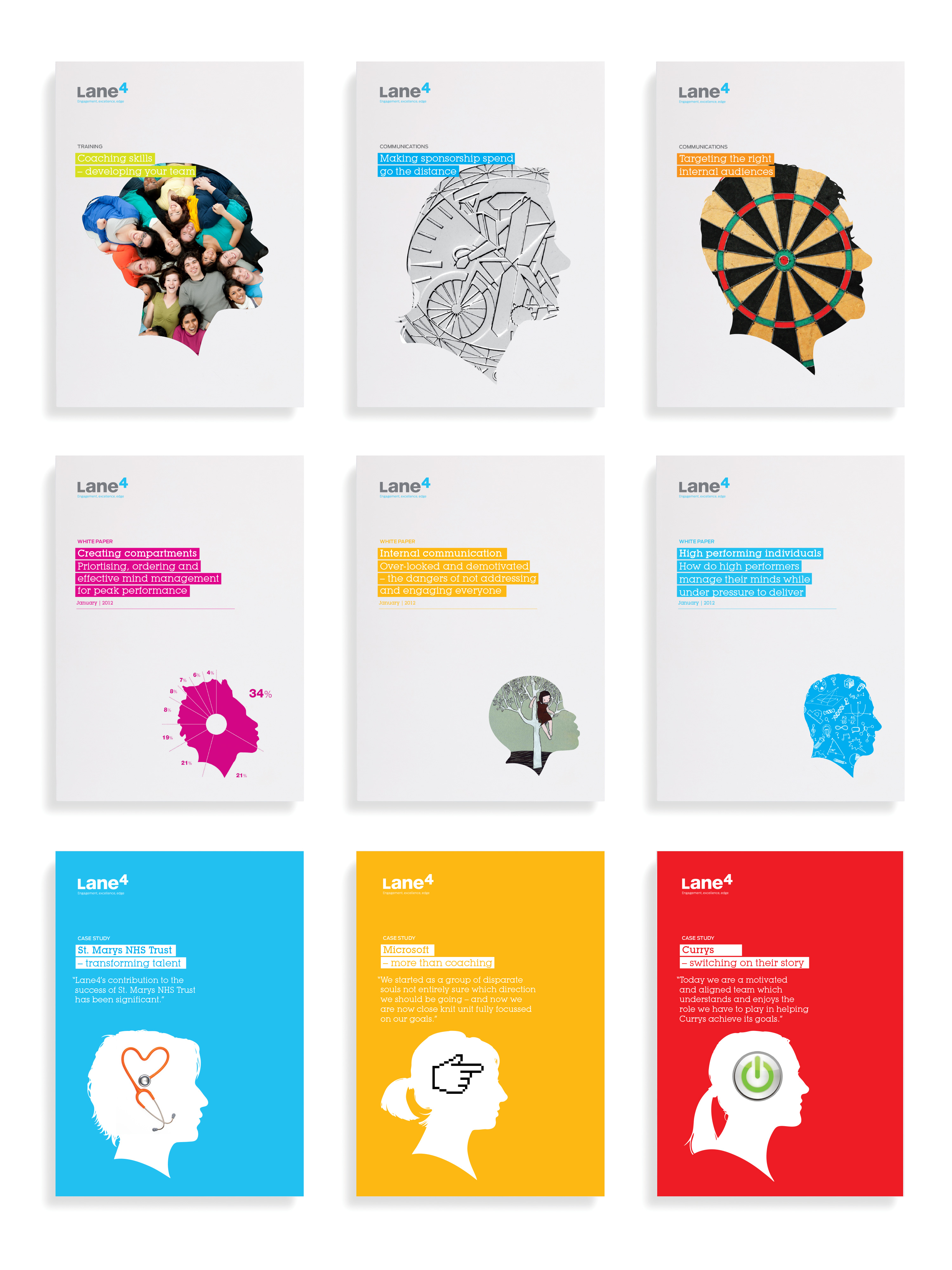
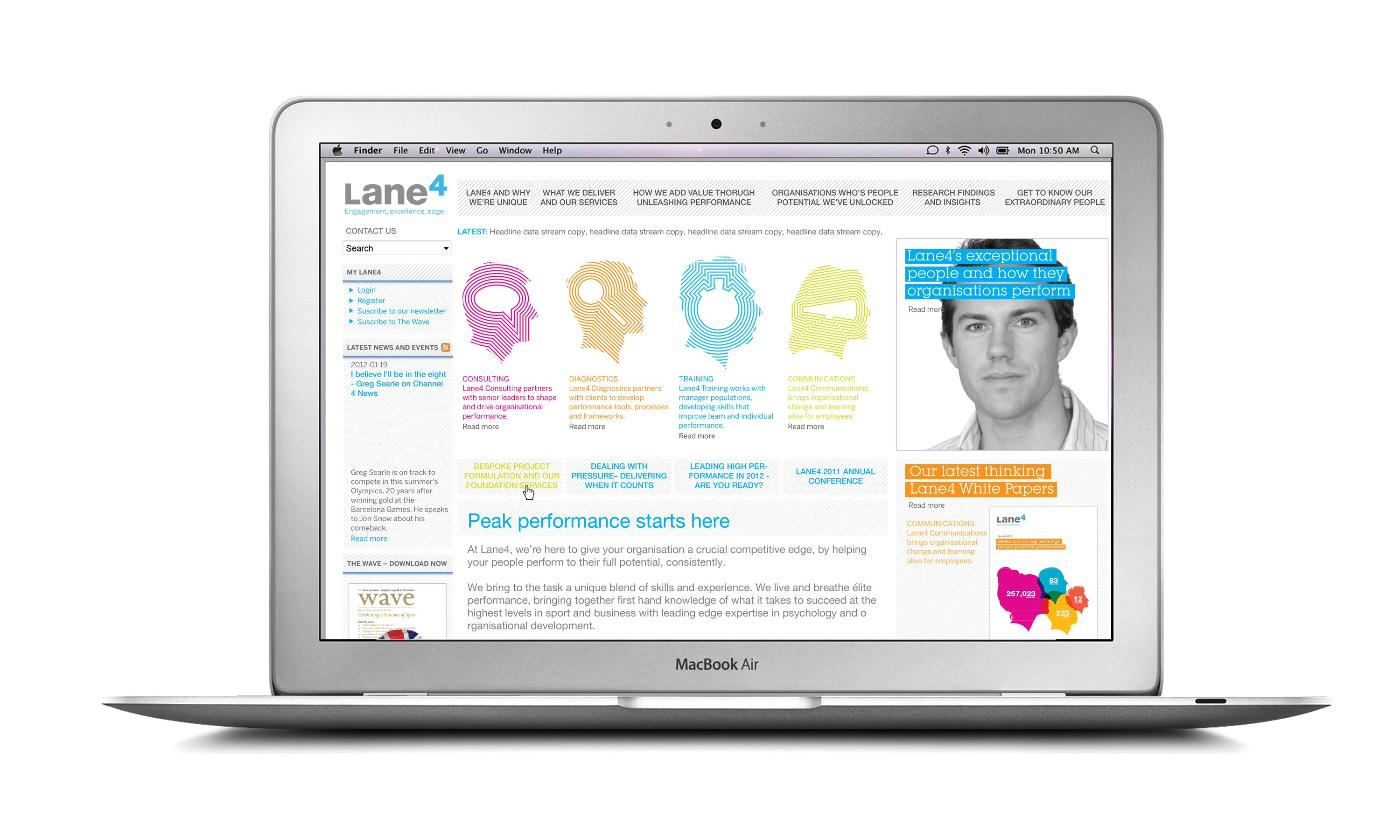
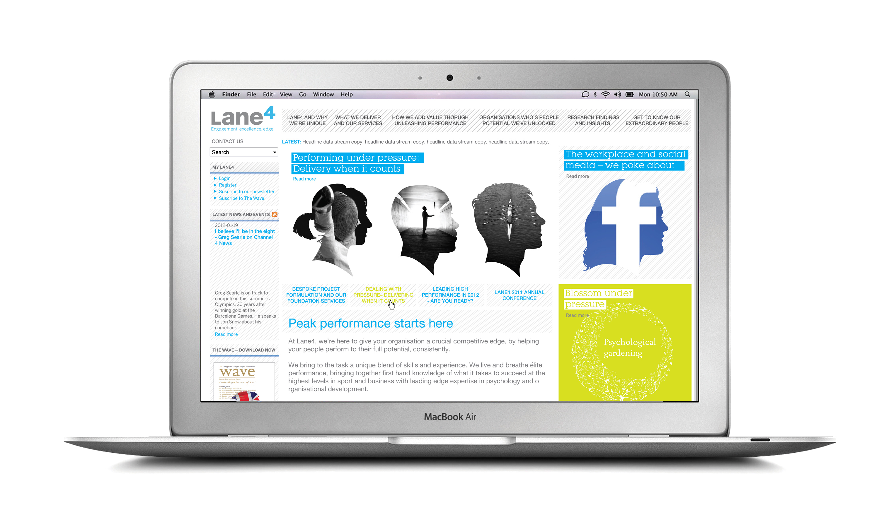
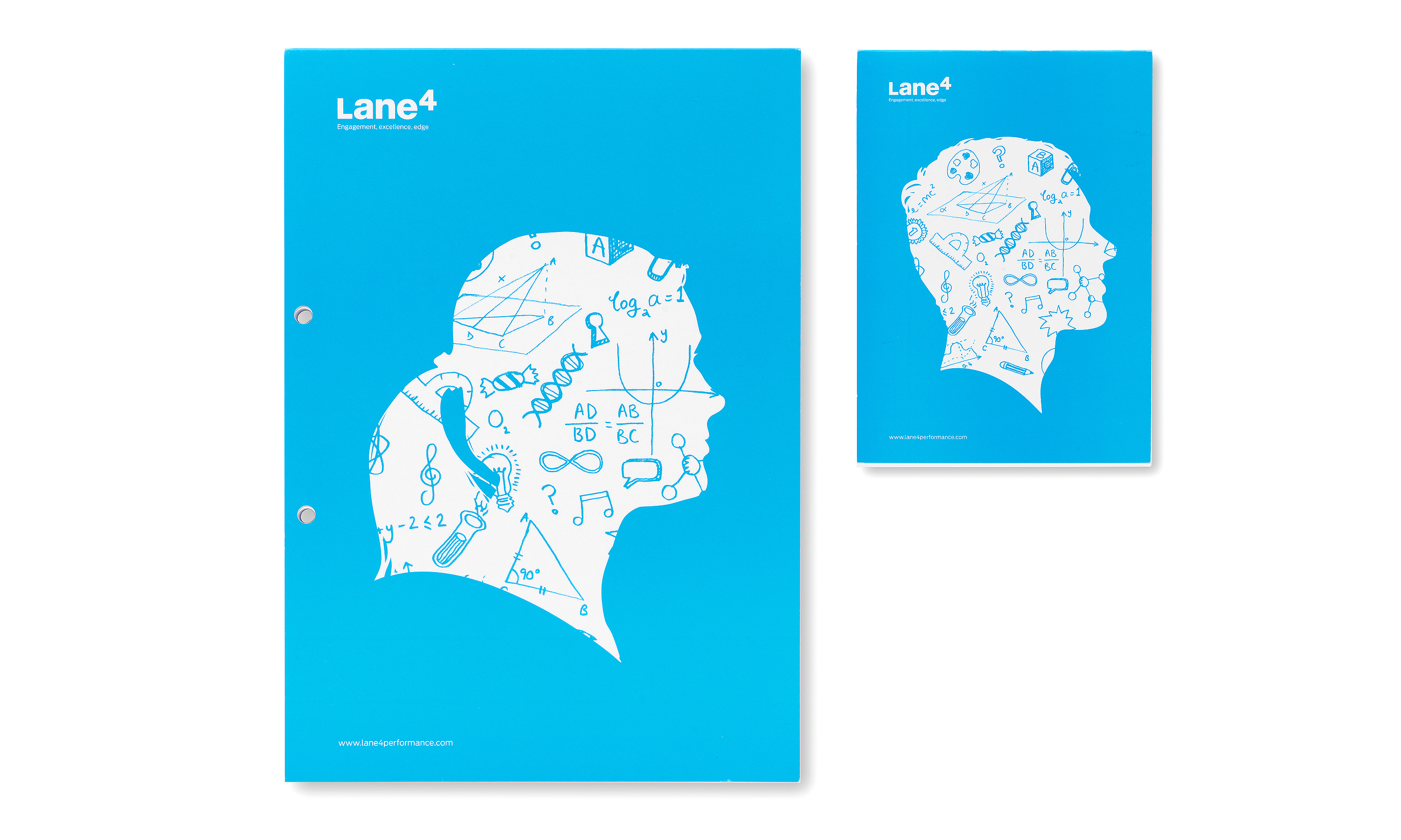
As for visual style, Lane4 is all about people: the brilliant team of inspiring individuals who work for the company, and the incredibly diverse range of people whose performance they help to improve. We wanted a look that would strongly reflect what Lane4 do — getting inside people’s heads to inspire them, change their thinking, and help them achieve their potential.
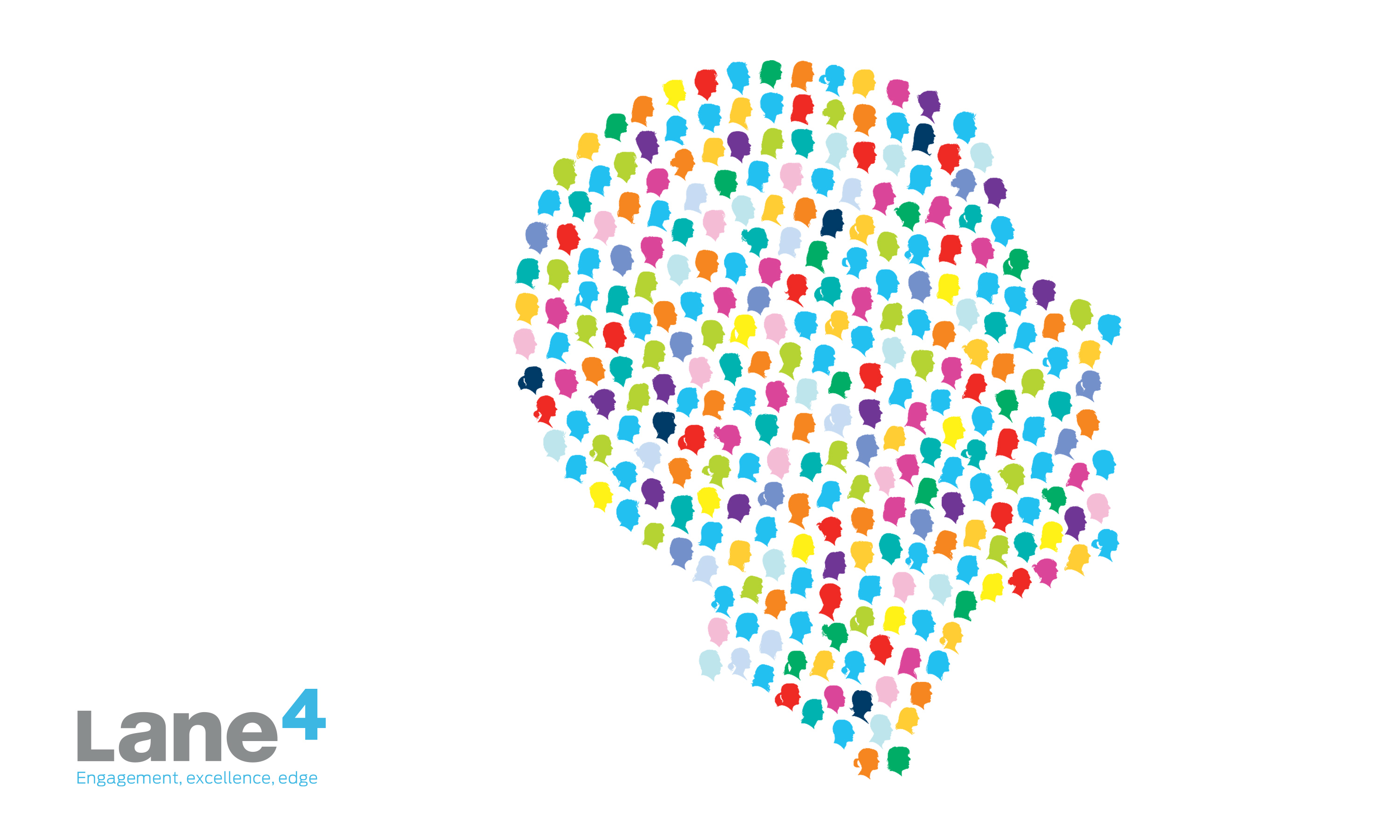
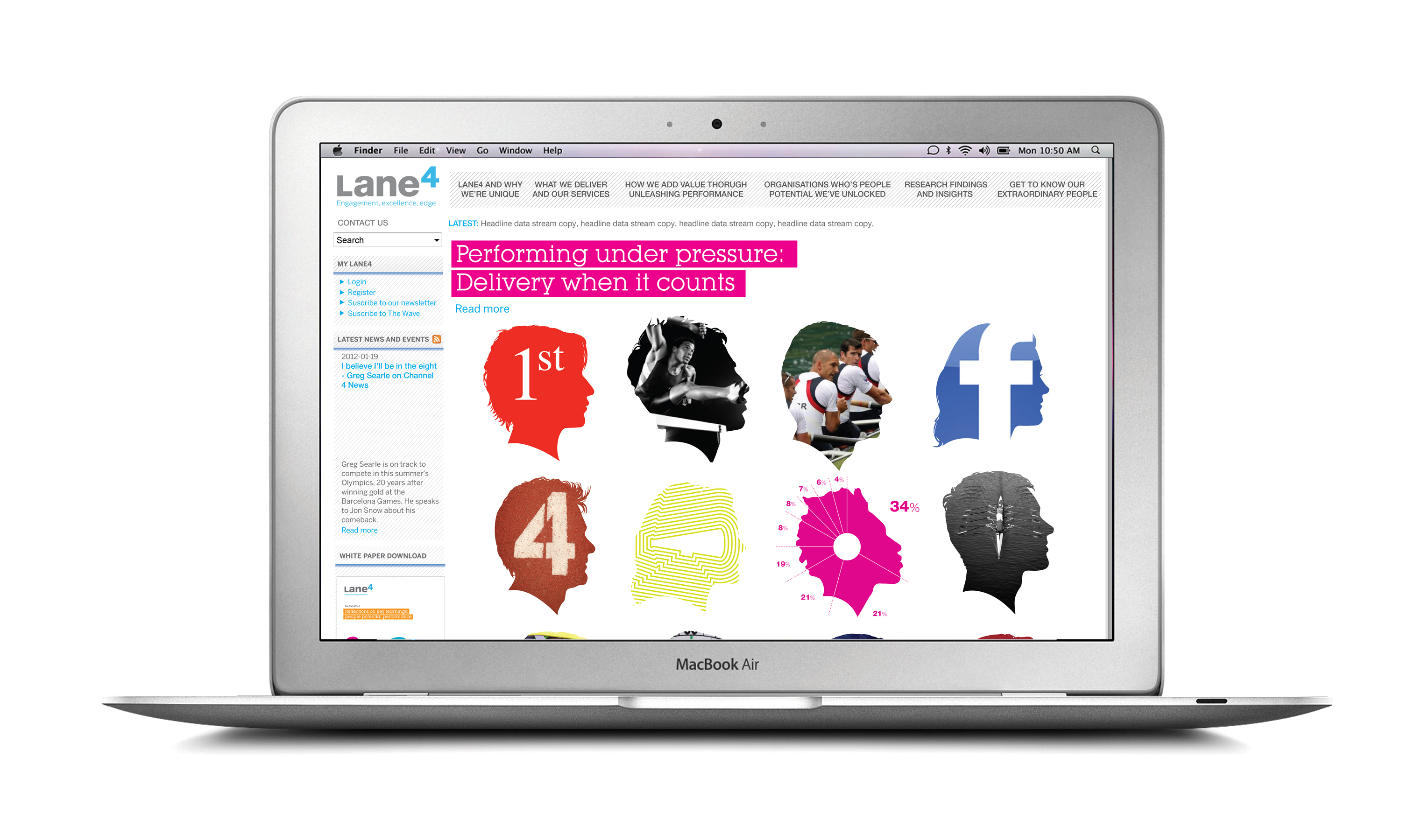
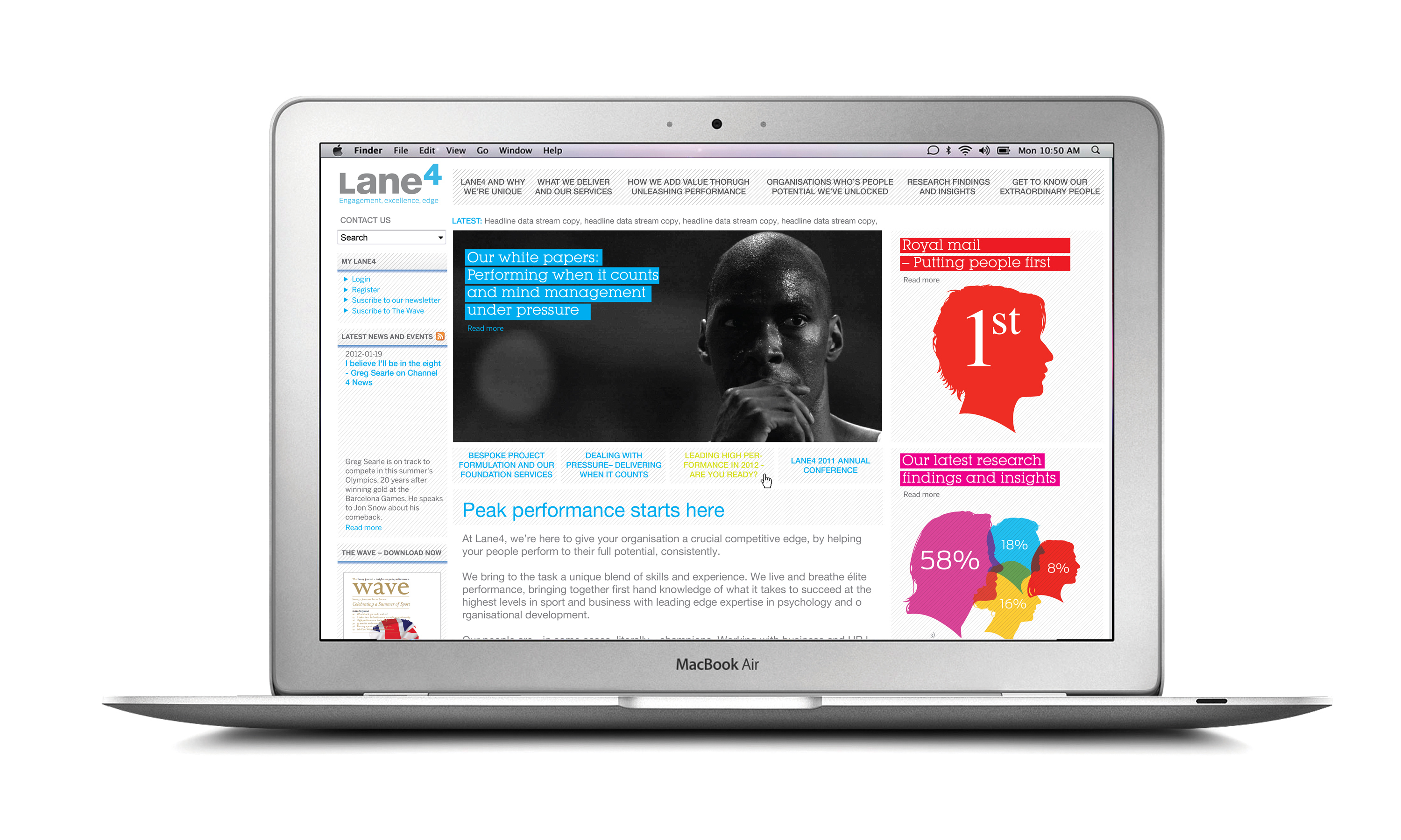
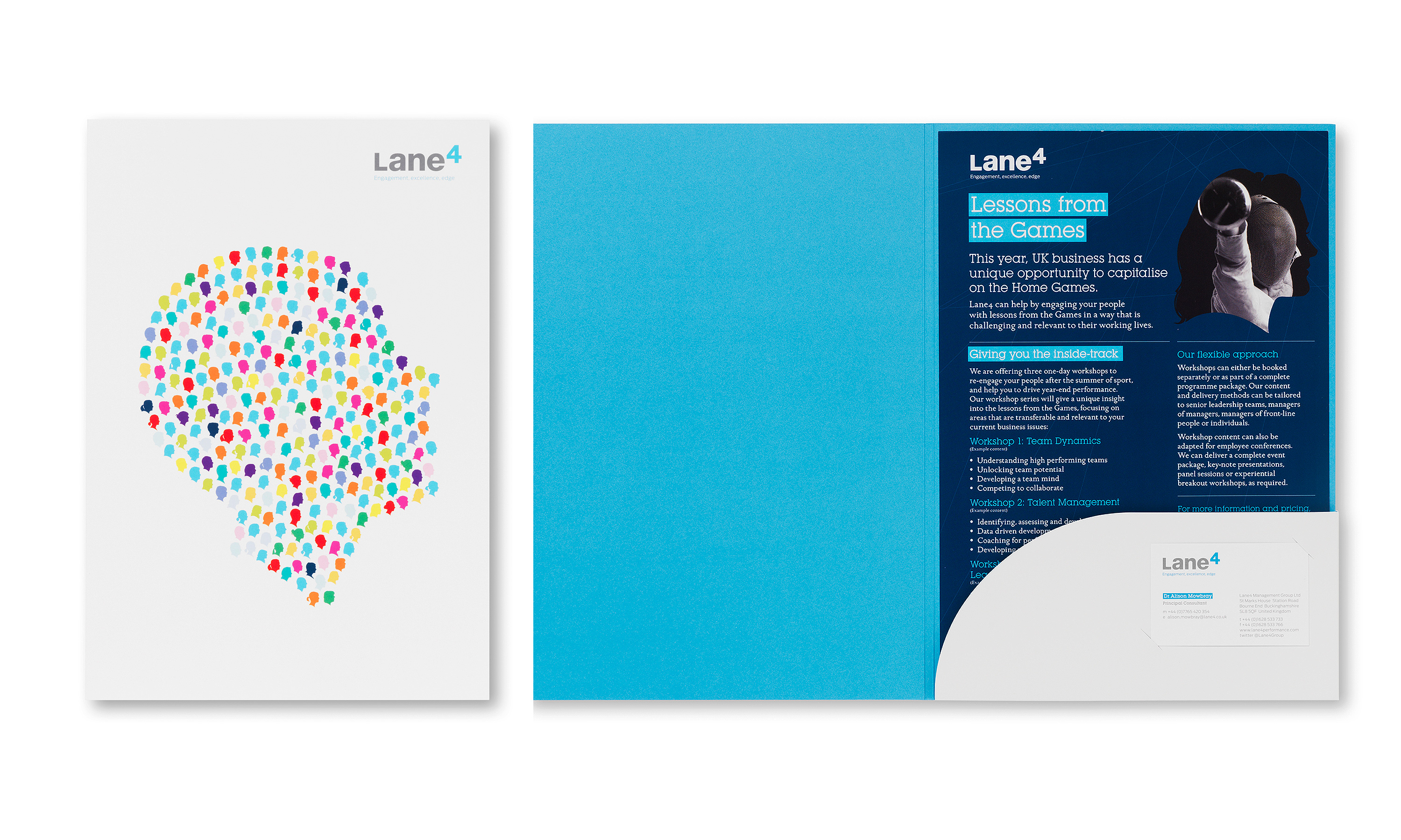
To that end, we created a library of hand drawn graphic silhouettes, using the actual profiles of every member of the Lane4 organisation — celebrating the individuals, at the same time as highlighting collaboration. This silhouette device is not just powerfully distinctive but also highly versatile, capable of adding warmth humanity to all kinds of communications, from visuals conveying abstract thought to charts and diagrams.
(Read Less...)
Kind words…
“Expertise and professionalism. As a member of the Board initially resistant to change, I have really appreciated Neon’s expertise and professionalism in what is a very important year for Lane4. Read More…
ADRIAN MOORHOUSE “A true partnership from beginning to end. Our relationship with Neon has been a true partnership from beginning to end. They have taken time to understand the strategic direction of our business, navigated difficult conversations with senior stakeholders and helped me to engage the rest of the organisation with the change. The creative execution is excellent and really makes Lane4 stand out among our competitors. The overall result is a huge step-up in quality for us and I’m pleased to say that our customers also love it!” CLARE HOPKINS
Founder and Managing Director,
Olympic Gold Medallist
Lane4
Head of Marketing and Communication
Lane4
(Read Less...)
To find out more: [email protected] or call +44 (0)20 3289 1733 Share this: Email, LinkedIn, Twitter, Facebook, Download PDF, follow us on Instagram or view our animations and movies on Vimeo
PROFESSIONAL SERVICES
Branding
PROJECT SUMMARY
Art direction
Brand positioning
Brand identity
Literature scheme
Exhibitions
Promotional posters
Stationery
Website
Brand guidelines
Digital templates
PowerPoint templates
Lane4 brand mark.
Lane4 brand mark and visual language, old vs new.
Lane4 visual language, 12 of 48 Lane4 staff head profile silhouettes.
Lane4 the Power of 4 super graphic with entire staff head profiles.
Lane4 new literature scheme.
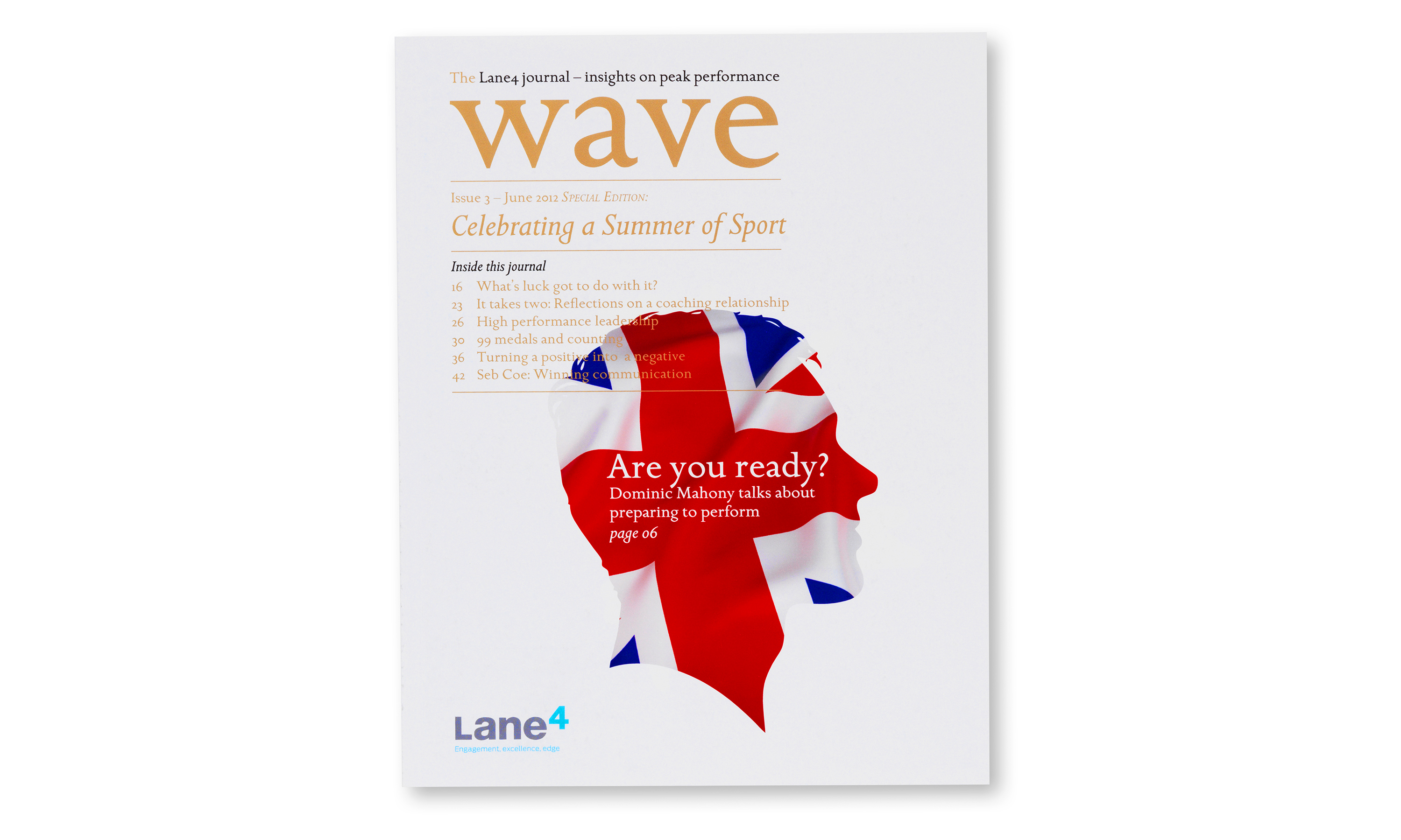
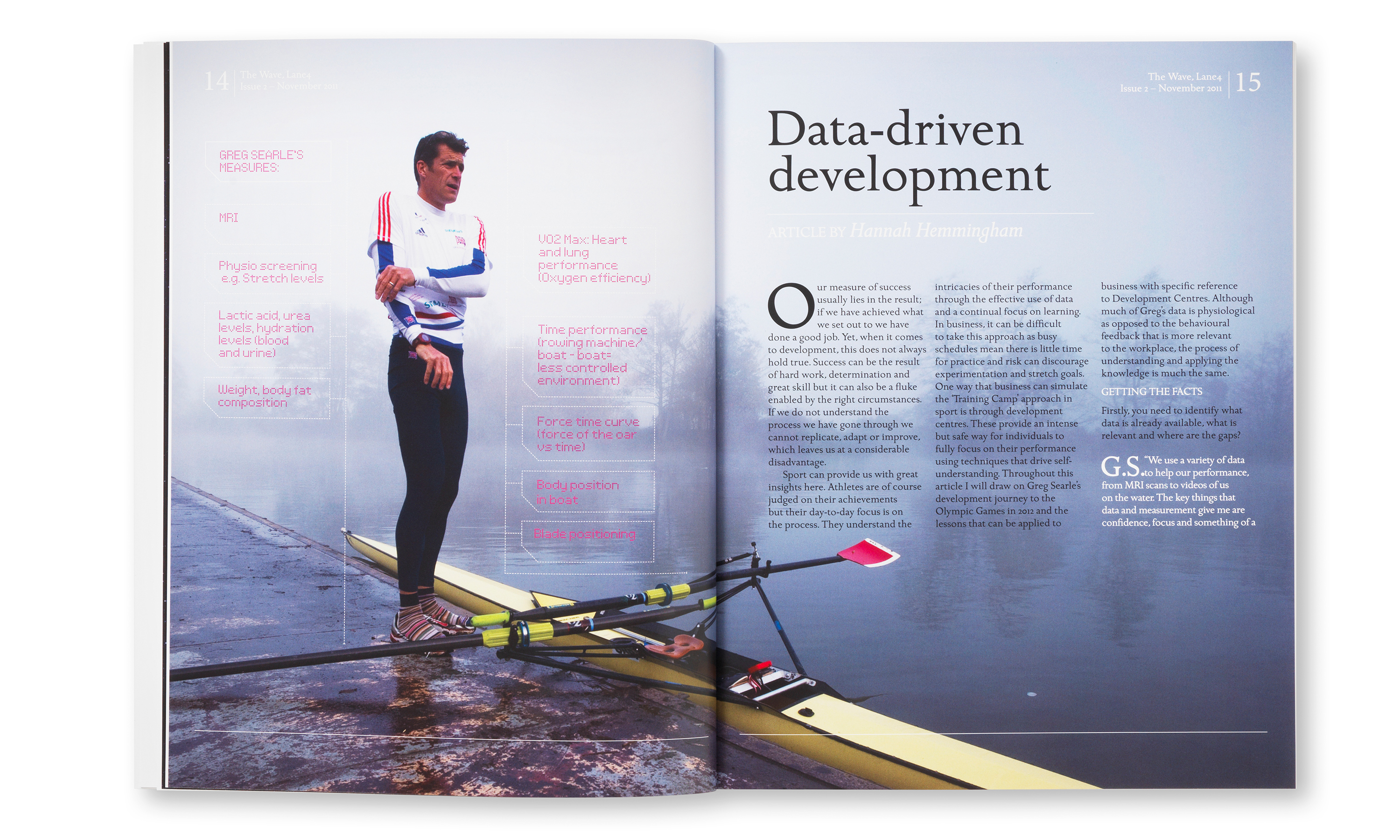
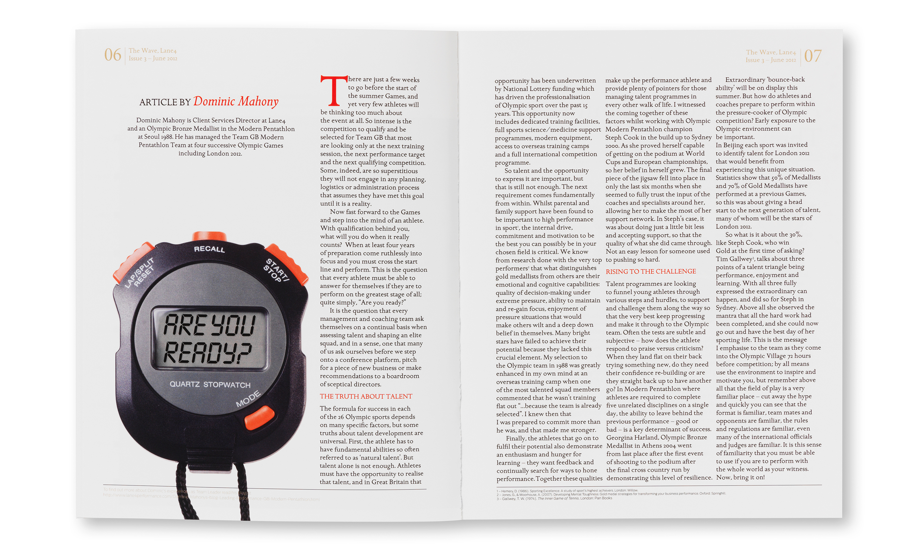
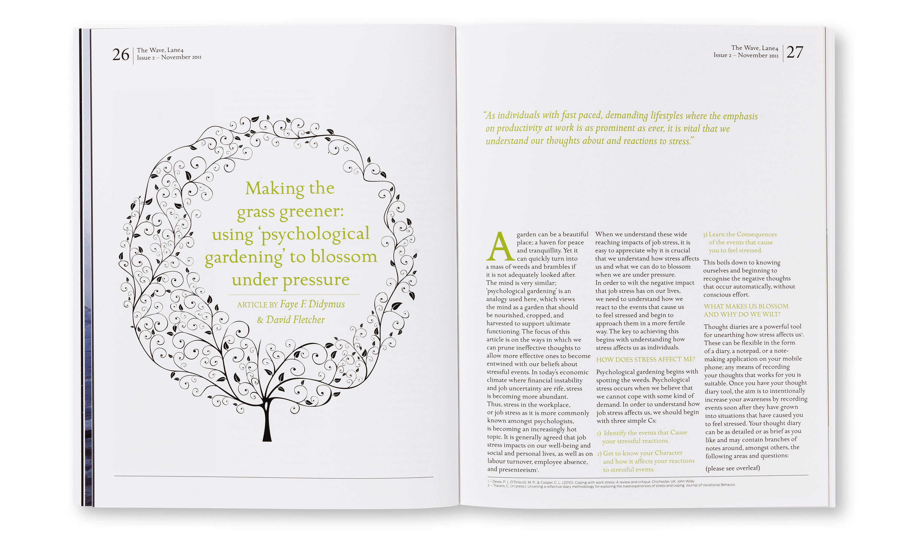
Lane4 'The Wave' journal, a quarterly thought piece sample spread.
Lane4 website.
Lane4 guidelines.
Lane4 client workshop folders and note pads.
Lane4 conference stand.
Lane4 reception wall super graphic.