Comment8
Brand identity

Have you noticed how one thing very often leads to another?

Here’s a good example. The “one thing” was a big rebranding project we did a couple of years ago for a company called Lane4, founded by Olympic gold medallist Adrian Moorhouse, and a leader in the field of human performance.

And the “another”? Well, Lane4 were impressed by our performance – so when they saw an opportunity to turn their expertise in internal communications into a separate business, they very kindly called on us to create the new brand identity, which needed to be dynamic and distinctive in its own right, but clearly related to the Lane4 parent brand.

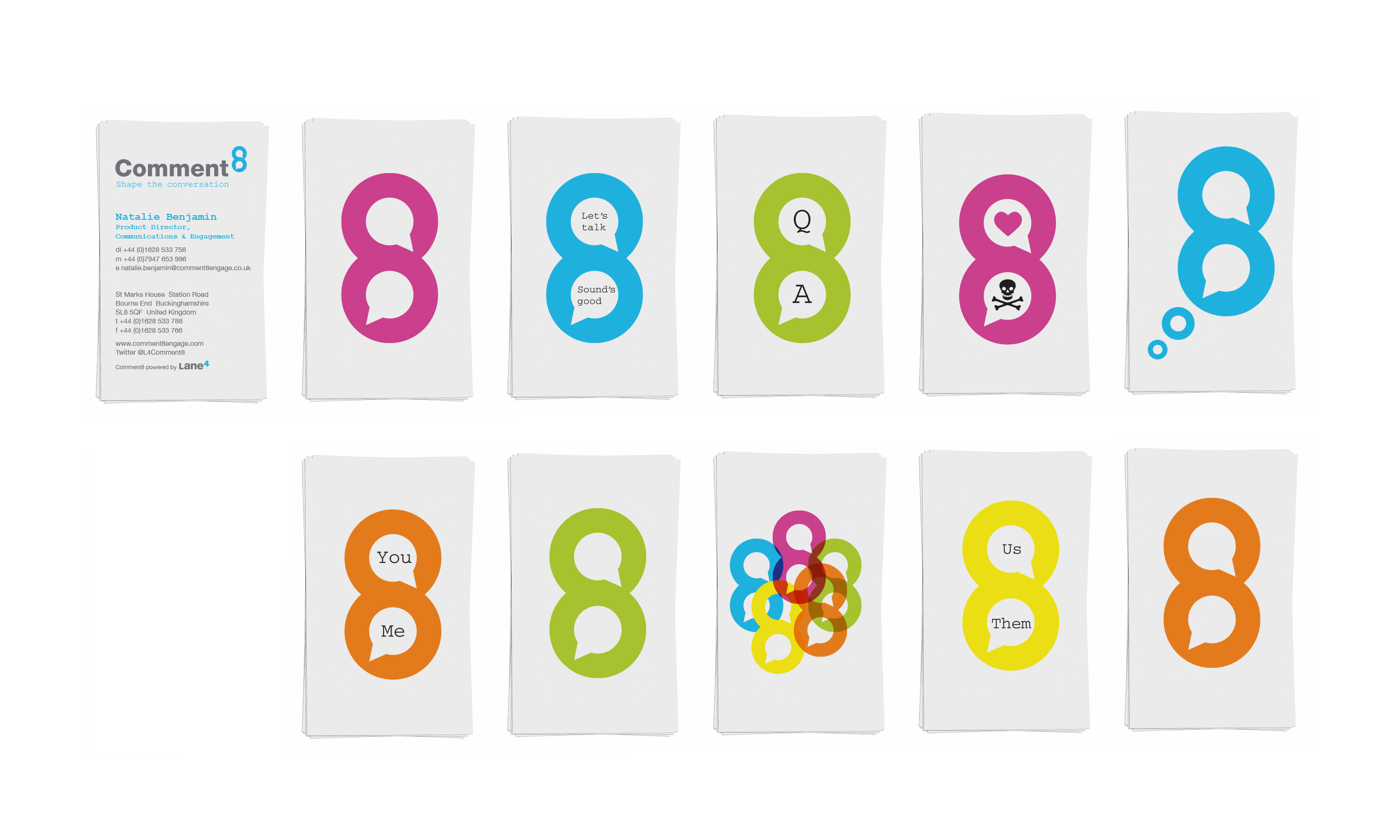
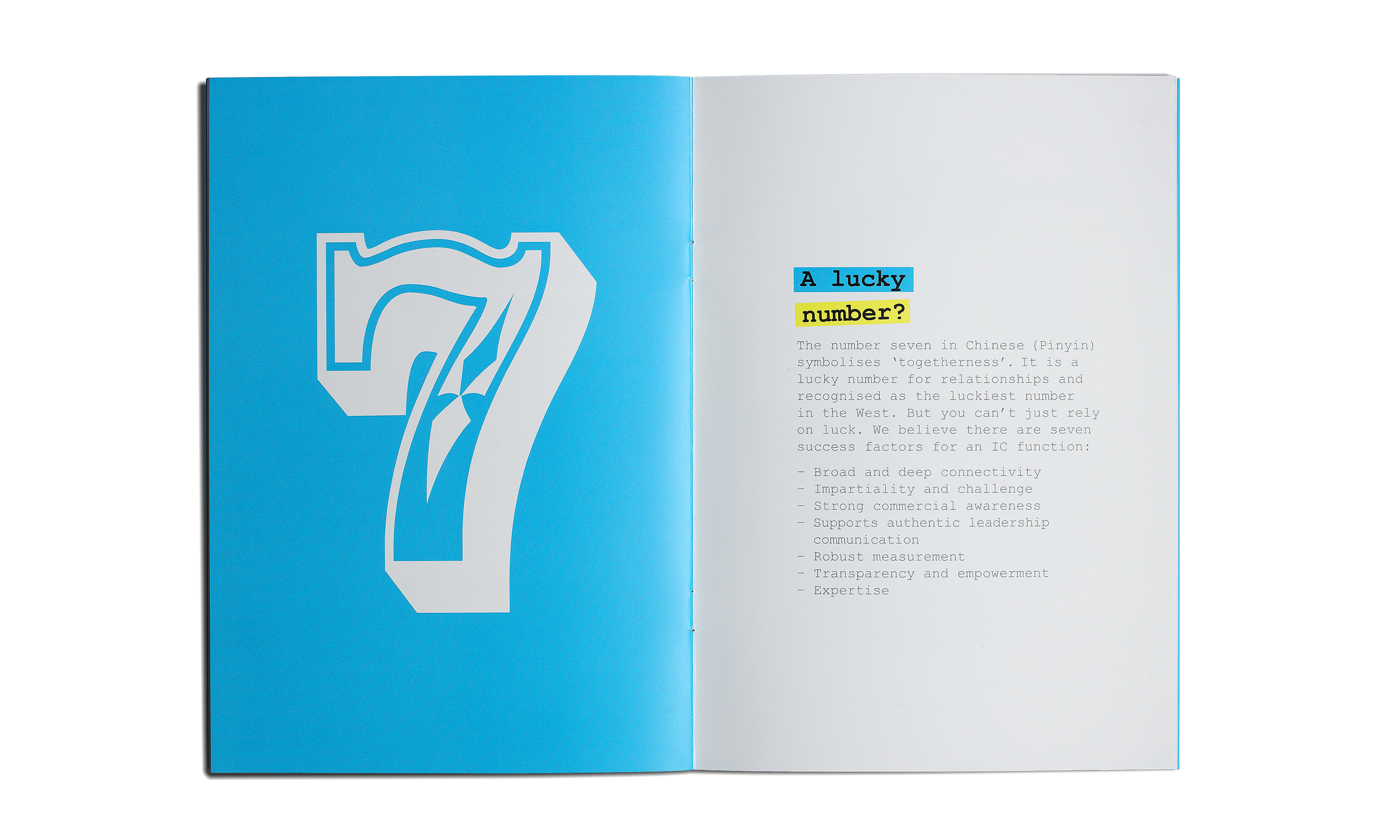
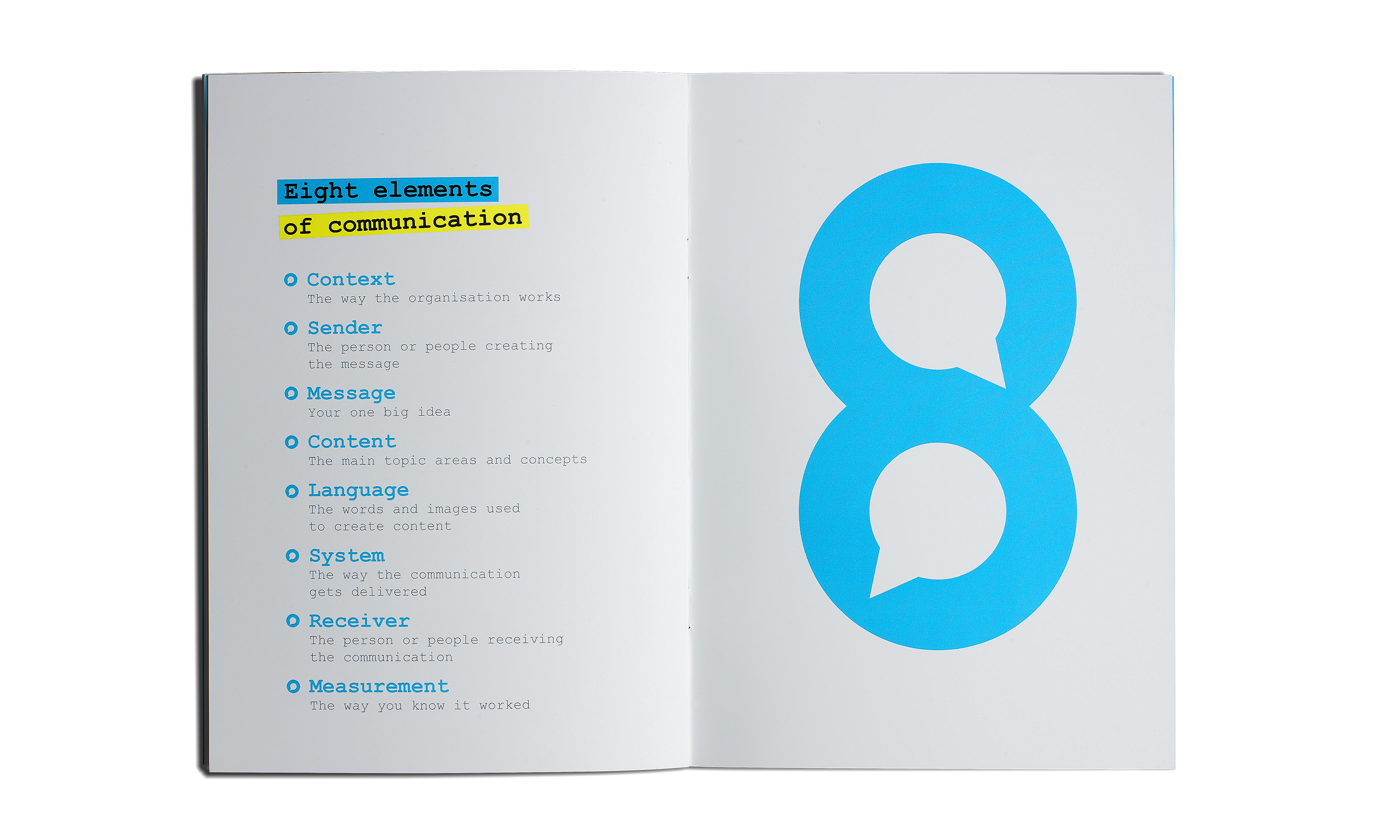
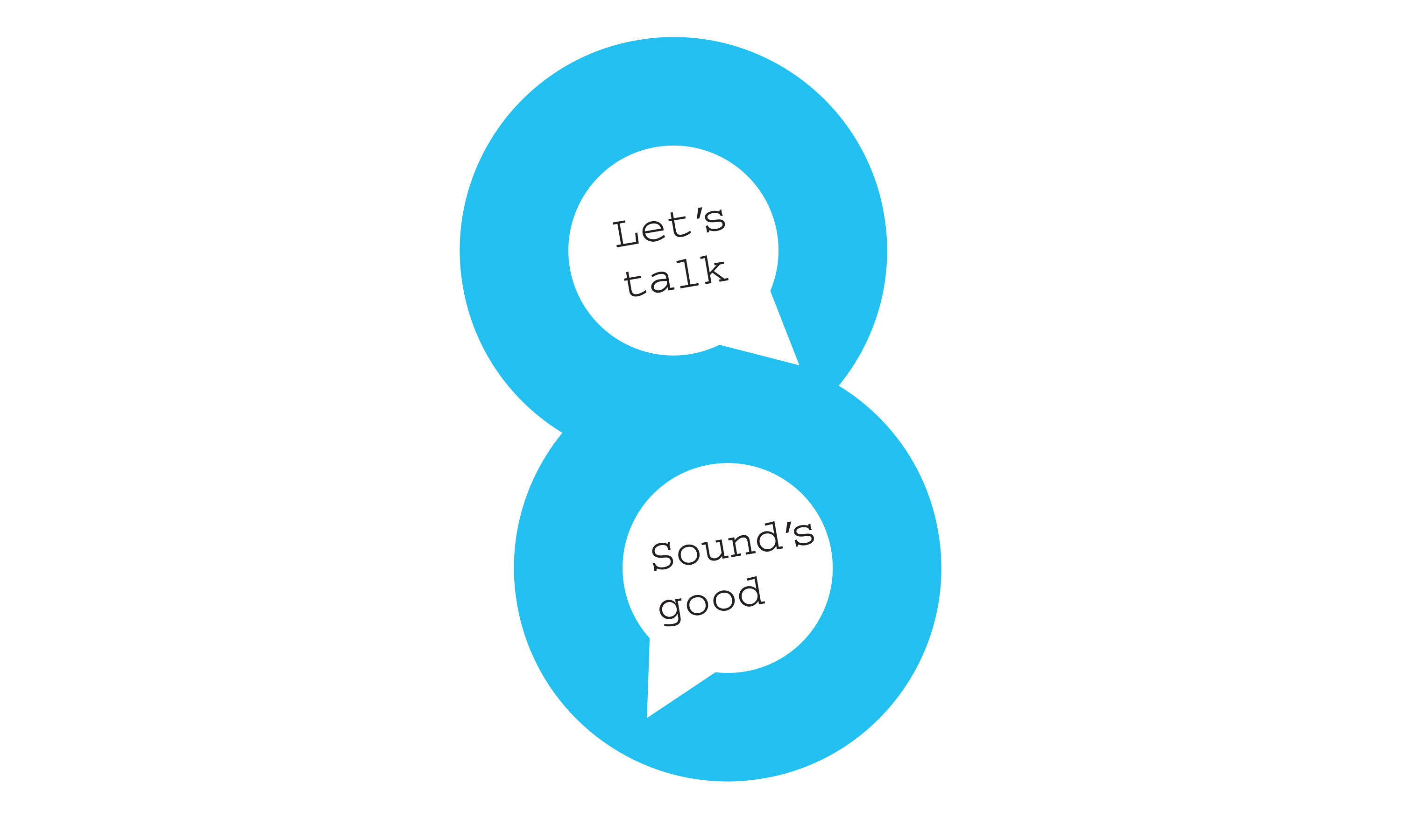
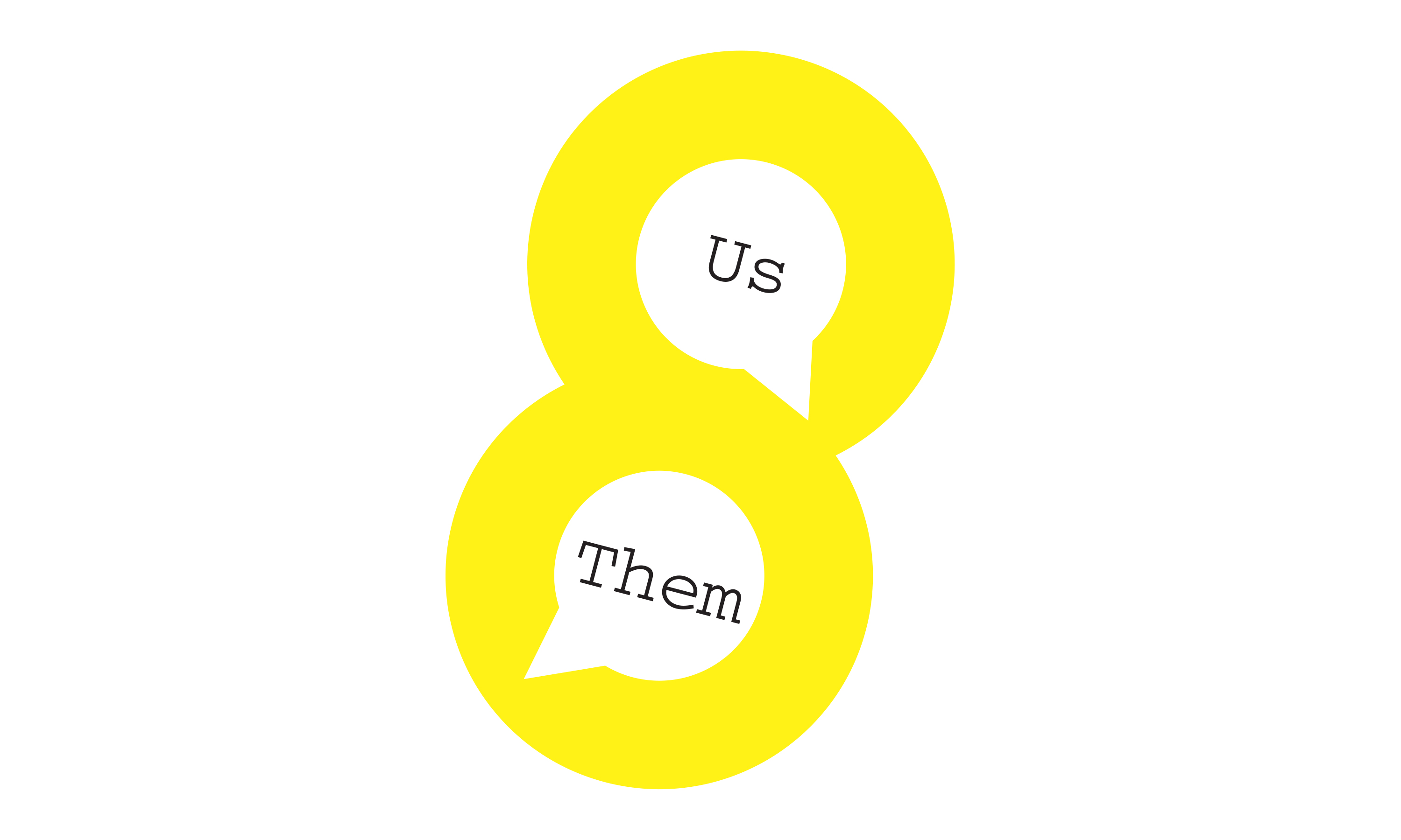
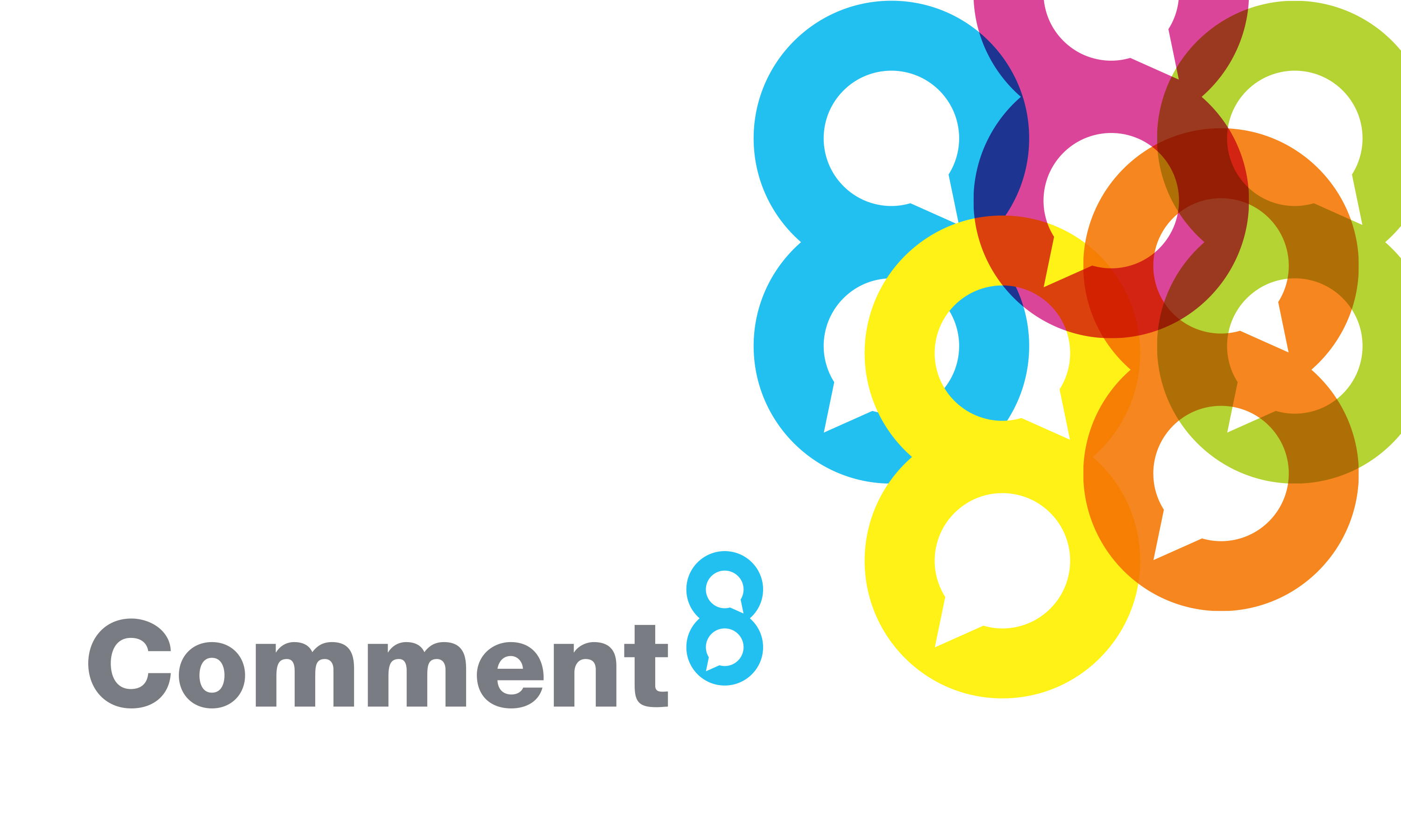
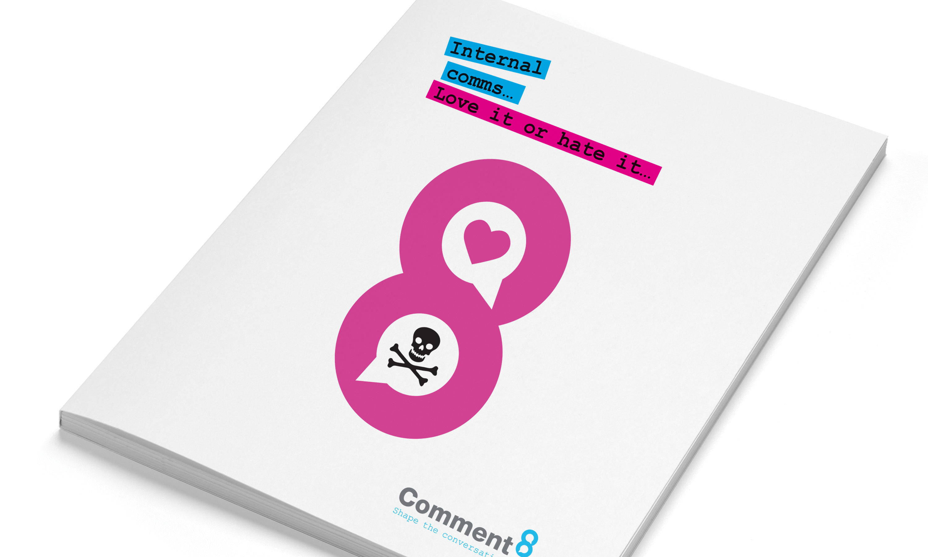
The client’s chosen name Comment8 gave us a nice numerical link, and from there, it was only a hop, step and jump to come up with a rather neat graphic device – using speech bubbles within the 8 to reflect the new company’s offer to help clients shape more product internal conversations.

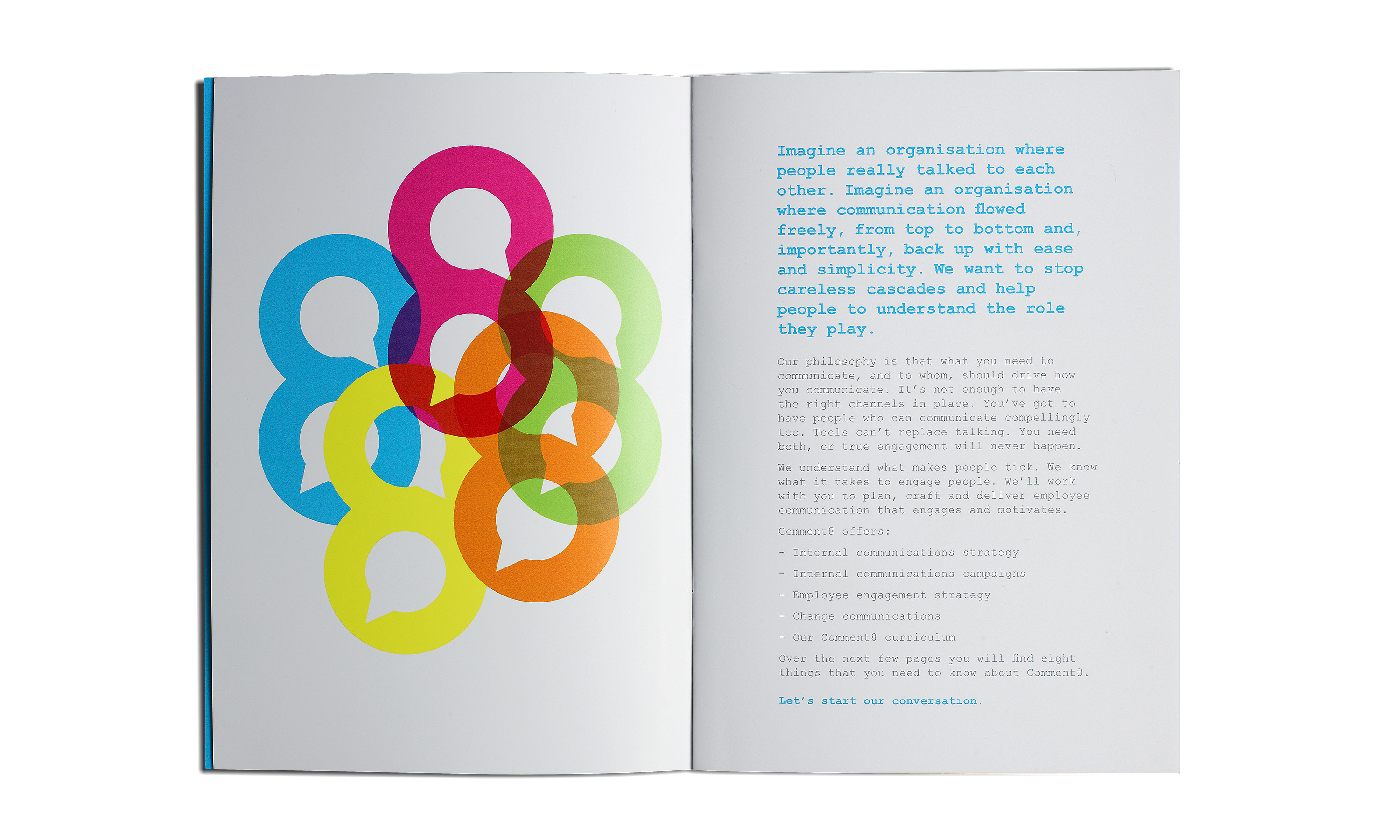
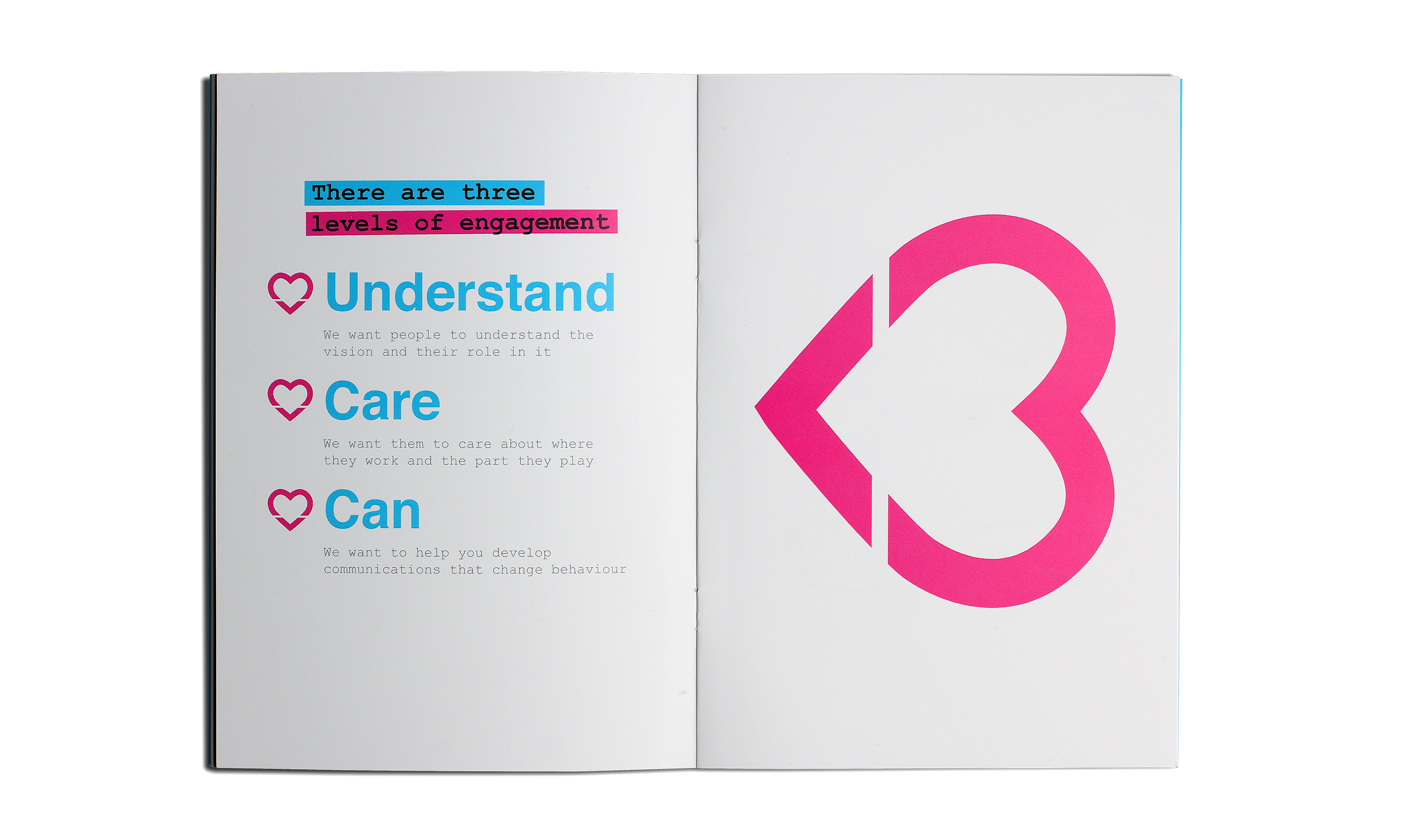
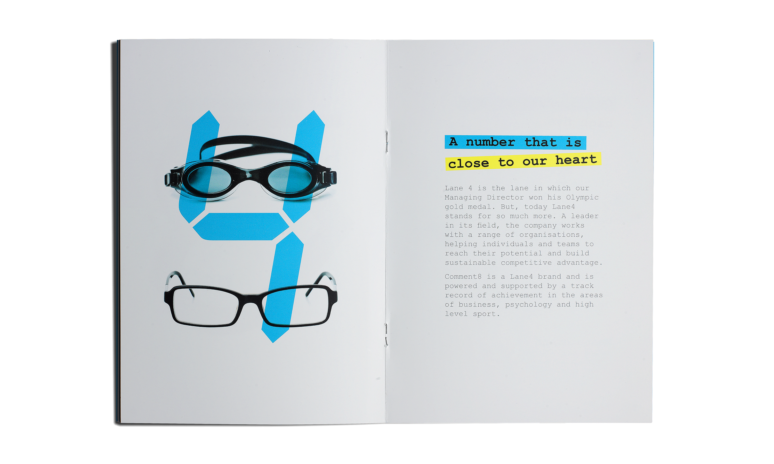
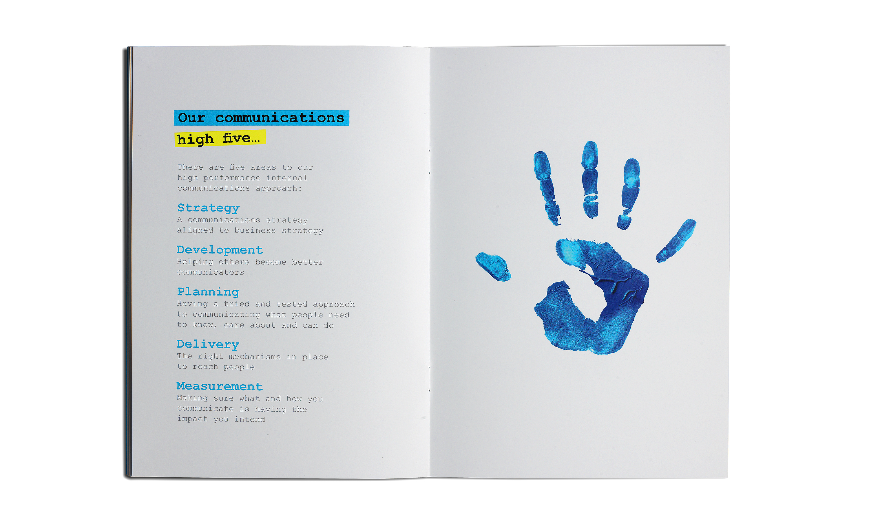
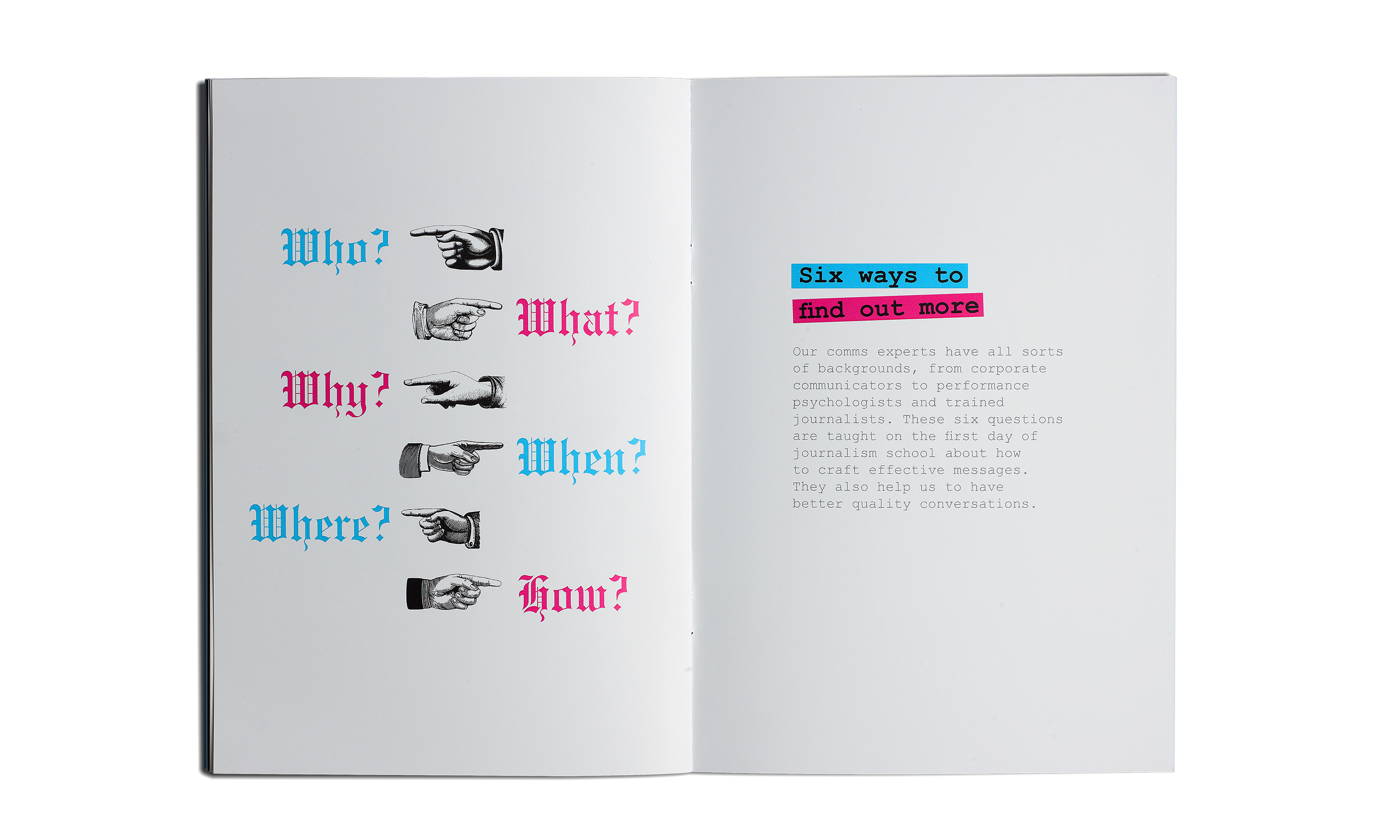
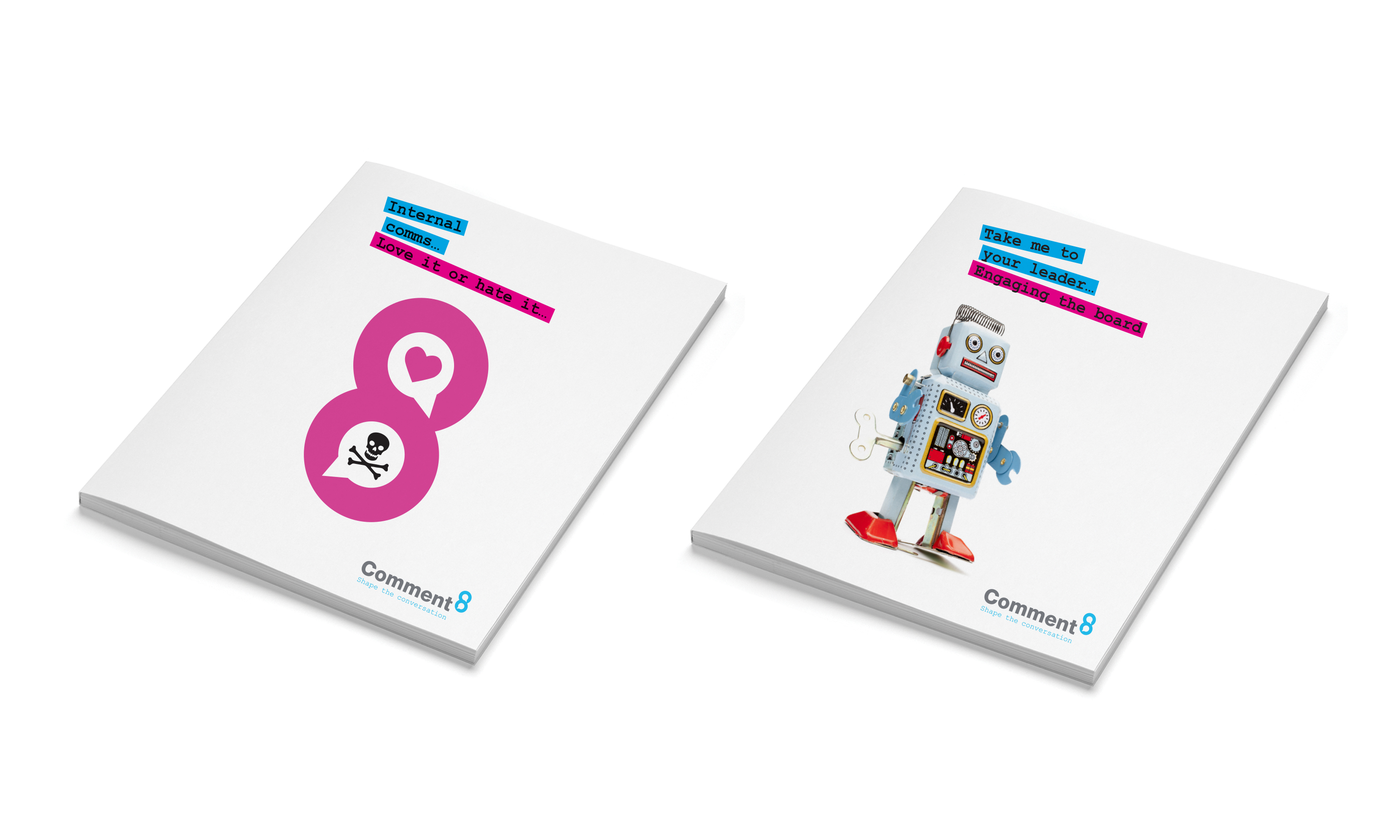
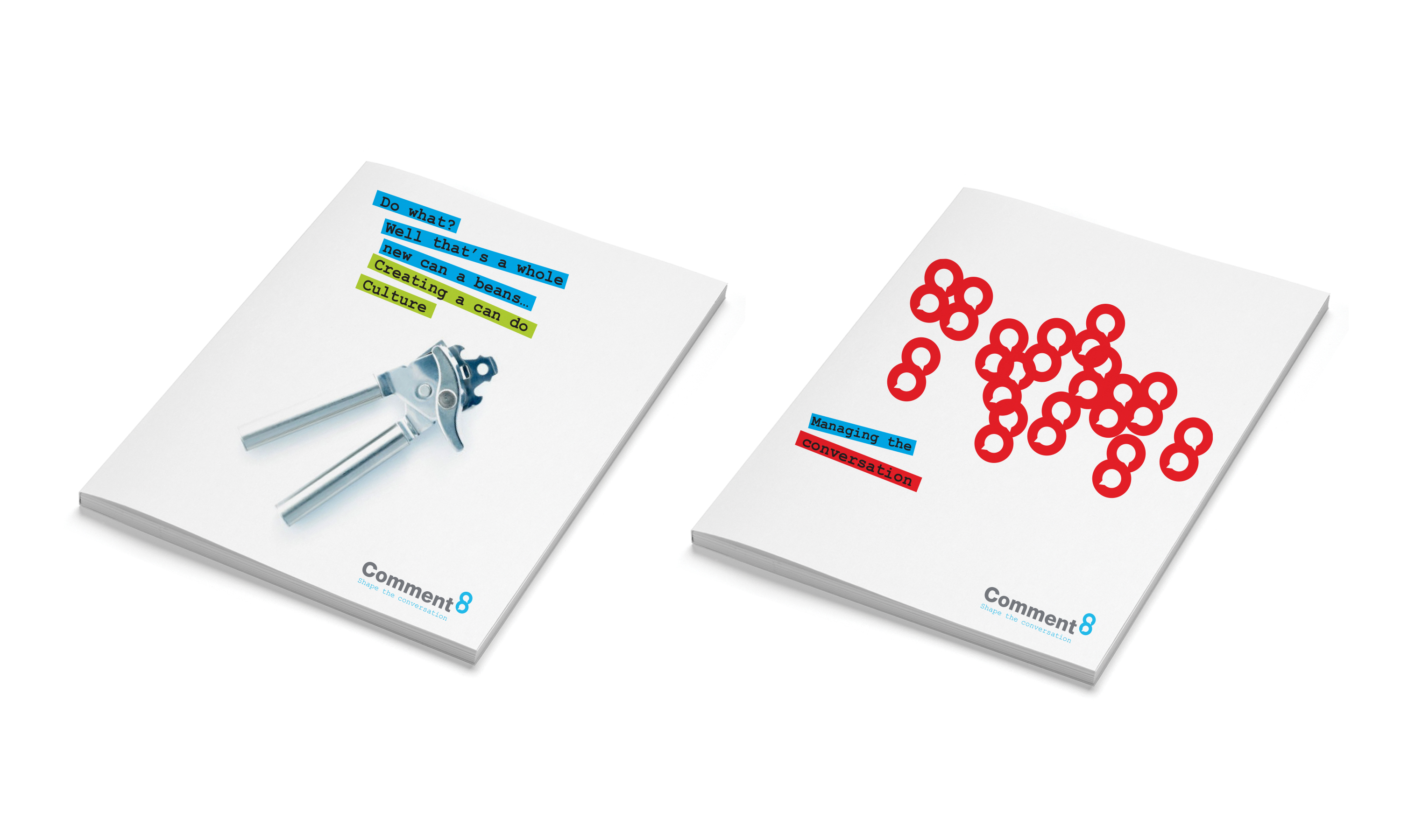
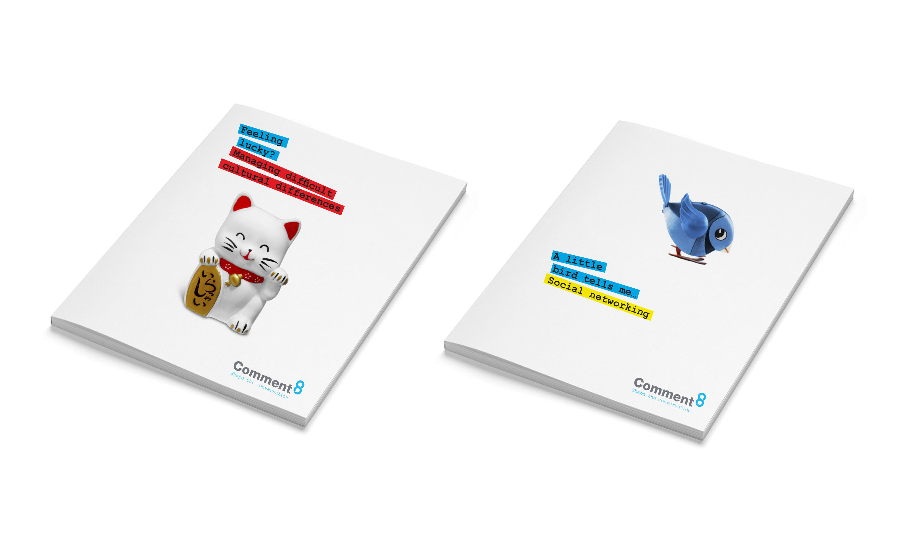
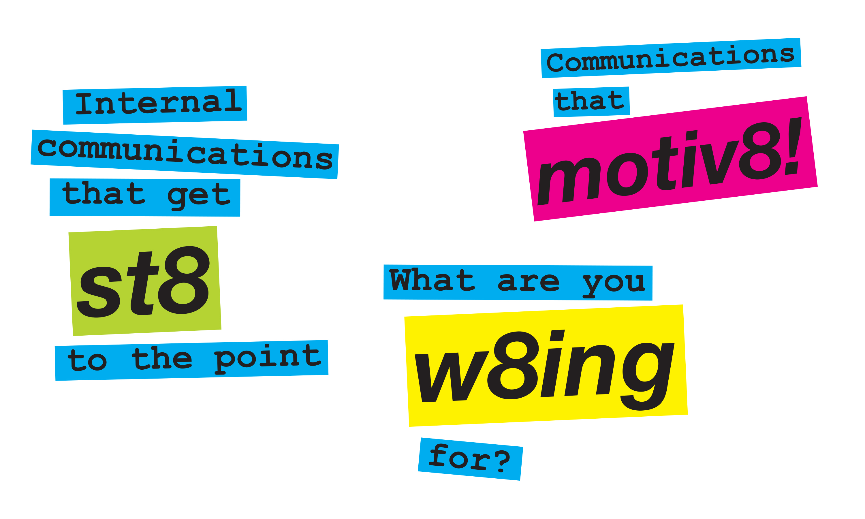
And that, in turn, led us on to develop a whole visual language for the new brand, which we applied to a range of launch communications, including a new corporate brochure, stationery, and various other bits and bobs…

Kind words…

“A really brilliant job.

It has real synergies with the Lane4 brand but is also a strong and creative brand identity in its own right, we’re really excited to get going with it all.”

NATALIE BENJAMIN
Product Director
Comment8

To find out more: [email protected] or call +44 (0)20 3289 1733 Share this: Email, LinkedIn, Twitter, Facebook, Download PDF, follow us on Instagram or view our animations and movies on Vimeo


PROFESSIONAL SERVICES
Brand identity

PROFESSIONAL SERVICES
Brand idenitity
Visual launguage
Literature
Exhibitions
Stationery & forms
Digital templates
PowerPoint templates

Comment8 brand mark.

By Dana Robertson Creative Director and Founder of Neon. Comment8 brand mark. Have you noticed how one thing very often leads to another? Here’s a good example. The “one thing” was a big rebranding project we did a couple of years ago for a company called Lane4, founded by Olympic gold medallist Adrian Moorhouse, and a leader in the field of human performance. And the “another”? Well, Lane4 were impressed by our performance – so when they saw an opportunity to turn their expertise in internal communications into a separate business, they very kindly called on us to create the new brand identity, which needed to be dynamic and distinctive in its own right, but clearly related to the Lane4 parent brand. The client’s chosen name Comment8 gave us a nice numerical link, and from there, it was only a hop, step and jump to come up with a rather neat graphic device – using speech bubbles within the 8 to reflect the new company’s offer to help clients shape more product internal conversations. And that, in turn, led us on to develop a whole visual language for the new brand, which we applied to a range of launch communications, including a new corporate brochure, stationery, and various other bits and bobs… Idea, art direction and design by Neon Design & Branding Consultancy www.neon-creative.com

Comment8 brand mark and graphic language.

By Dana Robertson Creative Director and Founder of Neon. Comment8 literature. Have you noticed how one thing very often leads to another? Here’s a good example. The “one thing” was a big rebranding project we did a couple of years ago for a company called Lane4, founded by Olympic gold medallist Adrian Moorhouse, and a leader in the field of human performance. And the “another”? Well, Lane4 were impressed by our performance – so when they saw an opportunity to turn their expertise in internal communications into a separate business, they very kindly called on us to create the new brand identity, which needed to be dynamic and distinctive in its own right, but clearly related to the Lane4 parent brand. The client’s chosen name Comment8 gave us a nice numerical link, and from there, it was only a hop, step and jump to come up with a rather neat graphic device – using speech bubbles within the 8 to reflect the new company’s offer to help clients shape more product internal conversations. And that, in turn, led us on to develop a whole visual language for the new brand, which we applied to a range of launch communications, including a new corporate brochure, stationery, and various other bits and bobs… Idea, art direction and design by Neon Design & Branding Consultancy www.neon-creative.com

Comment8 business cards.

By Dana Robertson Creative Director and Founder of Neon. Comment8 business cards. Have you noticed how one thing very often leads to another? Here’s a good example. The “one thing” was a big rebranding project we did a couple of years ago for a company called Lane4, founded by Olympic gold medallist Adrian Moorhouse, and a leader in the field of human performance. And the “another”? Well, Lane4 were impressed by our performance – so when they saw an opportunity to turn their expertise in internal communications into a separate business, they very kindly called on us to create the new brand identity, which needed to be dynamic and distinctive in its own right, but clearly related to the Lane4 parent brand. The client’s chosen name Comment8 gave us a nice numerical link, and from there, it was only a hop, step and jump to come up with a rather neat graphic device – using speech bubbles within the 8 to reflect the new company’s offer to help clients shape more product internal conversations. And that, in turn, led us on to develop a whole visual language for the new brand, which we applied to a range of launch communications, including a new corporate brochure, stationery, and various other bits and bobs… Idea, art direction and design by Neon Design & Branding Consultancy www.neon-creative.com

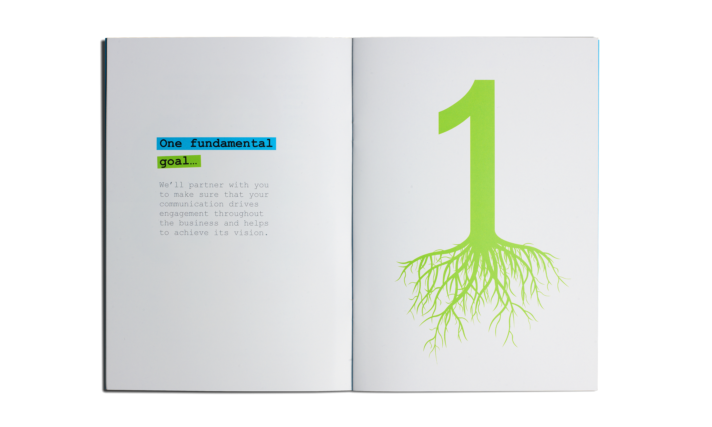
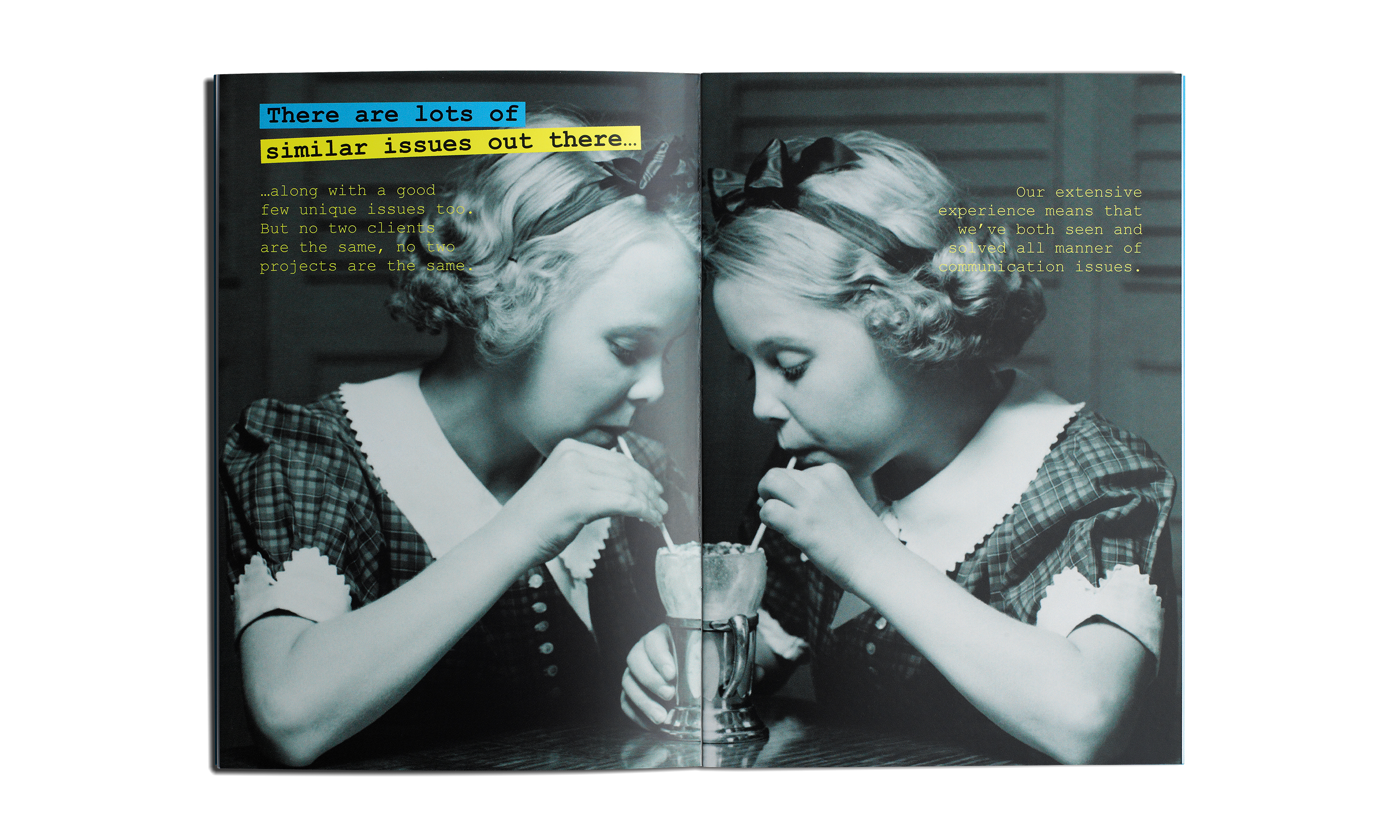
An introduction to Comment8 brochure.

Comment8 literature.

By Dana Robertson Creative Director and Founder of Neon. Comment8 literature. Have you noticed how one thing very often leads to another? Here’s a good example. The “one thing” was a big rebranding project we did a couple of years ago for a company called Lane4, founded by Olympic gold medallist Adrian Moorhouse, and a leader in the field of human performance. And the “another”? Well, Lane4 were impressed by our performance – so when they saw an opportunity to turn their expertise in internal communications into a separate business, they very kindly called on us to create the new brand identity, which needed to be dynamic and distinctive in its own right, but clearly related to the Lane4 parent brand. The client’s chosen name Comment8 gave us a nice numerical link, and from there, it was only a hop, step and jump to come up with a rather neat graphic device – using speech bubbles within the 8 to reflect the new company’s offer to help clients shape more product internal conversations. And that, in turn, led us on to develop a whole visual language for the new brand, which we applied to a range of launch communications, including a new corporate brochure, stationery, and various other bits and bobs… Idea, art direction and design by Neon Design & Branding Consultancy www.neon-creative.com

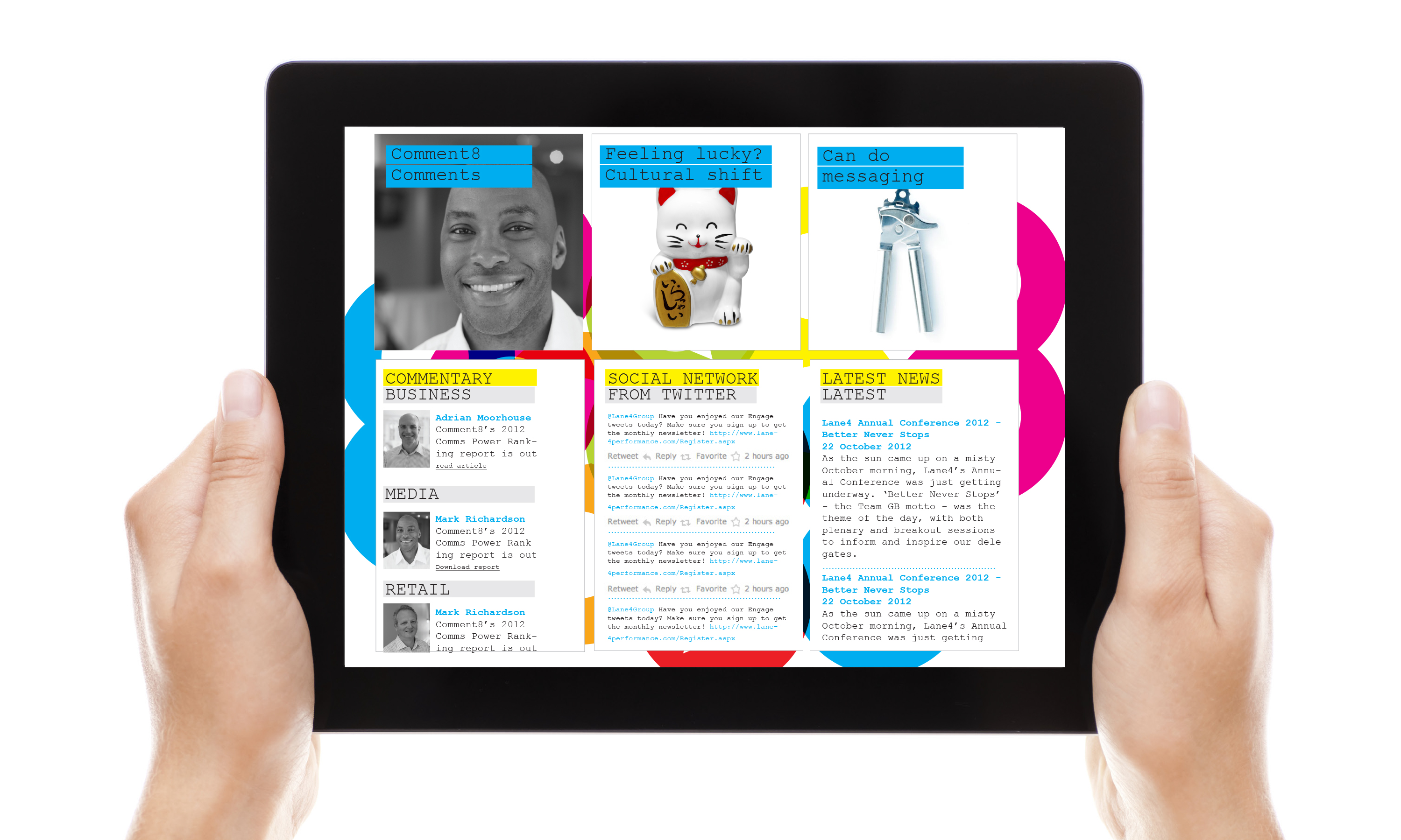
Comment8 website.

By Dana Robertson Creative Director and Founder of Neon. Comment8 website. Have you noticed how one thing very often leads to another? Here’s a good example. The “one thing” was a big rebranding project we did a couple of years ago for a company called Lane4, founded by Olympic gold medallist Adrian Moorhouse, and a leader in the field of human performance. And the “another”? Well, Lane4 were impressed by our performance – so when they saw an opportunity to turn their expertise in internal communications into a separate business, they very kindly called on us to create the new brand identity, which needed to be dynamic and distinctive in its own right, but clearly related to the Lane4 parent brand. The client’s chosen name Comment8 gave us a nice numerical link, and from there, it was only a hop, step and jump to come up with a rather neat graphic device – using speech bubbles within the 8 to reflect the new company’s offer to help clients shape more product internal conversations. And that, in turn, led us on to develop a whole visual language for the new brand, which we applied to a range of launch communications, including a new corporate brochure, stationery, and various other bits and bobs… Idea, art direction and design by Neon Design & Branding Consultancy www.neon-creative.com

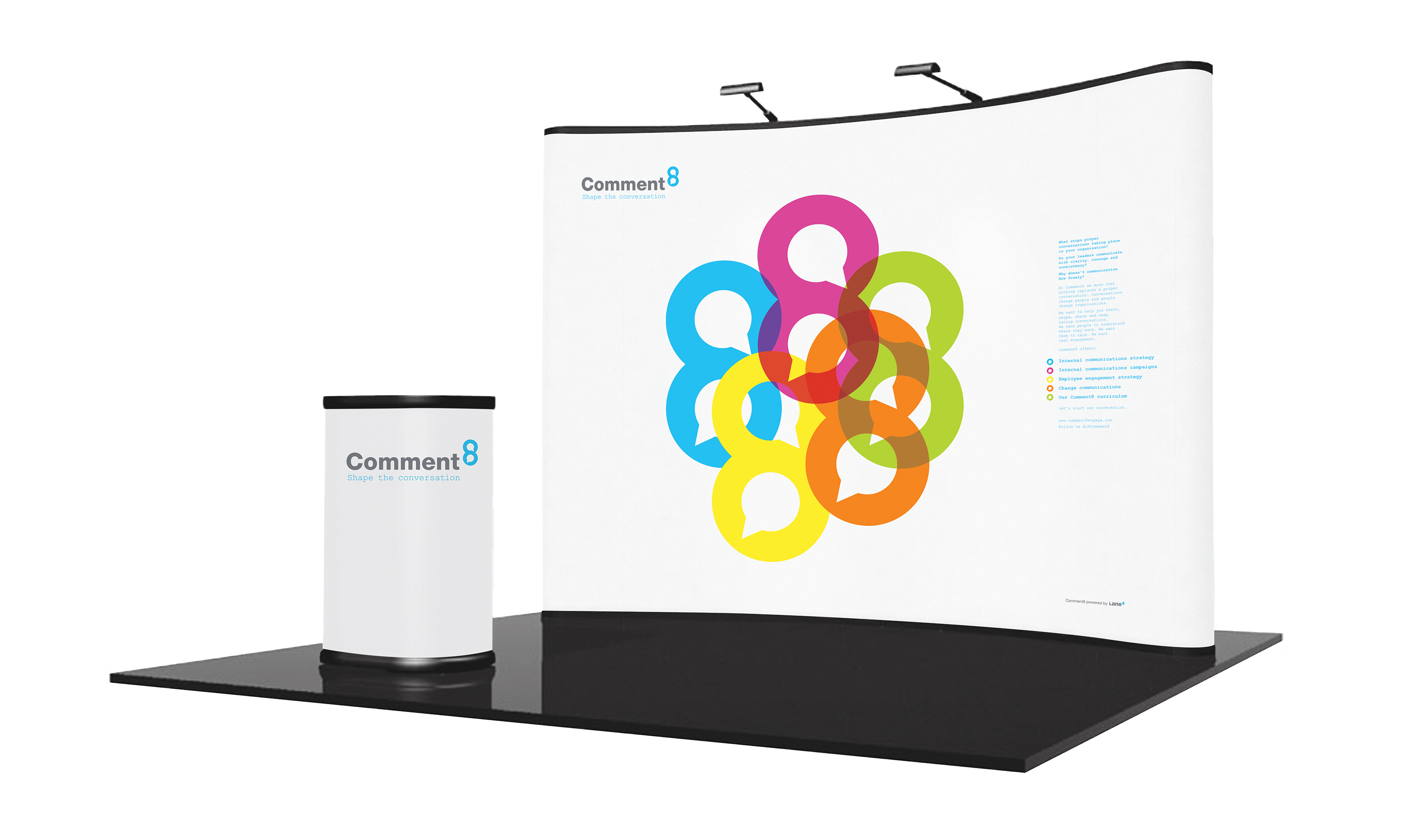
Comment8 stand.

By Dana Robertson Creative Director and Founder of Neon. Comment8 stand. Have you noticed how one thing very often leads to another? Here’s a good example. The “one thing” was a big rebranding project we did a couple of years ago for a company called Lane4, founded by Olympic gold medallist Adrian Moorhouse, and a leader in the field of human performance. And the “another”? Well, Lane4 were impressed by our performance – so when they saw an opportunity to turn their expertise in internal communications into a separate business, they very kindly called on us to create the new brand identity, which needed to be dynamic and distinctive in its own right, but clearly related to the Lane4 parent brand. The client’s chosen name Comment8 gave us a nice numerical link, and from there, it was only a hop, step and jump to come up with a rather neat graphic device – using speech bubbles within the 8 to reflect the new company’s offer to help clients shape more product internal conversations. And that, in turn, led us on to develop a whole visual language for the new brand, which we applied to a range of launch communications, including a new corporate brochure, stationery, and various other bits and bobs… Idea, art direction and design by Neon Design & Branding Consultancy www.neon-creative.com

Comment8 graphic language.

Comment8 supplementary graphic language.

By Dana Robertson Creative Director and Founder of Neon. Comment8 graphic language. Have you noticed how one thing very often leads to another? Here’s a good example. The “one thing” was a big rebranding project we did a couple of years ago for a company called Lane4, founded by Olympic gold medallist Adrian Moorhouse, and a leader in the field of human performance. And the “another”? Well, Lane4 were impressed by our performance – so when they saw an opportunity to turn their expertise in internal communications into a separate business, they very kindly called on us to create the new brand identity, which needed to be dynamic and distinctive in its own right, but clearly related to the Lane4 parent brand. The client’s chosen name Comment8 gave us a nice numerical link, and from there, it was only a hop, step and jump to come up with a rather neat graphic device – using speech bubbles within the 8 to reflect the new company’s offer to help clients shape more product internal conversations. And that, in turn, led us on to develop a whole visual language for the new brand, which we applied to a range of launch communications, including a new corporate brochure, stationery, and various other bits and bobs… Idea, art direction and design by Neon Design & Branding Consultancy www.neon-creative.com

Other projects you may find of interest...