Neon invited to comment in Design Week – Pantones colour of the year 2016.
15-3919 Serenity and 13-1520 Rose Quartz were chosen as Pantone’s ‘Colour of the Year’ for 2016 and Design Week followed up on a feature it ran asking designers which colour they think will best represent 2016. Here’s our snippet in the pic above and text below…
“Hmm, not sure I share Pantone’s somewhat utopian view of 2016. Call me an old-misery guts, but – looking at the news – I don’t expect peace, harmony and tranquillity to be the predominant shade in the year to come. What will be? Maybe the best we can hope for, if we’re looking for a combination, is honest black and white. But, if I can just shake off the grumpy mood provoked by Pantone’s escapist nonsense, I’ll be hoping to see a lot of my very favourite colour, only available from Mother Nature: the iridescent shimmer of sunset meeting sea – whenever I can steal a weekend away with my board.”
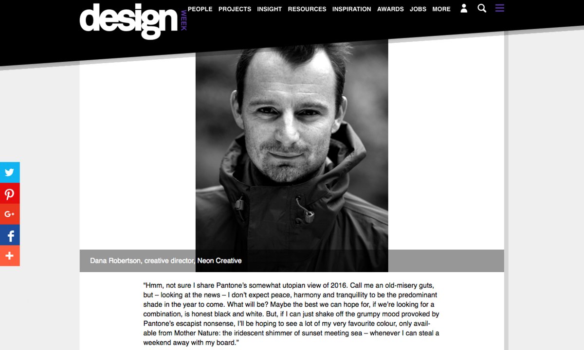
Dana Robertson
Creative Director
Neon
To view the full article and all responses on-line click here, but you will need to register with Design Week.