HW Fisher rebrand
Taking accountancy from dry-and-dusty to dynamic
HW Fisher is one of the UK’s leading accountancy firms, providing a vast range of financially-focused expertise to businesses of all sizes, as well as private individuals (including some very starry showbiz names). Realising the need to bring their brand – established way back in 1933 – up to speed with the modern world, they ran into difficulties with the branding project with an agency that promised a lot, but failed to deliver. Read More…
Recommended by a friendly former client from our long and hugely successful relationship with and branding of law firm Nabarro, we were asked to pick up the fumbled ball, and run with it. Or, to be more specific, to complete a total brand refresh that would help enable HW Fisher to compete on equal terms with the biggest names in their industry.
Our first objective: to develop a positioning and visual language, and refine the HW Fisher brandmark, to better communicate the firm’s premium offering and impressive heritage, in a distinctive and vibrantly contemporary way.
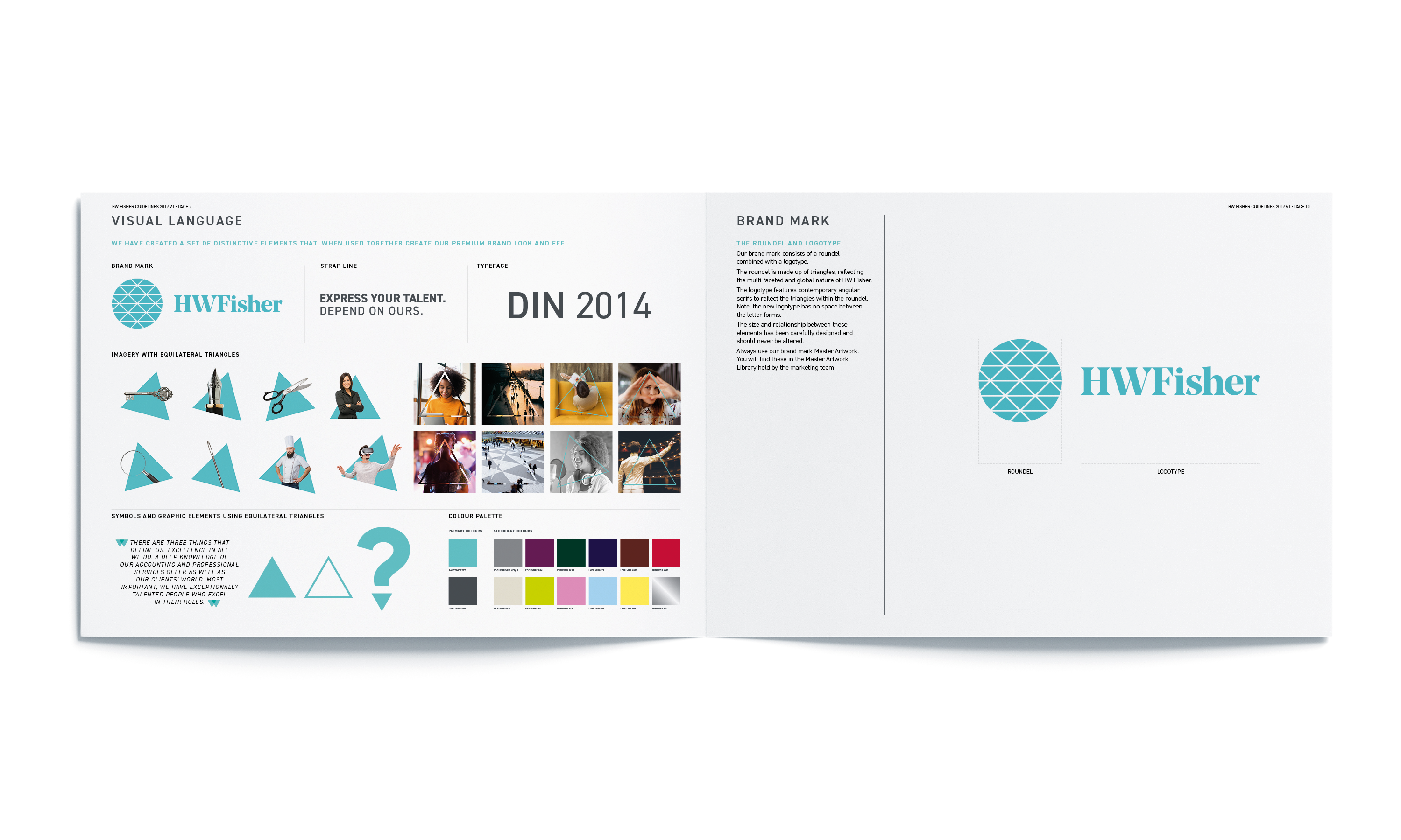
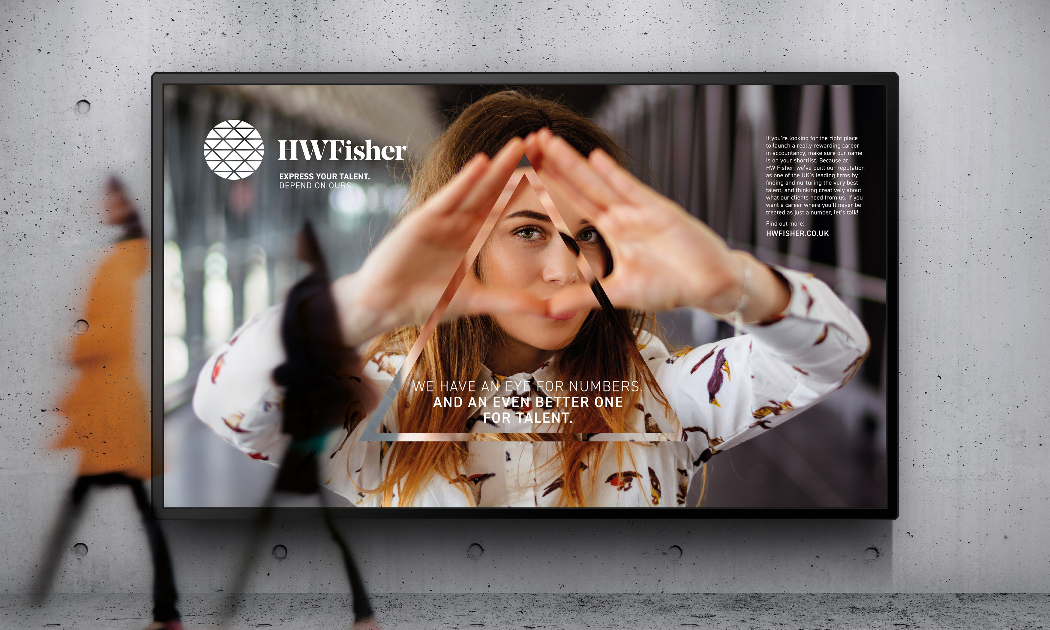
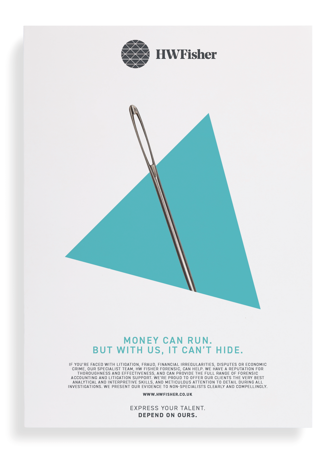
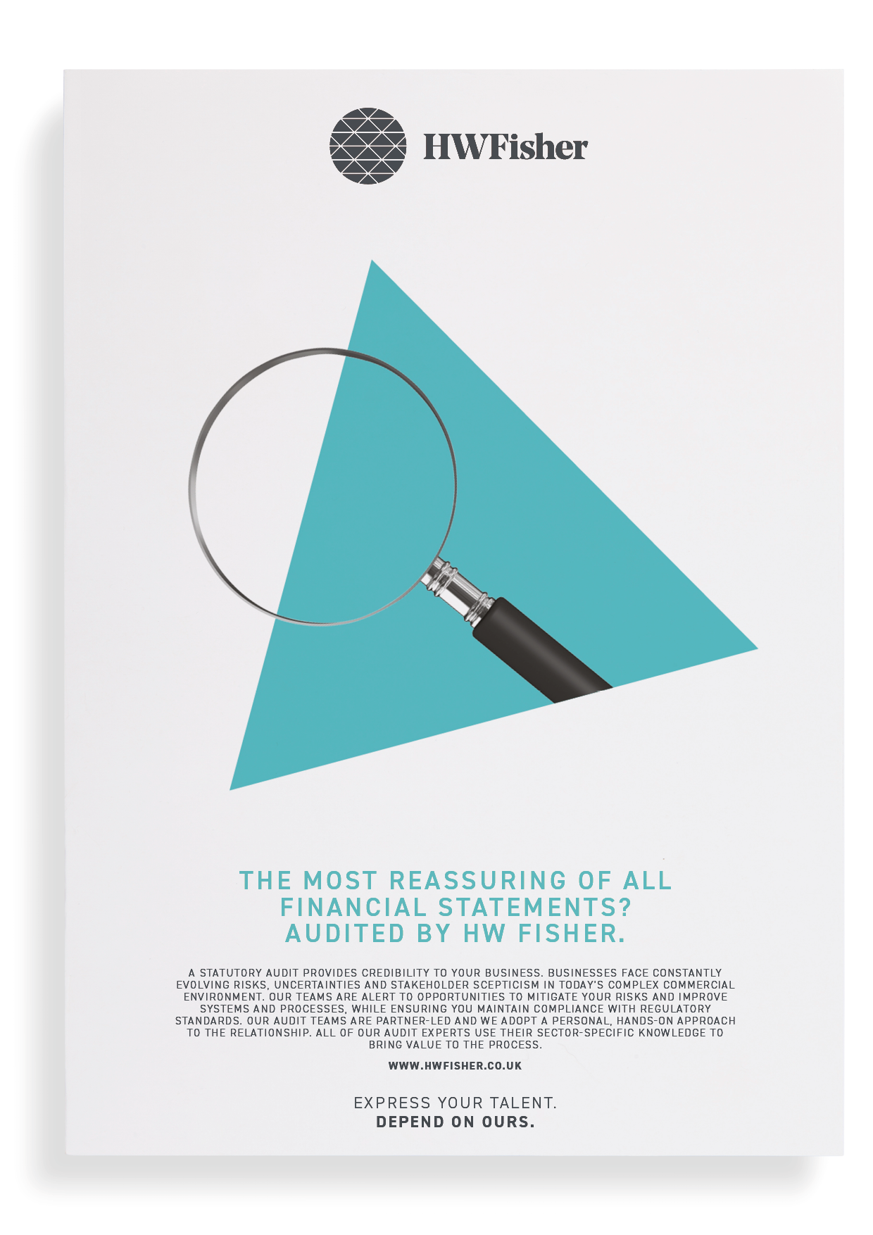
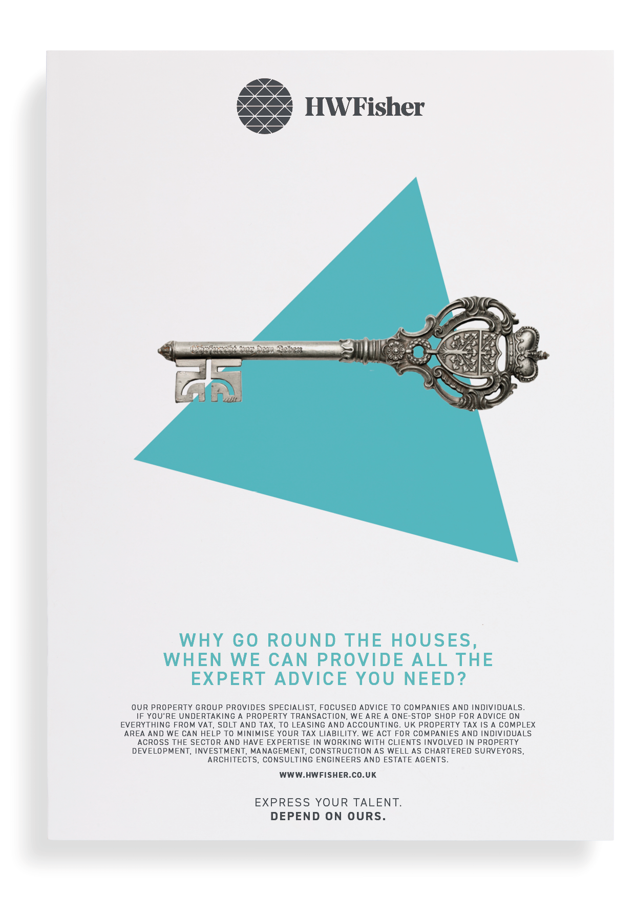
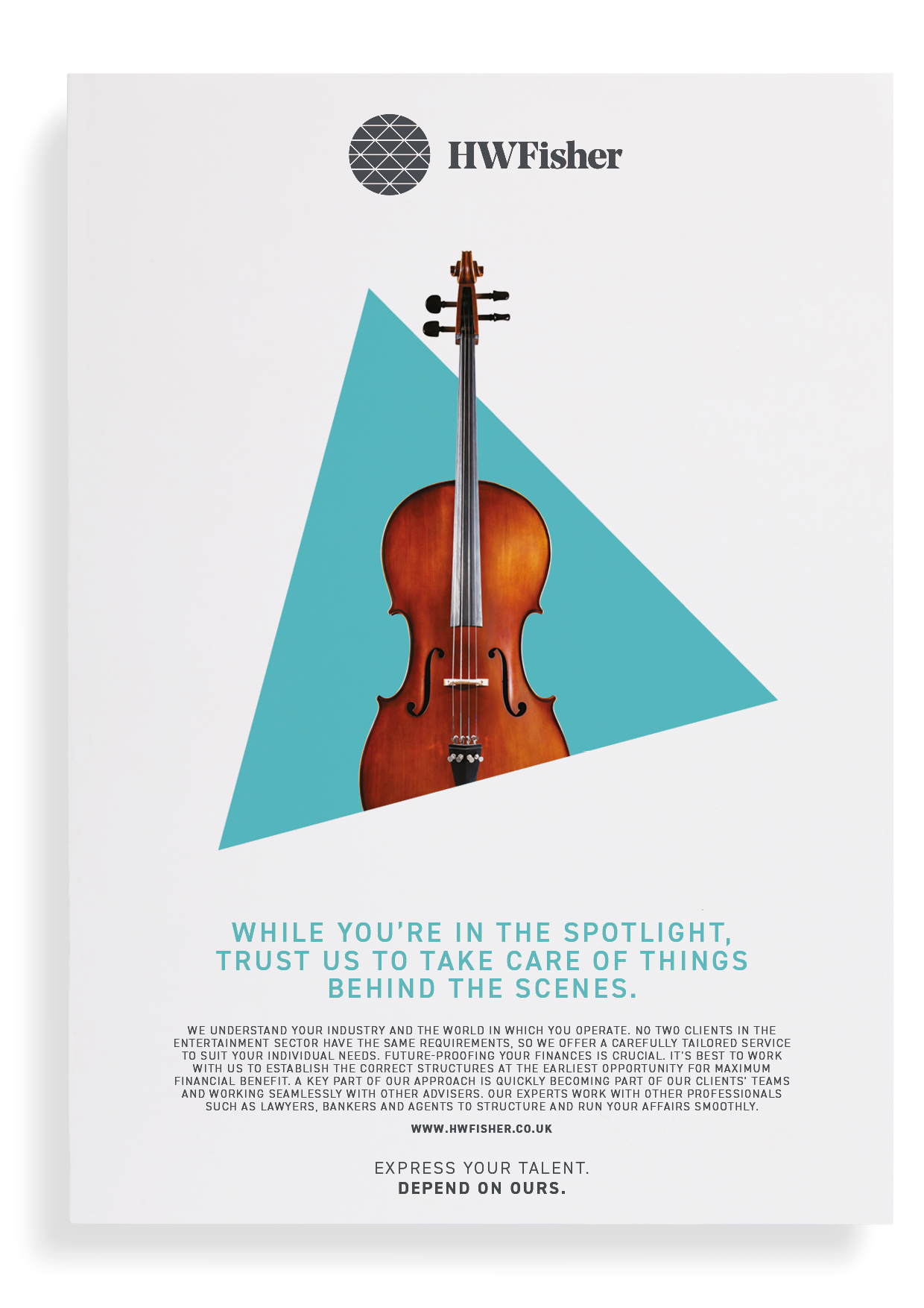
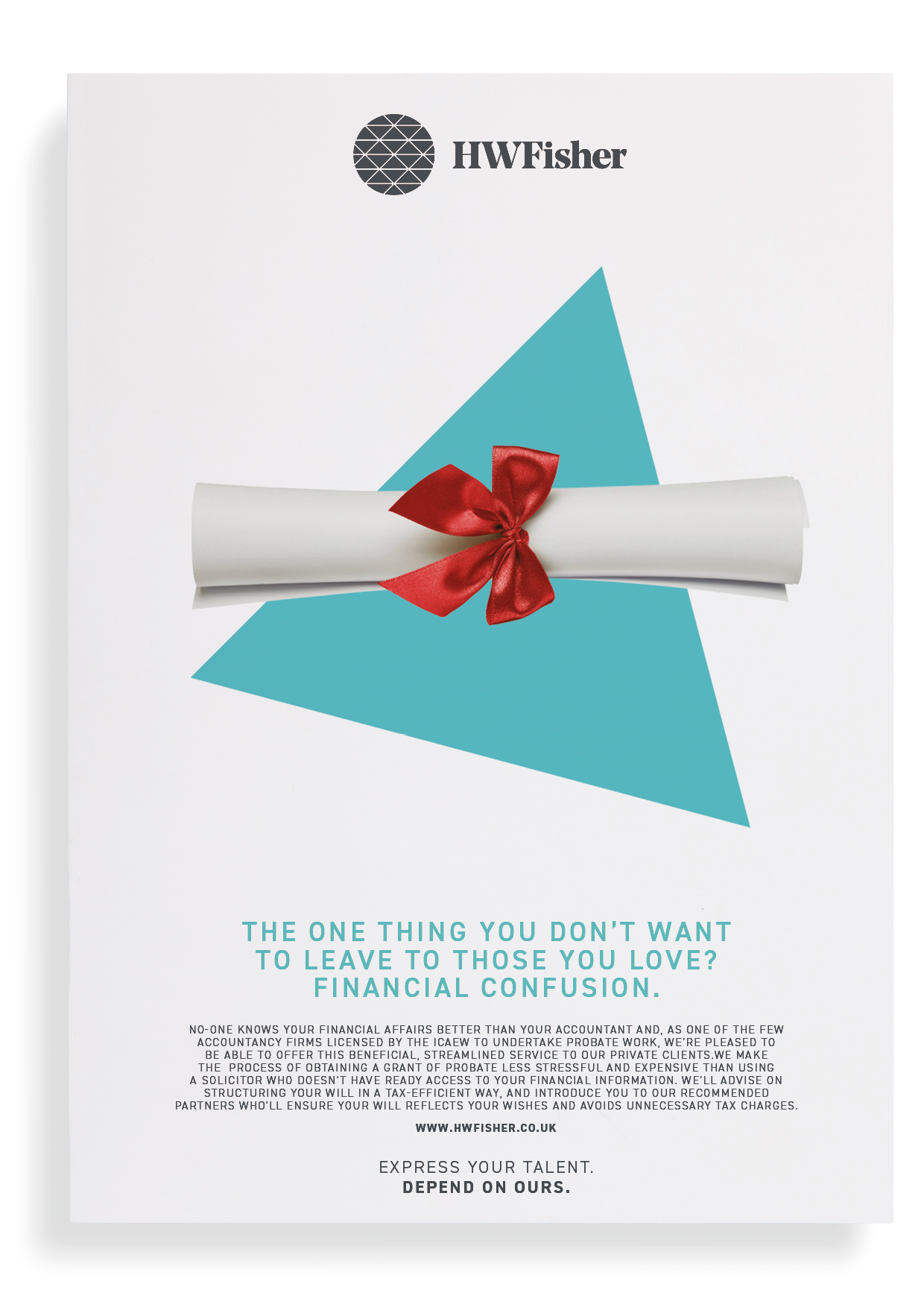
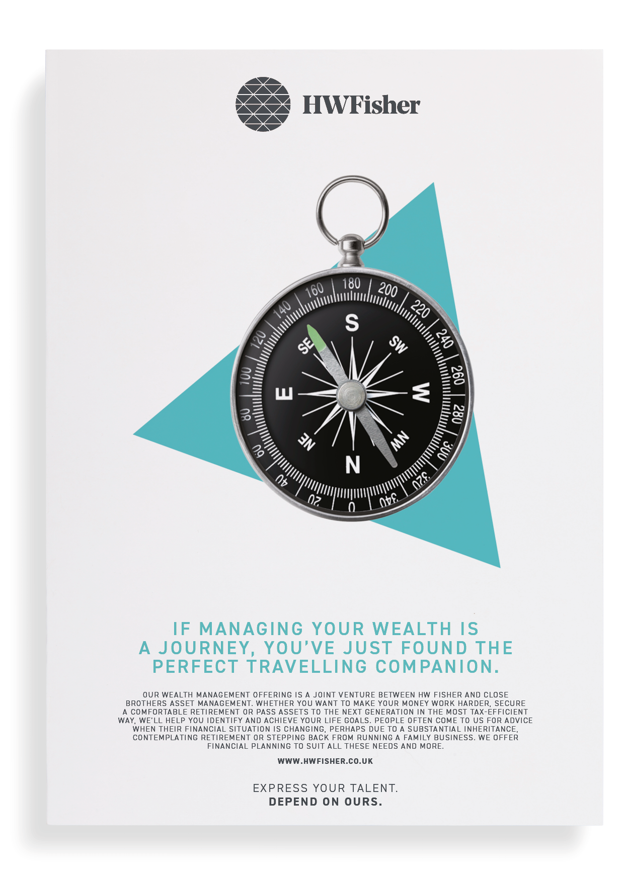
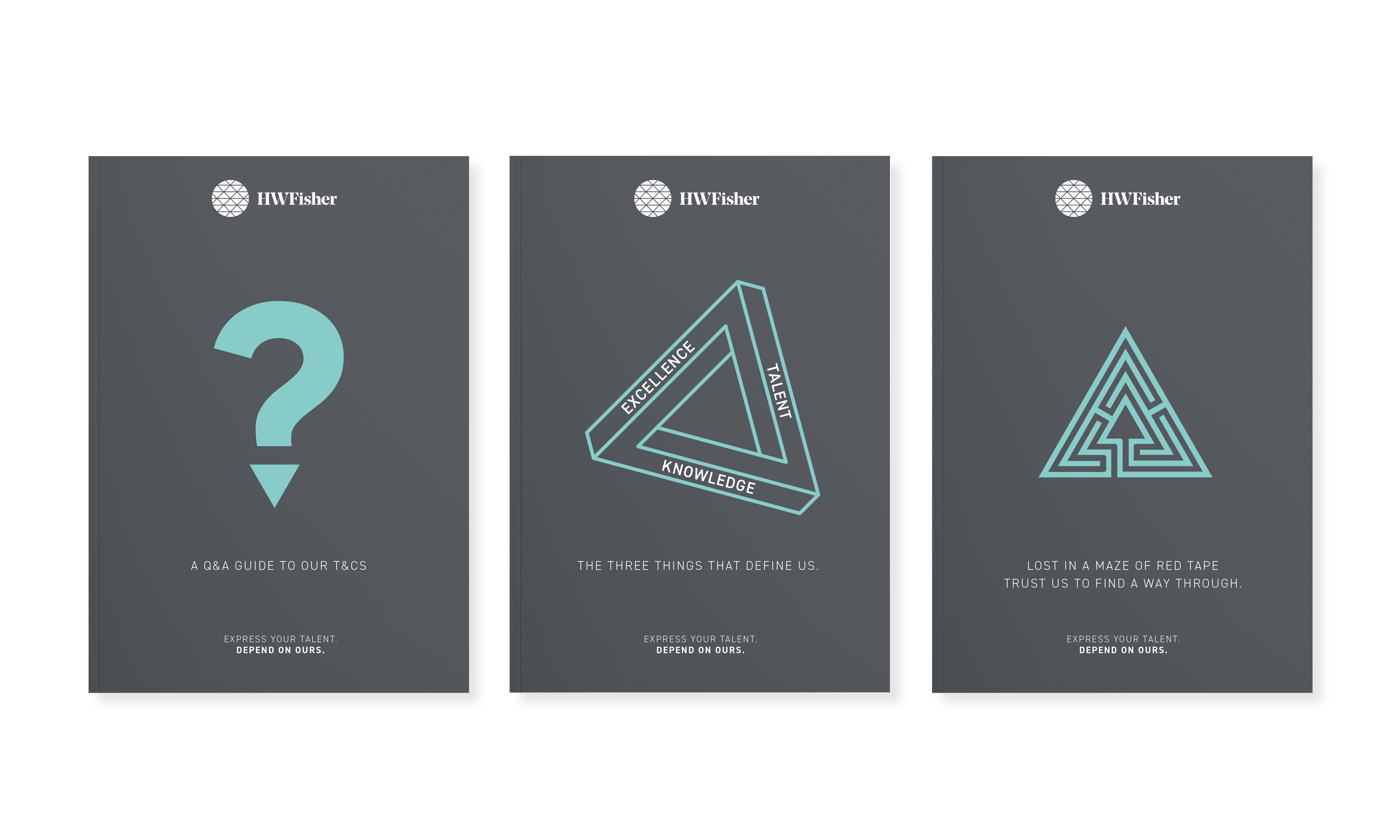
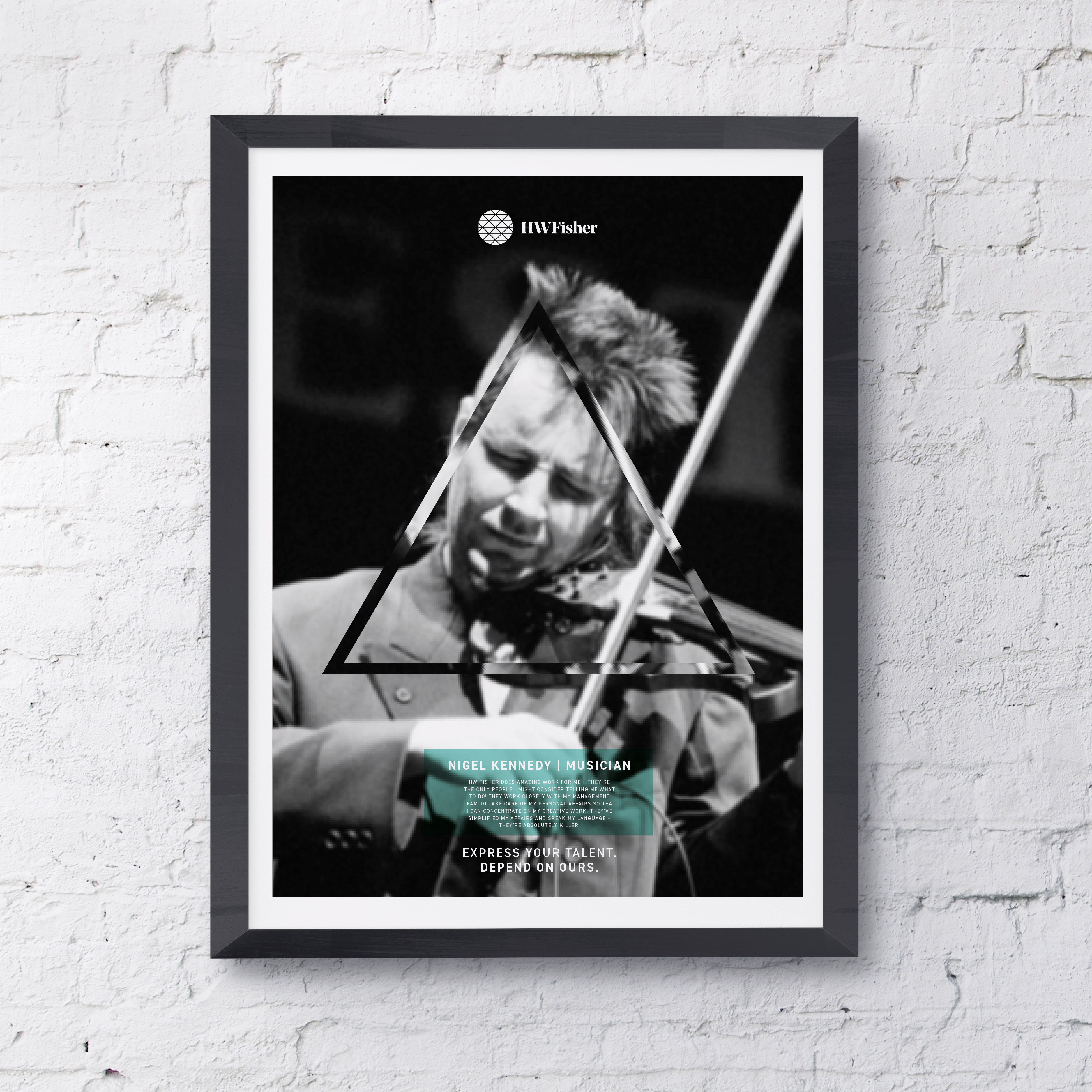
Three little words and a triangle – the power of three.
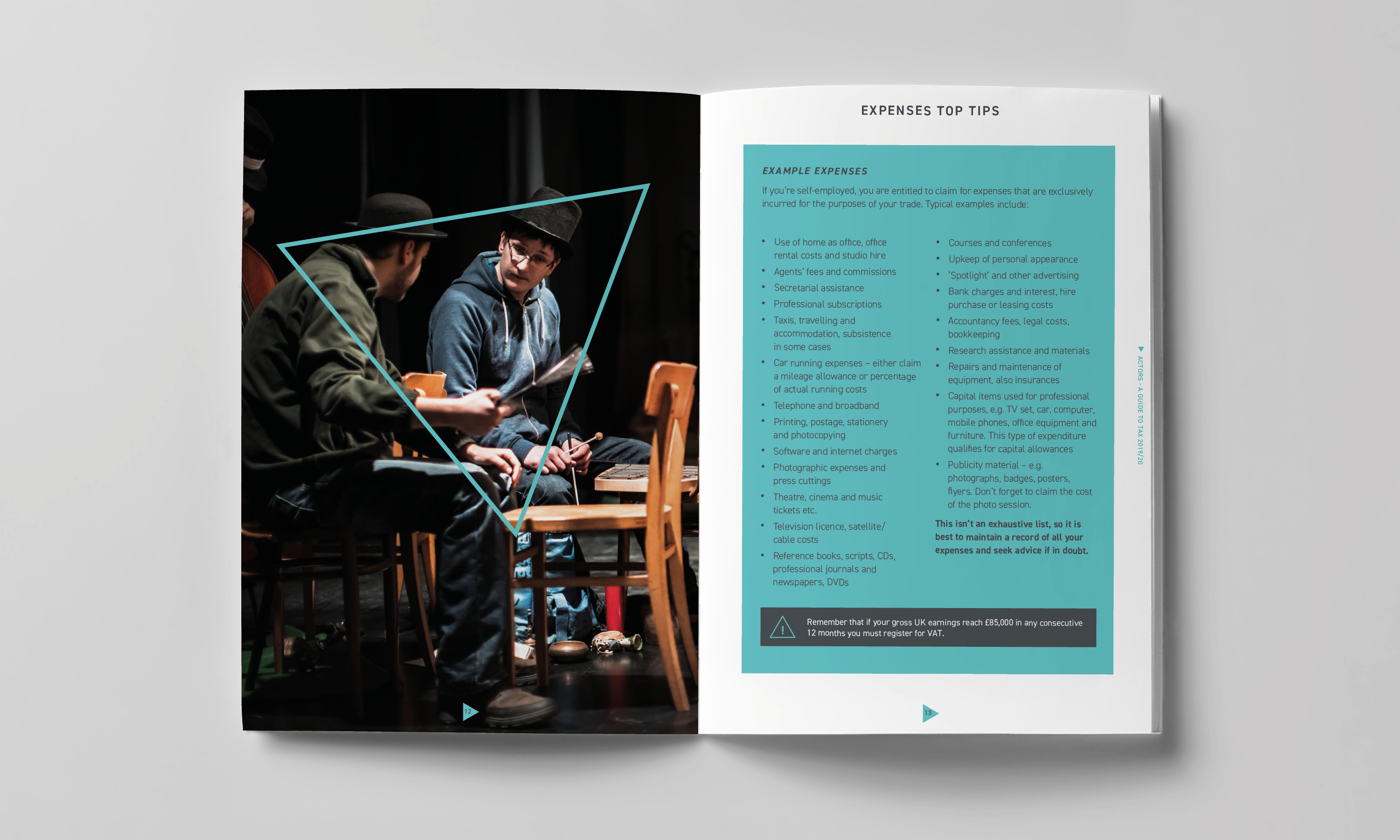
After extensive interviews with the firm’s senior team, we arrived at a three-word distillation of what sets HW Fisher apart from its competitors: Excellence, Talent, Knowledge . . . which led us, more or less directly, to a simple but highly effective triangle device, also to be found within the new brandmark.
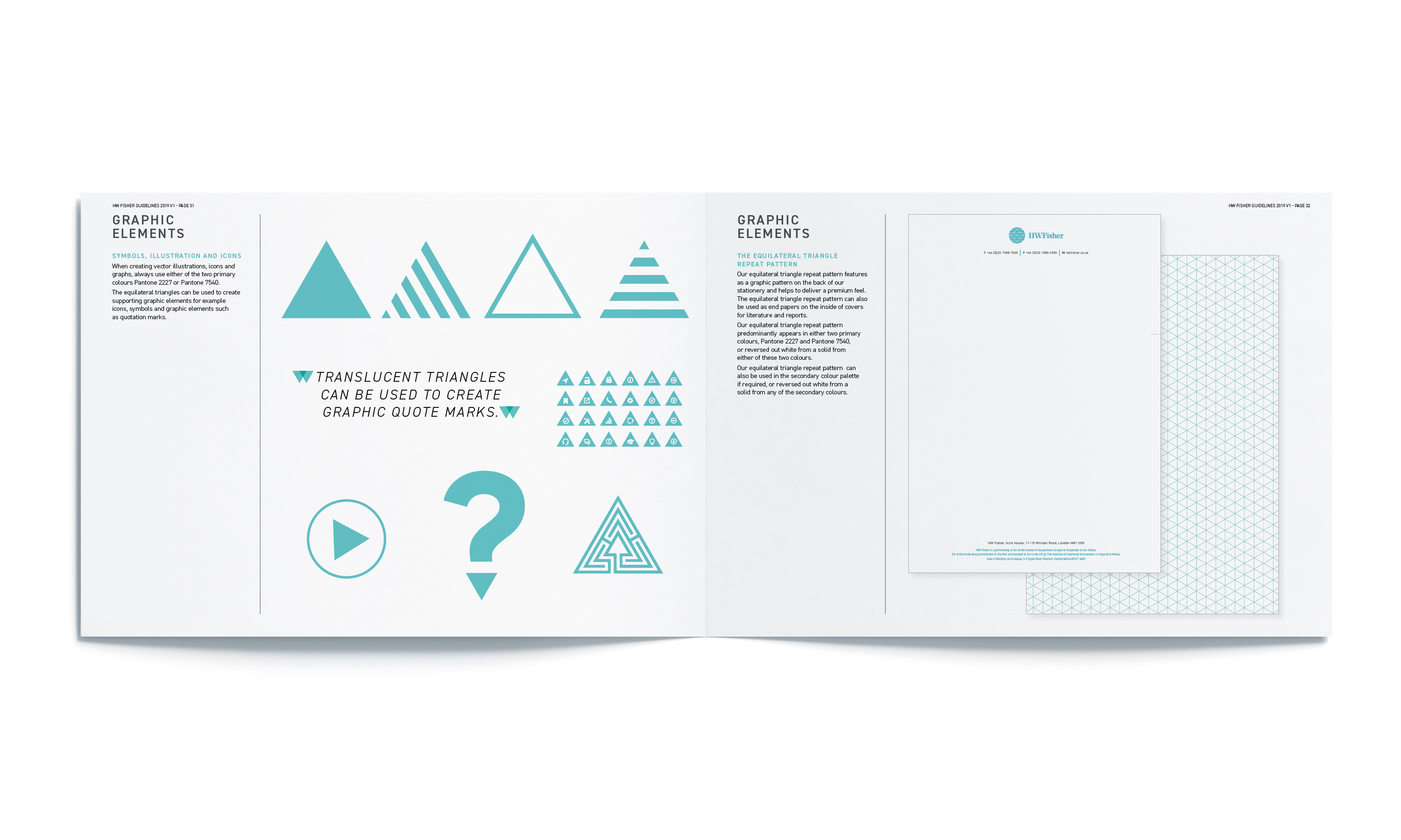
This extremely robust and versatile graphic component, we realised, could work across the board with real visual variety, as a means of providing visual focus, and a sense of the firm’s ability to see financial matters from a different perspective.
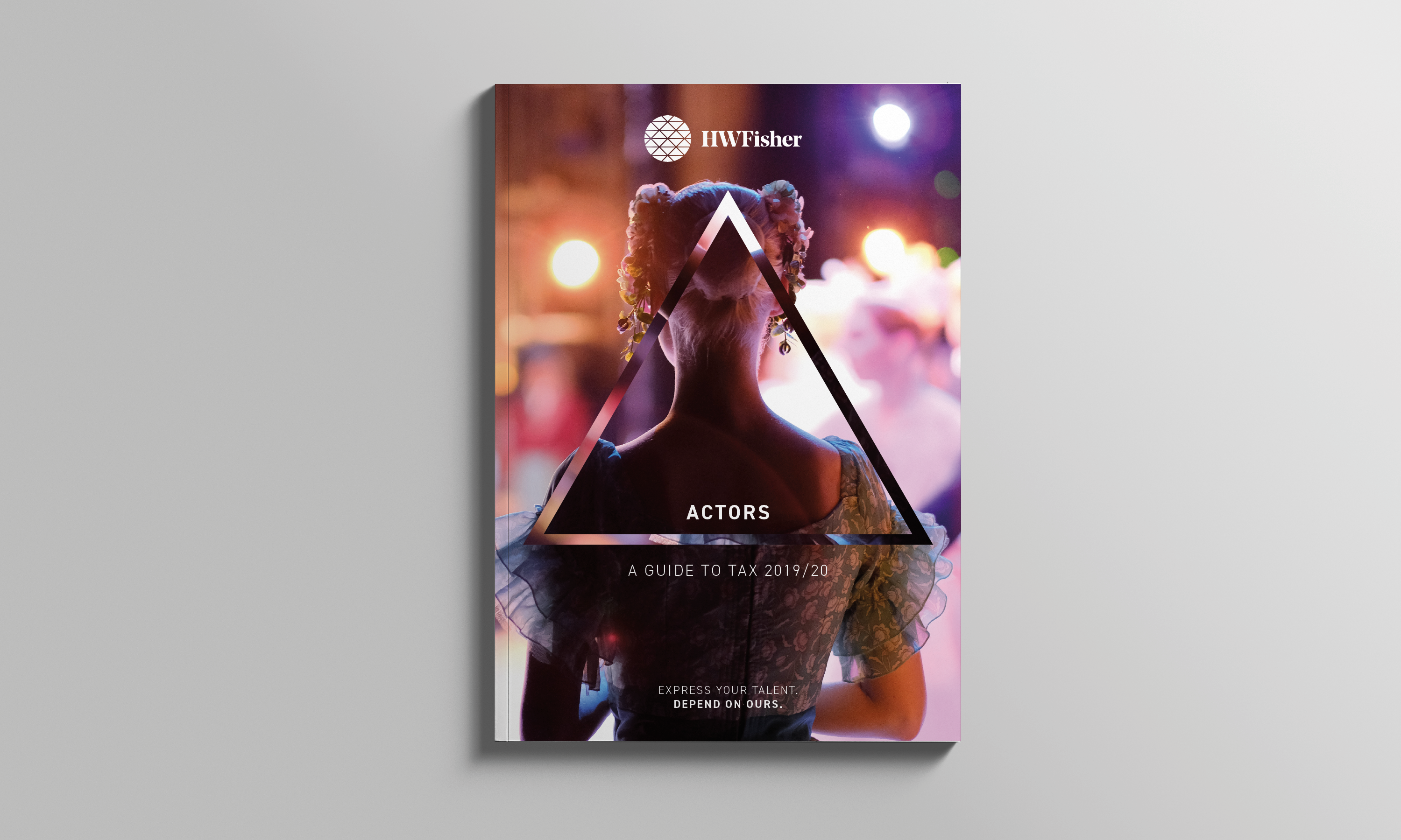
Next came a strapline that’s genuinely novel for the sector – ‘Express your Talent. Depend on ours.’– putting the emphasis on the firm’s policy of securing the very best accountancy talent, to enable their clients to focus on whatever it is they do best.
Making talent count, across the board.
And then it was all-systems go, applying the finishing touches to HW Fisher’s new identity, with new colour palettes and typography, before rolling out the new look and feel across a host of different communications.
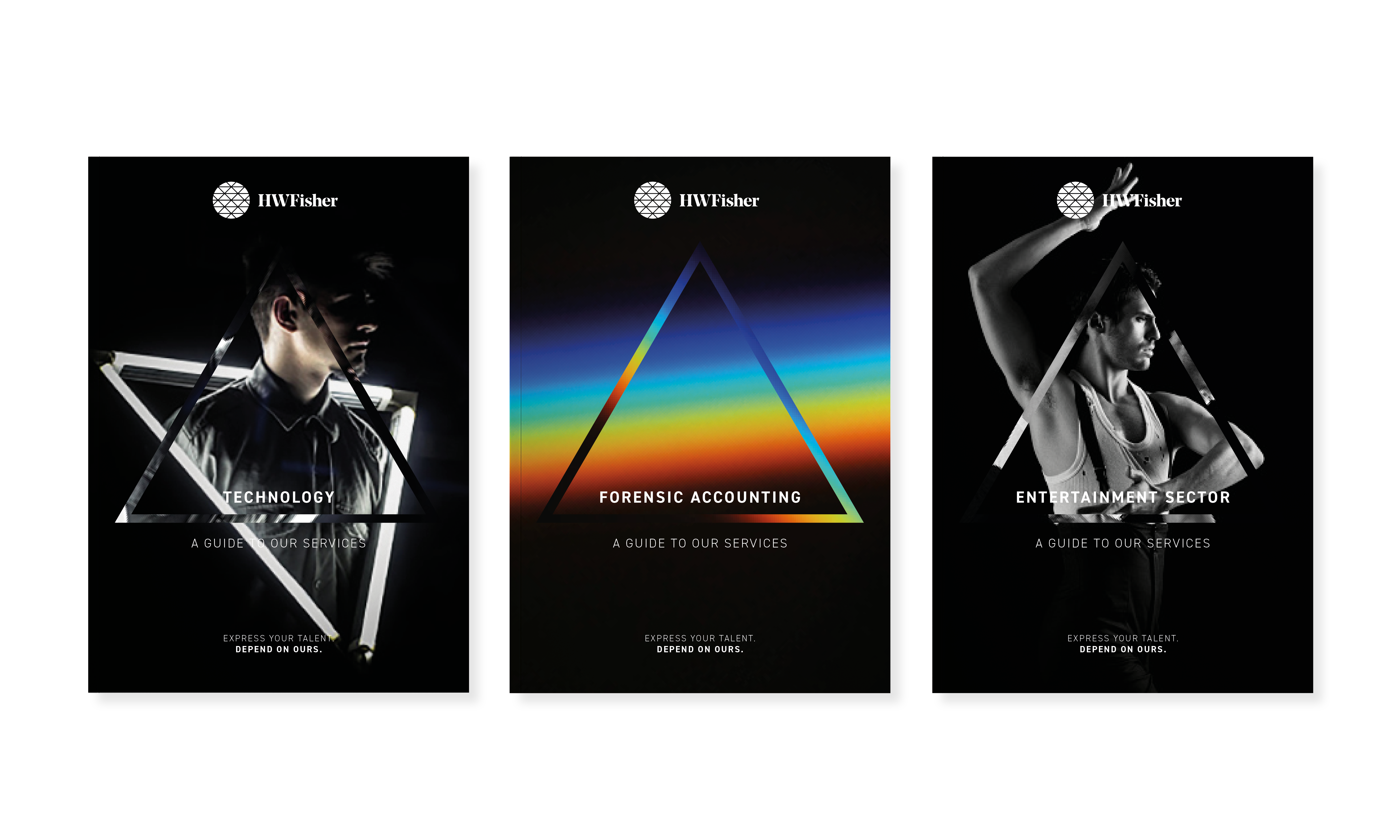
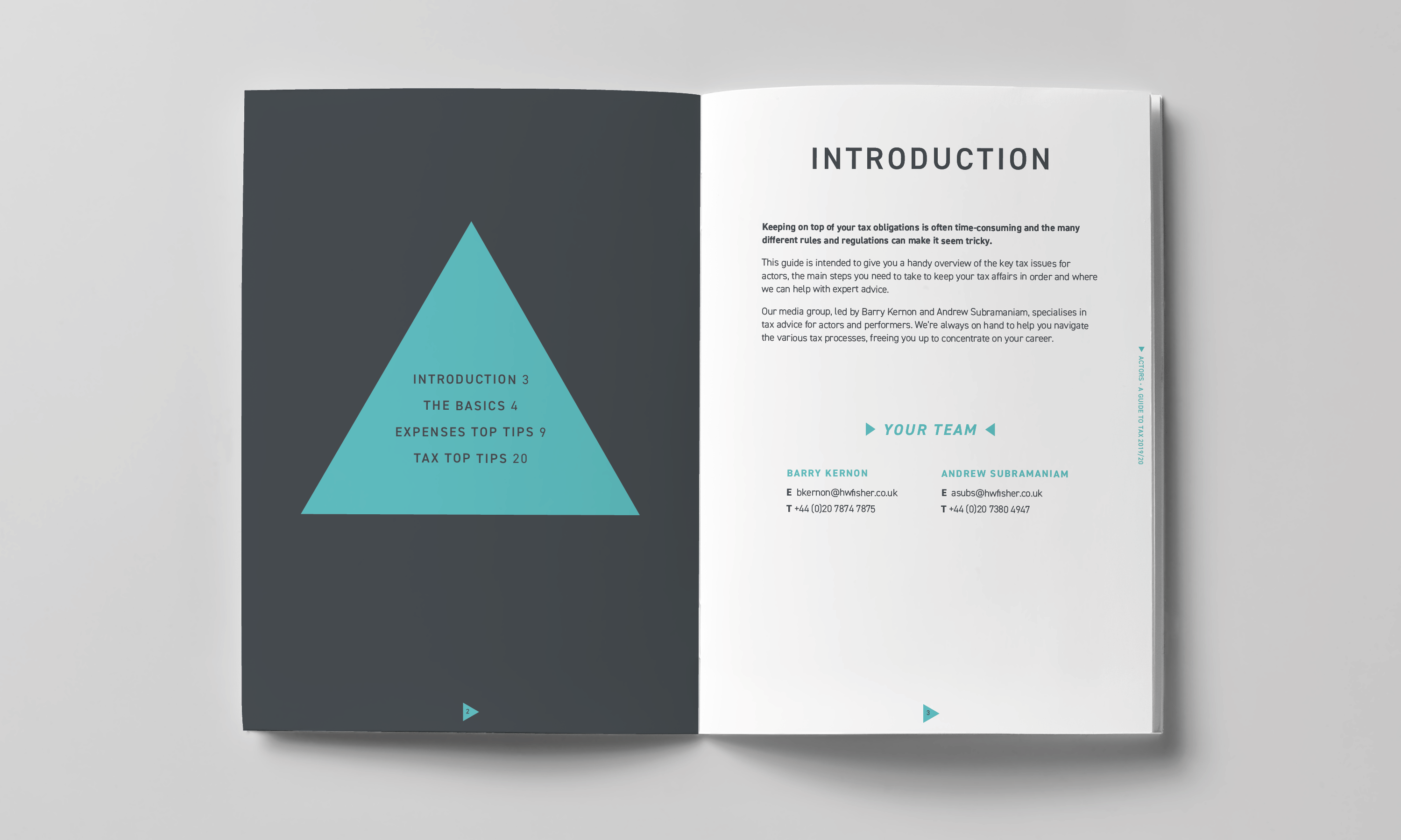
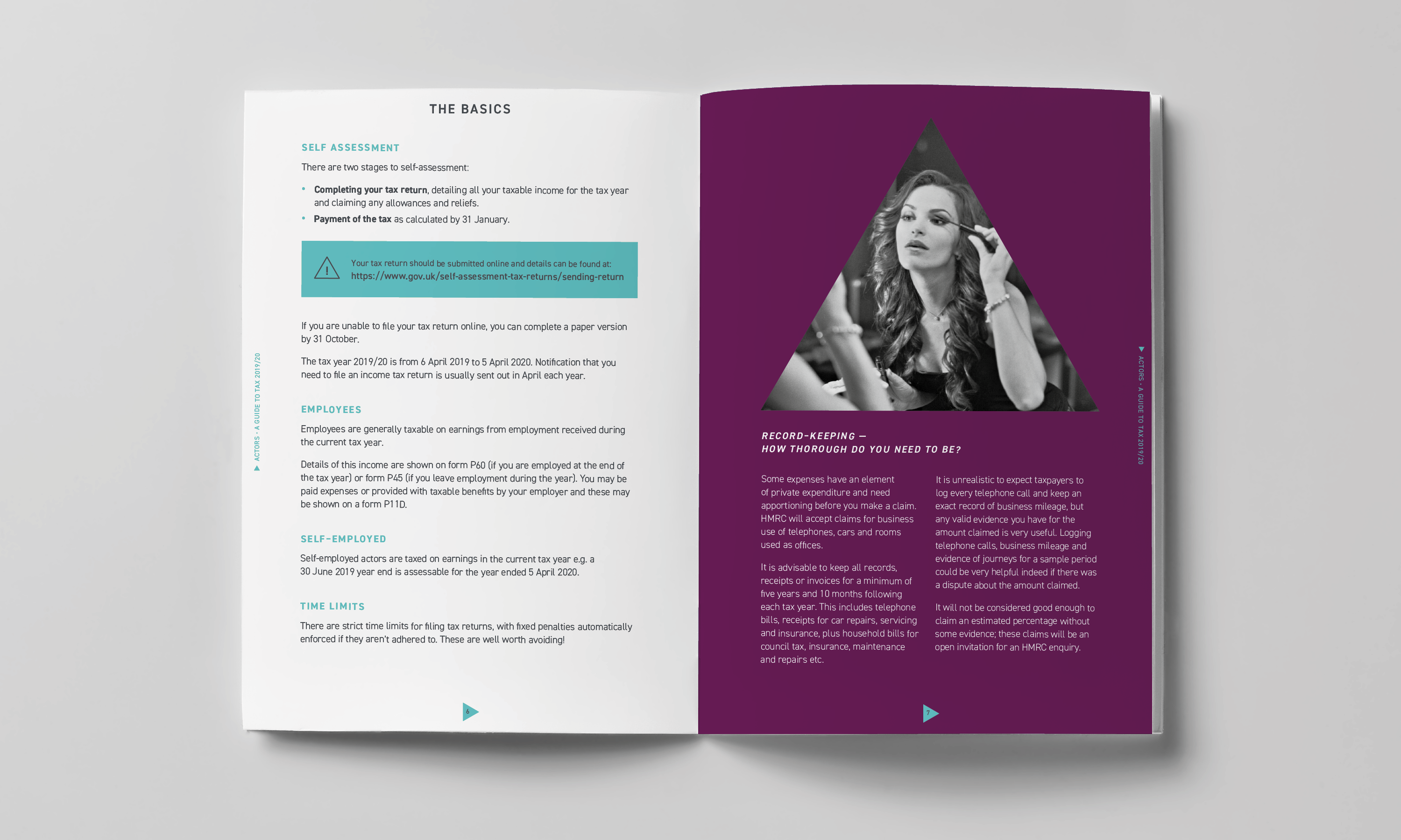
This included creating new literature and advertising templates, as well as a suite of sector-specific advertising lines, featuring an all-new copy approach – fresh, witty and engaging, in line with the contemporary visual styling of the new brand.
An all-new HW Fisher website, design and built by Neon
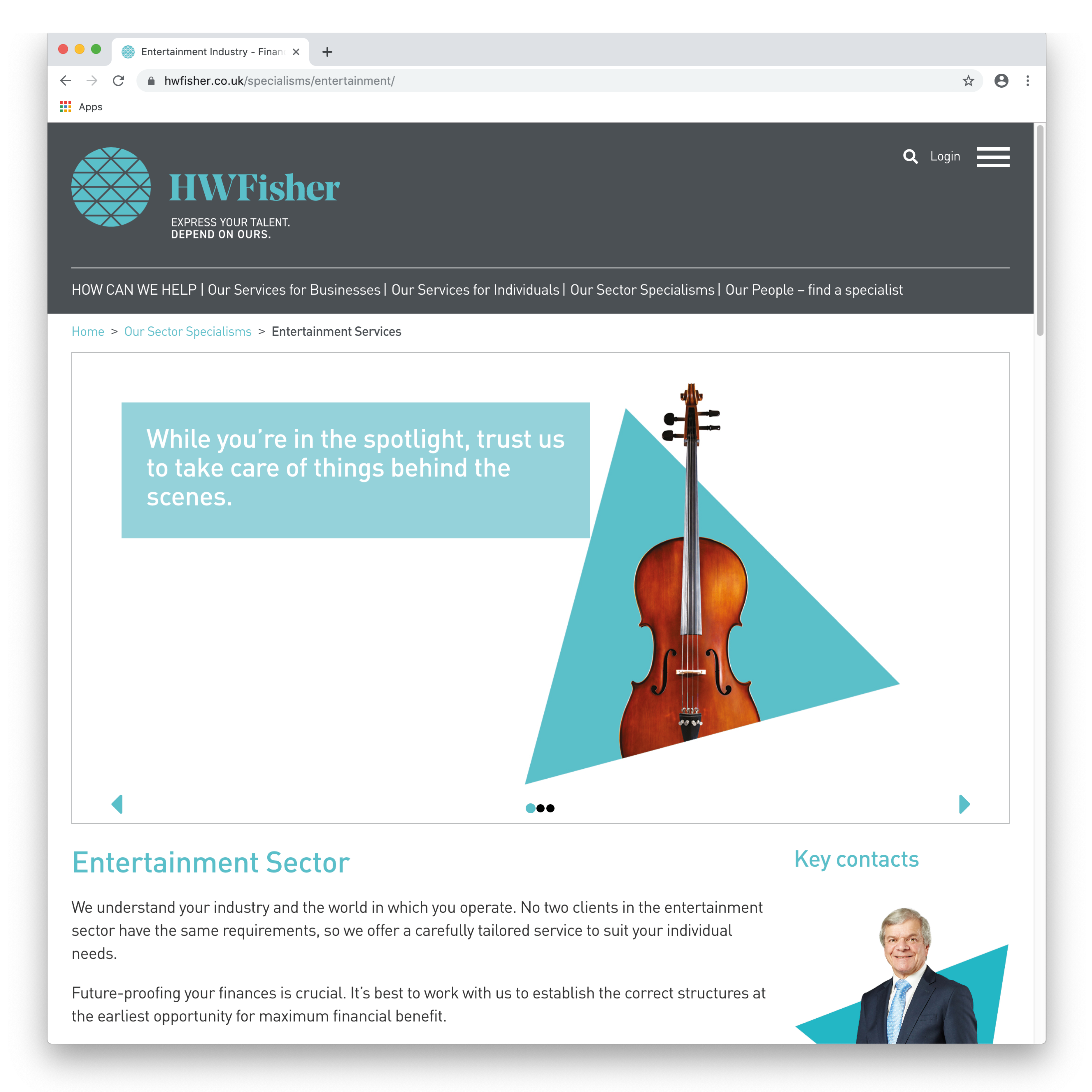
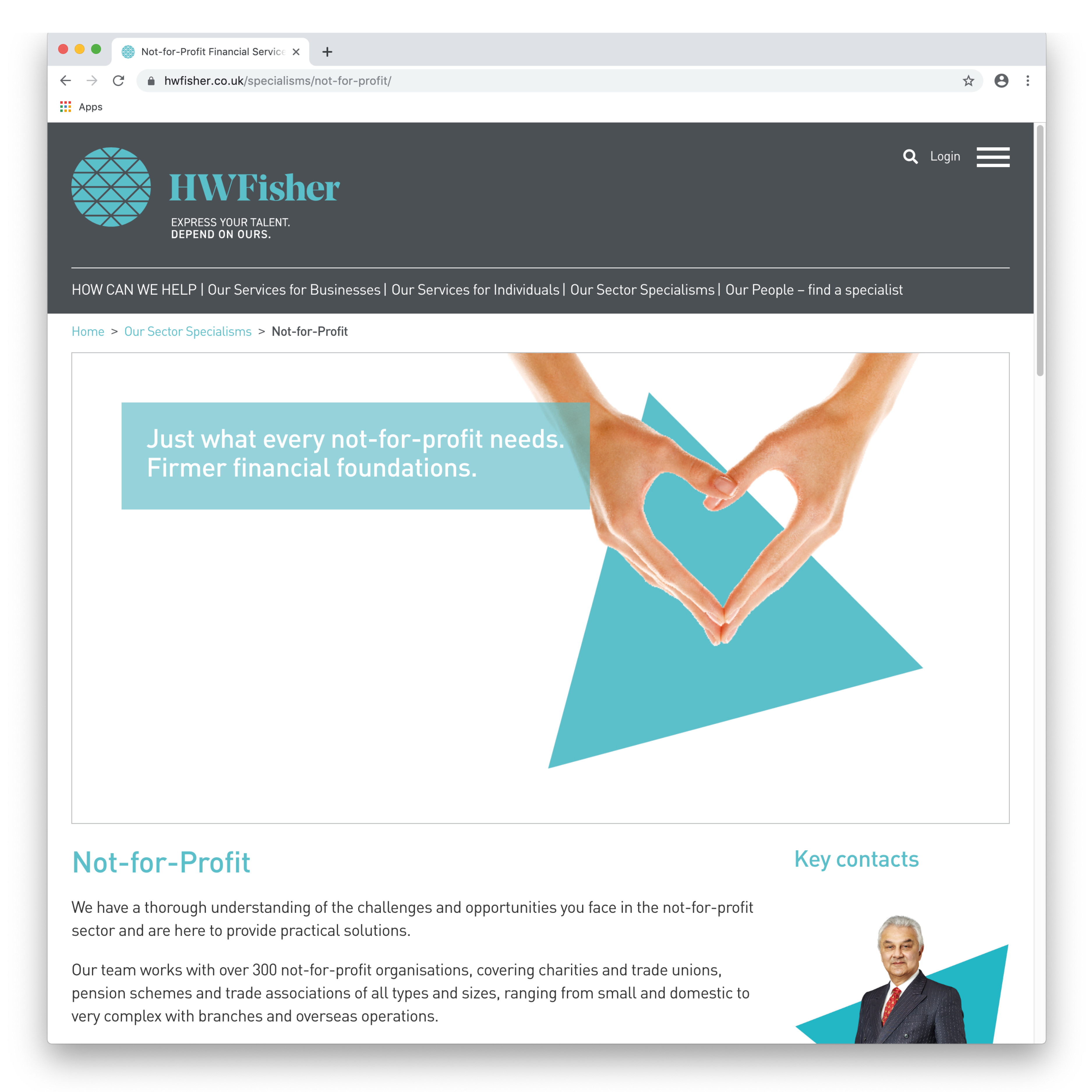
Then came the ultimate seal of approval from the client: an invitation for Neon to redo HW Fisher’s very extensive website, from top to bottom – planning, design and build.
In terms of user-experience, we introduced new clarity and coherence. To make the site even more pleasurable to browse, every word of copy was rewritten in our new style. We sharpened up the site SEO content, to ensure maximum online visibility. And the carefully considered visual language we had developed for the brand carried over smoothly and seamlessly into a digital environment. Oh yes, we even took all the portrait shots for the “meet our people” section.
Overall, we think the new site has moved on a million miles from the traditional dry and dusty world of accountancy, enabling HW Fisher to create a much more positive first impression as a provider of high-value talent and expertise, and a trusted adviser.
(Read Less...)
Kind words…
“A massive thank you to you and your team for coming to our rescue in our hour of need on this branding project. Read More… Nicola Purdue
Head of Marketing
HW Fisher
(Read Less...)
To find out more: [email protected] or call +44 (0)20 3289 1733 Share this: Email, LinkedIn, Twitter, Facebook, Download PDF, follow us on Instagram or view our animations and movies on Vimeo
PROFESSIONAL SERVICES
Branding
PROJECT SUMMARY
Positioning & strapline development
Brand identity
Website
Advertising
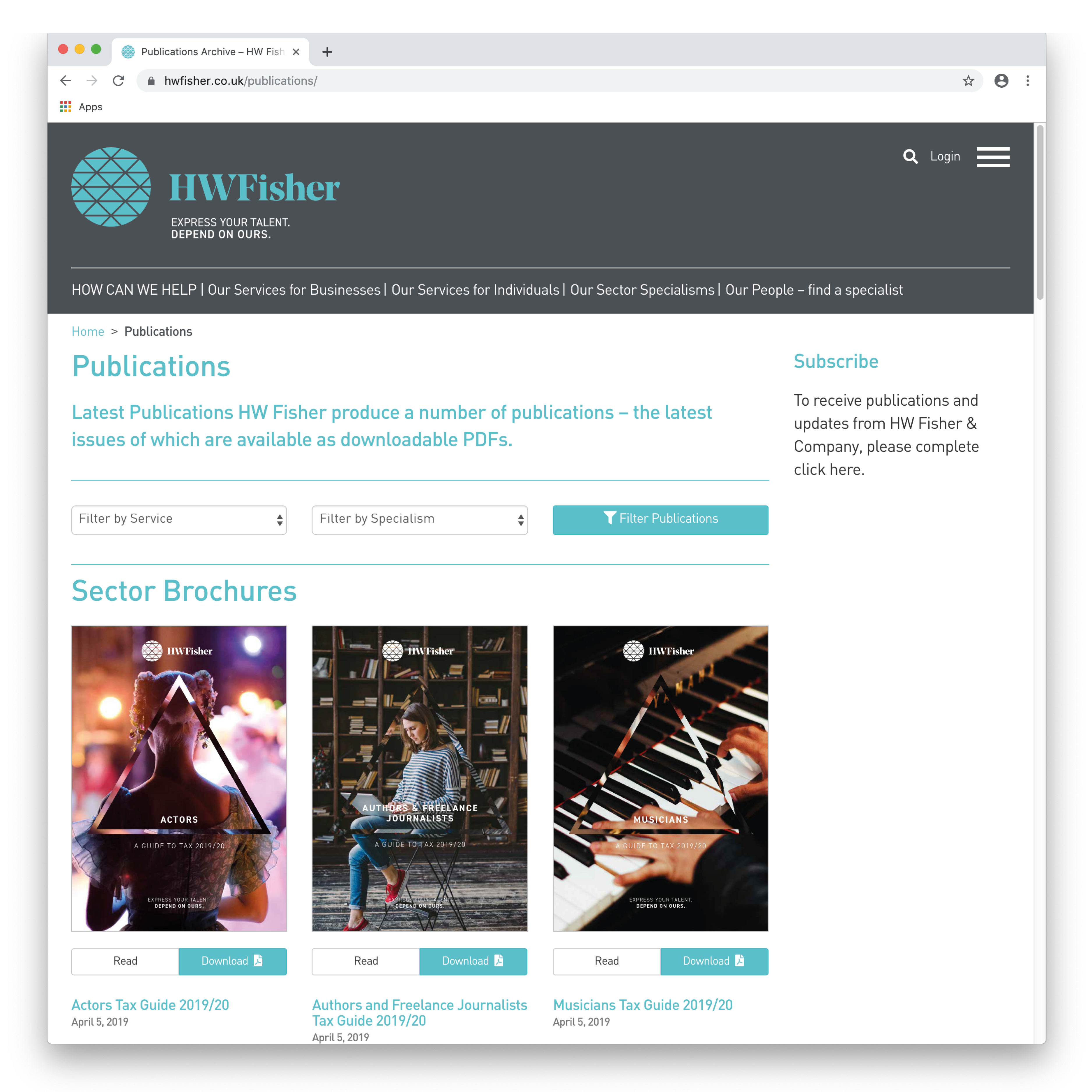
Brand guidelines
Flagship literature
Literature scheme
Advertising templates
Signage
Interior graphics
Stationery
Digital Templates
Power Point templates
HW Fisher triangle visual style and brand mark.
HW Fisher brand mark and strapline.
HW Fisher animated short.
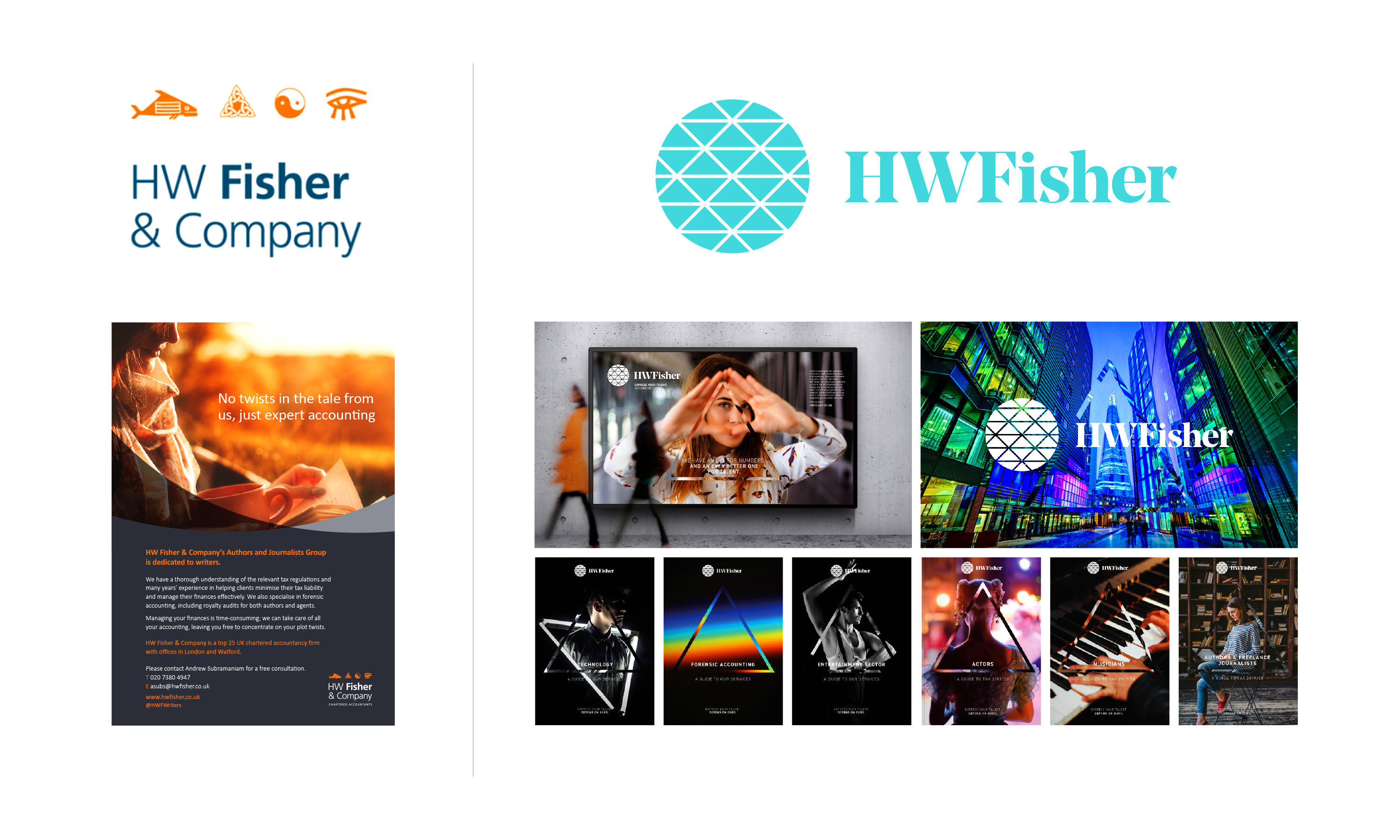
HW Fisher visual style and brand mark old vs new comparison.
HW Fisher triangle visual style and brand mark.
HW Fisher recruitment advertising.
HW Fisher triangle visual style and brand mark.
HW Fisher - examples of sector specific magazine print advertising.


HW Fisher triangle visual style and brand mark.
HW Fisher literature style.


HW Fisher triangle visual style and brand mark.
HW Fisher literature sample - Tax guide for actors.


HW Fisher triangle visual style and brand mark.
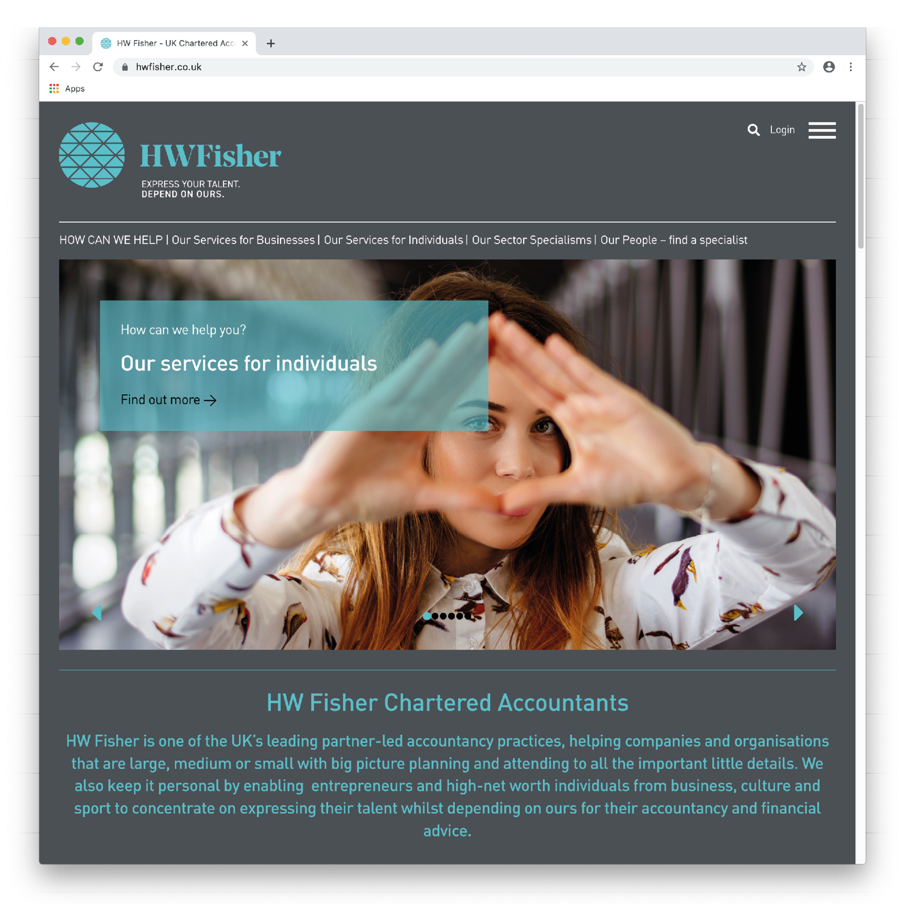
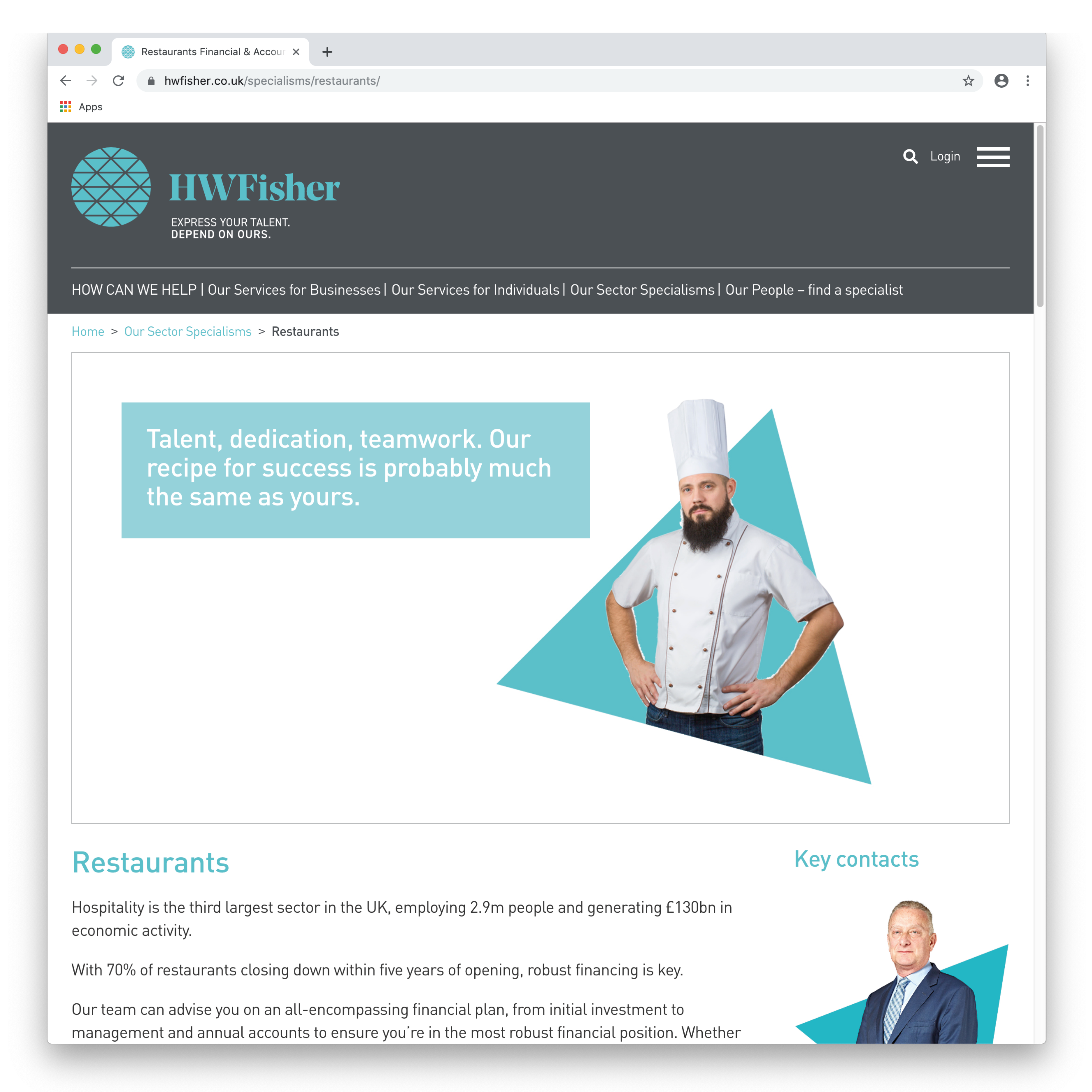
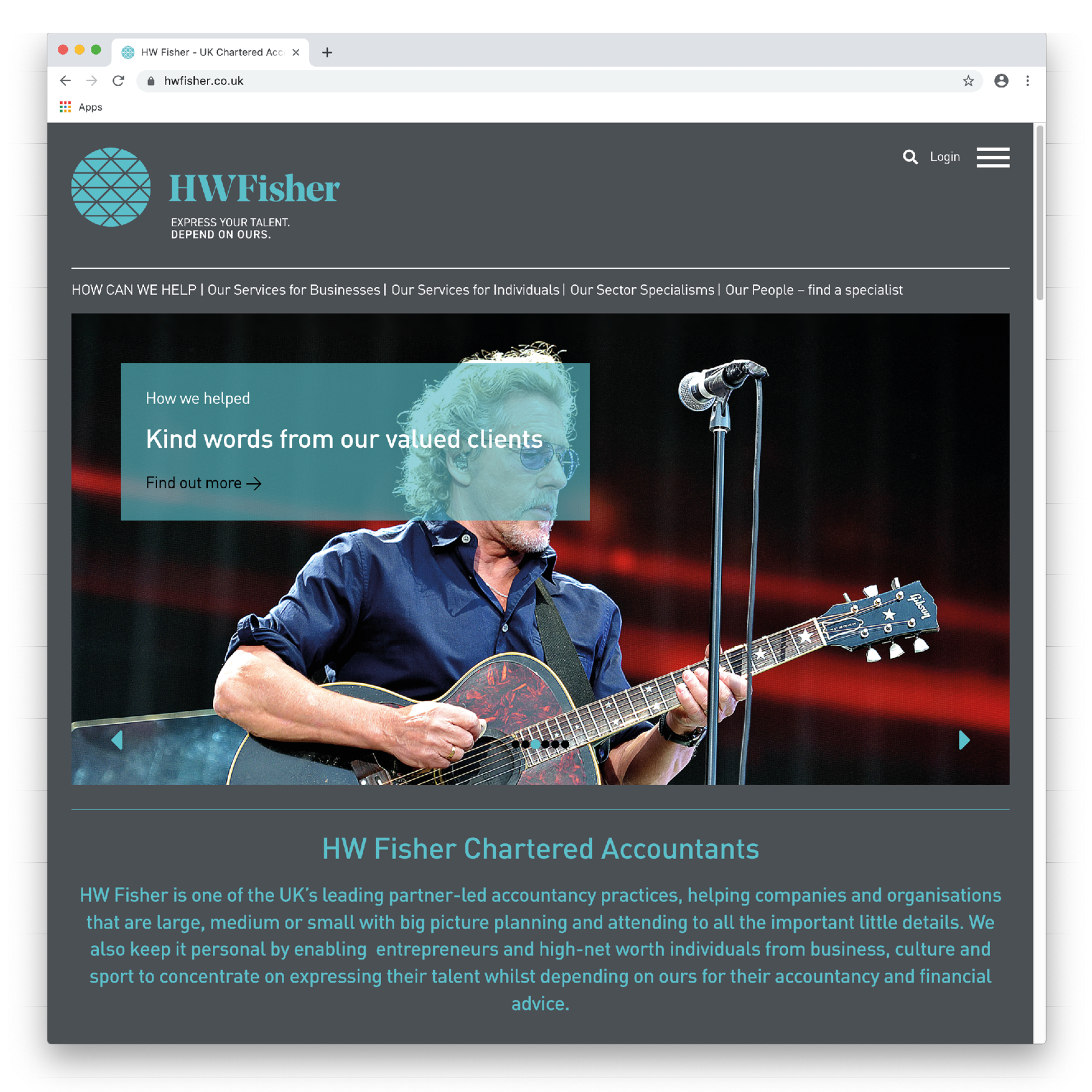
HW Fisher website.

HW Fisher website sample pages.


HW Fisher triangle visual style and brand mark.

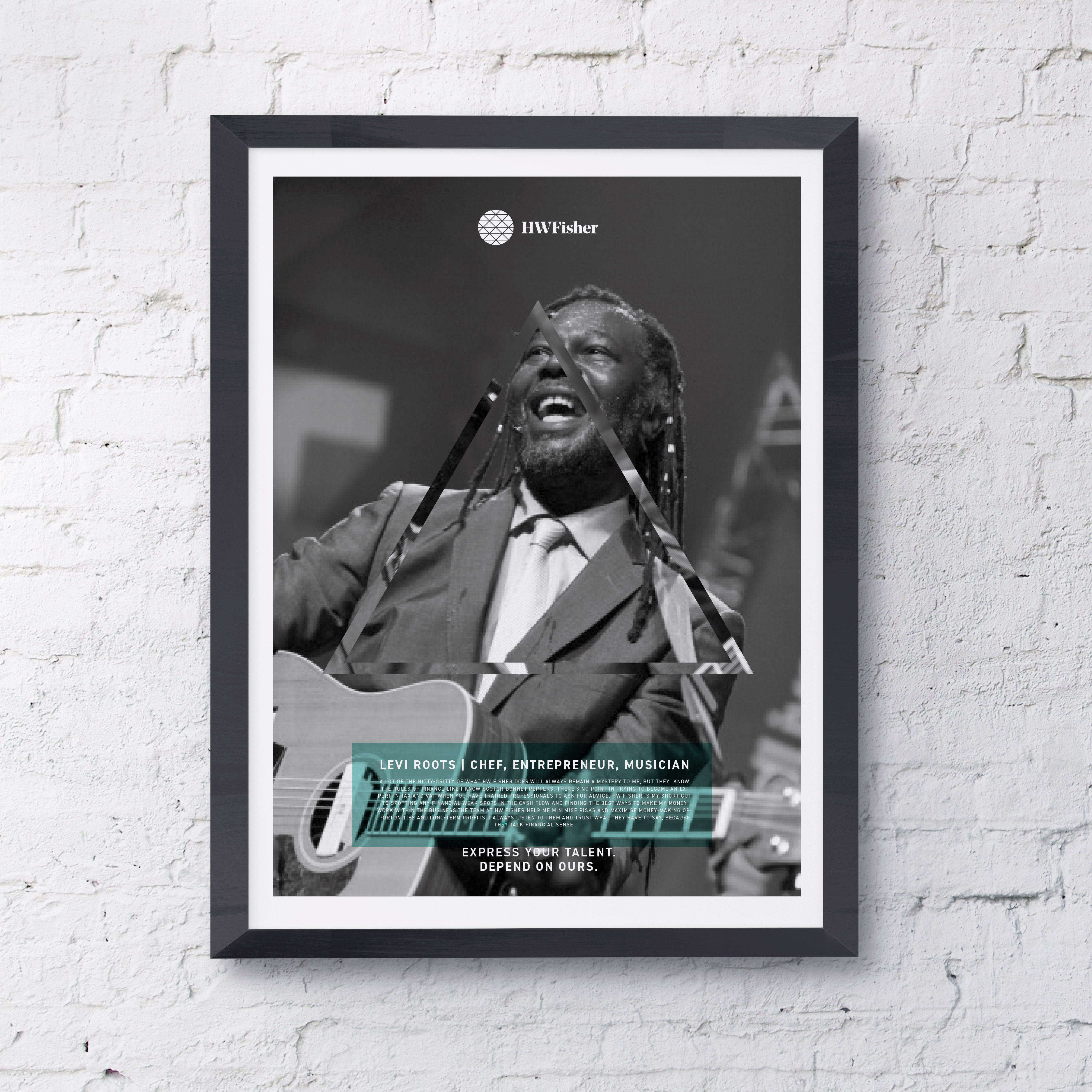
HW Fisher reception posters showcasing HW Fisher clients.
HW Fisher triangle visual style and brand mark.
HW Fisher guidelines - sample pages.