Comment8
Brand identity
Have you noticed how one thing very often leads to another?
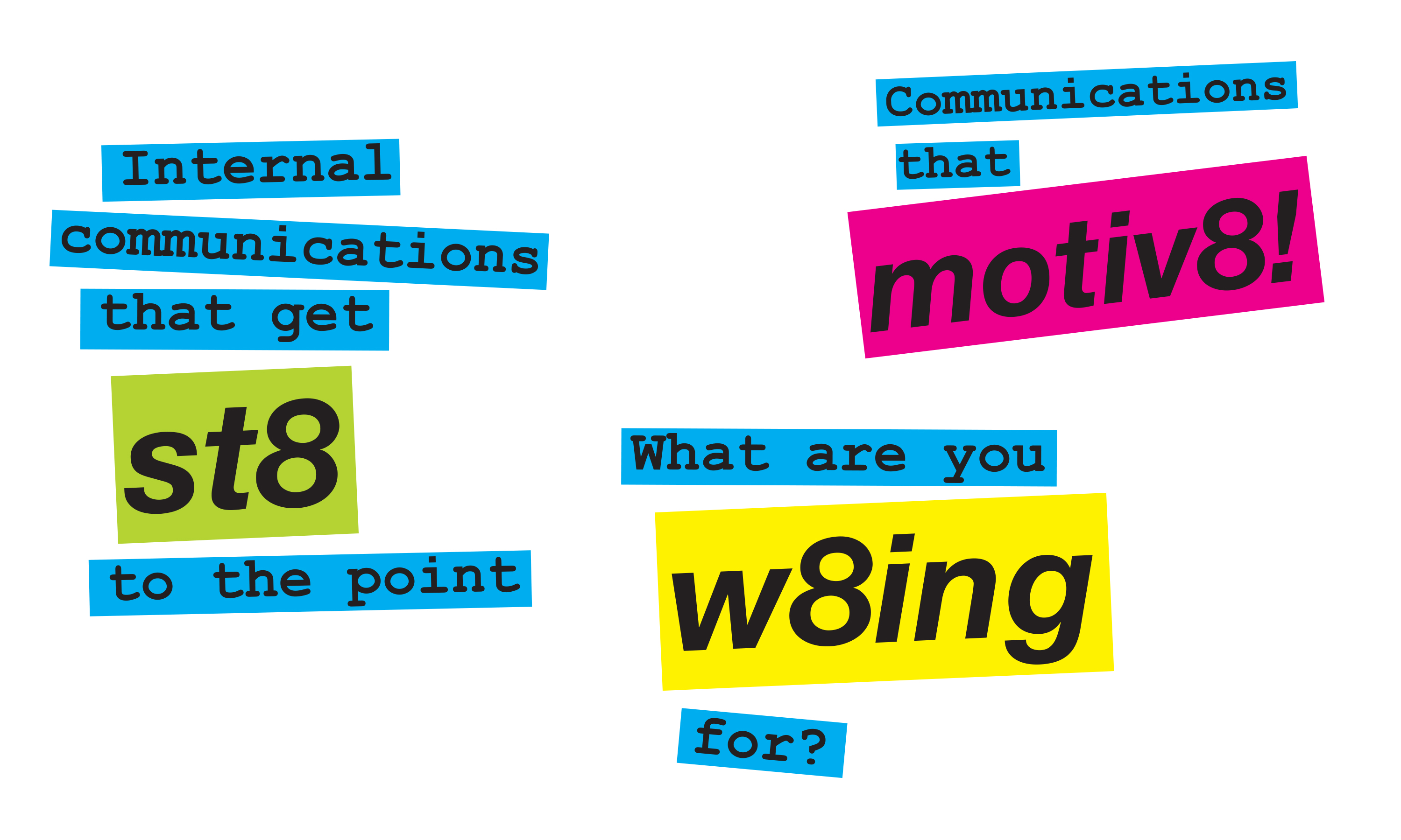
Following Neon’s successful rebrand for Lane4, Olympic gold medallist Adrian Moorhouse’s human performance consultancy, the team was invited to create the brand identity for Comment8 — a new digital learning platform designed to help businesses measure, improve, and sustain performance.
Building on Lane4’s principles of engagement, excellence, and edge, Neon developed a fresh yet related visual identity — confident, dynamic and digitally ready. The result has real synergy with the Lane4 brand while standing strong in its own right, expressing Comment8’s focus on actionable insight and continual feedback in the world of human performance.
Kind words…
“A really brilliant job. Read More…
NATALIE BENJAMIN
Product Director
Comment8
(Read Less...)
To find out more: [email protected] or call +44 (0)203 857 7656 Share this: Email, LinkedIn, Facebook, Download a PDF of this case study, follow us on Instagram or view our animations and movies on Vimeo
PROFESSIONAL SERVICES
Brand identity
PROFESSIONAL SERVICES
Brand idenitity
Visual launguage
Literature
Exhibitions
Stationery & forms
Digital templates
PowerPoint templates
Comment8 brand mark.
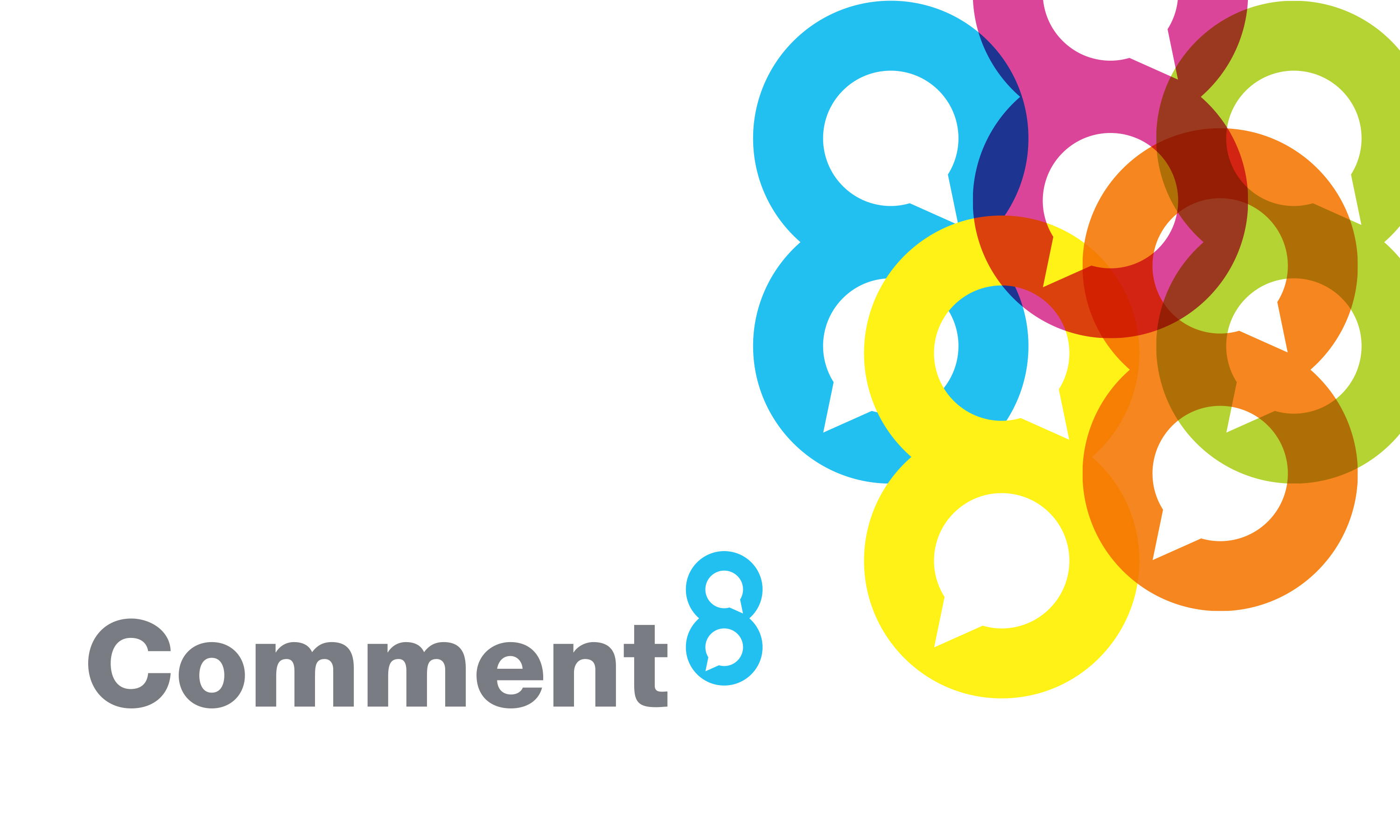
Comment8 brand mark and graphic language.
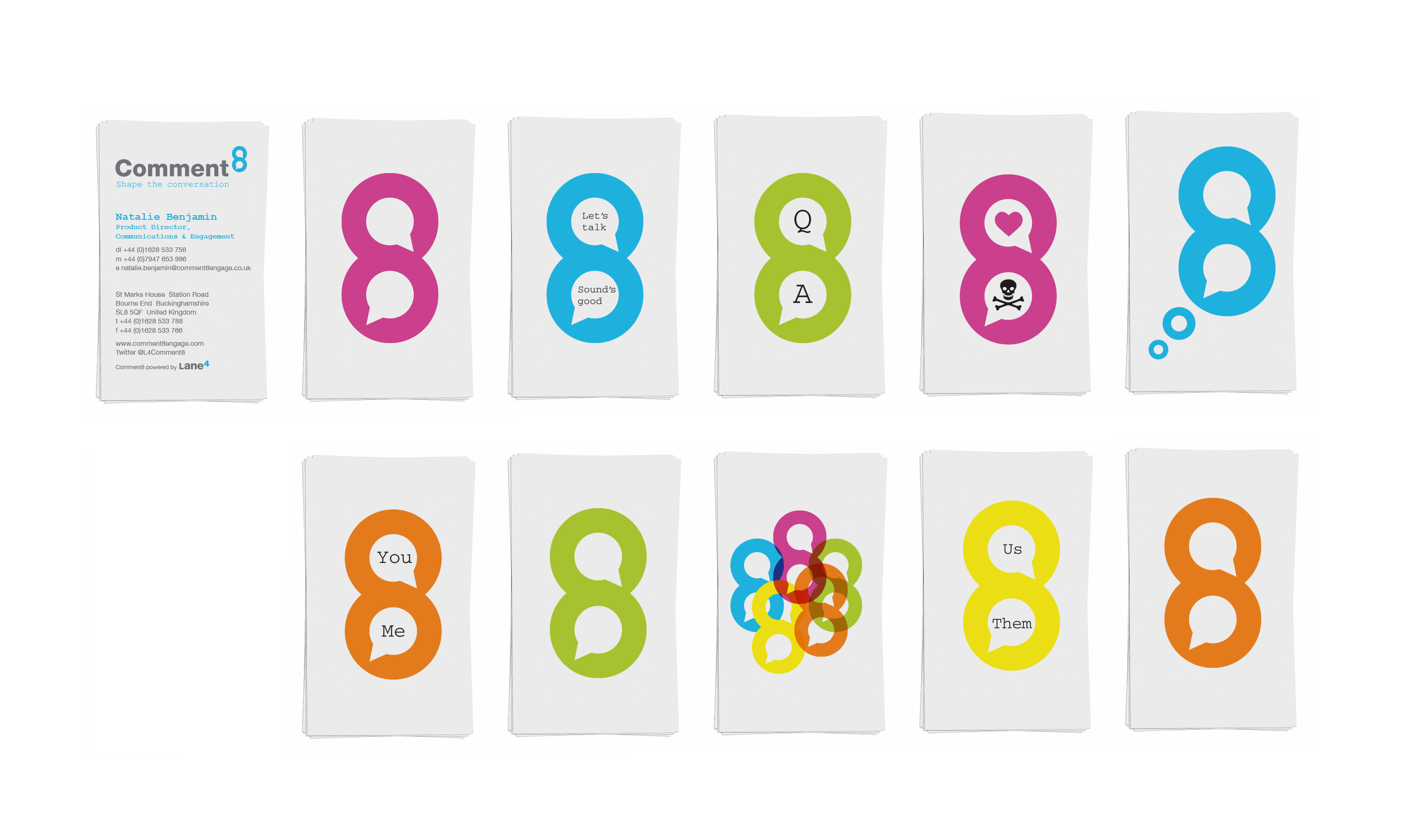
Comment8 business cards.
An introduction to Comment8 brochure.


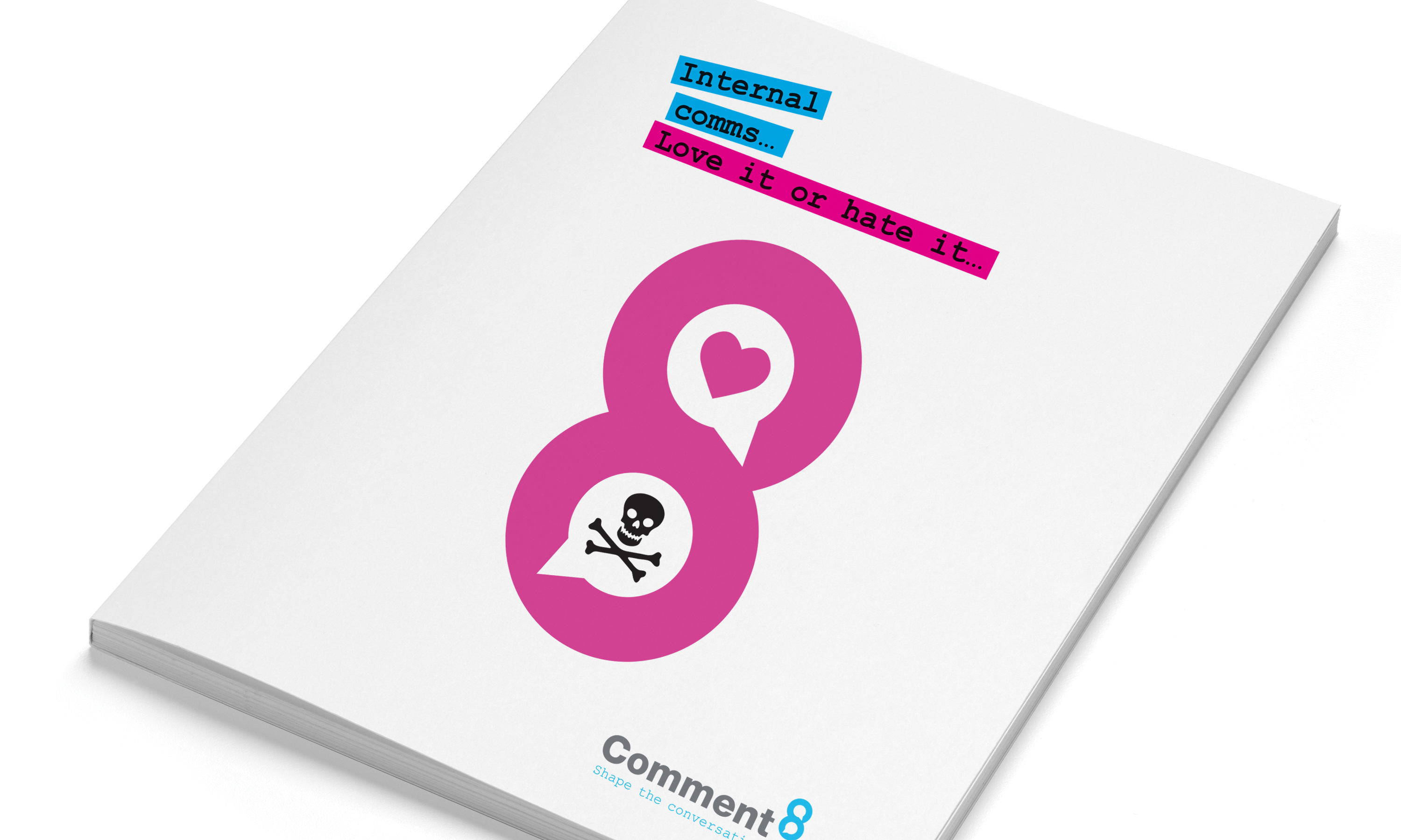
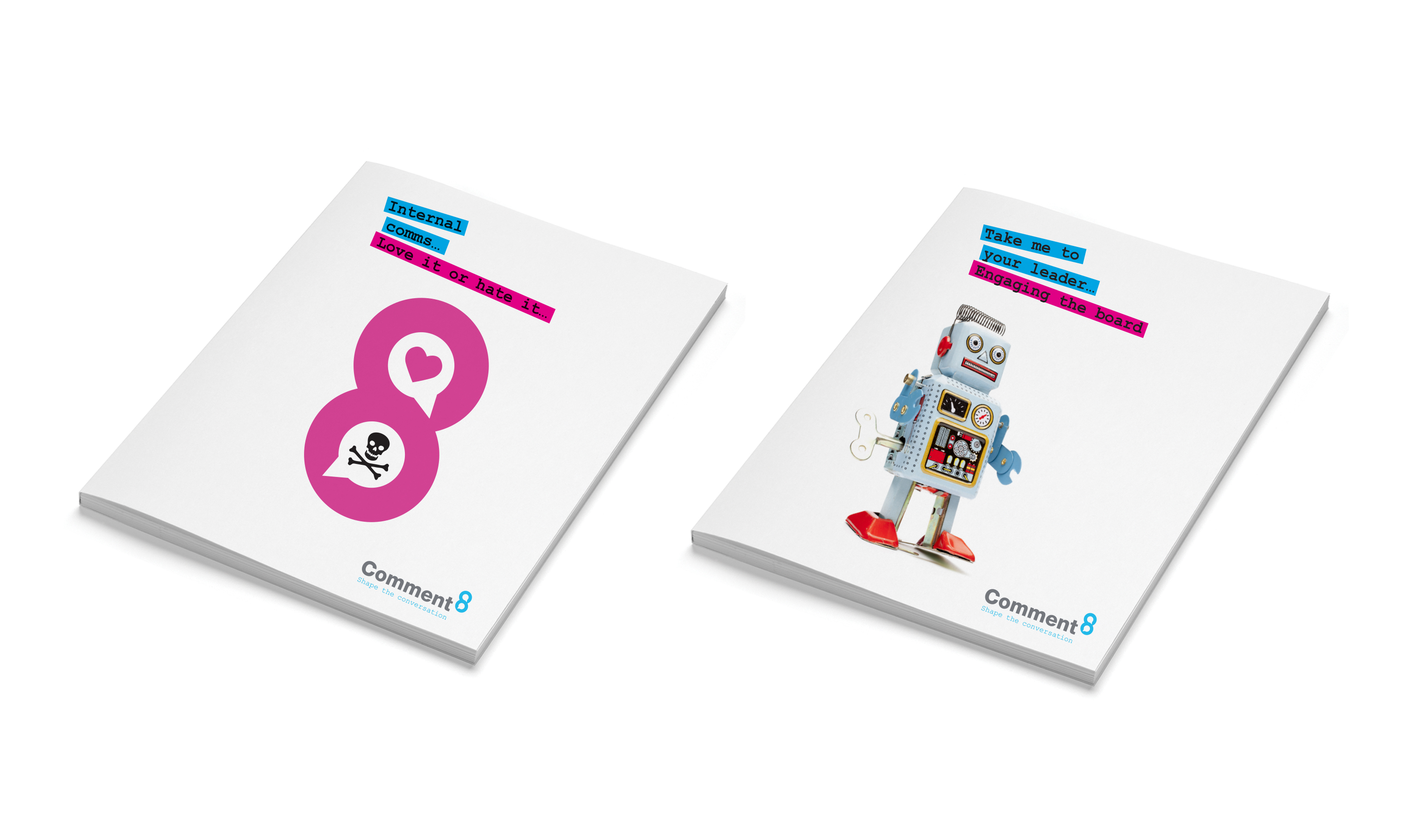
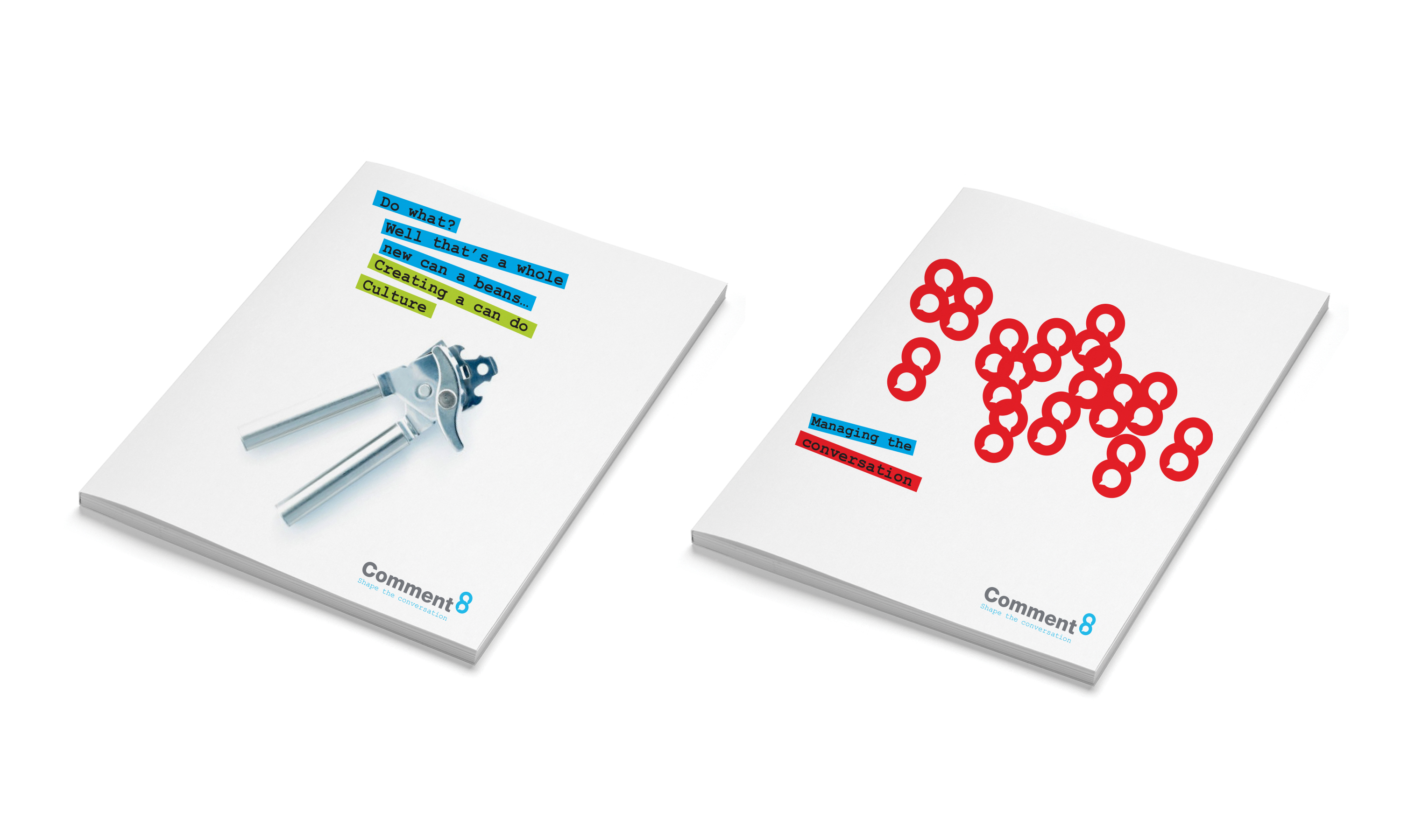
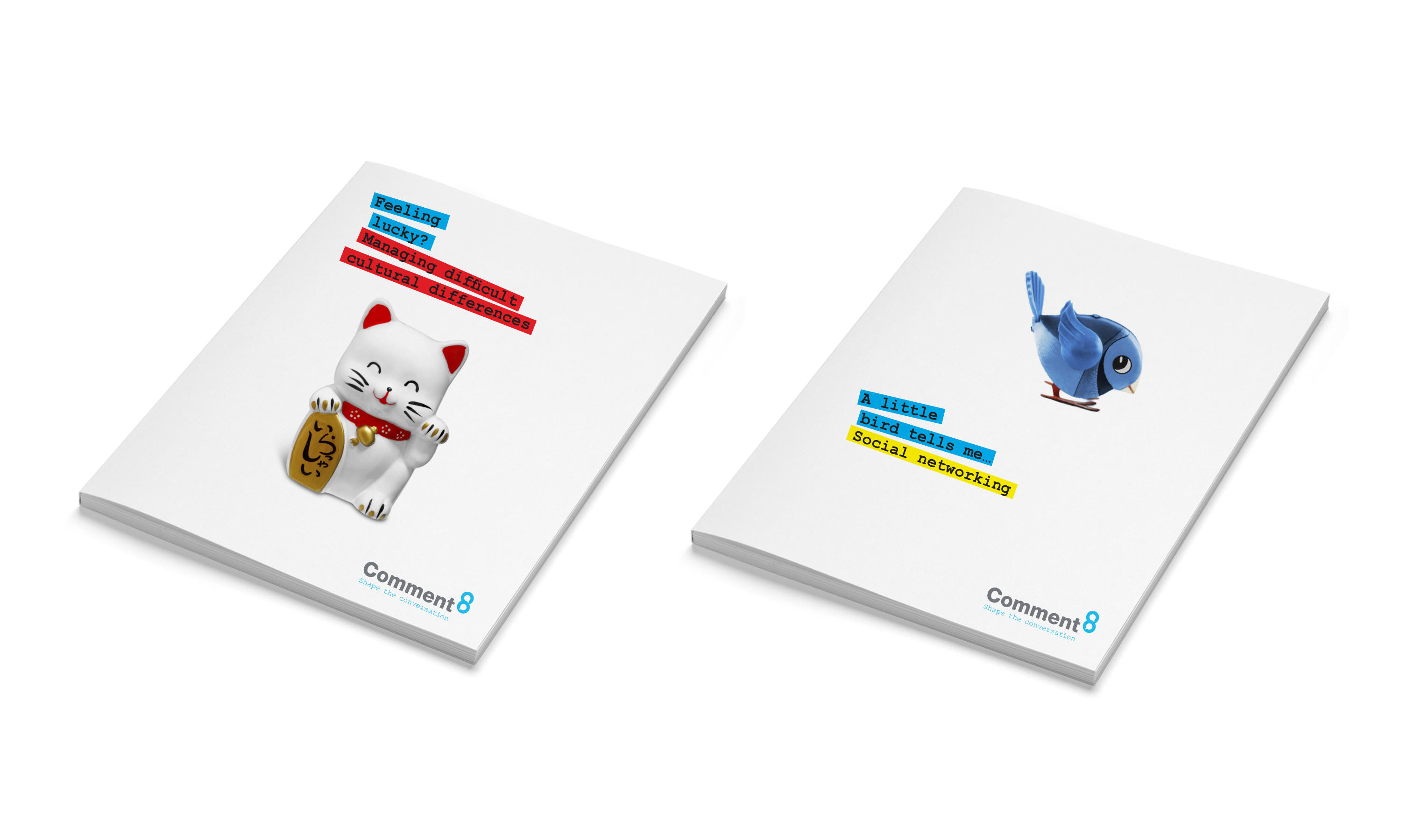
Comment8 literature.
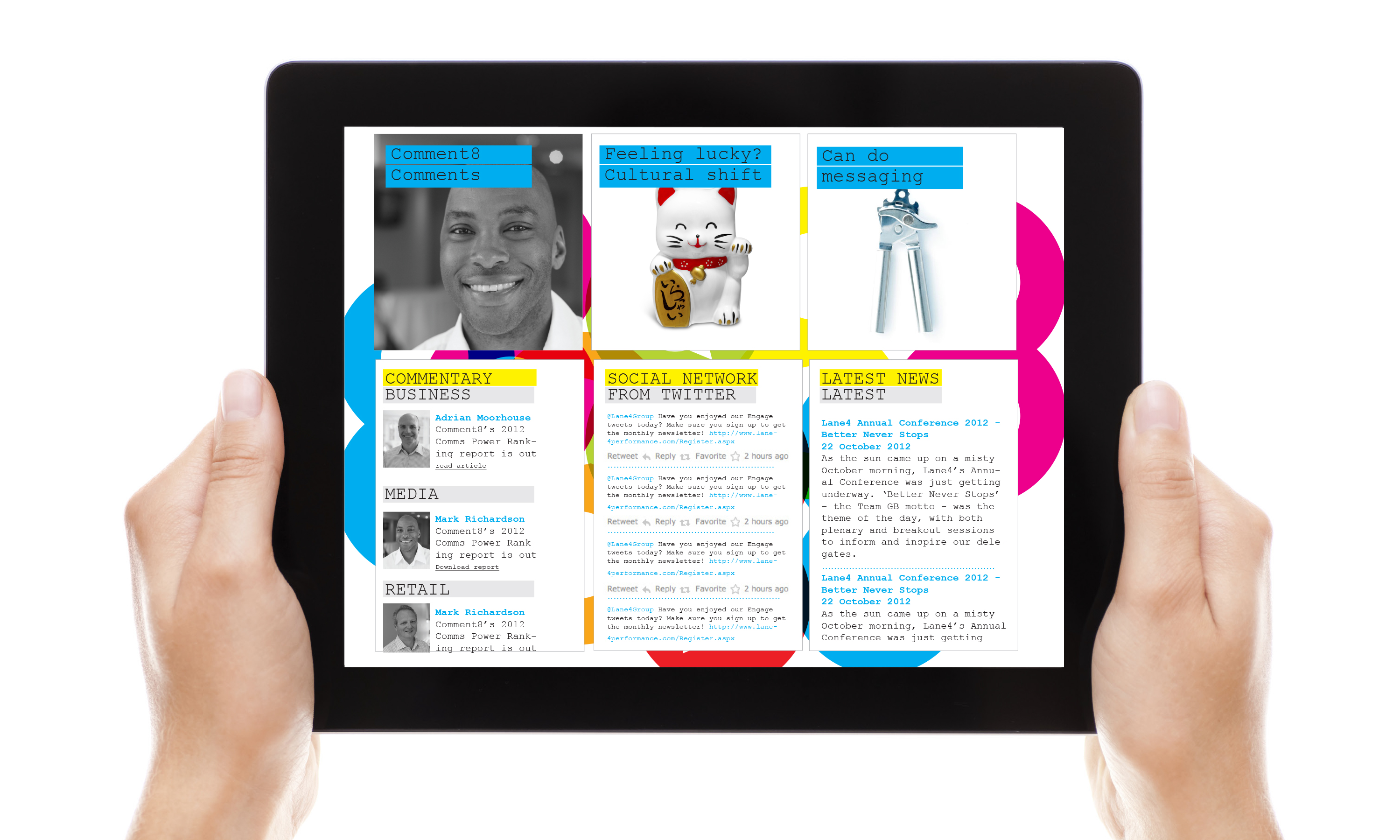
Comment8 website.

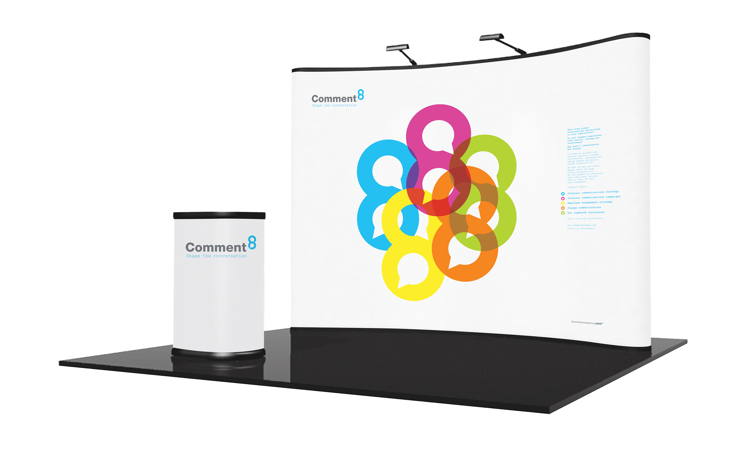
Comment8 stand.
Comment8 graphic language.


Comment8 supplementary graphic language.