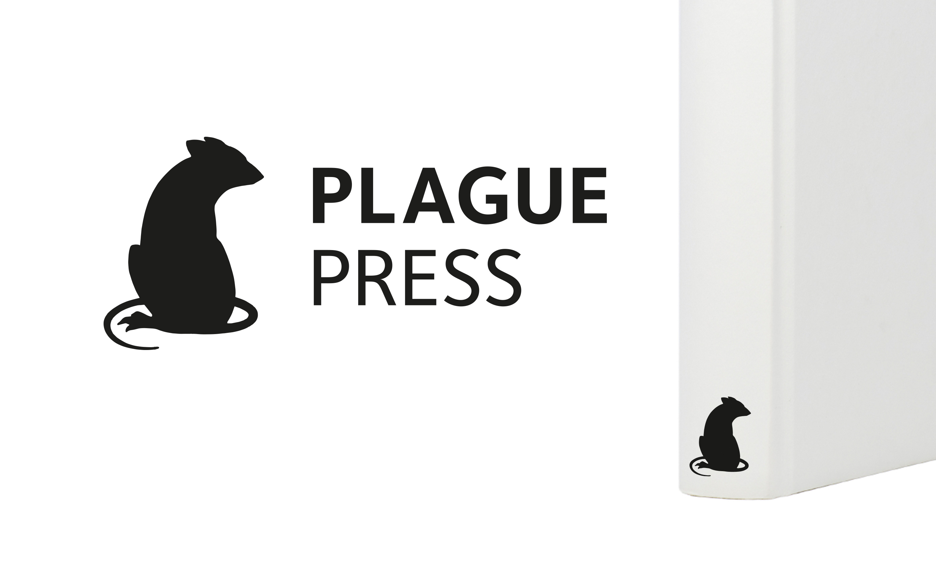
Plague Press
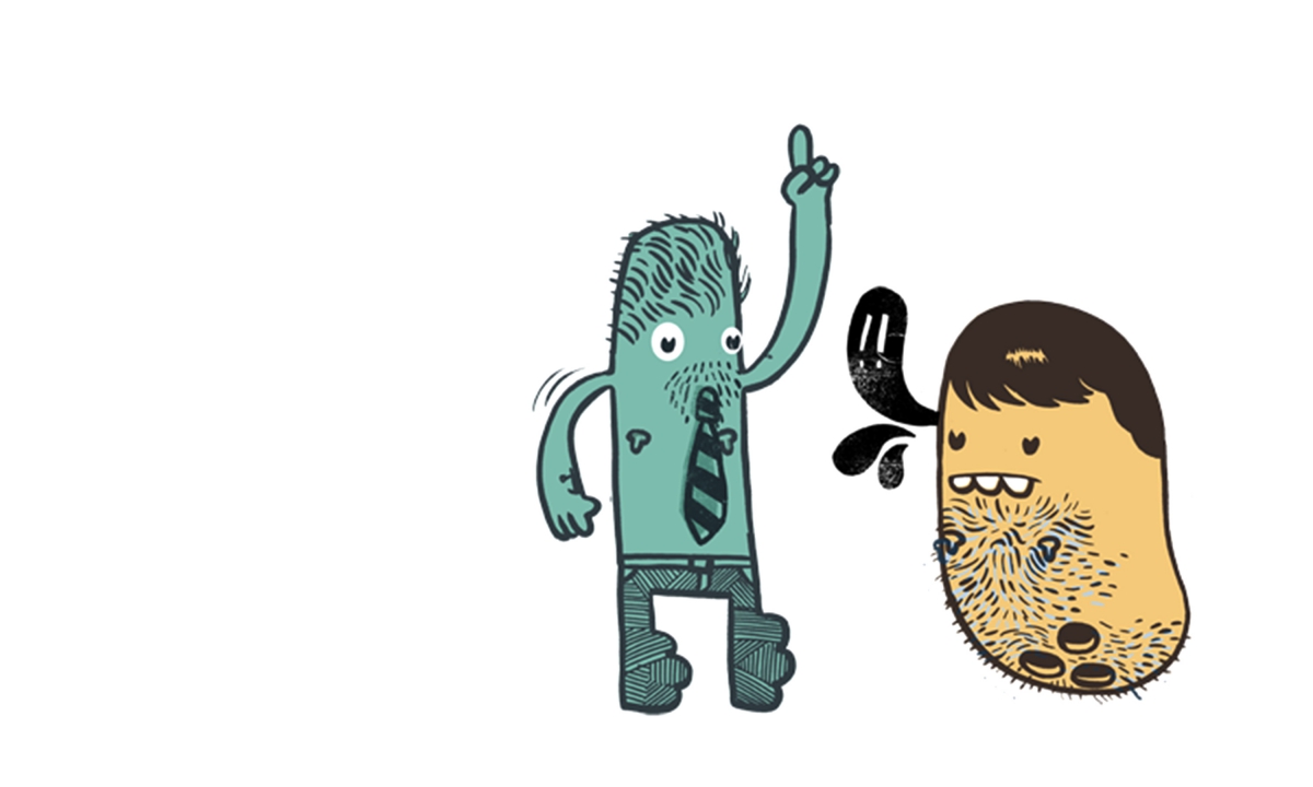
Matt Stuart
A little street urchin for street photgrapher Matt Stuart.
Sometimes the smallest projects lead to the biggest stories. Plague Press began as just that — a bold new publishing venture from award-winning street photographer and Magnum Photos nominee Matt Stuart, created to champion street culture and the arts from around the world.
Matt approached Neon Brand Consultancy with the name and a clear vision: to develop a brand identity that captured his anti-establishment spirit and raw, observational energy.
Our answer? A little street urchin.
A mischievous, characterful mark — part emblem, part attitude — designed to sit provocatively among the polished logos of the art publishing elite. It’s a perfect reflection of Matt’s photography: sharp, subversive and full of humanity.
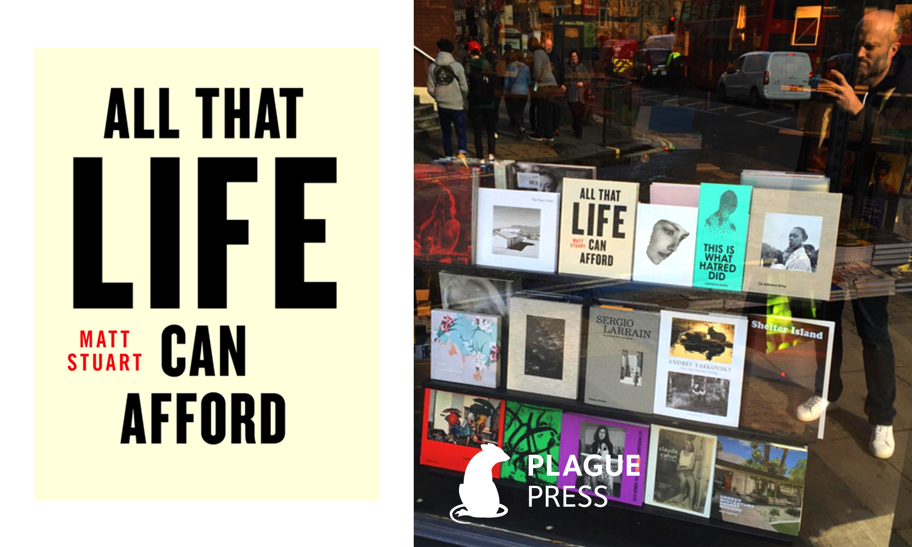
The new Plague Press identity makes its debut on the imprint’s first publication, All That Life Can Afford, a definitive collection of Matt’s work both old and new, and will roll out across future titles and the forthcoming Plague Press website.
Kind words…
“I f*cking love my rat! Genius.“
Matt Stuart
Photographer
To find out more: [email protected] or call +44 (0)203 857 7656 Share this: Email, LinkedIn, Facebook, Download a PDF of this case study, follow us on Instagram or view our animations and movies on Vimeo
ARTS
Publishing
PROJECT SUMMARY
Brand identity
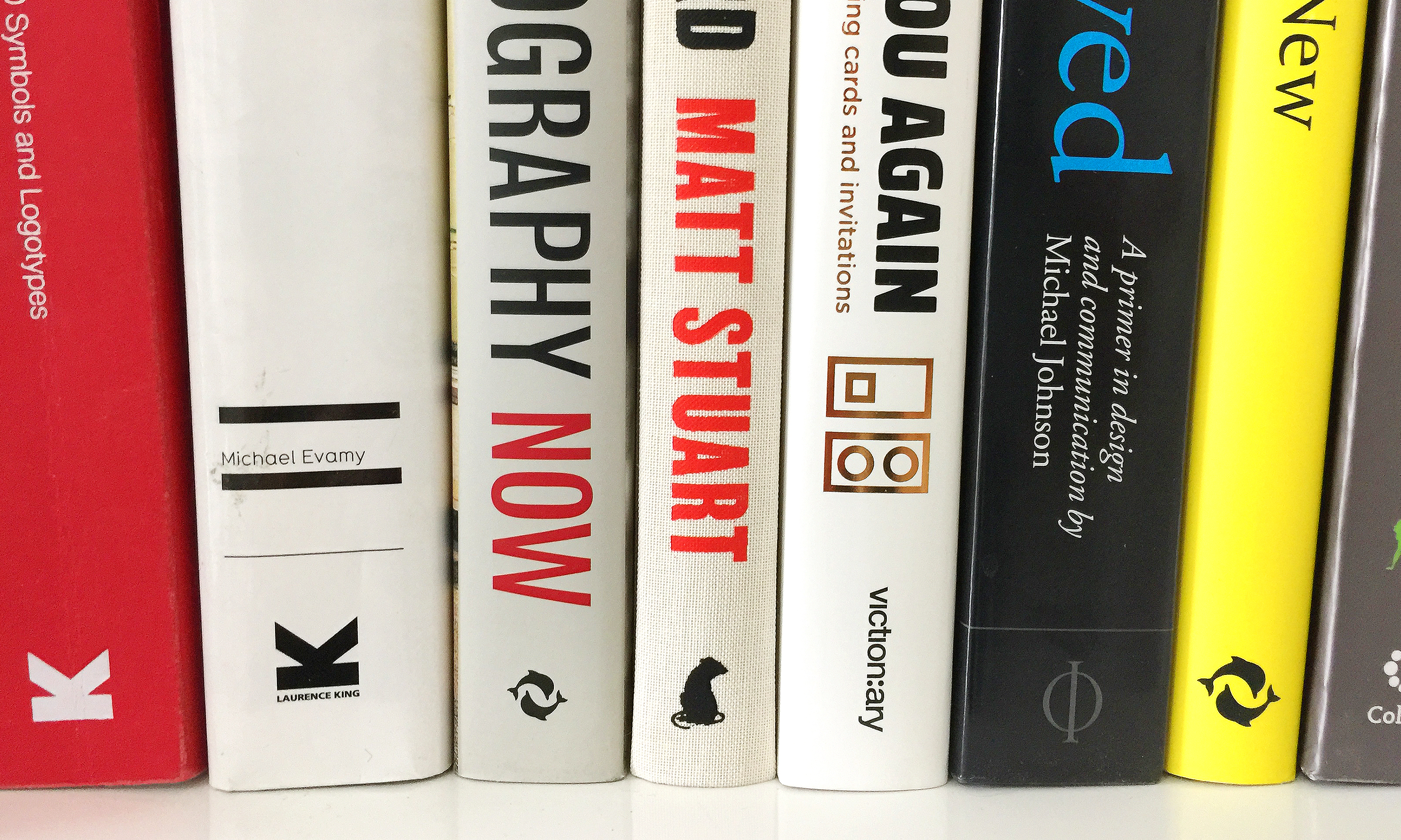
Plague Press brand mark and colophon.
Plague Press first publication “All That Life Can Afford” by Matt Stuart.