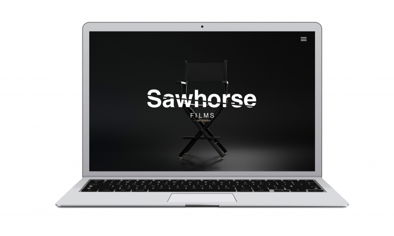
Sawhorse Films
Films with cut through
Following on from our identity work for The Castle Cinem, Neon Brand Consultancy was asked to create the name and brand identity for a new independent film production company — Sawhorse Films.
A small but perfectly formed project, our goal was to capture the studio’s creative ambition and sharp visual style. Out of a range of naming options, Sawhorse Films was chosen — a clever double meaning referencing both the classic director’s chair legs and the company’s promise to deliver “films with cut through.”
We then crafted a bold, monochromatic identity, featuring a distinctive wordmark sliced cleanly through the middle — an elegant nod to both the purpose of a sawhorse and the iconic film clapperboard cut.
Simple, striking and cinematic, the result was a confident launch identity that gave Sawhorse Films an immediately recognisable edge in the industry.
To find out more: [email protected] or call +44 (0)203 857 7656 Share this: Email, LinkedIn, Facebook, Download a PDF of this case study, follow us on Instagram or view our animations and movies on Vimeo
FILM
Brand identity
PROJECT SUMMARY
Naming
Brand identity
Stationery
Animated idents
Website
Sawhorse Films animated ident.
Sawhorse Films brand mark and website homepage.
Sawhorse Films black and white stationery.
Sawhorse Films homepage.