E-Sports Nutrition
Packaging
A stand-out solution
Before we started work on E-Sports Nutrition’s packaging post our initial foundational work defining the brand, we did a thorough review of the competitive landscape and took onboard all of ESN’s insights that they had identified as an opportunity in this market. What we found, to sum up briefly, was countless gaming energy and meal supplements in packs that were almost universally cheap in feel, short of substance in relation to brand, lacking in transparency in their labelling (as highlighted in the brand briefing stage by ESN), and nastily garish and childlike in terms of graphics cheap white tubs. Brand and product names were generally clichéd, too – not even close to being reflective of modern gamers’ interests and priorities. Read More…
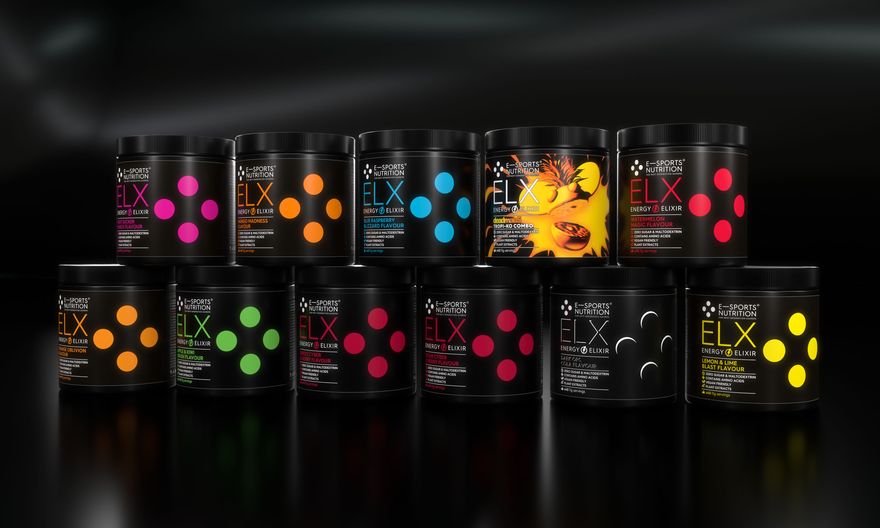
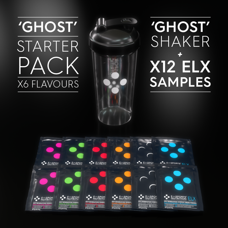
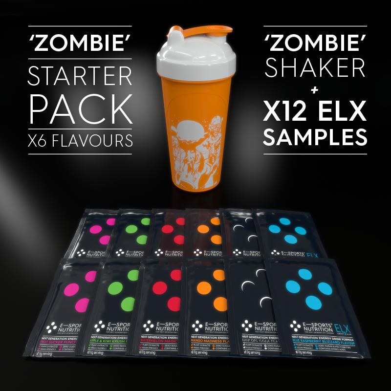
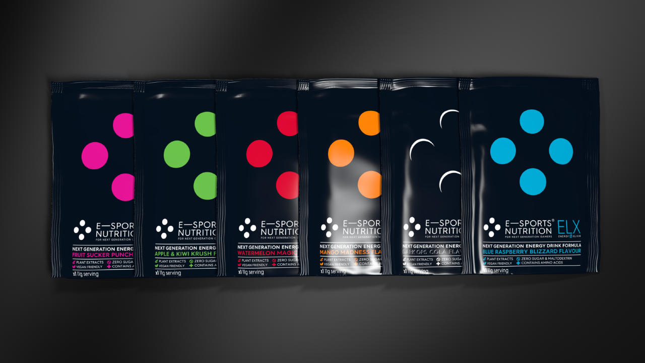
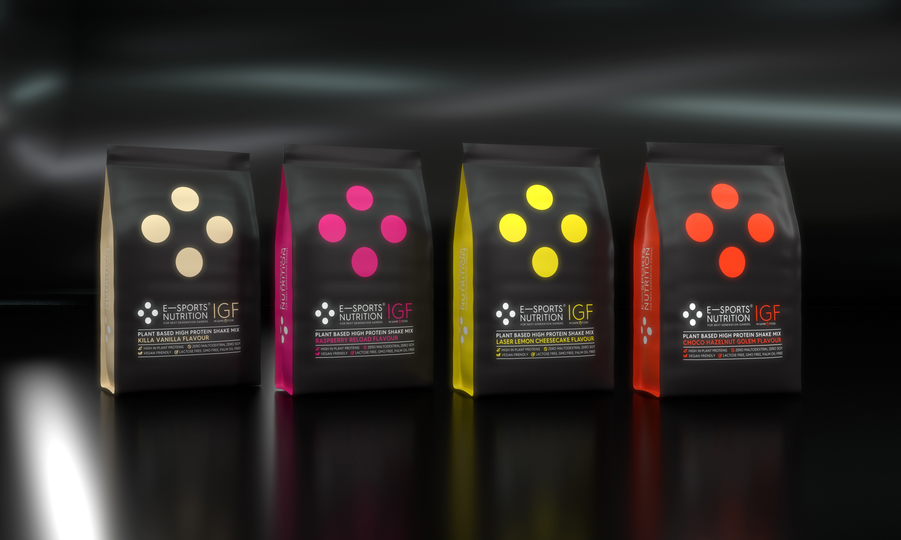
We knew we could do a lot better. To set the brand apart from the herd and accentuate ESN’s belief in premium ingredients and superior product formulations, our packaging went in the opposite direction of the all white cheap feel. We dialed up brief for a premium feel, with a monochromatic brand visual style using a deep premium black label, complemented by stylish flat colours for simple bot powerful typography and info graphics – doing away with cheap low quality imitations of game images or ‘try hard’ out of gaming community relevance wanna be skater graphics. And we also introduced a further powerful graphic device – the ESN “four dots”, taken from classic gaming controllers – to create a striking and instantly recognisable visual shorthand for the brand on pack linked to the brand mark, while also providing colour cues for product flavours.
Names to remember
Alongside our work on the packaging, we created distinctive names for the two main ESN product ranges. The energy drinks became ELX, from the energy ‘elixirs’ used to ‘power up’ and found in many styles of game. And the meal replacement products were brought together under the banner IGF, standing for In Game Food – to help with clarity of the pitch / introduction of bringing a meal replacement shake mix designed specifically to the gaming market.
As well as standing out in a totally relevant way, these succinct product range names were designed for a short hand for the products amongst gamers which came alive ‘Twitch chat’ (and was useful to highlight promotion featuring elx! and igf! in chat and nightbots etc.) and within all kinds of social media chat.
On pack, the names naturally featured prominently, underpinned by iconography punchily highlighting the key product USPs.
Flavours to savour
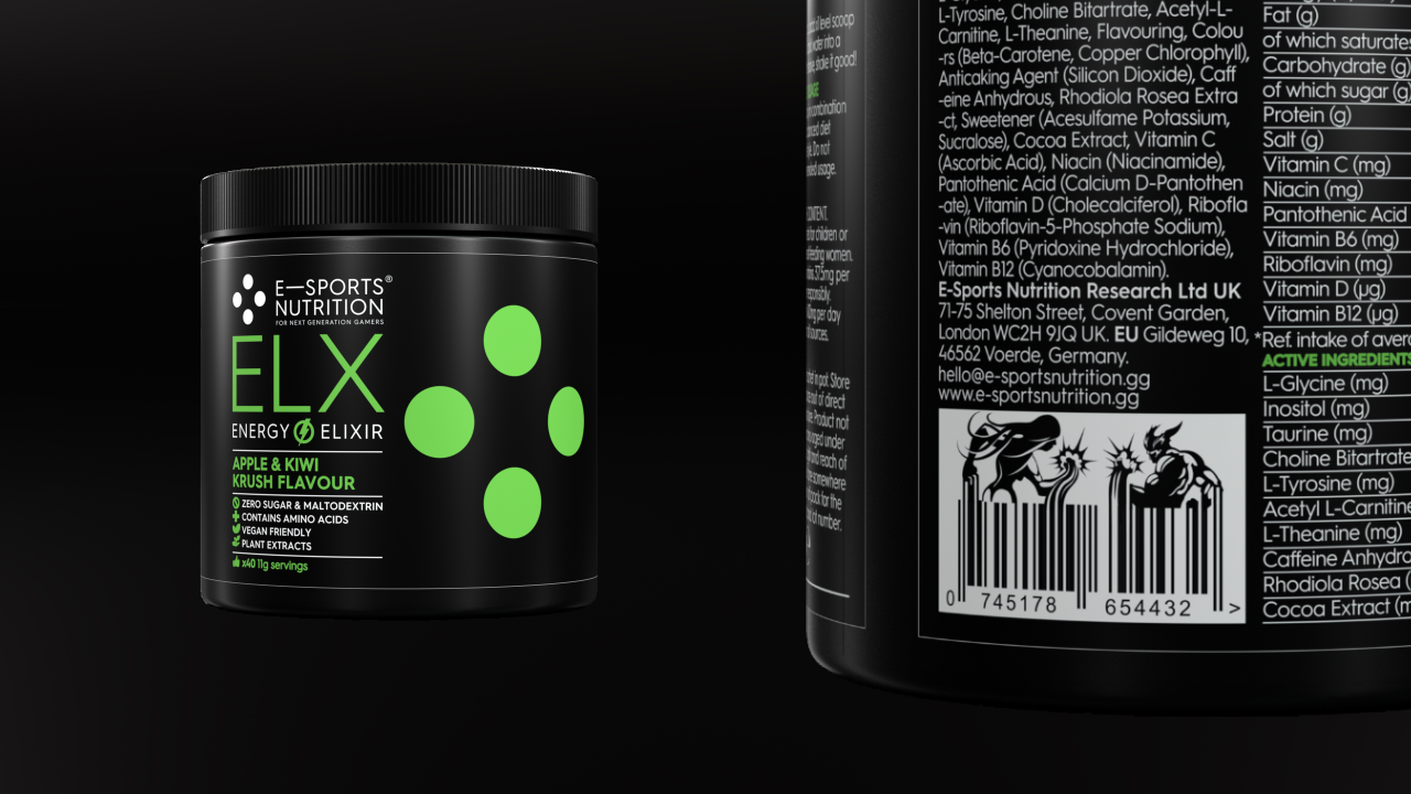
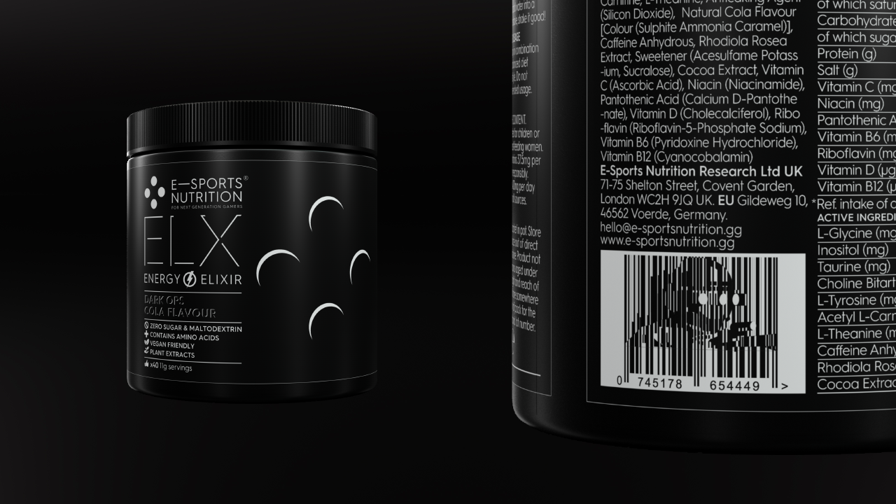
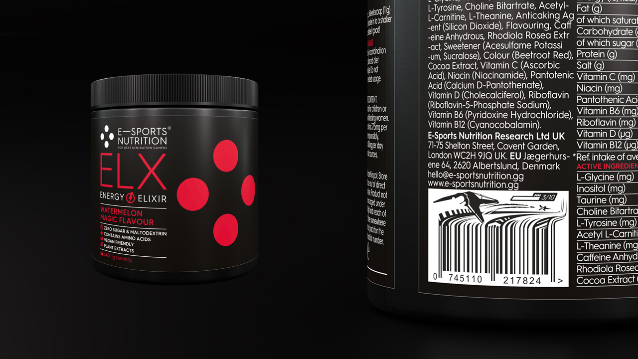
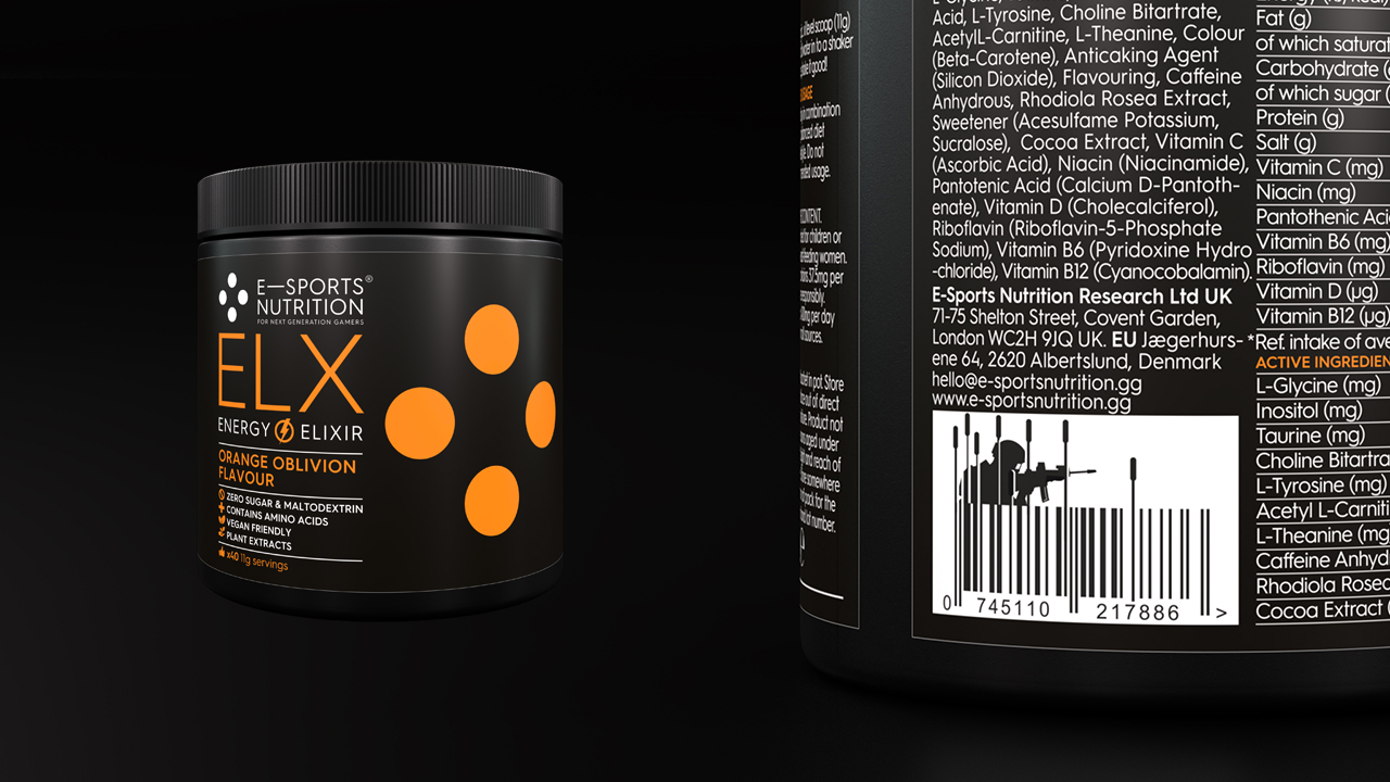
Our flavour descriptions were also designed to be gamer-relevant and a fun way to collaborate with and guide the ESN team in regard to naming. Fruit punch, for example, became Fruit Sucker Punch, while apple and kiwi became Apple & Kiwi Krush, in references to fighting games. Watermelon Magic was a nod to RPG games, and Dark Ops Cola not-so-subtly suggestive of stealth-based first person shooter games.
It’s all in the detail
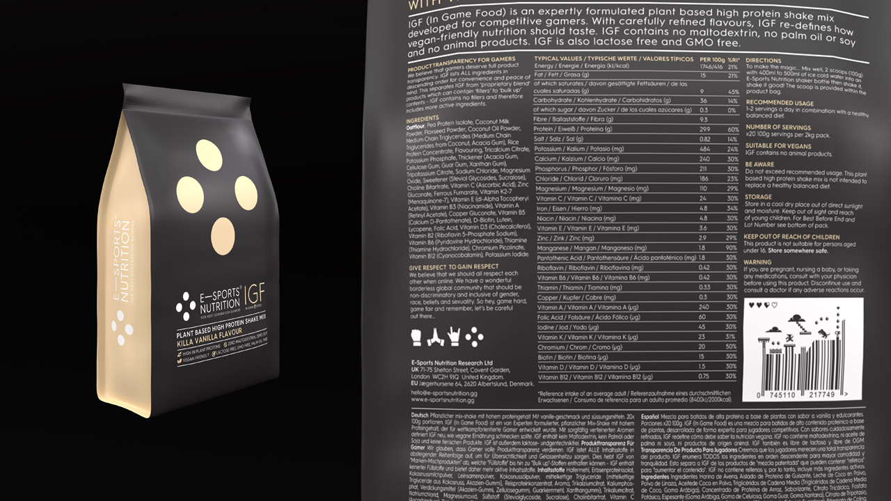
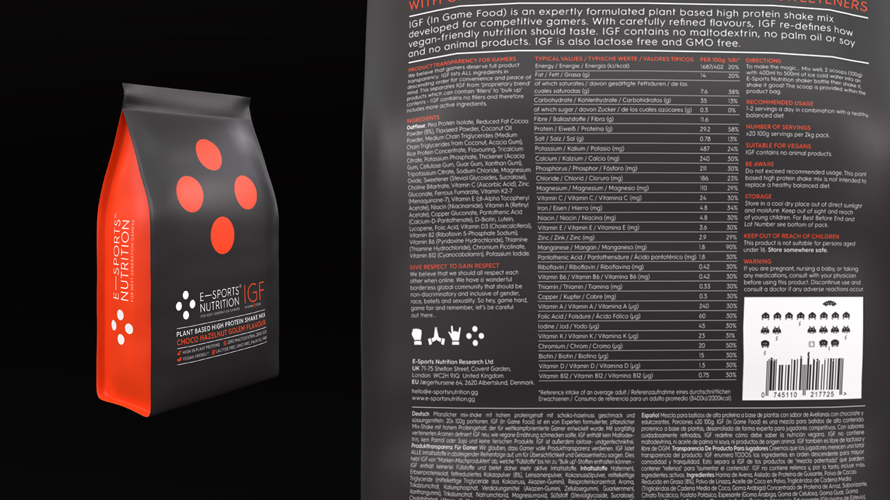
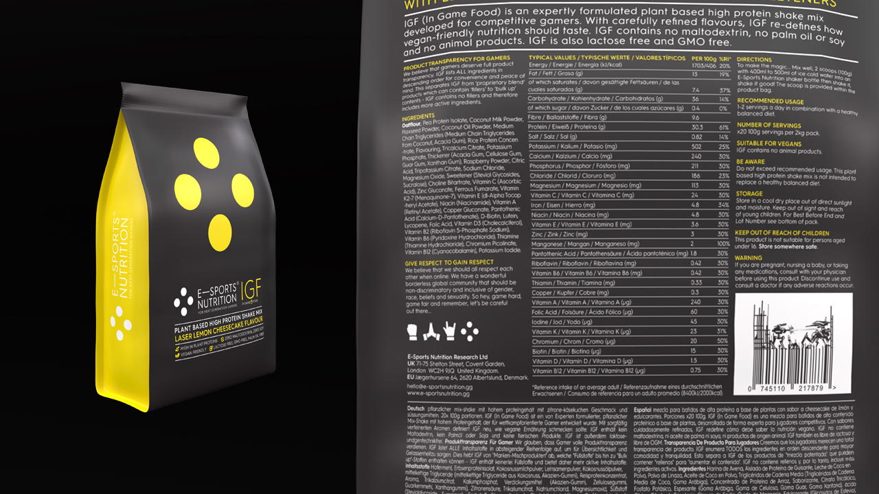
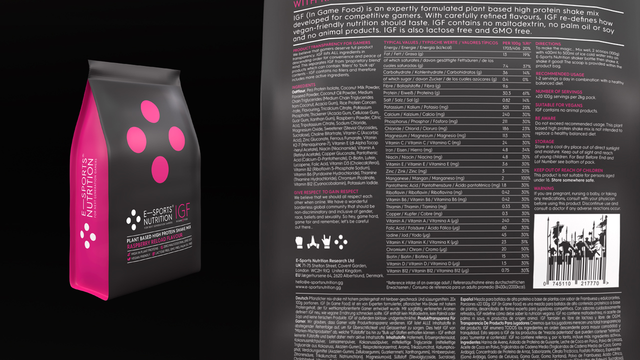
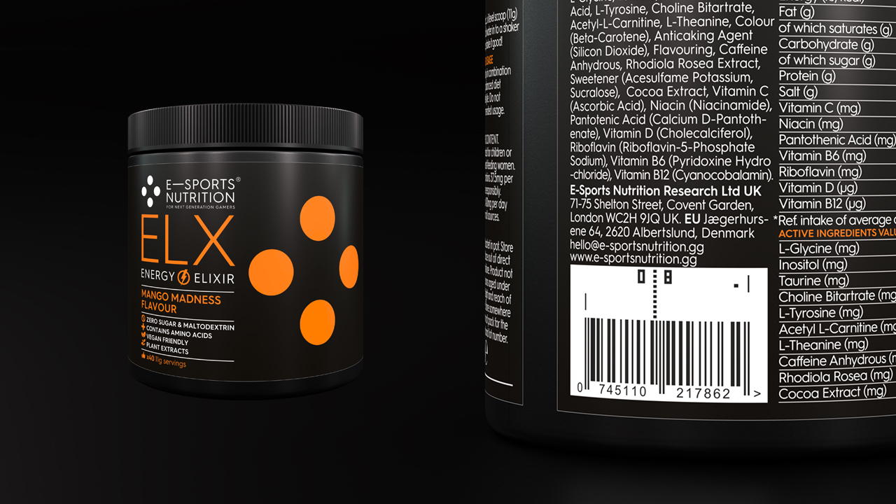
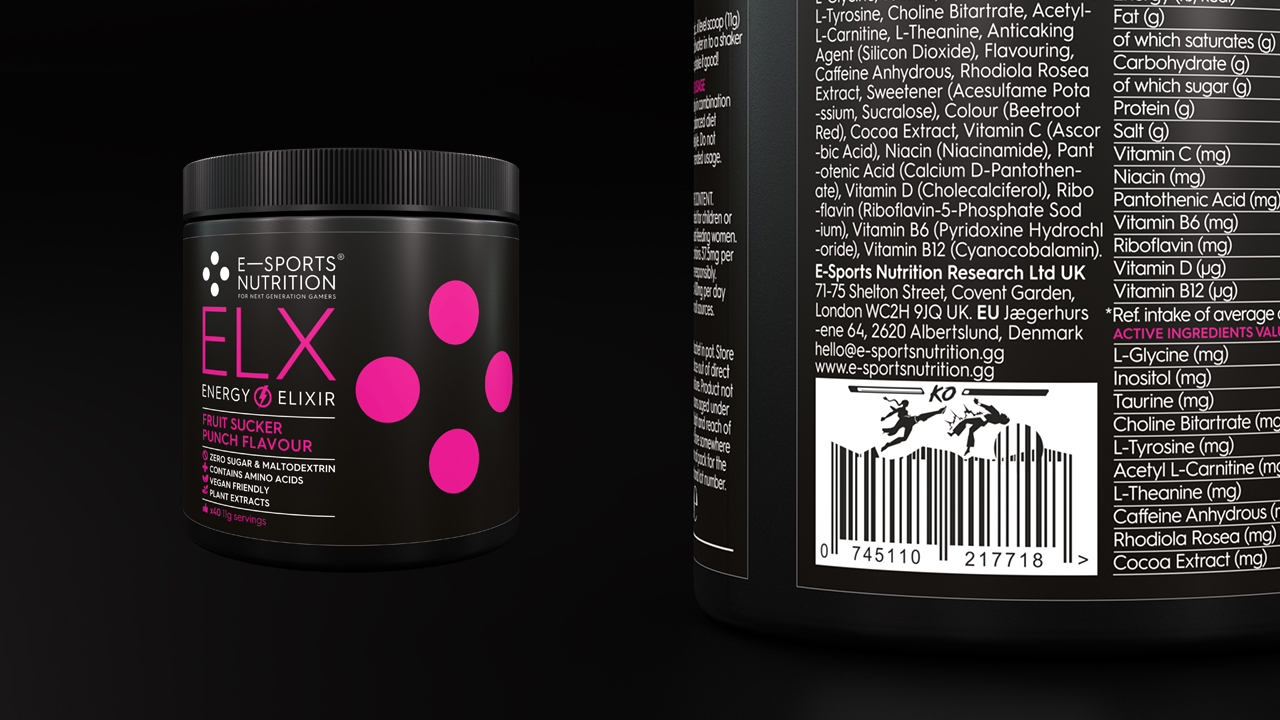
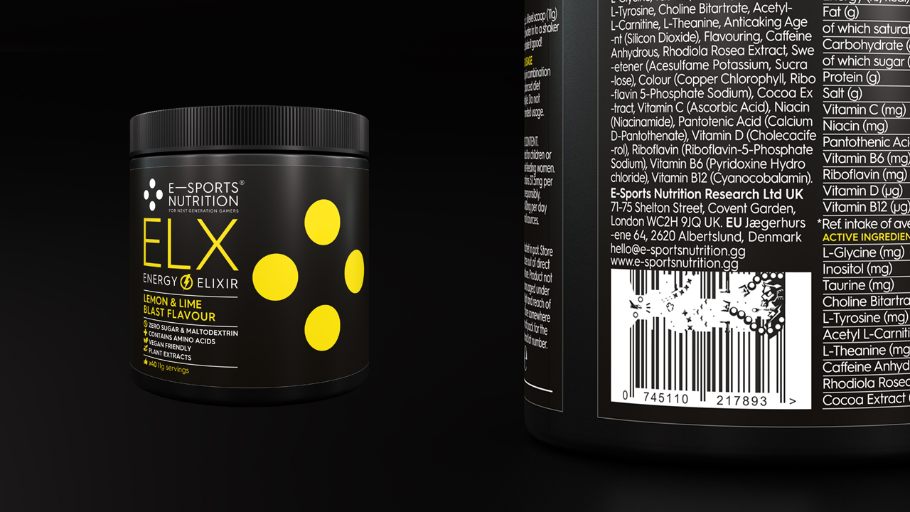
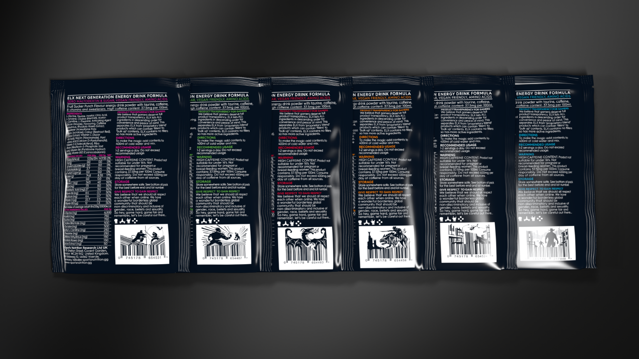
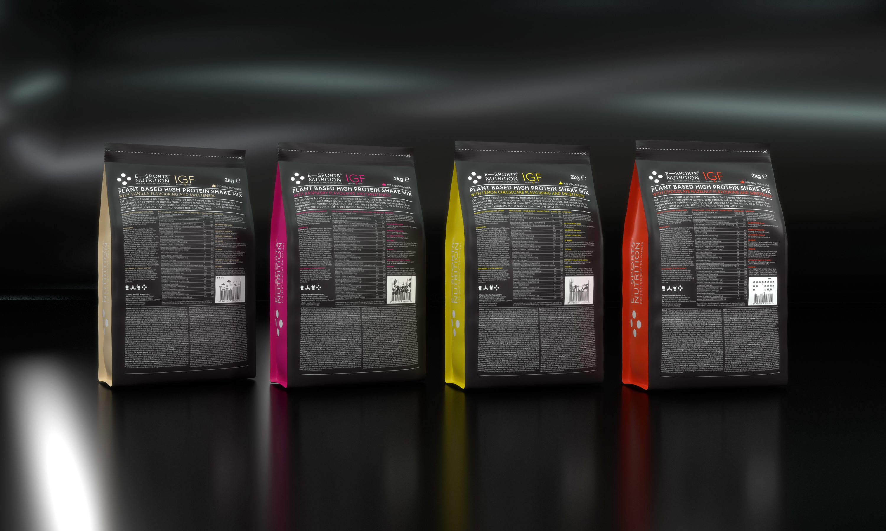
To support the gaming reference of our “four dots” device, we also looked to introduce little “true gamer” details. For example, take the humble barcode. It may be just a practical requirement, but we decided to make something charming and engaging out of it – with each pack having a gaming reference visually incorporated into a fully functioning barcode.
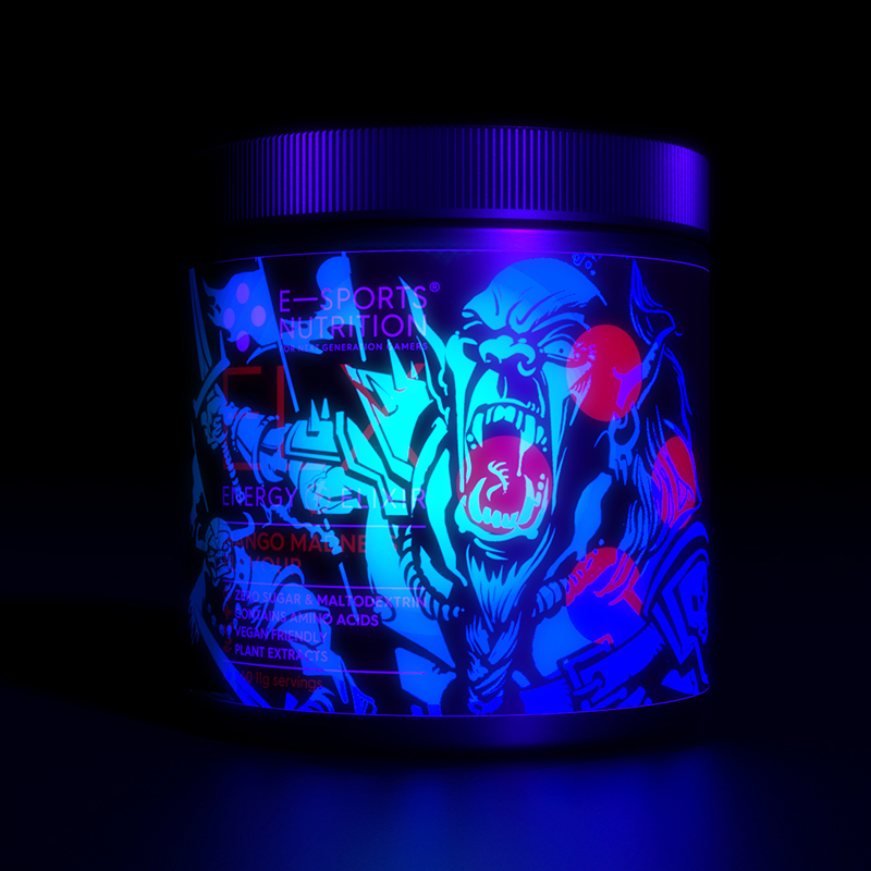
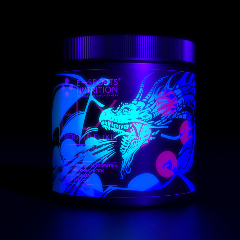
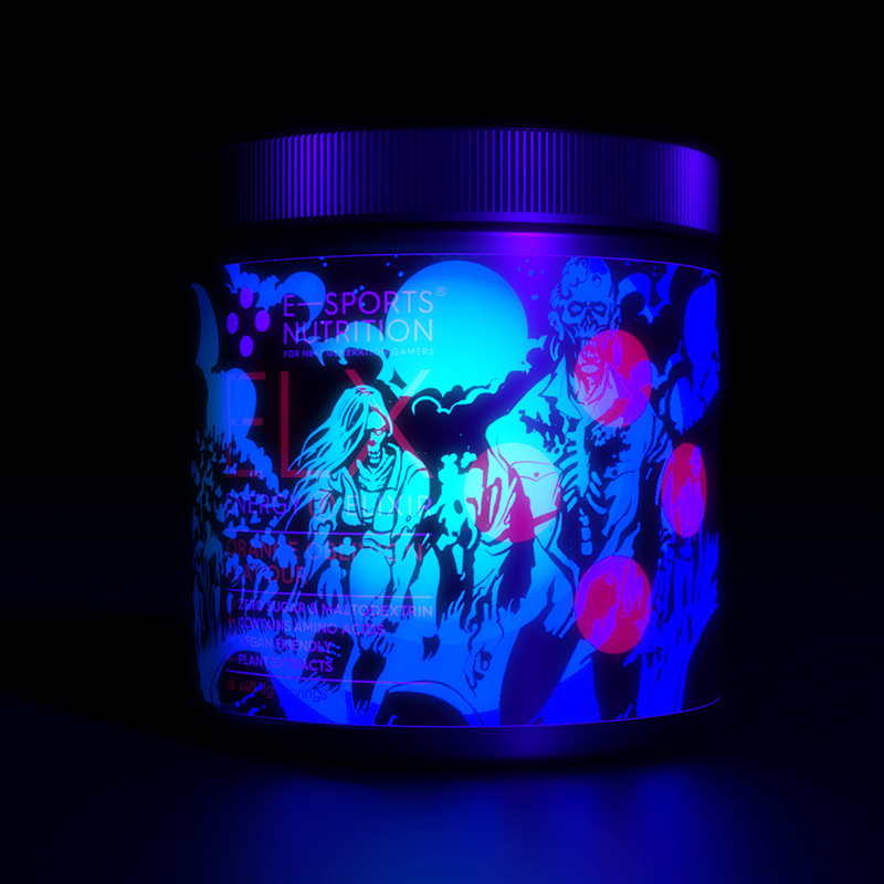
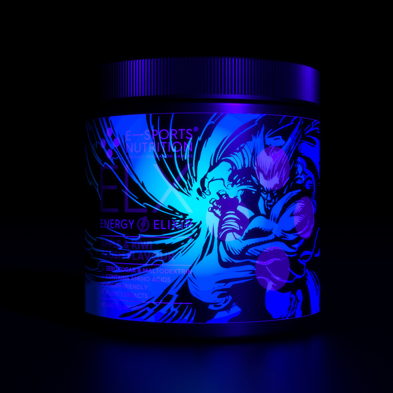
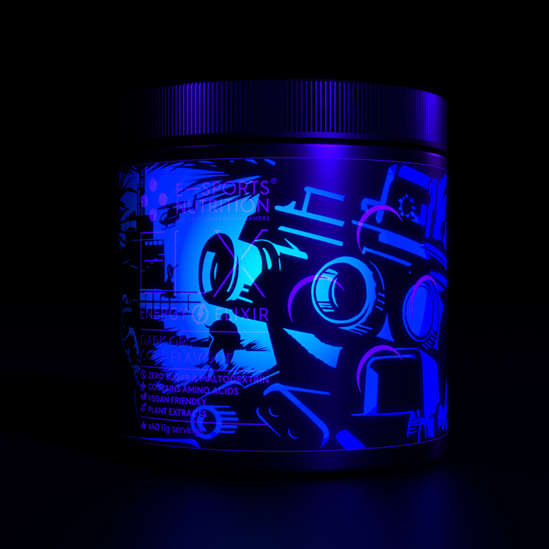
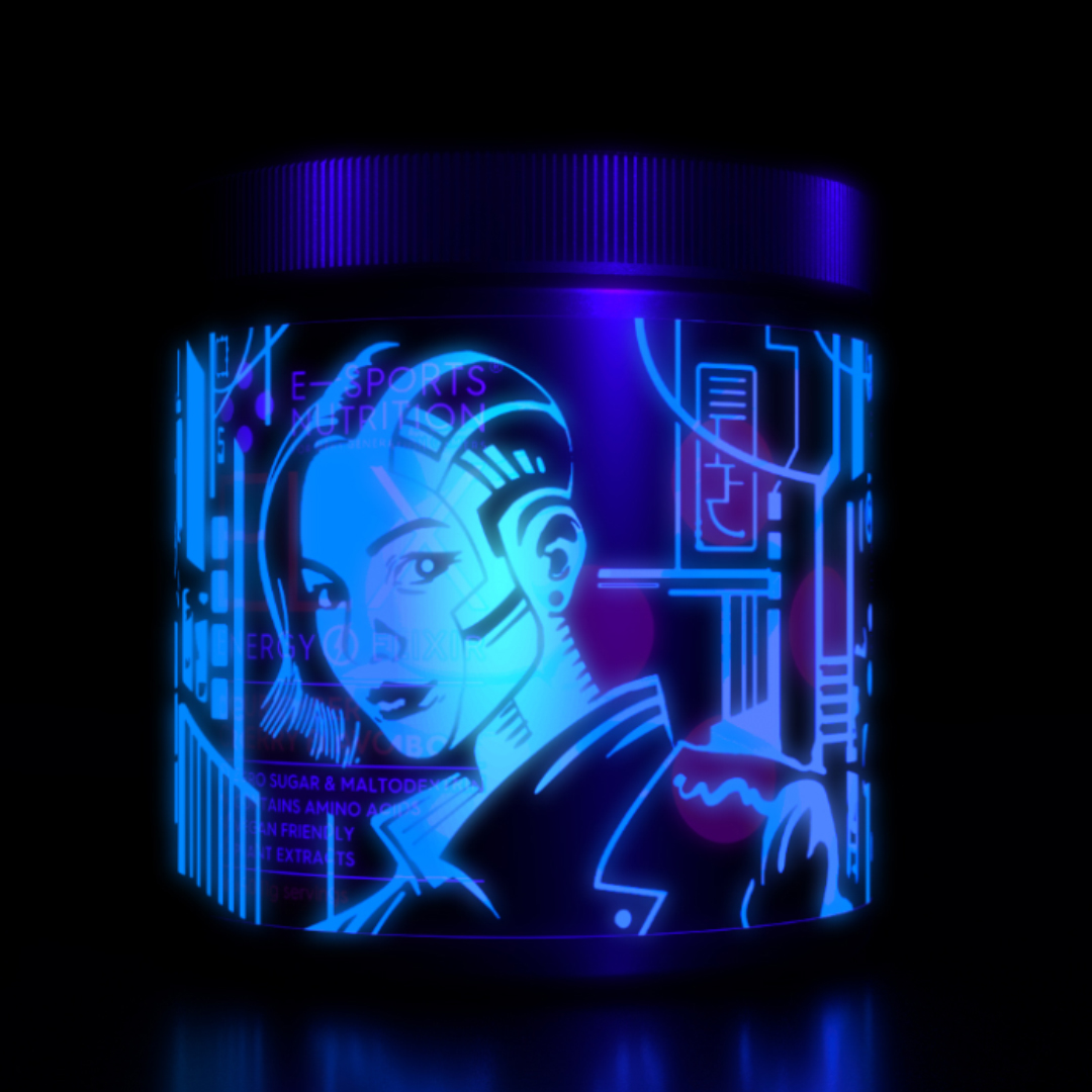
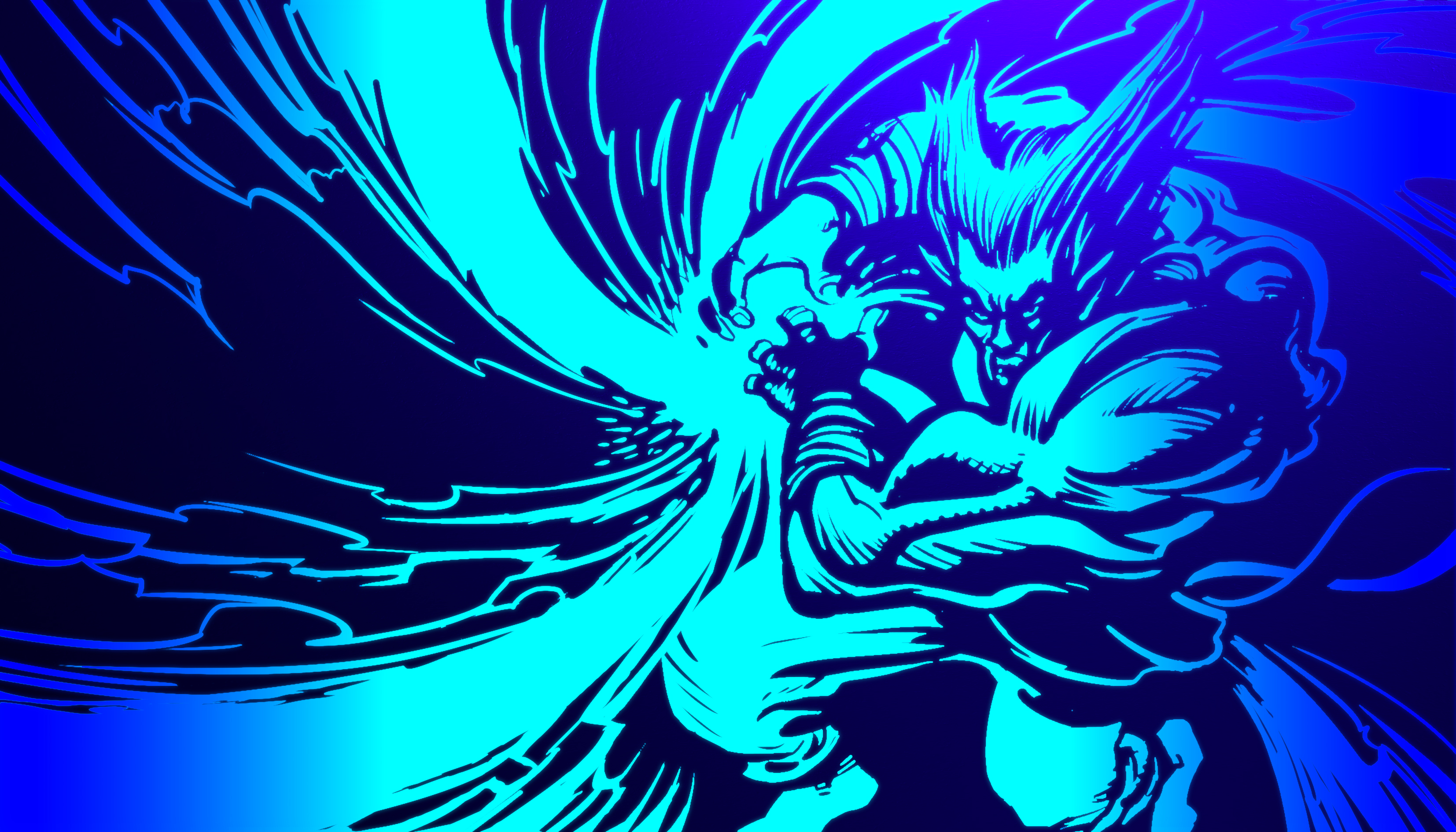
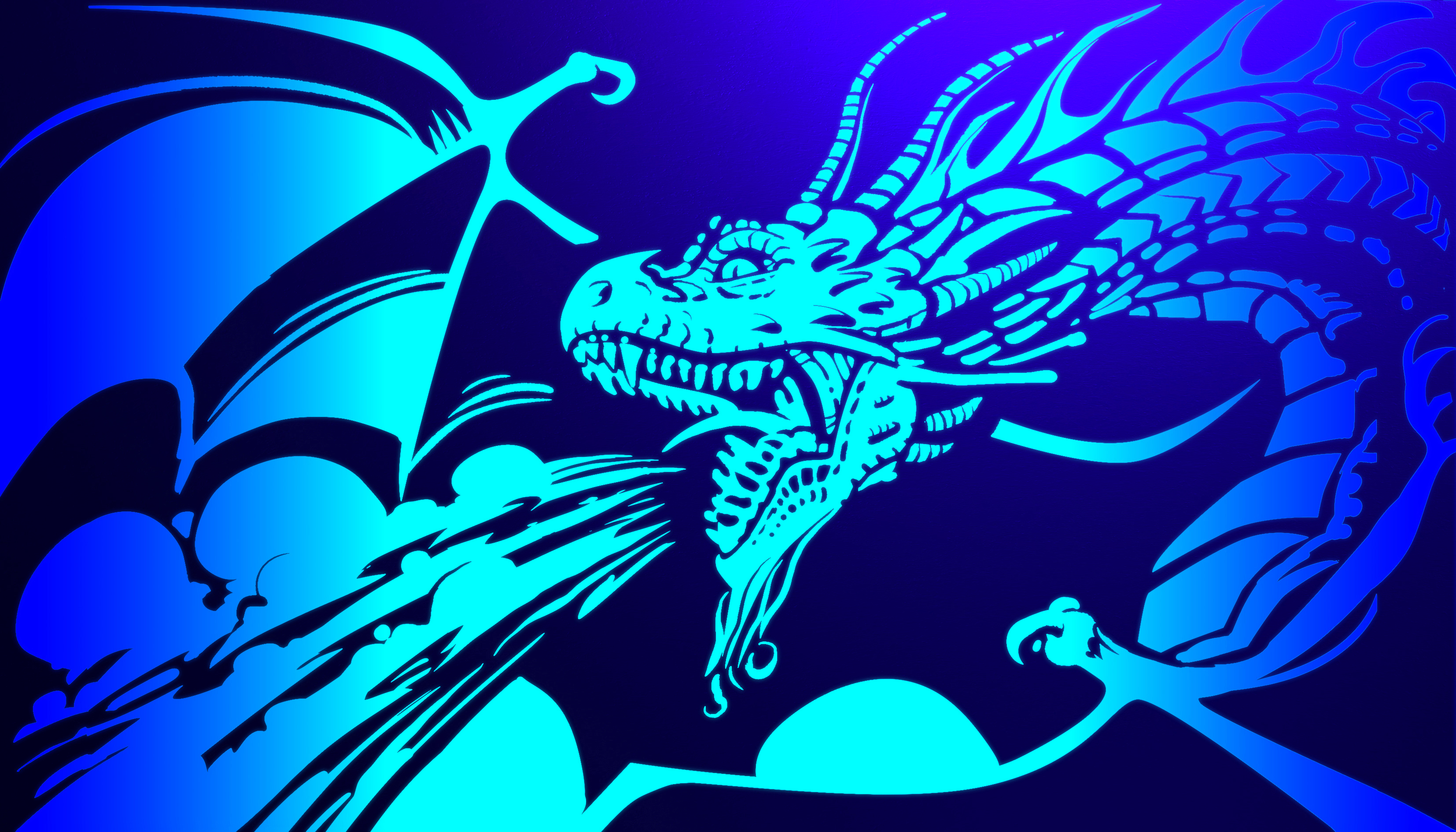
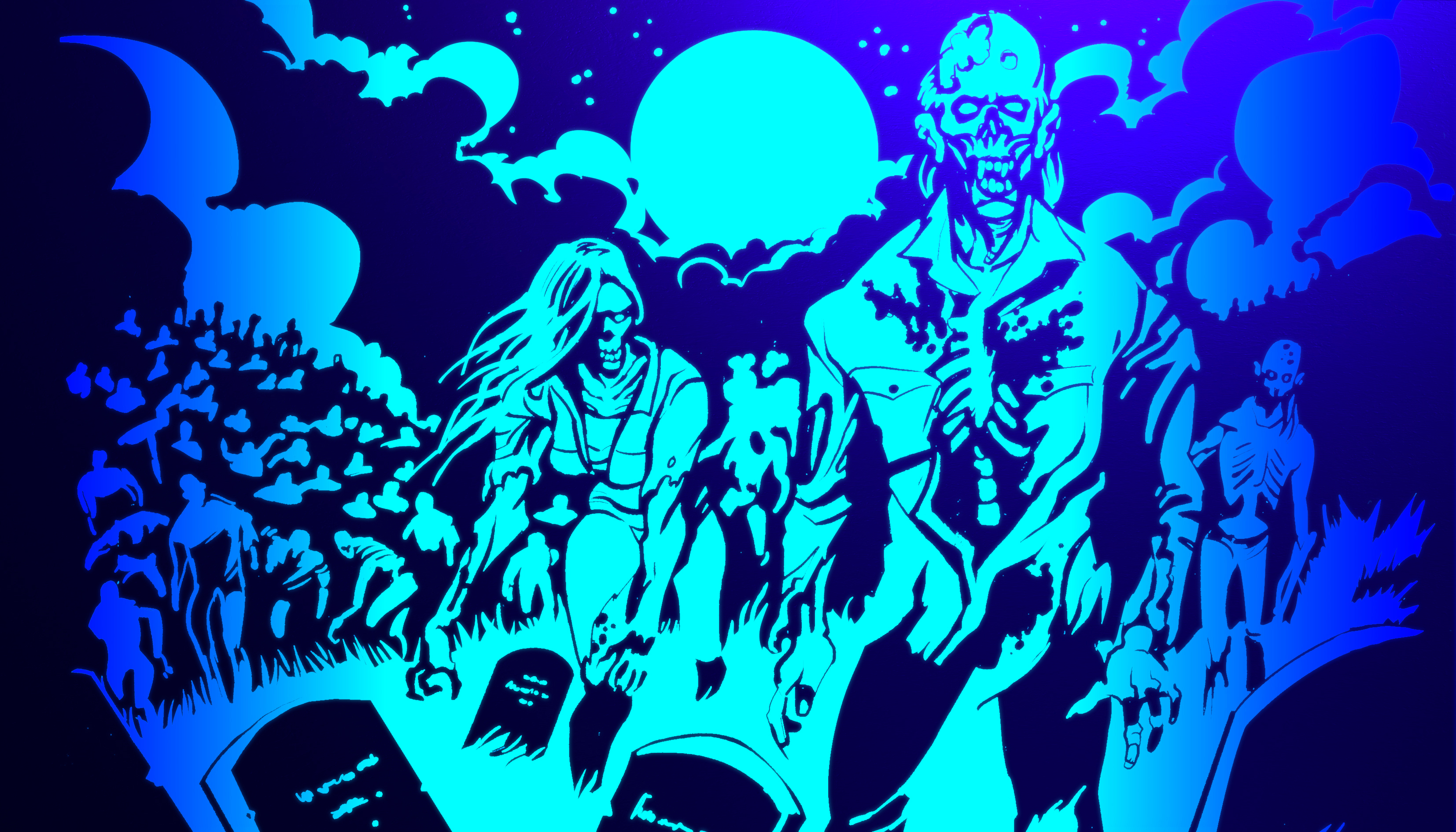
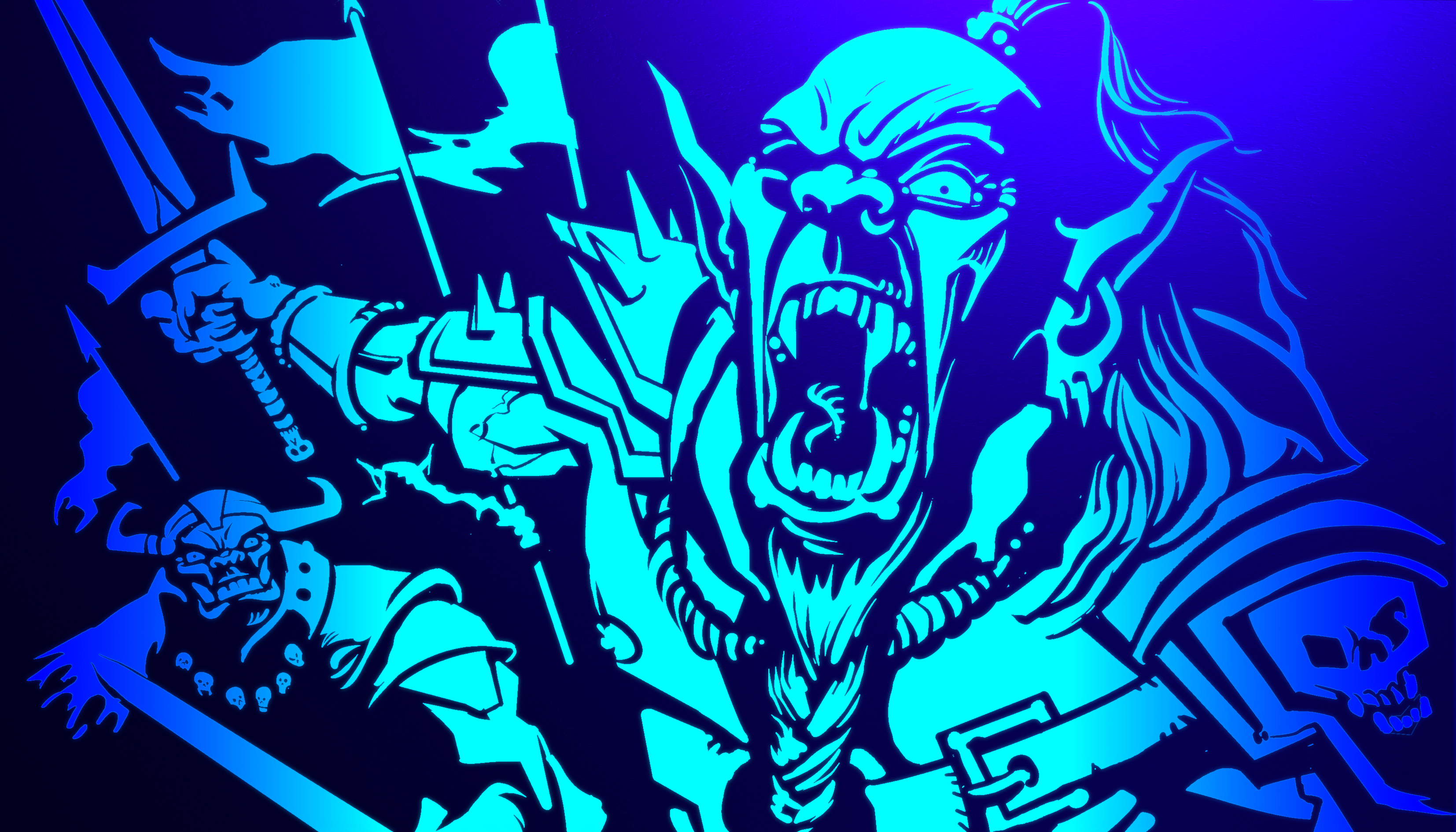
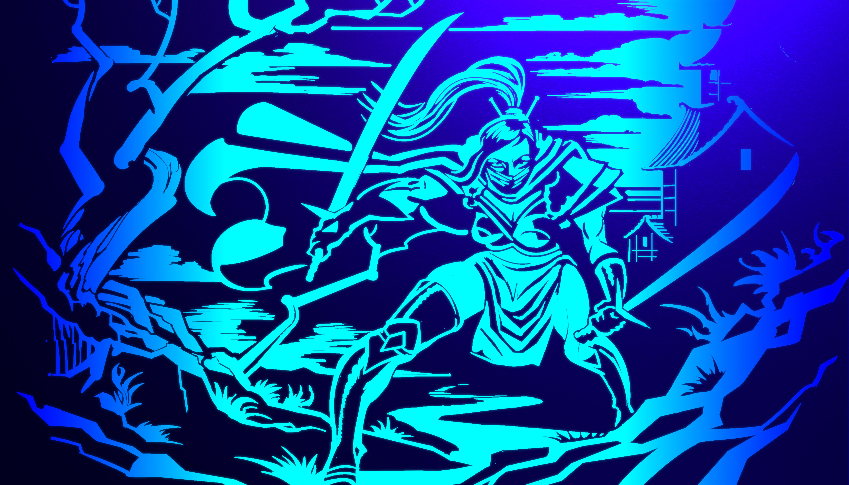
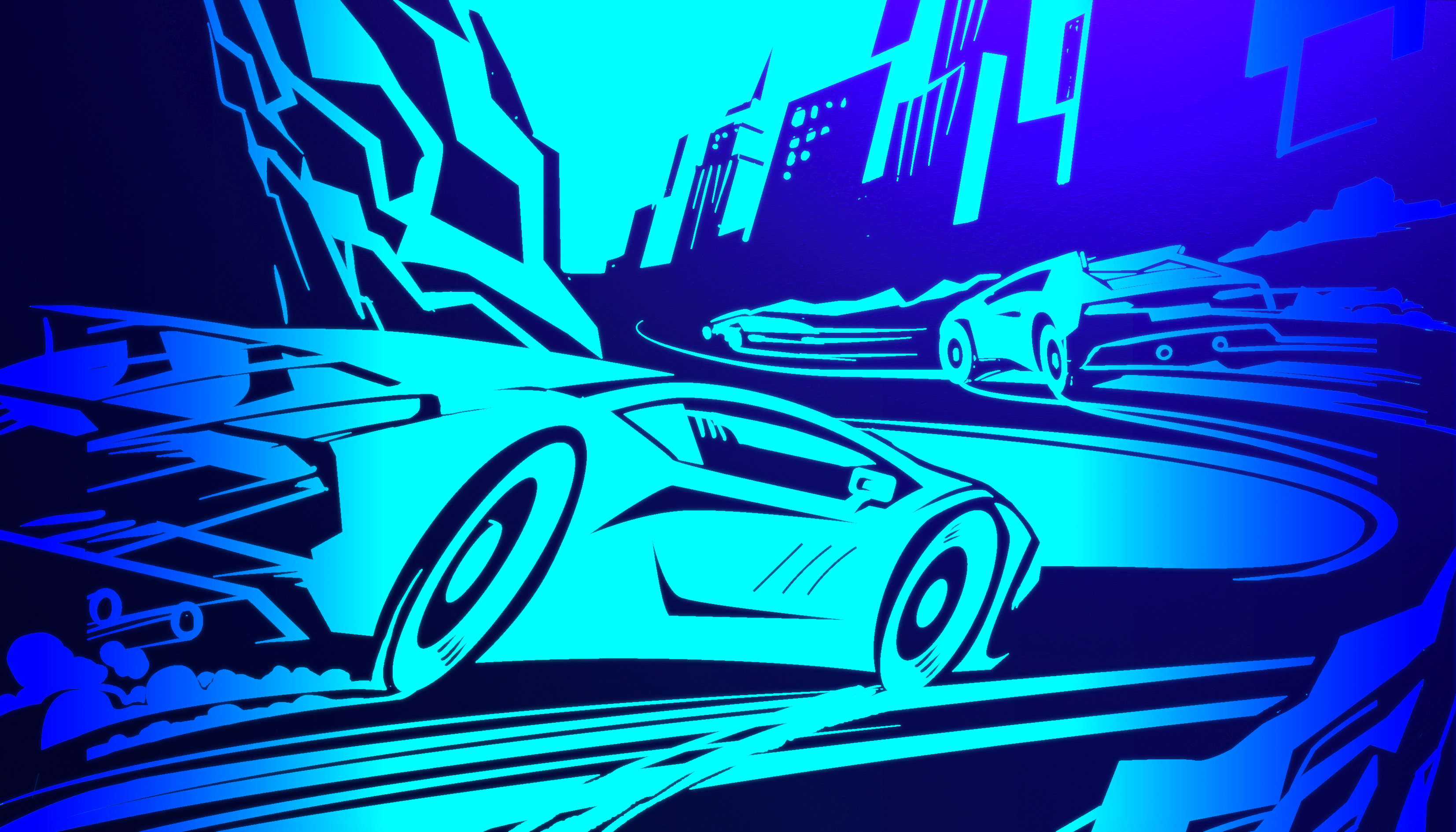
And then we went even further, incorporating a “hidden” or “easter egg” element into each pack, just because we could! Everyone likes to stumble across something within a game, so we introduced a light-sensitive varnish to every pack, concealing a gaming-relevant illustration – only revealed under UV.
Respectfully transparent
Alongside short flavour and product descriptions, we naturally included a complete and clearly presented table of all ingredients and nutritional values that ESN wanted in place to separate them from the competition. All the labels hit the ESN brief of being compliant with the highest UK trading standards regulations (in sharp contrast to the majority of the gamer energy drink and meal replacement market) in regard to type sizes and clarity with hours of whittling away at the design to ensure every element was on pack and compliancy.
And, in keeping with ESN’s values of respect for gamers in regard to product transparency we with suggested putting a pledge in combination with Give Respect to Gain Respect bring home this transparency to gamers and subtly make them aware that this wasn’t happening on competitor product packagings; an important reminder of the brand’s commitment to becoming a force for good in the global gaming community.
Overall, the packaging created for ESN by Neon helps give the brand an ultra-confident premium feel and level transparency and product clarity desired by ESN to set it apart from any competitor, and forge a powerful connection with both the product and brand with grass roots level to esports great gamers everywhere.
Please do also find out in more detail here about: ESN’s brand building, campaigns and e-commerce website, all created by Neon.
(Read Less...)
Kind words…
“It was so important that our products ELX Energy and IGF Meals stood out for all the right reasons in such a saturated market. So Neon created product packaging that was highly memorable, distinct and clearly of the highest of quality. Read More…
But the real magic was in the gamer details on pack which include game genre barcode takeovers (mini works of art in their own right) and stunning UV varnish’s that also reveal game genre illustrations that can be seamlessly showcased as new additions to gamer set ups. This all combined to form a super strong brand look and feel across the entire range that serves to further distinguish ESN as an ultra-premium brand with gamer specific products.” ANTHONY MILLAR
Director & Co Founder
E-Sports Nutrition
(Read Less...)
To find out more: [email protected] or call +44 (0)20 3289 1733 Share this: Email, LinkedIn, Twitter, Facebook, Download PDF, follow us on Instagram or view our animations and movies on Vimeo
GAMING / ESPORTS & FMCG
Packaging
PROJECT SUMMARY
Product naming
Packaging design
Copy writing
Production sourcing & oversight
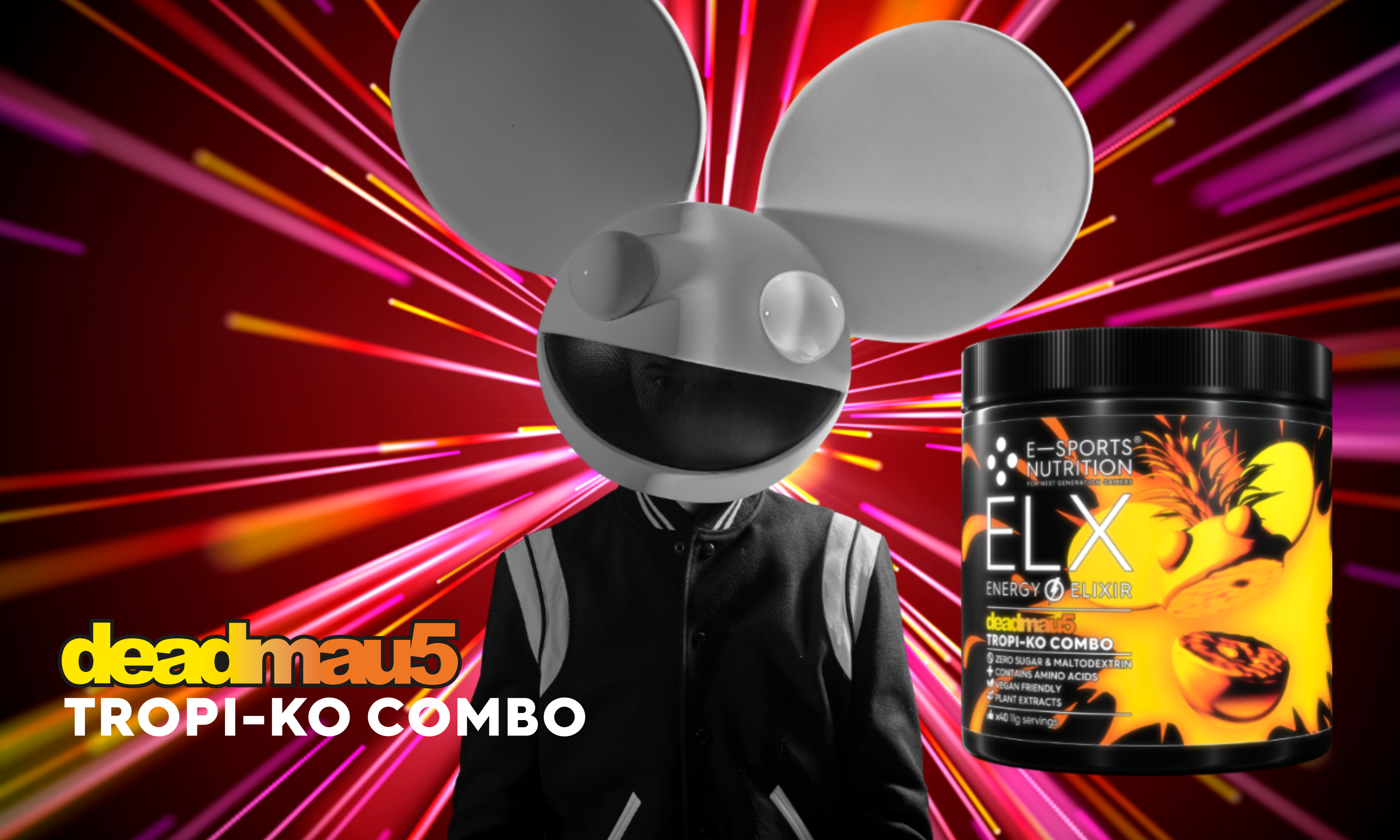
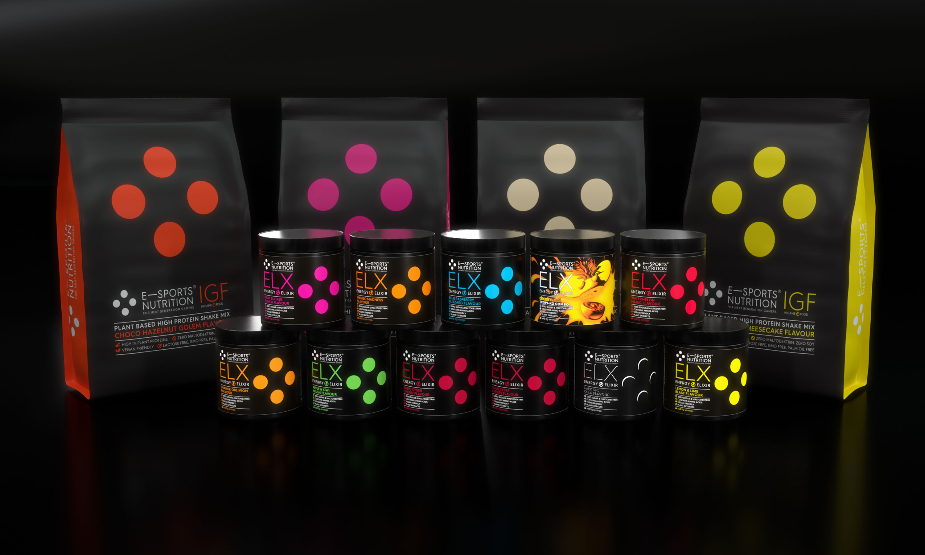
ELX energy drink formula and IGF In Game Food meal replacement shake packaging.
ELX energy drink formula product page spin.
ELX packaging detail.
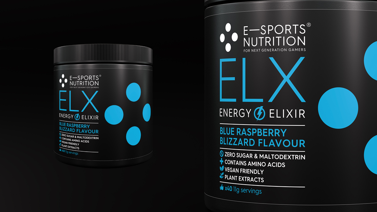
ELX energy drink formula packaging.
ELX , brand transparency pledge and Give Respect To Gain Respect message on every pack
ELX, label UV varnish hidden game genre illustrations.
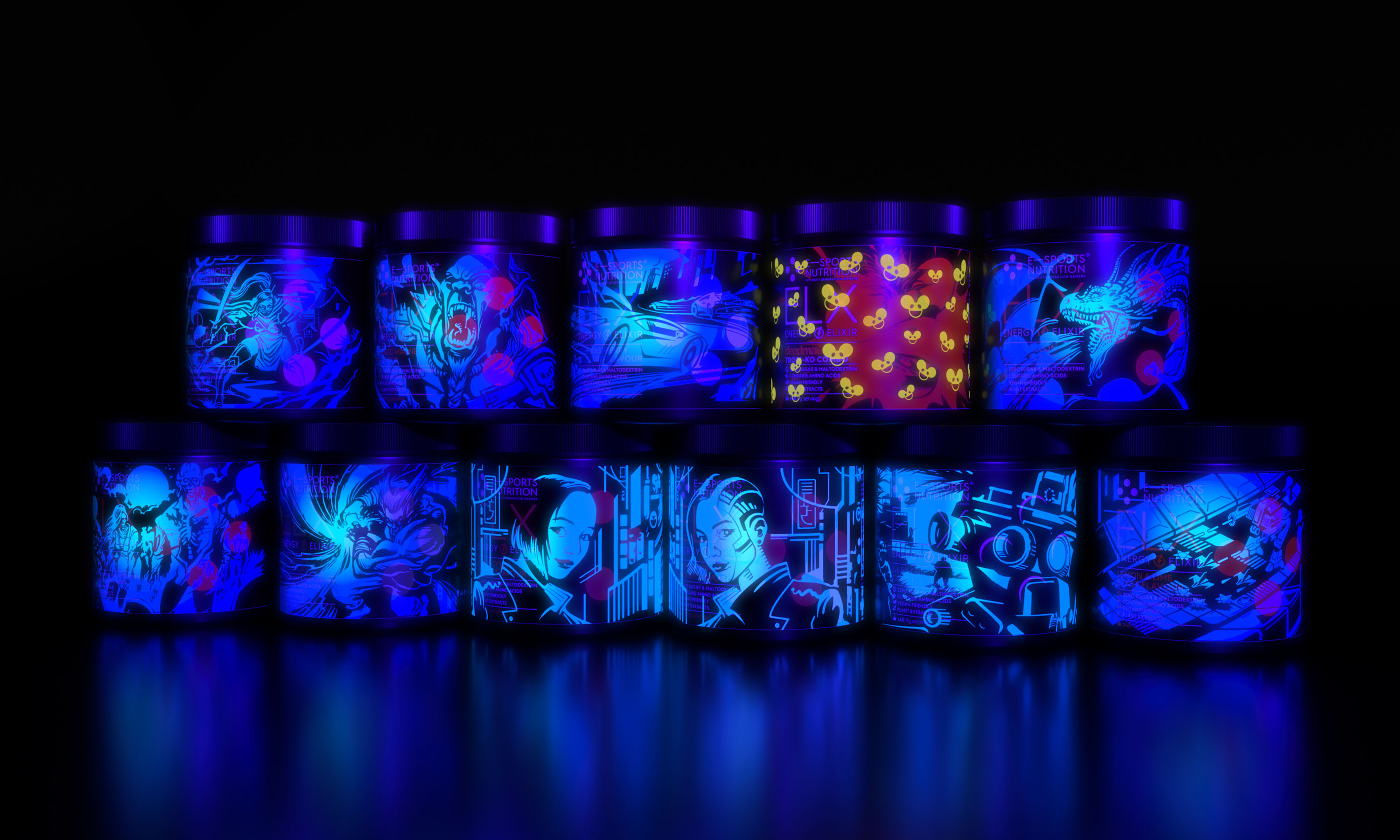
ELX, label UV varnish hidden game genre illustrations.


ELX, label UV varnish hidden game genre full illustrations.


ELX, game genre barcode take over illustrations detail.
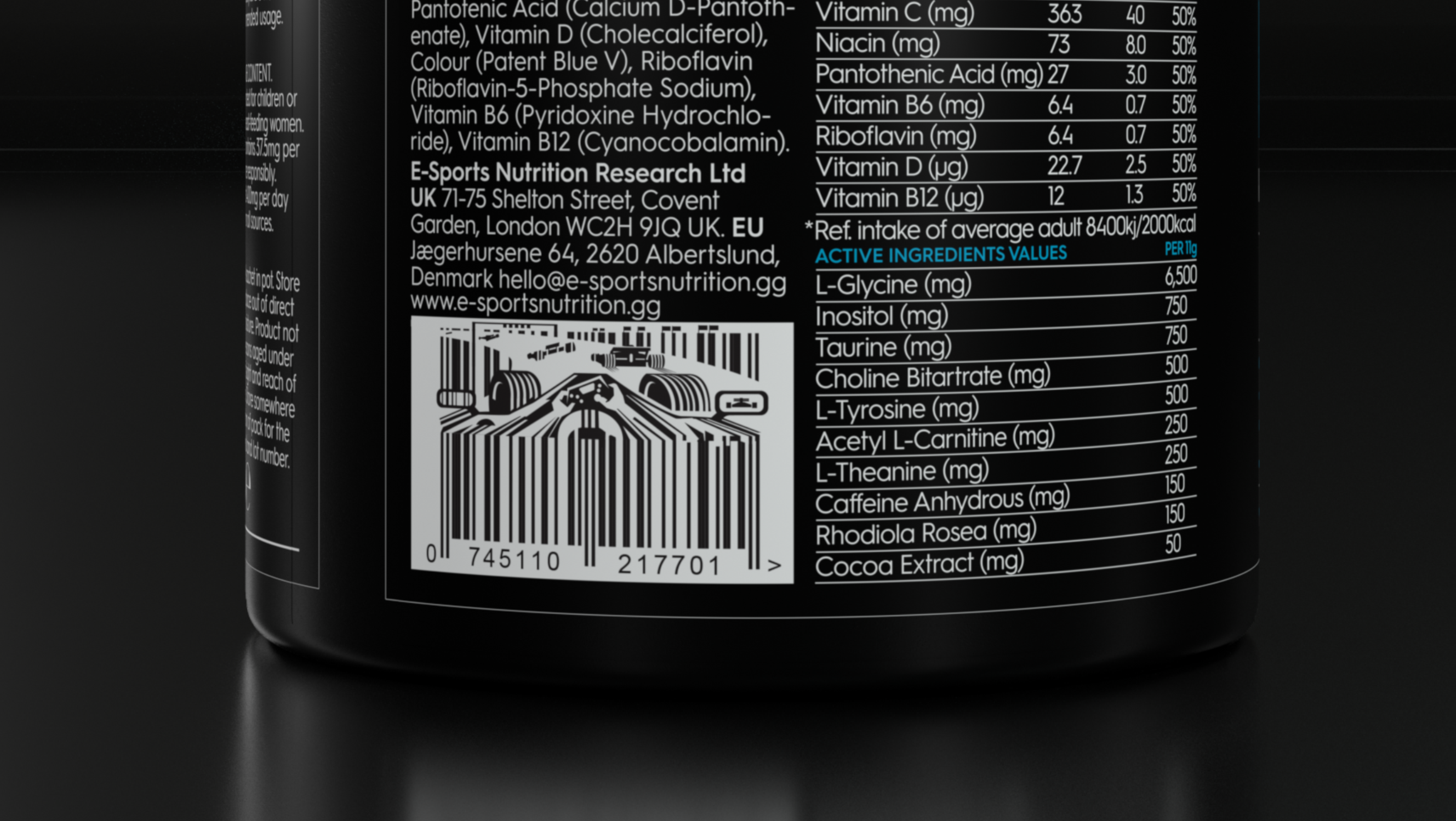
ELX energy drink packaging, game genre barcode take over illustrations.
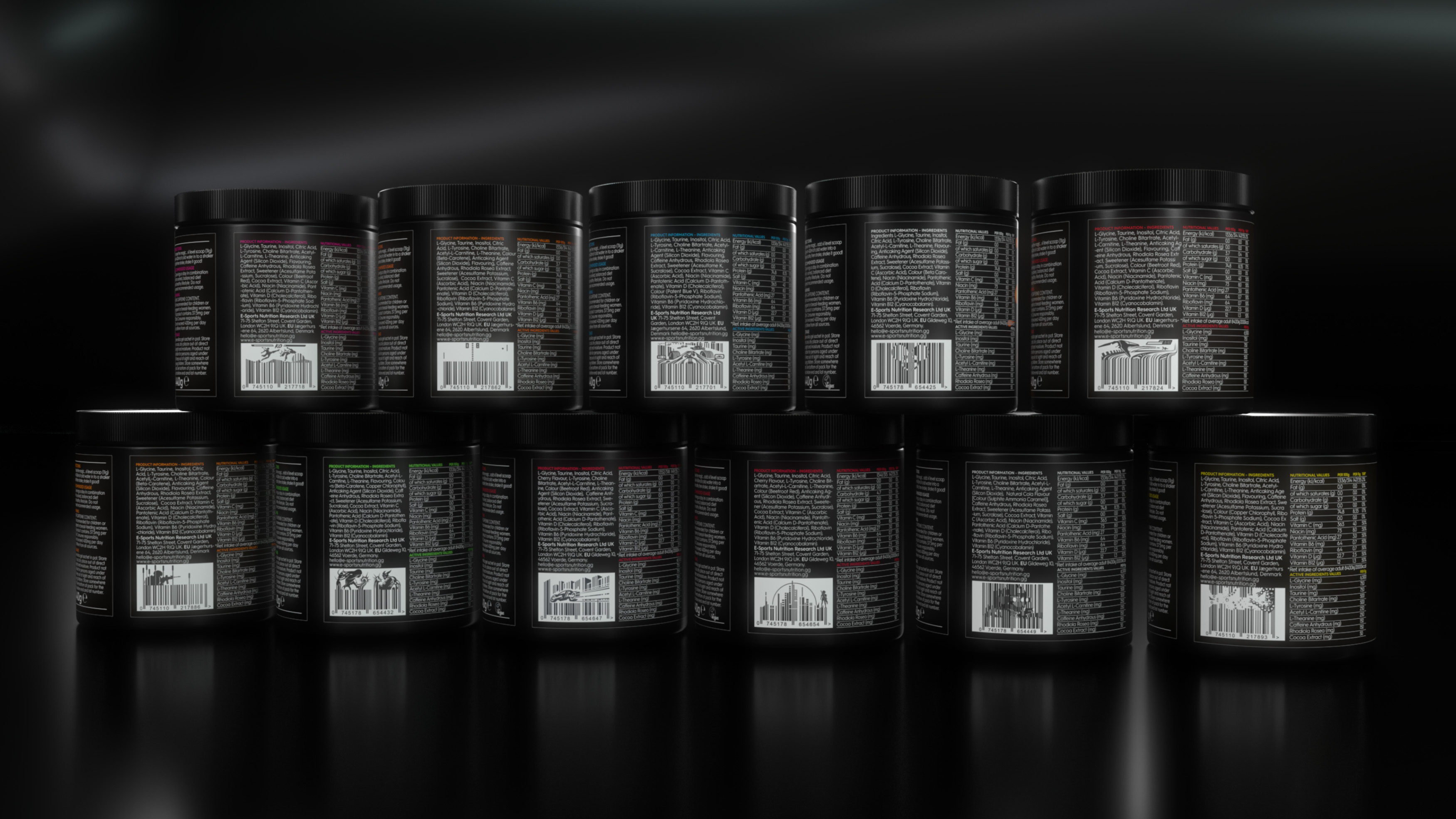
ELX, game genre barcode take over illustrations.

ELX example animations.
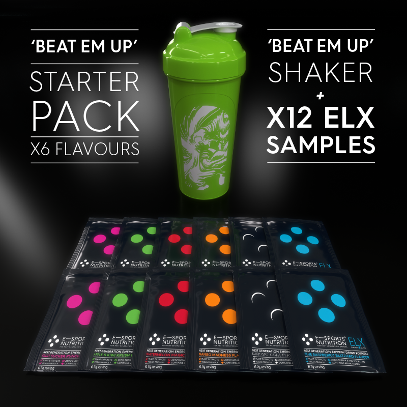
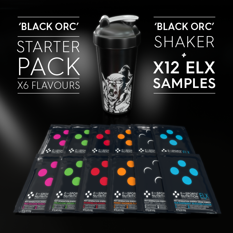
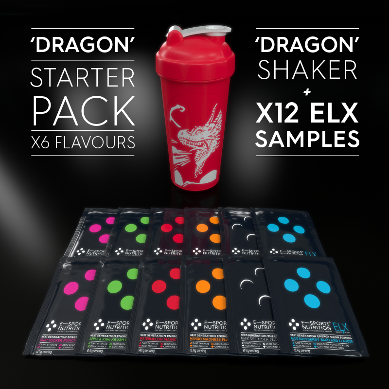
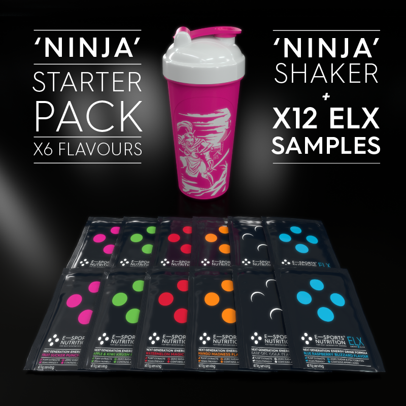
x12 ELX samples sachets starter pack promotional animations.
ELX energy drink sample sachet packaging.
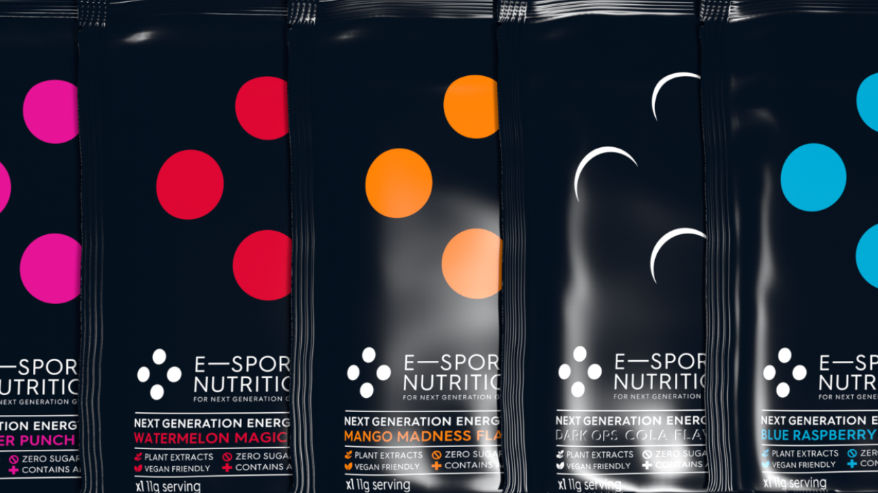
ELX sample sachet packaging, back of pack game genre barcode take over illustrations.
Promotional IGF & ELX samples starter pack promotional video.
IGF (In Game Food) 'For The Journey' gamer ad.
IGF (In Game Food) meal replacement shake packaging.
IGF (In Game Food) meal replacement shake packaging, back of pack game genre barcode take over illustrations.
IGF, back of pack game genre barcode take over illustration details.