Rinkit rebrand
Rebrand & website
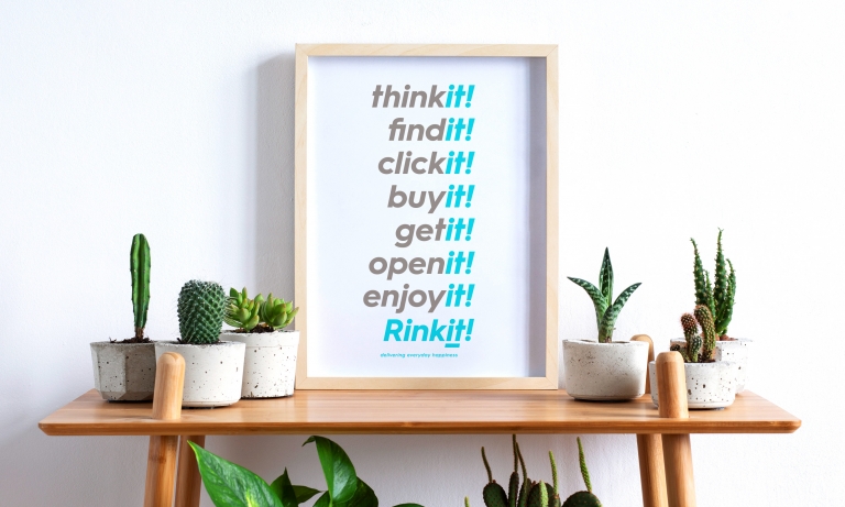
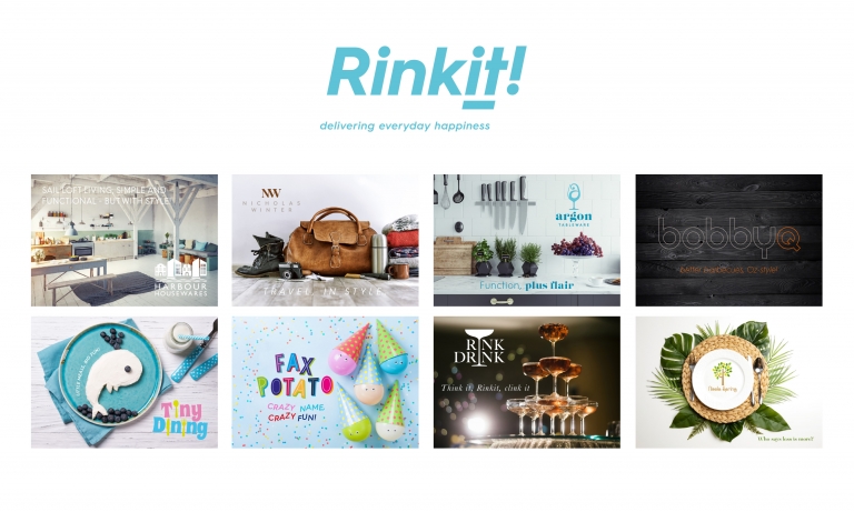
Delivering everyday happiness
When fast-growing online home and garden retailer Rinkit approached Neon Brand Consultancy, they had built a thriving e-commerce business — but not yet a true brand. Our challenge was to create a more meaningful emotional connection with customers, elevating Rinkit from functional to feel-good.
After a deep dive into their culture and offer, we uncovered the brand’s real purpose: “delivering everyday happiness.” This positive positioning captured Rinkit’s drive to make it easy for people to buy simple, beautiful things that bring joy to their homes.
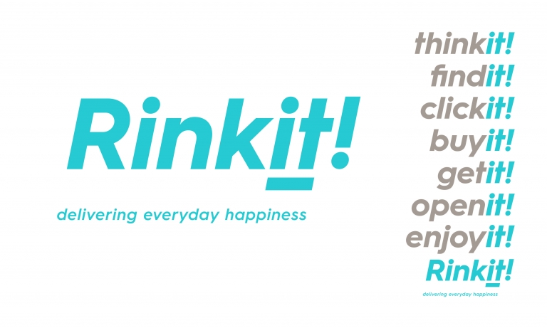
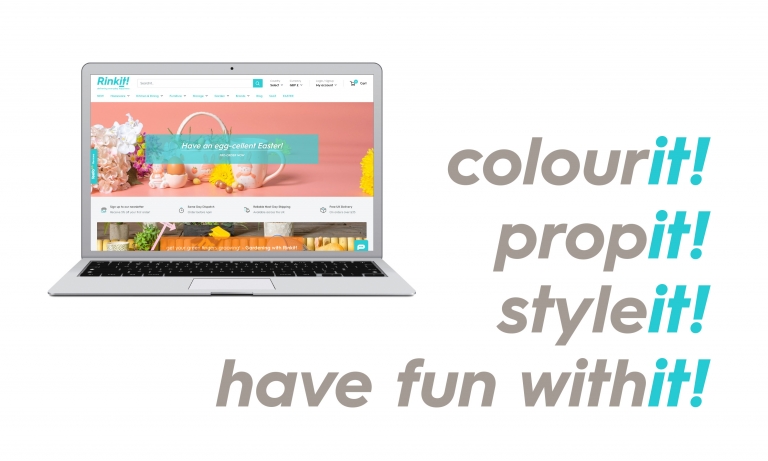
We advised keeping the memorable Rinkit name, unlocking an entire “it” brand vocabulary for playful communications across their website, packaging and ads. Then we brought the happiness to life visually — with brighter, more colourful product photography, engaging copy, and a refreshed digital experience that’s as vibrant as the products themselves.
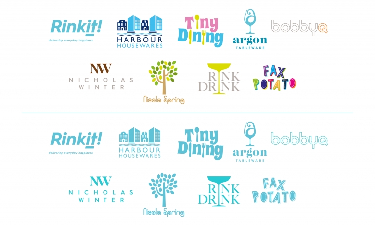
Alongside the masterbrand, we helped define Rinkit’s growing family of exclusive sub-brands, ensuring each had its own personality while maintaining a shared sense of quality and warmth.
The result? A business transformed into a brand — one that’s as delightful, dependable and distinctive as the homes it helps to furnish.
For the full long read case study, click here…
When Rinkit started back in 2008, it was, literally, two blokes in a bedroom, selling glassware and crockery on Amazon. But by the time Neon appeared on the scene, they’d built their business into a highly successful online home and garden store, offering everything from wine-racks to wall-clocks, photo frames to furniture, soap dishes to sun-loungers…
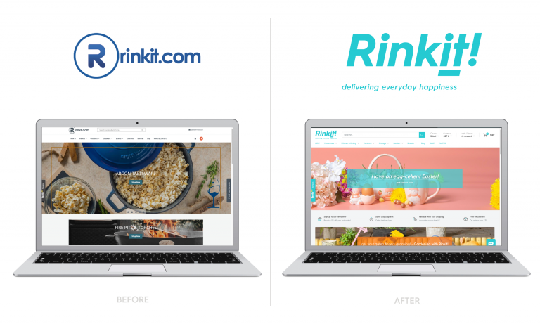
Great products at great prices were, of course, the key to their success. However, their site had a low-budget feel that didn’t do justice to the quality of Rinkit’s all-round product and service offering — and once we chatted with them about refining their brand we saw Rinkit as a business driven by a powerful desire to make it easy for their customers to buy really nice things for their homes and gardens, which we boiled down to putting the fun into functional.
A positive positioning, with limitless potential
So that’s what led us to developing our “delivering everyday happiness” positioning for the brand.
We knew it was right. But would the highly successful hard-nosed retail guys behind Rinkit feel the same way?
To our joy, and their credit, they immediately saw the potential to make the Rinkit brand a positive and enabling presence in their customers’ lives. And beyond that, they recognised that the positioning could be invaluable internally, rallying their hard-working team around a higher purpose — not just selling products, but making people happy.
Rinkit – changeit or keepit?
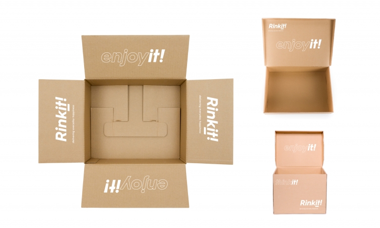
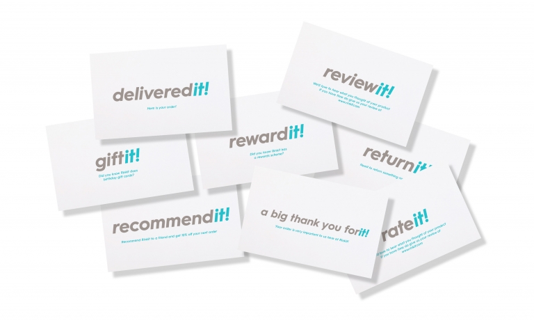
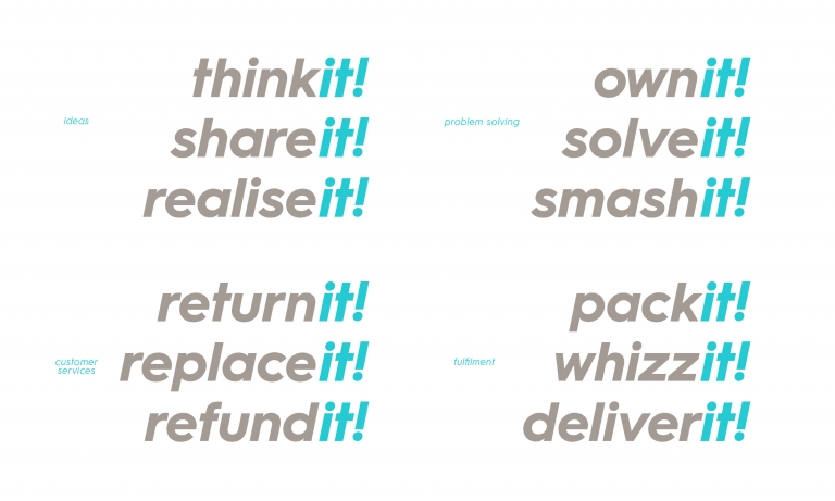
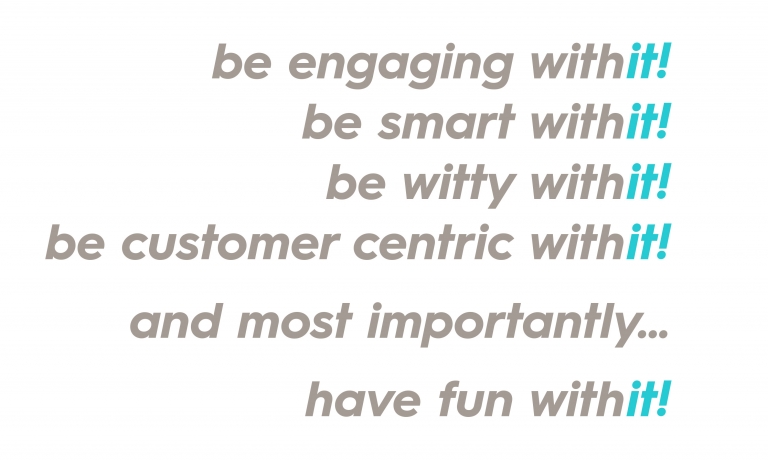
What about the name? Rinkit was, it seems, originally a bit of an in-joke. So whilst liked internally there had been discussions around a name change, Rinkit were keen to get our view form a branding perspective. And? We loved it. We thought it was snappy, distinctive, memorable. And when we started to explore its possibilities, we realised there was an entire “it” brand vocabulary just waiting to fall into place, throughout the brand’s communications, from website to packaging. Plus there was also the practical aspect of all of the SEO and data heritage behind it — therefore our advice was to retain the name as an essential brand asset underpinned by strong commercial benefits.
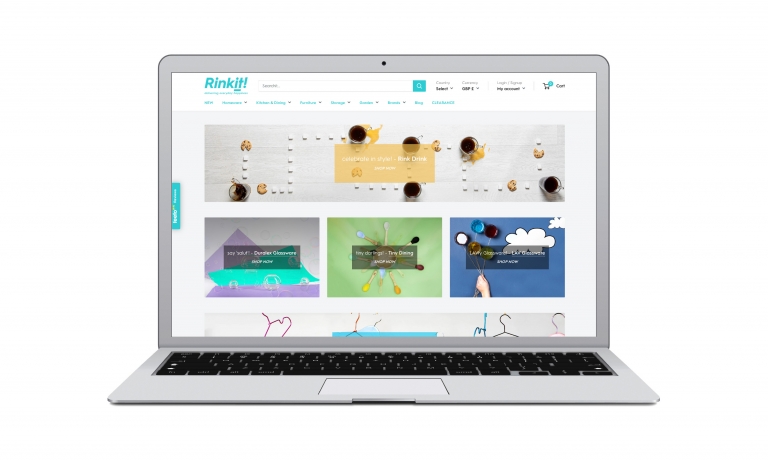
A fresher, more seductive site
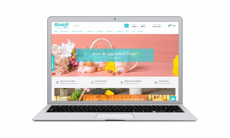
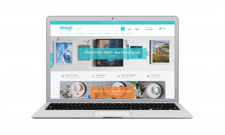
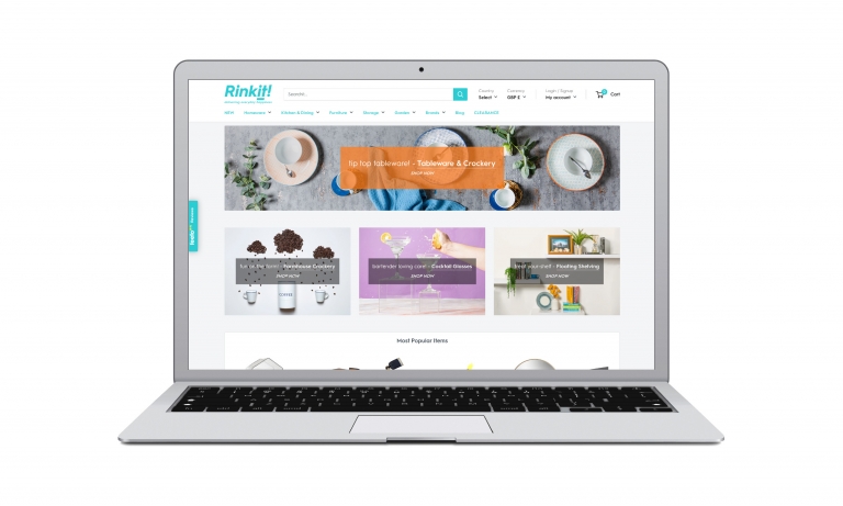
As for the visual look and feel of the Rinkit website, our job was relatively straightforward: to take something a bit drab and unloved-looking, and make it brighter, fresher, more vibrant and seductive.
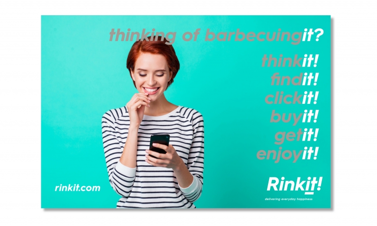
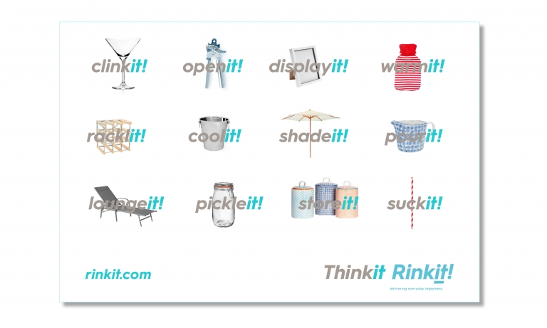
As well as introducing the Rinkit ‘it’ language to their website we also guided them on how to put little ideas within product titling and copy to link to be a more engaging and happy experience for the customer.
We also recommended having fun with product photography and simple propping using bright coloured papers — putting the fun functional and creating a brighter and fresher online experience. This also translated over into product videos again keeping it simple and fun with a bit of stop go magic. Then with Rinkit we went to work on spreading the happiness around, through ads, internal signage and a rather jolly little promotional video.
Building brand value — and sub-brand value
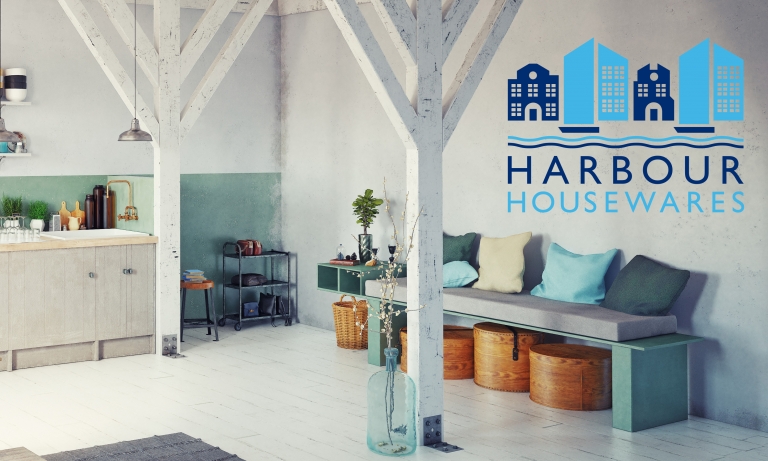
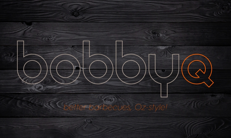
A key part of Rinkit’s strategy for success has been the development of their own exclusive brands — enabling them to offer their customers something a bit more special, particularly well suited to their needs and tastes. These range from the minimalist sophistication of Harbour housewares to the bobbyq selection of authentic Australian barbecue equipment.
As part of our overall branding, we focused on each of these sub-brands in turn, aiming to bring out their distinctive personality, while ensuring a complementary high quality feel to the main Rinkit brand, enabling them to target their customers and niche markets even more effectively.
From a great business to a great brand
All in all, it’s been a lovely project for us. Long before Neon came along, Rinkit had built a fantastic business. But they really hadn’t built a brand, in the sense of something that connects with people, and has meaning for them, beyond the basic function the business performs. Now, for more and more customers, around the UK and internationally, Rinkit is rapidly becoming synonymous with the prompt and reliable delivery of little bits of everyday happiness — and adding brand value to Rinkit as a tangible business asset.
Neon’s other branding projects in West Sussex include brand identities for Bignor Park estate, plus for community based initiatives Love Arundel and the Arundel Bee Project, as well as for Akin Arundel’s creative collective, The Castle Cinema and Lidgett Search genealogy.
(Read Less...)
Kind words…
“Rinkit began working with Dana and Neon in early 2020 to explore a company wide re-brand. Rinkit was now 10 years old and despite having multiple websites, house brands and several thousand products it had never been through any form of professional branding and as a company we knew this needed to change. Read More… Rob Lowe
Founding Partner
Rinkit
(Read Less...)
To find out more: [email protected] or call +44 (0)203 857 7656 Share this: Email, LinkedIn, Facebook, Download a PDF of this case study, follow us on Instagram or view our animations and movies on Vimeo
RETAIL E-COMMERCE
Branding
PROJECT SUMMARY
Positioning & strapline development}
Sub-brand development
Brand and sub brands identitys
Website
Advertising
Brand guidelines
Packaging
Signage
Interior graphics
Stationery
Digital Templates
Power Point templates
New Rinkit brand mark.
Rinkit promotional video short.
New Rinkit brand mark & strapline/positioning with offer 'it' language.
Rinkit Advertising.
Rinkit before and after comparison.
New Rinkit website on going image and copy style brief.
Rinkit Tiny Dining video short, based on new creative direction and styling brief.
New Rinkit website.


Rinkit outer packing delivery box messaging.
New Rinkit box stuffer postcards.
Rinkit internal messaging.
Rinkit copywriting guide.
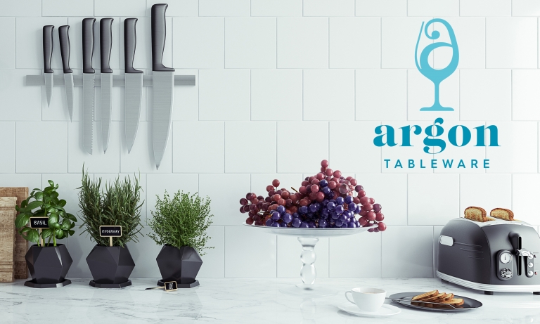
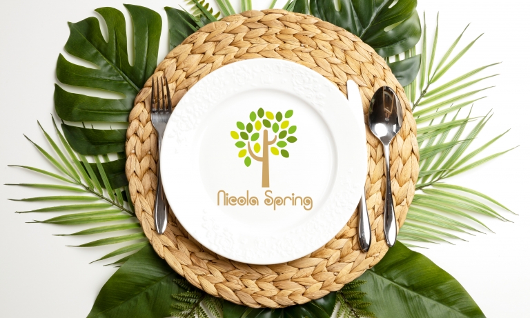
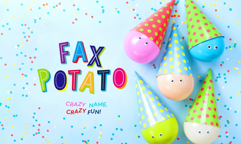
Rinkit sub brands, brand marks.


Rinkit, primary short hand 'it' language.