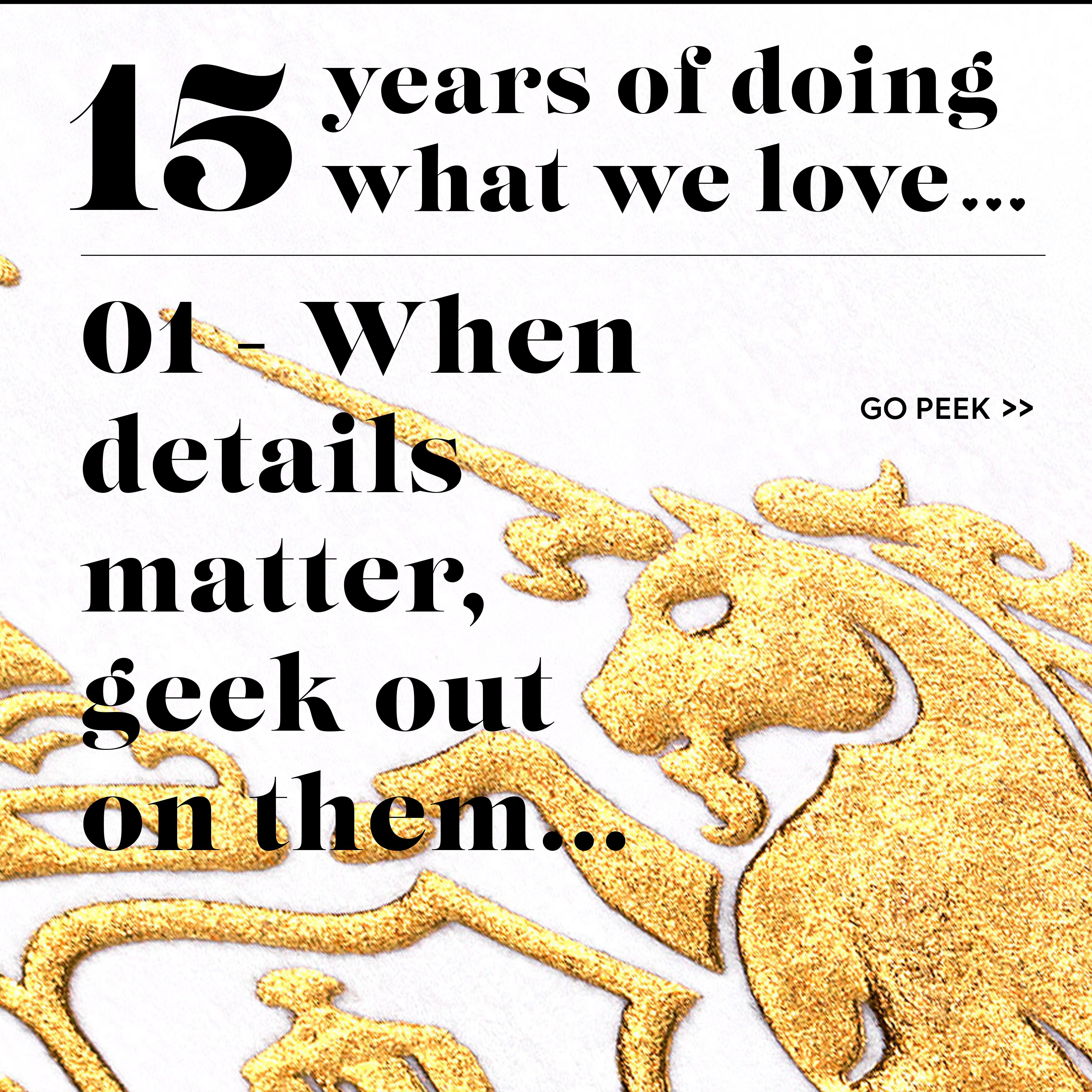
01 – When details matter, geek out on them…
There’s a lot of healthy discussion about Burberry’s new brand ID, moving away from a trend it helped start of flat minimal sans-serif sanitised word marks.
Don’t get me wrong I’m all for the new – and using the odd bit of sans serif. However, I do still enjoy the challenge of doing something based on provenance if the brief, brand, it’s strategy and audience fits that approach.
I like Burberry’s Equestrian Knights refresh – and then there’s the debate about its balance of being an icon and practicalities in application with all the fine line work. But there’s the challenge – creating something with joyous details and provenance, plus works as a brand mark in application.
Details is a challenge we faced on a branding project for The Goldsmiths’ Company.
So in short, when details matter, you have to go all in and geek out on them…
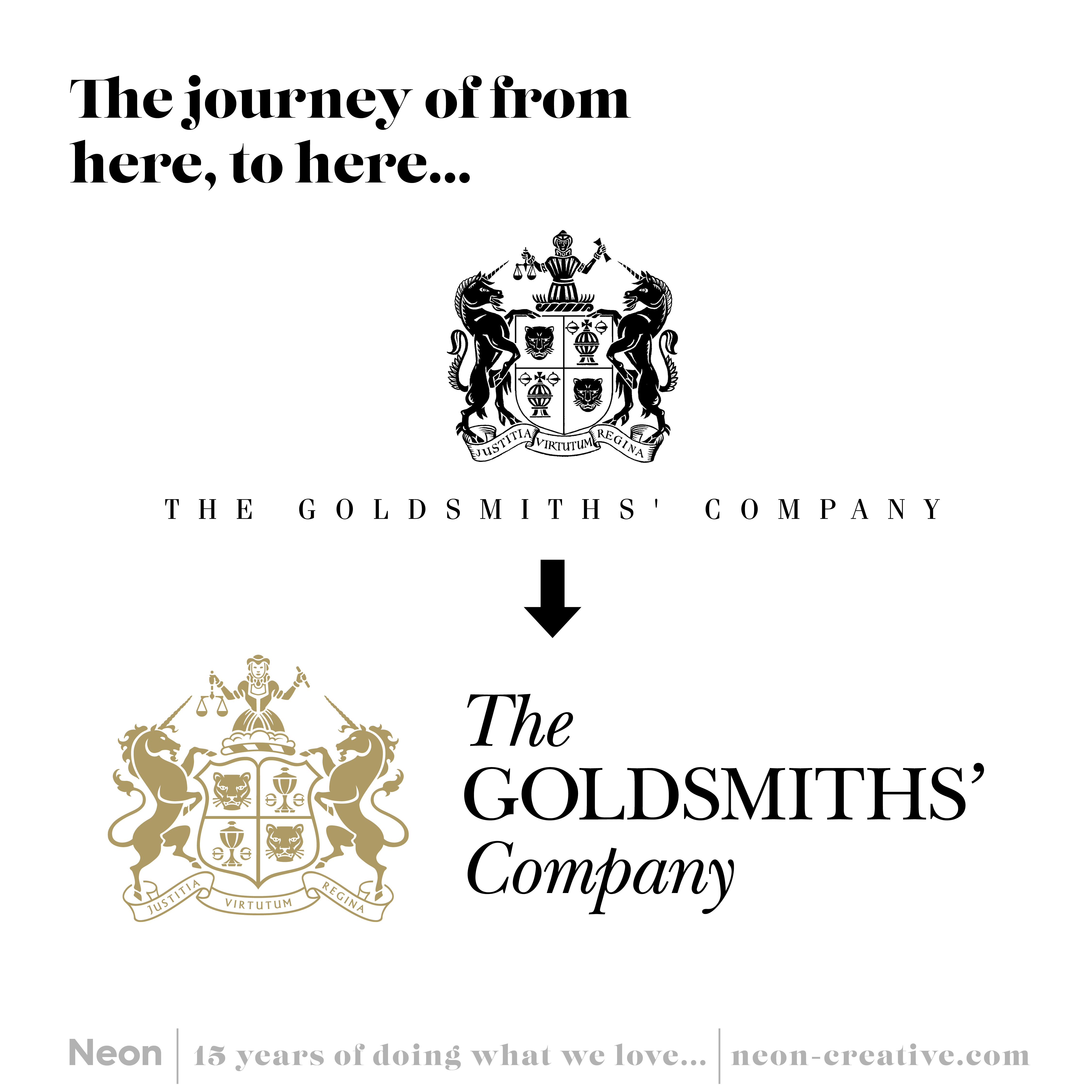
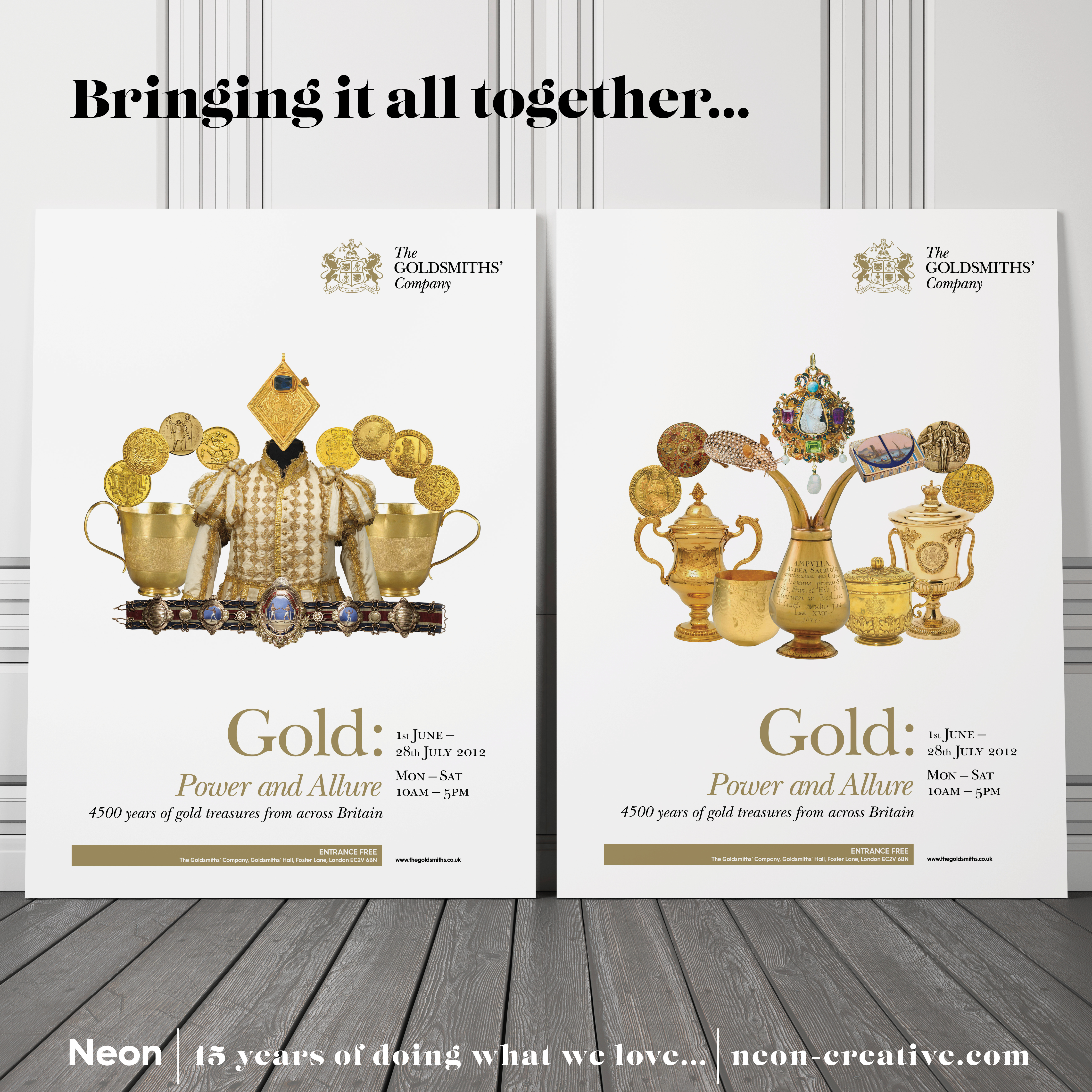
The initial concepts for The Goldsmiths’ Company pushed the boundaries as to how far to go the new brand identity (which included reducing the Coat of Arms down and the odd bit of sans serif I do confess).
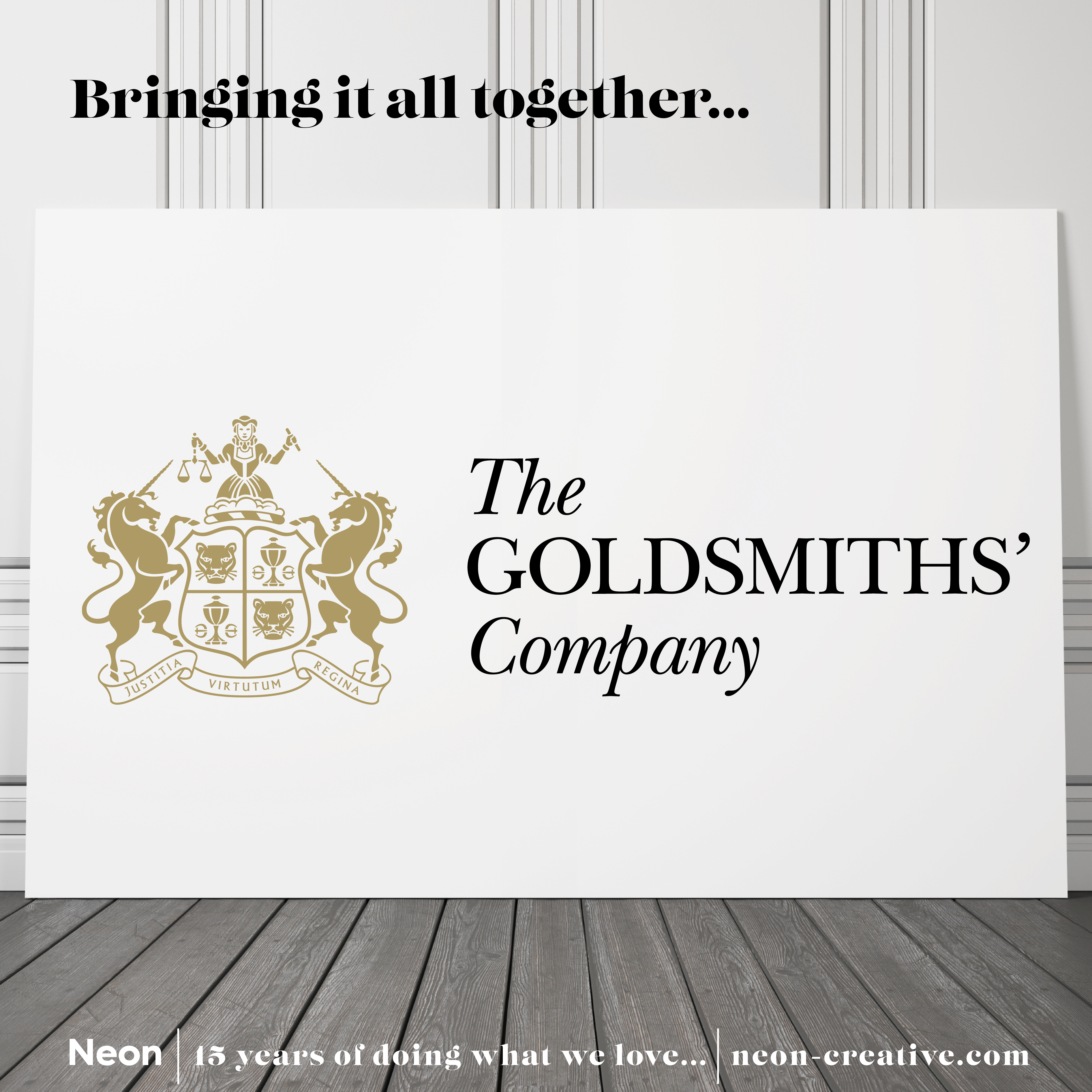
The Goldsmiths’ Company selected brand ID direction retaining the Coat of Arms, that was informed by its position of being both a historical as well as future champion of quality for the goldsmiths craft and crafts people.
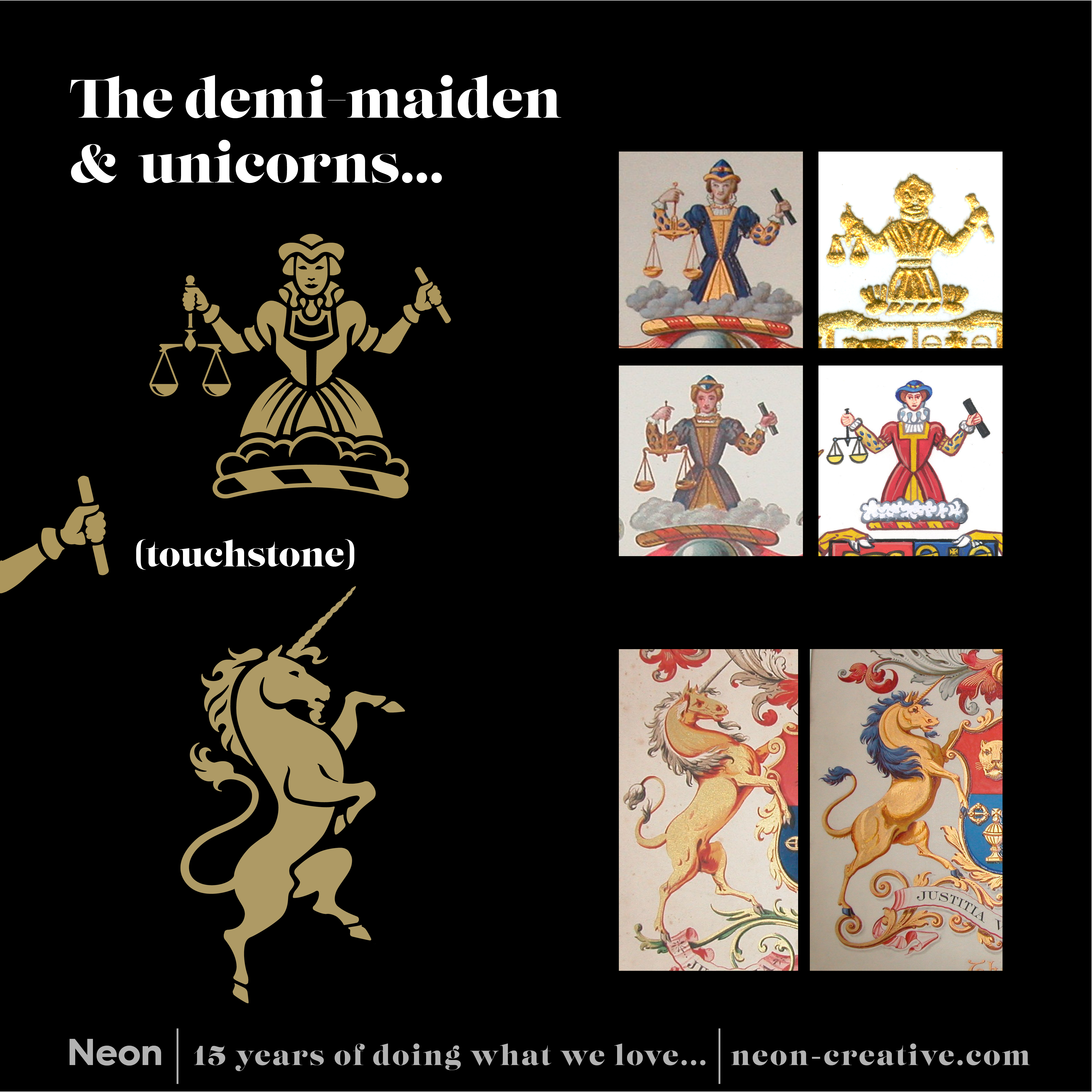
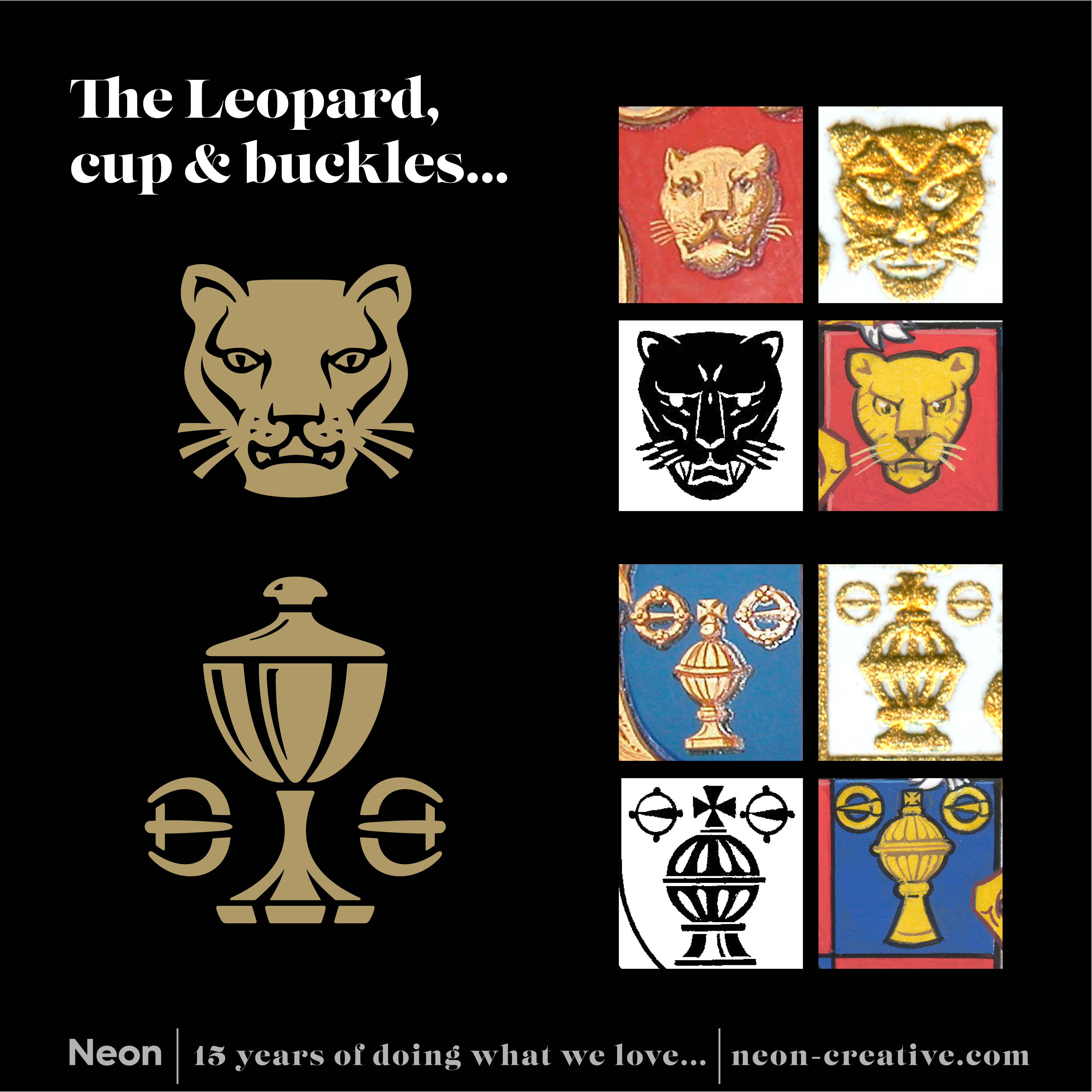
This was underpinned by our positioning ‘Touchstone’ – a touchstone (traditionally used for testing gold) appeared within their CoA (see below) and also means ‘a benchmark by which others are judged’. Which gave us a perfect shorthand for The Goldsmiths’ Company – being the Touchstone for the industry, for crafts, skills, support, promotion and education activities.
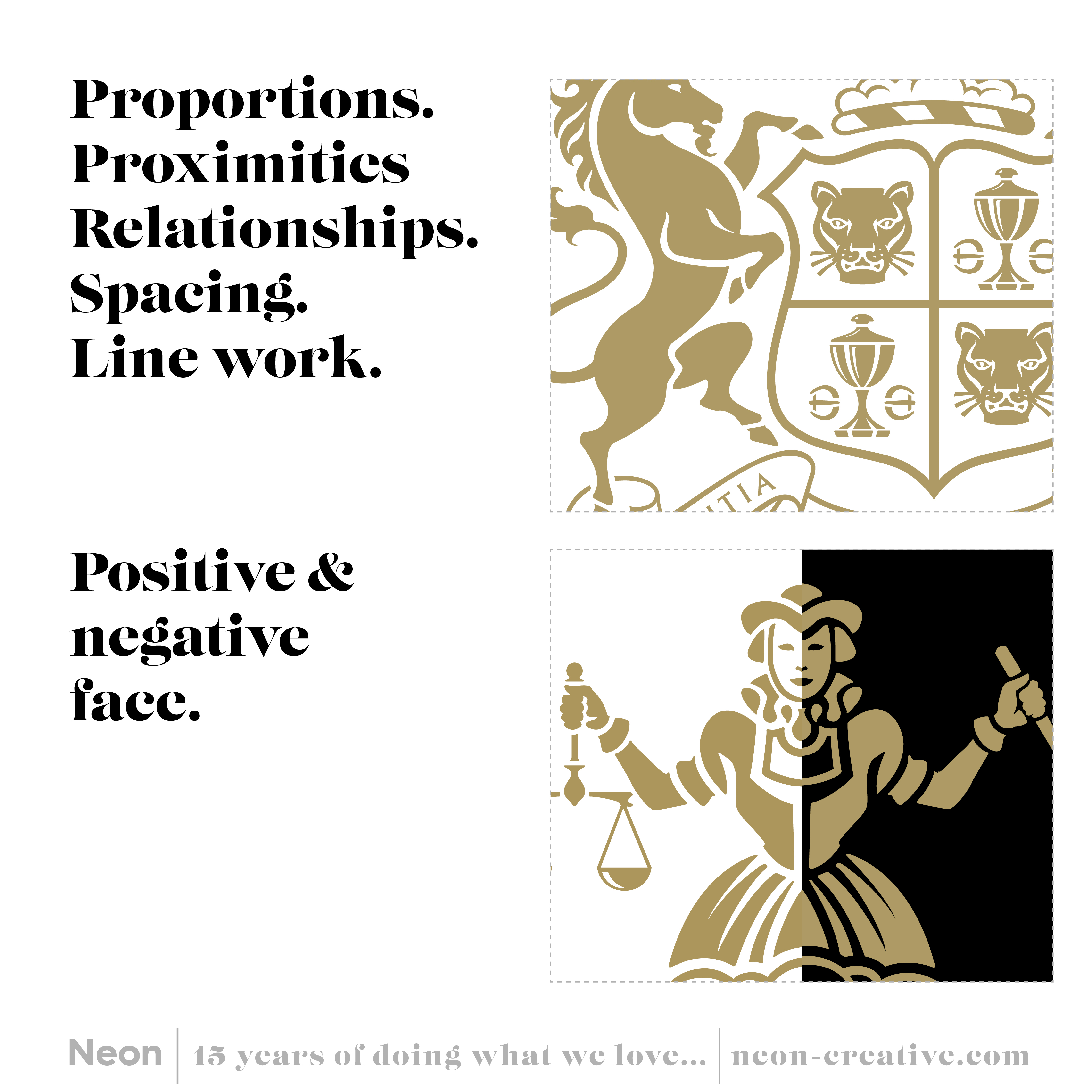
We then had to find that delicate balance of being true to its heritage, yet be a step forward and work as a practical future facing logo.
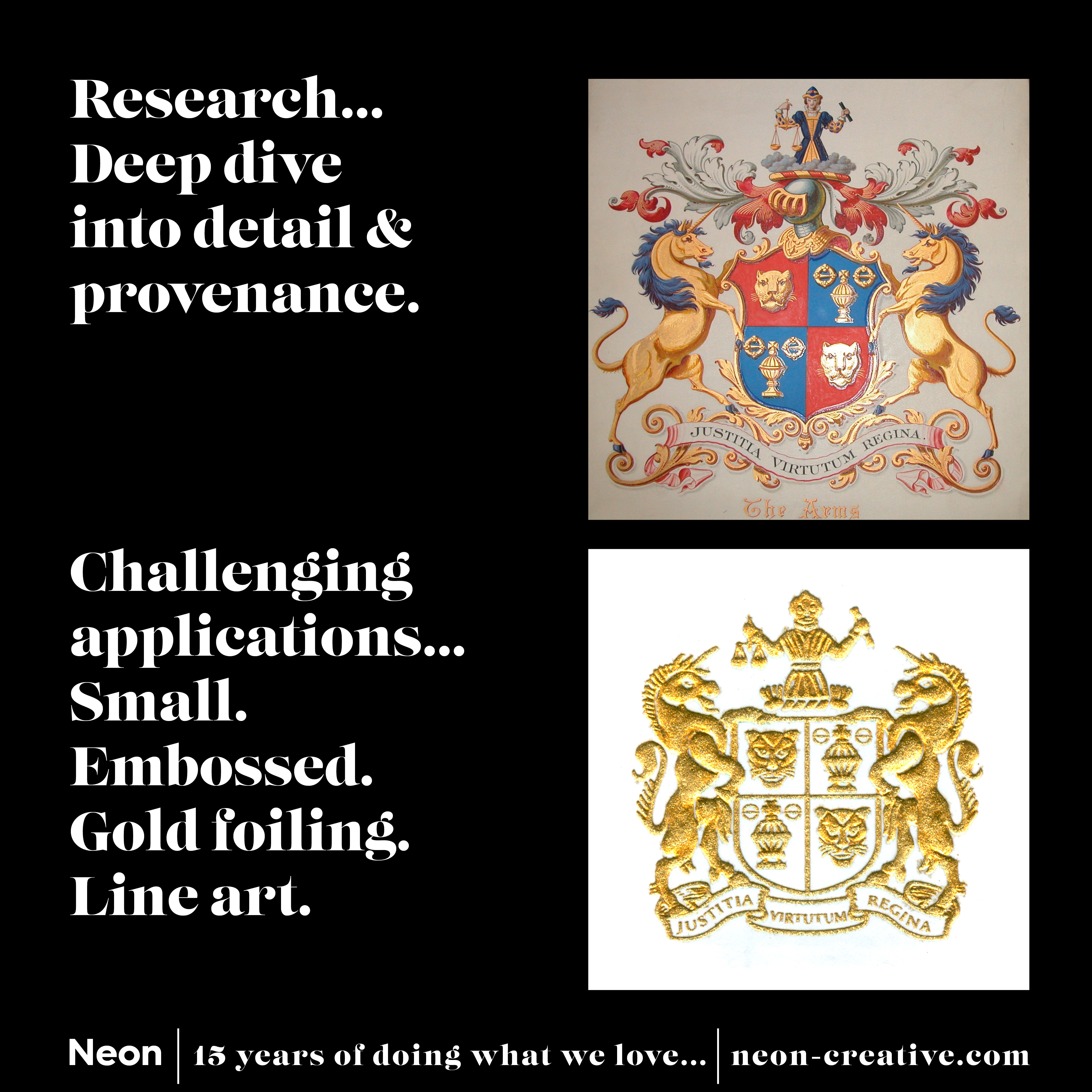
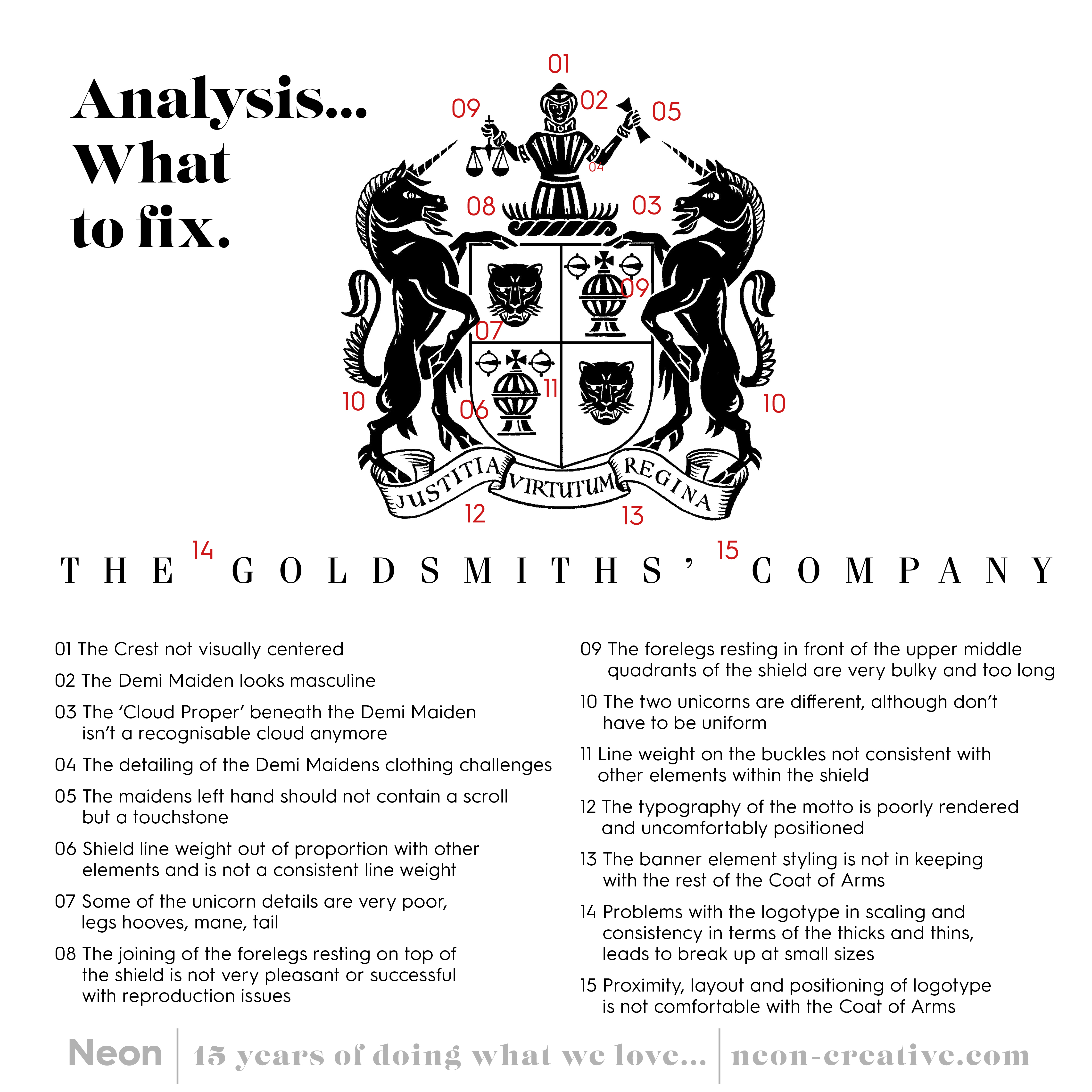
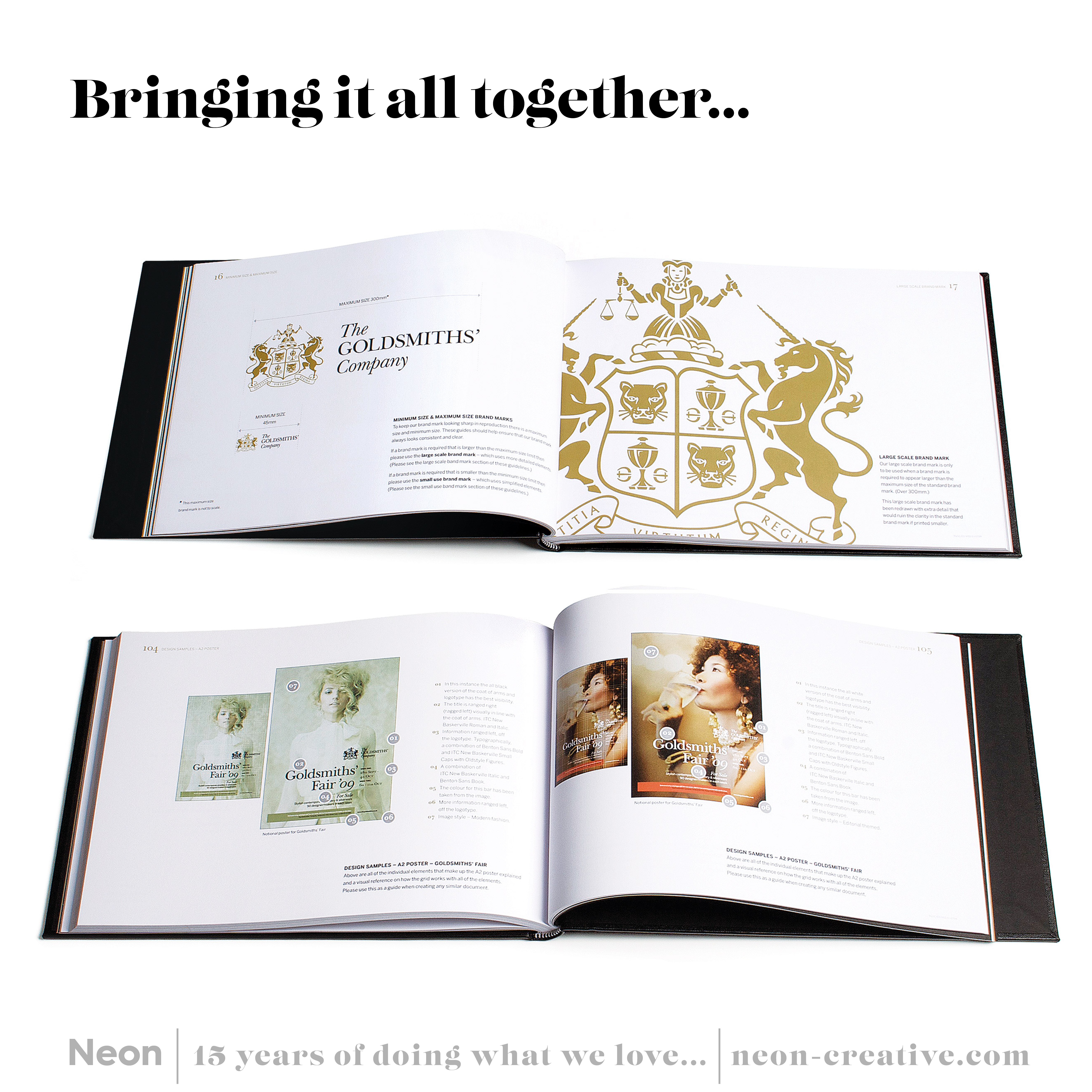
We did our research, we picked apart the existing brand mark which – was in a very sorry state.
For example, the crest appeared male rather than a demi-maiden. The ‘cloud proper’ below the demi maiden looked like flames. The ‘scroll’ in the hand of the demi-maiden is meant to be a ‘Touchstone’.
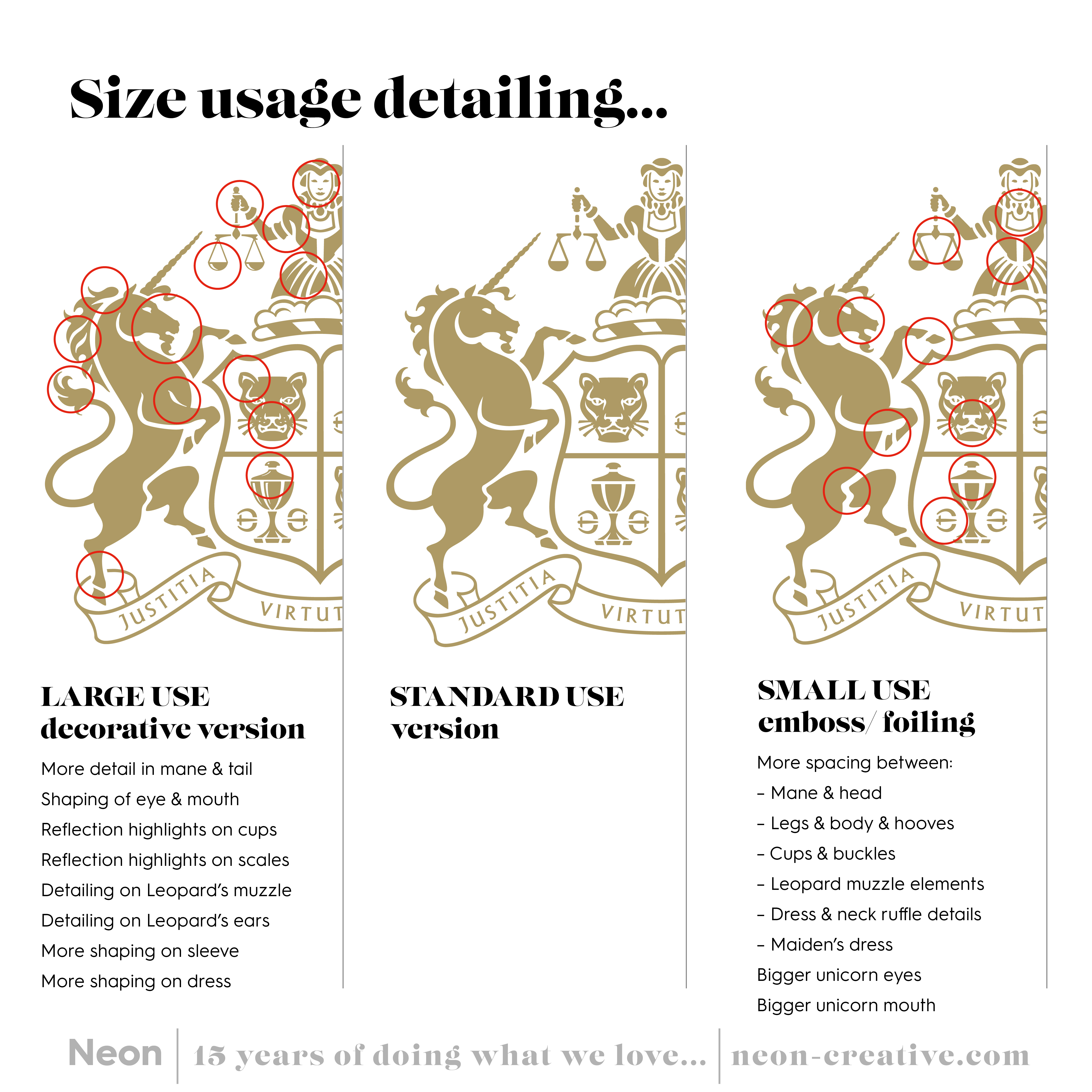
We carefully crafted each element into a more harmonious unit, changing the configuration of the cup and buckles (which saved space within the shields fields). Re-shaped the shield to accommodate legs of the unicorns. We also created different size usage variants from the standard mark.
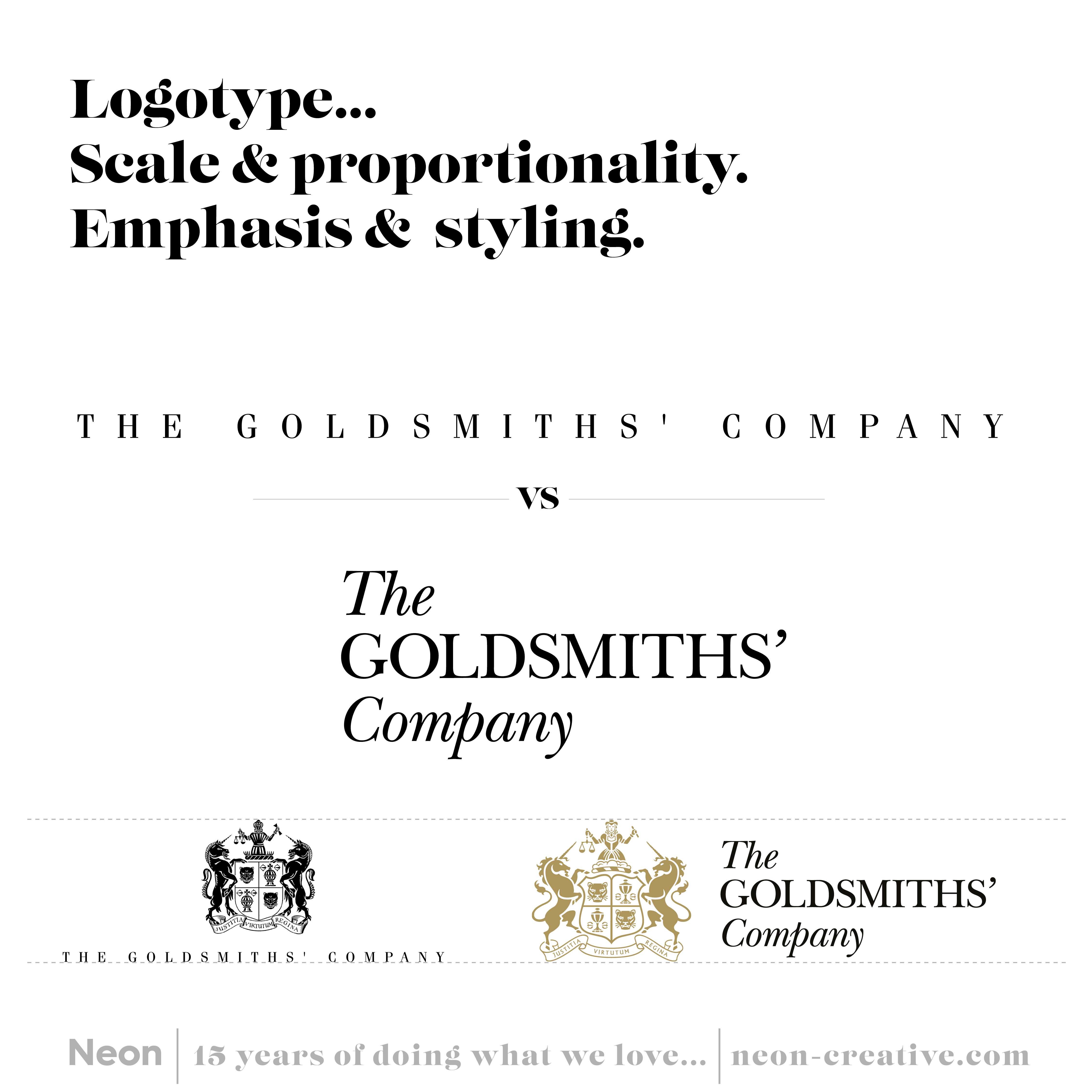
We then set about redesigning a more elegant logotype, with a more size practical stacked configuration.
The result, we hope you agree, was a harmonious unit that had crafted detail, gravitas and stand out – all within the same space footprint of the old brand mark.
If you would like to find out more about Neon or have up and coming project you’d like to have a chat about, then for sure do call on the number below, drop us an email or connect via LinkedIn.
Telephone +44 (0)20 3289 1733
Email [email protected]