Argonon rebrand
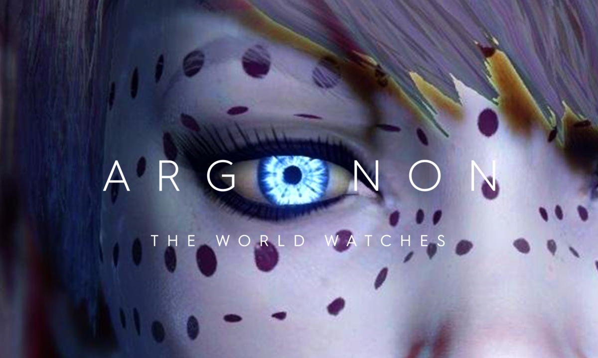
The World Watches
Neon Brand Consultancy partnered with Argonon, the award-winning independent international media group behind some of the world’s most diverse and successful multi-platform content, to deliver a full rebrand and positioning strategy.
Tasked with uniting nine production companies under one powerful idea, Neon defined Argonon’s new brand positioning and strapline — “The World Watches” — a phrase that captures both the group’s global reach and its creative ambition.
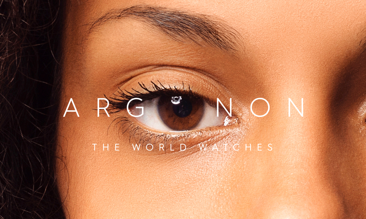
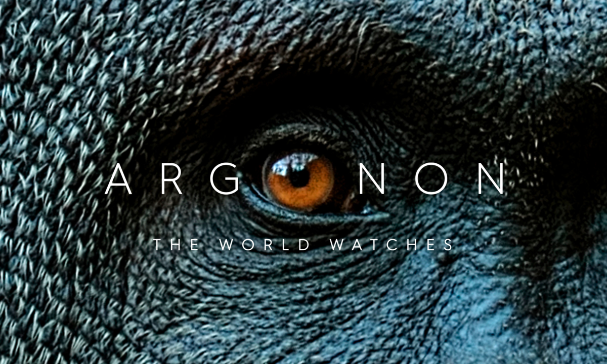
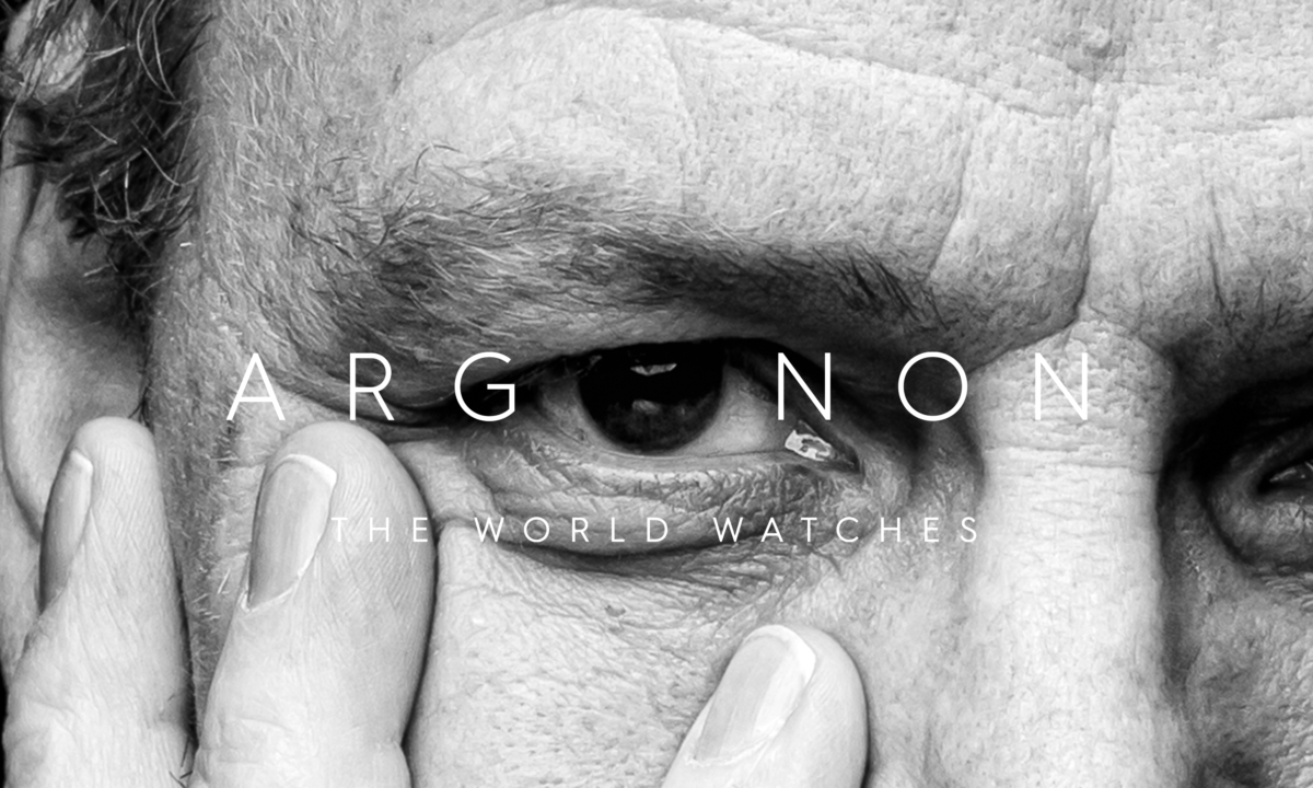
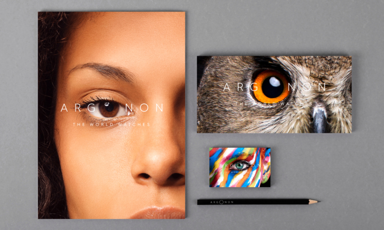
Visually, Neon transformed the “O” in Argonon into a dynamic lens motif, creating a flexible and emotive design system built around the theme of eyes — symbolising creativity, humanity and the diversity of content that captivates audiences worldwide. The new identity reflects Argonon’s role as a global creative powerhouse — bold, cohesive and world-facing.
For the full long read case study, click here…
As an award winning independent international media group encompassing nine production companies, Argonon is the driving force behind an astonishingly diverse range of world-class multi-platform content across literally every genre, from factual and current affairs to drama, comedy, arts, branded content, reality and children’s programming.
Neon were approached by Argonon’s CEO James Burstall and Global Communications Director Rich Turner on recommendation from another project, to take on the challenge of sharpening Argonon’s message and create a new brand identity to help them signal the next big step forward in Argonon’s ambitions.
For the company, in pursuit of global leadership in a field where creative talent rules, that diversity is a massive asset. But for us at Neon, entrusted with creating a new over-arching identity for the group, it also presented a challenge: how to communicate such a multi-faceted offering with compelling coherence?
Emotional & Functional
We started by defining their positioning which distillation also became their “unifying” strapline: The world watches… which, of course, is a literal statement of fact for a group of companies producing content for a truly global audience – that watches on-line, via streaming, all manner of platforms as well as film and TV. But also it delivered real gravitas and emotion in regard to all that content – and the unparalleled creativity of Argonon and its sub-brands. And finally, what we – and, luckily, the client – really liked about it is that the phrase also works as an internal rallying cry: with all eyes on us, are we brave and brilliant enough to keep on leading the way, raising standards, pushing the creative envelope?
Visually, looking for something that could play a similar role, we quickly started to eye up the central “O” in Argonon. As part of our new brand mark, that perfect circle expresses an elegance, beauty and balance and sense of premium – along with an unmistakably contemporary and global feel. It also strongly hints at a lens, which led us to develop a rich visual language capable of embracing the incredible diversity of content created under the Argonon umbrella.
Eyes are the window to the soul
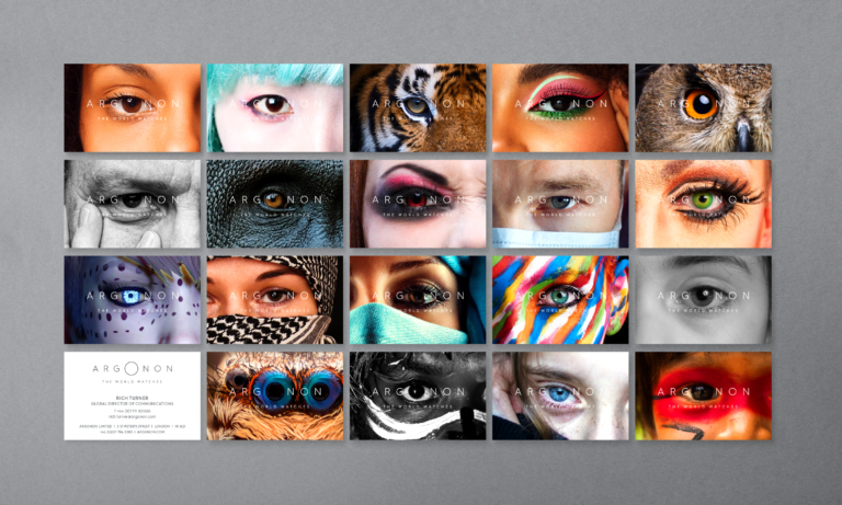
As you see, our first focus was on eyes, of many kinds and colours – conveying a nicely ambiguous impression of the world as it watches, as well as all the variety of what is being watched, via that metaphorical lens.
Visually captivating, this device strongly reflects the human diversity, creativity, gravitas and global scale that were all essential requirements of the brief. It’s also endlessly flexible, capable of accommodating any kind of content, and perfectly at home in different cultures and societies.
The Argonon eye also performs exceptionally well in a supporting role, sitting under the group’s individual production brands, and easily adaptable to make it relevant to the specific category of content.
Extended visual language
As a secondary element in our “O-based” visual language, we also developed a library of circular objects – from a doughnut to a soap bubble, a Saxon warrior’s shield to the rings of Saturn – giving ourselves even greater scope for expressing the diversity of Argonon’s award-winning output.
So far, the new visual style has been rolled out across business cards and stationery, interior graphics and signage, as well as programme end frames and animations for all of Argonon’s sub-brands – plus new website in the pipeline.
And we are happy to report that, off the back of this circular success story, Neon has now been invited to create new identities for several of the Argonon Group’s sub-brands.
(Read Less...)
Kind words…
“Dana/Neon’s unique ability to understand and interpret our ambitions, offer razor sharp and insightful thinking and ultimately deliver wondrously exciting creative solutions has helped take our visual identity to a new level. Read More…
RICH TURNER
Global Communications Director
Argonon
(Read Less...)
To find out more: [email protected] or call +44 (0)203 857 7656 Share this: Email, LinkedIn, Facebook, Download a PDF of this case study, follow us on Instagram or view our animations and movies on Vimeo
ENTERTAINMENT & MEDIA
Branding
PROJECT SUMMARY
Brand positioning
Strapline
Brand identity
Brand mark animation
Animations & end screens
Brand visual style
Sub-brand development
Digital templates
Interior graphic and signage
Stationery
Argonon branding, 'The World Watches', primary visual style - 'Eyes'.
Argonon brand mark and strapline.
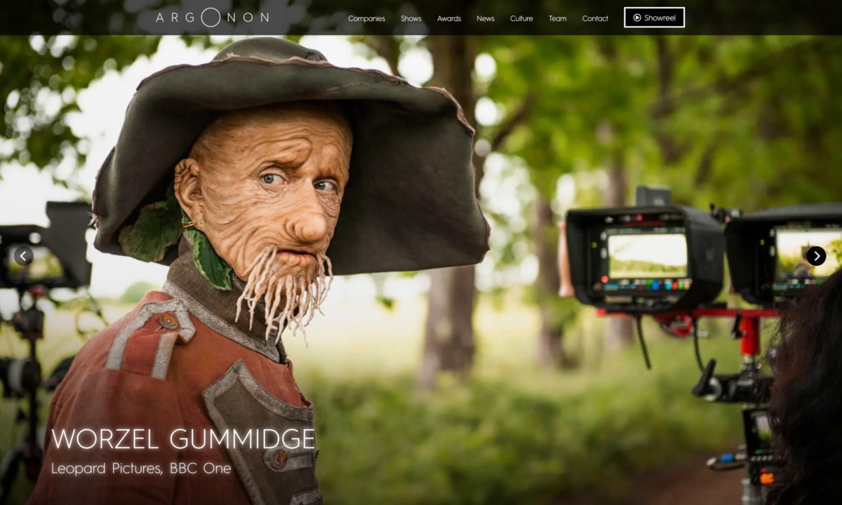
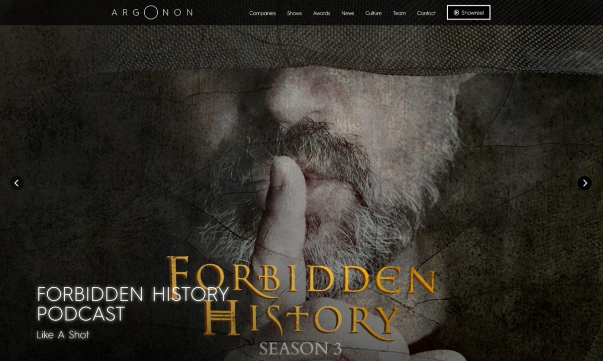
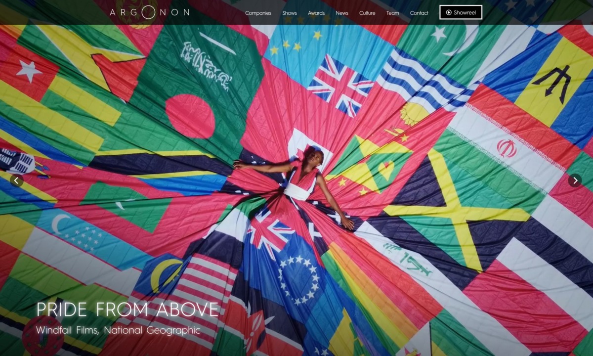
Argonon homepage.
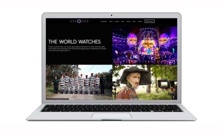
Argonon homepage - variety of output.
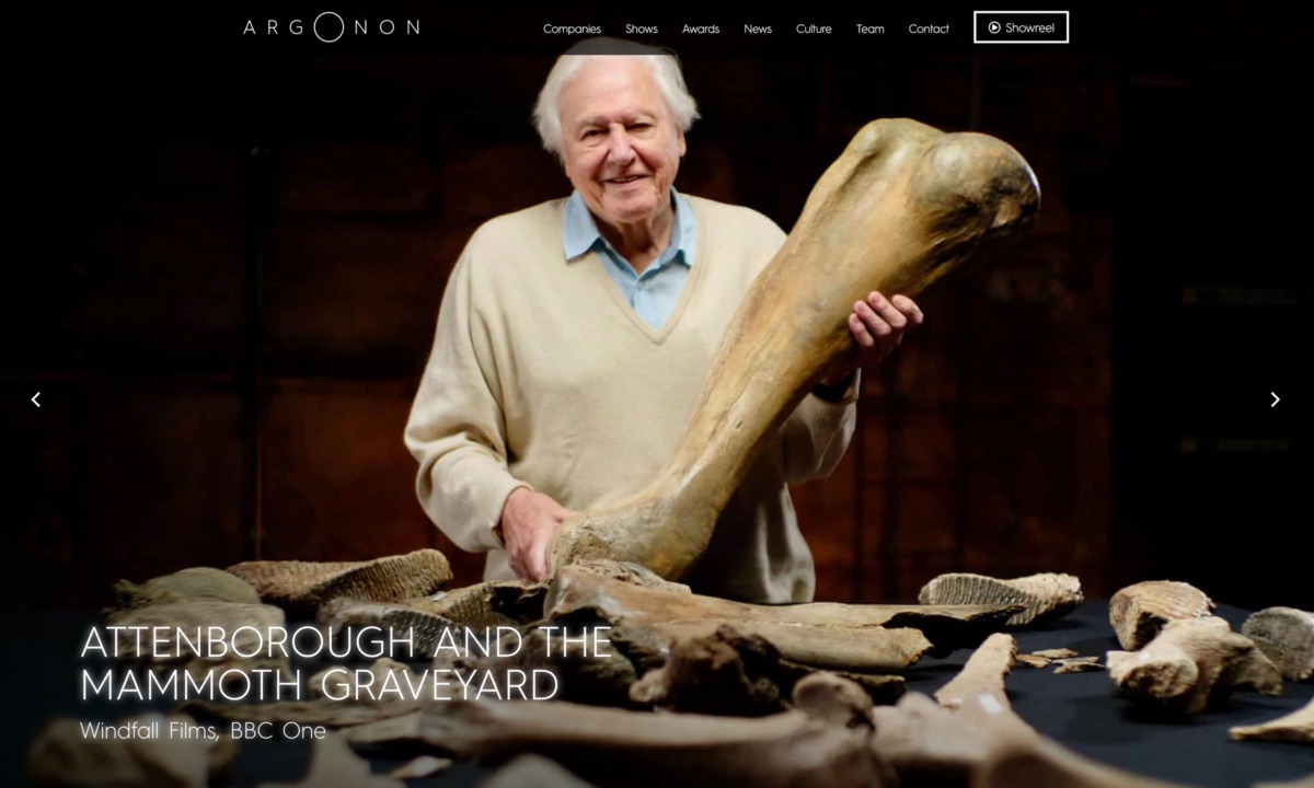
Argonon 'The World Watches' branding, primary visual style - 'Eyes'.
Argonon stationery.
Argonon branding, 'The World Watches', secondary visual style - Circular objects.
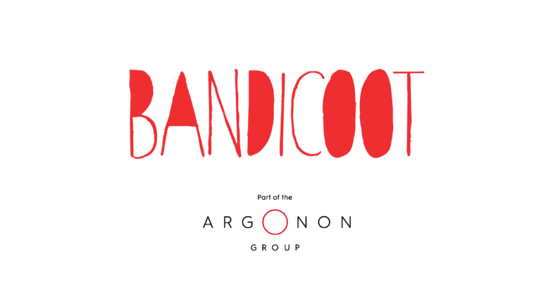
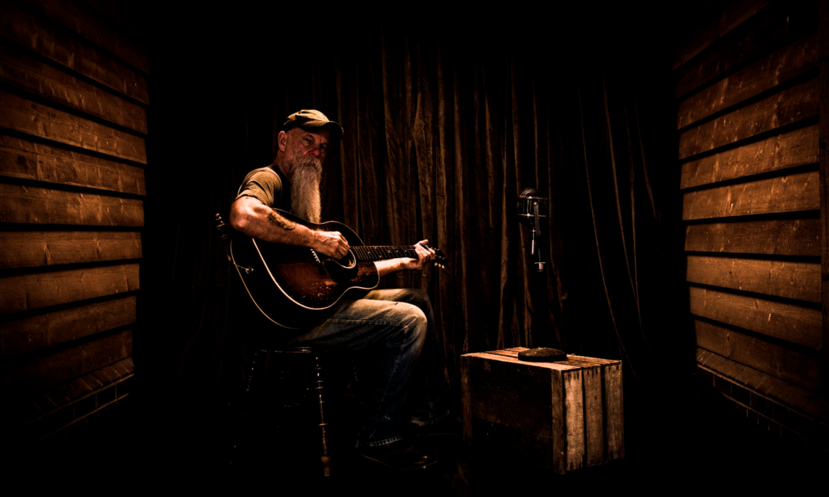
Argonon - sub branding.