Clarion Wealth Planning
Branding
Neon Brand Consultancy rebranded Clarion Wealth Planning, pioneers of true lifelong financial planning, creating a distinctive identity that unites emotional connection with rational confidence.
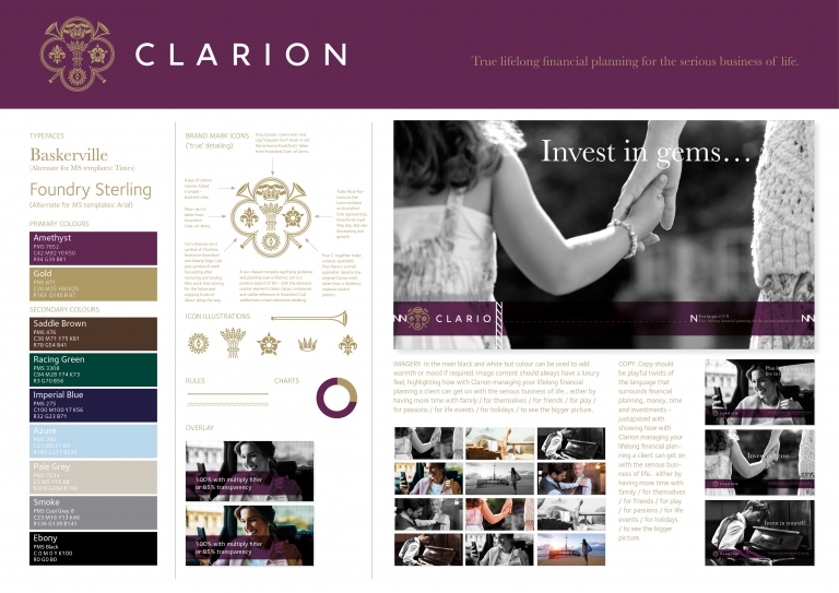
Targeting a discerning, high-net-worth audience, we positioned Clarion around the promise of “true lifelong financial planning for the serious business of life.” The new brandmark combines richly symbolic details – corn sheaves for reward and heritage, a compass for direction, and trumpets for clarity and cut-through – paired with a clean contemporary logotype and an amethyst-and-gold palette that evokes both luxury and trust.
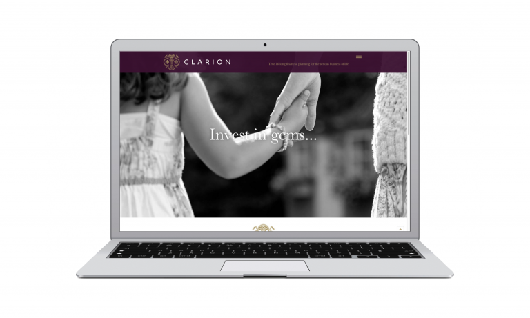
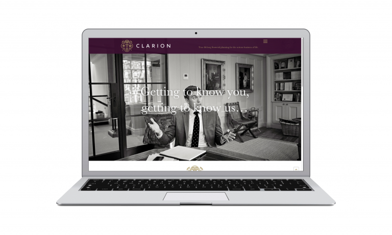
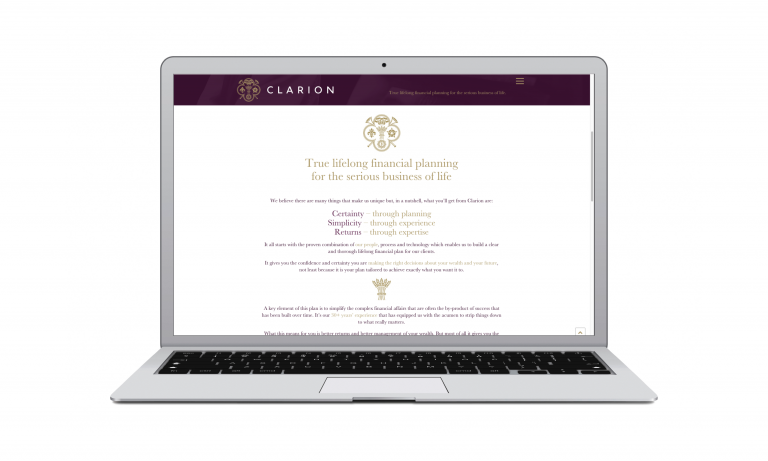
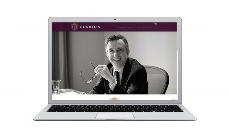
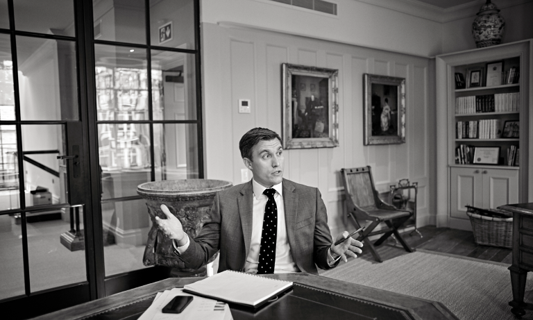
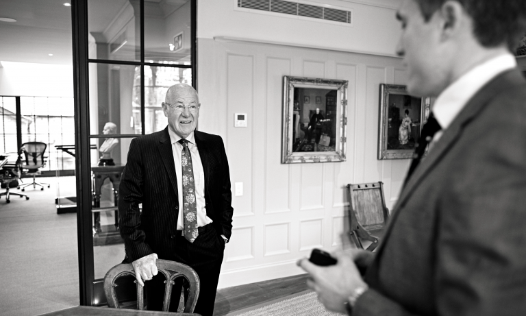
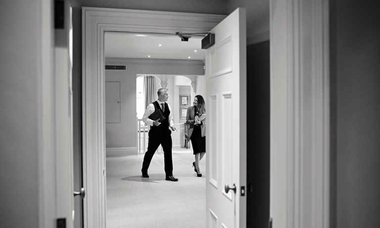
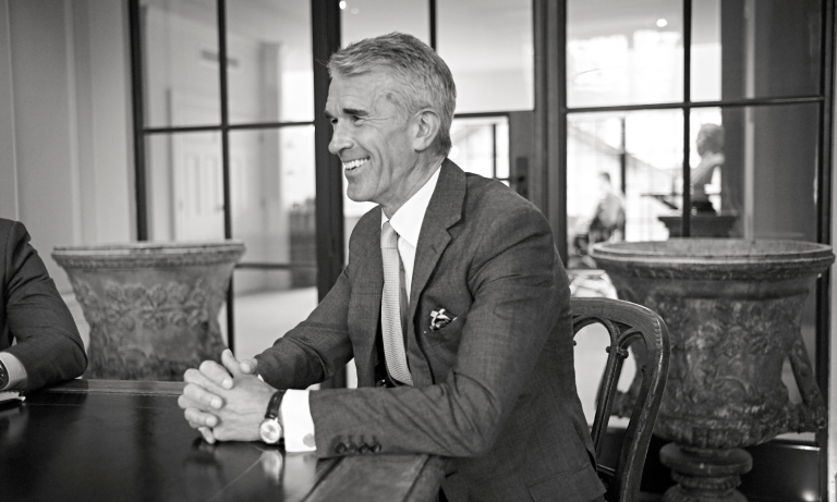
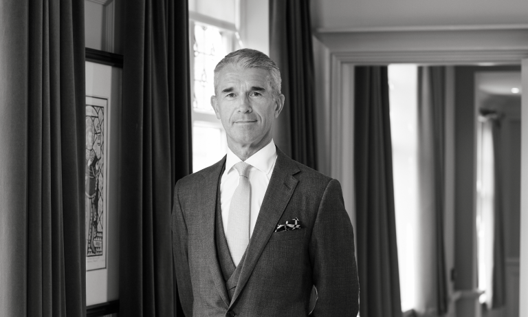
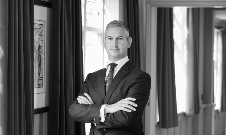
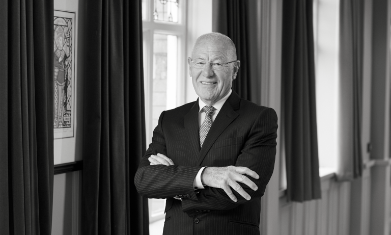
Our full redesign extended to a new website — conceived, written, designed, and built by Neon — optimised for clarity, warmth and SEO performance. Emotionally resonant black-and-white photography and confident, conversational copy brought the brand promise vividly to life.
The result: a refined, premium identity and online presence that sets Clarion apart as trusted advisers for those serious about life and legacy.
For the full long read case study, click here…
Clarion Wealth Management are pioneers in the field of true lifelong financial planning. They offer a very high standard of service to seriously wealthy individuals, with a strong and distinctive focus on helping clients make the most of their wealth in the here and now, while taking good care of their long-term financial future. [collapse_btn target="my_panel"] Read More…[/collapse_btn]
[collapse_panel panel_id="my_panel"]When they came to us on a recommendation, they were looking for a rebrand that would connect on an emotive level, as well as a rational one, with this demanding target audience, and strongly convey the bespoke, boutique nature of their offering.Our starting-point was creating a powerful brand proposition, putting the focus on Clarion’s role in helping clients enjoy the fruits of their success, through “true lifelong financial planning for the serious business of life”.
Creating a luxury brand feel.
In terms of look and feel, we wanted to create a luxury brand feel for Clarion. More specifically, our aim was to convey an air of long established stability, to help inspire the sense of certainty and confidence that come with knowing your wealth is in the most expert hands.
The brand mark icon we created is subtly packed with beautifully illustrated details designed to help provide this reassurance. Corn sheaves suggest harvest, and labour’s well deserved rewards, while also serving as a symbol to underline provenance, as a symbol of Clarion’s home county of Cheshire. The compass hints at planning, and well directed journeys. And of course the war-trumpets represent the firm’s name, while also bringing to mind cut-through and clarity.
Blending past, present and future.
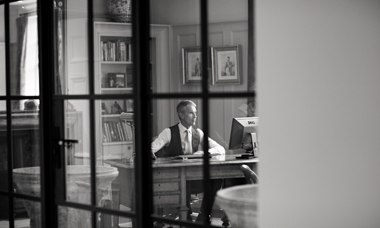
Juxtaposed with this heritage-focused mark, the logotype is strikingly clean and contemporary. And the richness of the key colours we chose – amethyst and gold – further strengthens the satisfying sense of a long established brand completely at home in the modern world. In terms of visual language, we went for highly emotive black-and-white photography, bringing alive the brand promise of helping clients to enjoy what matters most in their lives. Finally, in headlines and copy, we set out to find playful ways to put Clarion’s own spin on the conventional language of financial planning, inviting clients, for example, to “plan to have no plan” or to “invest in yourself”. . . in order to get the most from “the serious business of life”.
An all-new Clarion website, design and built by Neon
Then came the ultimate seal of approval from the client: an invitation for Neon to redo Clarion’s very extensive website, from top to bottom – planning, design and build.
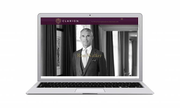
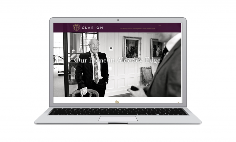
In terms of user-experience, we introduced new clarity and coherence. To make the site even more pleasurable to browse, every word of copy was rewritten in our new style. We sharpened up the site SEO content, to ensure maximum online visibility. And the carefully considered visual language we had developed for the brand carried over smoothly and seamlessly into a digital environment. Oh yes, we even took all the portrait shots for the “Our people” section.
Overall, we think the new site has moved on a million miles from the traditional dry and dusty world of financial services, enabling Clarion to create a much more positive first impression as a premium provider of high-value expertise and a trusted adviser.
(Read Less...)
Kind words…
“Dana and the team at Neon worked tirelessly to create a new brand positioning that we now feel truly reflects the essence of our business Read More…
RON WALKER
Founder
Clarion Wealth Planning
(Read Less...)
To find out more: [email protected] or call +44 (0)203 857 7656 Share this: Email, LinkedIn, Facebook, Download a PDF of this case study, follow us on Instagram or view our animations and movies on Vimeo
FINANCIAL SERVICES
Branding
PROJECT SUMMARY
Brand positioning
Brand identity
Website
Portrait photography
Reportage photography
Copywriting
Stationery
Digital templates
Literature
Clarion Wealth Planning brand mark.
Clarion Wealth Planning icon detail.
Clarion Wealth Planning old vs new comparison.
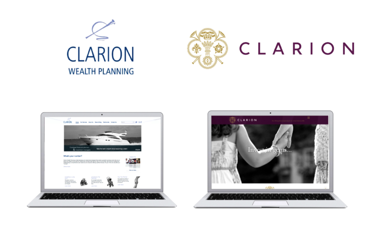
Clarion Wealth Planning icon client / outward facing meaning.
Clarion website.
Clarion Wealth Planning stationery.
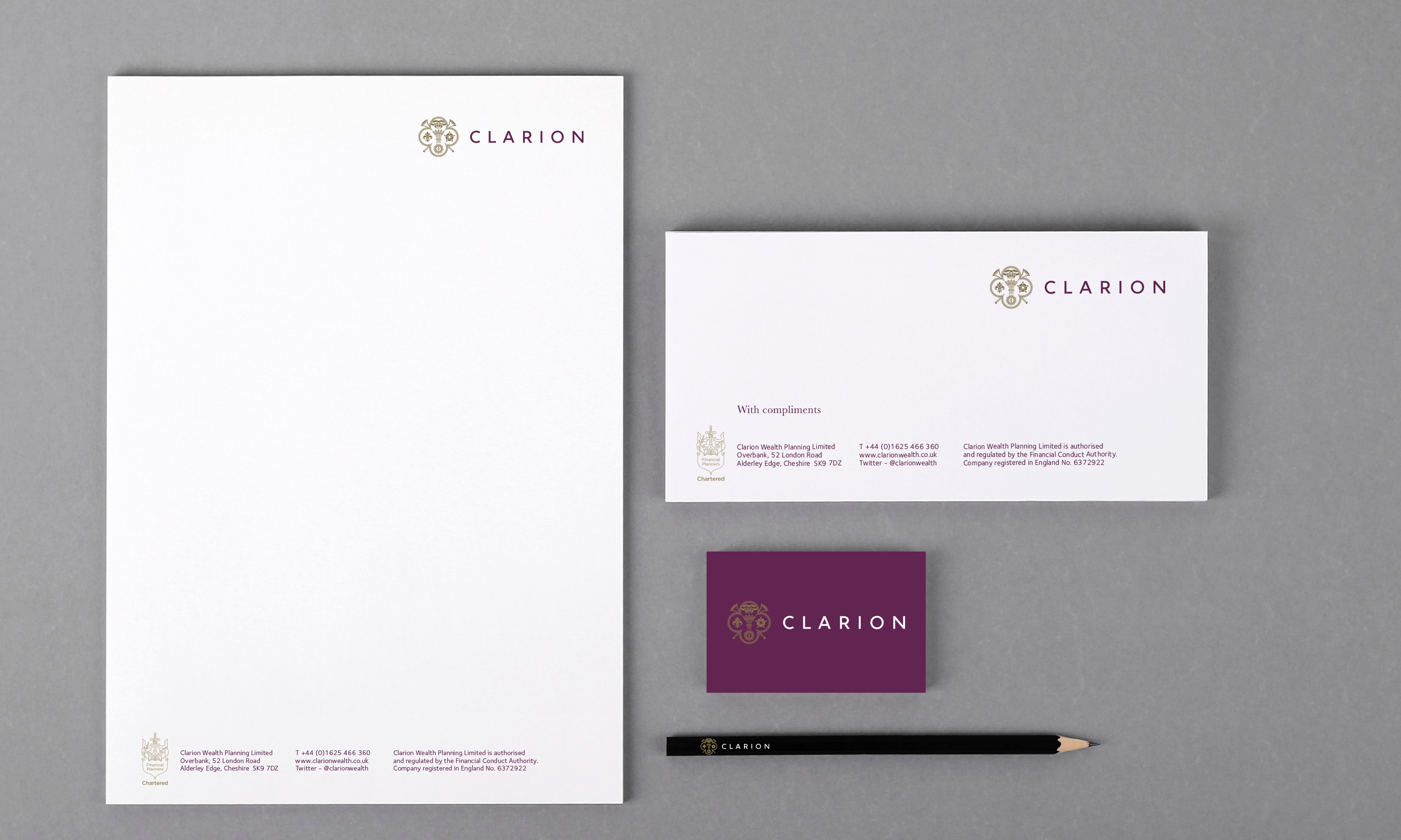
Clarion Wealth Planning advertising.






Clarion Wealth Planning basic elements guidelines one pager.
