Nabarro LLP
125 London Wall
A chance to create a total branded environment.
Neon helped Nabarro LLP transform their new headquarters at 125 London Wall into a complete branded environment — bringing their “Clarity Matters” identity to life across six floors.
Working with interior designers TP Bennett, Neon used brand-led design thinking to create an immersive, humanised workspace that reflected Nabarro’s personality and precision — proving that great brands don’t just build buildings, they brand them.
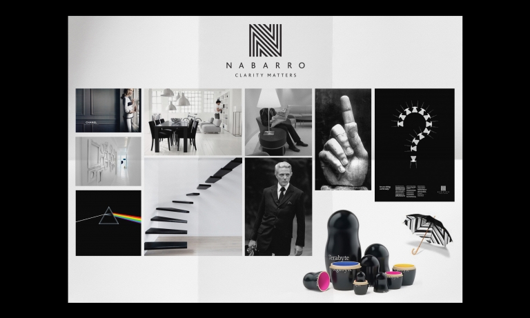
For the full long read case study, click here…We’ve worked with international commercial law firm Nabarro LLP for nearly 10 years. Over that period, we’ve helped them develop a distinctive positioning (reflected in their strapline Clarity Matters), and a powerful monochrome-based visual identity. So when they told us they were moving their London headquarters to a prestigious new address in the heart of the City, we saw a fantastic opportunity to create a total branded environment; a new home that would bring the firm’s values and personality to life, at every level.
Making full use of a flexible brand system.
Working closely with interior design specialists TP bennett, we worked with them to create a scheme for the entire building. An early concern was that our black-and-white brand identity could look a bit stark, on such a big scale. But the brand system developed by Neon proved up to the challenge, enabling us to introduce a number of other elements to soften and “humanise” the look and feel of the new building.
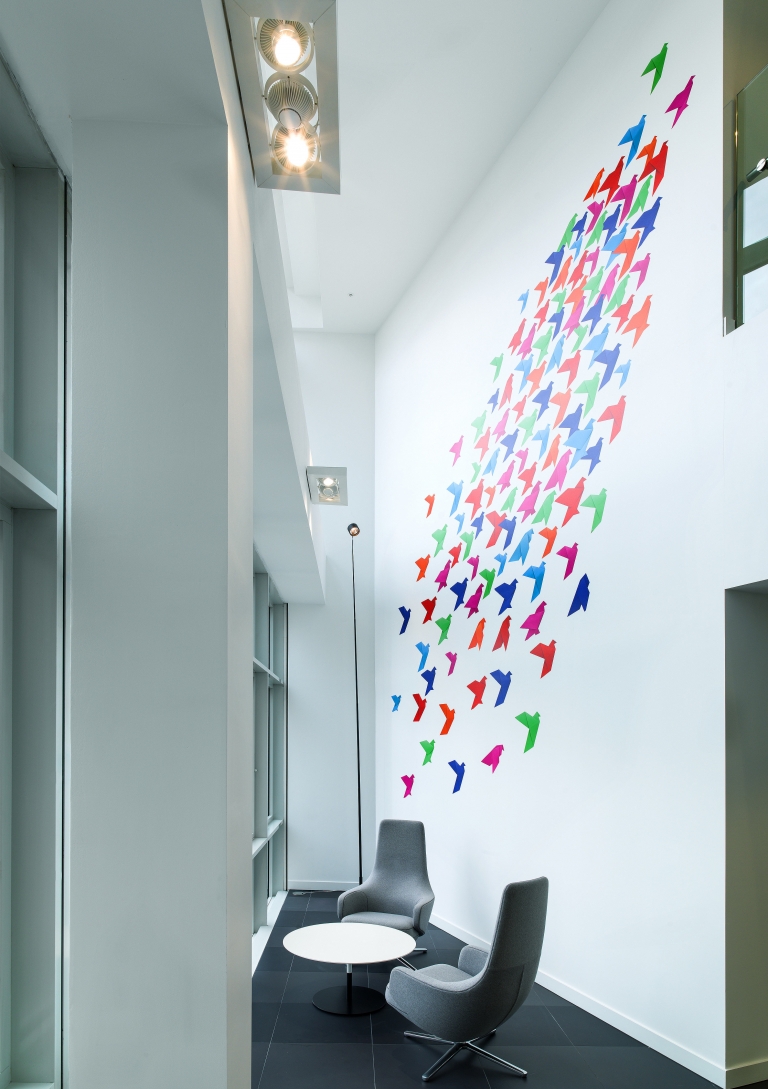
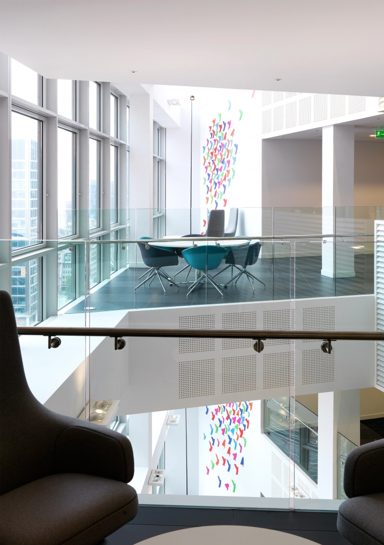
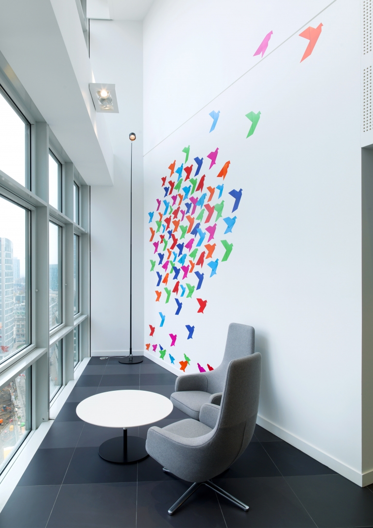
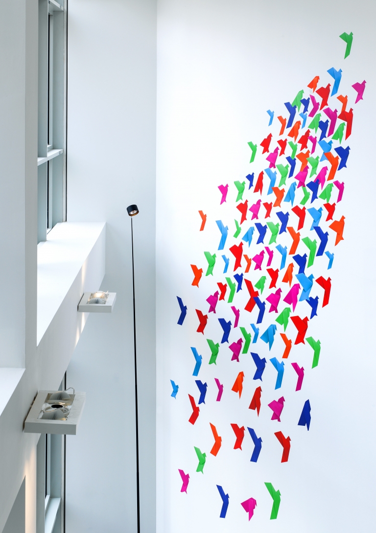
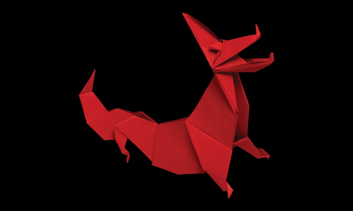
For example, we saw the impressive double height walls as the perfect place for dazzling flocks of birds, in Nabarro’s origami visual style. And the lift lobbies – where employees and visitors would have a little time to linger and enjoy the view – presented us with an even more enticing creative opportunity.
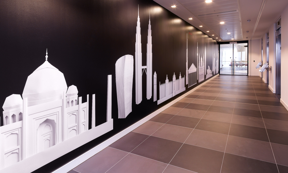
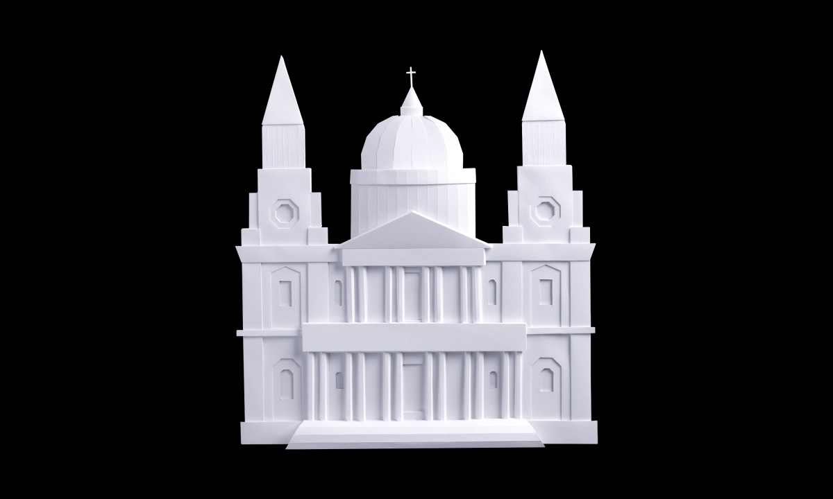
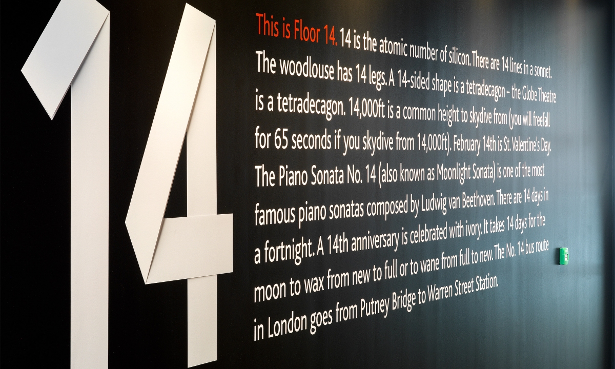
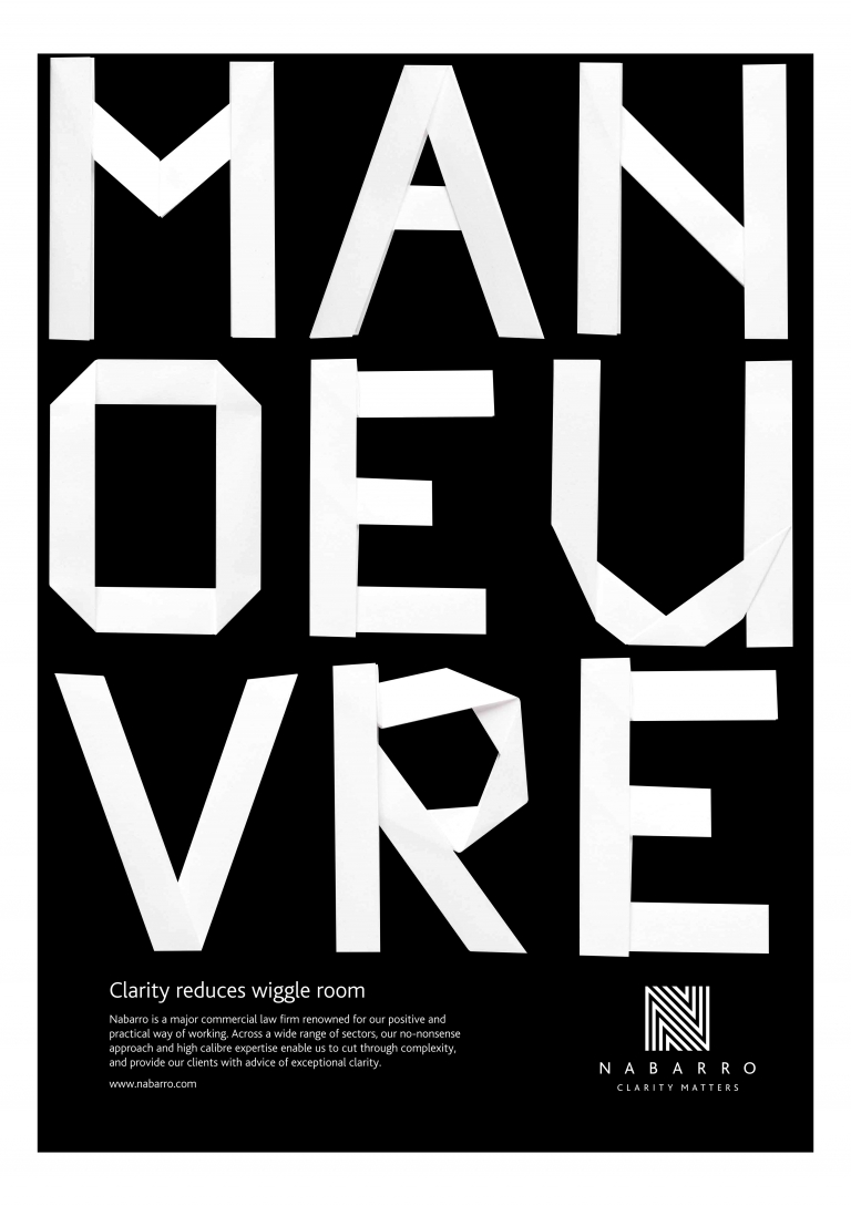
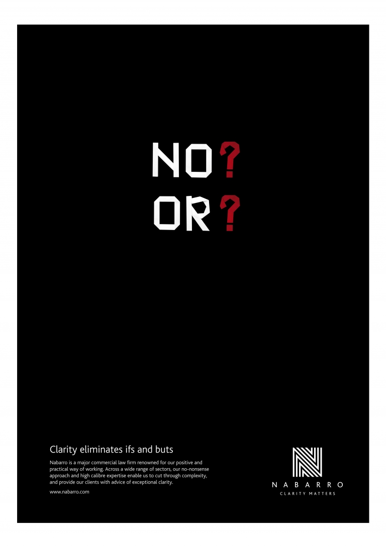
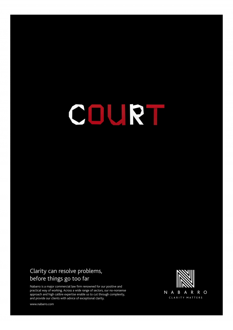
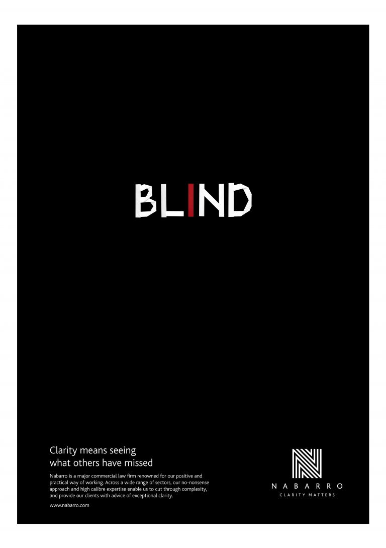
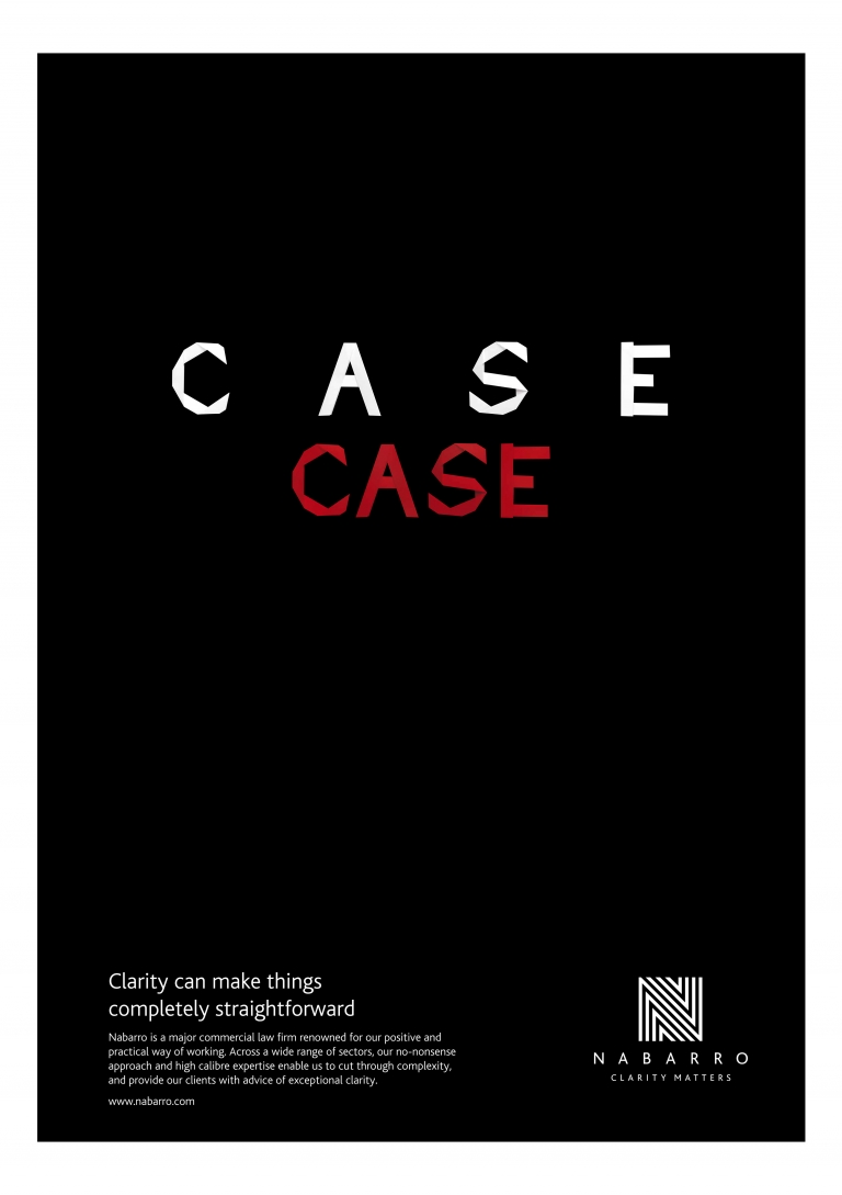
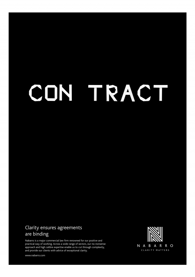
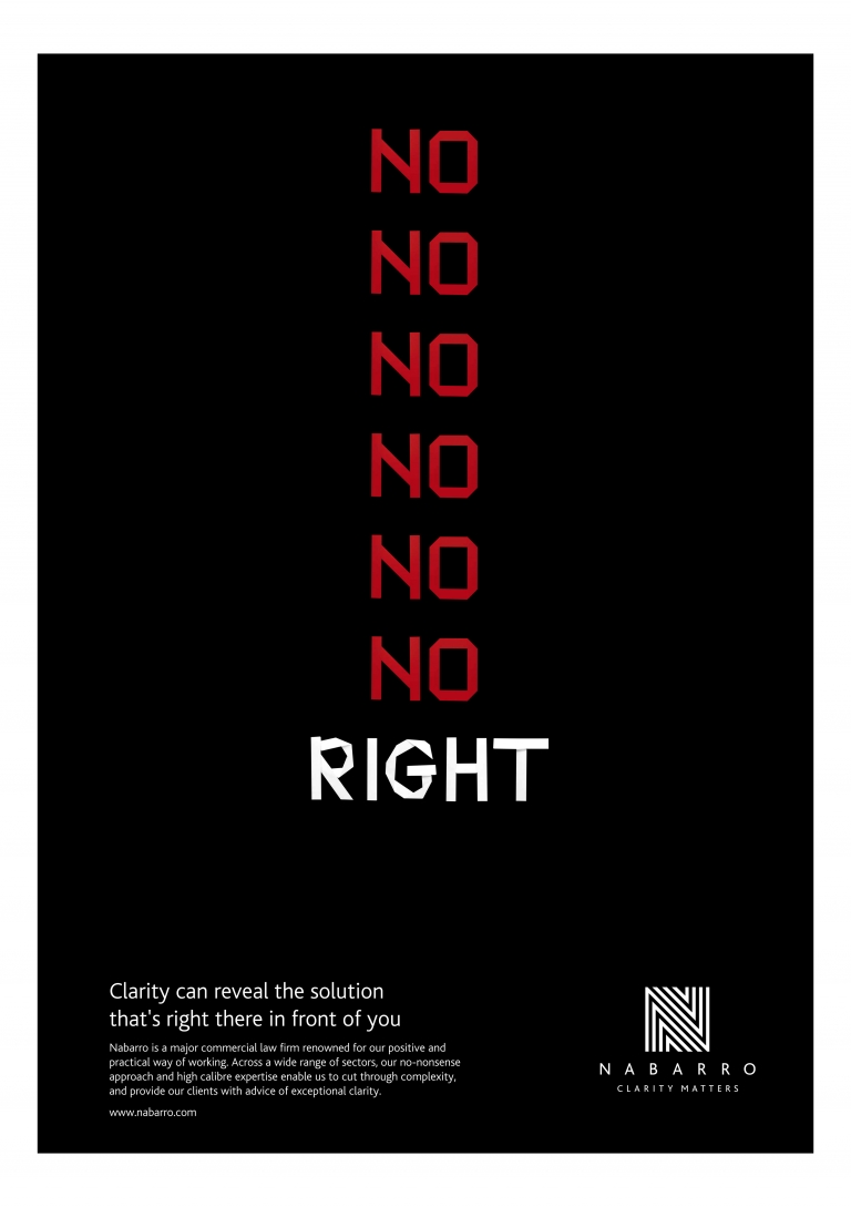
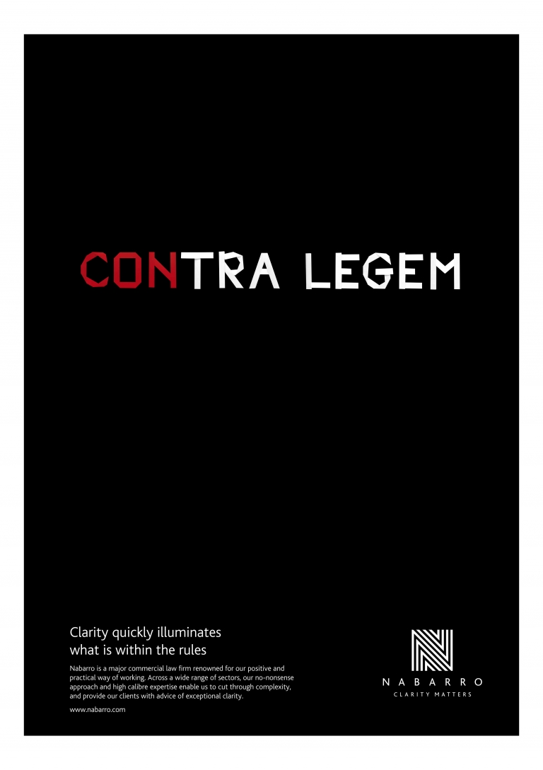
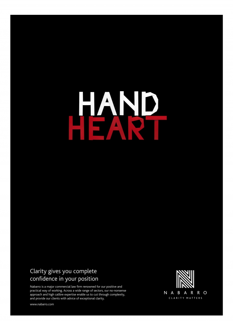
For one, we created a gallery of great buildings of the world, also in origami. For another, we laid every image from our extensive brand library on a powerful black background. For yet another, we challenged lift-users with our campaign of brain-teasing typographic conundrums. While, on the fourteenth floor, we conducted a fascinating in-depth investigation into the number 14…
Brand achitecture, in a literal sense.
Architecturally, without a doubt the most impressive feature of Nabarro’s new home was the stunning – and strongly branded – steel and marble spiral staircase, to accommodate which it was necessary to remodel the building, drilling through 6 floors. Worth it, though, we think you’ll agree?
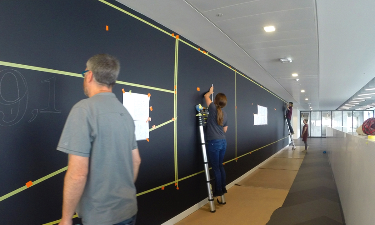
One other rather lovely feature deserving a mention; the 25 foot wall in the canteen and break-out area. Our idea: to use it, in keeping with the black and white theme, with a giant blackboard highlighting to Nabarros staff the facts and figures of the work require to create their amazing new office spaces – and a competition inviting the firm’s people to submit ideas for us to bring to visually to life in chalk.
We’re pleased to say that Nabarro love their new home. And their clients have also responded very positively indeed. Since we started working with the firm, their commitment to establishing a clearly defined positioning and identity has given them a clear edge over their competitors. Now they’ve raised the bar again; this time, not by building a brand, but by branding a building.
(Read Less...)
Kind words…
“Dana was instrumental in the initial rebrand of the firm, with our new brand proposition of user friendly law and its expression of ‘Clarity Matters’ along with the visual identity in 2005/6. Read More…
GUY HEATH
Partner
Nabarro LLP
(Read Less...)
To find out more: [email protected] or call +44 (0)203 857 7656 Share this: Email, LinkedIn, Facebook, Download a PDF of this case study, follow us on Instagram or view our animations and movies on Vimeo
LAW
Branding
PROJECT SUMMARY
Project brand guardian
Art direction
Interior design moodboards
Signage & way finding
Breakout area graphics
Client space graphics
Staff spaces graphics
Meeting room art & graphics
Digital messaging
Manifestations
Cafe branding
Nabarro 125 London Wall branded interior details.
Nabarro 125 London Wall double height walls flocks of paper birds.
Nabarro 125 London Wall lift lobby paper models skyline.
Nabarro 125 London Wall lift lobby skyline paper models.
Nabarro 125 London Wall lift 'Gallery' of sectors and practice areas paper models.
Nabarro 125 London Wall selected paper models details from lift lobby 'Gallery'.
Nabarro 125 London Wall staff area 'Welcome Wall' with original sketch.
Nabarro 125 London Wall staff area 'Welcome Wall' time lapse hand rendering highlights.
Nabarro 125 London Wall staff area 'Welcome Wall' hand rendering highlights.
Nabarro 125 London Wall staff area 'Welcome Wall' finished details.
Nabarro 125 London Wall lift lobby floor 14, facts about the number 14.

Nabarro 125 London Wall lift lobby floor 14 detail, facts about the number 14.
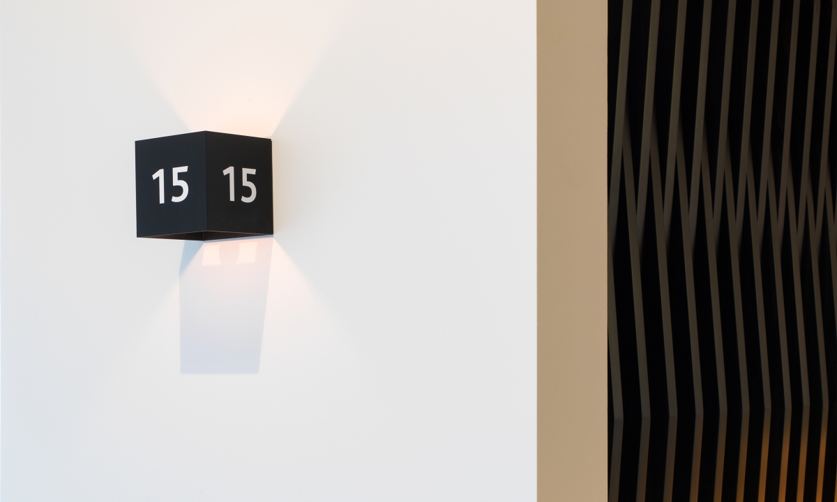
Nabarro 125 London Wall Neon designed 3 faced meeting room numbers and corridor lights
Nabarro 125 London Wall lift lobby 'Clarity Matters' typographic conundrums.
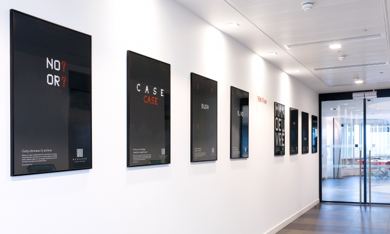
Nabarro 125 London Wall 'Clarity Matters' typographic conundrums.
Nabarro 'Clarity Matters' typographic conundrums digital animations for client spaces.
Nabarro 125 London Wall branded interior – original briefing mood board.
