The Bench café
Naming & identity
A working lunch…
Neon Brand Consultancy was commissioned to name and create the brand identity for The Bench Café, part of The Goldsmiths’ Centre — London’s hub for creativity, craftsmanship and community.
The café was designed as a welcoming meeting place for silversmiths, patrons, partners and the public. Neon’s naming concept, The Bench, cleverly bridges heritage and informality — referencing both the silversmith’s classic workbench and the café’s relaxed atmosphere.
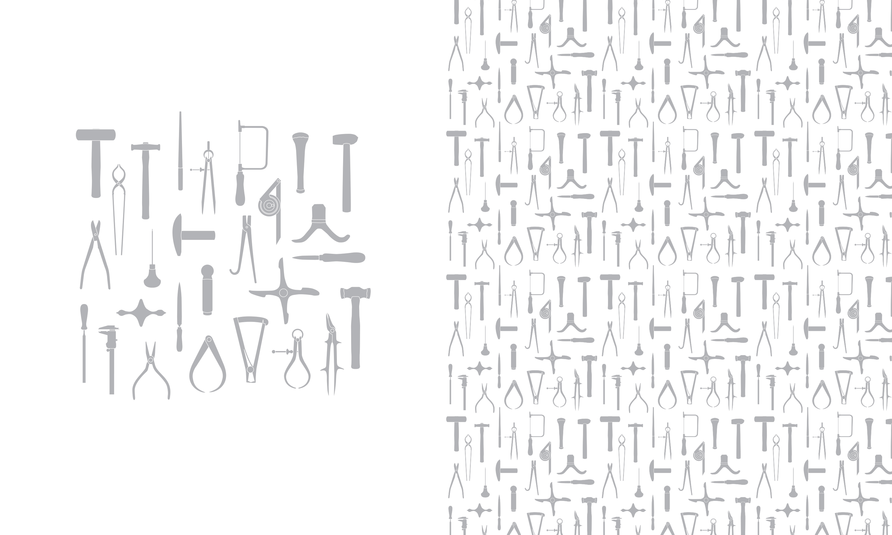
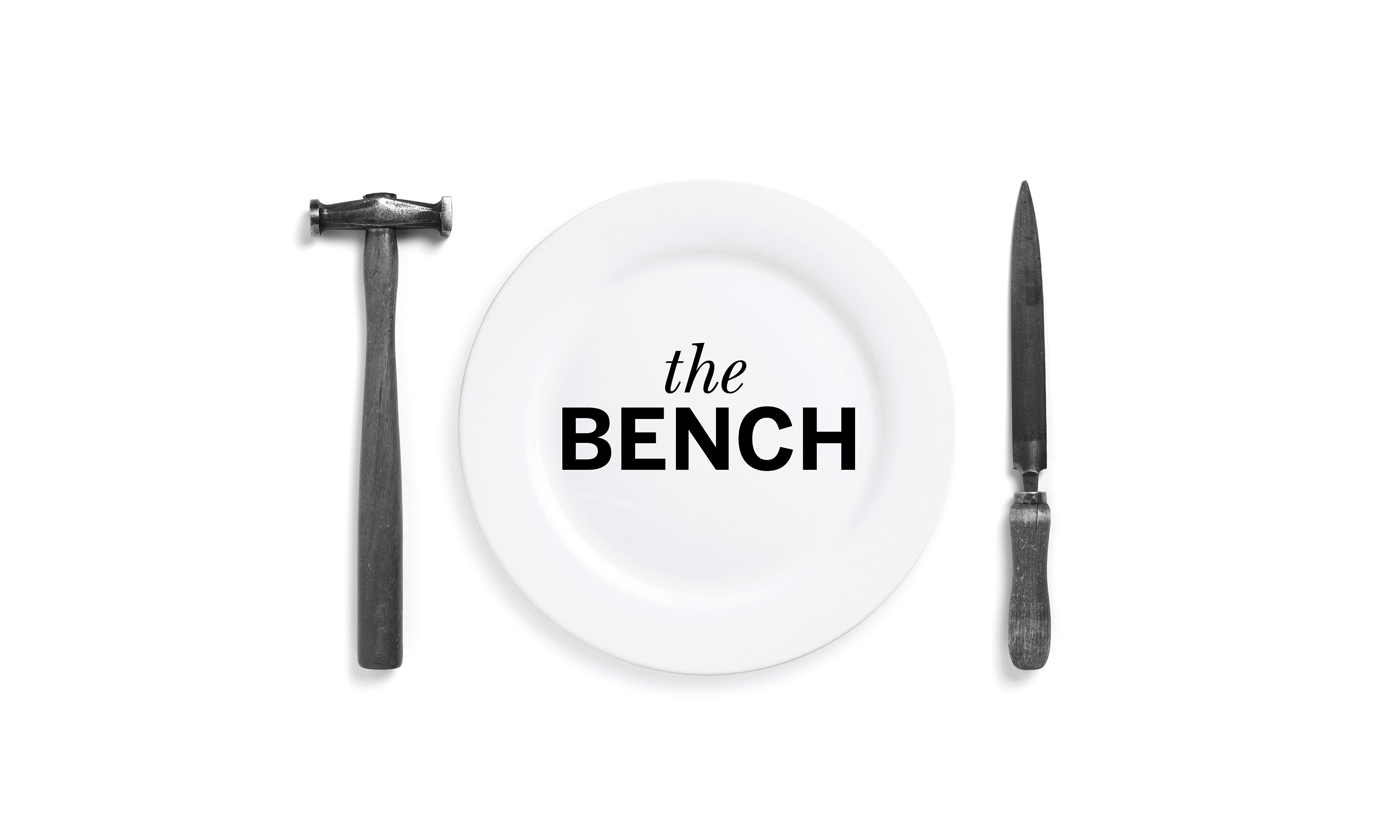
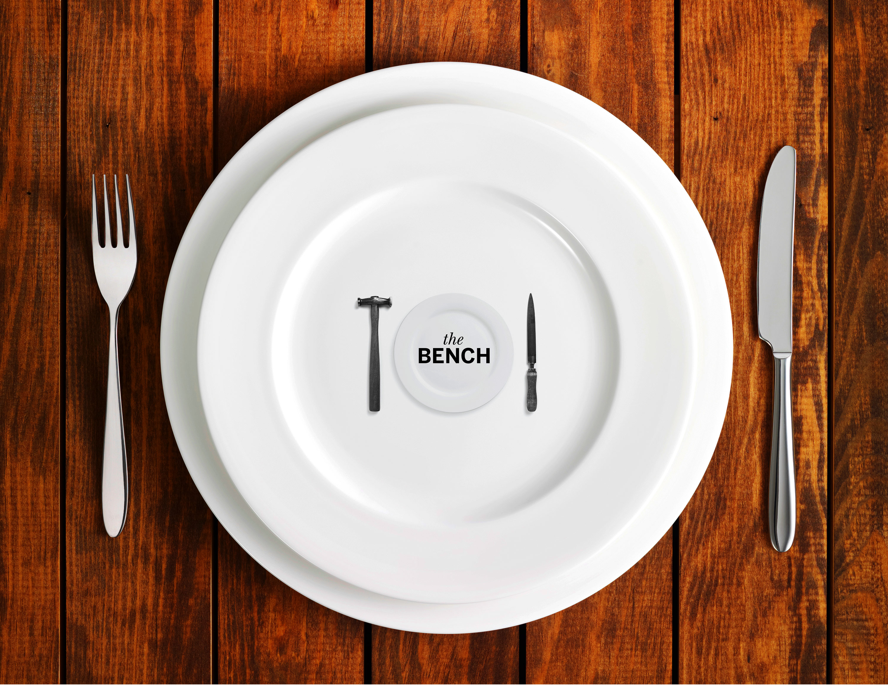
The visual identity celebrates silversmithing tradition with refined simplicity, featuring classic silversmithing tools (courtesy of Grant MacDonald’s studio) in place of cutlery. The Bench Café brand identity was rolled out across signage, uniforms, crockery and environmental graphics, creating a beautifully crafted experience rooted in the Centre’s artisanal spirit.
Kind words…
“Great name, with great creativity.Read More…
MARTIN DURY CBE FSA
Chairman of the board of Trustees for The Goldsmiths’ Centre
The Goldsmiths’ Centre
(Read Less...)
To find out more: [email protected] or call +44 (0)203 857 7656 Share this: Email, LinkedIn, Facebook, Download a PDF of this case study, follow us on Instagram or view our animations and movies on Vimeo
FOOD & DRINK
Brand identity
A SMILE IN THE MIND
Featured in book 2016
PROJECT SUMMARY
Art direction
Brand identity
Stationery
Brand guidelines
Crockery
Signage
Uniforms
The Bench brand mark.
The Bench guidelines.
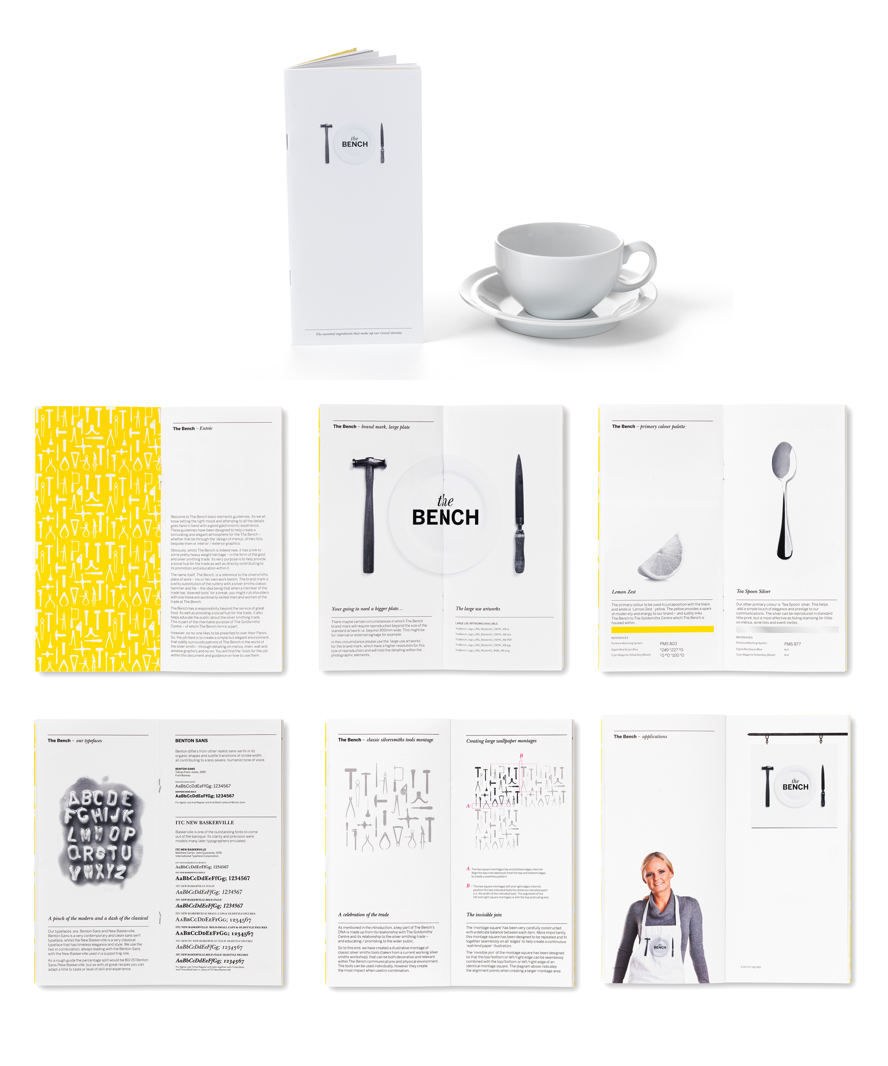
The Bench signage.

The Bench branded aprons.

The Bench crockery.
The Bench branded crockery and paperware.

The Bench paper wrap and glass manifestation repeat pattern.