The Goldsmiths' Centre
Brand positioning & identity
A place for Creativity, Craftsmanship, Community.
Neon developed the brand positioning and identity for The Goldsmiths’ Centre, a new £18M initiative by The Goldsmiths’ Company — created to secure the future of the UK’s gold and silversmithing industry. The Centre’s vision was to unite education, craftsmanship and commerce under one roof, building a lasting creative community.
Neon defined the brand idea — Creativity, Craftsmanship, Community — and designed a contemporary visual identity blending the heritage of The Goldsmiths’ Company with a bold, future-facing energy. Using a crafted yellow “information plate” motif and a refined monochrome palette, the identity was applied across signage, literature and digital platforms, establishing the Centre as the UK’s home for inspiration, innovation and skill.
For the full long read case study, click here…
Following Neon’s successful re-branding of The Goldsmiths’ Company, we were invited to help the Company with another hugely important project: the launch of The Goldsmiths’ Centre — their largest ever investment in the future of the industry and in the continuing success of those who work in precious metals.
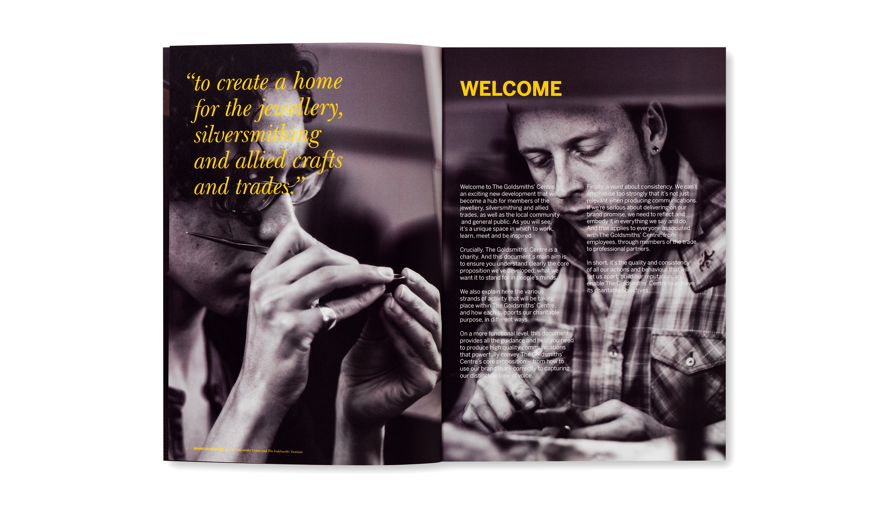
The Centre’s goal was to create a sustainable future for the industry by bringing together education and commerce, building an enduring community of like-minded individuals and businesses from the industry and the associated trades. It was also to have charitable status.
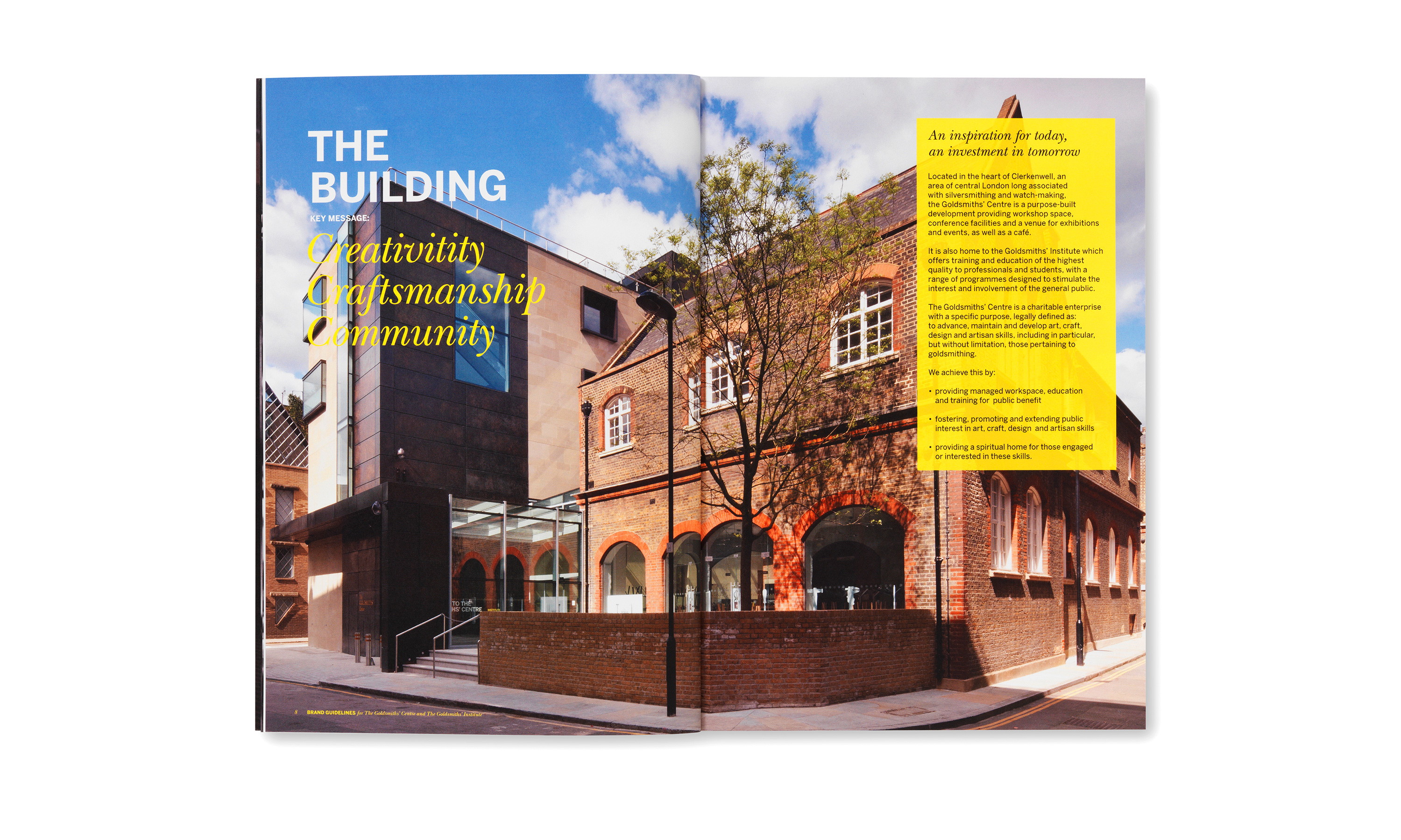
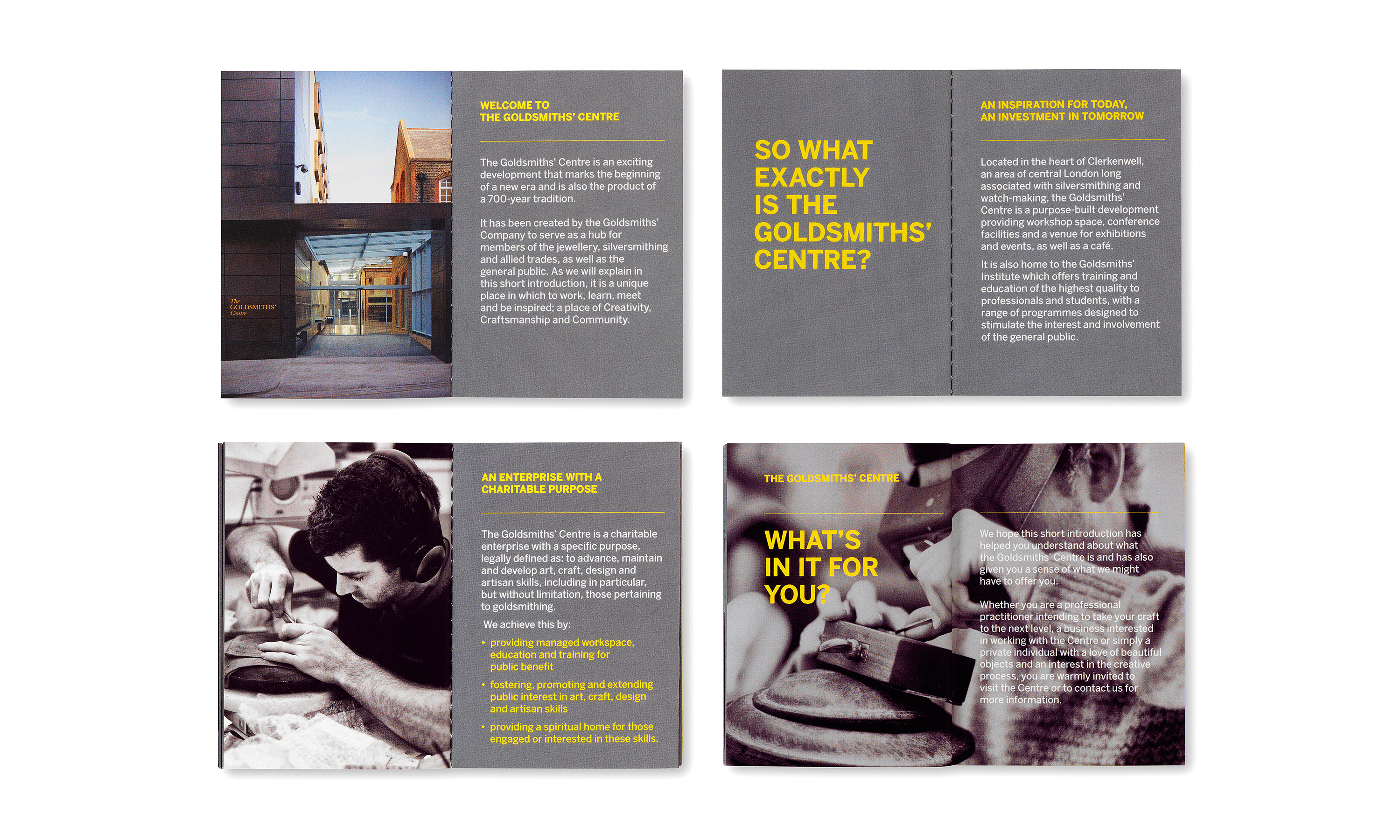
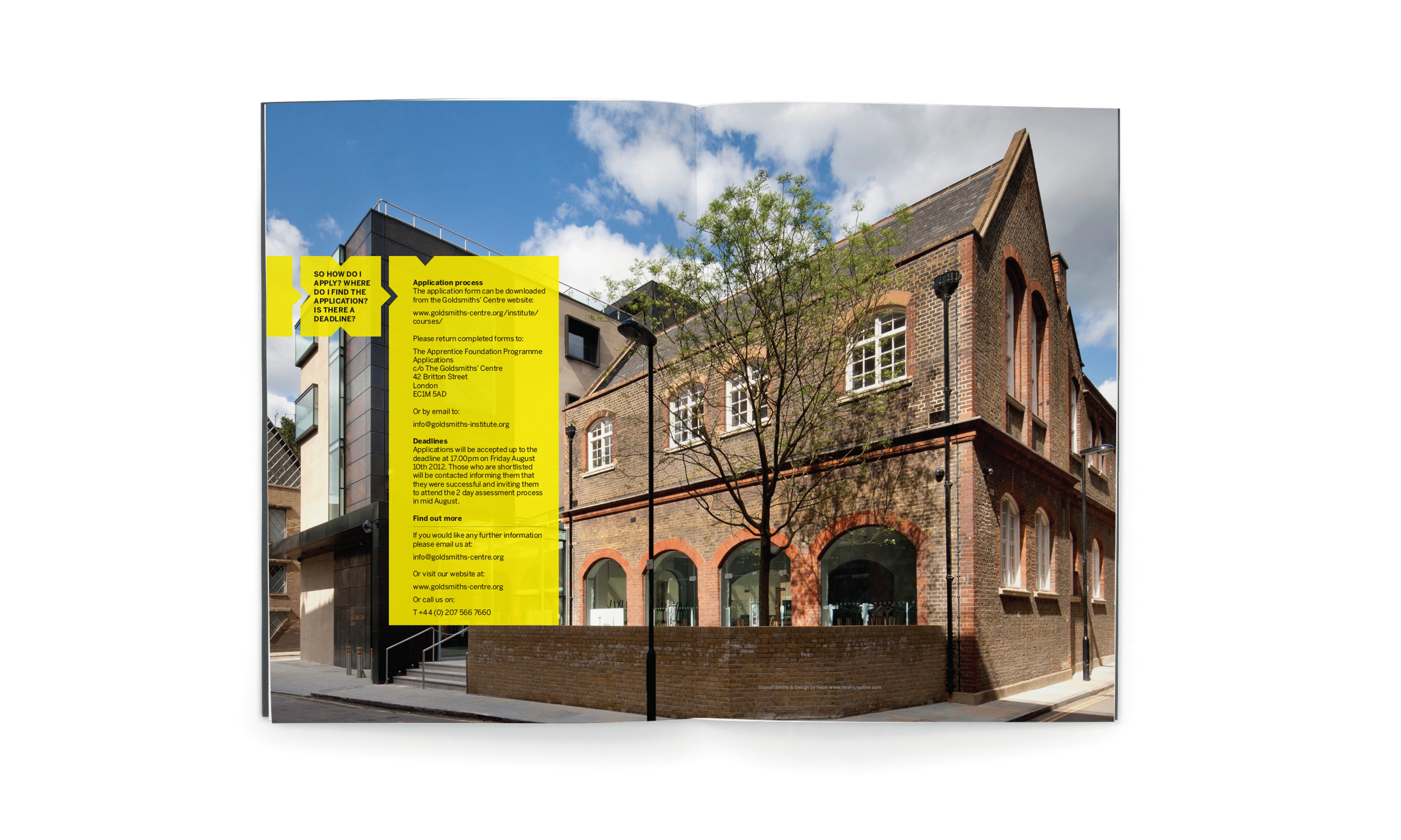
The Goldsmiths’ Centre is a purpose-built development, created by restoring a Grade II-listed Victorian Board School and adding a new four-storey building, in the heart of Clerkenwell. It provides workshop space, conference facilities and a venue for exhibitions and events, as well as a café. It also offers training and education of the highest quality to professionals and students, as well as a range of programmes designed to stimulate the interest and involvement of the general public.
Brand Idea.
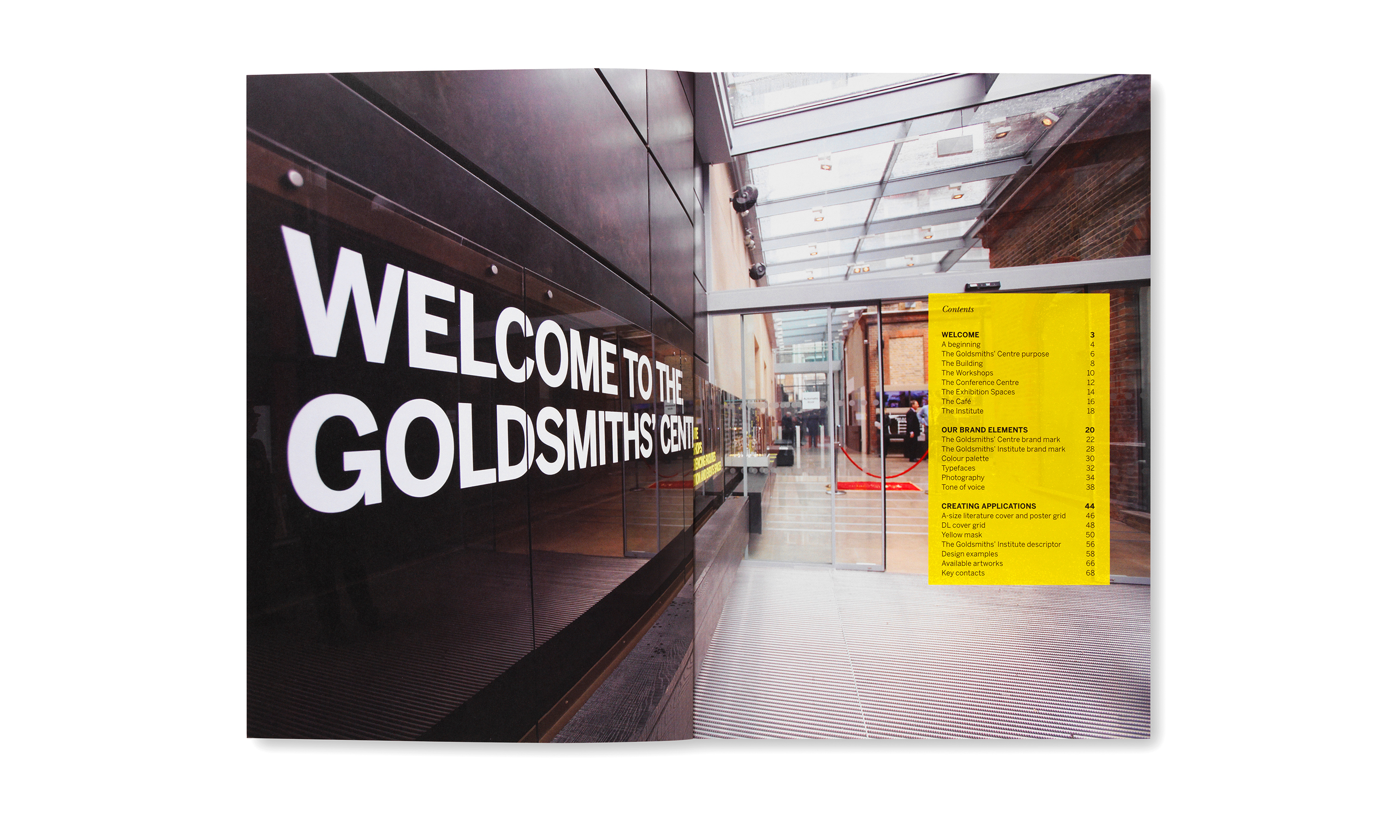
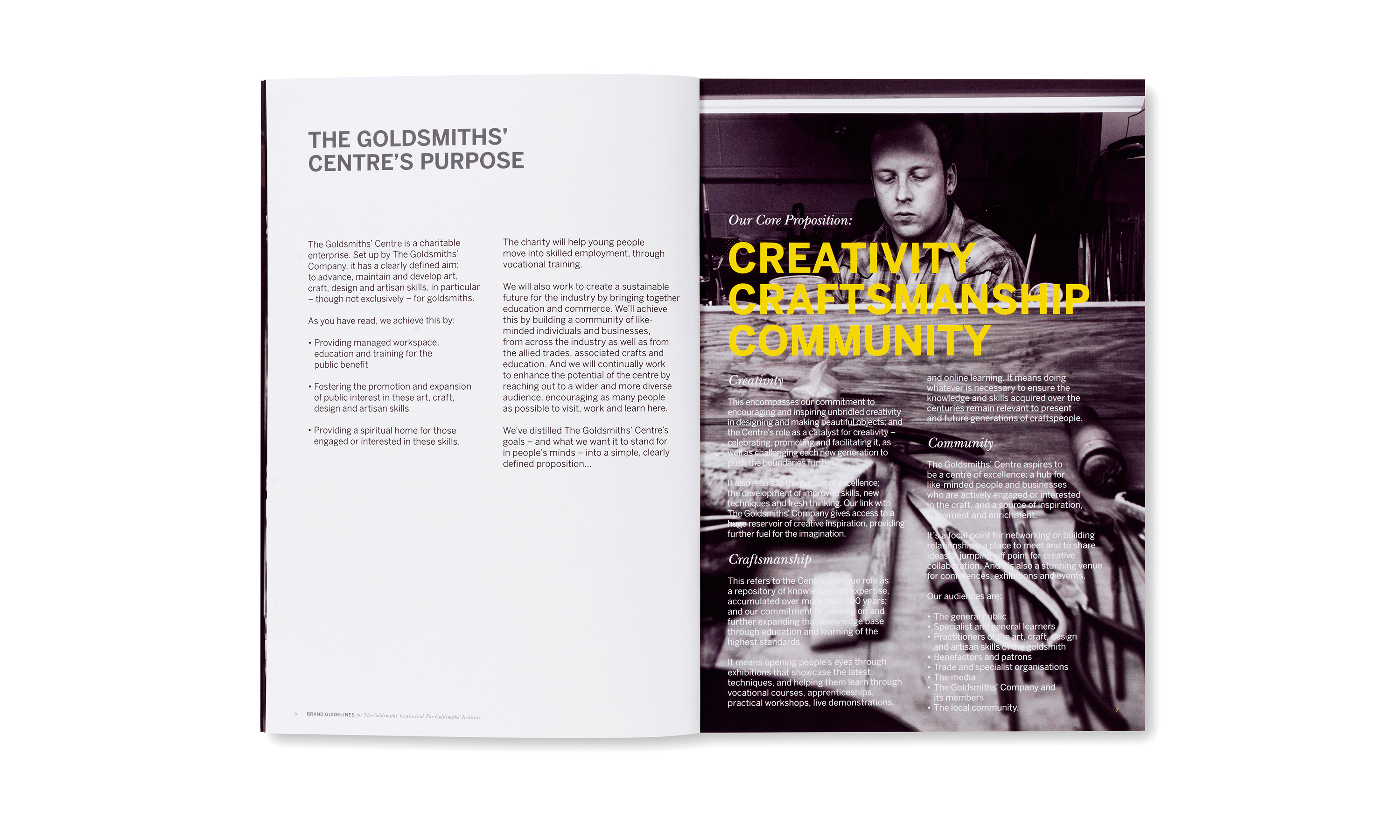
Three words encapsulate the values of The Goldsmiths’ Centre. Creativity encompasses Centre’s commitment to encouraging and inspiring creativity in the design and making of beautiful objects. Craftsmanship refers to the Centre’s important role as a repository of knowledge, building on centuries of experience. Community expresses an important aspiration of the Centre; to create a centre of excellence, a hub where like-minded people and businesses come together to share ideas, collaborate and build relationships, and to become a place of inspiration.
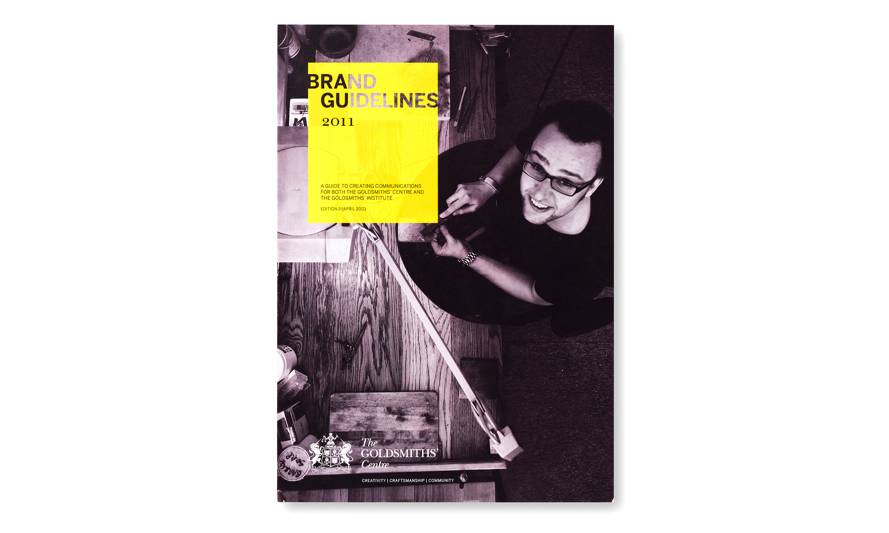
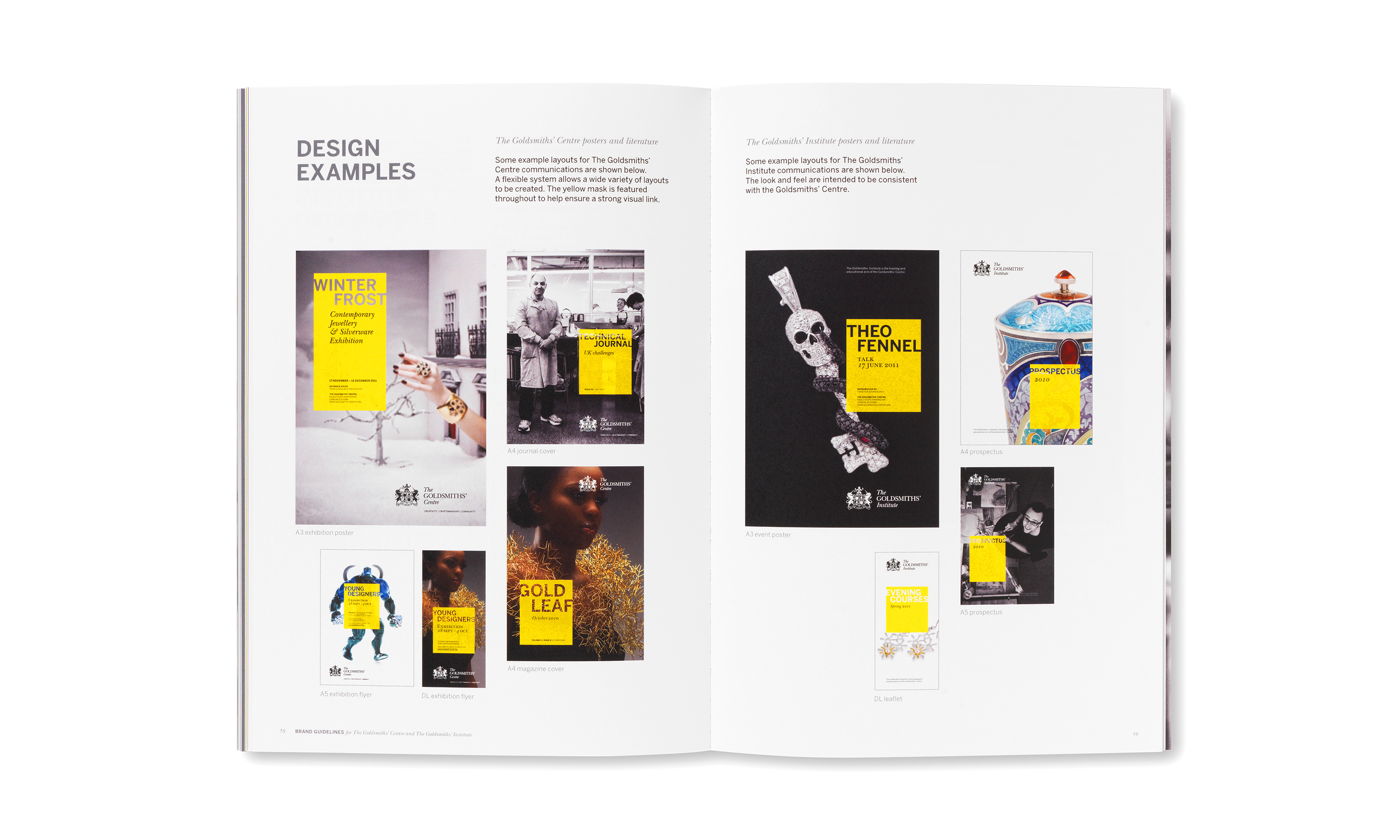
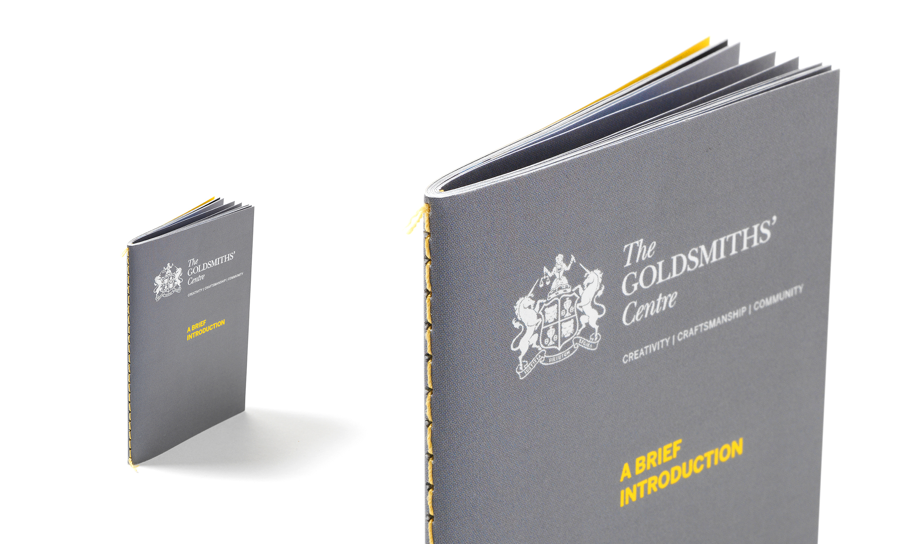
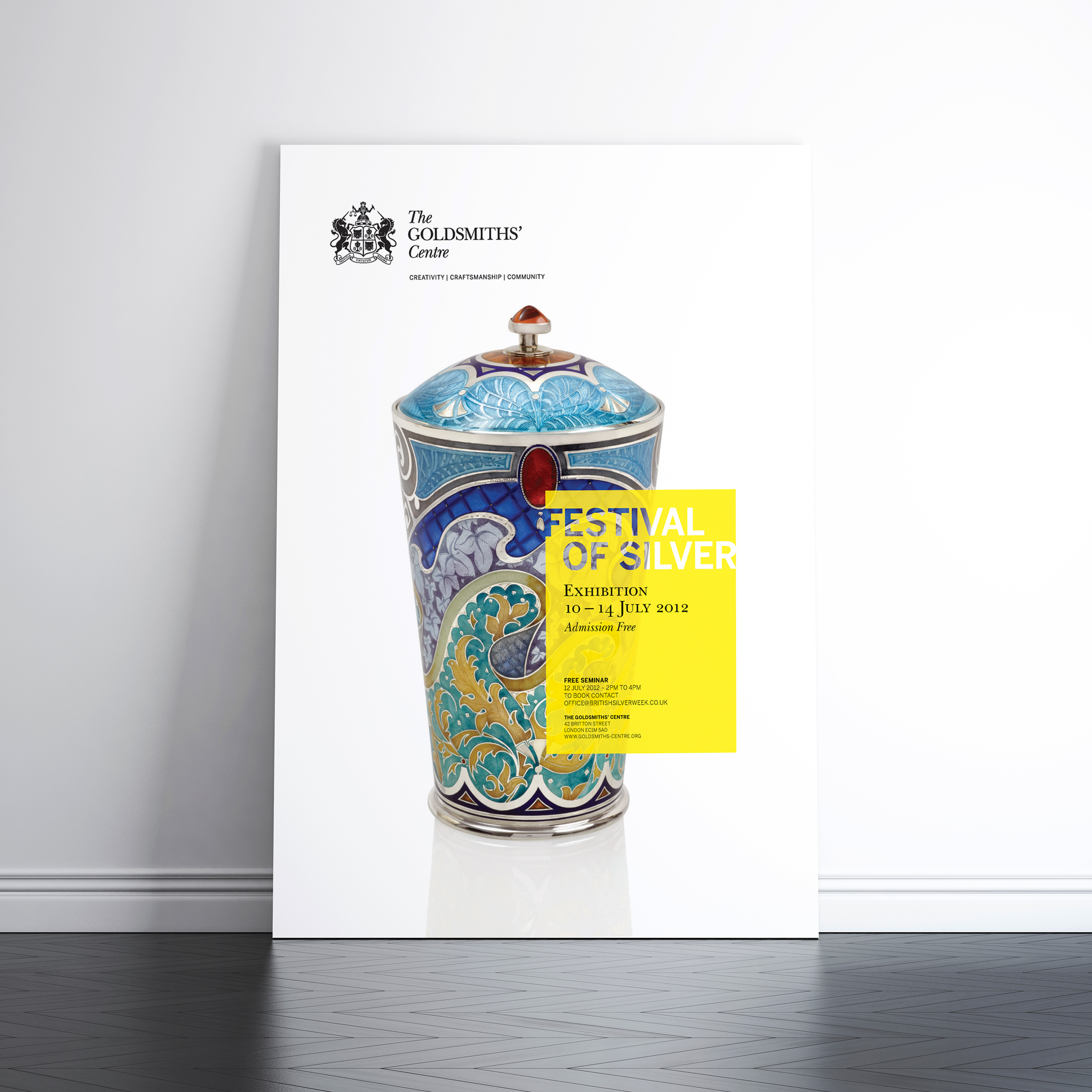
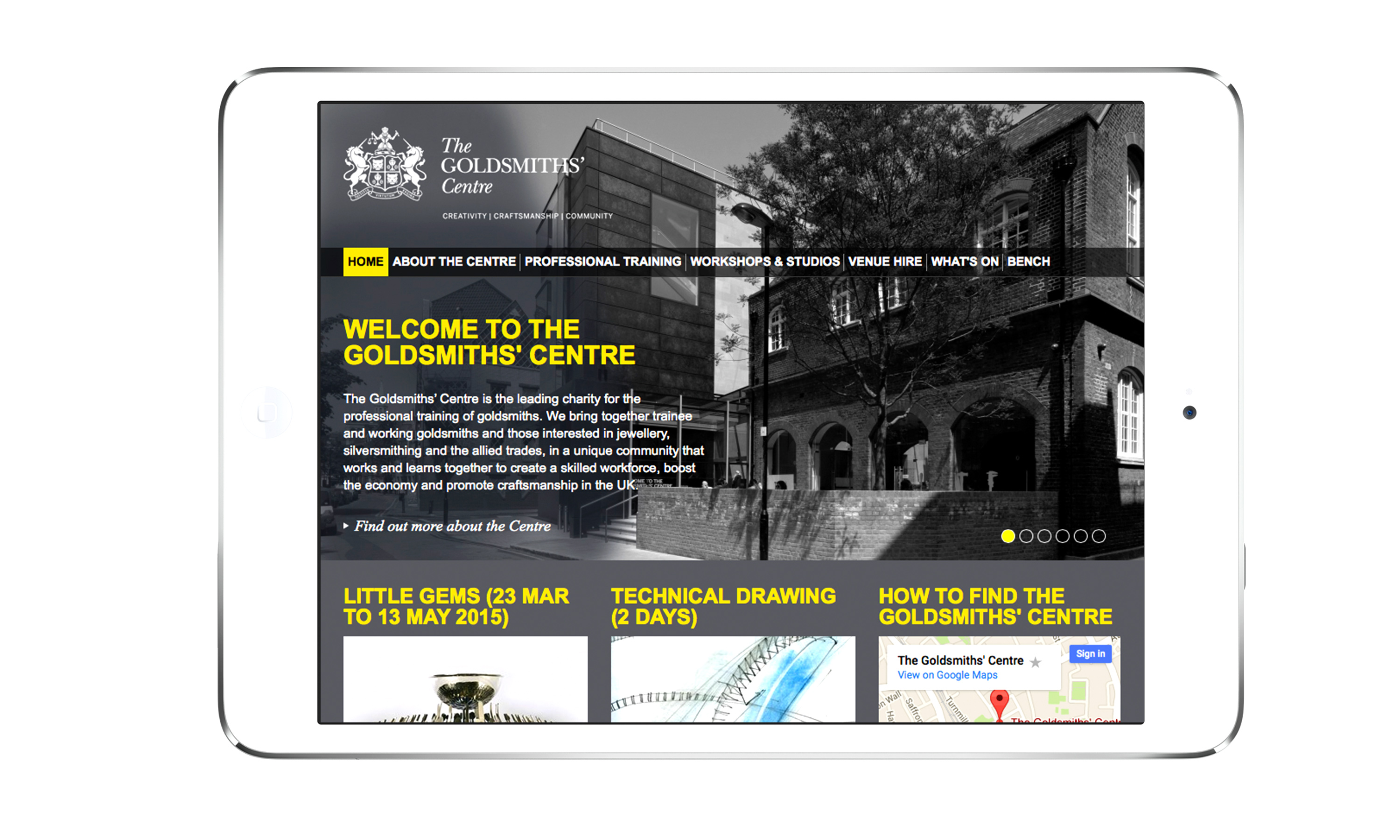
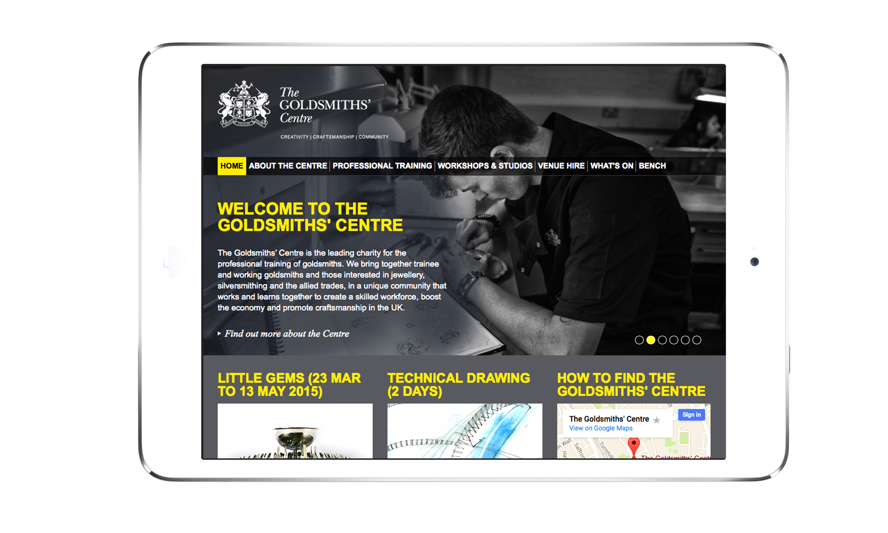
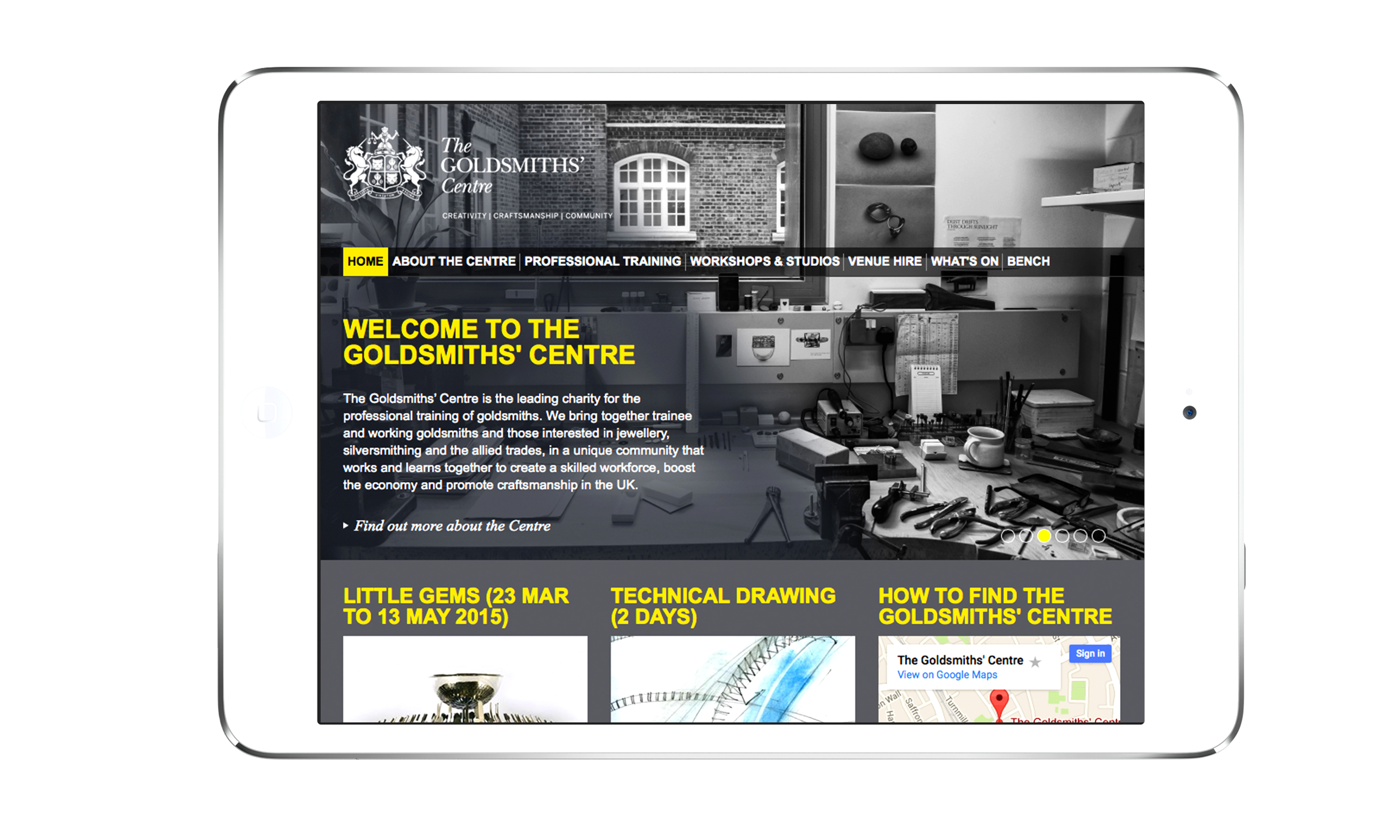
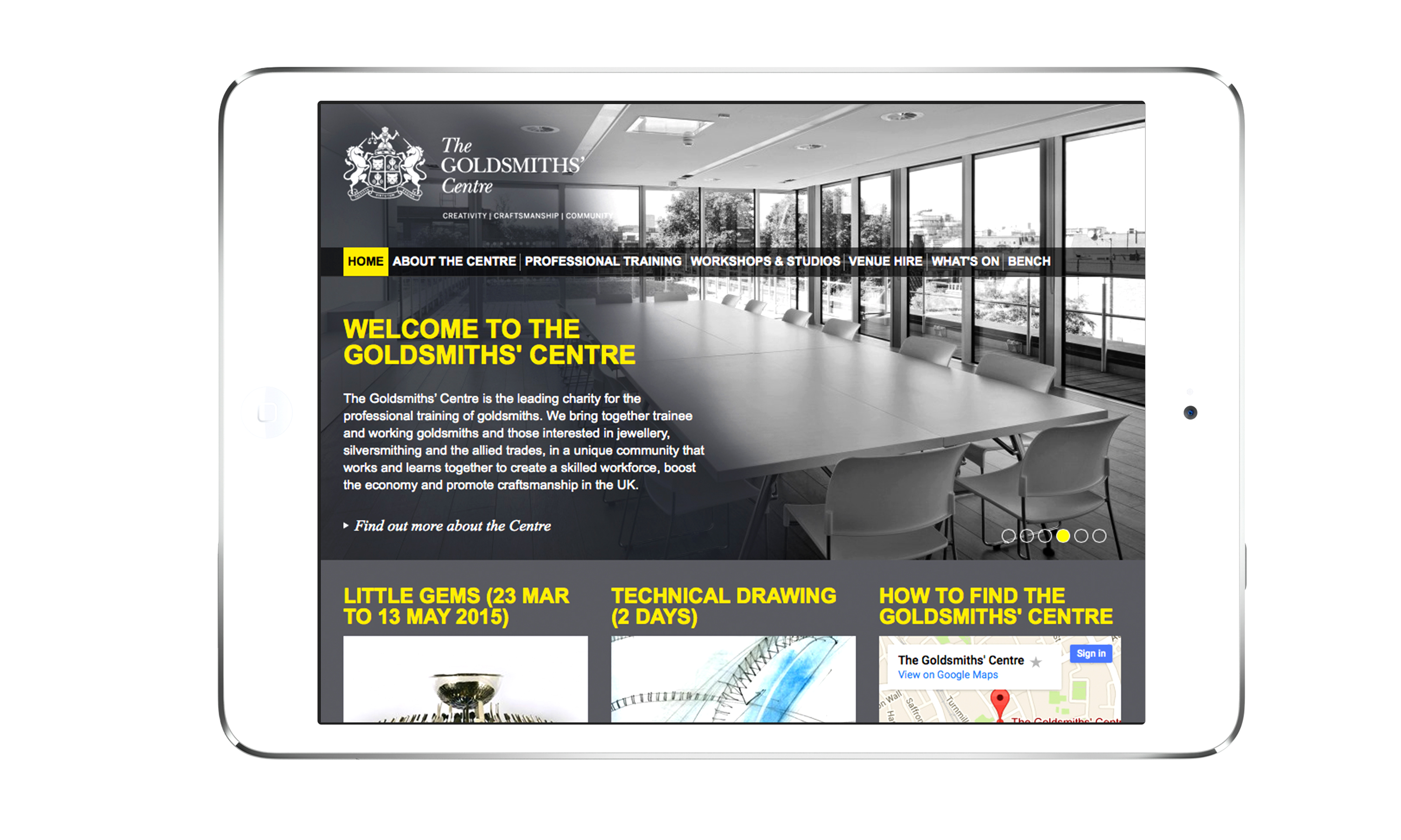
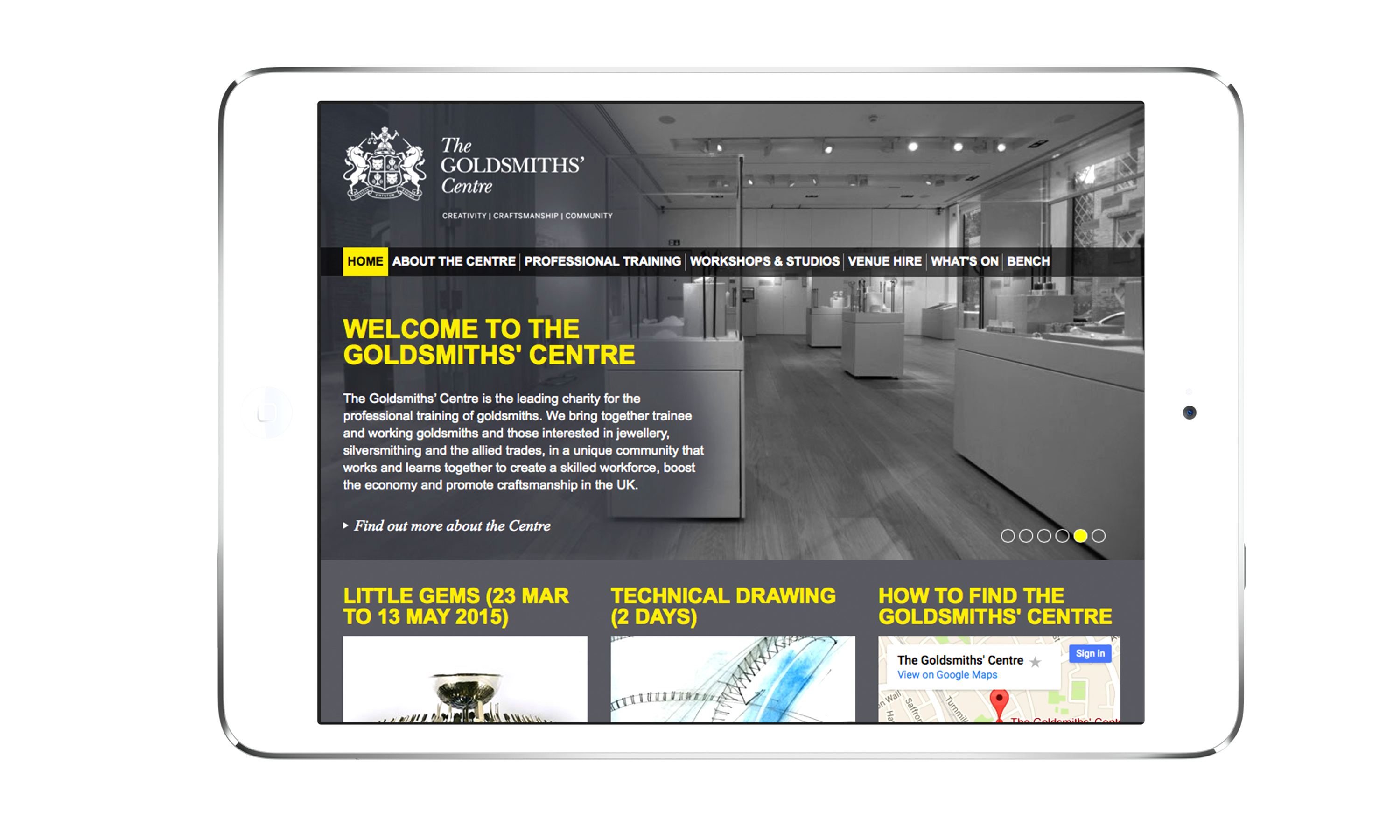
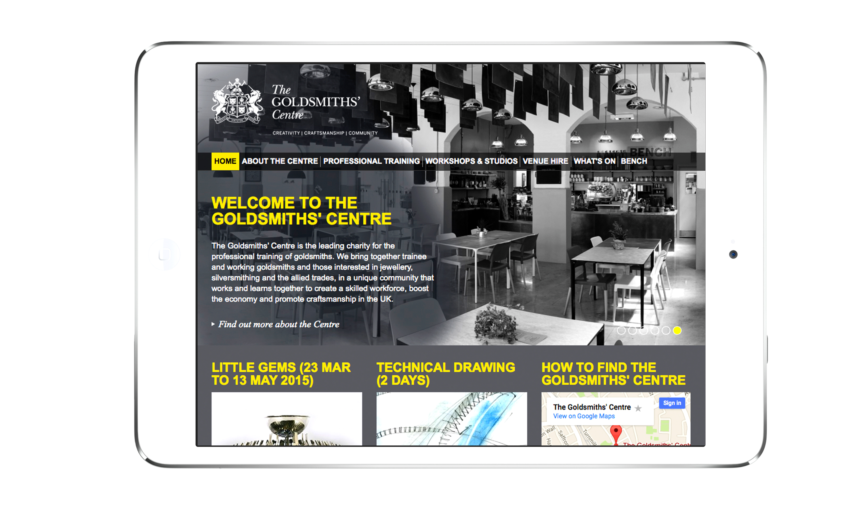
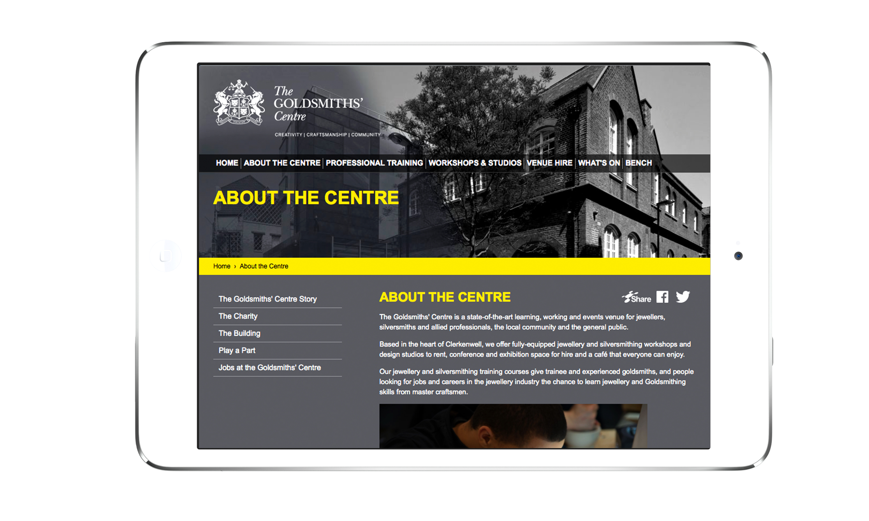
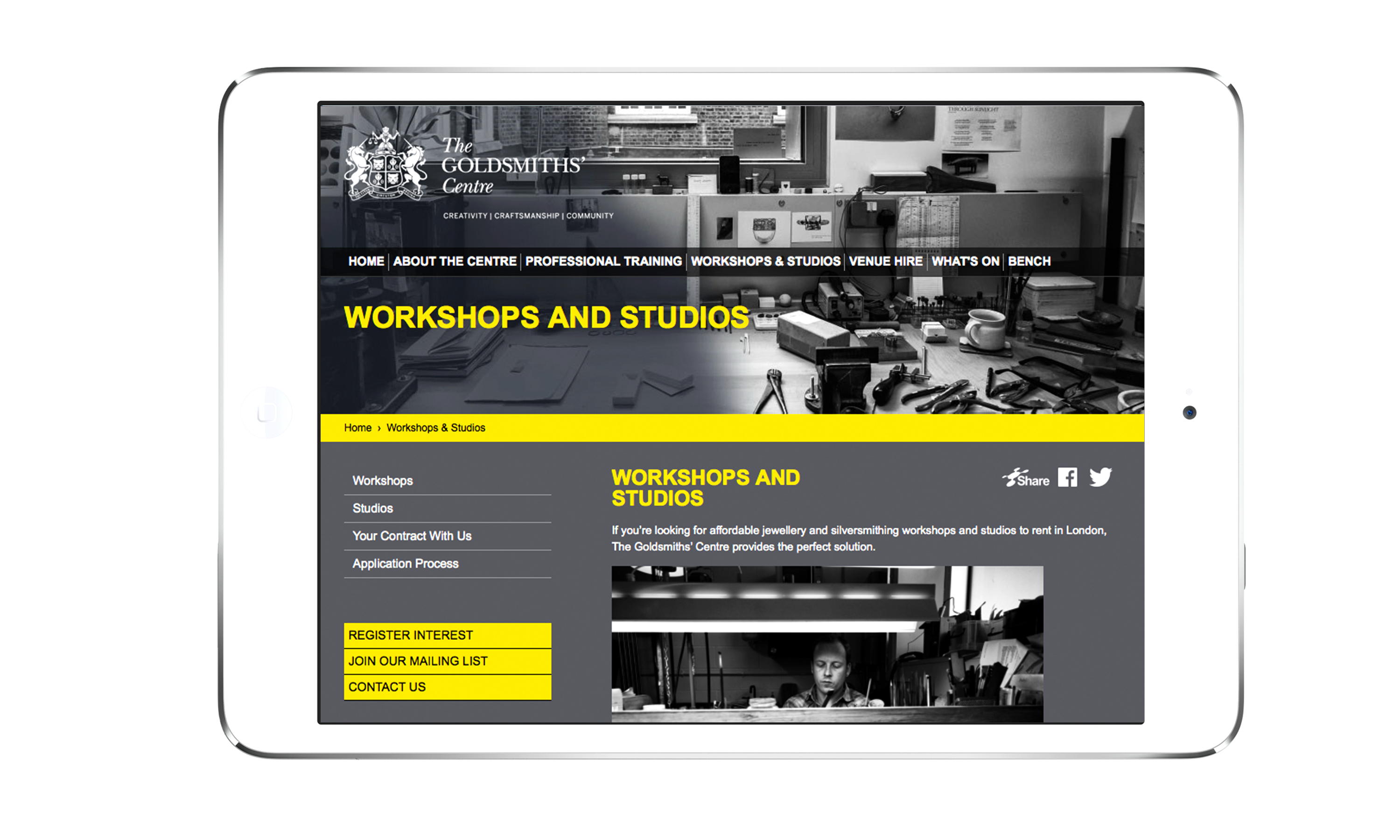
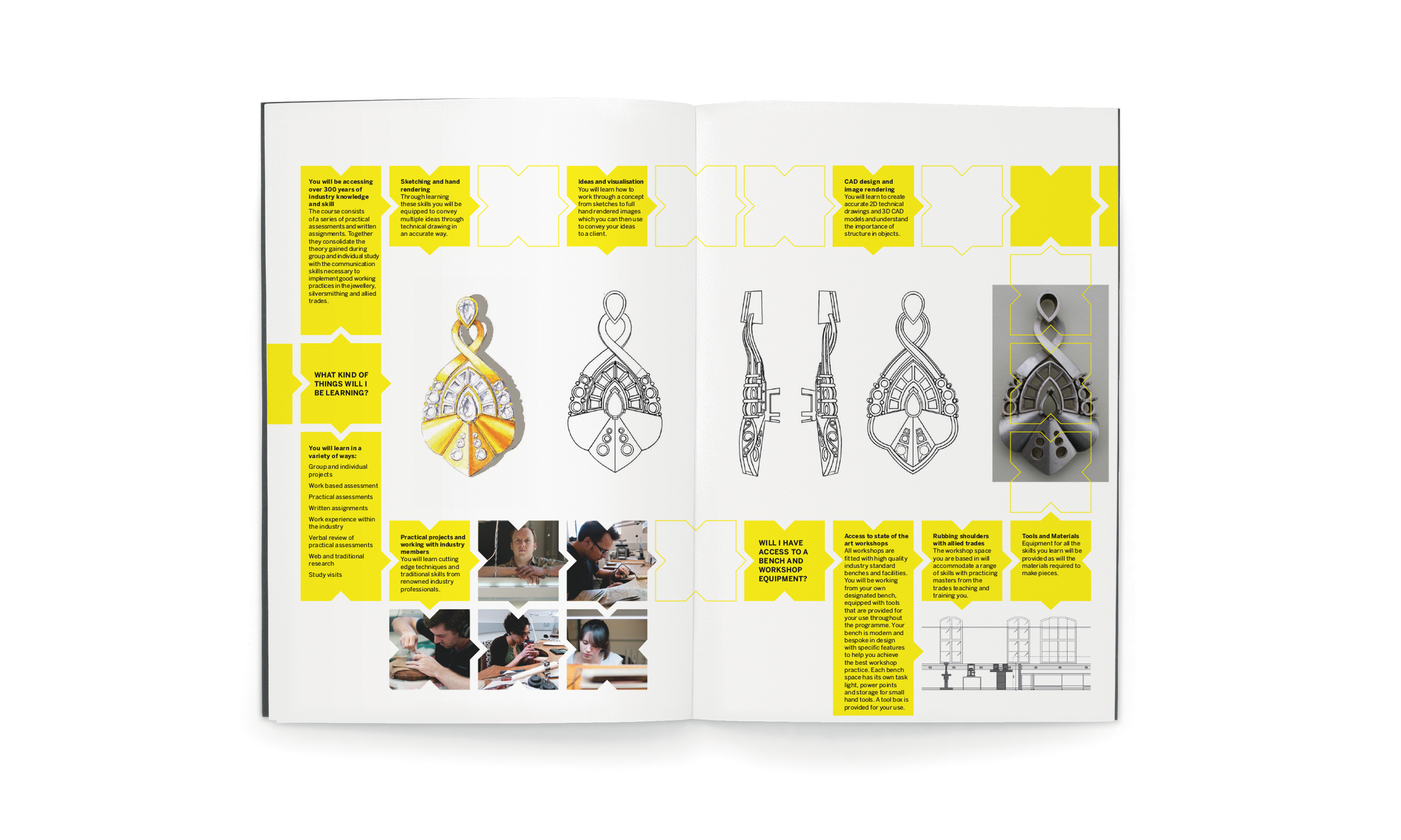
These values are married with a brand identity which reflects the Centre’s heritage, with the use of a monochromatic coat of arms of The Goldsmiths’ Company. A strong yellow – the common heraldic substitution for gold – helps create a vibrant, contemporary look and feel, positioning the Centre as a new future-facing organisation, distinctly separate from the more traditional Goldsmiths’ Company. The yellow appears as a crafted information plate on all materials – helping to clearly state the purpose of each piece of comms with the main headline elegantly stencilled into the plate. The new identity was rolled out across all manner of media, including literature, signage and website
(Read Less...)
Kind Words…
“Neon are a highly professional, creative, yet personable agency. Read More…
REBECCA VAN ROOIJEN “Super creative but methodical too. Neon was employed by the Goldsmiths’ Company as Creative Agency to oversee and develop a new brand identity. The brief was to update its corporate branding, create a more contemporary feel and yet maintain the Company’s rich heritage. This was no mean feat given the many committees that had to be presented to and won over, all of which Dana Robertson handled with much diplomacy and tact after having undertaken painstaking research to fully understand the Company, its activities and audience. As a result of Dana’s strategic thinking, meticulous research and subsequent understanding of the Goldsmiths’ Company he developed the over arching idea of ‘touchstone’ to represent the Goldsmiths’ Company as the bench mark and ‘go to’ representative of the gold and silversmithing industry. As part of this work, Dana and I worked together on the Company’s technical publication, the Technical Bulletin that is distributed to the jewellery industry. This involved a review of the purpose, content and industry relevance of this publication – so to make it both useful to the industry and be regarded as ‘the’ thought leadership piece. Re-named by Neon to become the ‘Technical Journal’ it was an absolute joy to end up with a publication of which the Company could be justly proud of and pitched at exactly the right audiences in terms of revised content structure and beautiful design. It was a natural progression for Neon to be appointed as Creative Agency for the Goldsmiths’ Company’s biggest investment in its history, an £18M purpose-built centre for silversmithing and jewellery, The Goldsmiths’ Centre. As a result of Dana’s exhaustive research and strategic thinking in regard to the Goldsmiths’ Centre’s audiences and importantly the Centres charitable status, he created an idea and ethos that helped position the Centre as much more ‘just a building’. ‘Creativity, Craftsmanship, Community’ now runs through the heart of the building and is to inform all the Centres activities going forward — along with a vibrant brand identity that was separate but sympathetic to the Goldsmiths’ Company. The resulting effect of this has been the creation of a very strong brand image throughout the completed building, which opened in April 2012. This follows through all the elements within the building from the outside signage, the café, internal signage and printed and online media and website. I would have no hesitation in recommending Dana’s work as I have found him to really listen to what the client is saying, super creative, methodical in approach as well as fun to work with.” KARIN PAYNTER “I am grateful for your input and commitment to the project and you can be rightly proud of the influence that you have had over the branding of the Centre to date. On a personal level I have enjoyed working with you.” PETER TAYLOR
Project Director
The Goldsmiths’ Centre
Project Director
The Goldsmiths’ Centre
Director elect
The Goldsmiths’ Centre
(Read Less...)
To find out more: [email protected] or call +44 (0)203 857 7656 Share this: Email, LinkedIn, Facebook, Download a PDF of this case study, follow us on Instagram or view our animations and movies on Vimeo
TRADE BODY / CHARITY
Branding
PROJECT SUMMARY
Art direction
Brand positioning
Brand architecture
Brand identity
Brand guidelines
Literature scheme
Exhibitions
Advertising
Digital interfaces
Promotional posters
Stationery
Website
Digital templates
The Goldsmiths' Centre ‘Creativity, Craftsmanship, Community’.

The Goldsmiths' Centre brand mark.
The Goldsmiths' Centre little pocket 'about us' / brand book.
The Goldsmiths' Centre exhibition poster.
The Goldsmiths' Centre website.
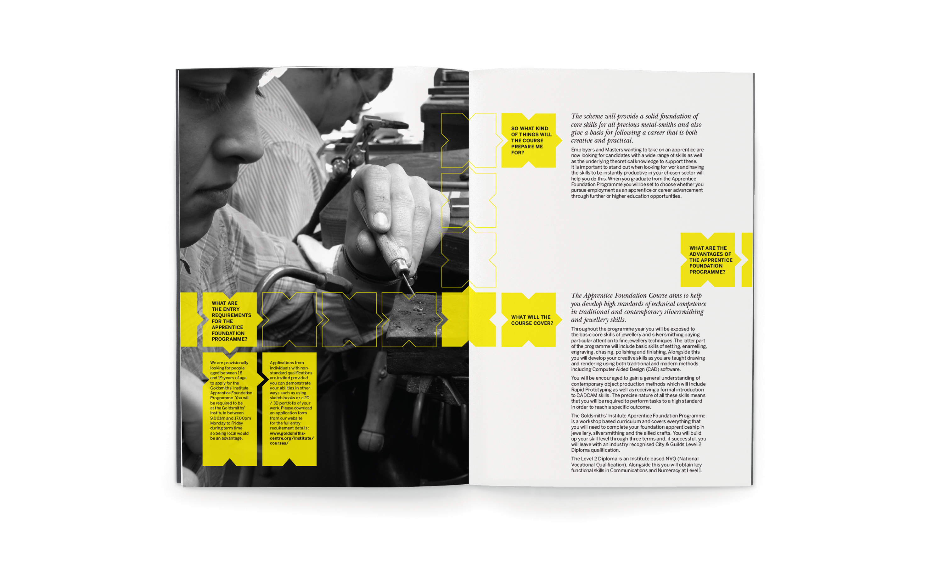
The Goldsmiths' Centre Apprentice Foundation Programme prospectus.


The Goldsmiths' Centre ‘Creativity, Craftsmanship, Community’.
The Goldsmiths' Centre London 'New Designers' awareness exhibition stand.

The Goldsmiths' Centre brand guidelines sample pages.