Wollens
The law firm that thinks in full colour – but keeps things black & white
Rebranding and relaunching a local player as a regional powerhouse
Neon rebranded Wollen Michelmore as Wollens, transforming a respected local law firm into a dynamic regional powerhouse. The new name, positioning, and visual identity — “Full Spectrum Law” — reflect a bold, modern mindset: thinking in full colour while keeping things black and white.
The relaunch unified the firm’s 200-strong team and elevated Wollens’ profile across the South West legal landscape.
For the full long read case study, click here…
One name to remember
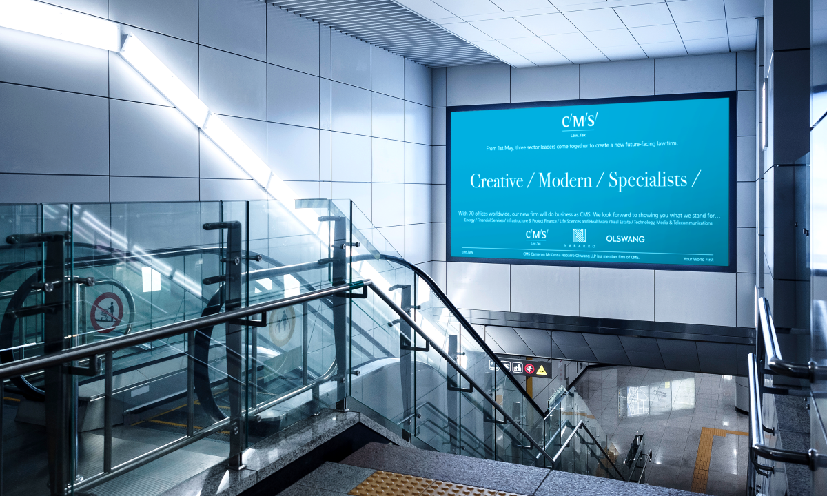
The Devon-based law firm was in the midst of a major growth period, with successive mergers set to make it one of the West Country’s biggest players. Brand consultant Tom Banks had already talked to them about our extensive work for leading law firms – particularly our rebranding project for the merger of legal giant CMS with niche players Nabarro and Olswang – which struck a chord with Wollen Michelmore.
So Tom asked us to join forces to deliver the project. The result is another successful example of our collaborative approach to major projects.
We set out to give the firm a new look and feel that would clearly signal the start of an exciting new era, for them and for buyers legal services across their expanding regional network.
Our first step was deceptively simple: Wollen Michelmore became Wollens. A singular, simpler, more memorable name to “reset” the firm on a new and different path. (And a provenly effective approach, as we had previously demonstrated when we advised Nabarro Nathanson to become Nabarro.)
The law firm that thinks in full colour – but keeps things black & white
Next came a new positioning, summed up in the strapline Full spectrum law – a reflection of the comprehensive range of corporate, commercial and personal legal services offered by the newly expanded Wollens team.
And from this strong statement, a clean, contemporary, and powerfully positive visual language quickly emerged, based around our colourfully upbeat “spectrum O” device, adding further emphasis to the firm’s 360o offering.
In terms of imagery, we wanted to the rebranding to convey a sense of a firm deeply rooted in its home territory, yet at the same time ambitious, optimistic and outward-looking. Devon’s stunning juxtapositions of land, sea and sky – particularly at sunrise and sunset – were right there on Wollens’ doorstep, perfectly suited to our needs.
Full spectrum success
The launch of the rebranded firm has, we’re pleased a say, been an unqualified success. Reaction from clients, and prospects, has been universally positive. And just as important, the “new Wollens” has been embraced by everyone who works there, helping to unify the 200-strong team, and to speed the process of integration that always follows a merger.
(Read Less...)
Kind words…
“This has been a hugely positive project for the firm, particularly following the growth of recent years. Read More… Chris Hart
Chief executive
Wollens
(Read Less...)
To find out more: [email protected] or call +44 (0)203 857 7656 Share this: Email, LinkedIn, Facebook, Download a PDF of this case study, follow us on Instagram or view our animations and movies on Vimeo
PROFESSIONAL SERVICES
Branding
PROJECT SUMMARY
Positioning & strapline development
Brand identity
Advertising
Brand guidelines
Literature scheme
Advertising templates
Stationery
Wollens brand mark on regional imagery.

Wollens brand mark.

Wollens lead advertising line.

Wollens brand mark on regional imagery.

Wollens literature system.


Wollens brand mark on regional imagery.

Wollens brand advertising.

Wollens brand mark on regional imagery.

Wollens website homepage.

Wollens brand mark on regional imagery.

Wollens corporate brochure.

Wollens brand mark on regional imagery.

Wollens stationery.

Wollens brand mark on regional imagery.

Wollens Christmas card.

Wollens brand mark on regional imagery.