Yogita
Naming & brand identity
Going ga-ga for yo-ga.
When a new start-up offering high-end educational yoga classes for mothers and babies approached Neon Brand Consultancy, they were determined not to blend into the soft-focus world of generic wellness branding. Their ambition was to create something intelligent, elegant and a little bit joyful — a brand that felt as good as it did good.
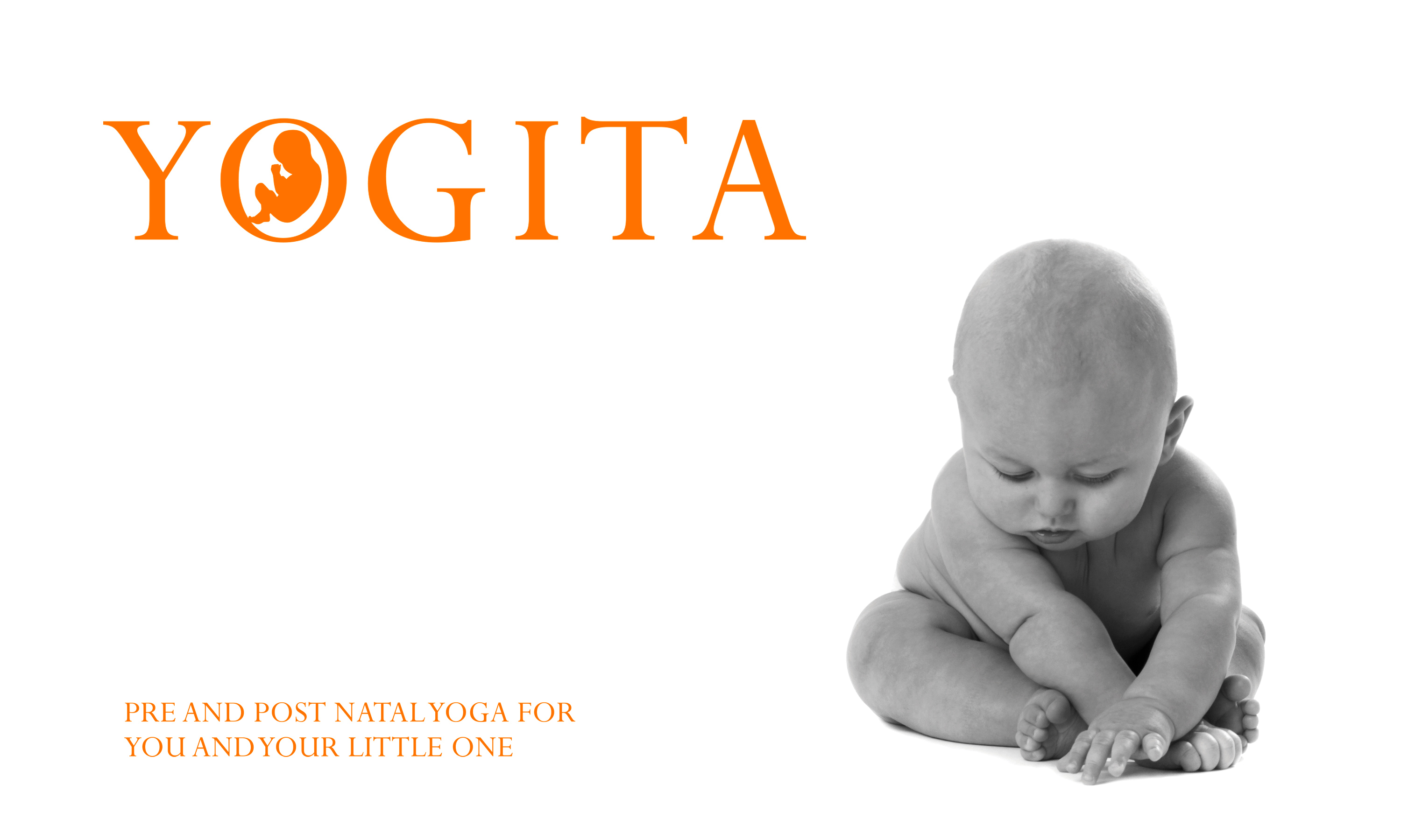
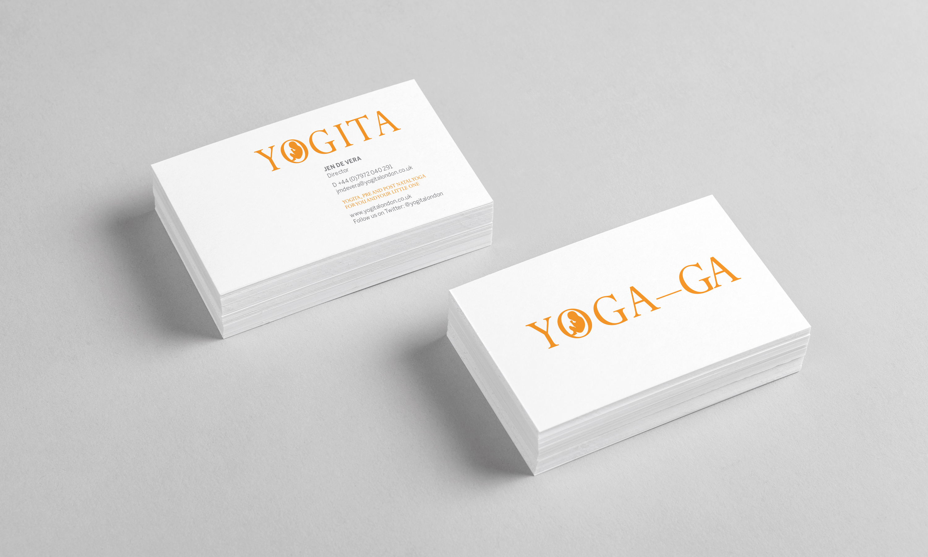
Our first task was naming. The result — Yogita — is a warm, memorable and lyrical name, combining “yoga” with a gentle nod to “maternity”. It perfectly reflects the brand’s holistic approach, supporting mothers, babies and partners through pregnancy, labour and postnatal recovery.
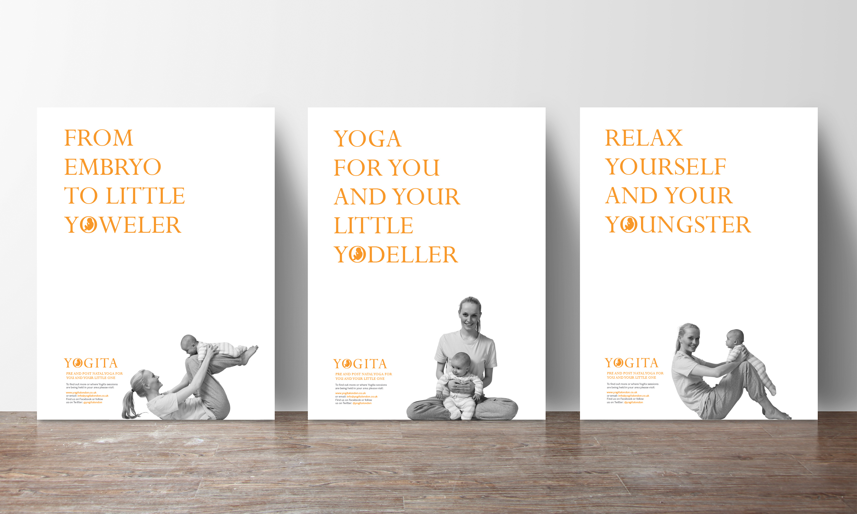
Visually, we developed a brand identity that feels elegant yet uplifting, avoiding clichés of pastel photography and lotus leaves. The logo’s flowing letterforms balance poise with playfulness, while the accompanying tone of voice brings charm and wit to the world of pre- and postnatal yoga.
The outcome is a brand that connects emotionally as well as aesthetically — positioning Yogita as a distinctive, premium name in maternal wellbeing.
Kind words…
“A wonderful and memorable name, just brilliant! Read More…
JEN DE VERA
Founder & Director
Yogita, London
(Read Less...)
To find out more: [email protected] or call +44 (0)203 857 7656 Share this: Email, LinkedIn, Facebook, Download a PDF of this case study, follow us on Instagram or view our animations and movies on Vimeo
WELL BEING
Brand identity
GRAPHIS INTERNATIONAL
Logo design 2017
– GOLD
PROJECT SUMMARY
Art direction
Naming
Brand identity
Stationery
Promotional posters
Promotional apparel
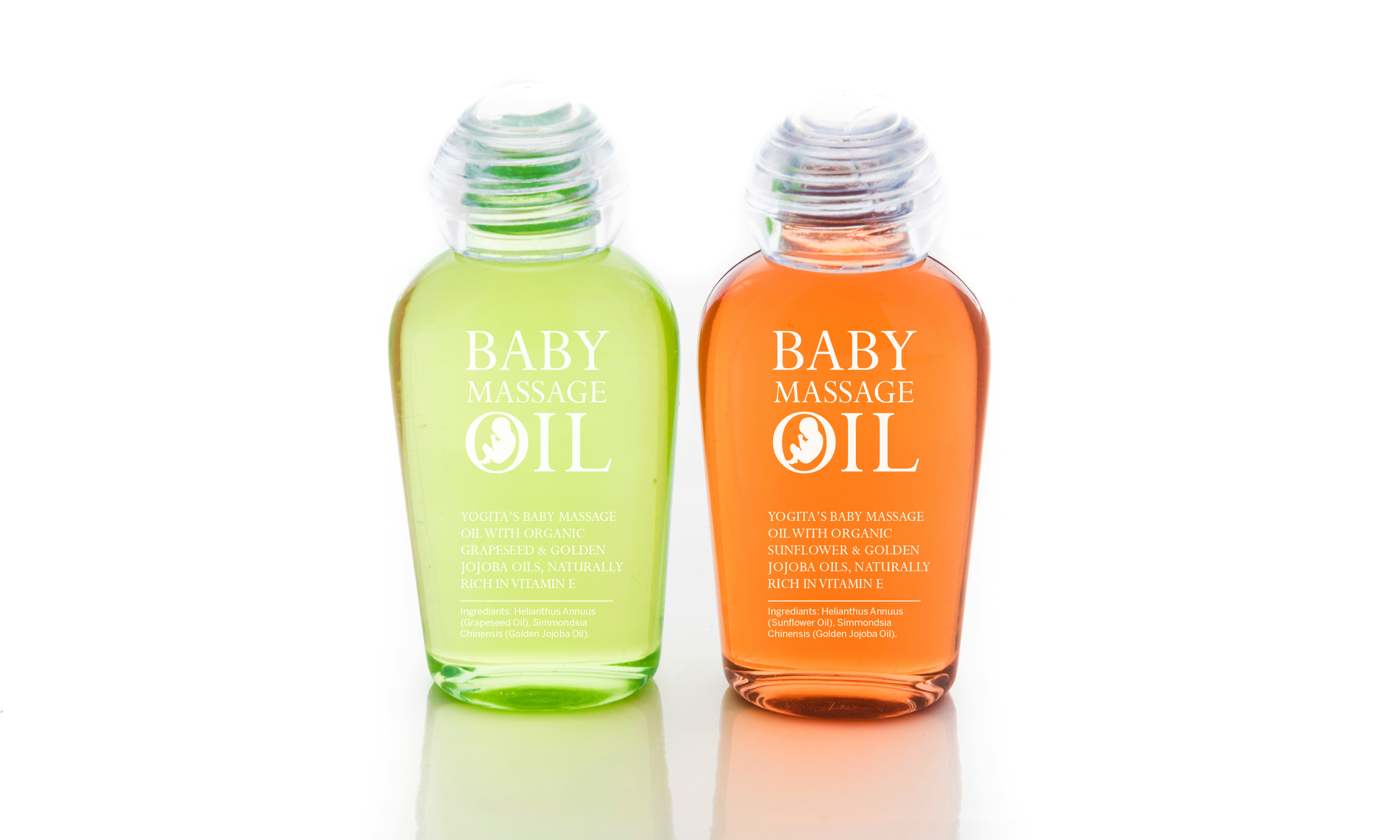
Packaging
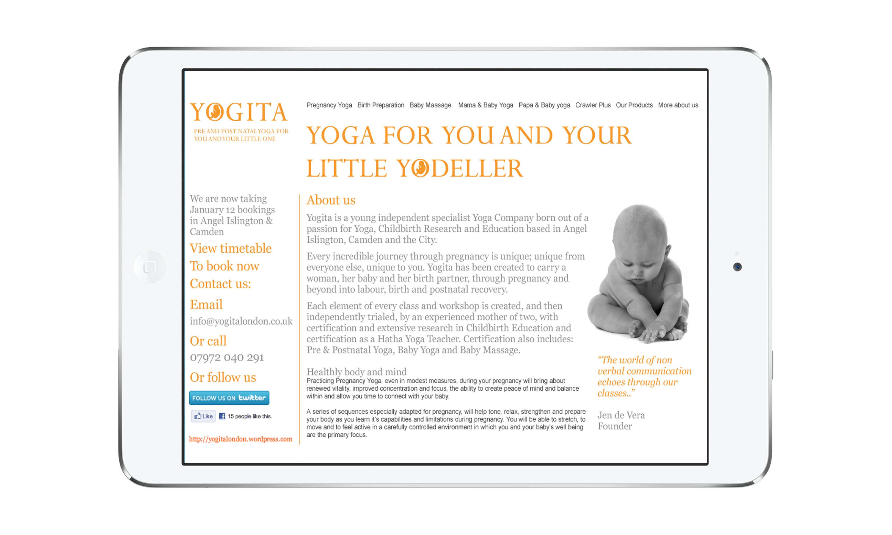
Website
Yogita brand mark.
Yogita monogram detail.

Yogita posters and advertising.
Yogita stationery.
Yogita website.
Yogita massage oils.
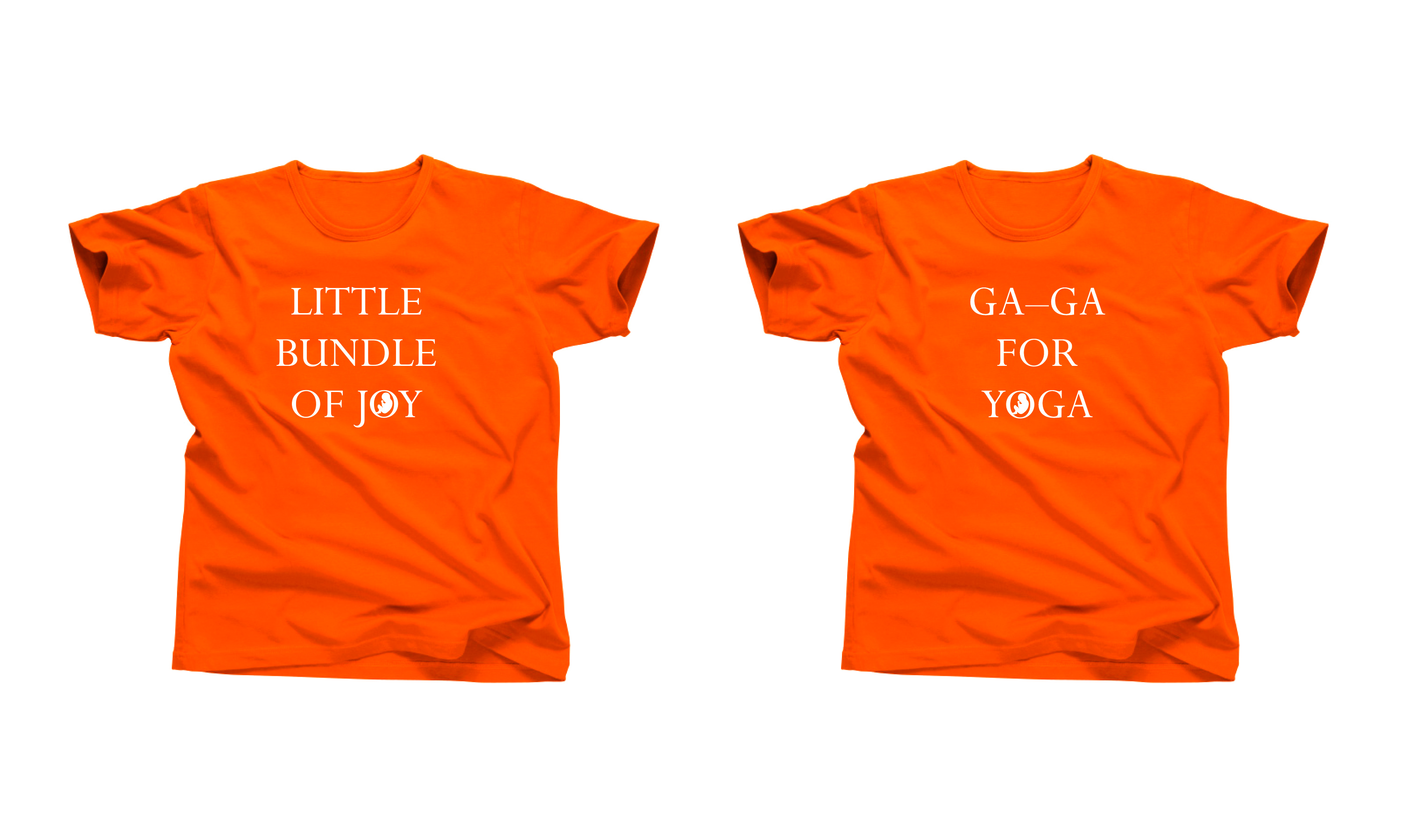
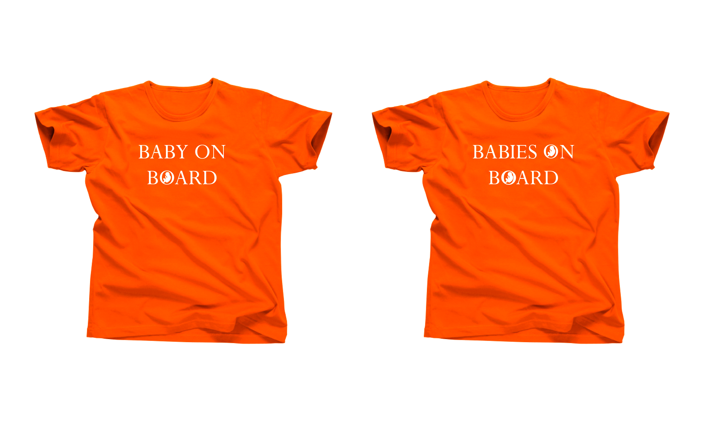
Yogita promotional T-shirts.