Natalia Schroder
Brand identity

A jewel in the making.

Natalia Schroder is an up and coming jewellery designer, whose work has appeared in Vogue and other leading fashion publications.

Natalia asked us to create a new brand identity that would make an elegant impact in the luxury goods market. We combined Natalia’s initials to form a unique monogram, designed to work at a very small sizes, so that it could be used as Natalia Schroder’s ‘maker’s mark’ alongside the hallmarks stamped into her jewellery. The detailing from the Natalia Schroder brand identity monogram carried through onto the refined but strong logotype typography. For the colour palette, we went with a simple yet sophisticated black and white, with a graphic stripe detail, taken from the feel of the monogram, to be used in packaging, ribbons, tissue wraps and end-paper detailing.

Kind words…

Wow! Modern yet timeless was the brief, but this is beyond anything I expected – thank you so much!

The symbol works brilliantly alongside the Hallmark on my pieces. So individual, so crafted, so clever!

NATALIA SCHRODER
Creative Director
Natalia Schroder Jewellery

To find out more: [email protected] or call +44 (0)20 3289 1733 Share this: Email, LinkedIn, Twitter, Facebook, Download PDF, follow us on Instagram or view our animations and movies on Vimeo


FASHION
Brand identity

GRAPHIS INTERNATIONAL
Logo design 2017
– GOLD

PROJECT SUMMARY
Brand identity
Stationery
Press pack
Packaging
Literature
Website


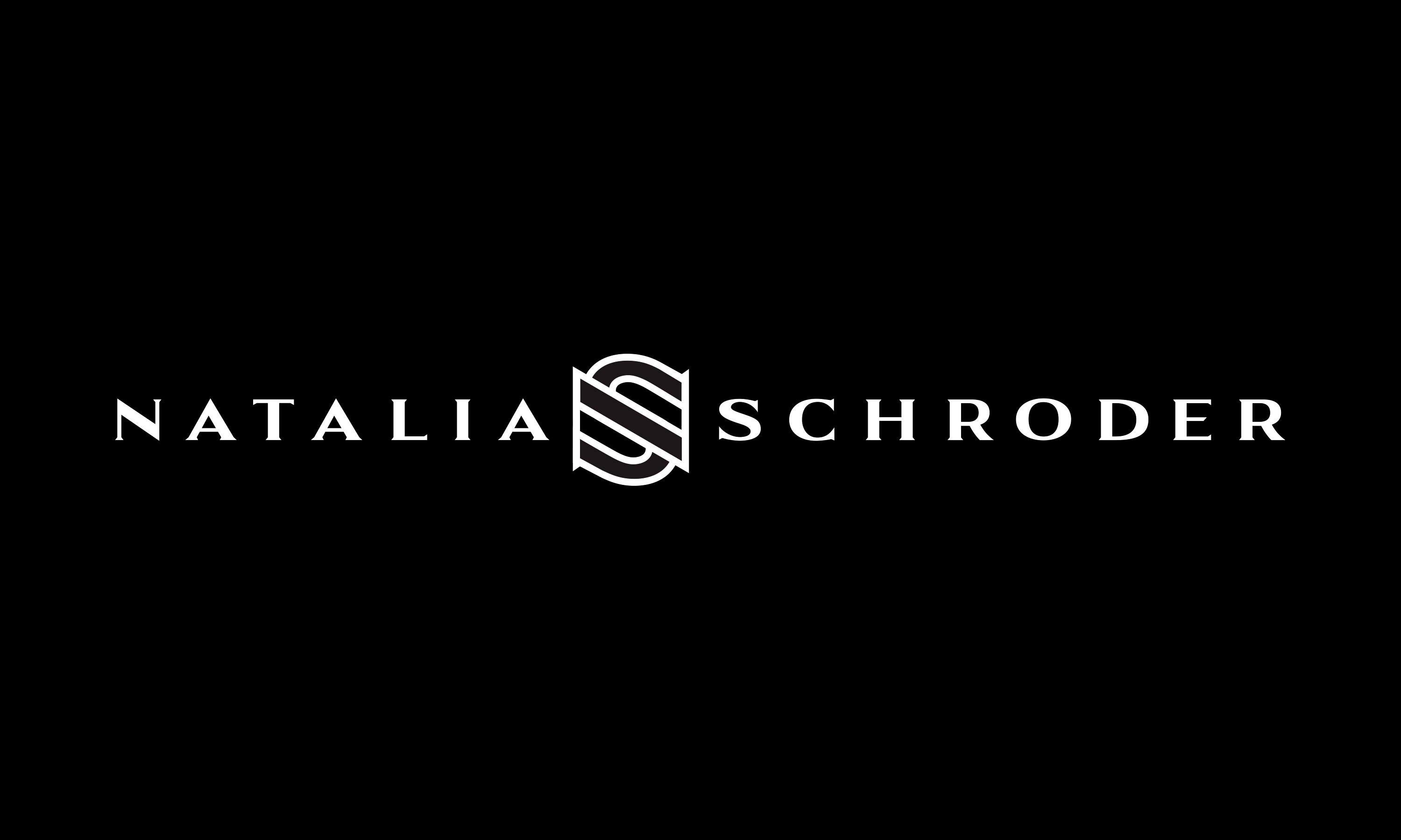
Natalia Schroder full brand mark.

By Dana Robertson Creative Director and Founder of Neon. Natalia Schroder brand mark. Natalia Schroder is an up and coming jewellery designer, whose work has appeared in Vogue and other heavyweight fashion publications. Natalia approached Neon on recommendation to create her new brand identity that would make a elegant impact in the luxury goods market. We elegantly combined Natalia’s initials into a unique monogram, designed to work at a very small sizes, so that it could be used as her ‘maker’s mark’ alongside the hallmarks stamped into her jewellery. The detailing from the monogram carried through onto the refined but strong logotype typography. The colour palette, we used a simple yet sophisticated black and white, with a graphic stripe detail, taken from the feel of the monogram, to be used in packaging, ribbons, tissue wraps and end-paper detailing. Idea, art direction and design by Neon Design & Branding Consultancy www.neon-creative.com

Natalia Schroder monogram.

By Dana Robertson Creative Director and Founder of Neon. Natalia Schroder Monogram. Natalia Schroder is an up and coming jewellery designer, whose work has appeared in Vogue and other heavyweight fashion publications. Natalia approached Neon on recommendation to create her new brand identity that would make a elegant impact in the luxury goods market. We elegantly combined Natalia’s initials into a unique monogram, designed to work at a very small sizes, so that it could be used as her ‘maker’s mark’ alongside the hallmarks stamped into her jewellery. The detailing from the monogram carried through onto the refined but strong logotype typography. The colour palette, we used a simple yet sophisticated black and white, with a graphic stripe detail, taken from the feel of the monogram, to be used in packaging, ribbons, tissue wraps and end-paper detailing. Idea, art direction and design by Neon Design & Branding Consultancy www.neon-creative.com

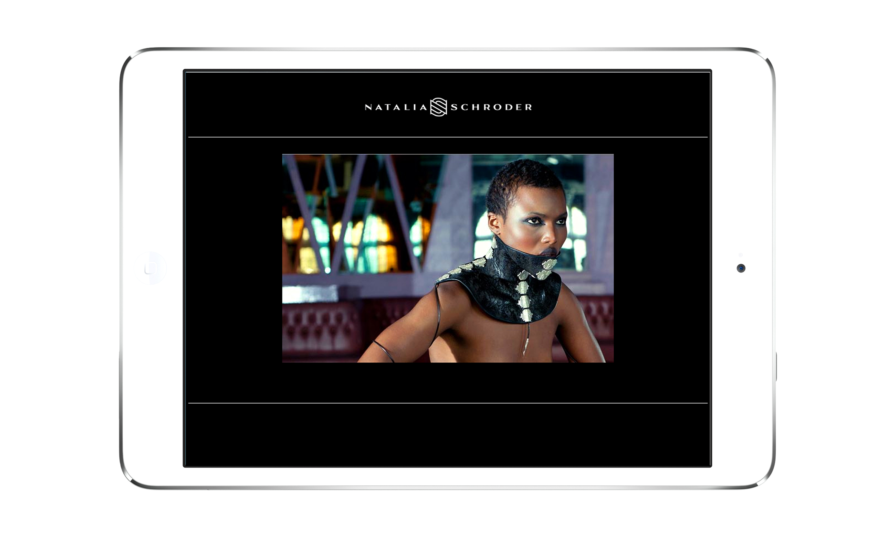
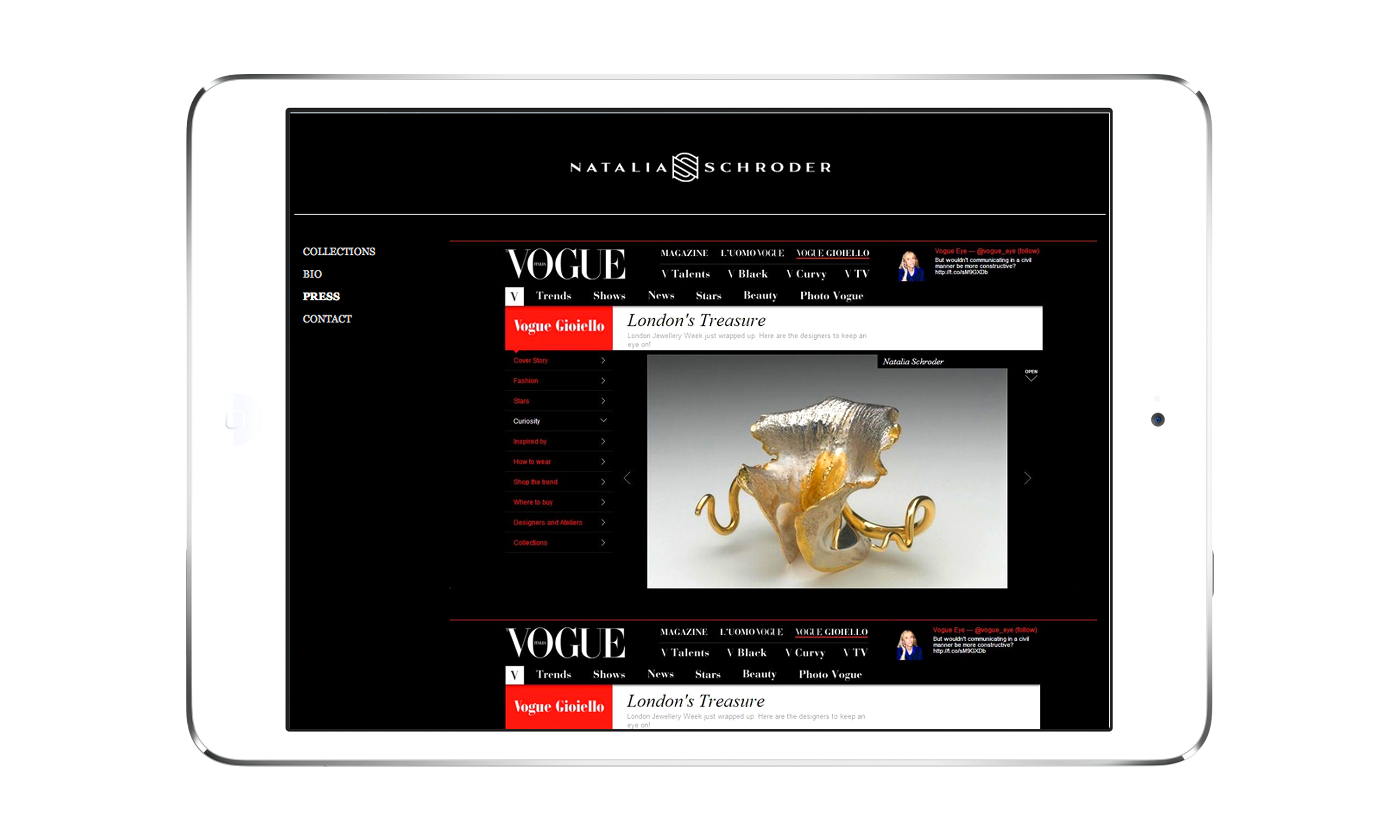
Natalia Schroder website.

By Dana Robertson Creative Director and Founder of Neon. Natalia Schroder website home page. Natalia Schroder is an up and coming jewellery designer, whose work has appeared in Vogue and other heavyweight fashion publications. Natalia approached Neon on recommendation to create her new brand identity that would make a elegant impact in the luxury goods market. We elegantly combined Natalia’s initials into a unique monogram, designed to work at a very small sizes, so that it could be used as her ‘maker’s mark’ alongside the hallmarks stamped into her jewellery. The detailing from the monogram carried through onto the refined but strong logotype typography. The colour palette, we used a simple yet sophisticated black and white, with a graphic stripe detail, taken from the feel of the monogram, to be used in packaging, ribbons, tissue wraps and end-paper detailing. Idea, art direction and design by Neon Design & Branding Consultancy www.neon-creative.com
By Dana Robertson Creative Director and Founder of Neon. Natalia Schroder website blog. Natalia Schroder is an up and coming jewellery designer, whose work has appeared in Vogue and other heavyweight fashion publications. Natalia approached Neon on recommendation to create her new brand identity that would make a elegant impact in the luxury goods market. We elegantly combined Natalia’s initials into a unique monogram, designed to work at a very small sizes, so that it could be used as her ‘maker’s mark’ alongside the hallmarks stamped into her jewellery. The detailing from the monogram carried through onto the refined but strong logotype typography. The colour palette, we used a simple yet sophisticated black and white, with a graphic stripe detail, taken from the feel of the monogram, to be used in packaging, ribbons, tissue wraps and end-paper detailing. Idea, art direction and design by Neon Design & Branding Consultancy www.neon-creative.com
By Dana Robertson Creative Director and Founder of Neon. Natalia Schroder website collection page. Natalia Schroder is an up and coming jewellery designer, whose work has appeared in Vogue and other heavyweight fashion publications. Natalia approached Neon on recommendation to create her new brand identity that would make a elegant impact in the luxury goods market. We elegantly combined Natalia’s initials into a unique monogram, designed to work at a very small sizes, so that it could be used as her ‘maker’s mark’ alongside the hallmarks stamped into her jewellery. The detailing from the monogram carried through onto the refined but strong logotype typography. The colour palette, we used a simple yet sophisticated black and white, with a graphic stripe detail, taken from the feel of the monogram, to be used in packaging, ribbons, tissue wraps and end-paper detailing. Idea, art direction and design by Neon Design & Branding Consultancy www.neon-creative.com

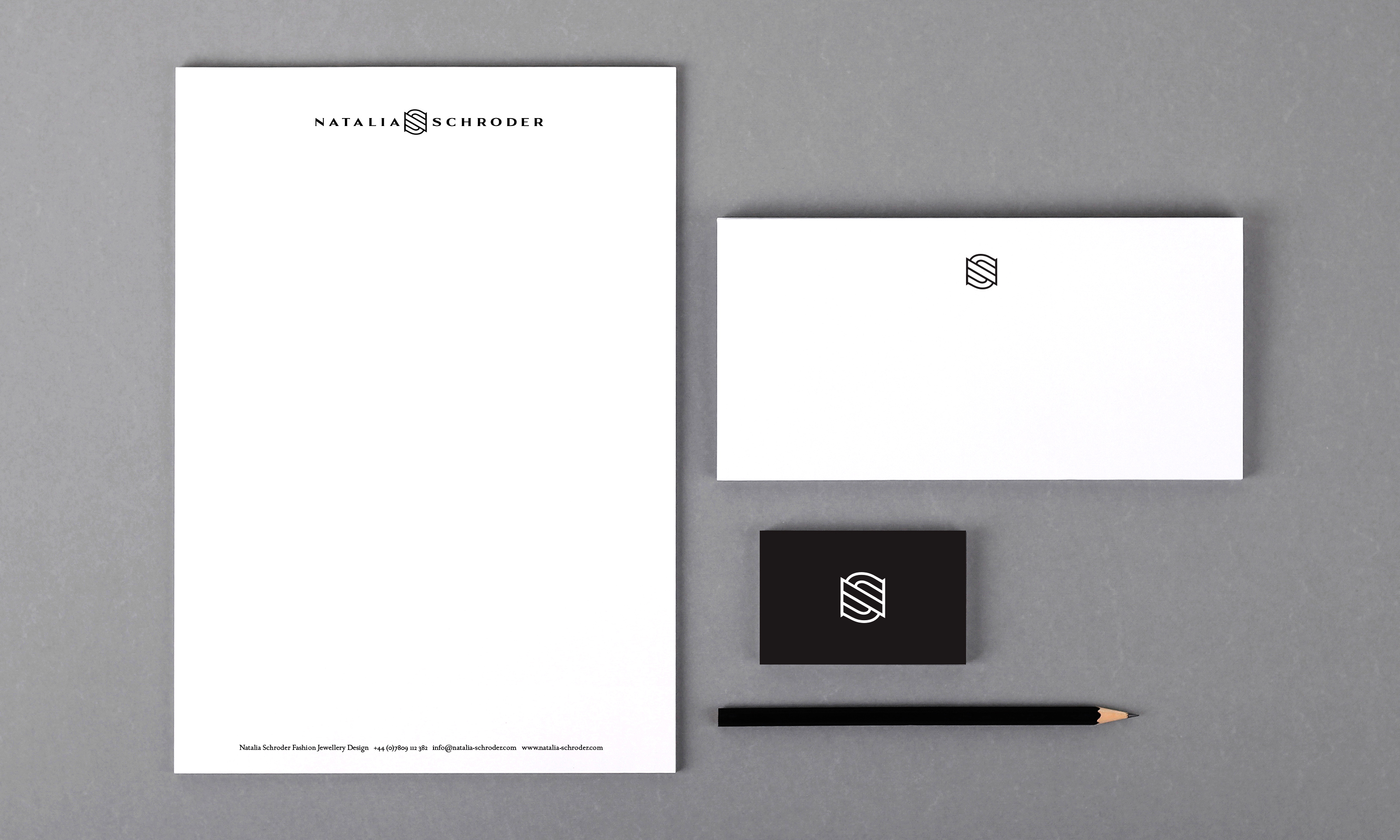
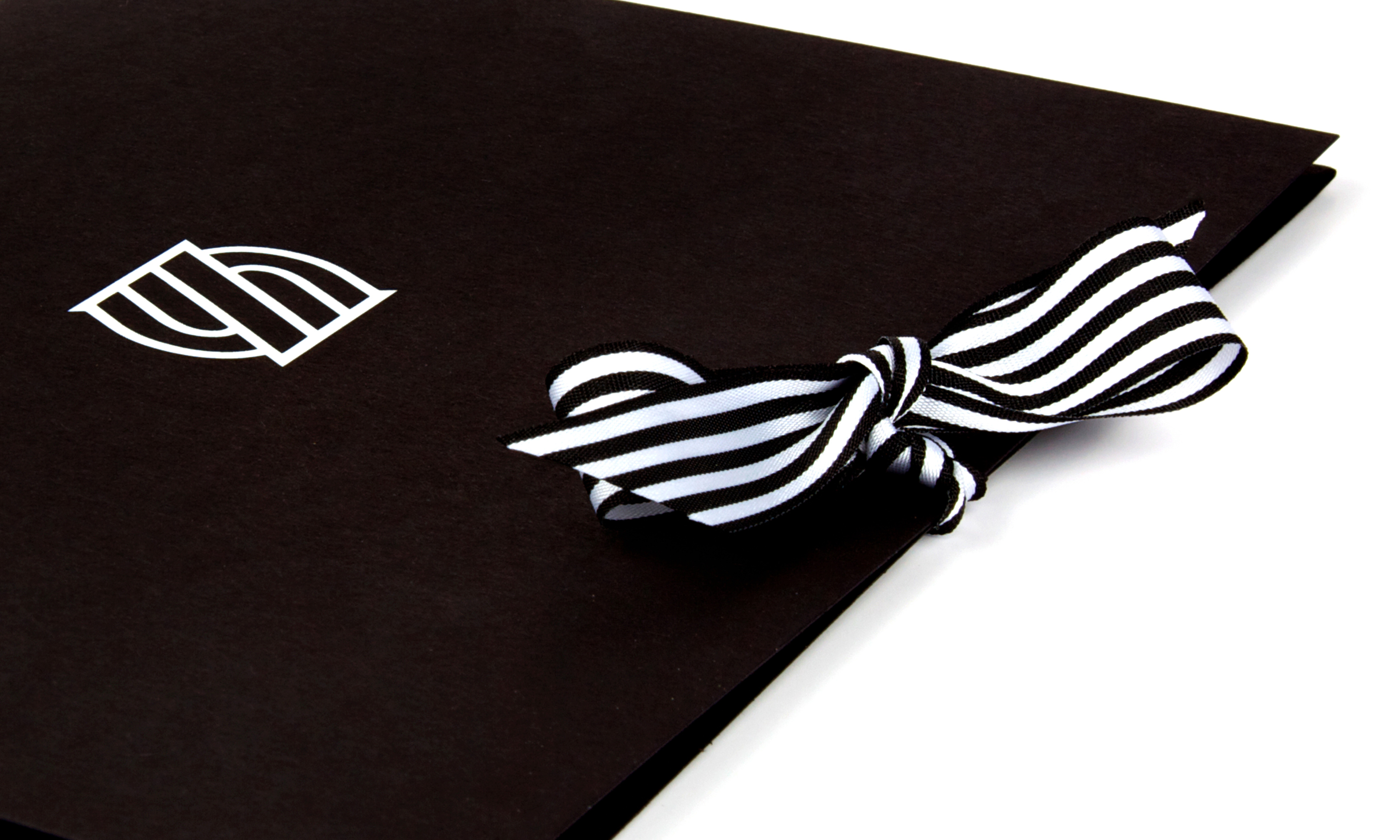
Natalia Schroder stationery.

Natalia Schroder brand mark on stationery. Natalia Schroder is an up and coming jewellery designer, whose work has appeared in Vogue and other heavyweight fashion publications. Natalia approached Neon on recommendation to create her new brand identity that would make a elegant impact in the luxury goods market. We elegantly combined Natalia’s initials into a unique monogram, designed to work at a very small sizes, so that it could be used as her ‘maker’s mark’ alongside the hallmarks stamped into her jewellery. The detailing from the monogram carried through onto the refined but strong logotype typography. The colour palette, we used a simple yet sophisticated black and white, with a graphic stripe detail, taken from the feel of the monogram, to be used in packaging, ribbons, tissue wraps and end-paper detailing. Idea, art direction and design by Neon Design & Branding Consultancy www.neon-creative.com

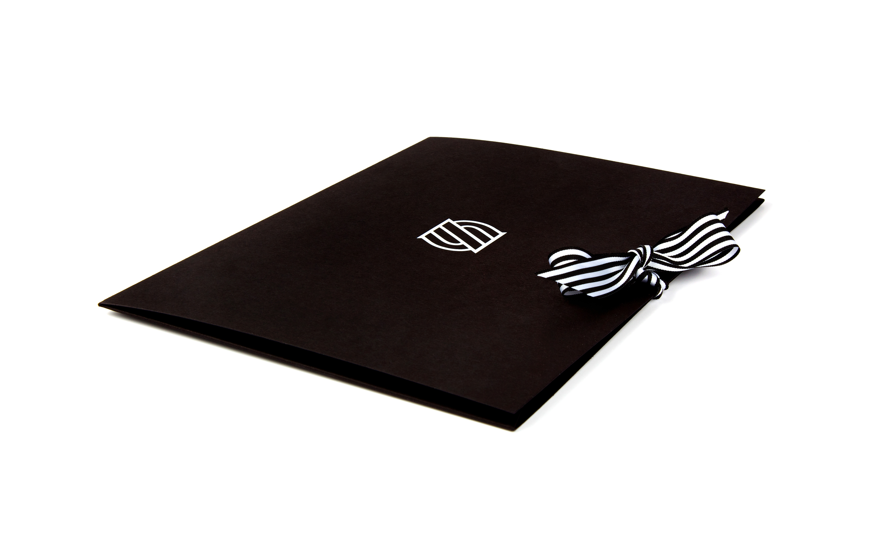
Natalia Schroder press pack, inserts and jewellery box.

By Dana Robertson Creative Director and Founder of Neon. Natalia Schroder press pack l. Natalia Schroder is an up and coming jewellery designer, whose work has appeared in Vogue and other heavyweight fashion publications. Natalia approached Neon on recommendation to create her new brand identity that would make a elegant impact in the luxury goods market. We elegantly combined Natalia’s initials into a unique monogram, designed to work at a very small sizes, so that it could be used as her ‘maker’s mark’ alongside the hallmarks stamped into her jewellery. The detailing from the monogram carried through onto the refined but strong logotype typography. The colour palette, we used a simple yet sophisticated black and white, with a graphic stripe detail, taken from the feel of the monogram, to be used in packaging, ribbons, tissue wraps and end-paper detailing. Idea, art direction and design by Neon Design & Branding Consultancy www.neon-creative.com
By Dana Robertson Creative Director and Founder of Neon. Natalia Schroder press pack ribbon detail. Natalia Schroder is an up and coming jewellery designer, whose work has appeared in Vogue and other heavyweight fashion publications. Natalia approached Neon on recommendation to create her new brand identity that would make a elegant impact in the luxury goods market. We elegantly combined Natalia’s initials into a unique monogram, designed to work at a very small sizes, so that it could be used as her ‘maker’s mark’ alongside the hallmarks stamped into her jewellery. The detailing from the monogram carried through onto the refined but strong logotype typography. The colour palette, we used a simple yet sophisticated black and white, with a graphic stripe detail, taken from the feel of the monogram, to be used in packaging, ribbons, tissue wraps and end-paper detailing. Idea, art direction and design by Neon Design & Branding Consultancy www.neon-creative.com
By Dana Robertson Creative Director and Founder of Neon. Natalia Schroder press pack and jewellery box. Natalia Schroder is an up and coming jewellery designer, whose work has appeared in Vogue and other heavyweight fashion publications. Natalia approached Neon on recommendation to create her new brand identity that would make a elegant impact in the luxury goods market. We elegantly combined Natalia’s initials into a unique monogram, designed to work at a very small sizes, so that it could be used as her ‘maker’s mark’ alongside the hallmarks stamped into her jewellery. The detailing from the monogram carried through onto the refined but strong logotype typography. The colour palette, we used a simple yet sophisticated black and white, with a graphic stripe detail, taken from the feel of the monogram, to be used in packaging, ribbons, tissue wraps and end-paper detailing. Idea, art direction and design by Neon Design & Branding Consultancy www.neon-creative.com

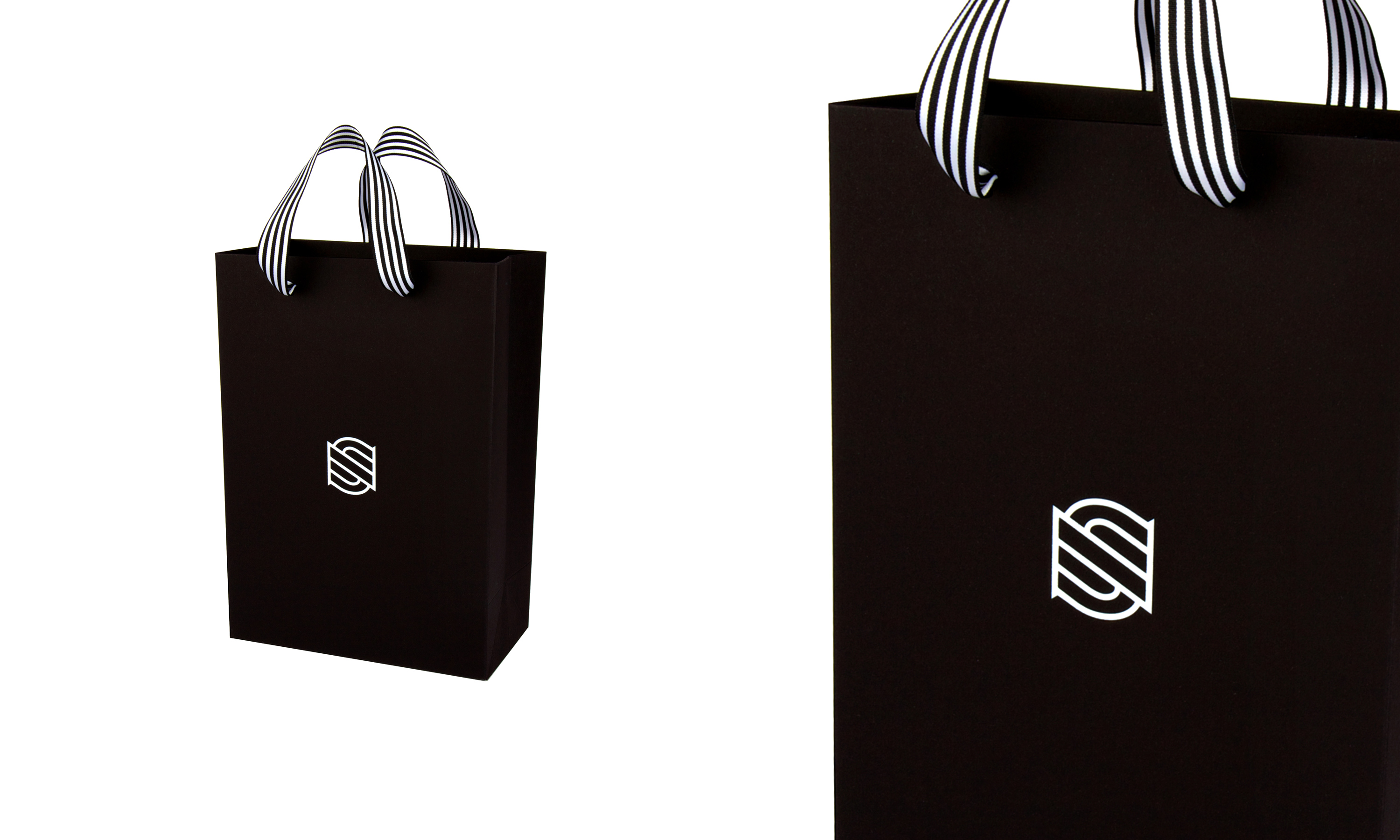
Natalia Schroder gift bags.

By Dana Robertson Creative Director and Founder of Neon. Natalia Schroder bags. Natalia Schroder is an up and coming jewellery designer, whose work has appeared in Vogue and other heavyweight fashion publications. Natalia approached Neon on recommendation to create her new brand identity that would make a elegant impact in the luxury goods market. We elegantly combined Natalia’s initials into a unique monogram, designed to work at a very small sizes, so that it could be used as her ‘maker’s mark’ alongside the hallmarks stamped into her jewellery. The detailing from the monogram carried through onto the refined but strong logotype typography. The colour palette, we used a simple yet sophisticated black and white, with a graphic stripe detail, taken from the feel of the monogram, to be used in packaging, ribbons, tissue wraps and end-paper detailing. Idea, art direction and design by Neon Design & Branding Consultancy www.neon-creative.com

Other projects you may find of interest...