The Goldsmiths' Company
Brand positioning & identity
A Touchstone for the industry.
Neon redefined the brand positioning and identity for The Goldsmiths’ Company, one of London’s historic Great Livery Companies.
Tasked with clarifying their 360° influence across craft, education, and industry, Neon developed the brand idea “Touchstone” — symbolising the Company’s role as a benchmark for excellence and education. The refreshed Coat of Arms and typographic system restored craft, clarity, and balance while uniting the organisation’s diverse directorates under one coherent identity.
The result: a heritage-rich yet modern brand built to inspire and endure — a true touchstone for the goldsmithing industry.
For the full long read case study, click here…
One of very few of the 12 Great Livery Companies that are still active in the field for which they were founded, The Goldsmiths’ Company original raison d’être was to regulate the craft and trade of the gold and silversmith.
Over the centuries, however, it had evolved into an organisation that did much more than just act as a guardian and facilitator. Today, The Goldsmiths’ Company occupies a unique space with a 360° influence. And while there are other organisations that offer, for example, assaying services, training and technology facilities and promotional support, only The Goldsmiths’ Company can claim to be active across all these areas, and many more.
Neon won a competitive pitch to define The Goldsmiths’ Company brand message, to clearly communicate their offer and help them engage with their multiple audiences. The task also included bringing structure and clarity to their brand architecture — along with reinstating a sense of craft, clarity and elegance to The Goldsmiths’ Company brand identity.
Brand idea.
The Touchstone held by the demi-maiden in the Company’s coat of arms is an essential tool of the trade, used for testing alloys. Based on this original use, Touchstone has come to mean ‘a benchmark by which others are judged’. So there was our brand idea: Touchstone; a single word that encapsulates The Goldsmiths’ Company’s role within their industry, their unique 360° influence (as guardian and facilitator), and their commitment to delivering the highest standards of usefulness and quality across their entire range of activities of keeping the craft alive, developing new skills and technologies, bursaries and support, promotion and education activities.
Brand identity.
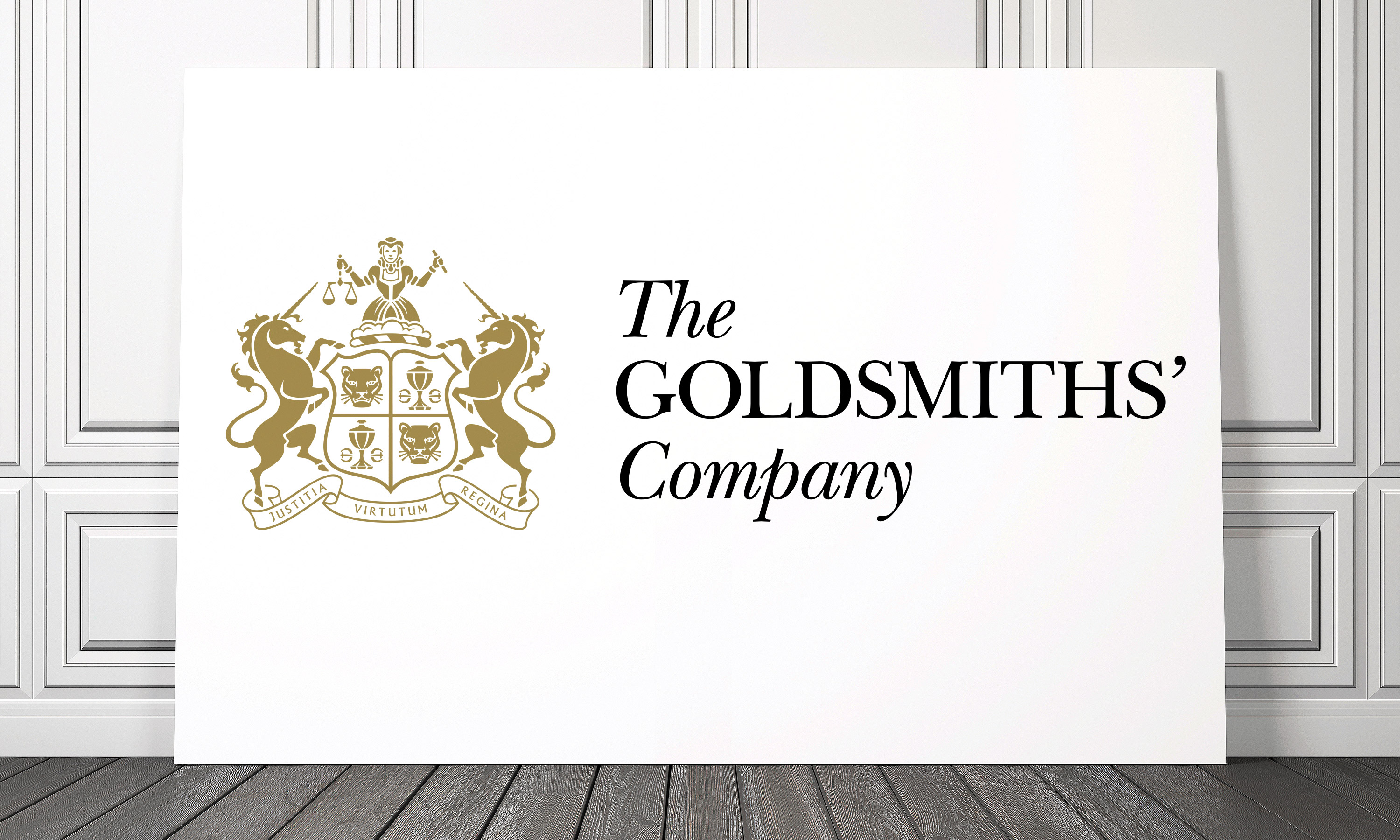
After our initial concepts pushing the possibilities as to what the new brand identity might be including options moving away from the Coat if Arms and including the odd bit of sans serif, The Goldsmiths’ Company’s preferred direction was a brand identity informed by its extraordinary history while also reflecting its present and future role as a champion of quality for the goldsmith’s craft and craftspeople.
We then had to find that delicate balance of refreshing the Coat of Arms in a way true to its heritage, while clearly being seen as a major step forward, and working as a practical future-facing logo/icon.
And when details matter, you have to go all in and geek out on them…
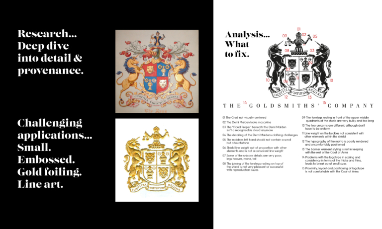
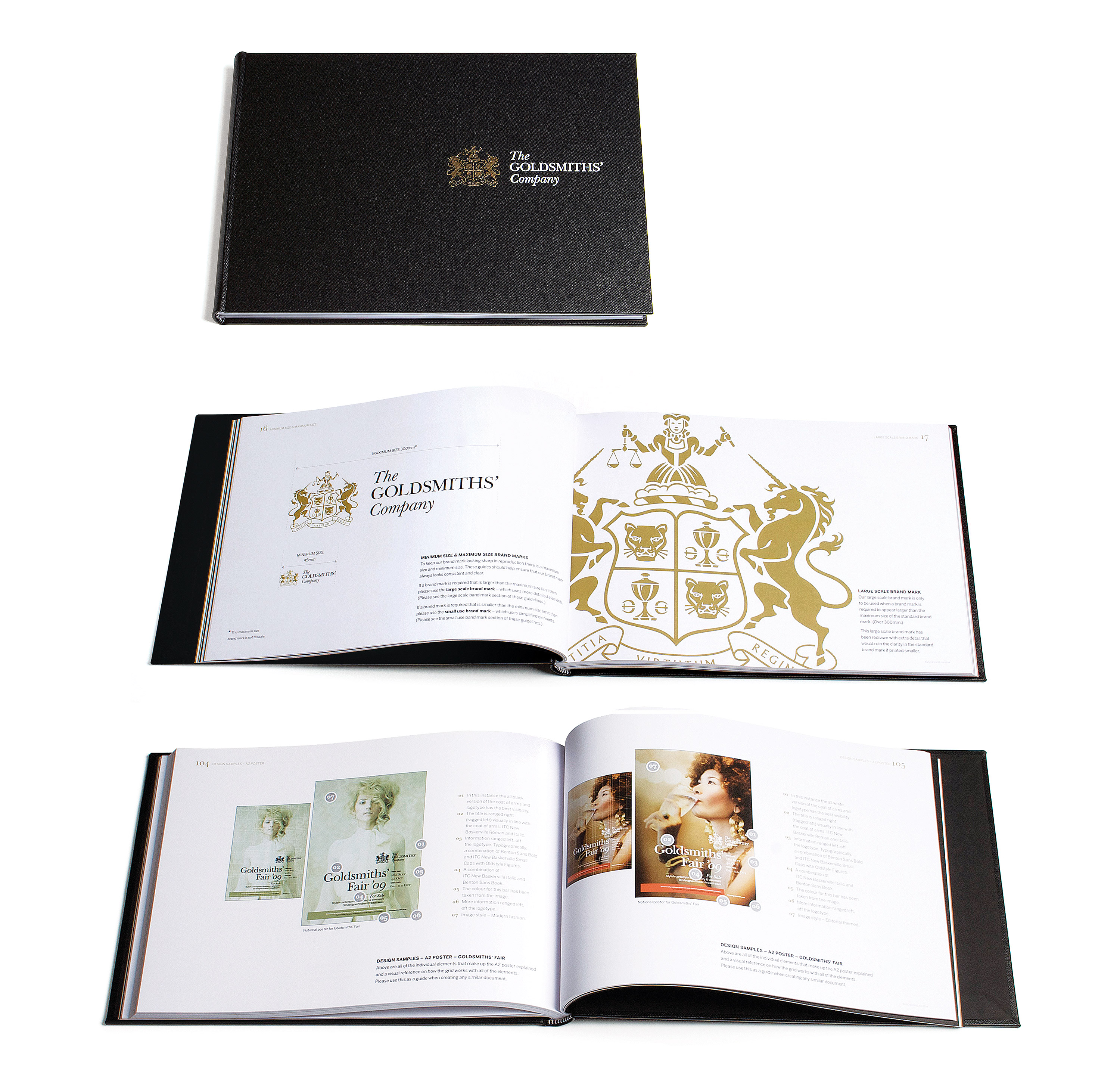
We did our research; and we picked apart the existing brand mark which was in a very sorry state. All the elements of the Coat of Arms lacked craft, and there was no sense of coherence or consistency between them. Some of the elements had become ugly and distorted, over time.
For example, the crest looked male, while supposedly depicting a ‘demi-maiden’. The ‘cloud proper’ below the demi-maiden looked like flames. The ‘scroll’ in the hand of the demi-maiden was meant to be a ‘Touchstone’.
We lovingly crafted a more harmonious unit, changing the configuration of the cup and buckles (which also saved space within the shields fields). And we reshaped the shield to accommodate the legs of the unicorns.
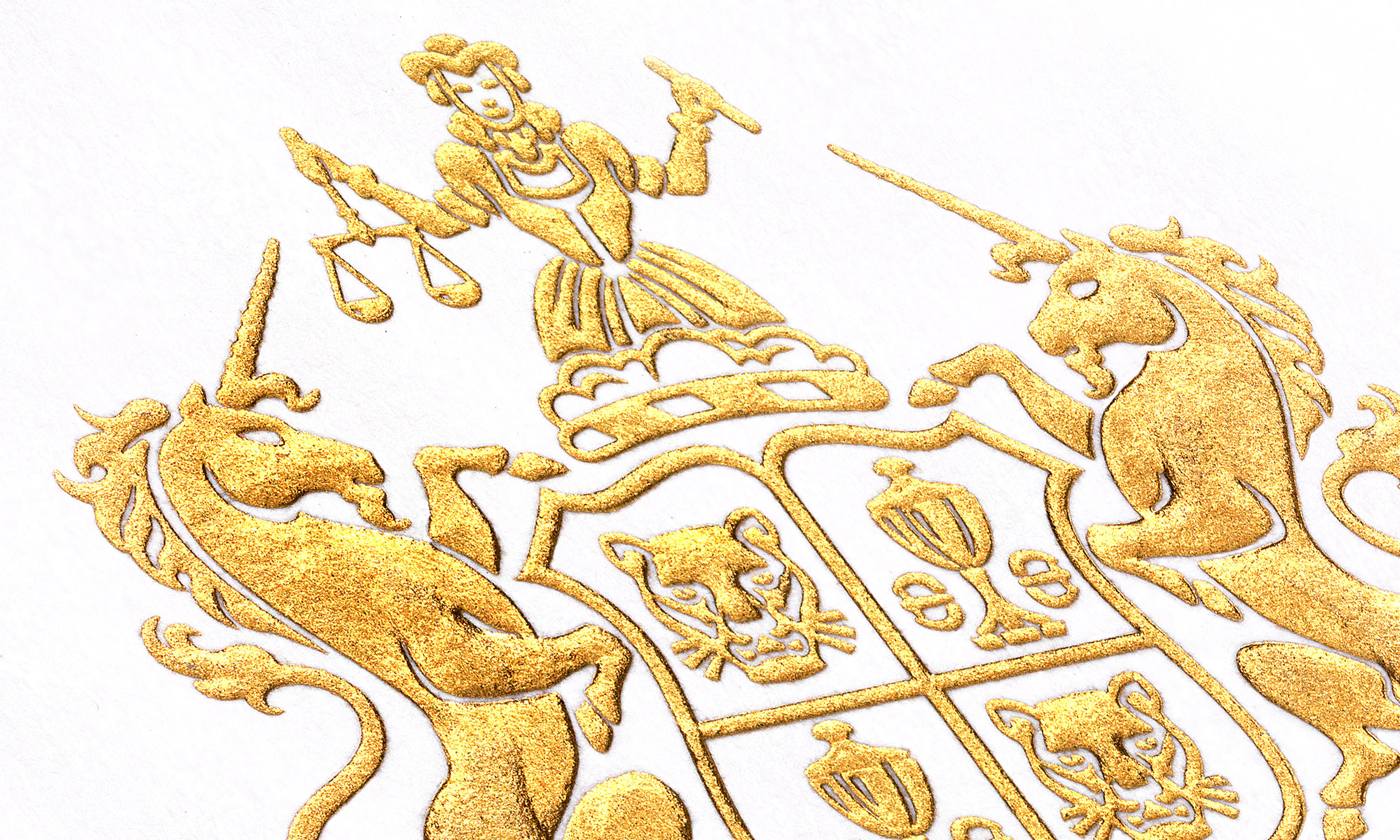
We also created different variants from the standard mark: an even more detailed one for super-sized applications and a simplified one with tweaked line work and spacing, for small use, or for challenging reproduction techniques like foiling.
We then set about redesigning a more elegant logotype, with a more size-practical stacked unit.
The result, we hope you agree, was a harmonious whole, with real craft and gravitas – and powerful enough to work as an icon. All within the same space footprint of the existing Coat of Arms.
If you would like to find out more about Neon or have up and coming project you’d like a chat about then for sure DM us.
(Read Less...)
Kind words…
“Heavyweight creative thinking, with a lightness of touch. Read More…
PAUL DYSON “Neon were brought on board at the Goldsmiths’ Company to refresh and consolidate the company’s reputation and message through its visual identity, which had never been reviewed before. Branding as a concept, was completely new to us, and Neon were brilliant at taking us through every step of the process, as well as managing stakeholder views and expectations. The way in which Neon work is great, everything is founded on logic, which makes their processes really easy to understand, this is combined with creative thinking both graphically and how they use words and text. They were subsequently commissioned to work on our £18M project Goldsmiths’ Centre because of the work they had completed with the company, and were extremely easy and flexible to work with, they became part of the team. I would have no hesitation in recommending Dana and his team.” REBECCA VAN ROOIJEN
Director Promotions
The Goldsmiths’ Company
Project Manager
The Goldsmiths’ Company
(Read Less...)
To find out more: [email protected] or call +44 (0)203 857 7656 Share this: Email, LinkedIn, Facebook, Download a PDF of this case study, follow us on Instagram or view our animations and movies on Vimeo
TRADE BODY/CHARITY
Branding
GRAPHIS INTERNATIONAL
Poster Annual 2016
Awarded ‘In book’
PROJECT SUMMARY
Art direction
Brand positioning
Brand architecture
Brand identity
Brand guidelines
Literature scheme
Promotional posters
Trade advertising
Website
Exhibitions
Stationery
Digital templates
The Goldsmiths' Company a Touchstone for the industry brand identity.

The Goldsmiths' Company brand mark.
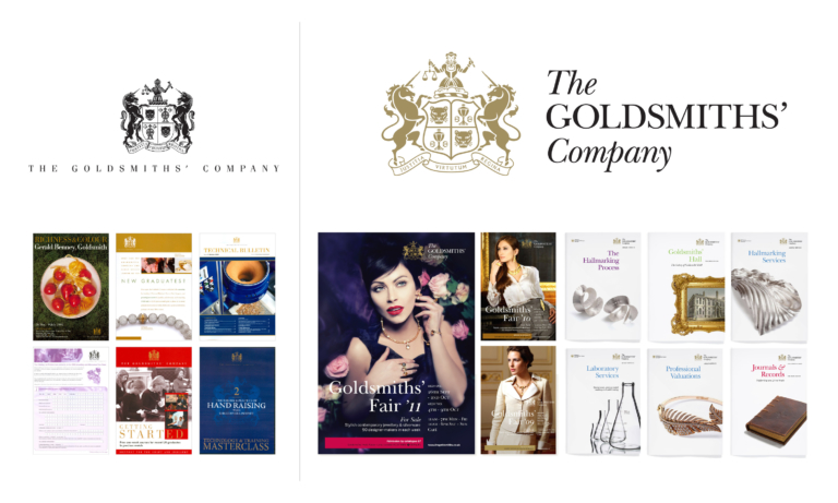
The Goldsmiths' Company brand mark old vs new comparison.

The Goldsmiths' Company brand mark developing the details.


The Goldsmiths' Company brand mark detail – gold foil blocking with pillow emboss on stationery.
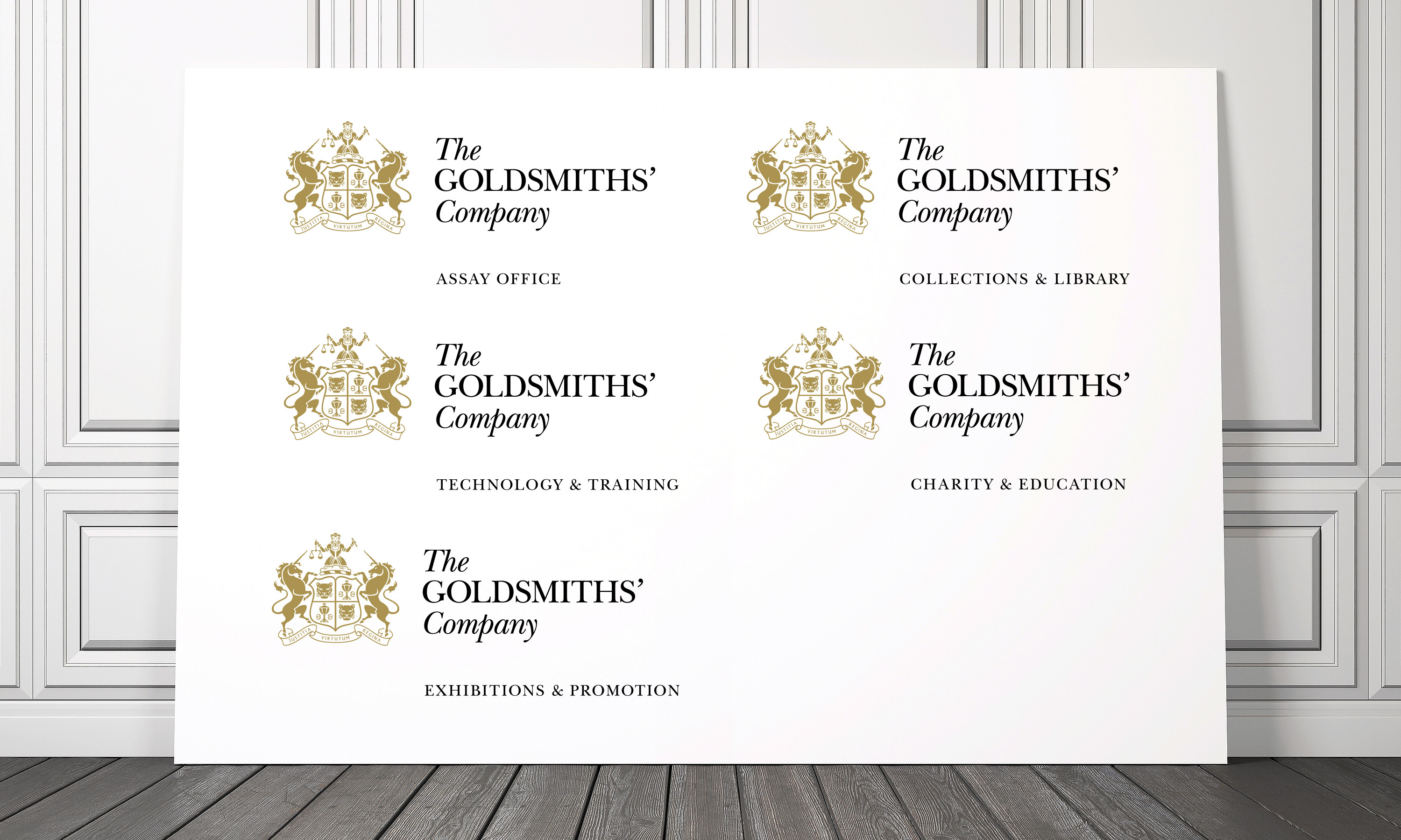
The Goldsmiths' Company redrawn Coat of Arms and departmental descriptors.
The Goldsmiths' Company redrawn Coat of Arms and departmental descriptors.
The Goldsmiths' Company visual system old vs new comparison.
The Goldsmiths' Company exhibitions and events poster style.
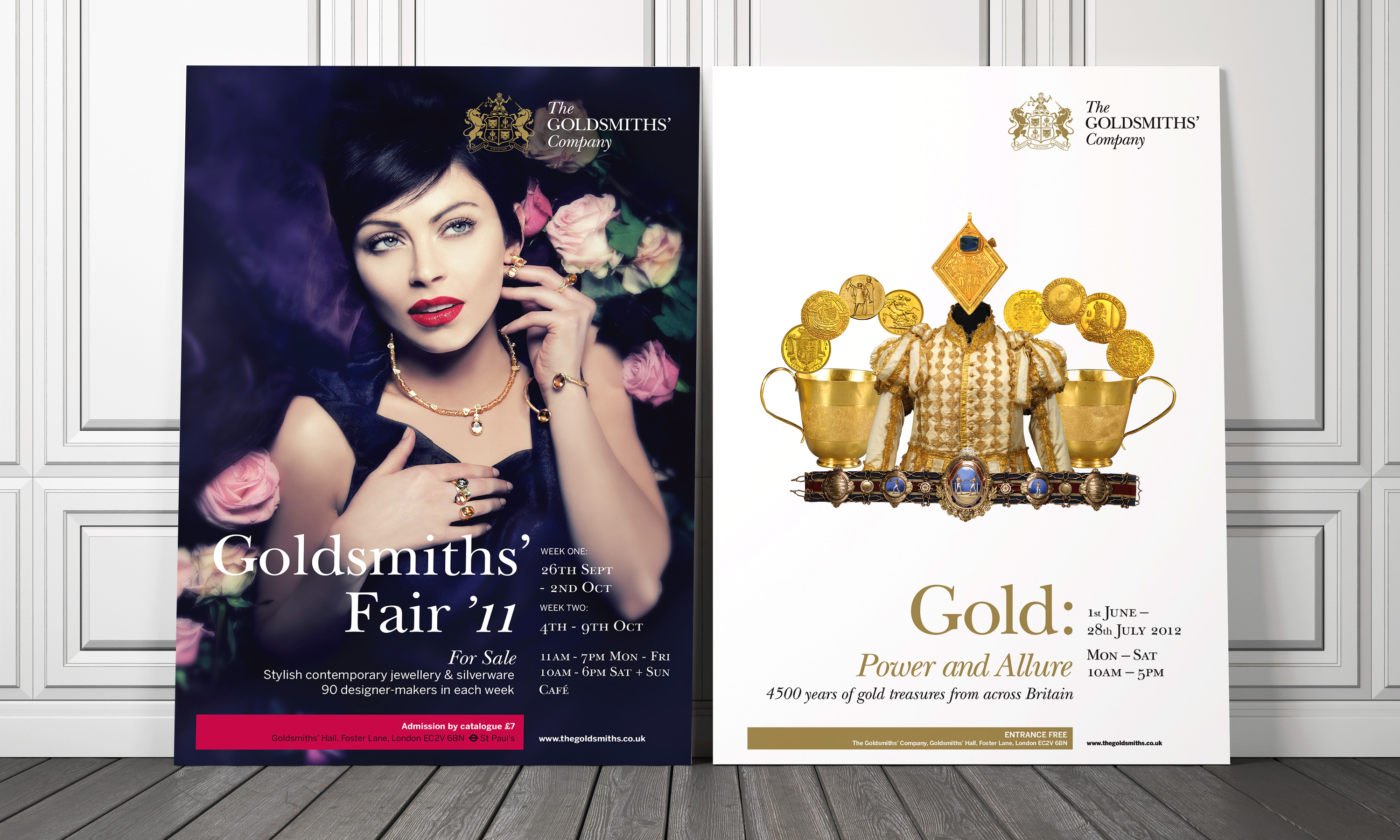
The Goldsmiths' Company – Goldsmiths' Fair Posters.

The Goldsmiths' Company exhibition posters.

The Goldsmiths' Company literature system.
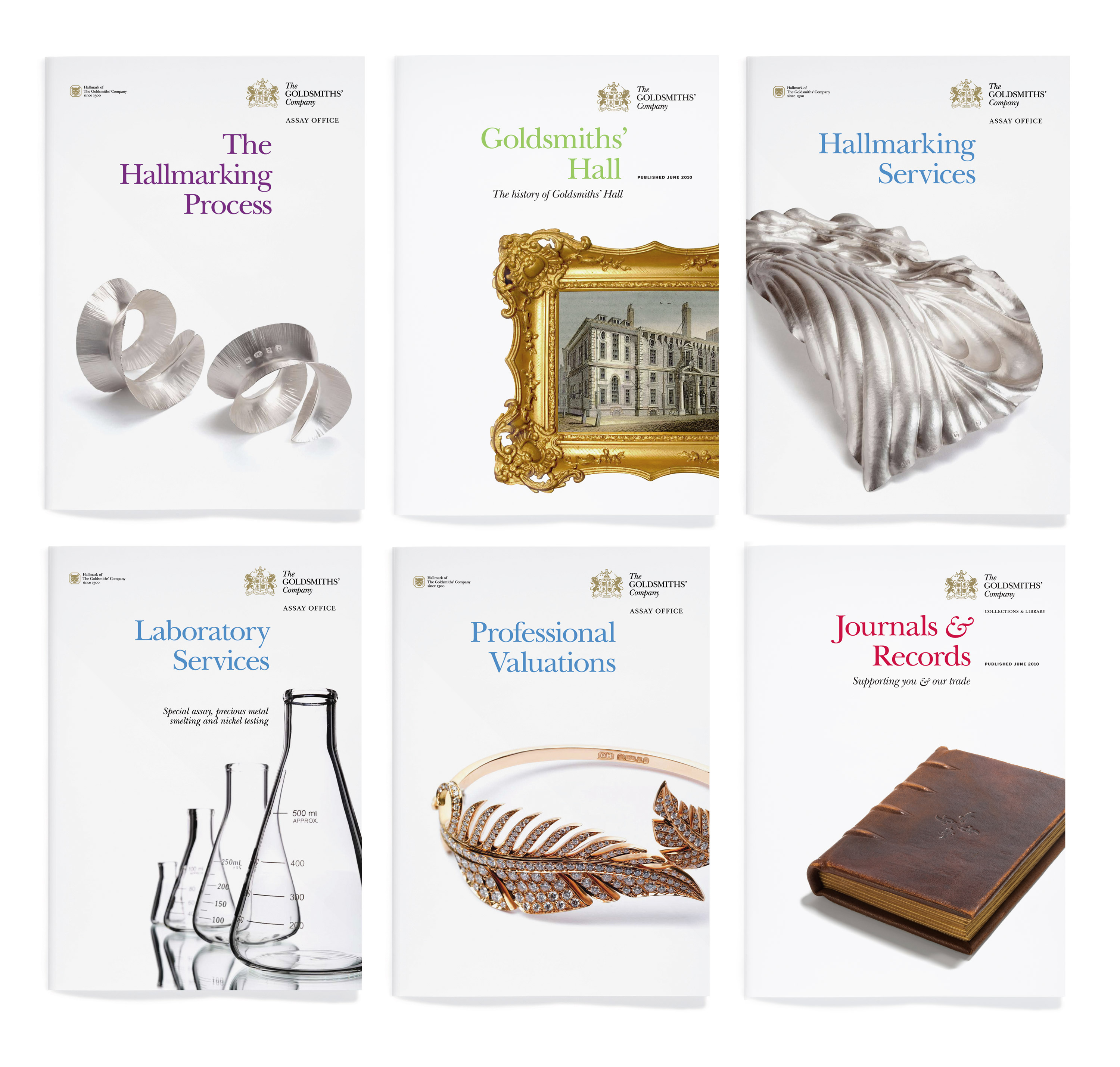
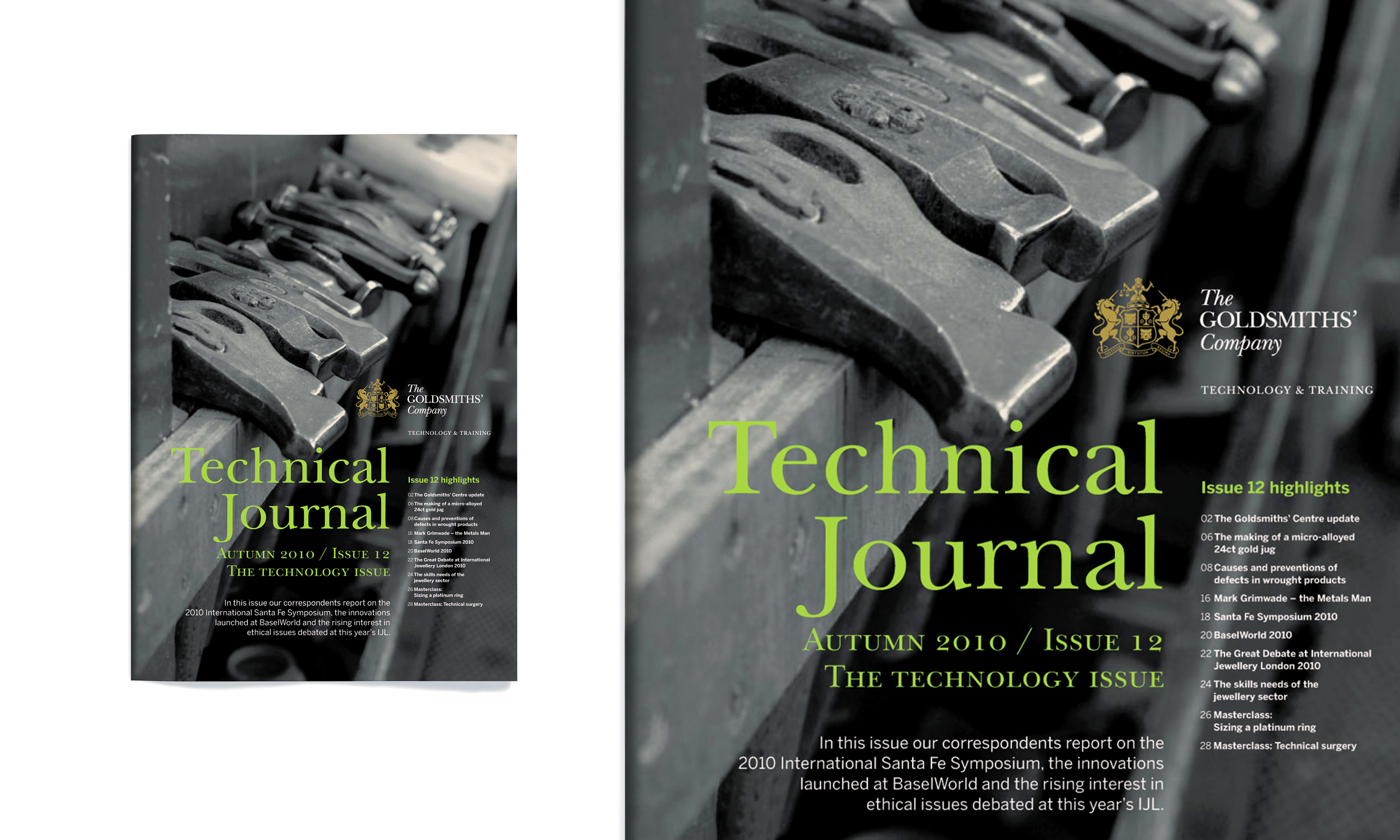
The Goldsmiths' Company technical literature.
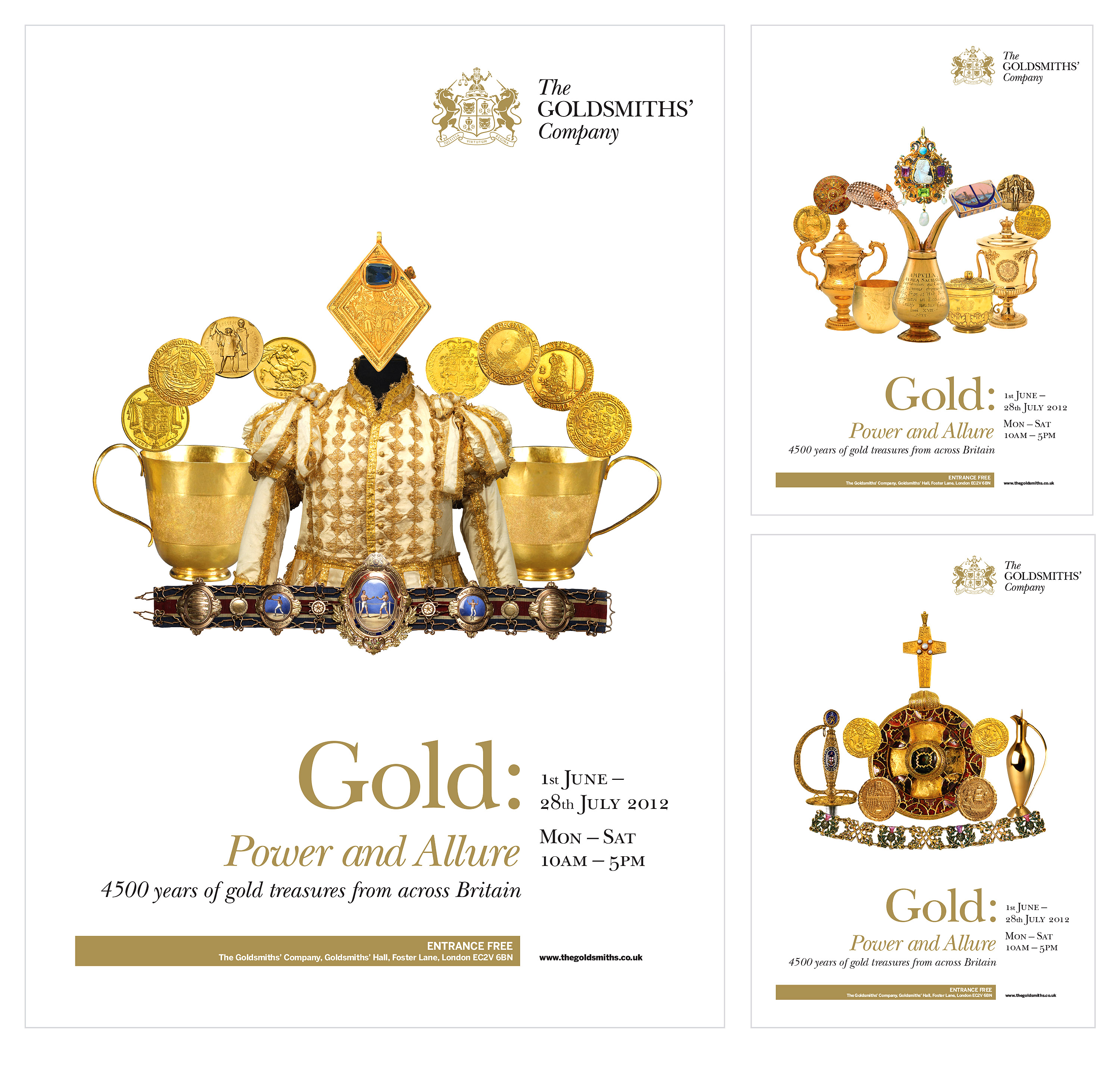
The Goldsmiths' Company Gold: Power & Allure exhibition digital animated tube posters.
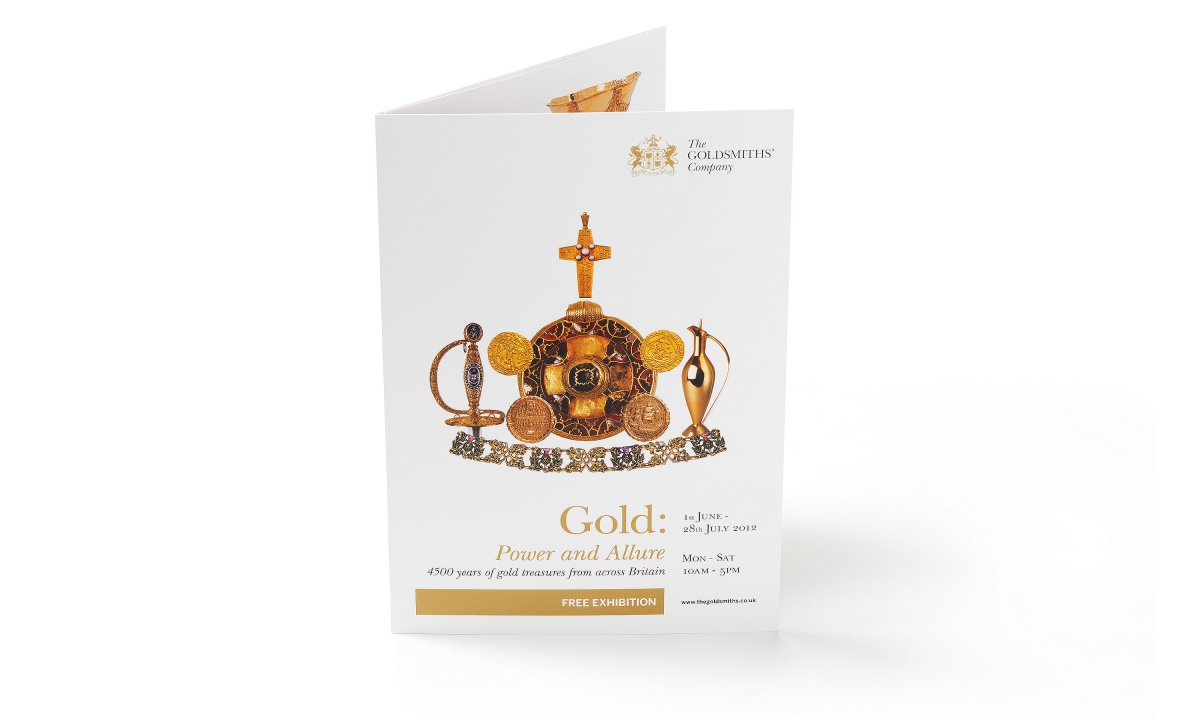
The Goldsmiths' Company Gold: Power & Allure exhibition posters.
The Goldsmiths' Company exhibition literature.
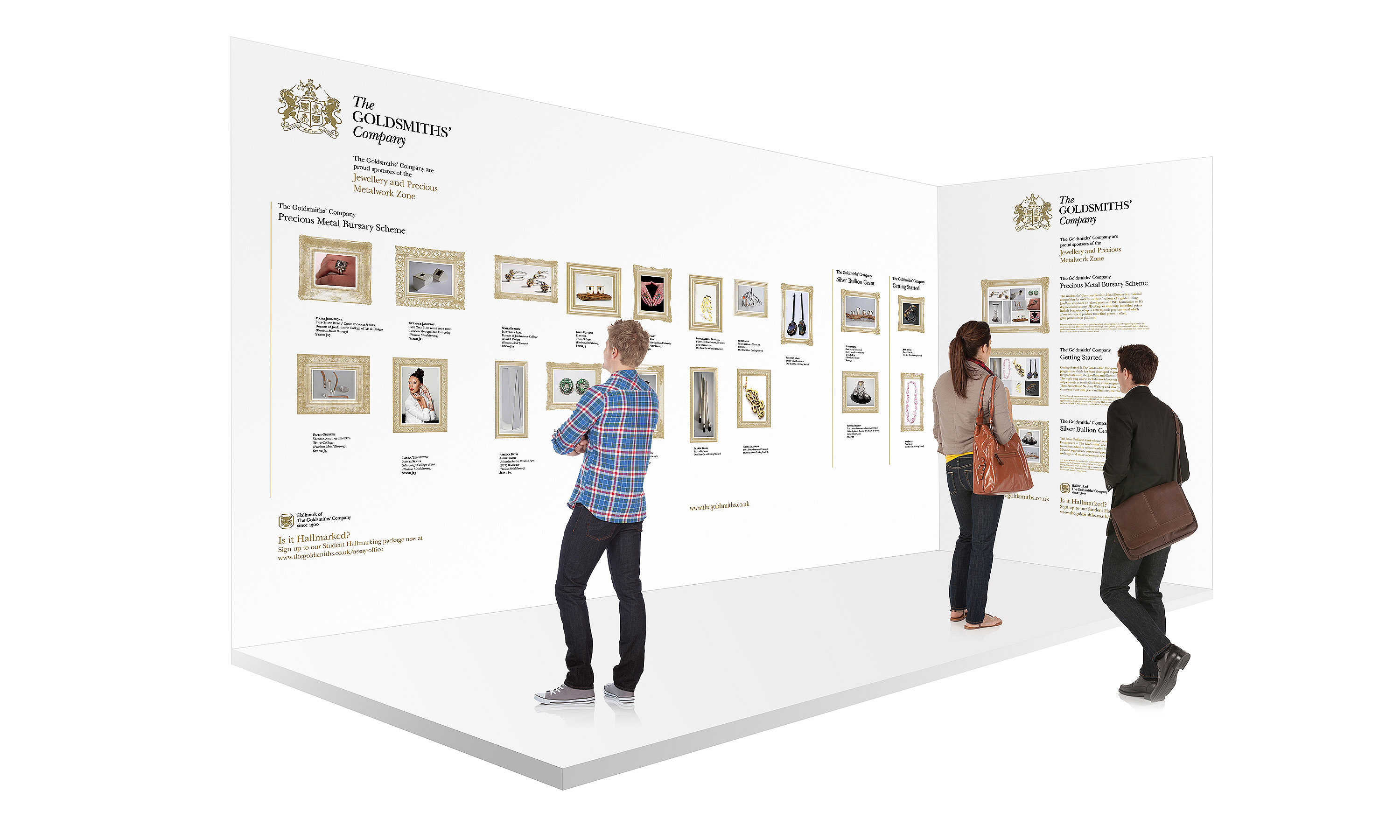
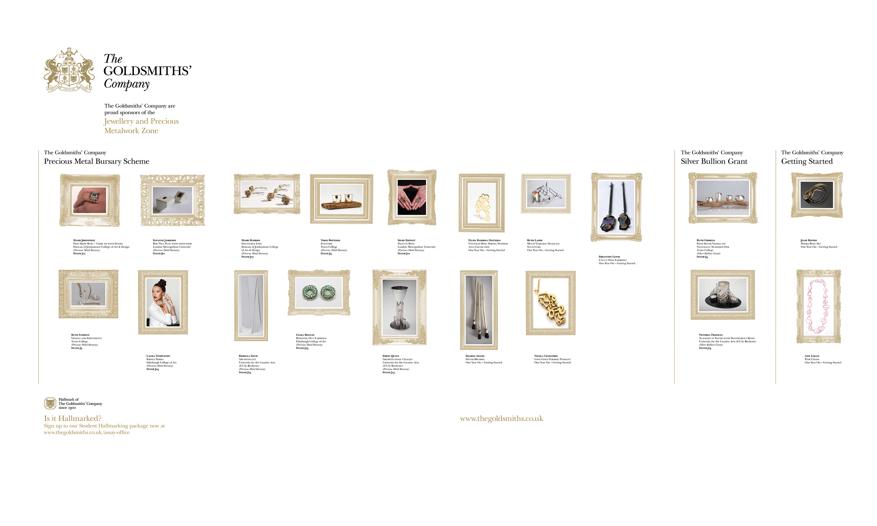
The Goldsmiths' Company 'New Designers' exhibition stand.
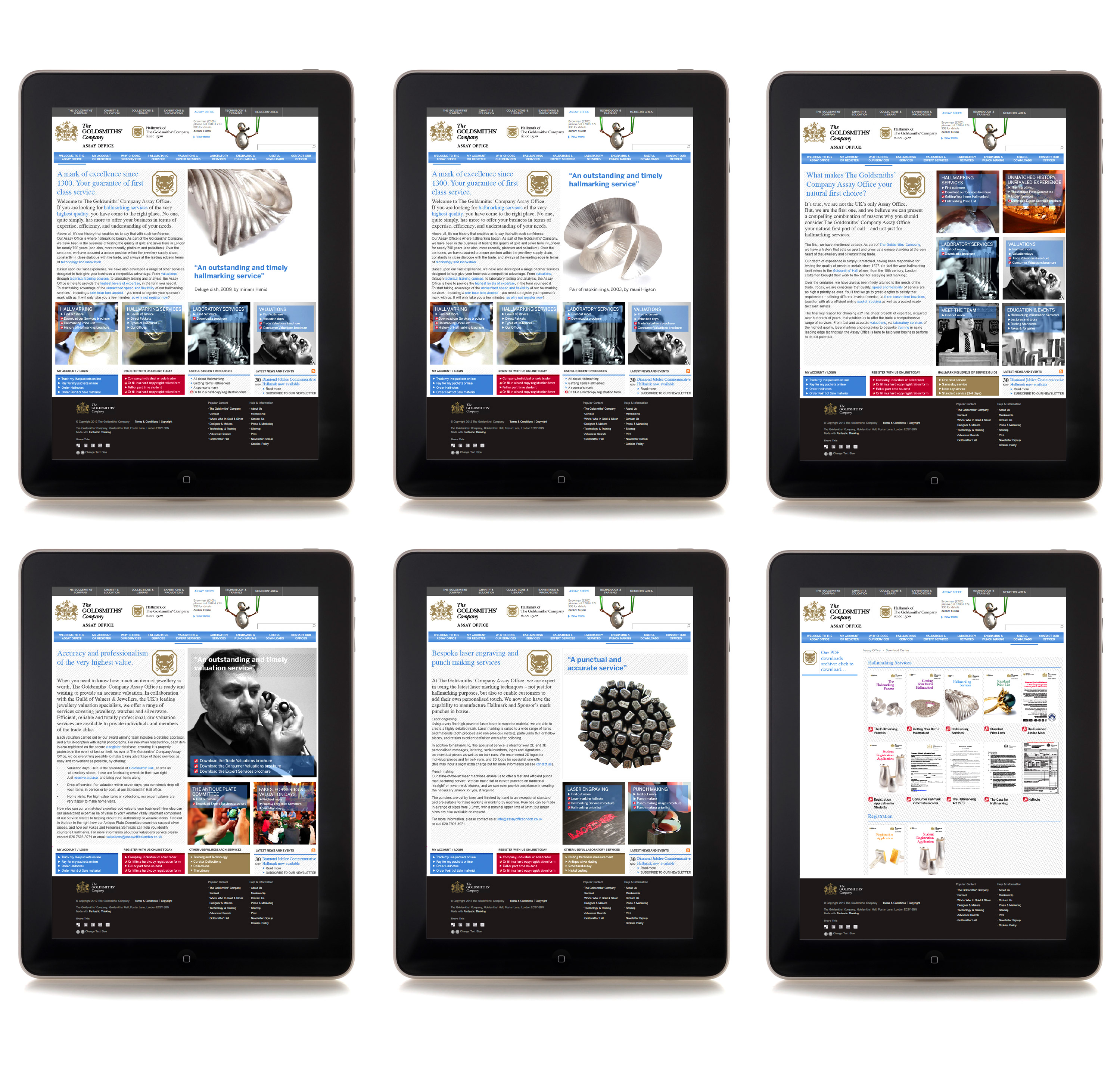
The Goldsmiths' Company website.

The Goldsmiths' Company brand positioning and identity guidelines.
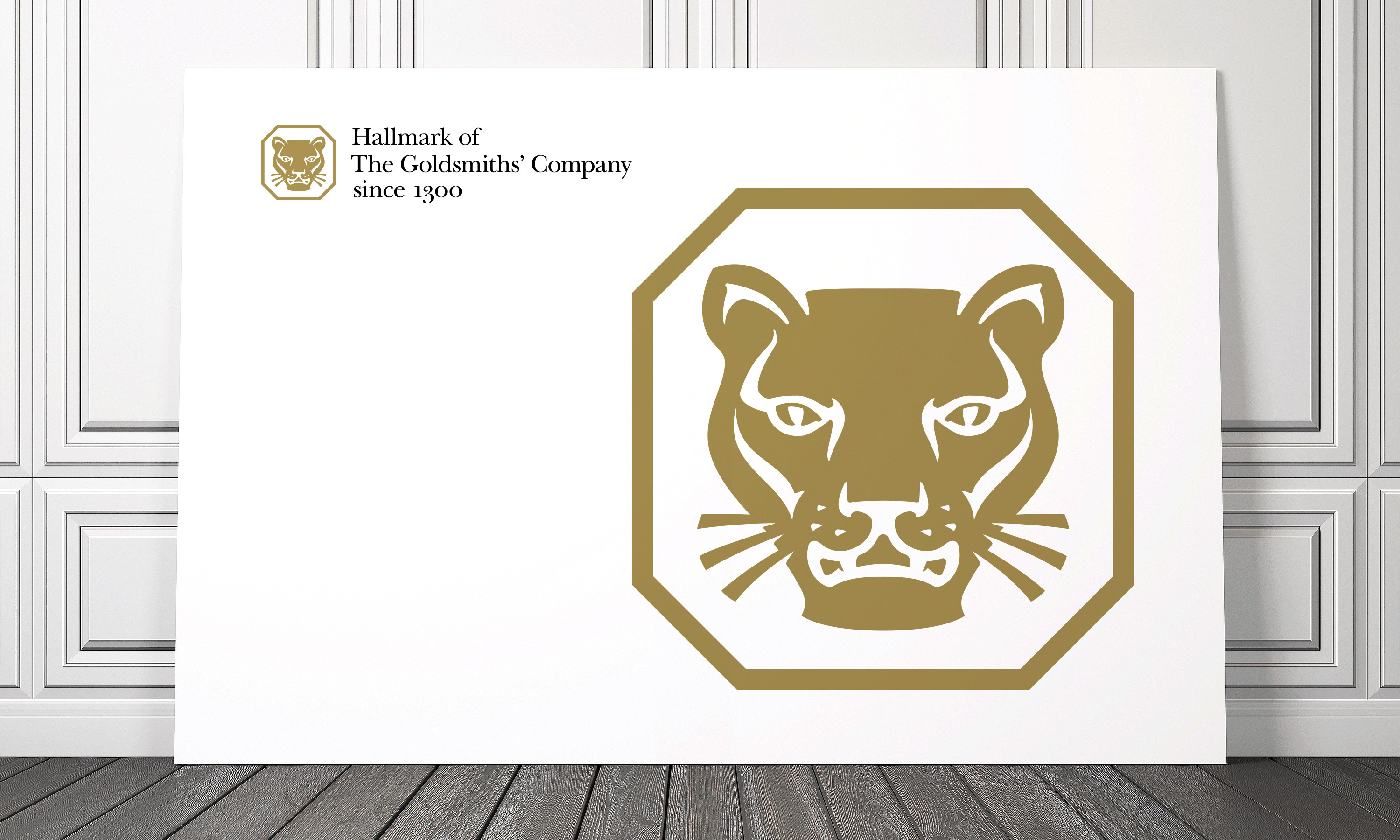
The Goldsmiths' Company Assay Office new Hallmark.
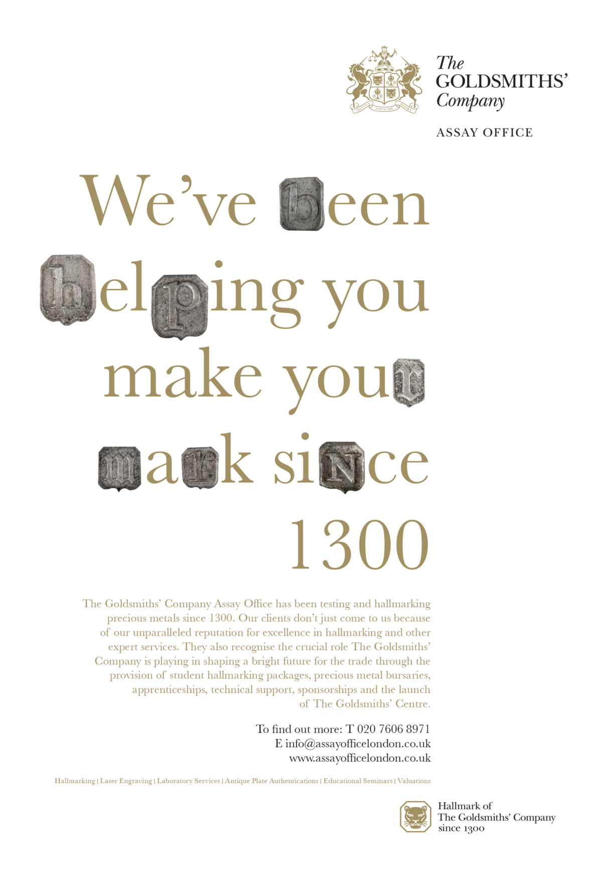
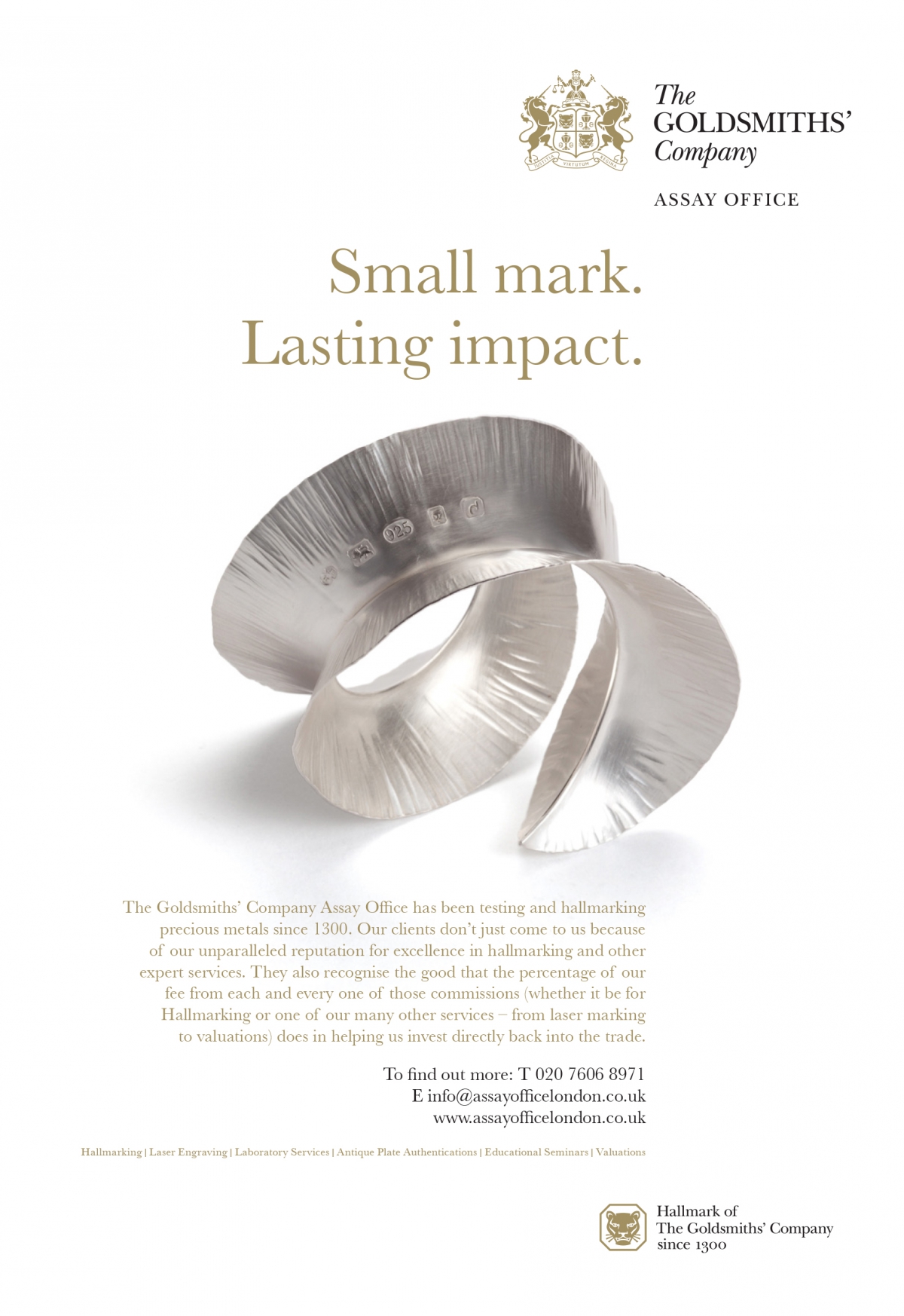
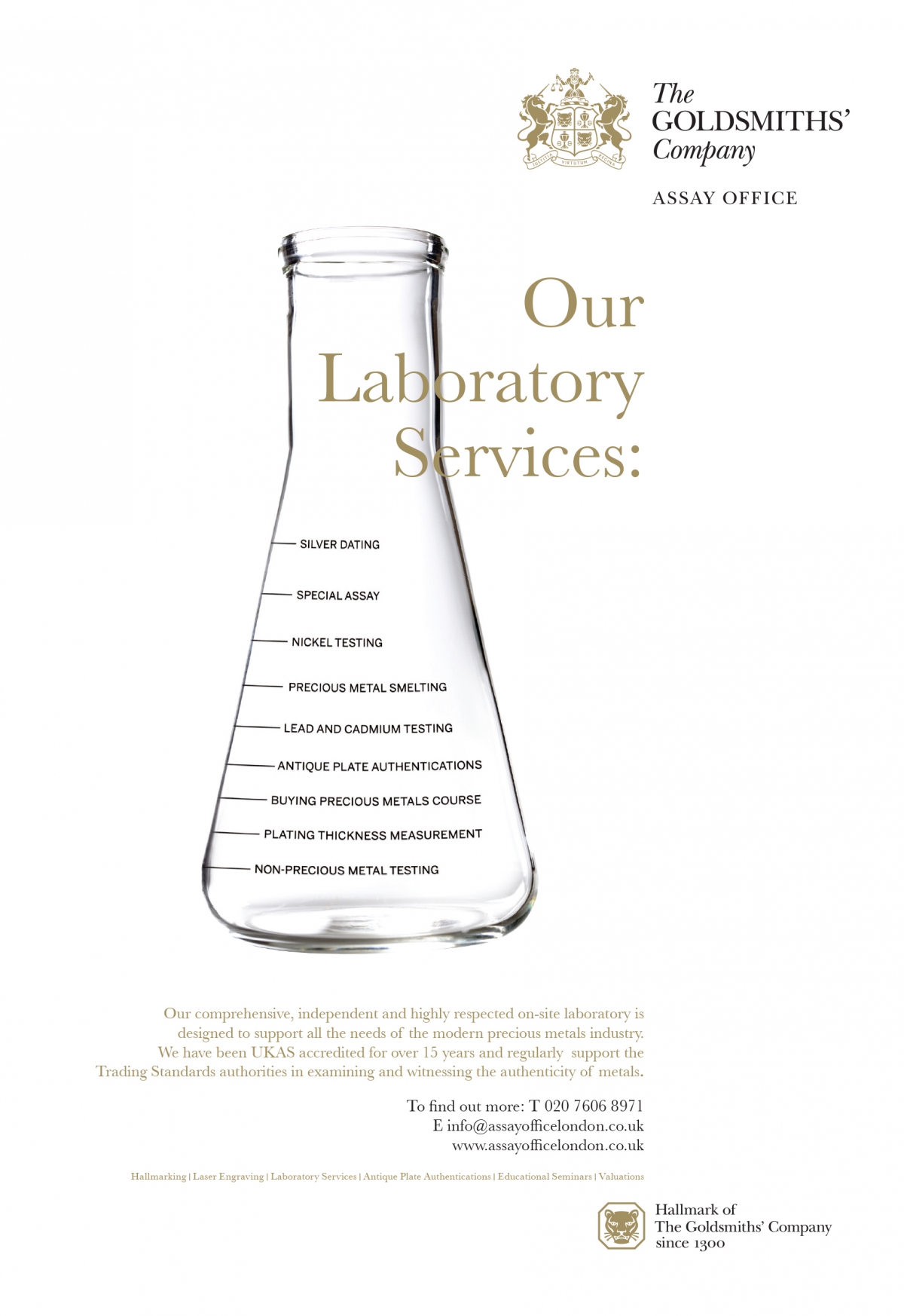
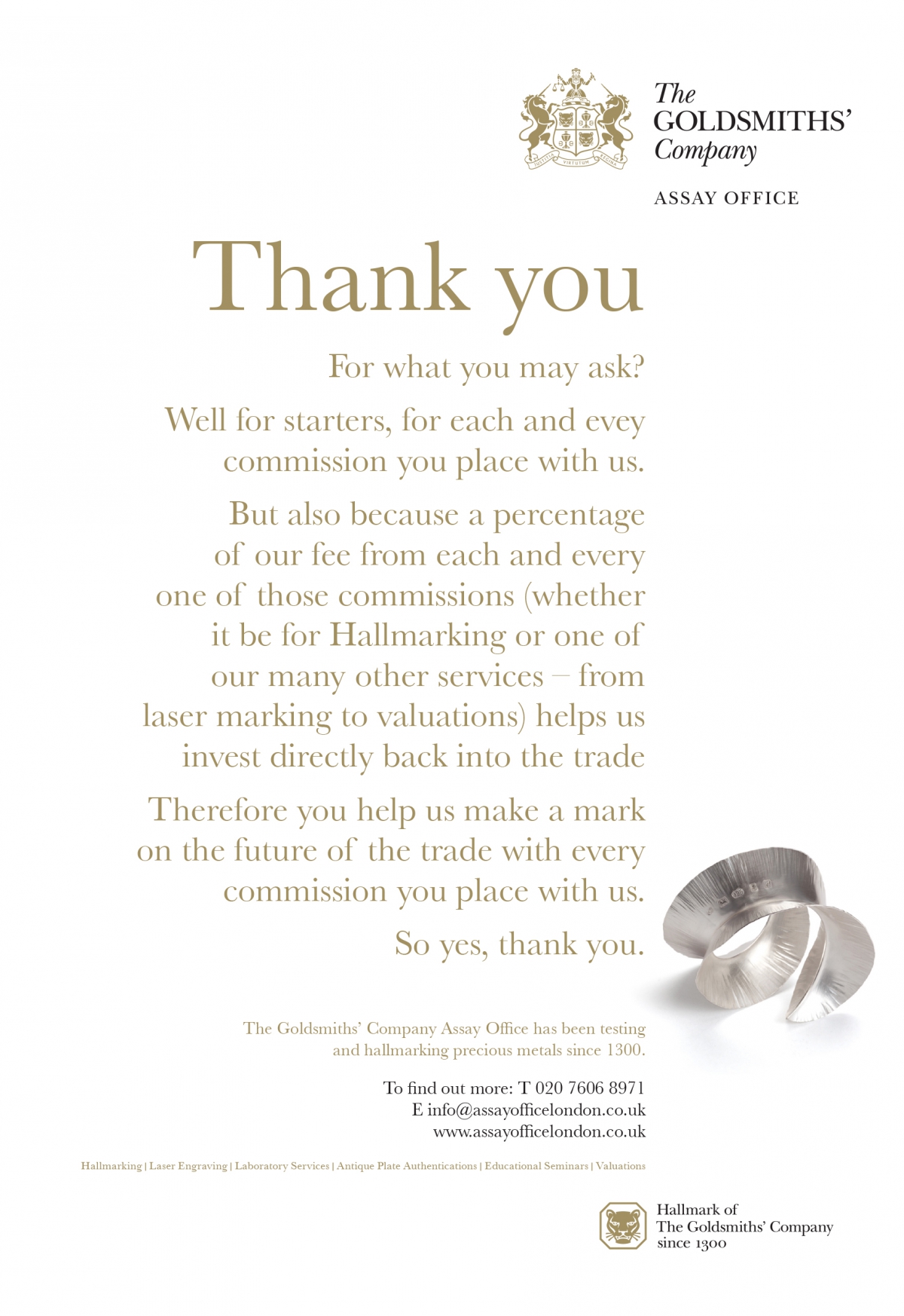
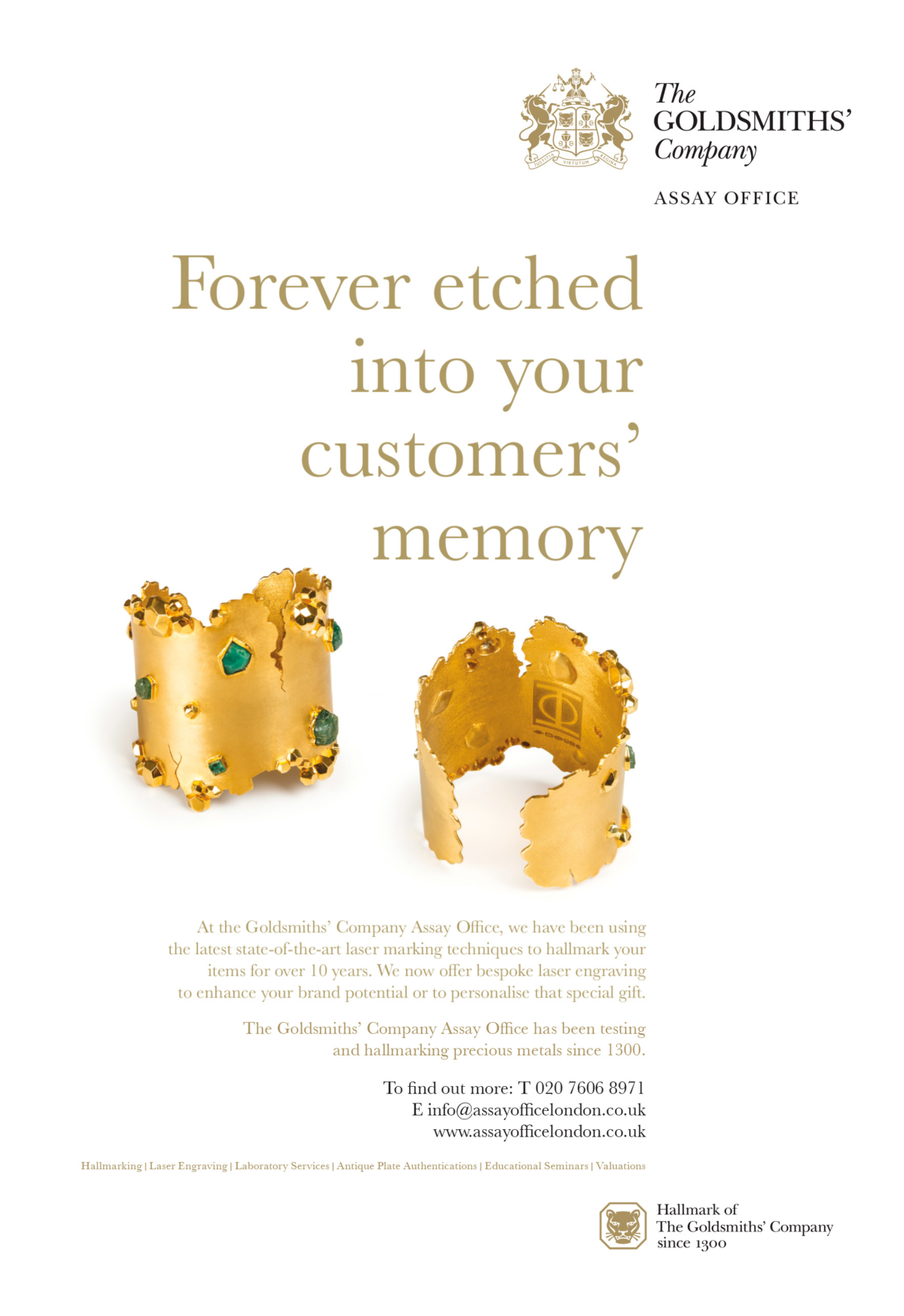
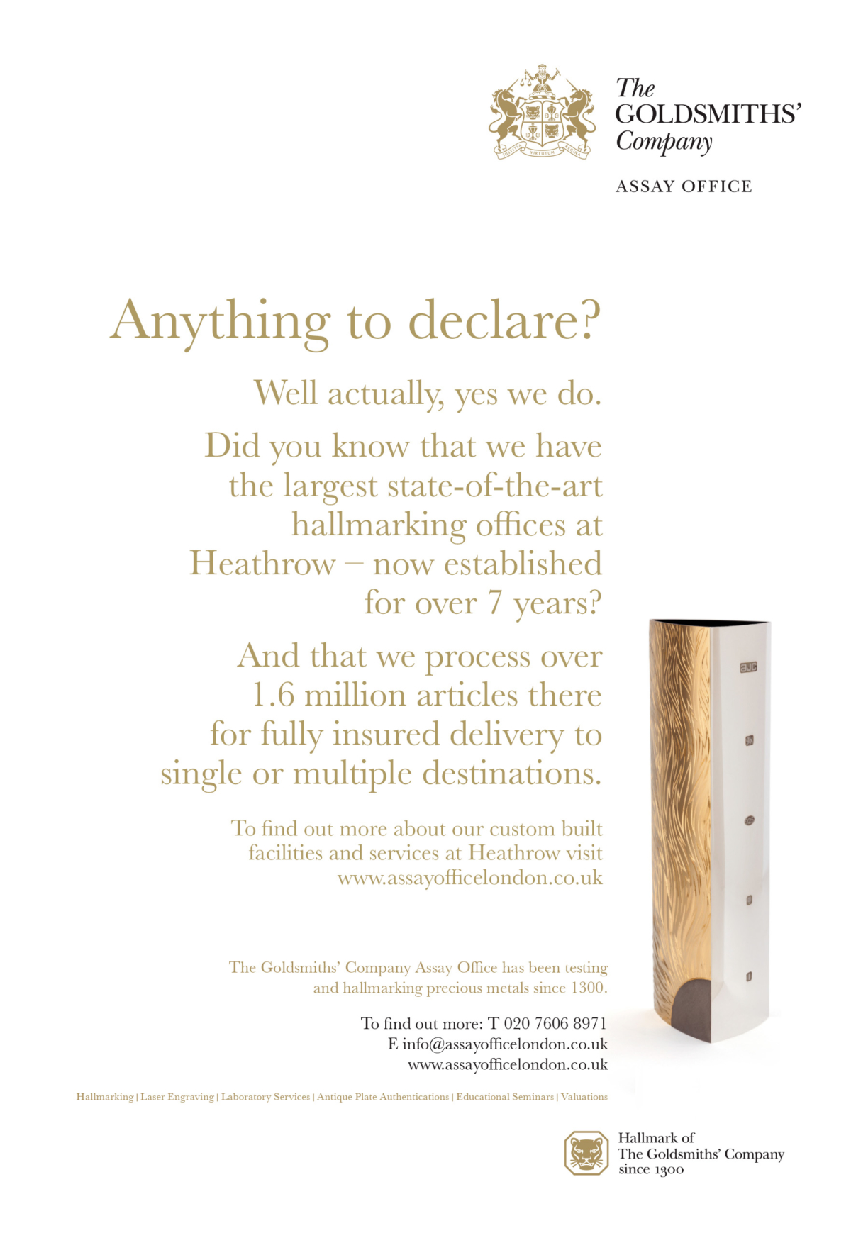
The Goldsmiths' Company Assay Office advertising and posters.
The Goldsmiths' Company Assay Office website.