Corney & Barrow
Brand identity

Premium & exclusive.

We were asked by Corney & Barrow to review and refresh their brand identity, to help position them as the leading independent wine merchants and supplier of fine wines from around the world.

The firm had a long and distinguished heritage in the trade and wanted to retain that equity while presenting themselves as a more forward-facing organisation. The new mark would also need to incorporate the two Royal Warrants, as well as working more effectively in digital media.

The solution? The new mark’s letter forms were completely redrawn, with the bespoke type lovingly sculpted to create a careful balance of heritage and a sense of the contemporary – while also being utterly premium in feel. The configuration of the old mark, which placed the name on a single line with Royal Warrant above, was revised to a more integrated and practical stacked configuration – with the two Royal Warrants moved to the left, to balance the mark.

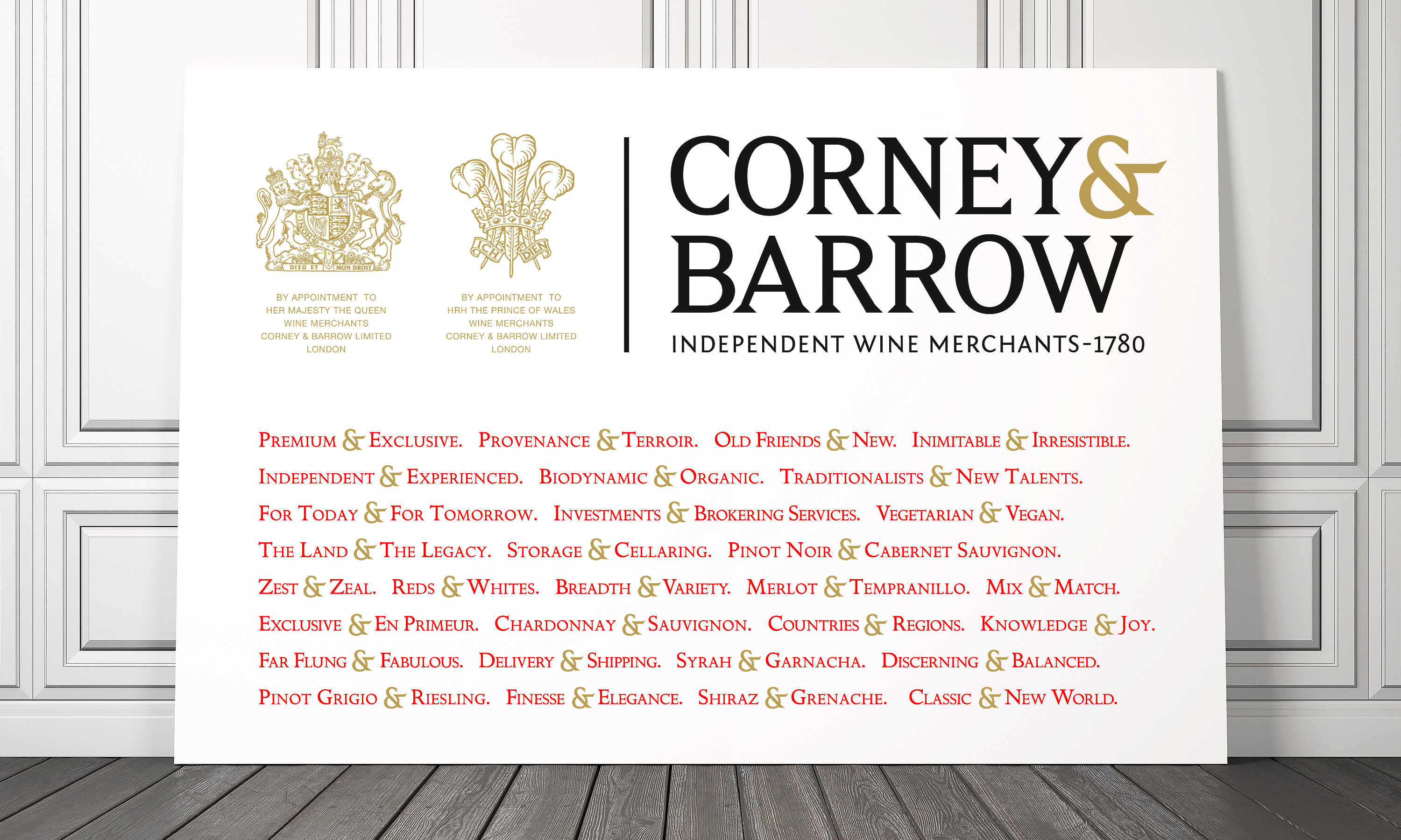
Our elegant new Ampersand was then used as a graphic device to help highlight Corney & Barrow’s many attributes and offerings. The new brand identity with its new mark and visual language was then rolled out across the business, online, in literature and on vehicle livery. And we’re pleased to say it’s now seen as a new benchmark of quality within the trade, and as the hallmark of a very premium offering to Corney & Barrow’s clients.

Kind words…

“Dana and Neon, came to us at Corney & Barrow with high recommendations from some very senior people in the industry.

Having decided to modernise our logo, refine our colour palette, change fonts and photographic style, Dana explained the process and shared his initial ideas; these stretched from the ‘slight refinement’ to the ‘total change’, in order to understand our level of engagement.

His attention to detail and the steps that he had gone through to make his initial recommendations really helped to cement our trust in him as an expert. With each stage, he refined the individual elements, always proposing a selection for us to choose from and enabling us to move forward with the project very quickly.

Not only are we extremely delighted with the outcome of the Corney & Barrow re-branding, but having someone so personable, talented and accessible to work with has made the entire process a pleasure and exciting.”

ADAM BRETT-SMITH
Managing Director
Corney & Barrow

To find out more: [email protected] or call +44 (0)20 3289 1733 Share this: Email, LinkedIn, Twitter, Facebook, Download PDF, follow us on Instagram or view our animations and movies on Vimeo


FOOD & BEVERAGE
Branding

PROJECT SUMMARY
Brand idenitity
Brand guidelines
Tone of voice guidelines
Flagship publications
Literature house style
Brand assets micro-site
House range packaging
Vehicle livery
Stationery and forms
Digital templates
PowerPoint templates


Corney & Barrow brand language.

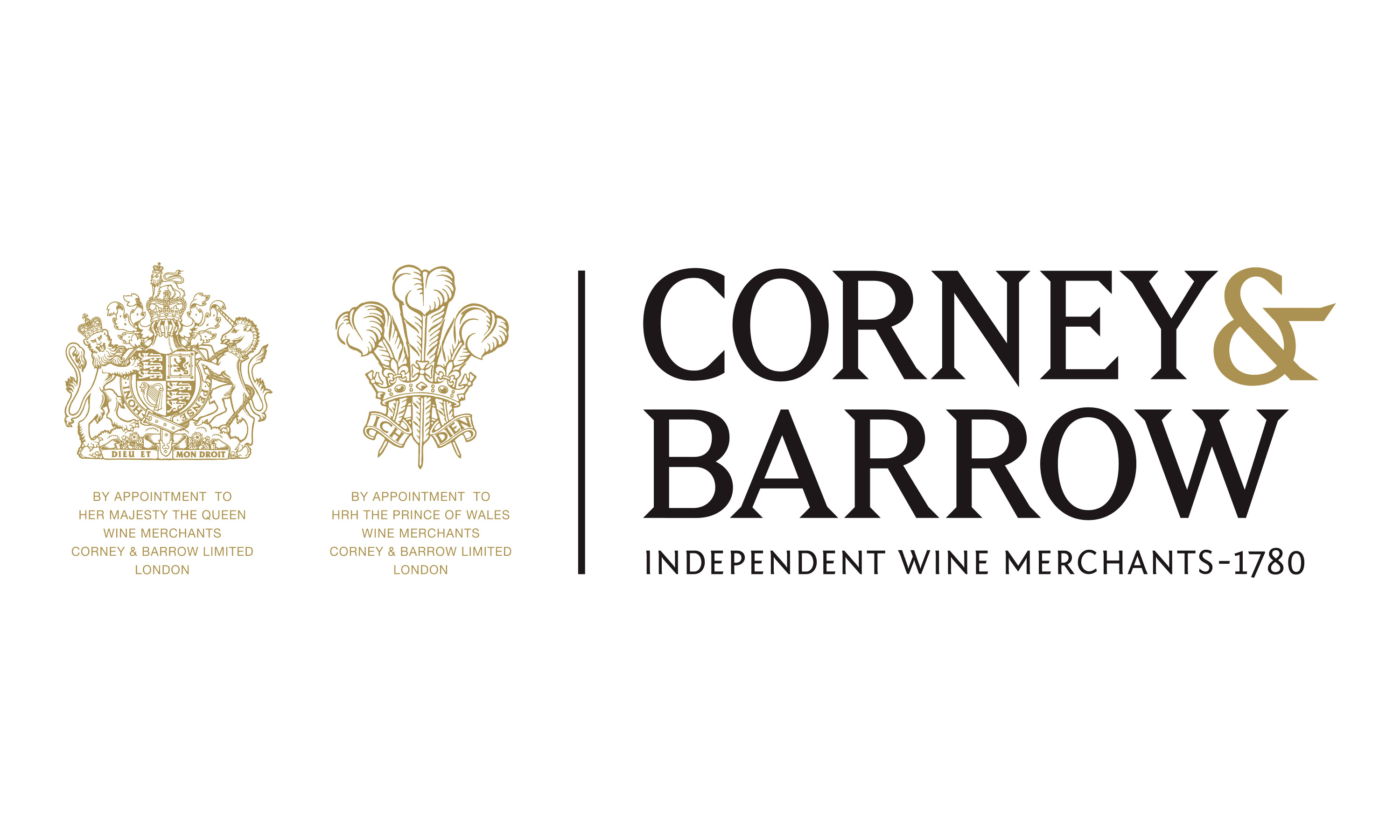
New Corney & Barrow brand mark.

By Dana Robertson Creative Director and Founder of Neon. The new re-crafted by Neon Corney & Barrow brand mark with Royal Warrants, part of the Corney & Barrow brand identity and visual language refresh designed to help position Corney & Barrow as the leading UK and international premium independent Wine Merchants. Idea, art direction and design by Neon Design & Branding Consultancy www.neon-creative.com

Corney & Barrow ampersand language.

By Dana Robertson Creative Director and Founder of Neon. The new Corney & Barrow brand mark with examples of the visual language using the ampersand taken from the brand mark – forming part of the Brand identity refresh project, designed to help position Corney & Barrow as the leading UK and international premium independent Wine Merchants – Idea, art direction and design by Neon Design & Branding Consultancy www.neon-creative.com

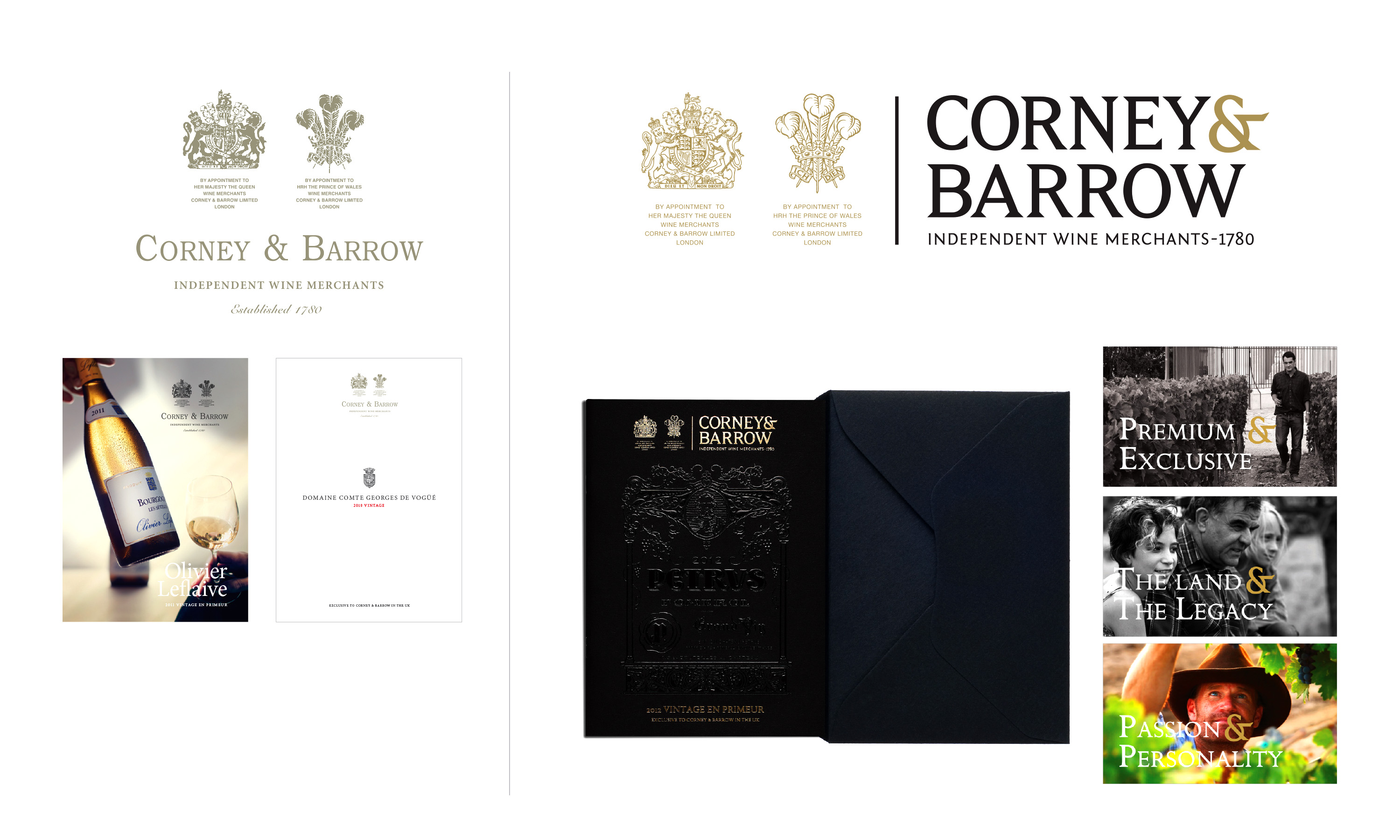
Corney & Barrow brand mark and visual style old vs new.

Corney-&-Barrow-Branding-old vs new comparison

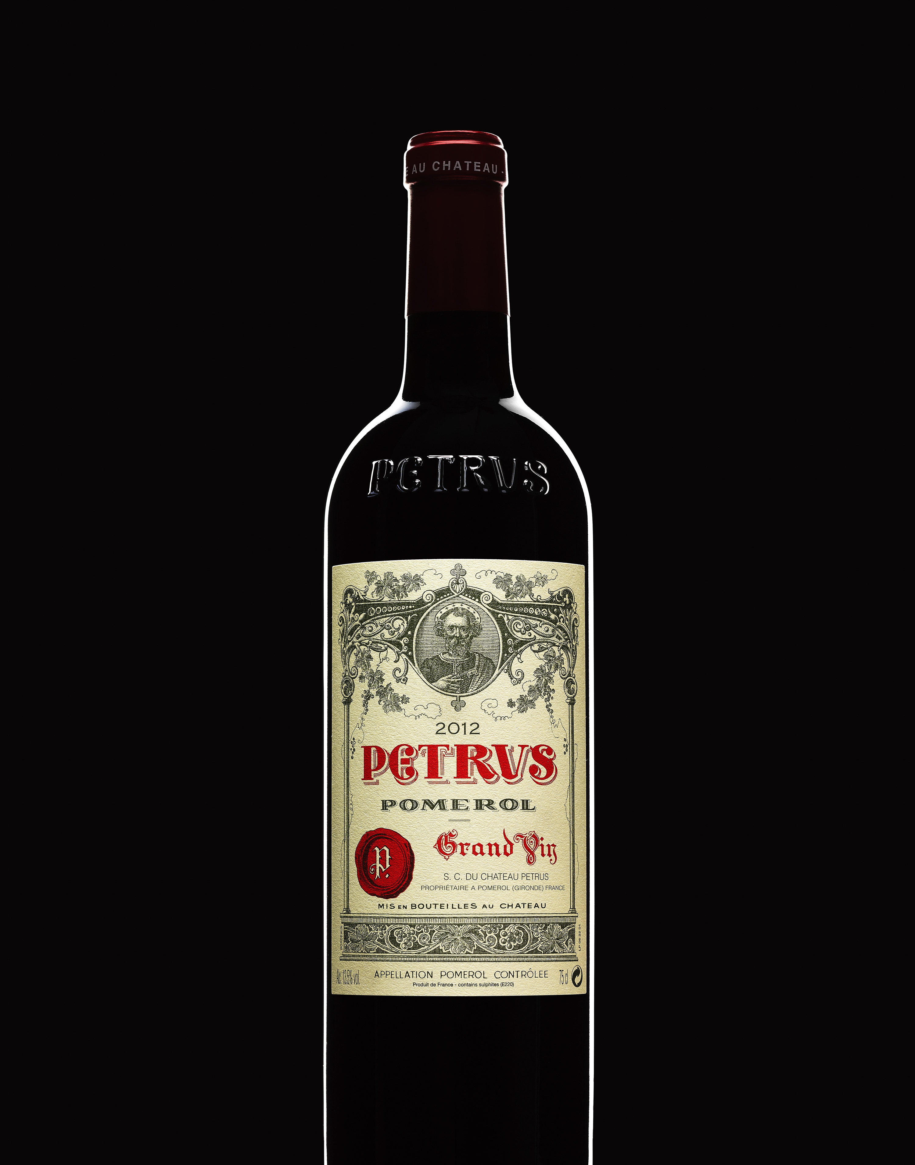
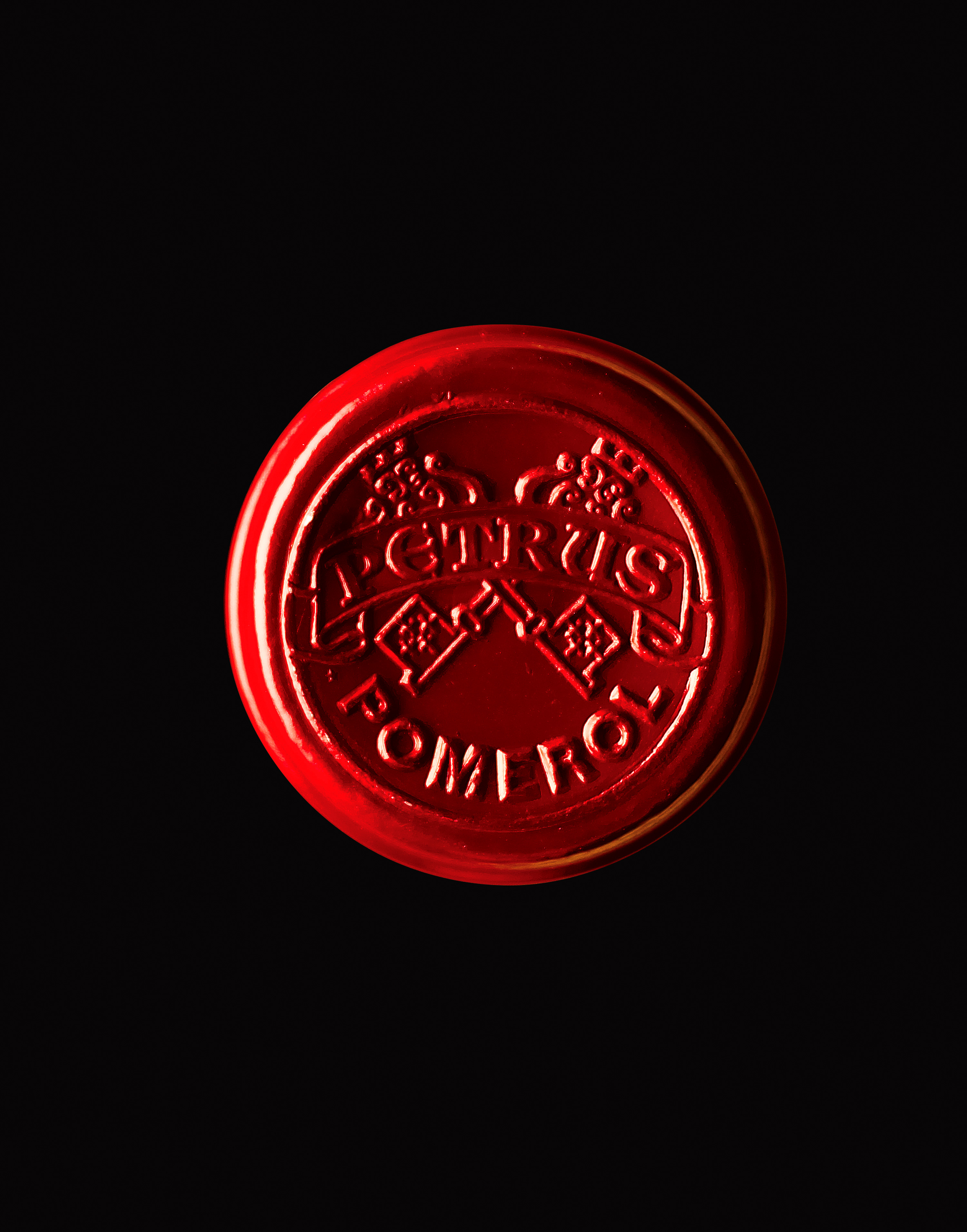
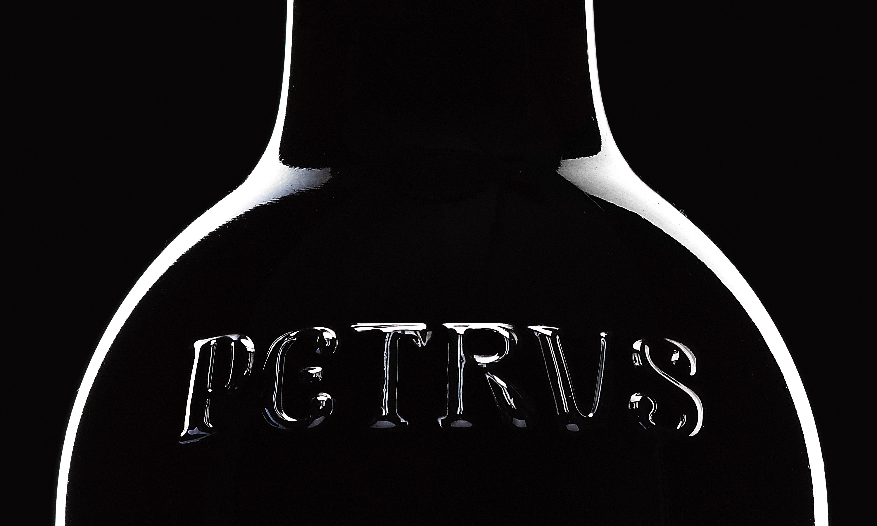
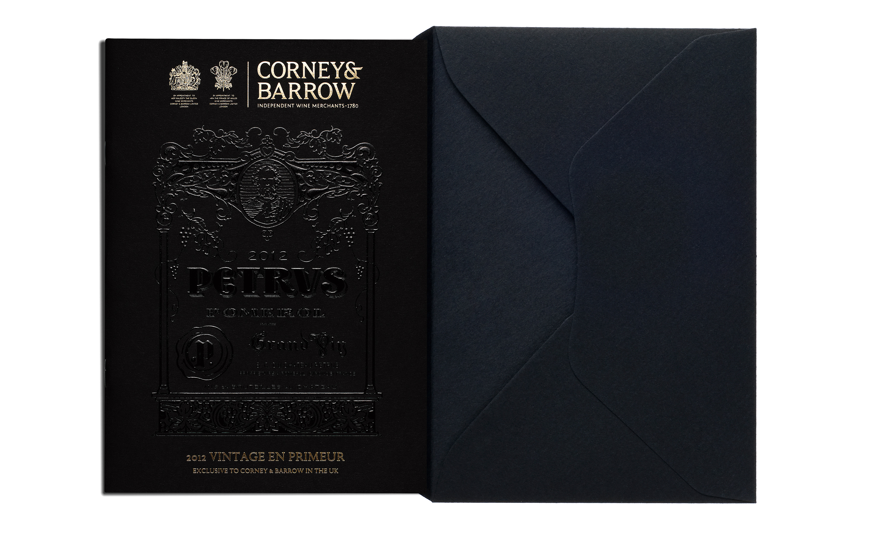
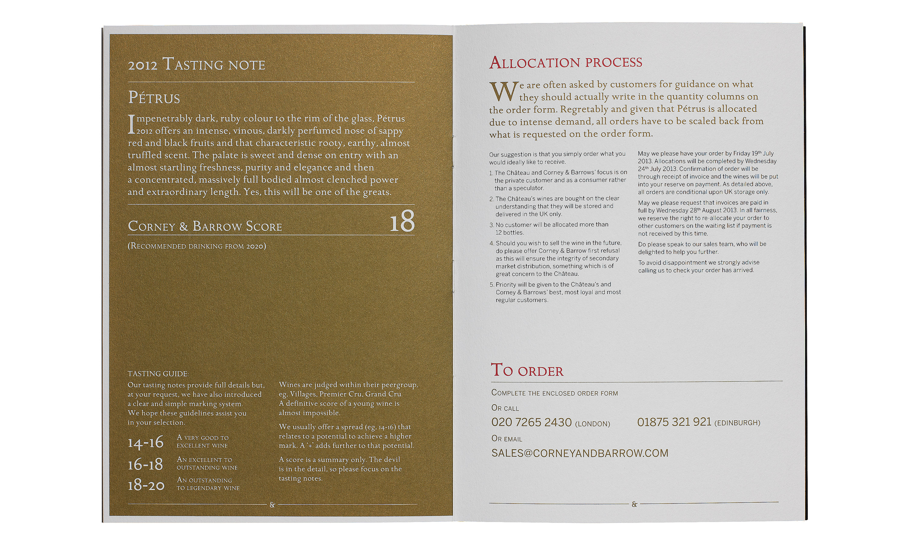
Corney & Barrow Pétrus brochure.

By Dana Robertson Creative Director and Founder of Neon. Corney & Barrow Pétrus brochure and black envelope. Pétrus is, to quote Corney & Barrow, one of
By Dana Robertson Creative Director and Founder of Neon. Corney & Barrow Pétrus brochure opening spread fly sheet. Pétrus is, to quote Corney & Barrow, one of
By Dana Robertson Creative Director and Founder of Neon. Corney & Barrow Pétrus brochure spread describing the land and the legacy of Pétrus. Pétrus is, to quote Corney & Barrow, one of
By Dana Robertson Creative Director and Founder of Neon. Corney & Barrow Pétrus brochure tasting notes pages. Pétrus is, to quote Corney & Barrow, one of

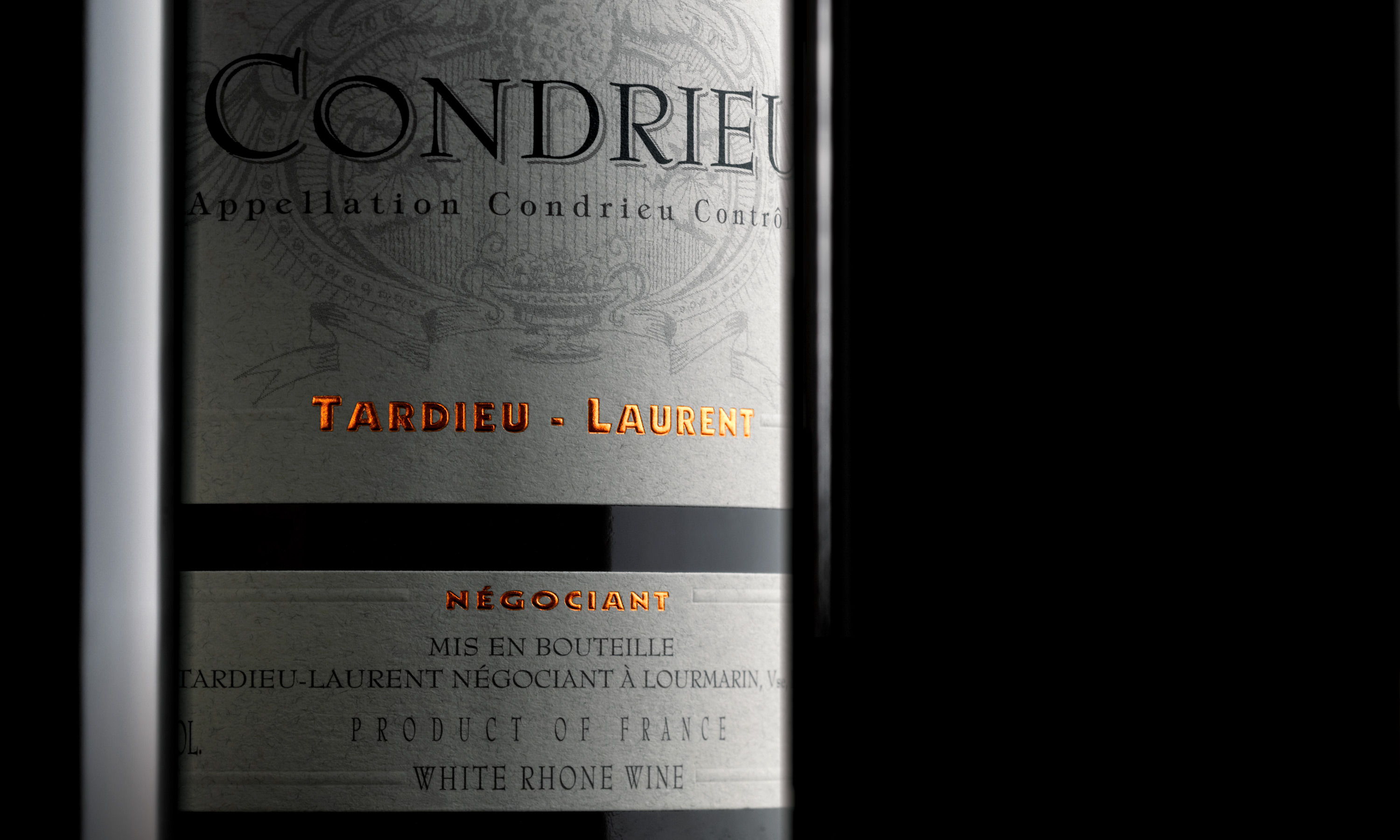
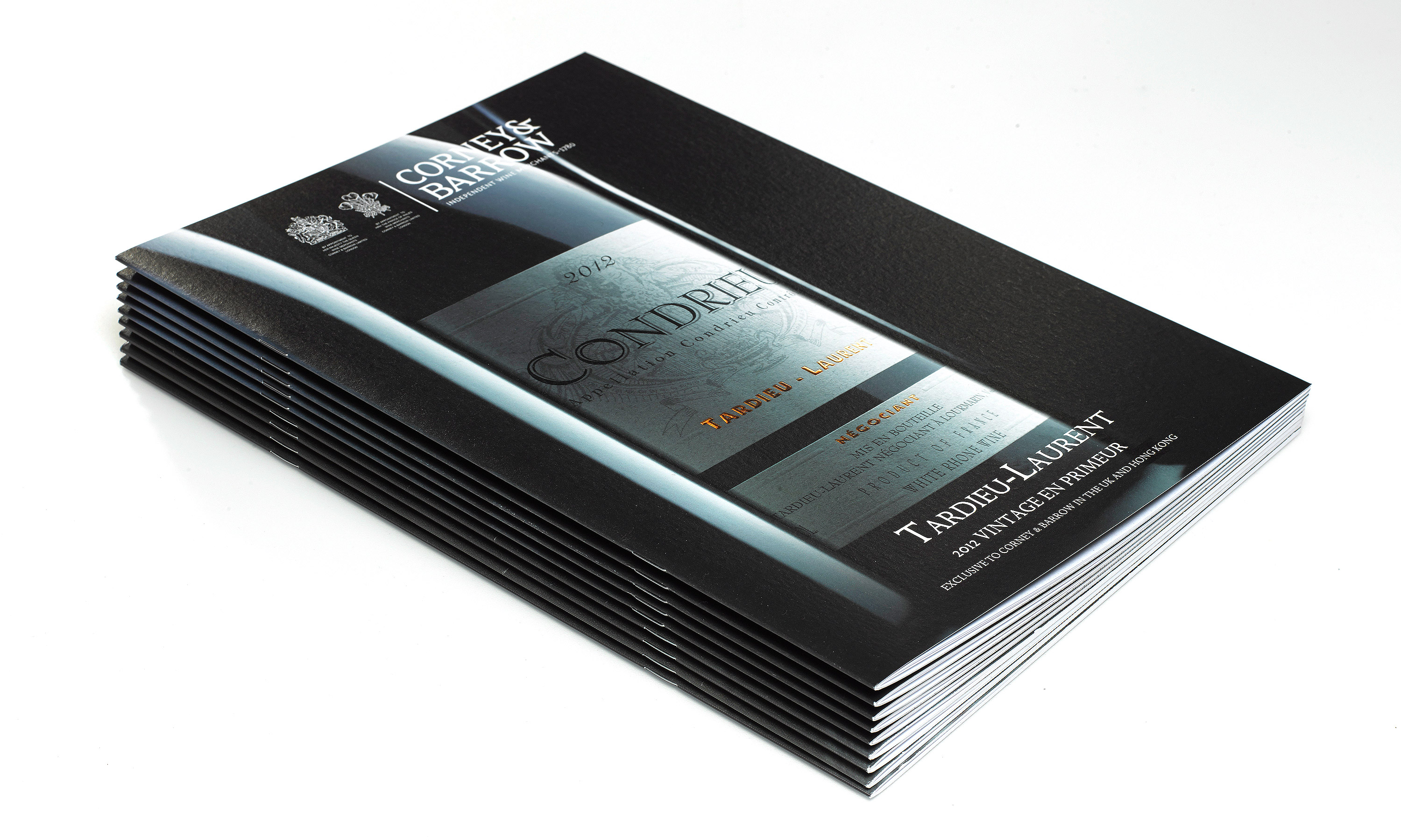
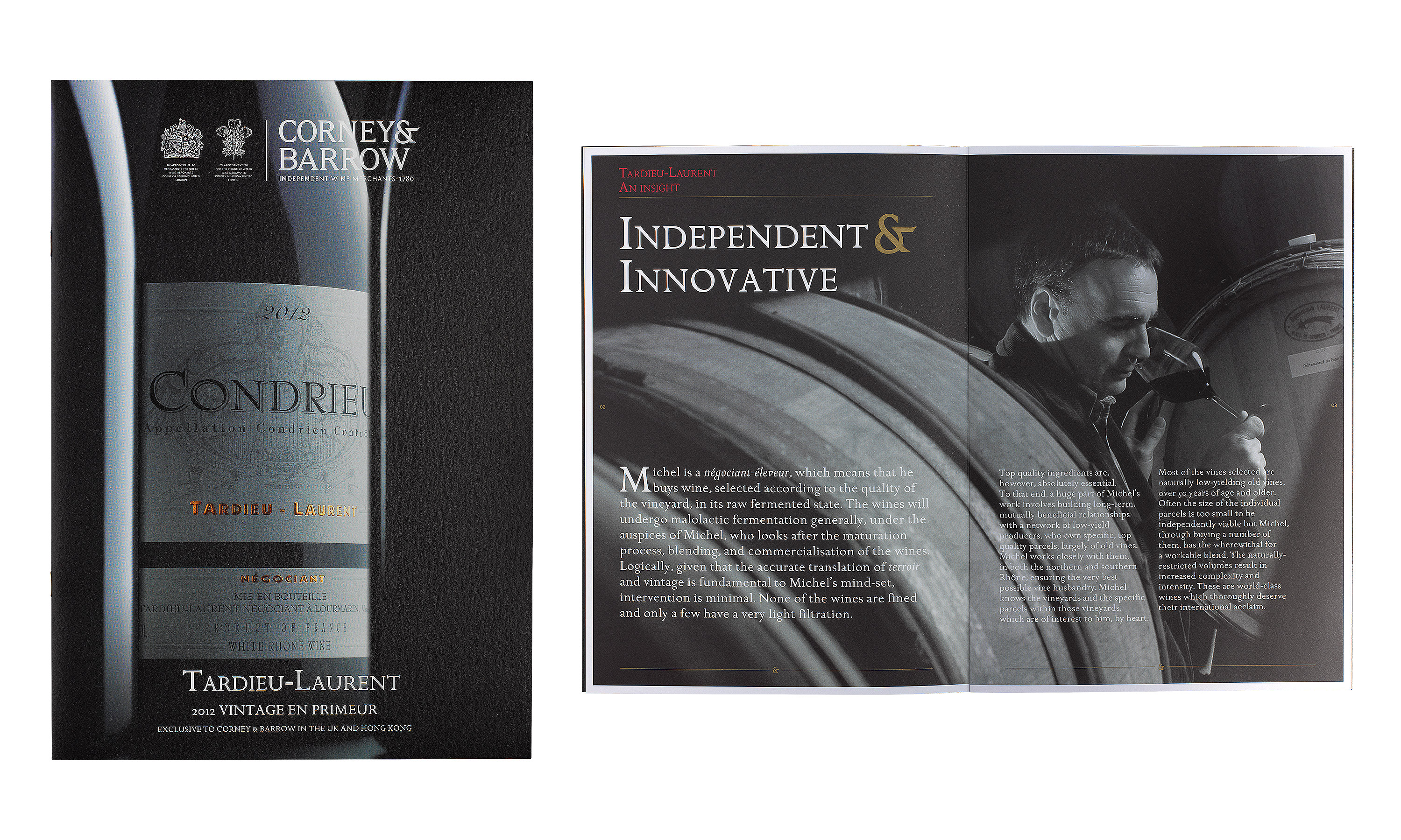
Corney & Barrow literature system.

By Dana Robertson Creative Director and Founder of Neon. An example of the new Corney & Barrow literature house style, showing a brochure cover using a crop of bottle cap, demonstrating the new brief for product photography in capturing beautiful details such as bottle embossing or the use of dramatic lighting to add a premium feel and gravitas to the product – forming part of the Brand identity refresh project, designed to help position Corney & Barrow as the leading UK and international premium independent Wine Merchants. Idea, art direction and design by Neon Design & Branding Consultancy www.neon-creative.com

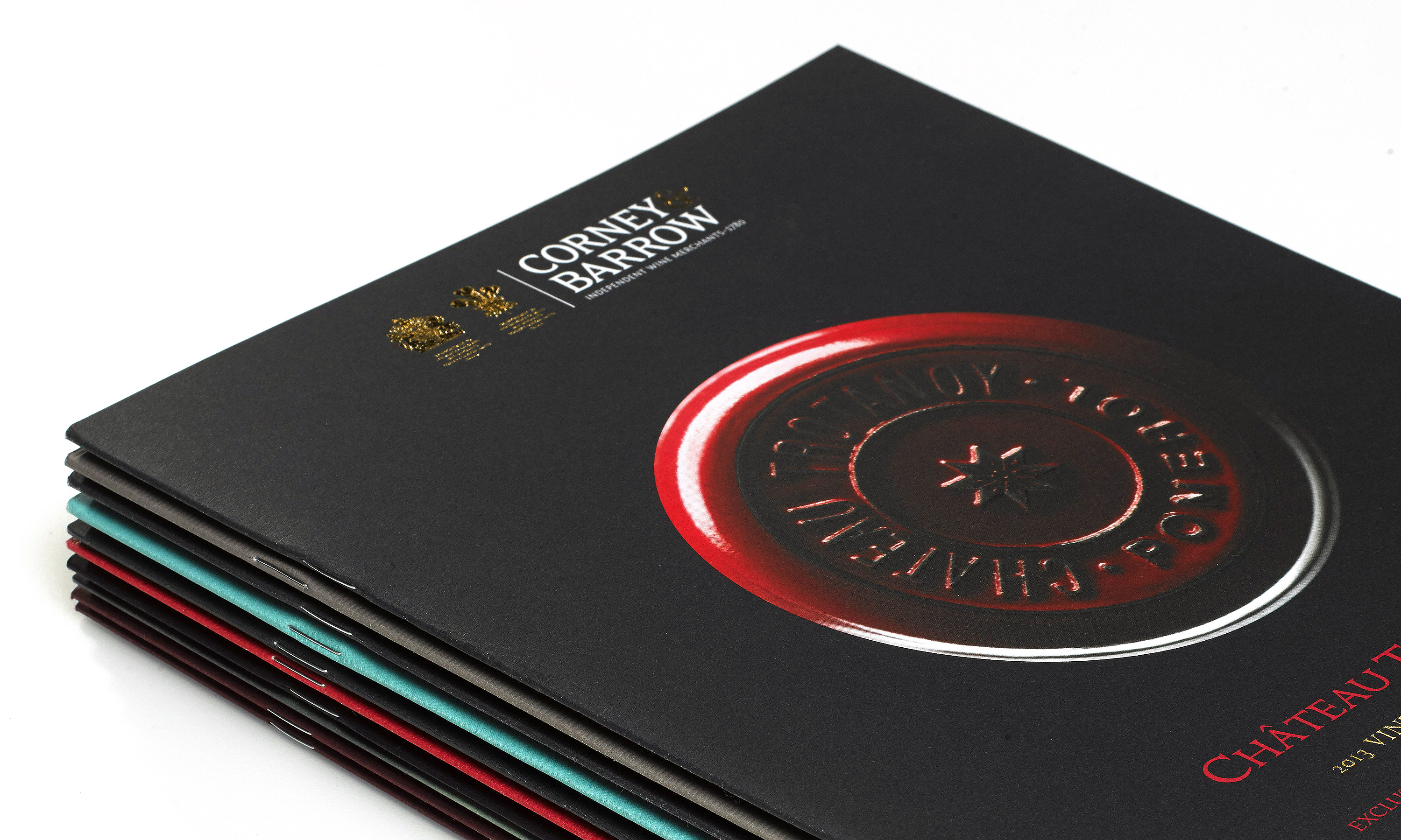
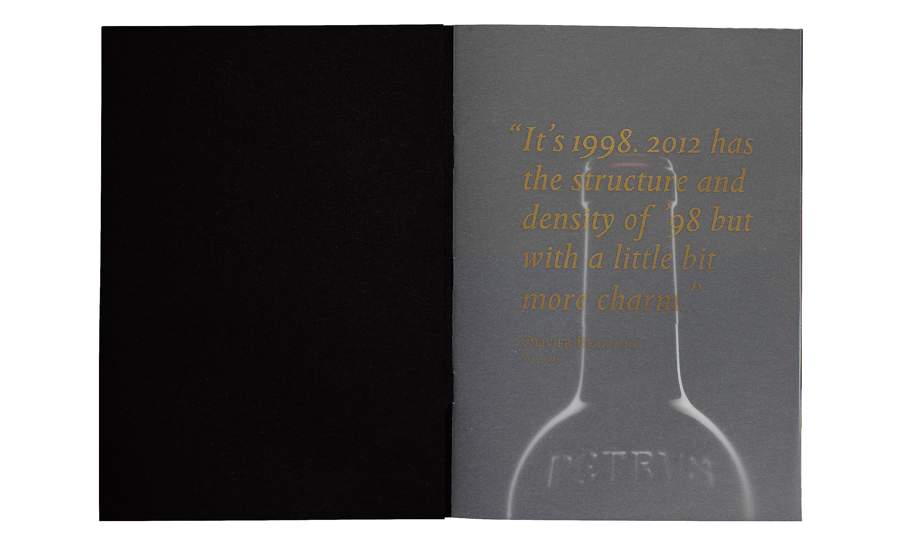
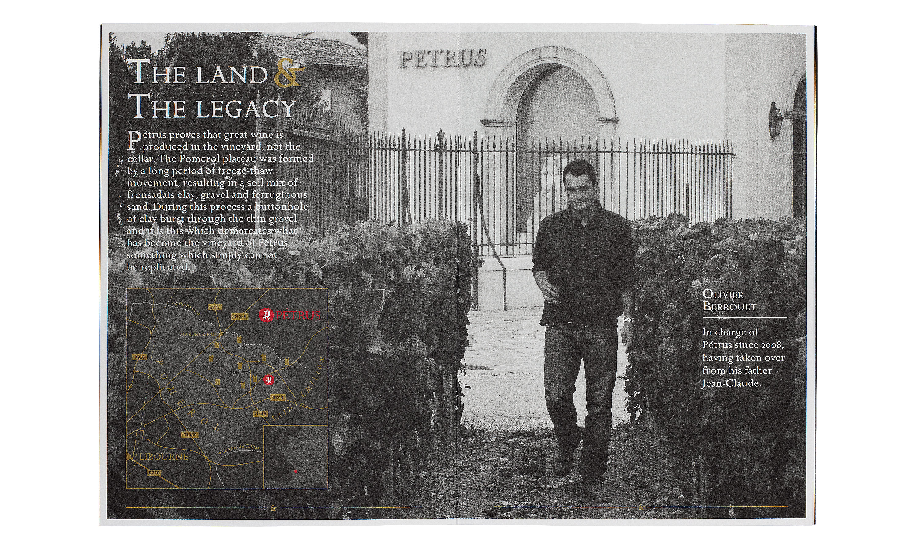
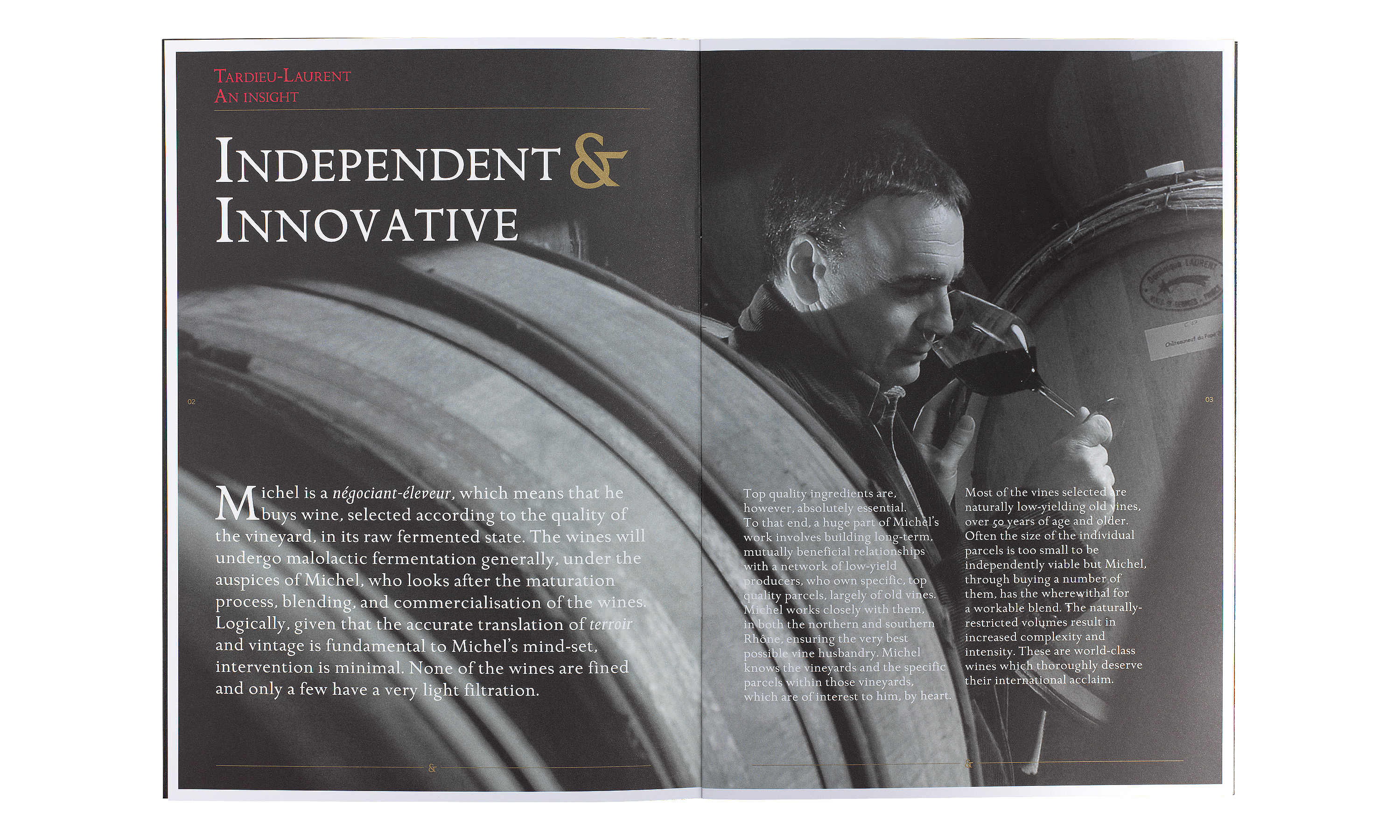
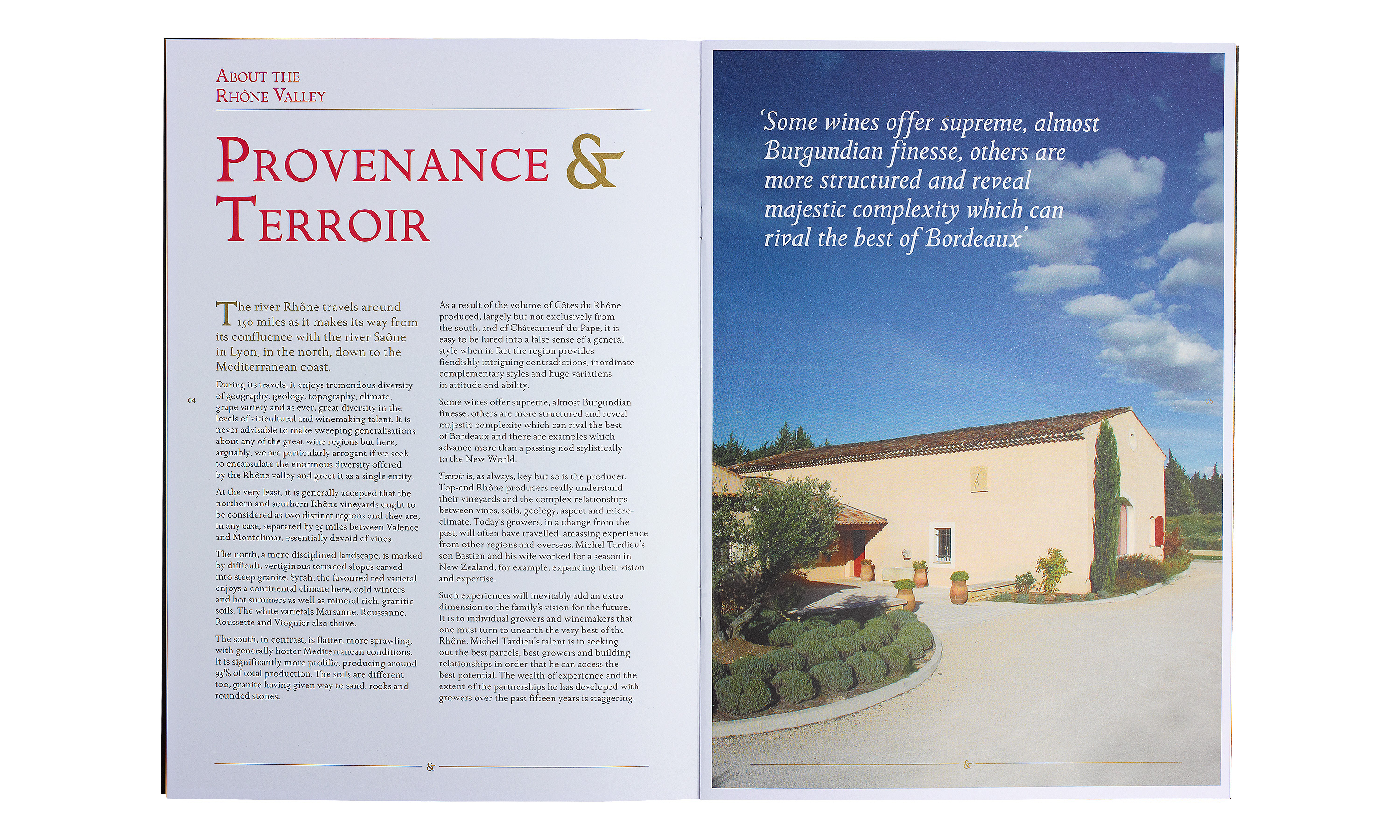
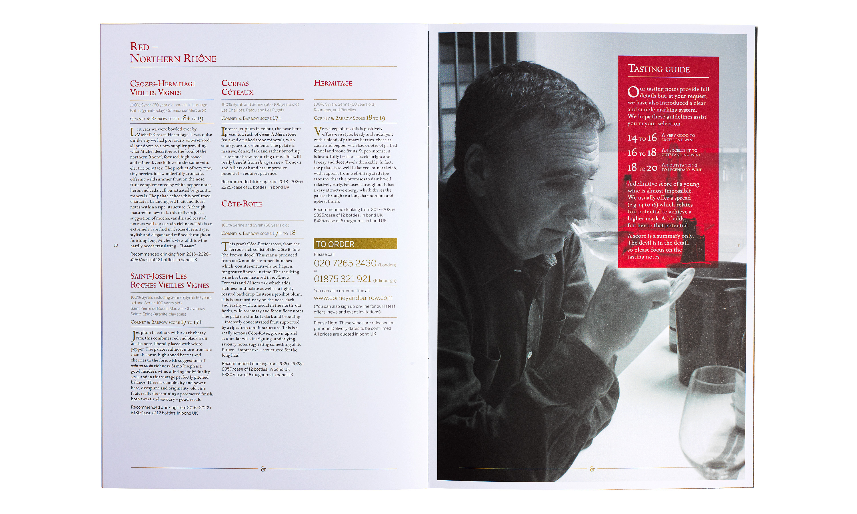
Corney & Barrow literature system sample spreads.

By Dana Robertson Creative Director and Founder of Neon. Tardieu-Laurant A4 brochure showing the new Corney & Barrow literature house style, photography style and visual language (using the ampersand taken from the newly refreshed Corney & Barrow brand mark) – forming part of the Brand identity refresh project, designed to help position Corney & Barrow as the leading UK and international premium independent Wine Merchants. Idea, art direction and design by Neon Design & Branding Consultancy www.neon-creative.com
By Dana Robertson Creative Director and Founder of Neon. Tardieu-Laurant A4 brochure cover and sample spread demonstrating the new Corney & Barrow literature house style, photography style and visual language (using the ampersand taken from the newly refreshed Corney & Barrow brand mark) – forming part of the Brand identity refresh project, designed to help position Corney & Barrow as the leading UK and international premium independent Wine Merchants. Idea, art direction and design by Neon Design & Branding Consultancy www.neon-creative.com
By Dana Robertson Creative Director and Founder of Neon. A sample spread from the new Corney & Barrow literature house style, demonstrating the new visual language which uses the ampersand graphic taken from the brand mark used in combination with text (Independent & Innovative), plus the more dramatic and intimate photography style. Part of the Corney & Barrow brand identity and visual language refresh designed to help position Corney & Barrow as the leading UK and international premium independent Wine Merchants. – Idea, art direction and design by Neon Design & Branding Consultancy www.neon-creative.com
By Dana Robertson Creative Director and Founder of Neon. A sample spread from the new Corney & Barrow literature house style, demonstrating the new visual language which uses the ampersand graphic taken from the brand mark used in combination with text (Provenance & Terrior.). Part of the Corney & Barrow brand identity and visual language refresh designed to help position Corney & Barrow as the leading UK and international premium independent Wine Merchants. – Idea, art direction and design by Neon Design & Branding Consultancy www.neon-creative.com
By Dana Robertson Creative Director and Founder of Neon. A sample spread from the new Corney & Barrow literature house style, demonstrating the new more dramatic and intimate photographic style. Part of the Corney & Barrow brand identity and visual language refresh designed to help position Corney & Barrow as the leading UK and international premium independent Wine Merchants. – Idea, art direction and design by Neon Design & Branding Consultancy www.neon-creative.com

Corney & Barrow ampersand visual language.

By Dana Robertson Creative Director and Founder of Neon. A detail from Corney & Barrow's price list cover, demonstrating the visual language using the ampersand taken from the brand mark – forming part of the Brand identity refresh project, designed to help position Corney & Barrow as the leading UK and international premium independent Wine Merchants. Idea, art direction and design by Neon Design & Branding Consultancy www.neon-creative.com

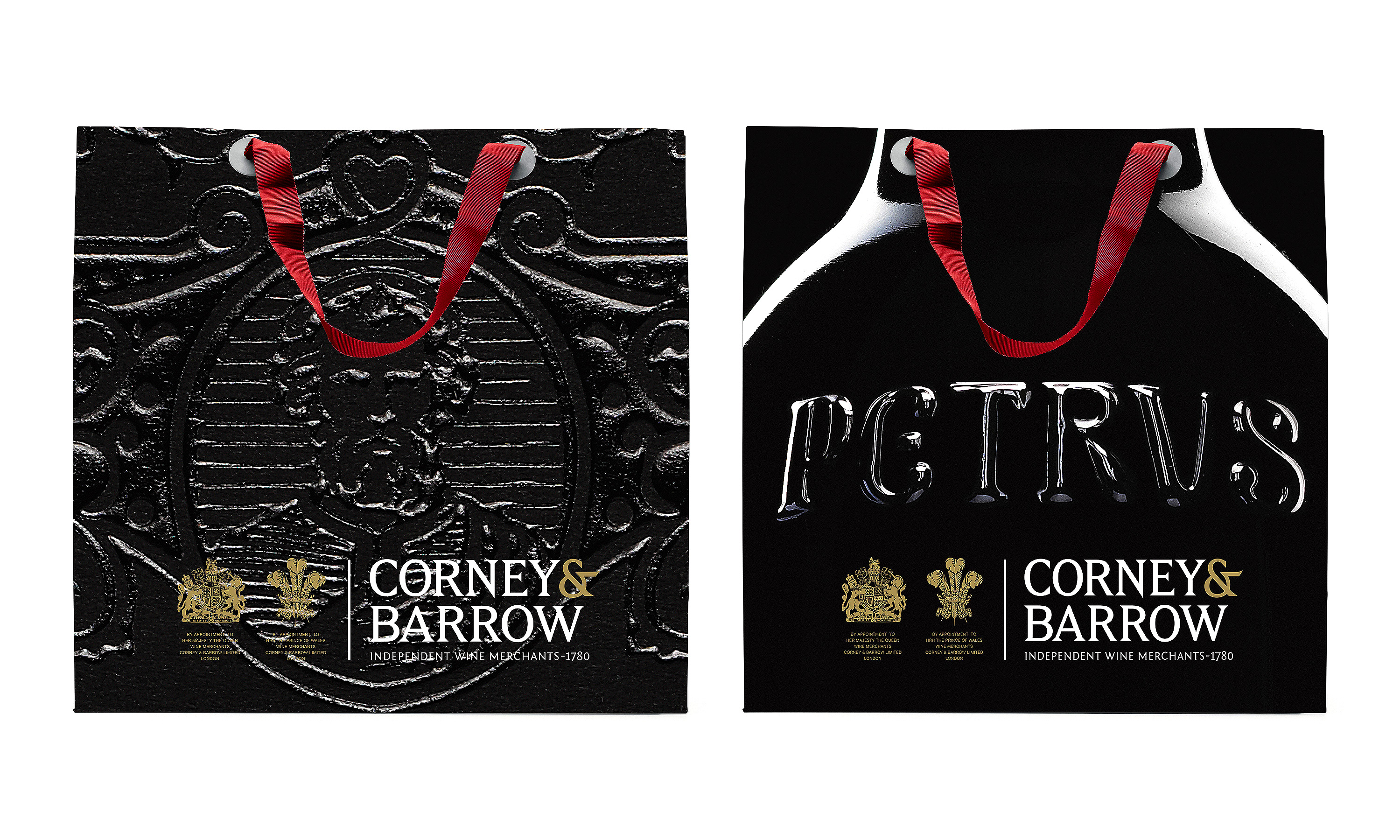
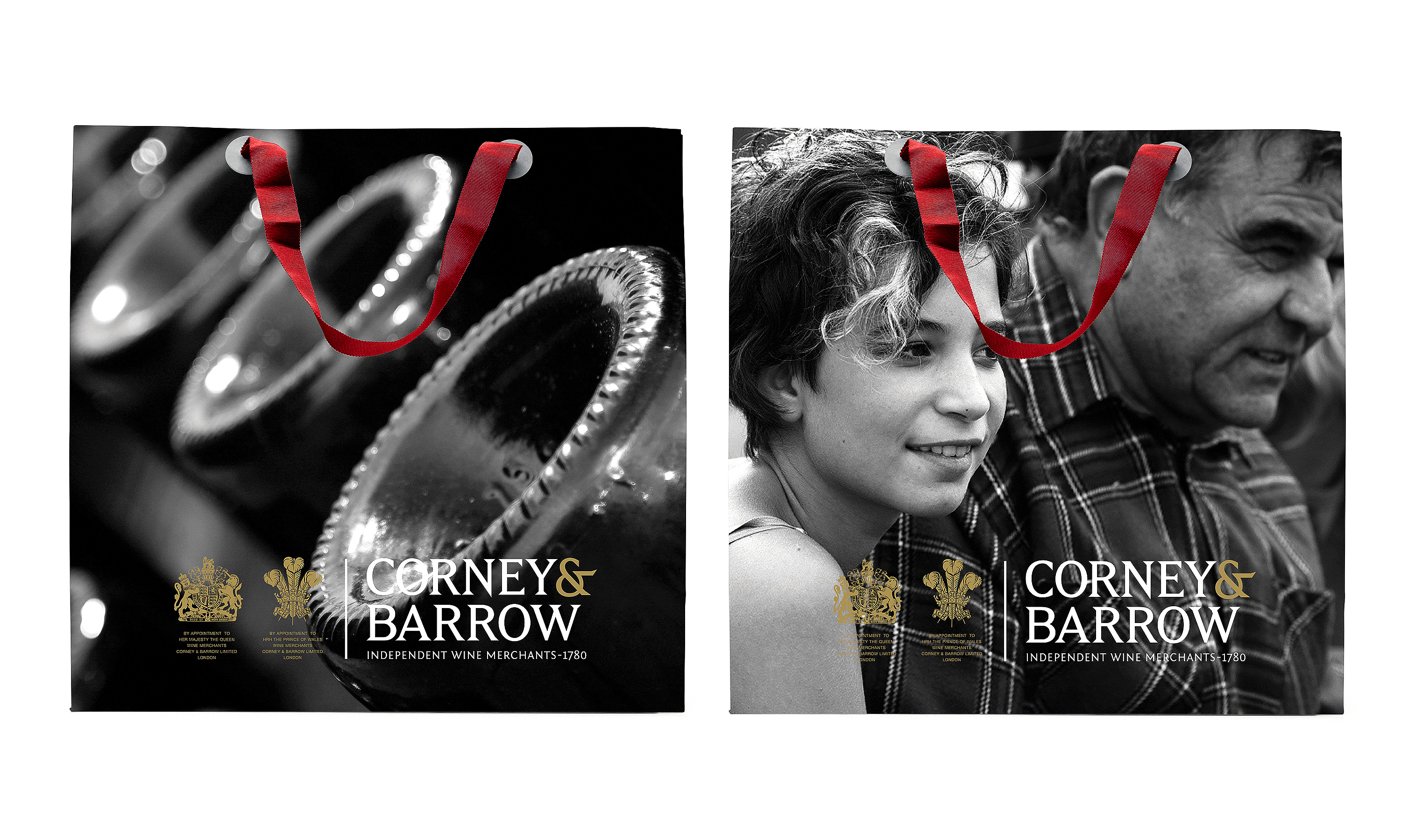
Corney & Barrow promotional gift bags.

By Dana Robertson Creative Director and Founder of Neon. Corney & Barrow promotional bags featuring Pétrus, part of the Corney & Barrow brand identity and visual language refresh designed to help position Corney & Barrow as the leading UK and international premium independent Wine Merchants. – Idea, art direction and design by Neon Design & Branding Consultancy www.neon-creative.com
By Dana Robertson Creative Director and Founder of Neon. Corney & Barrow promotional bags, part of the Corney & Barrow brand identity and visual language refresh designed to help position Corney & Barrow as the leading UK and international premium independent Wine Merchants. – Idea, art direction and design by Neon Design & Branding Consultancy www.neon-creative.com

Corney & Barrow brand language.

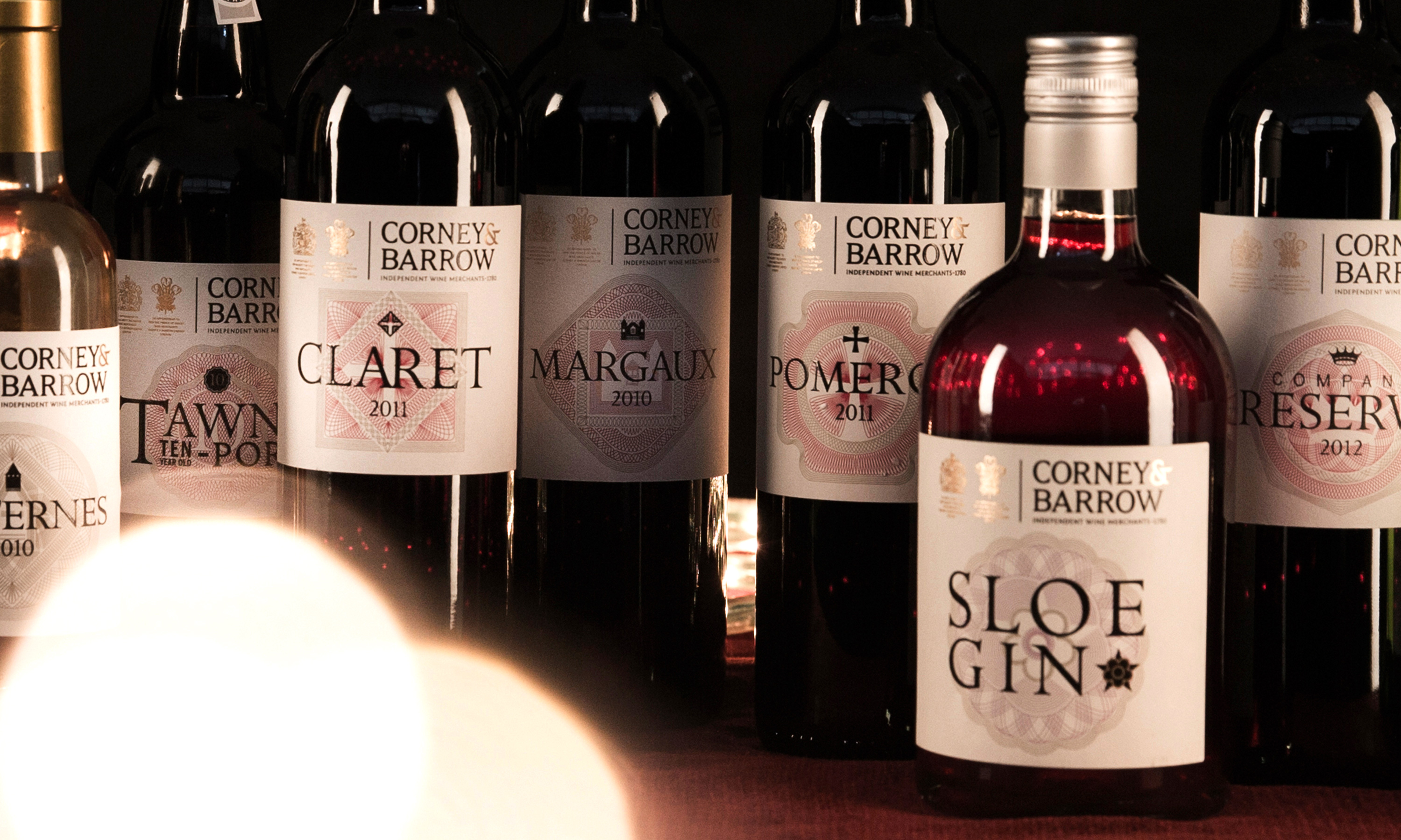
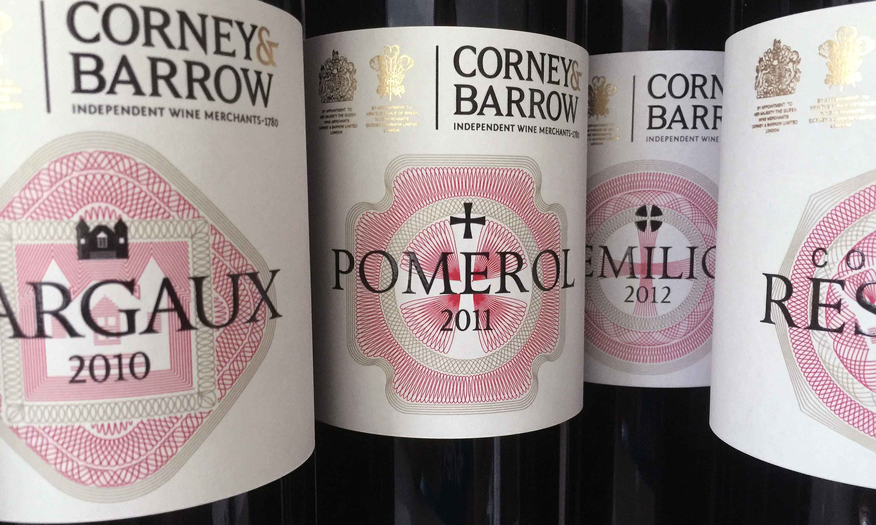
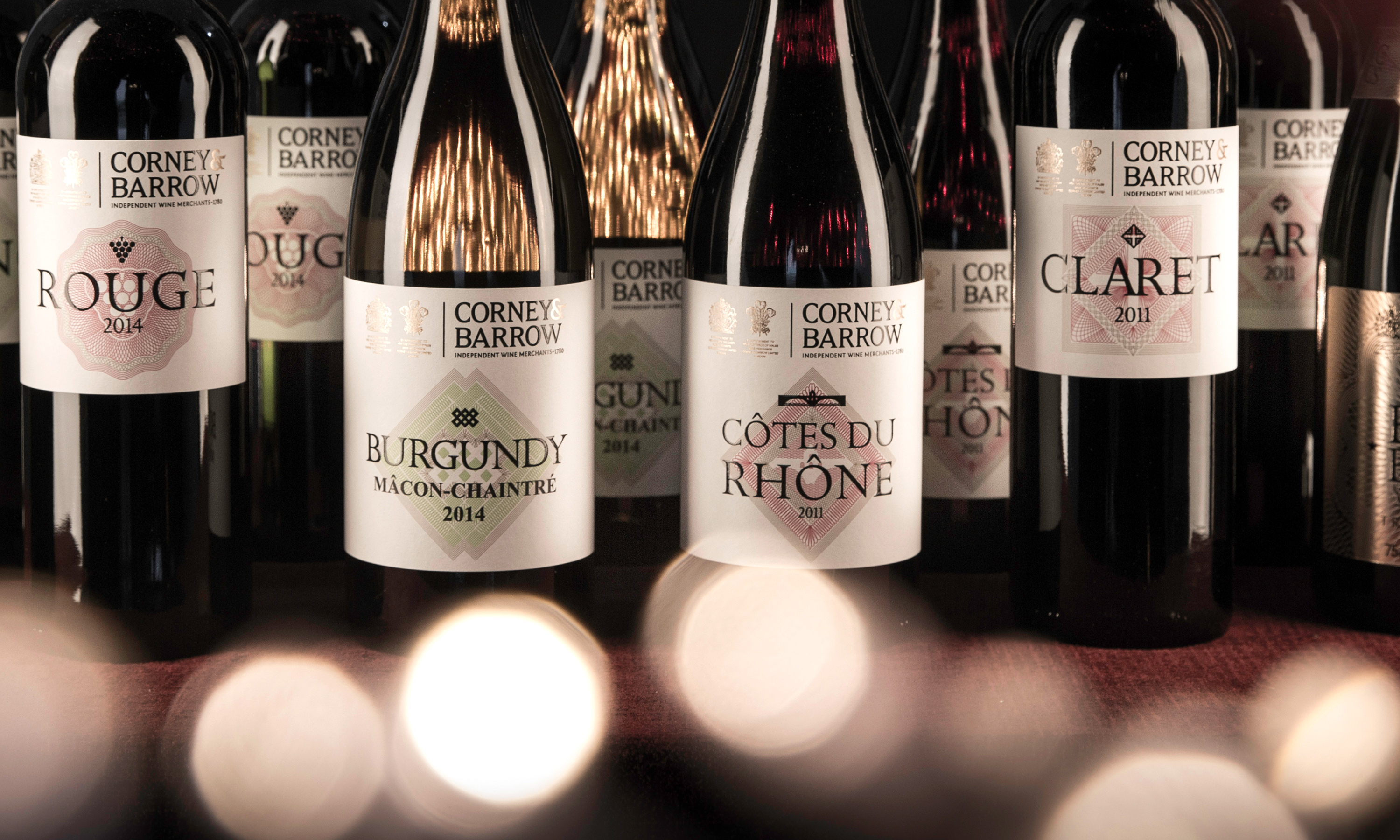
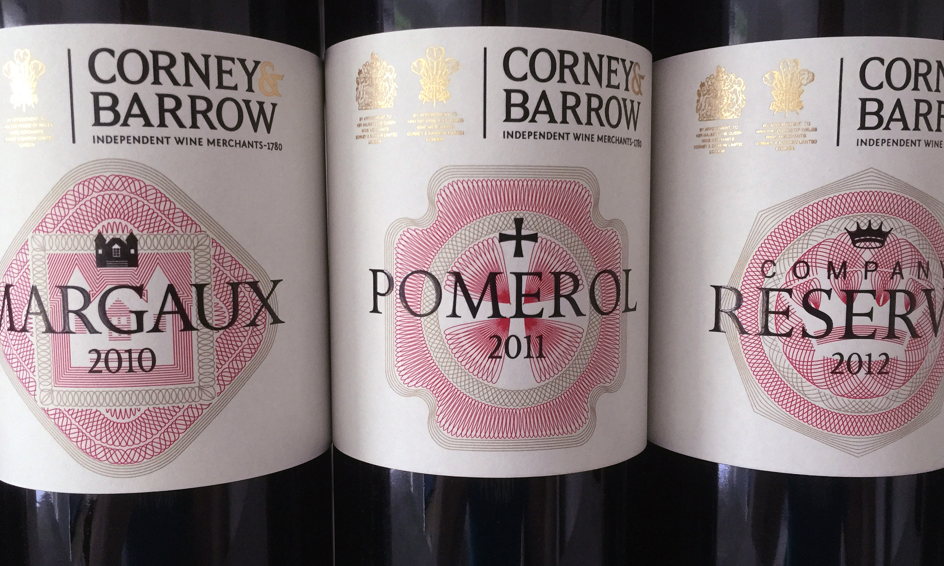
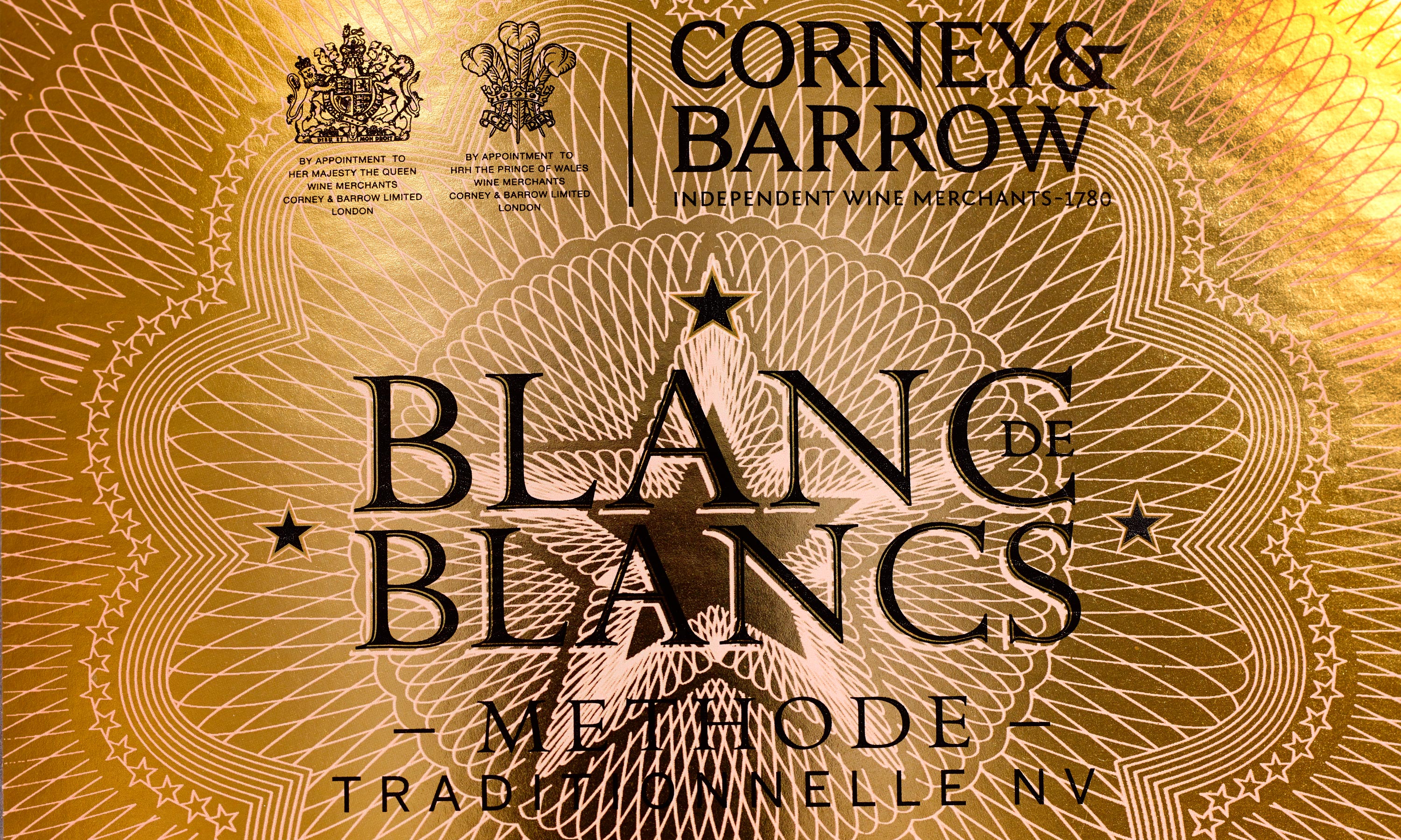
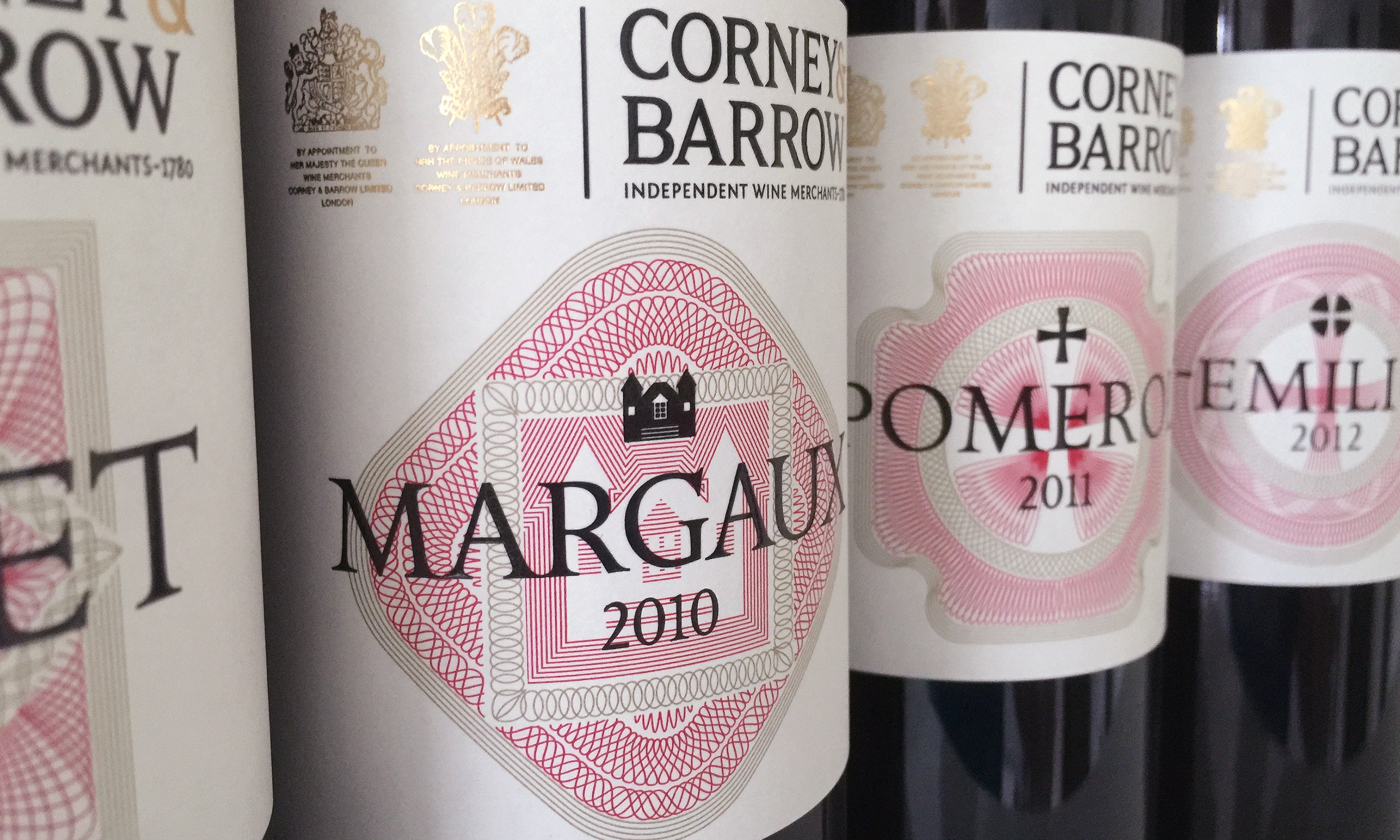
Corney & Barrow House range labels.

Branding and packaging by Neon - designed by Dana Robertson - for Corney & Barrow - Corney & Barrow House Range - Christmas promotion detail shot featuring sloe gin
Branding and packaging by Neon - designed by Dana Robertson - for Corney & Barrow - Corney & Barrow House Range - detail of four red wine label designs
Branding and packaging by Neon - designed by Dana Robertson - for Corney & Barrow - Corney & Barrow House Range - Christmas promotion detail shot
Branding and packaging by Neon - designed by Dana Robertson - for Corney & Barrow - Corney & Barrow House Range - detail of Pomerol red wine label design
Branding and packaging by Neon - designed by Dana Robertson - for Corney & Barrow - Corney & Barrow House Range - detail of Sparkling White Wine label design
Branding and packaging by Neon - designed by Dana Robertson - for Corney & Barrow - Corney & Barrow House Range - detail of four red wine label designs

Corney & Barrow brand language.

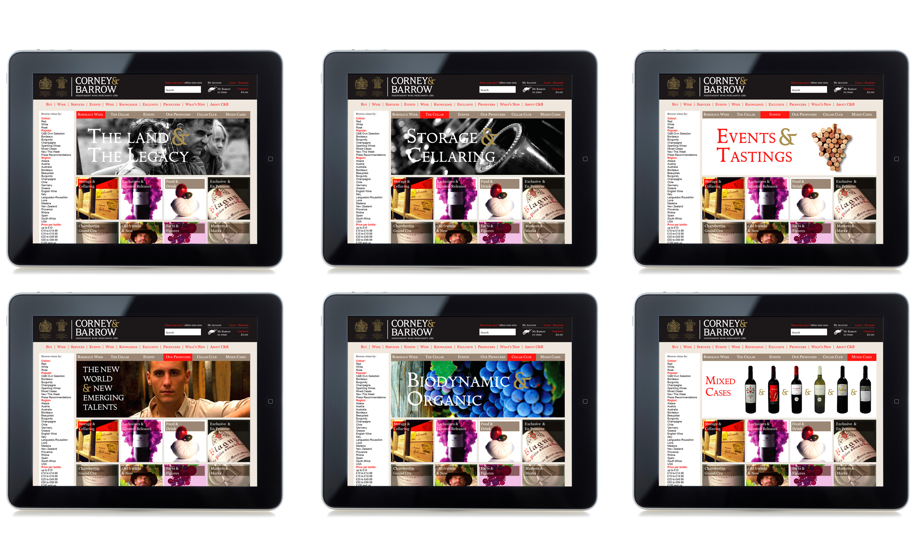
Corney & Barrow website refresh.

By Dana Robertson Creative Director and Founder of Neon. A detail from Corney & Barrows website highlighting the witty change out of the 'My basket' icon to my the 'My Barrow' icon. A small detail from the Corney & Barrow brand identity and visual language refresh designed to help position Corney & Barrow as the leading UK and international premium independent Wine Merchants. Idea, art direction and design by Neon Design & Branding Consultancy www.neon-creative.com
By Dana Robertson Creative Director and Founder of Neon. Corney & Barrow's website update was part of the Corney & Barrow brand identity and visual language refresh designed to help position Corney & Barrow as the leading UK and international premium independent Wine Merchants. Idea, art direction and design by Neon Design & Branding Consultancy www.neon-creative.com

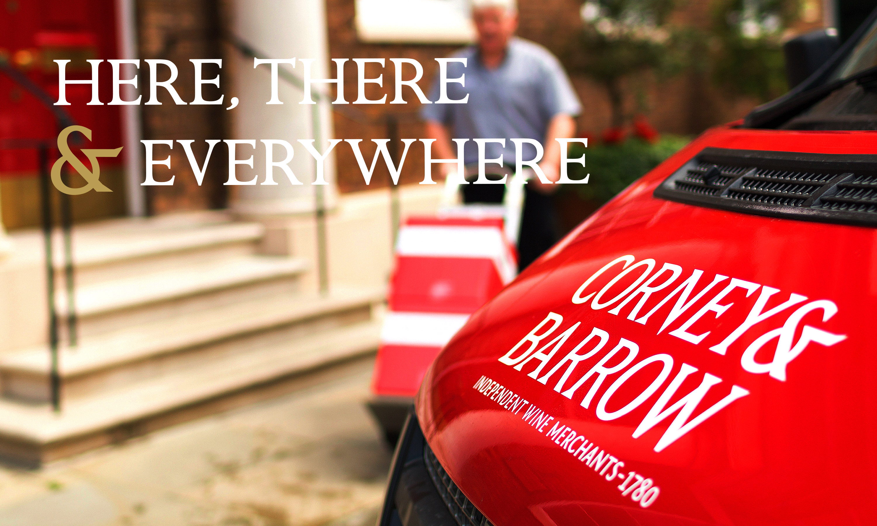
Corney & Barrow vehicle livery.

By Dana Robertson Creative Director and Founder of Neon. Here, there & everywhere. A sample of the visual language using the ampersand from Corney & Barrow's new brand mark – forming part of the Brand identity refresh project, designed to help position Corney & Barrow as the leading UK and international premium independent Wine Merchants. Idea, art direction and design by Neon Design & Branding Consultancy www.neon-creative.com

Corney & Barrow photographic styling guide.

Other projects you may find of interest...