1Varna
Naming, brand positioning & identity
A vibrant and unified community.
When developer Adamant Capital set out to create a landmark residential and commercial destination in the coastal city of Varna, Bulgaria, they turned to Neon Brand Consultancy to name, position and brand the project.
The goal was ambitious — to redefine urban living in Varna through contemporary design, community spirit and a renewed quality of life.
Neon developed that name ‘1Varna’ which caputred this sense of unity and modern aspiration, representing a single, connected community with a distinctly international outlook.
From this foundation, Neon developed a bold positioning idea: “Bringing colour to life.” It expressed both the physical transformation of the area and the emotional renewal offered by the development.
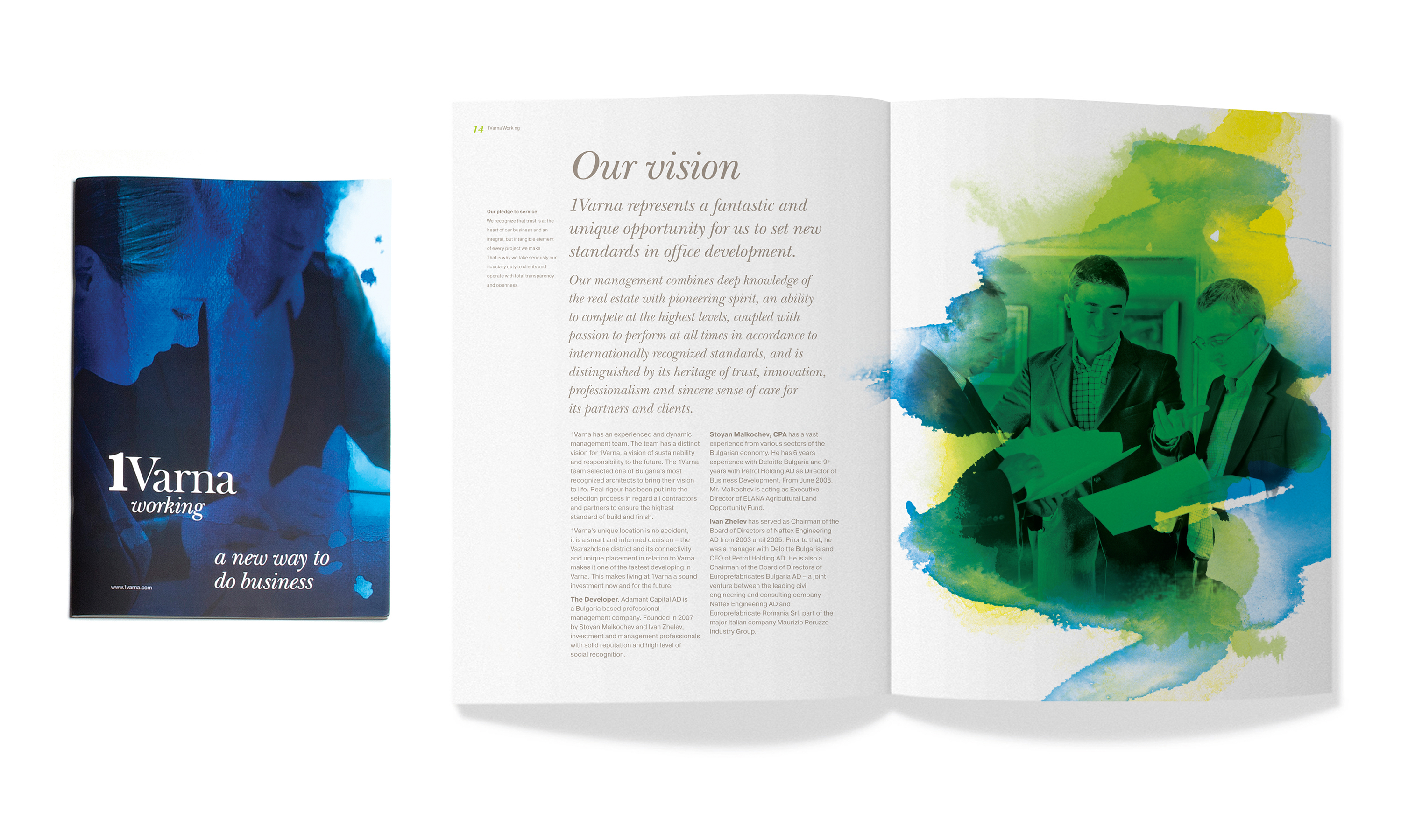
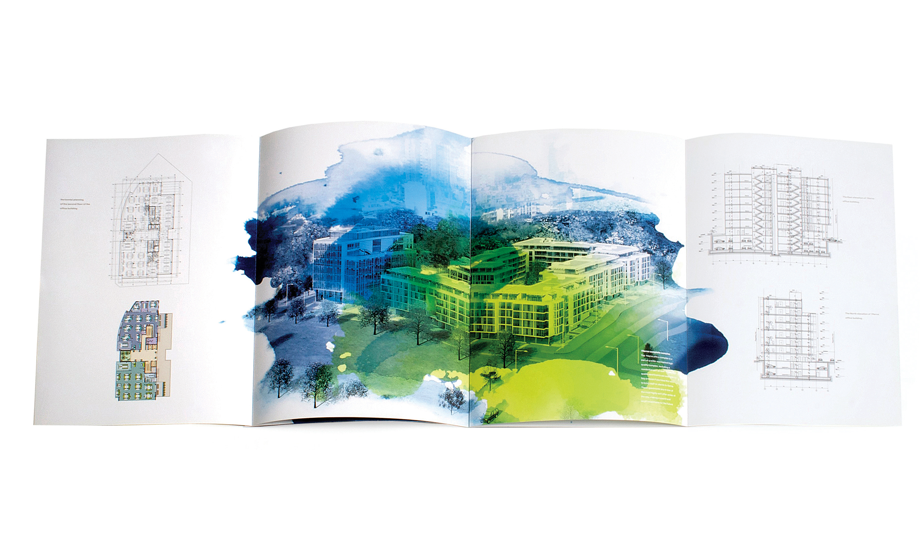
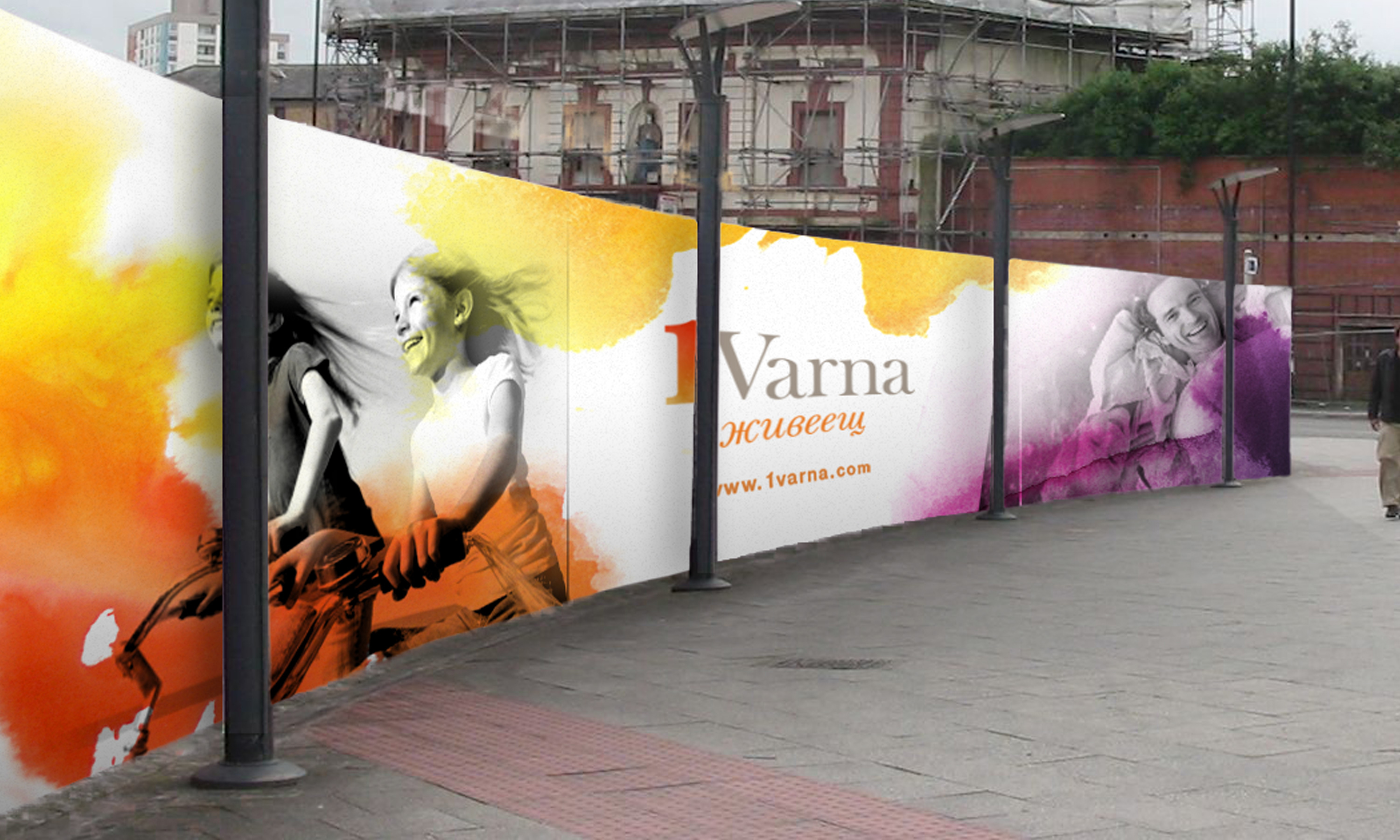
Visually, this idea came alive through a distinctive identity system featuring vibrant watercolour washes layered over black-and-white photography, blending modern architecture with human warmth and optimism.
Drawing inspiration from the district’s name ‘Vazrazhdane’ — meaning renaissance — the brand encapsulates the spirit of revival: a place where well-being, creativity and belonging converge.
The result is a confident, contemporary identity that has helped position 1Varna as a fresh and forward-looking development within Bulgaria’s evolving urban landscape.
Kind words…
“Neon delivered a real splash of colour into a very grey marketplace. Neon helped us name, position and bring to life our unique vision for reinventing life in Varna. Read More…
IVAN ZHELEV
Managing Director
Adamant Capita
(Read Less...)
To find out more: [email protected] or call +44 (0)203 857 7656 Share this: Email, LinkedIn, Facebook, Download a PDF of this case study, follow us on Instagram or view our animations and movies on Vimeo
REAL ESTATE
Branding
PROJECT SUMMARY
Art direction
Brand positioning
Naming
Brand architecture
Brand identity
Literature scheme
Promotional posters
Stationery
Digital templates
Website
Brand guidelines
Promotional hoardings
1Varna site.

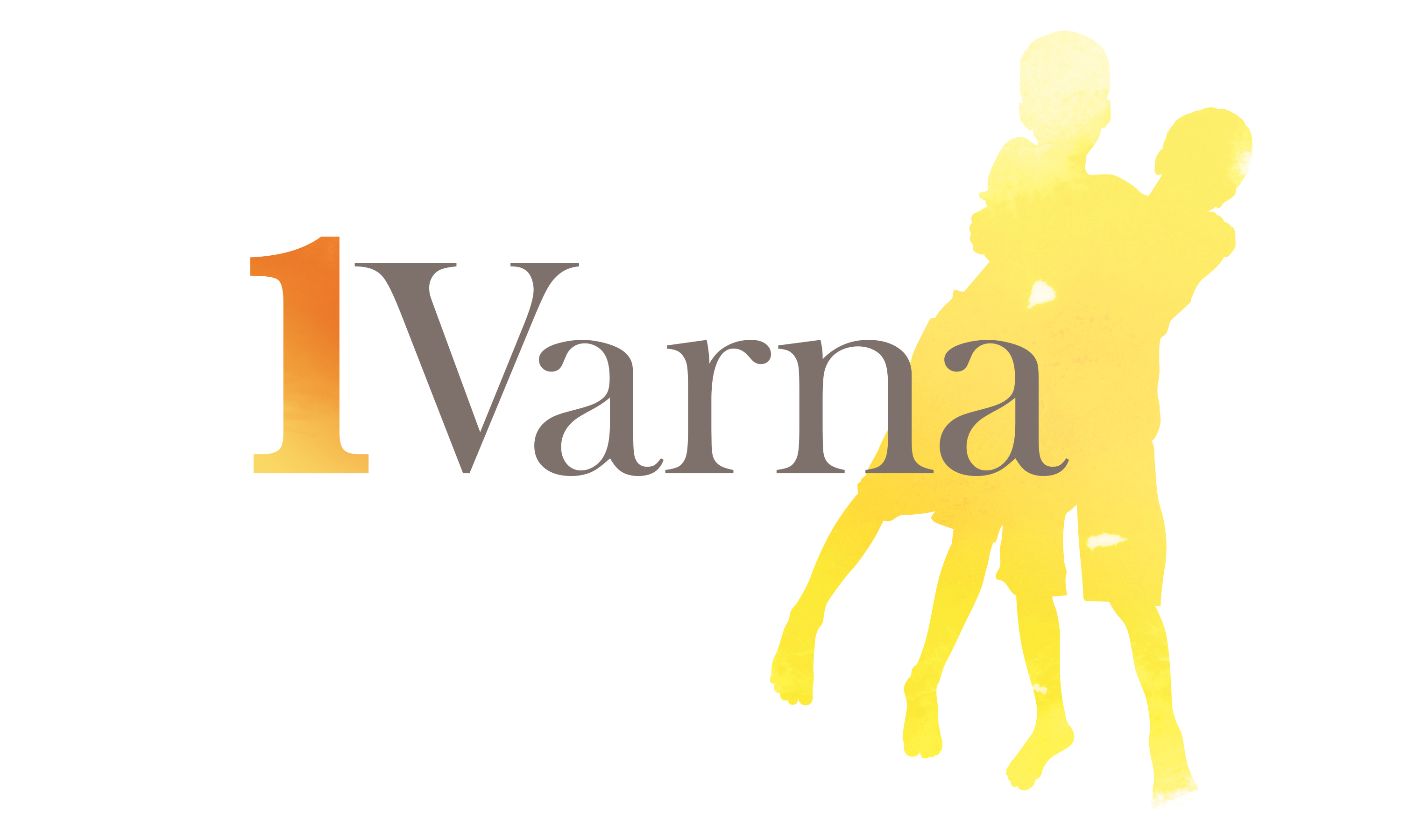
1Varna brand mark.
1Varna brand mark with 'living' descriptor.

1Varna brand mark with 'working' descriptor.

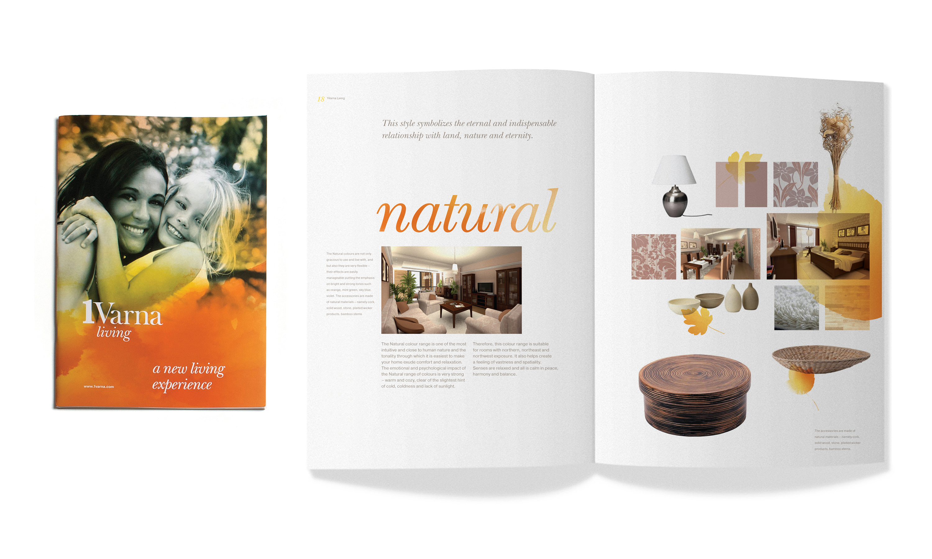
1Varna brand mark with 'living' brochure.

1Varna brand mark with 'living' brochure spread.
1Varna brand mark with 'working' brochure.

1Varna brand mark with 'working' brochure spreads.
1Varna site branding hoarding.
1Varna illustration style.

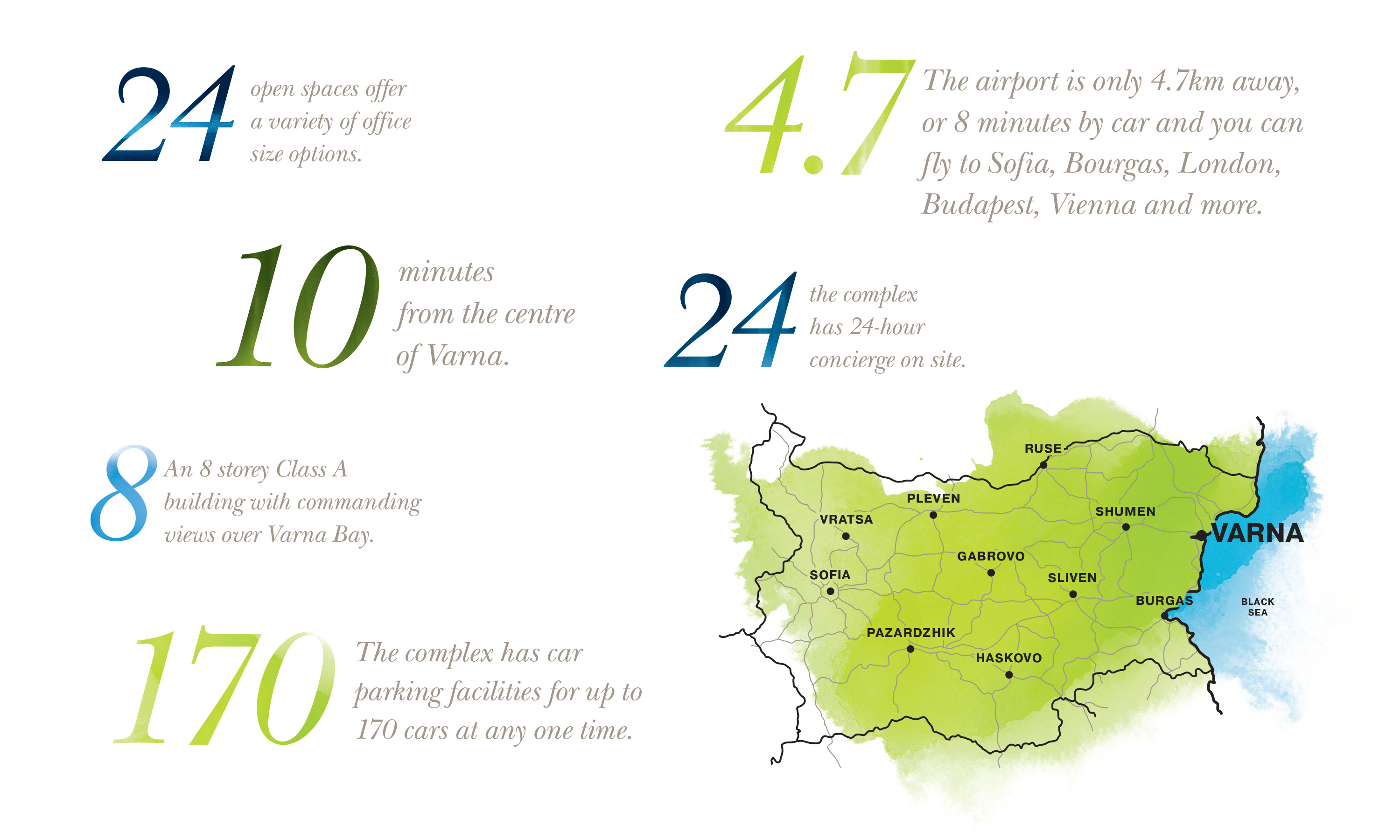
1Varna infographic style.