E-Sports Nutrition
Brand creation
Gaming harder and healthier, with respect
E-Sports Nutrition approached Neon Brand Consultancy to create a new kind of gaming brand — one built on respect, transparency, and next-generation performance.
Our task was to develop a complete brand from the ground up: defining the ethos, strategy, naming, packaging, campaigns, and digital presence for ESN’s two flagship products — ELX energy drinks and IGF meal replacement shakes.
In a market saturated with garish clichés, we created a sophisticated monochromatic brand world, rooted in authenticity and gamer culture. At its heart sits the ethos “Give respect to gain respect” — a rallying cry for a more inclusive, positive gaming community.
We named and designed the product ranges (ELX and IGF), crafted a bold four-dot brand mark inspired by classic controller buttons, and developed packaging rich in gaming details — from flavour names like Fruit Sucker Punch to UV-revealed hidden graphics.
The result is a premium, credible, and community-driven brand that’s redefining gaming nutrition. Within its first year, ESN achieved standout sales, Vegan Society certification, and even a collaboration with deadmau5 — levelling up from start-up to serious contender.
For the full long read case study, click here…
We were given a brief of clearly defined marketing principles to build a brand for E-Sports Nutrition’s. At the heart of ESN was a passion for creating intelligent energy and nutrition for next generation gamers through 2 flagship products, a ground breaking energy drink and nutritional meal replacement shake.
ESN wanted to stand out for all the right reasons in a very murky space where dated formulations full of fillers, nasty colourings, proprietary blends and misleading labels were commonplace.
ESN were passionate about doing things properly which included pitching their products to next generation gamers. By doing so this not only meant putting an end to old, outdated gamer sterotypes of but also meant positively changing the way gamers view their energy and nutritional needs.
At the heart of this was a no compromise approach to player health / wellbeing, gaming performance, advanced flavour systems, product transparency, absolutely no product fillers, value for money and inclusivity i.e vegan friendly. In regard to vegan friendly, we suggested that ESN amplified this positive attribute and apply for the ‘gold standard’ of certification by The Vegan Society (which they duly did and secured). This certification would not only be a powerful marketing message, but also reflect ESN stance of transparency and qualification in regard product claims.
More than “just a product”
Taking all these elements from the brief in regard to ESN’s passion for high product standards, we believed they needed to not only capture and communicate functional benefits, but become something more and transcended the clichéd views of gamers shown by other brands within this market. To create an ethos and values that would go far beyond ESN bringing next generation products energy drinks and nutrition to help them game hard and game healthy, delivering a positive message as brand and fellow member gaming community.
We encapsulated this in an ethos statement that appears on every ESN product, and which helped to shape every element of brand communication, from the launch video onwards:
GIVE RESPECT TO GAIN RESPECT
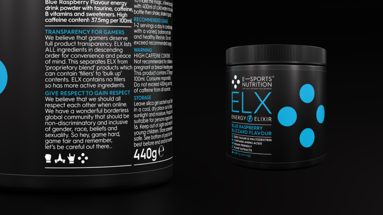
We believe that we should all respect each other when online and in competition. We have our own wonderful borderless global community, that should be inclusive of gender, race, beliefs, sexuality and be non discriminatory. So hey, game hard, game fair and remember, let’s be careful out there…
This was underpinned by helping ESN whittle down the key elements of the brief in producing products that were a generational leap in comparison other brands and appeal to the current next generation contemporary gamers and their successors as a strapline to simply ‘For next generation gamers’. ‘For next generation gamers’ also delivered an emotive and inspirational sign-off to balance the functional nature of E-Sports Nutrition’s name.
A black and white solution
In terms of bringing to life a brand for next generation gamers, we naturally zigged while others zagged – opting for a super-sophisticated monochromatic feel, and steering well clear of all the cheap, cheerful and frankly childish graphics that typify the market.
To set the brand apart form the herd, the look and feel for the brand visual style uses a deep premium black, that not only reflected gamers’ love of black screen “themes” online, as well as all the state-of-the-art gaming gear and peripherals, from gaming chairs to mice and microphones, but also helped underpin the premium nature of the product itself. Complementing the black, stylish flat colours subtly echo the RGB lighting used in in gamer set-up and peripherals.
Launch video: portraits of a generation
This monochromatic style also set the tone for brand promotional videos and digital advertising, creating a coolly contemporary premium feel, in a sea of shouty, brightly coloured, cheap-looking competitive activity.
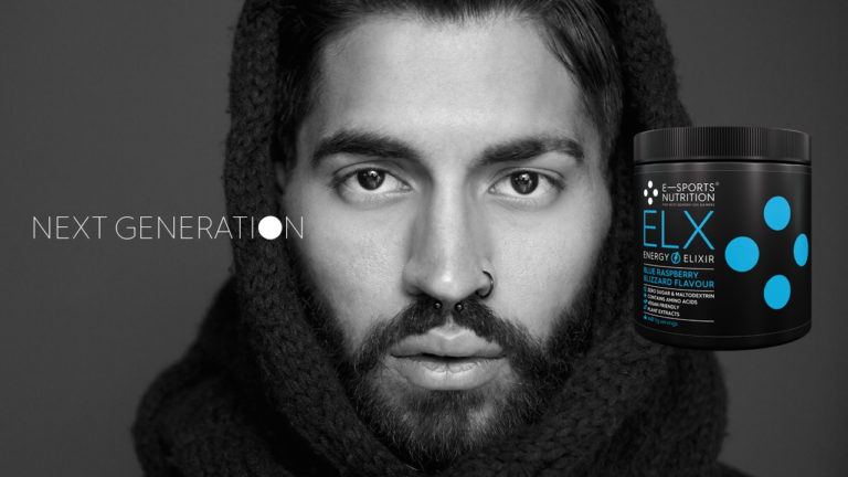
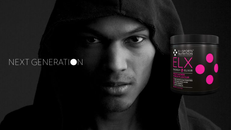
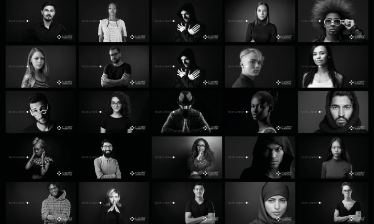
Oozing confidence, our launch campaign kicked off with a teaser that didn’t even feature the product. Instead, we focused squarely on the “next generation”, cutting between cool black and white portraits, reflecting the true diversity of the gaming community, in terms of age, gender, nationality, sexuality, and gaming capability (from casual gamers to elite esports players). Posted across gaming social and streaming channels, the video’s clearly defined aim was to create a buzz around the brand.
Look, no clichés
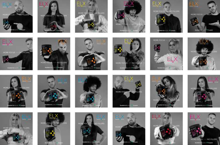
And when we did introduce the products, we avoided the obvious cliché of happy gamers brandishing them at camera. Instead, while continuing to focus on emotive portraits of gamers, off all levels, ages and genders, we showcased the black packs with their flat-coloured graphics by super-imposing them over the monochrome imagery.
Overall, the visual style we created played a vital role in positioning ESN and its energy drinks and in-game food meal replacement shakes as something genuinely new and different; premium, performance-focused, designed by and for gamers – and, crucially, as a “force for good” in the gaming community.
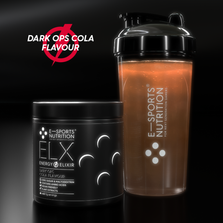
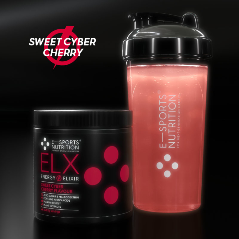
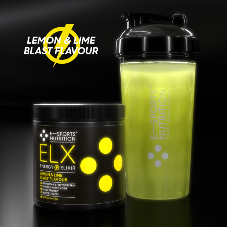
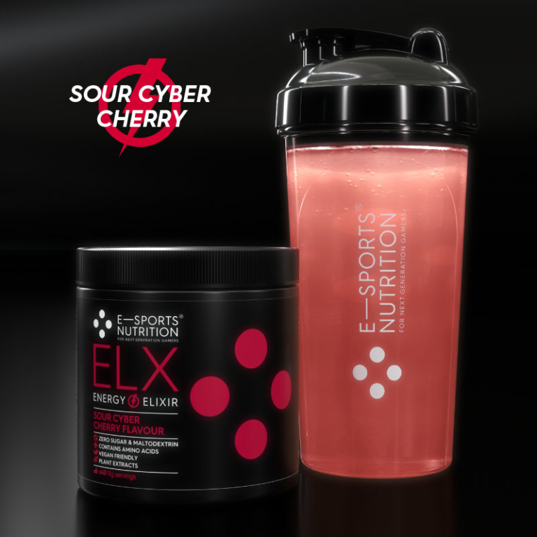
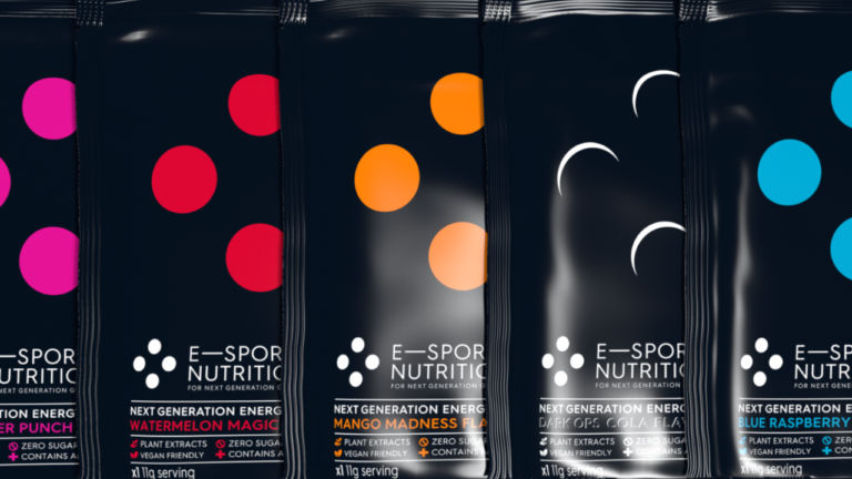
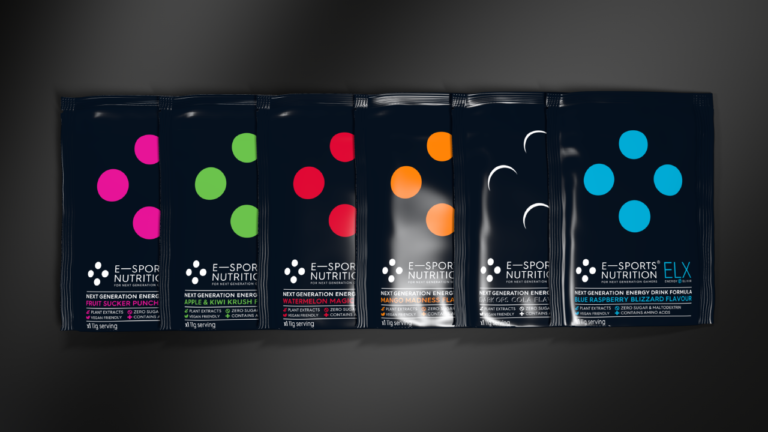
A further powerful graphic device – the ESN four dots, taken from classic gaming controllers – was also featured on pack, creating an instantly recognisable visual shorthand for the brand, while providing colour cues for product flavours.
Product naming and packaging
Before we started work on the packaging, we did a thorough review of the competitive landscape and took onboard all of ESN’s insights that they had identified as an opportunity in this market. What we found, to sum up briefly, was countless gaming energy and meal supplements in packs that were almost universally cheap in feel, short of substance in relation to brand, lacking in transparency in their labelling (as highlighted in the brand briefing stage by ESN), and nastily garish and childlike in terms of graphics. Brand and product names were generally clichéd, too – not even close to being reflective of modern gamers’ interests and priorities.
We knew we could do a lot better. We started by creating distinctive names for the two main ESN product ranges. The energy drinks became ELX, from the energy elixirs used to “power up” found in many styles of game. And the meal replacement products were brought together under the banner IGF, standing for In Game Food.
As well as standing out in a totally relevant way, these succinct names were designed for maximum ease-of-use on Twitch in ‘the chat’ (and highlight promotion with elx! and igf! in chat and nightbots) and within all kinds of social media chat.
On pack, the names naturally featured prominently, underpinned by iconography punchily highlighting the key product USPs.
Flavours for gamers to savour
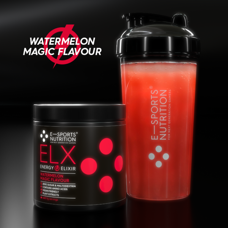
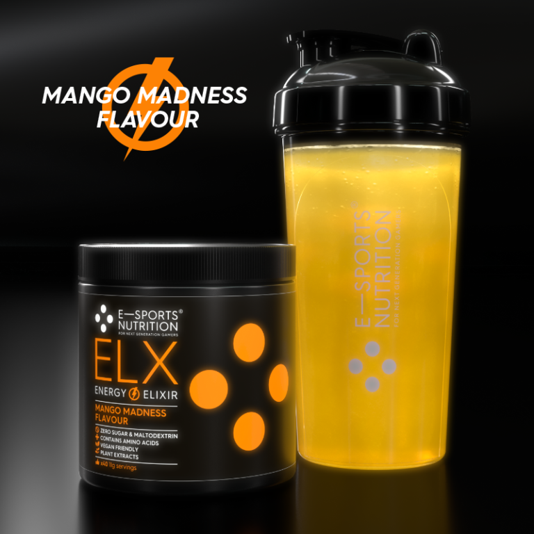
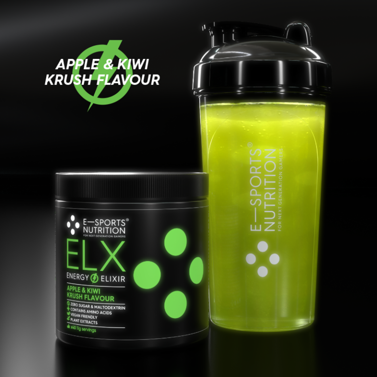
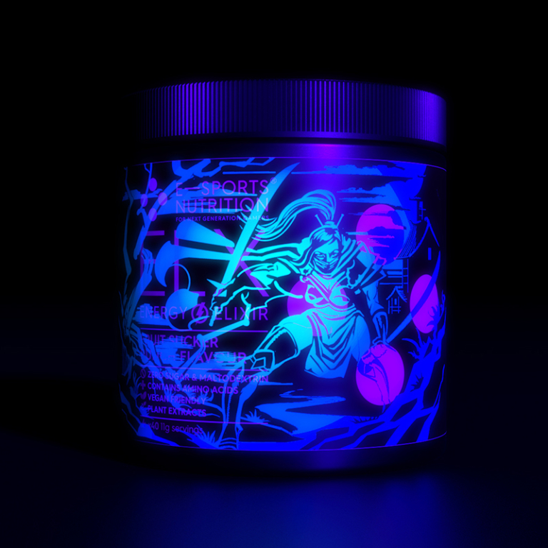
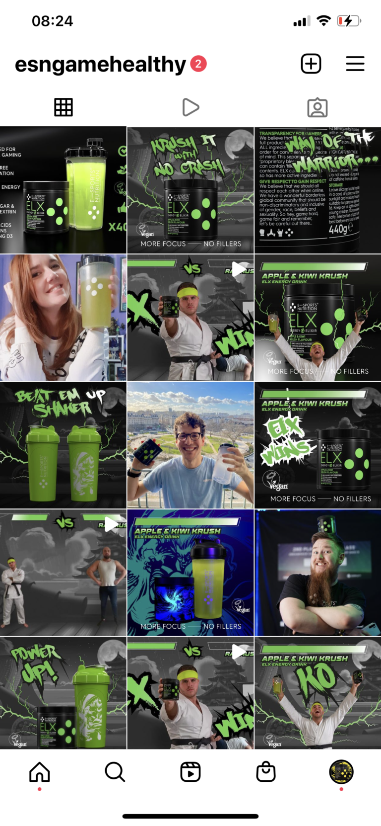
Our flavour descriptions were also designed to be gamer-relevant. Fruit punch, for example, became Fruit Sucker Punch, while apple and kiwi became Apple & Kiwi Krush, in references to fighting games. Watermelon Magic was a nod to RPG games, and Dark Ops Cola not-so-subtly suggestive of stealth-based first person shooter games.
It’s all in the detail
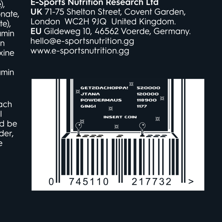
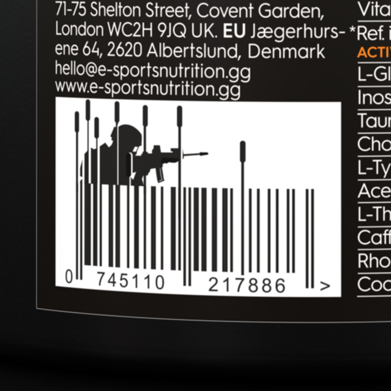
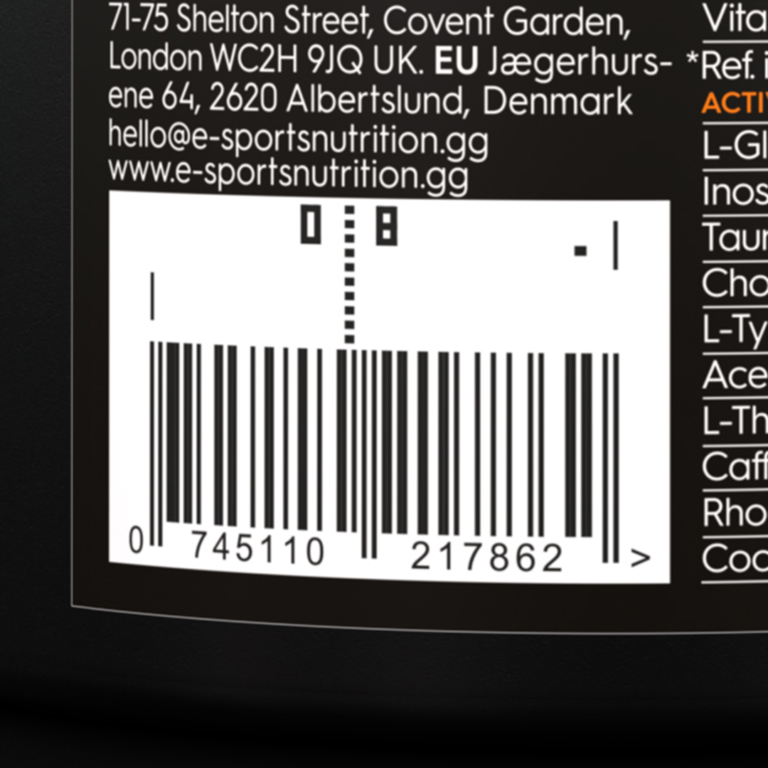
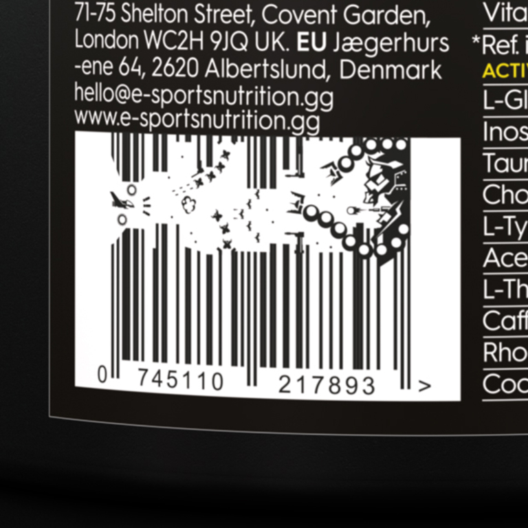
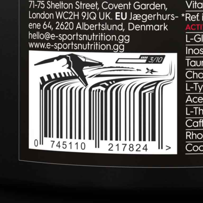
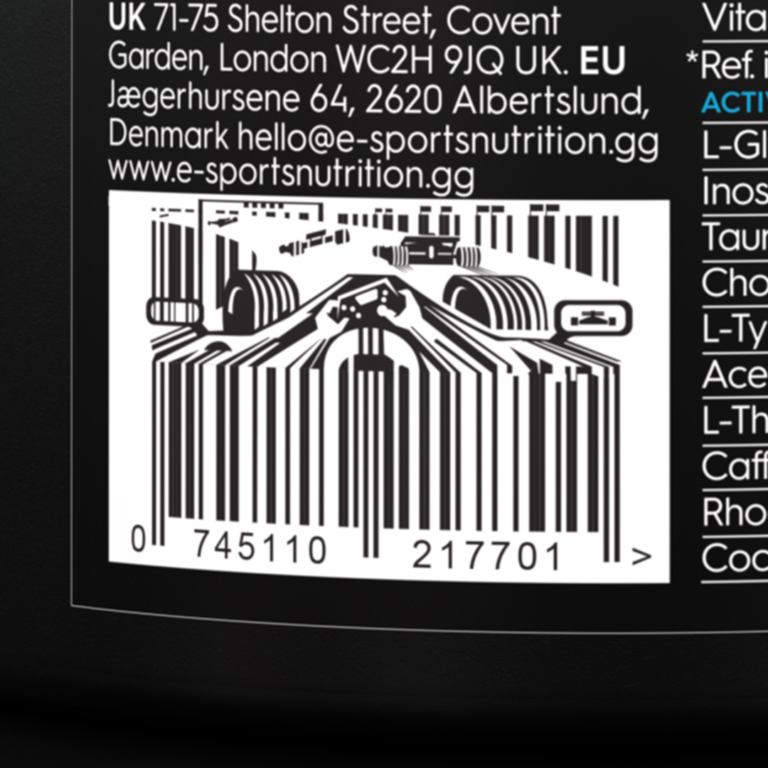
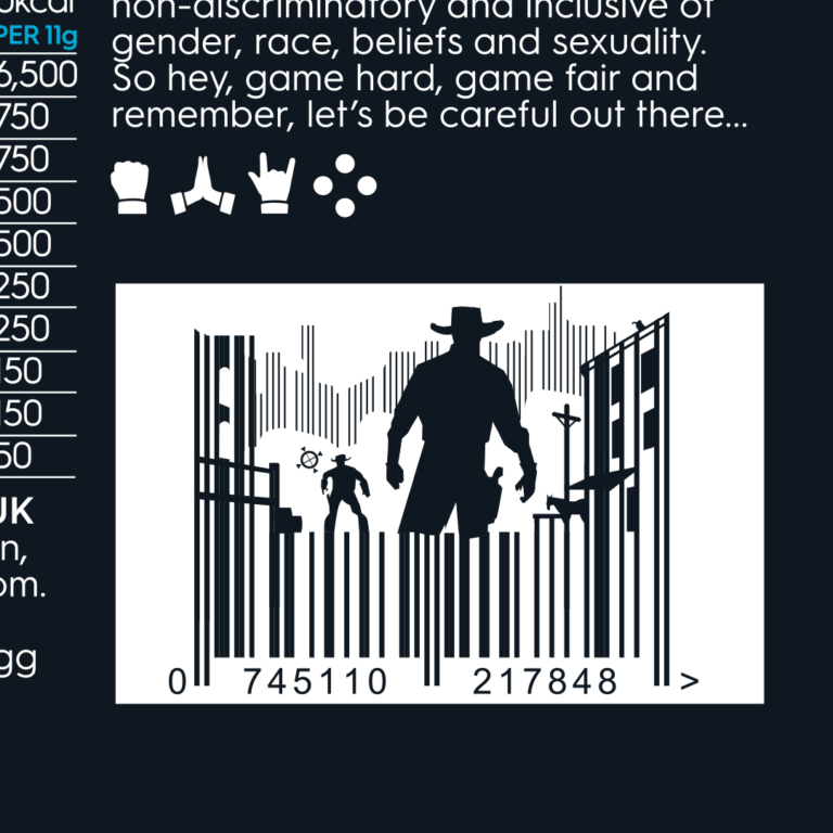
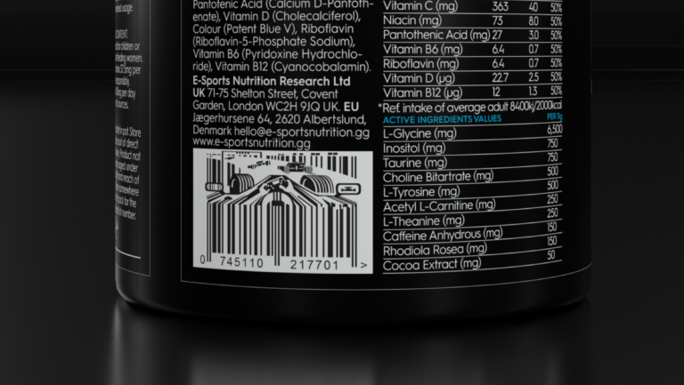
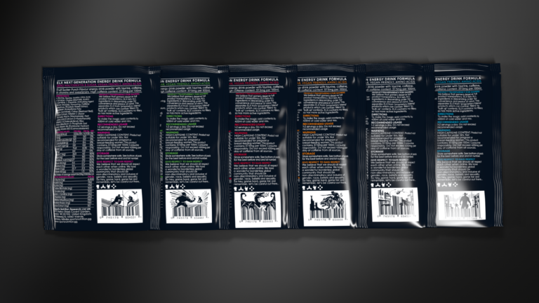
To support the gaming reference of our “four dots” device, we also looked to introduce little “true gamer” details. For example, take the humble barcode. It may be just a practical requirement, but we decided to make something charming and engaging out of it – with each pack having a gaming reference visually incorporated into a fully functioning barcode.
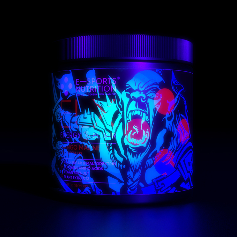
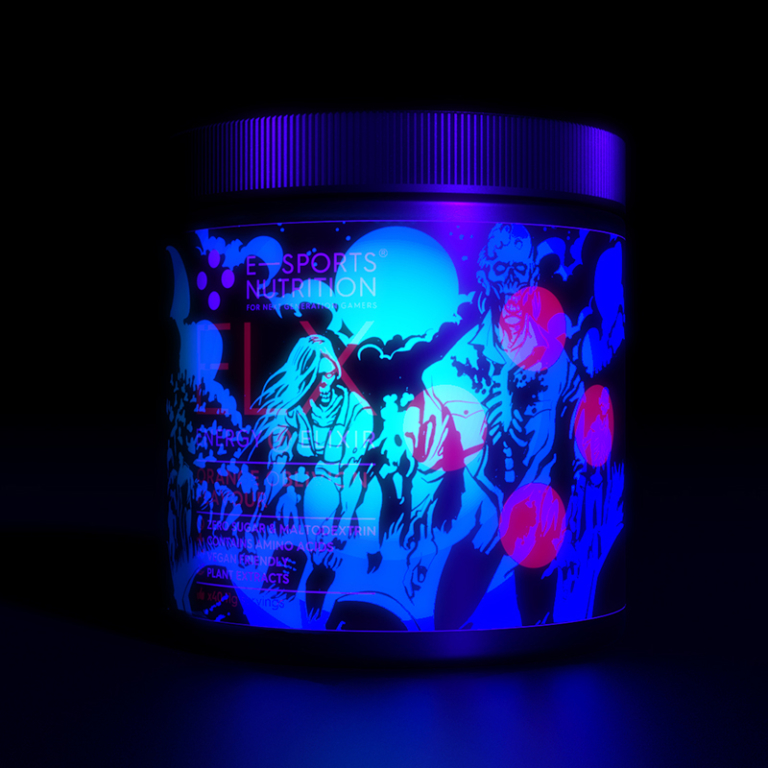
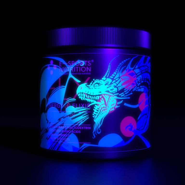
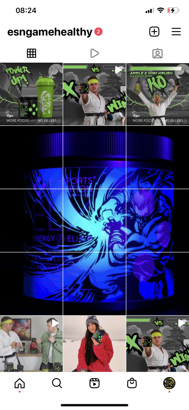
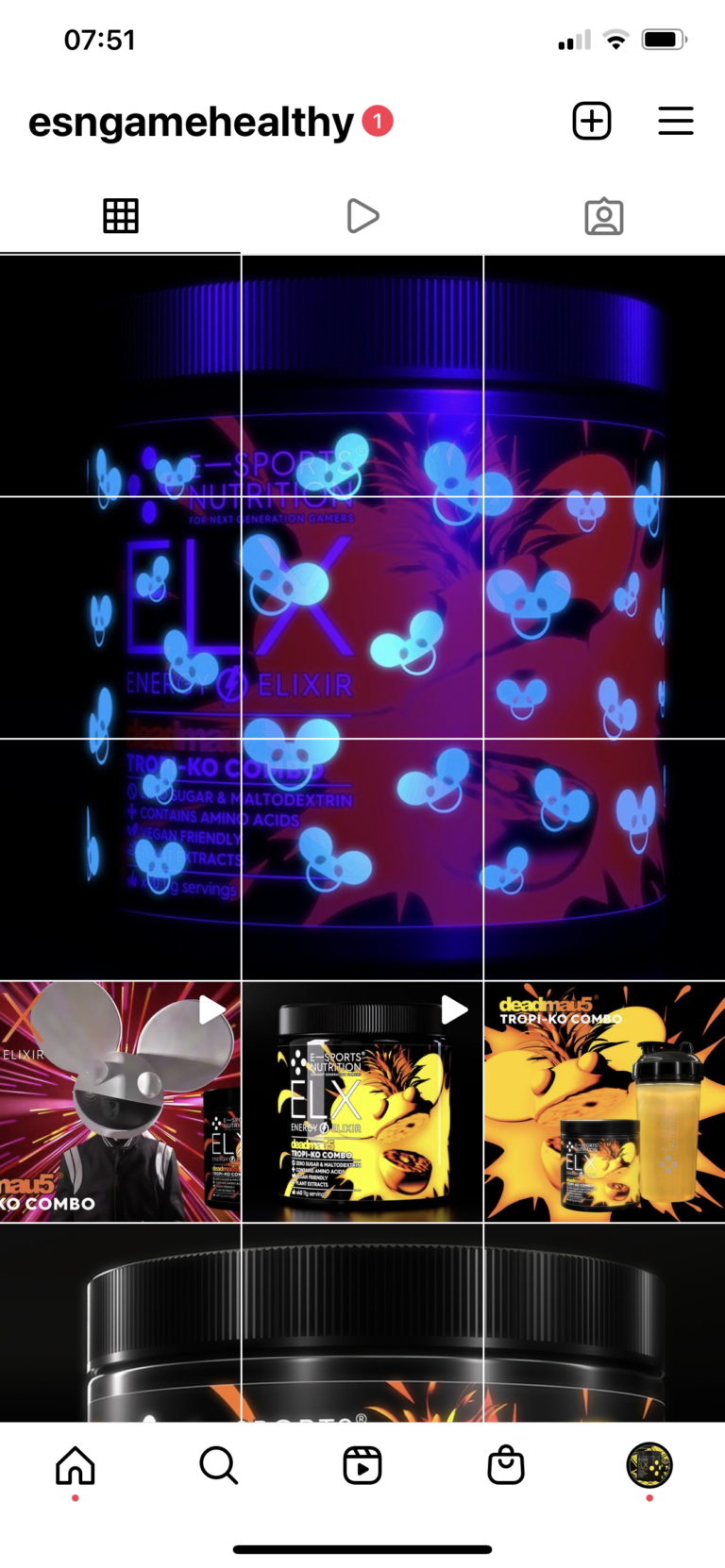
And then we went even further, incorporating a “hidden” element into each pack, just because we could! Everyone likes to stumble across something within a game, so we introduced a light-sensitive varnish to every pack, concealing a gaming-relevant illustration – only revealed under UV (illustrations by our very good friend illustrator Rob Ball).
Putting the products in the game
The brand’s authentic gamer credentials were further reinforced by black and white promotional animations, showcasing ELX and IGF while paying homage to various gaming genres. In each case, the animation placed the viewer in the game at the time when maximum focus and energy was required – “when you need to go on. And on.’
As well as standing out visually, these animations neatly side-stepped acquiring expensive IP from game franchises, and helped deliver key product benefits. Crucially, at the same time, they also demonstrated ESB’s true gamer knowledge of genres and folklore – from racing sims to RPG dragons, from the early days of gaming to today’s Elden Ring type games, through to homages to Destiny space operas for IGF and classic fighting games like Mortal Kombat and Streetfighter for ELX. Each campaign animation also helped generate suites of promotional imagery for adverts and social media.
Results so far: a high score!
It’s early days for ESN, but the brand has already made its mark, rapidly gaining recognition as a new player offering an unmatched combination of value for money and the best formulated products on the market, while taking very seriously its ambition to be a positive force within the gaming community.
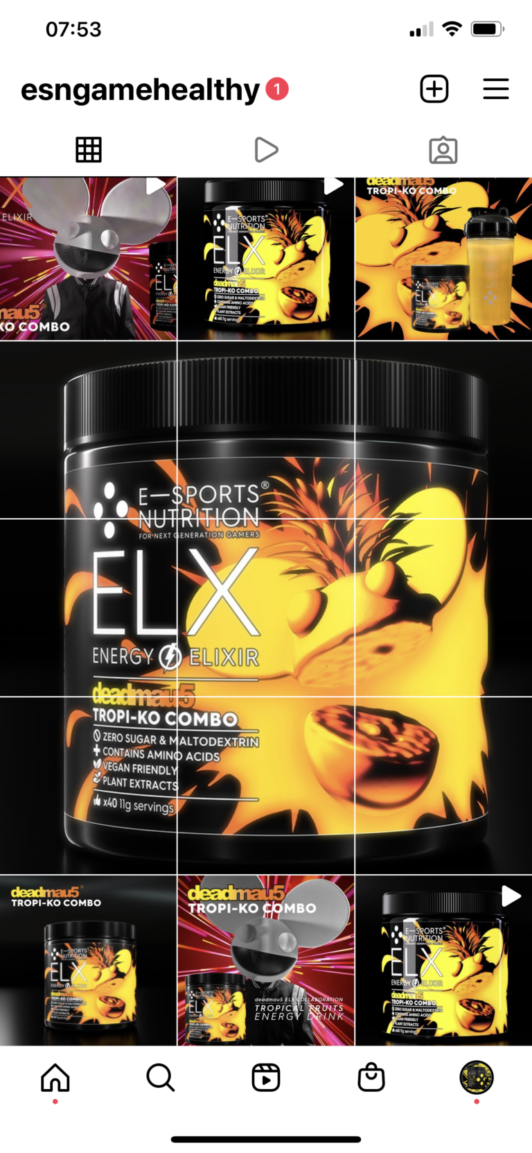
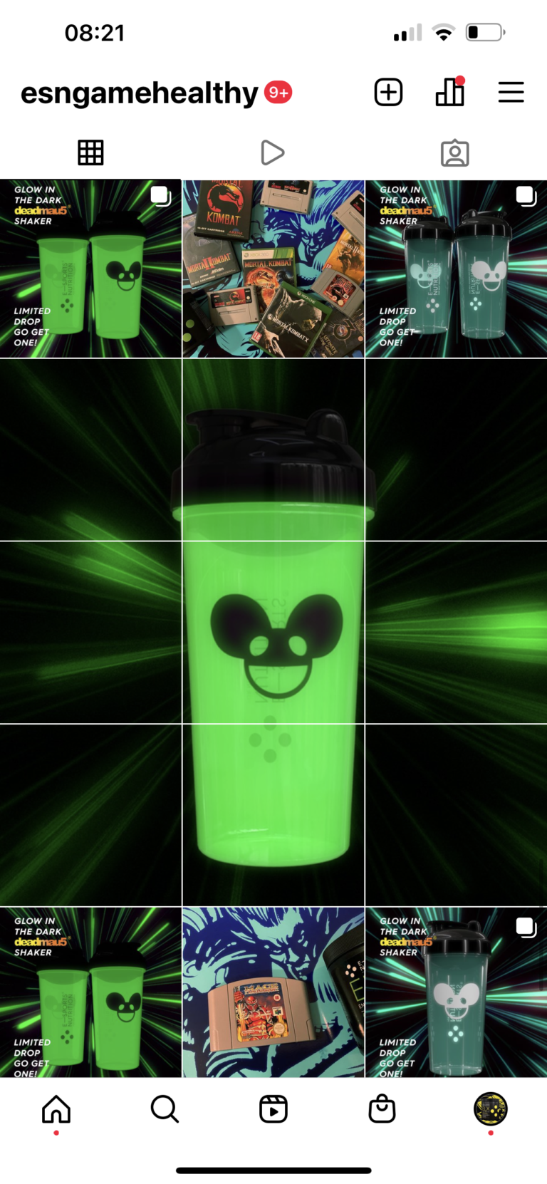
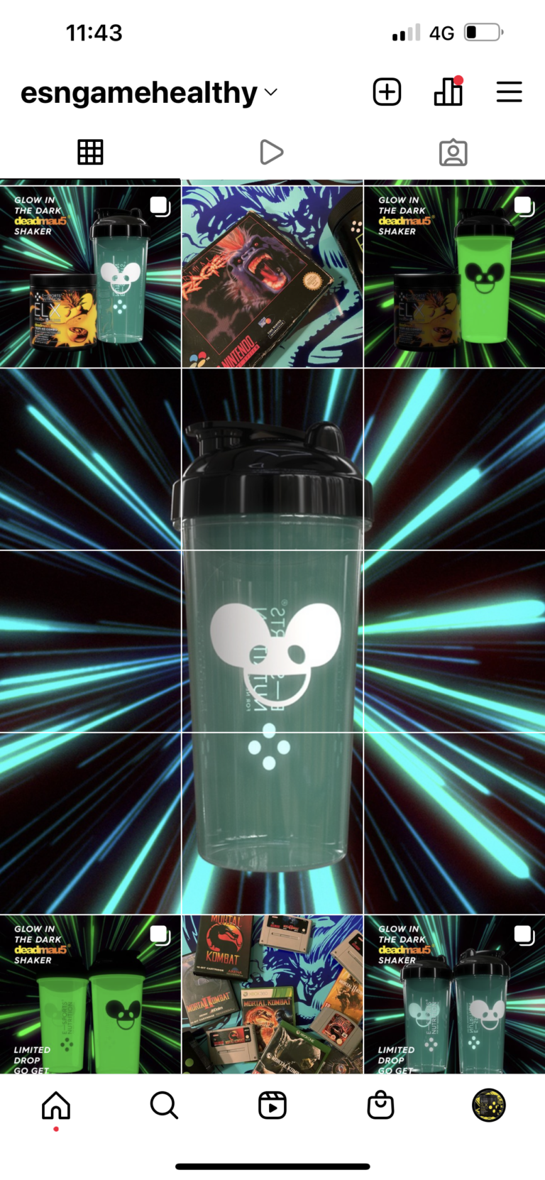
Commercial success aside, ESN has already been approached by several esports teams attracted by the brand’s Give Respect to Gain Respect ethos. And the combination of ethos and product also led directly to ESN being approached by deadmau5’s representation (deadmau5 is not only a DJ megastar, but also a passionate gamer and metaverse pioneer with his own Twitch stream for gaming ).
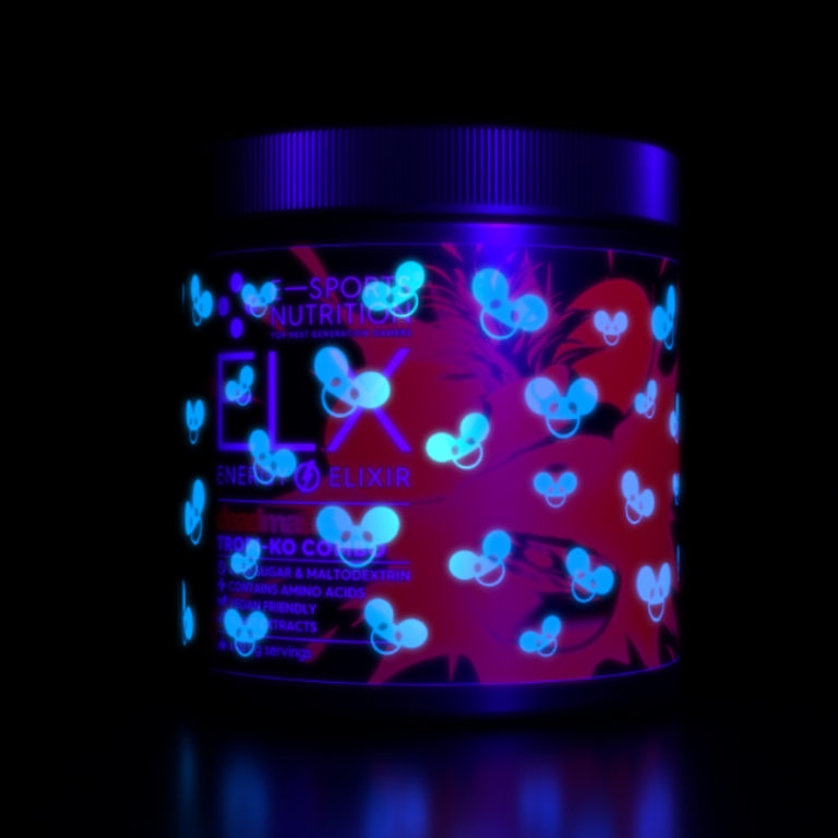
Exactly one year after launch, this resulted in ESN’s huge announcement of an ELX energy drink flavour collaboration with deadmau5.
A fantastic first year, with more to come
As the brand continues to go from strength to strength, the next step planned by ESN is to create its own esports team – to help unknown grass roots next generation gamers up to the next level of visibility, while becoming better players. in terms of attitude and perspective, as well as gaming ability.
First year sales have been very encouraging indeed; and ESN has achieved the stature of an established premium brand, on a budget a fraction the size of its main competitors.
Onward and upward…
At Neon, we’ve put everything we know into the successful launch of ESN. We’ve built a brand for contemporary gamers, from the ground up in collaboration with the ESN team for theESN team – basing it on ESN insights, our deep and wide-ranging brand expertise, creative excellence . . . oh yes, and many, many happy hours spent playing games ourselves (and not just in our mis-spent youth).
It’s been a massive pleasure and a privilege to be part of the ESN journey so far. We can hardly wait to help take the brand to the next level.
Please do also find out in more detail here about: ESN’s packaging, campaigns and e-commerce website, all created by Neon.
(Read Less...)
Kind words…
“Neon created the foundations of the brand with neat, strategic positioning within the gaming space. Dana also focused on our brand ethos which is central in supporting our products pitch. Read More…
What really impressed me was the attention to detail in terms of the packaging and how the flavours and product USP’s were so clear and engaging. Our website along with campaigns and socials were not only beautifully designed but really represented us as being a core gaming brand which is such a difficult task to pull off. A year on we shave a successful brand that’s immersed within the gaming community, and all this has been created and delivered on a self-funded and somewhat limited start up budget!” ANTHONY MILLAR
Director & Co Founder
E-Sports Nutrition
(Read Less...)
To find out more: [email protected] or call +44 (0)203 857 7656 Share this: Email, LinkedIn, Facebook, Download a PDF of this case study, follow us on Instagram or view our animations and movies on Vimeo
GAMING / ESPORTS & FMCG
Branding
PROJECT SUMMARY
Brand positioning
Strapline
Product Naming
Brand identity
Brand mark animation
Advertising
Animations & end screens
Brand visual style
Sub-brand development
Packaging
Ecommerce website
Product campaigns
Social media content
ESN - Brand mark and monochromatic style.

E-Sports Nutrition launch video.
ESN - Give Respect to Gain Respect ethos within the gaming community.
ELX energy drink and IGF In Game Food packaging.


E-Sports Nutrition teaser campaign.
ESN brand mark animation.
ELX & IGF brand imagery.
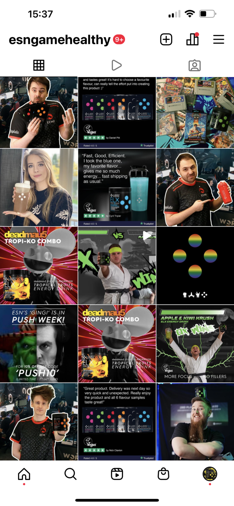
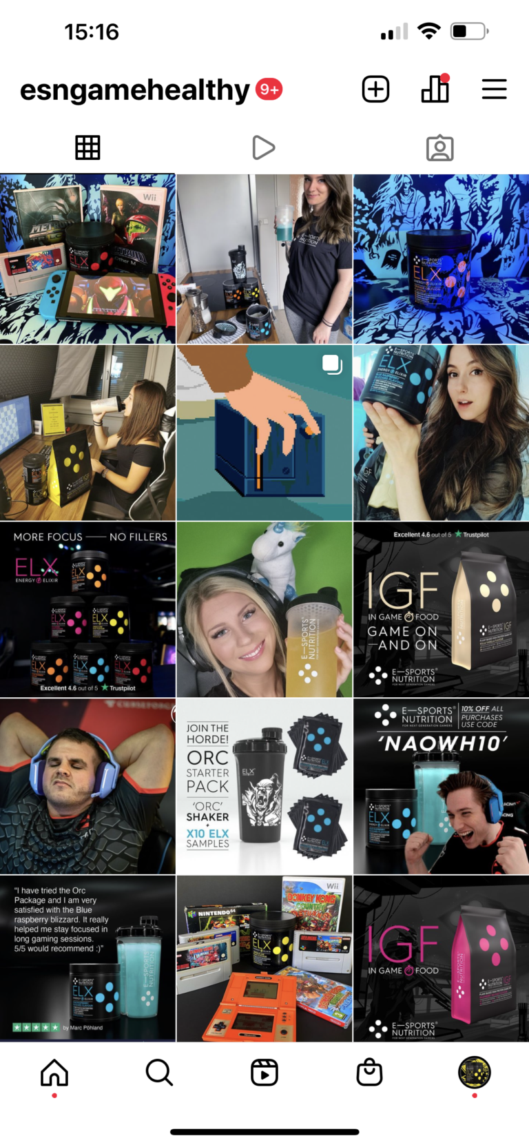
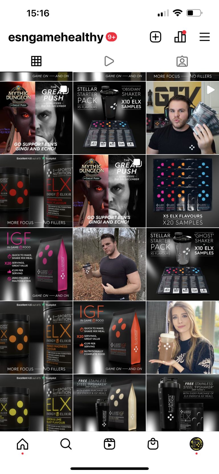
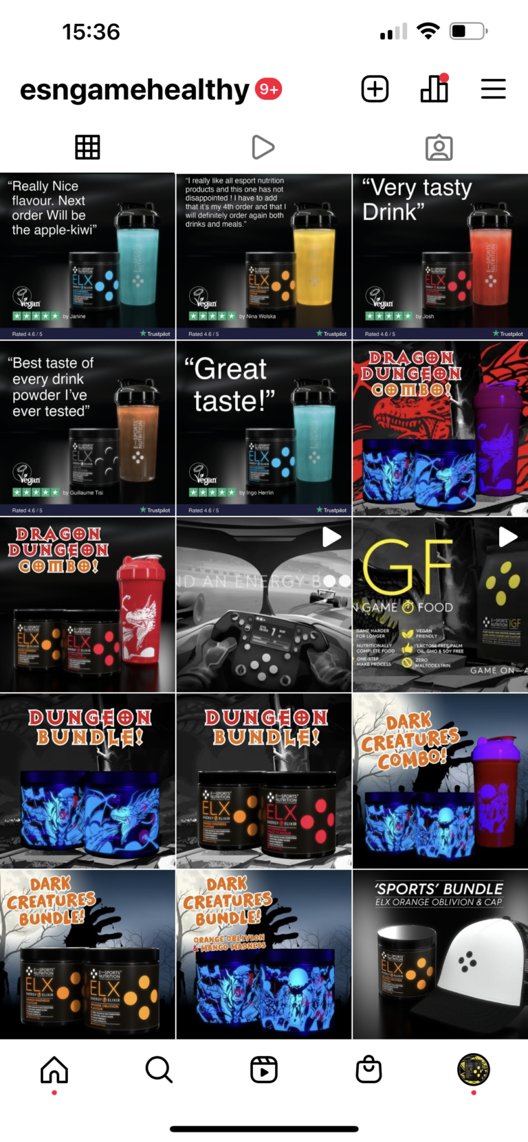
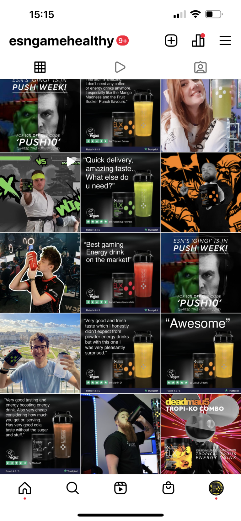
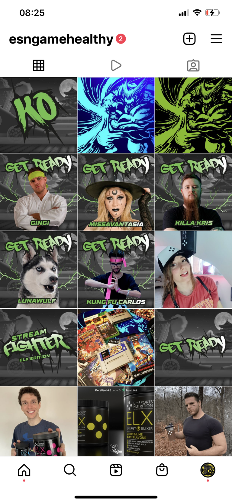
ESN ads and socials.
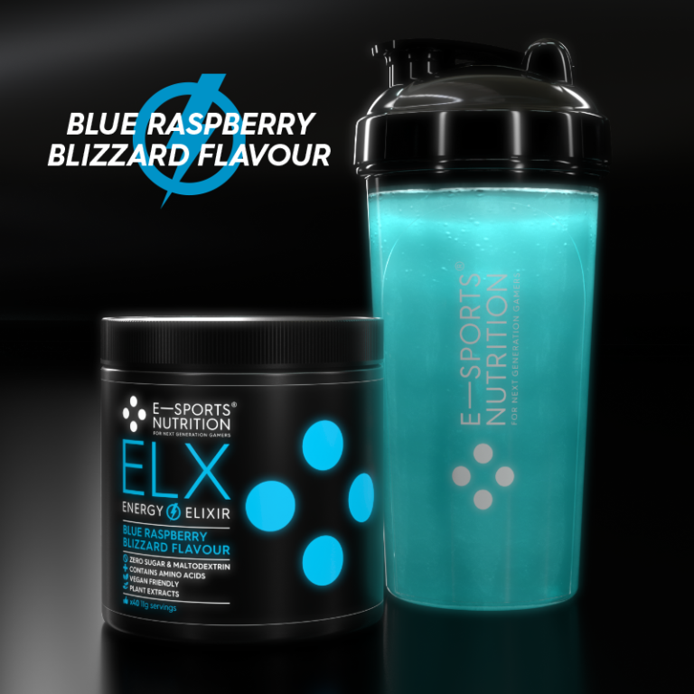
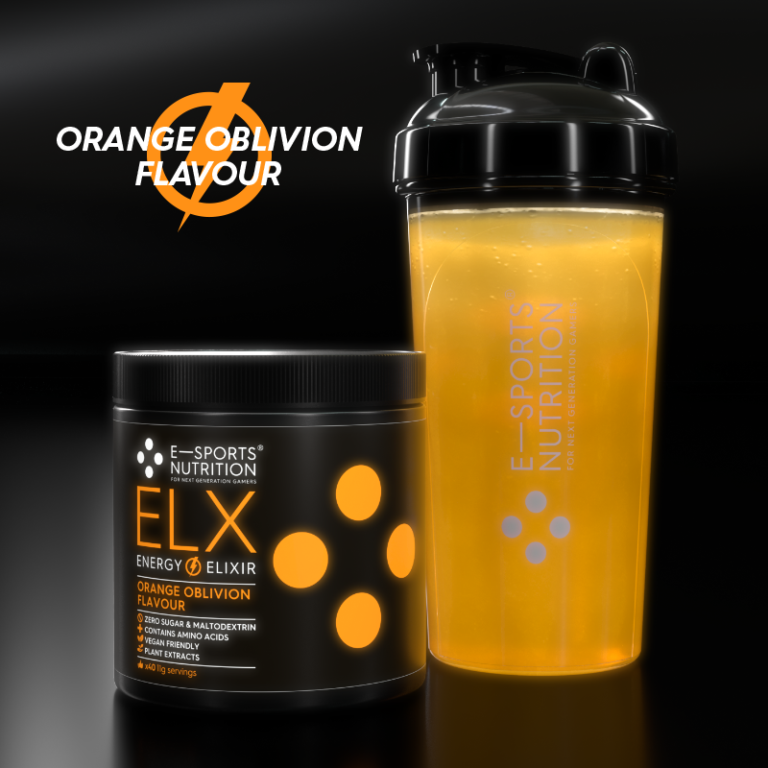
ELX packaging range x11 flavours.

ELX packaging detail.
ELX packaging detail.

ELX packaging, transparency pledge and gaming community ethos on every pack.
ELX x11 flavours with ghost shaker.
ELX packaging, UV varnishes.
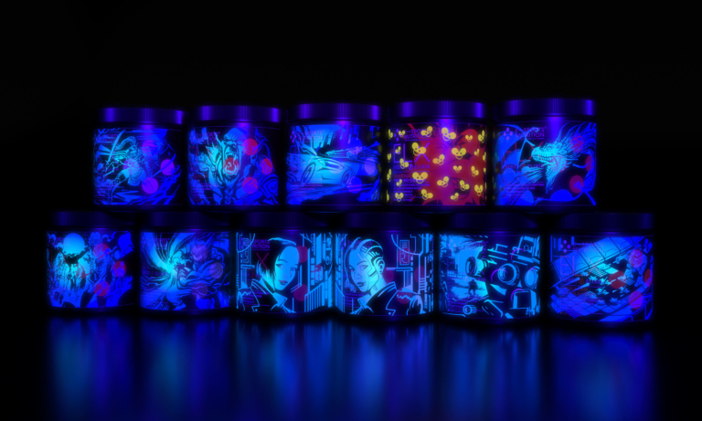
ELX packaging, UV varnish details.
ELX UV label artwork promotional graphics.

ELX packaging, game genre barcode take overs.

ELX energy drink & IGF Image game food 'Starter Pack I' launch promo animation.
ELX energy drink 'Starter Pack II' launch promo animation.
ELX sample sachets.
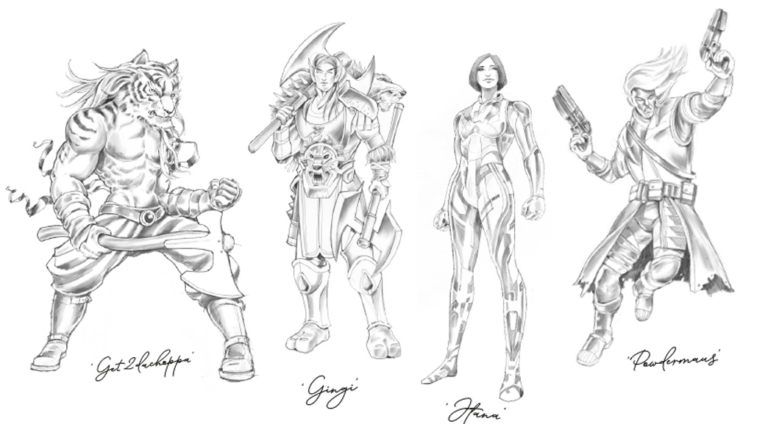
Monochromatic illustration style.

IGF product promo video.
IGF In Game Food packaging x4 flavours.
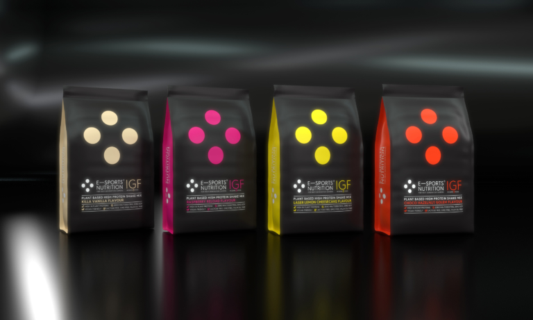
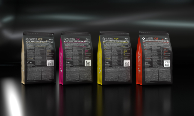
IGF In Dame Food, detail game genre barcode take overs, transparency pledge and gaming community ethos on every pack.
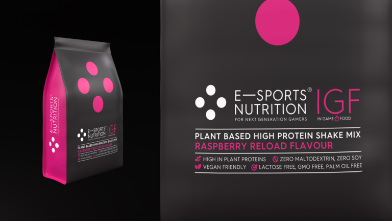
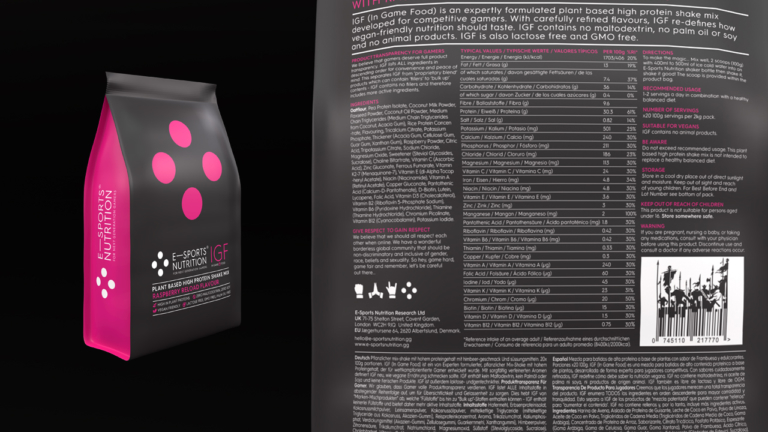
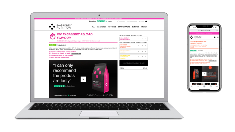
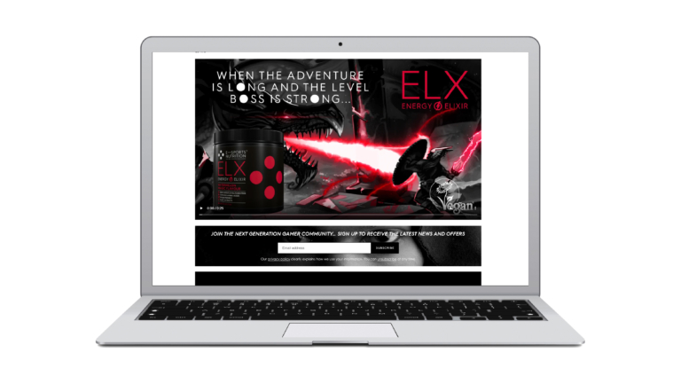
E-Sports Nutrition ecommerce website.
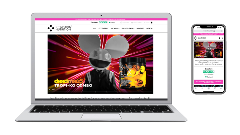
E-Sports Nutrition Website
ELX energy for gamers new flavour launch promo animation 'ELX Wins!'
ELX energy for gamers promo animation 'When the adventure is long - Dragon'.
ELX energy for gamers promo animation 'Life on the Limit'.
ELX energy for gamers promo animation 'Elixir'.
ELX energy and deadmau5 collaboration promo animation.
E-Sports Nutrition directors game genre illustrations.
