Field Court Chambers
Rebrand
Field Court Chambers
A new identity for a new generation of barristers.
Neon created a contemporary new brand identity for Field Court Chambers — part of the Honourable Society of Gray’s Inn — reflecting growth, renewal, and a modern legal mindset.
Inspired by the Inn’s historic gardens, the new marque of six oak leaves captures the passage of time and the chambers’ forward-thinking ethos.
A confident yet natural identity that stands apart from legal tradition — expressing professionalism with warmth and clarity.
For the full long read case study, click here…
A new identity for a new generation of barristers.
Field Court Chambers is part of the Honourable Society of Gray’s Inn — one of London’s four Inns of Court. Recommended through Neon’s long and trusted relationship with Nabarro LLP (now CMS Law), Field Court Chambers invited us to create a new identity that would reflect their progressive approach and mark a generational shift within the set.
Our task was to retain a sense of heritage while introducing a fresher, more contemporary personality. Something that would speak to clients and peers alike — confident, modern, and distinct from the traditional heraldic language of the legal world.
Inspired by Gray’s Inn’s famous five-acre gardens, known as The Walks, we developed a striking new marque of six American Red Oak leaves — each in a different stage of colour and form. The motif symbolises growth, renewal, and the passing of seasons: a natural metaphor for evolution and continuity.
This elegant, organic device became the centrepiece of a new visual language — from digital and print to the chambers’ refreshed website and collateral. Clean typography, generous white space, and subtle natural imagery bring warmth and accessibility to every touchpoint.
The result is a confident new brand for Field Court Chambers — one that balances authority with humanity, reflecting both their legal excellence and their forward-looking culture.
(Read Less...)
Kind words…
“Dana and Neon are a joy to work with – they develop creative and clever branding solutions. Read More…
I asked Dana and Neon to work with us after being impressed by their work with Nabarro and am very glad that I did. Our new branding is fresh, modern and sets us apart. Thank you Dana and Neon!” CAROLINE PAUL
Marketing Director
Field Court Chambers
(Read Less...)
To find out more: [email protected] or call +44 (0)203 857 7656 Share this: Email, LinkedIn, Facebook, Download a PDF of this case study, follow us on Instagram or view our animations and movies on Vimeo
LAW
Branding
Advertising
PROJECT SUMMARY
Brand identity
Literature system
Launch materials
Signage
Interior graphics
Digital Templates
Power Point templates
Field Court Chambers brand mark.

Field Court Chambers brand mark inspired by 'the Walks’.
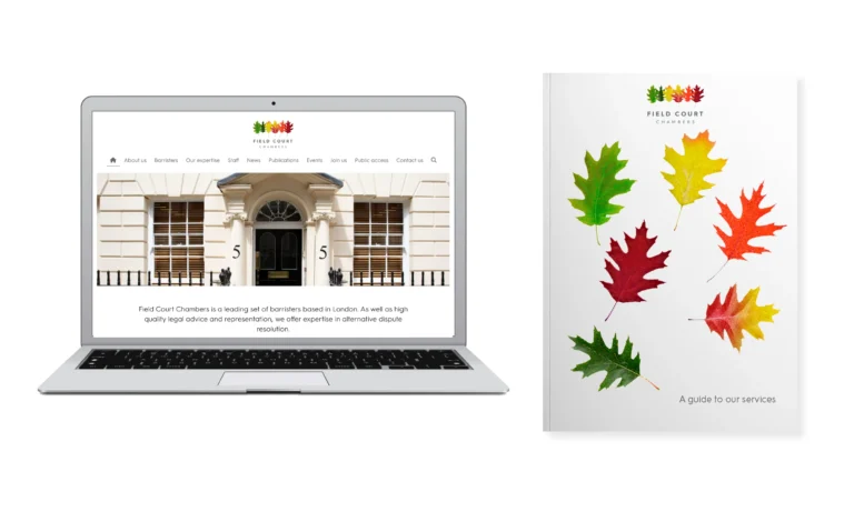
Field Court Chambers website and literature examples.
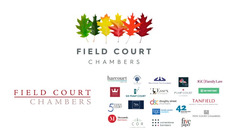
Field Court Chambers old mark and competitors comparison.
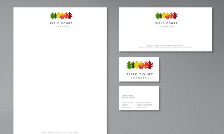
Field Court Chambers stationery.