The Futures Company
Naming, brand positioning & identity
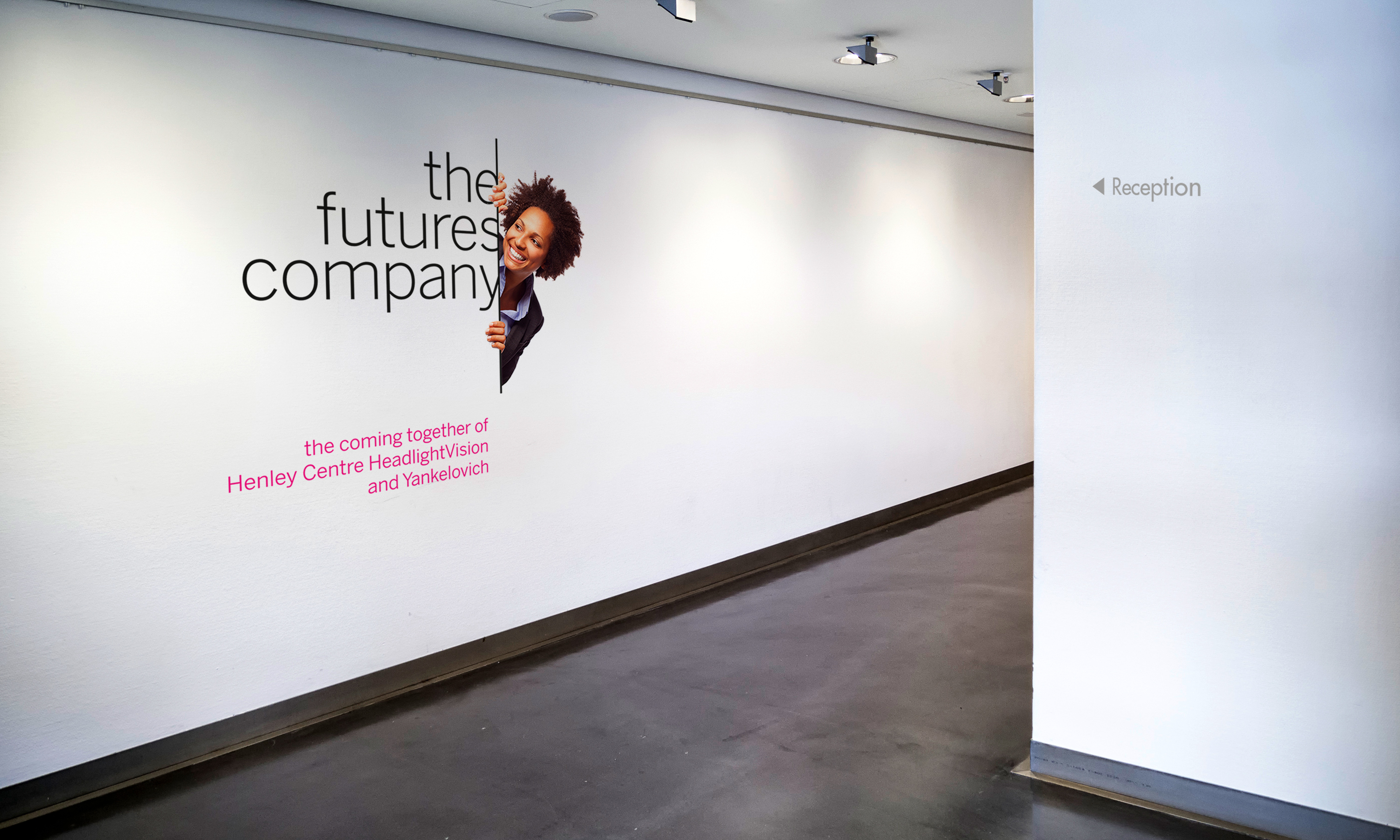
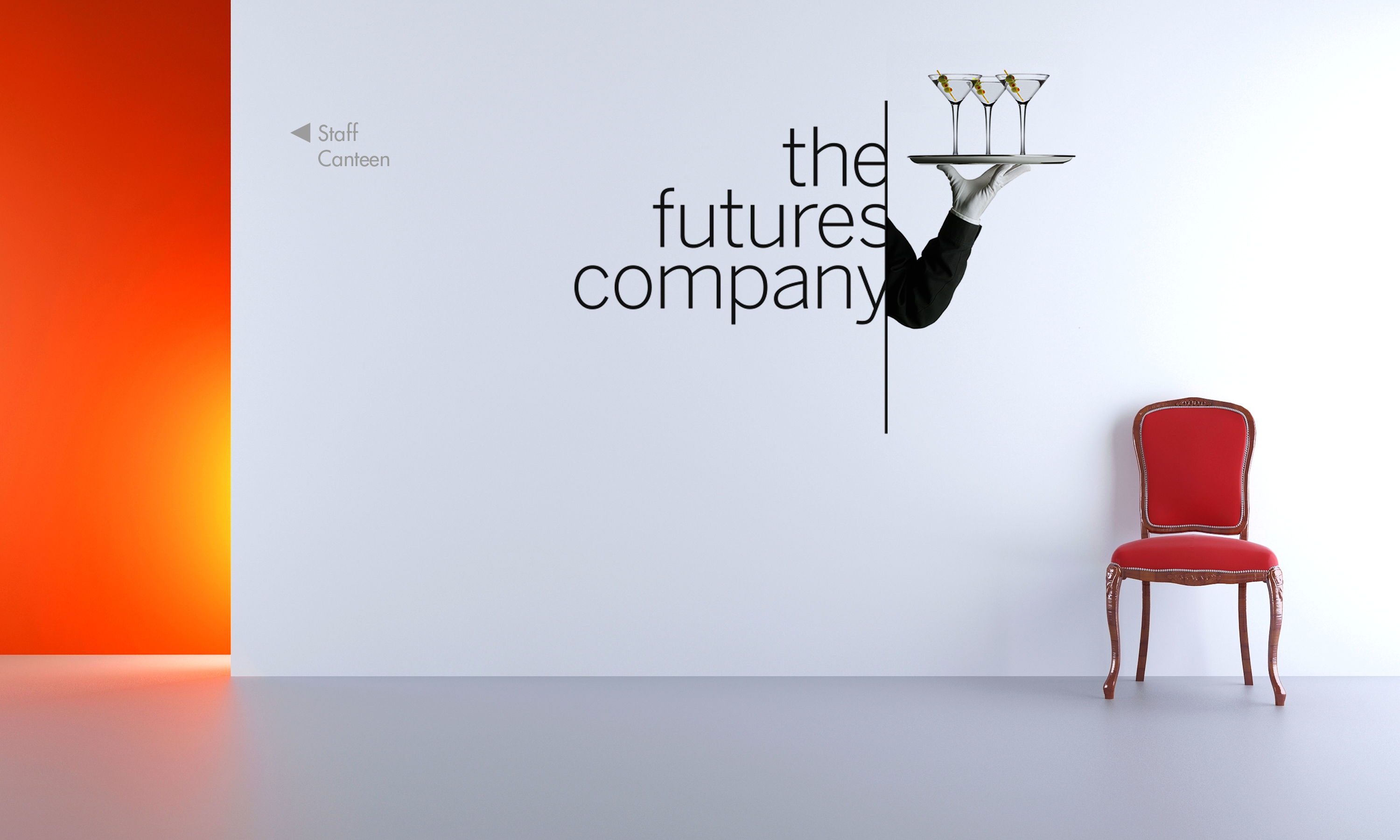
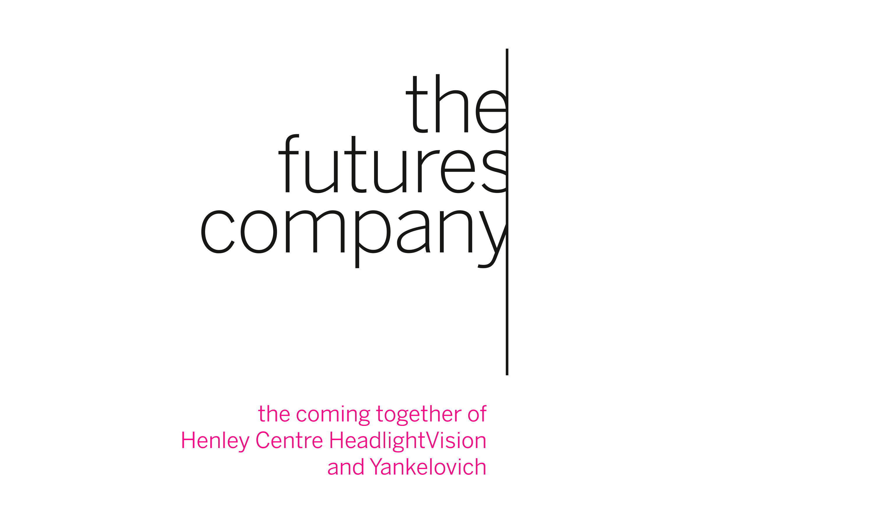
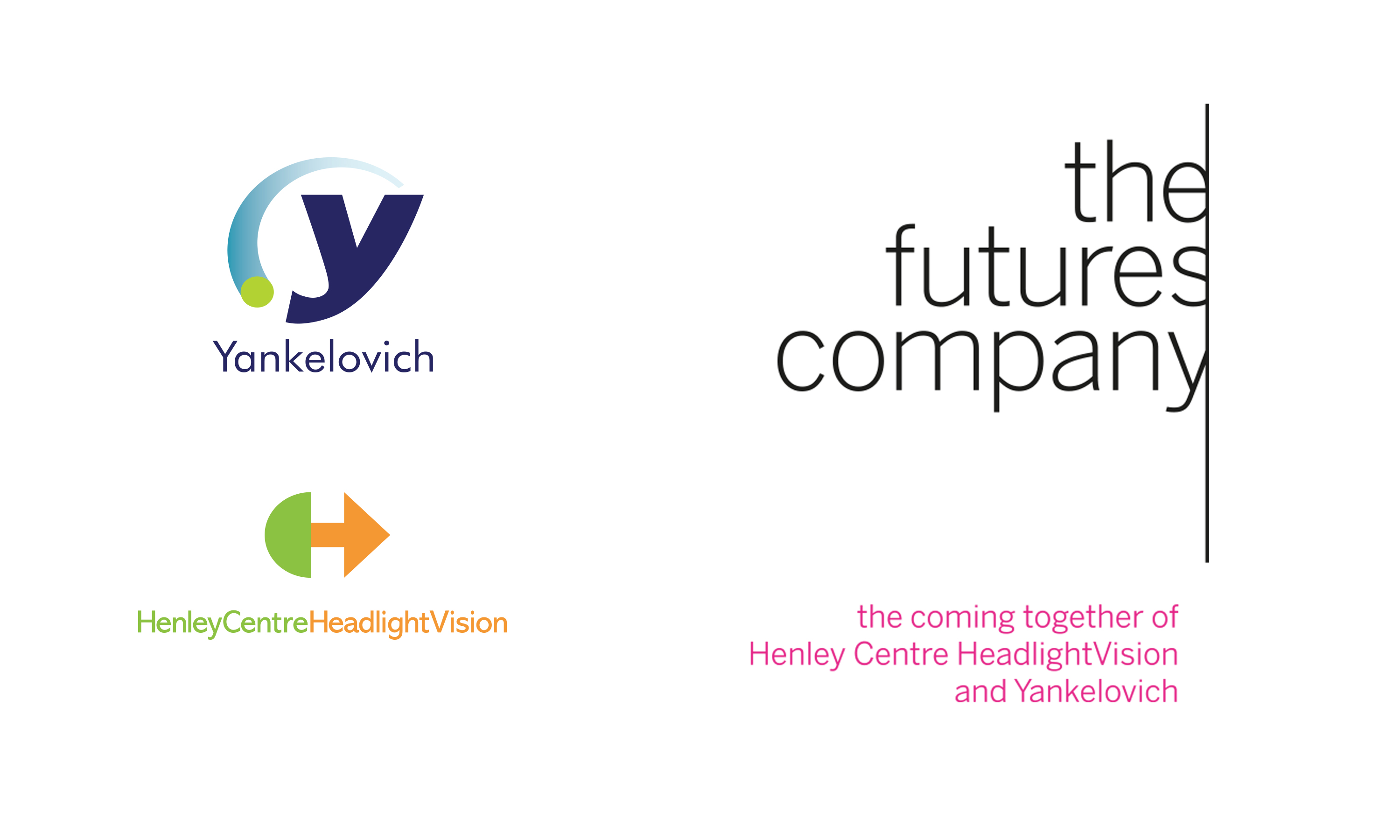
The coming together of…
Neon was commissioned by WPP to create the name, brand idea and identity for The Futures Company — formed from the merger of Yankelovich, the US leader in consumer trends and lifestyle research, and Henley Centre HeadlightVision, WPP’s European foresight consultancy.
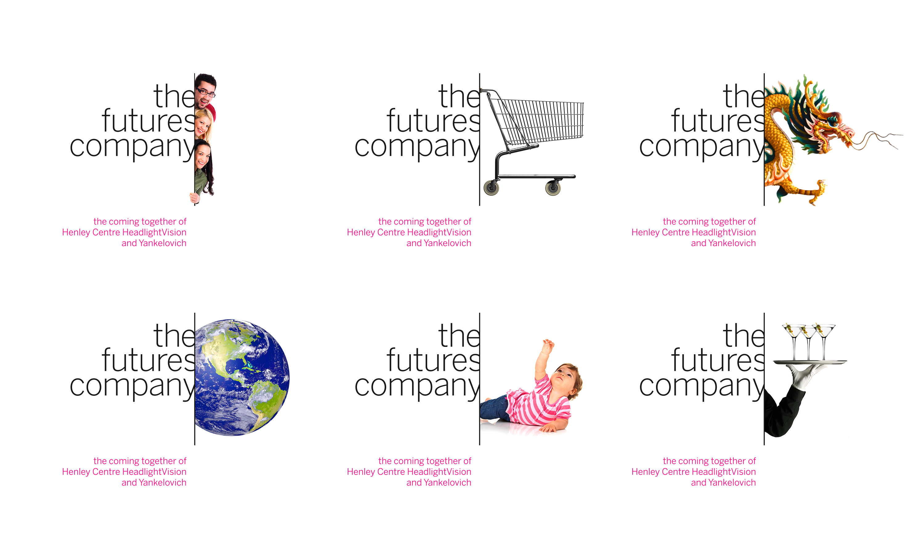
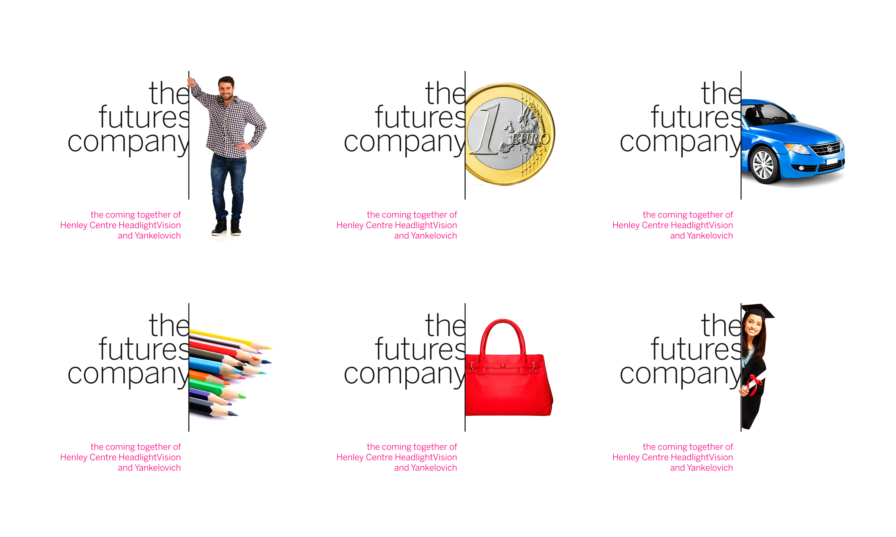
The challenge was to unite two world-class research firms under one inspiring global identity. Neon’s strategic idea, “Unlocking Futures,” captured the company’s ability to blend analytical rigour with imagination — learning from the past and present to understand what comes next. From this, the name The Futures Company naturally followed.
A modern typographic brand mark hinted at the elusive nature of foresight, while a confident, human visual language communicated optimism and clarity. The result: a brand that embodied vision, transformation and the power to unlock better futures.
Kind words…
“Thinking with the future in mind. Working with people who view themselves as both experts in the future and creative lateral thinkers is most design agencies worst nightmare. Read More…
CRAWFORD HOLLINGWORH “Compelling and creative. Neon were a really great partner for our naming and rebranding work. The enthusiasm and care that they put into the pitch carried on throughout the engagement. They consulted widely with our management team and demonstrated a strong grasp of our business fundamentals and opportunities, resulting in a strong and compelling brand idea. Their creative work was innovative and pushed us to a new level in terms of how we present ourselves. The internal launch was made particularly successful because of the video developed by Neon, which gave a powerful strategic rationale for our new name and identity, and brought it to life in a way that proved inspirational to the team.” SIÂN DAVIES “Inspirational, insightful and inspiring. Neon did great work for The Futures Company. We had a difficult branding challenge, which they mastered brilliantly. They started by defining a process within which we could focus on key issues, and with that we were able to articulate a set of criteria that successfully guided the rebranding of our company. They exhaustively developed creative alternatives for us to review and provided insightful counsel as we narrowed down our choices. Once the decision was made, Neon developed an outstanding video and presentation for us to use in introducing the new company identity internally and to our clients. We rely closely on the rulebook of branding guidelines they prepared. Every step of the way, Neon was a close collaborator and a nonpareil strategic branding partner.” J. WALKER SMITH
Executive Chairman
The Futures Company
Chief Executive
The Futures Company
Executive Vice Chairman
The Futures Company
(Read Less...)
To find out more: [email protected] or call +44 (0)203 857 7656 Share this: Email, LinkedIn, Facebook, Download a PDF of this case study, follow us on Instagram or view our animations and movies on Vimeo
PROFESSIONAL SERVICES
Branding
Published in book LOGO
by Michael Evamy
PROJECT SUMMARY
Naming
Brand proposition
Brand architecture
Migration strategy
Brand identity
Sub-brands
Internal launch movies
Internal communications
Brand guidelines
Literature
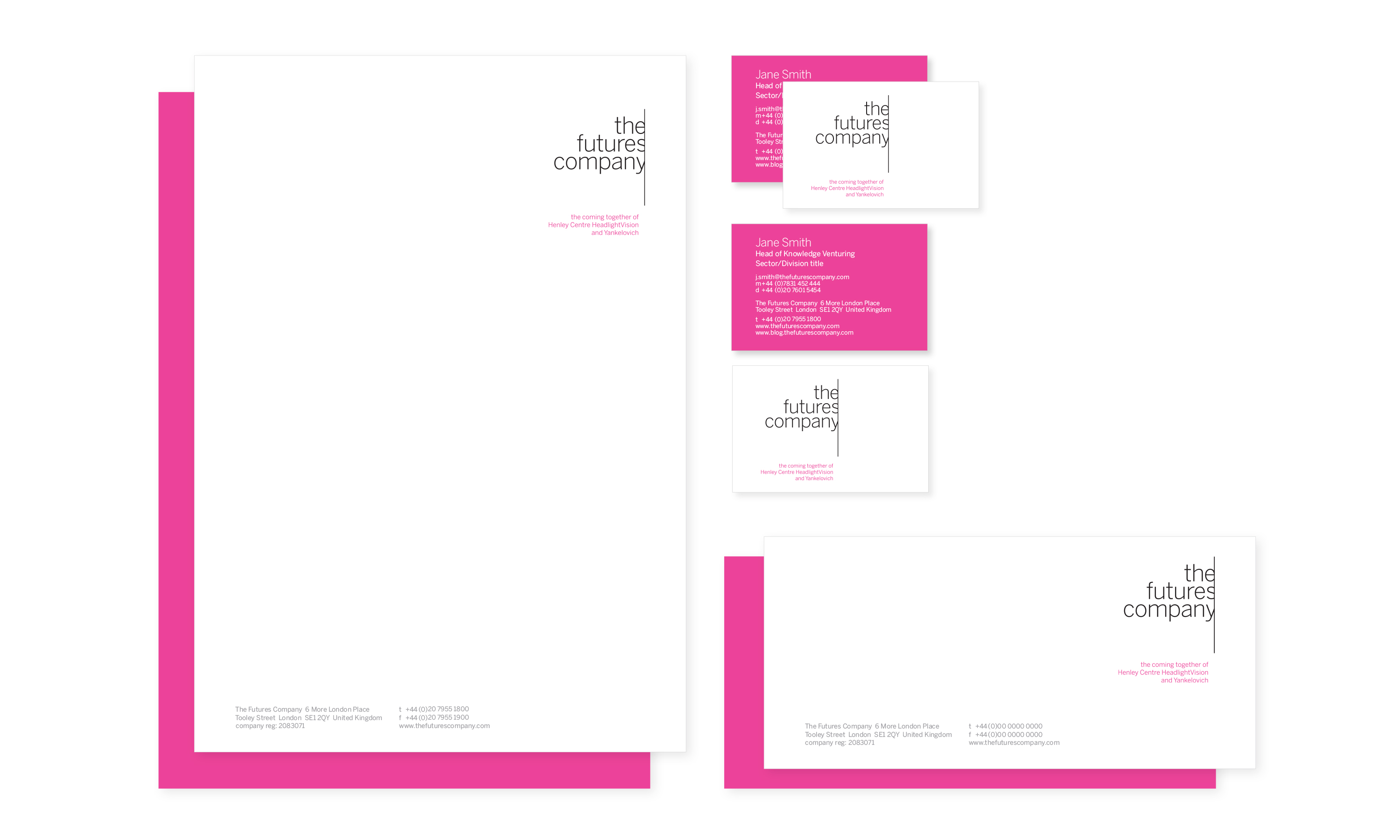
Stationery
Digital templates
Signage
Web transition
The Futures Company brand mark.
The Futures Company 'before and after merger' brand marks.
The Futures Company brand mark animation.
The Futures Company brand mark with images gallery.
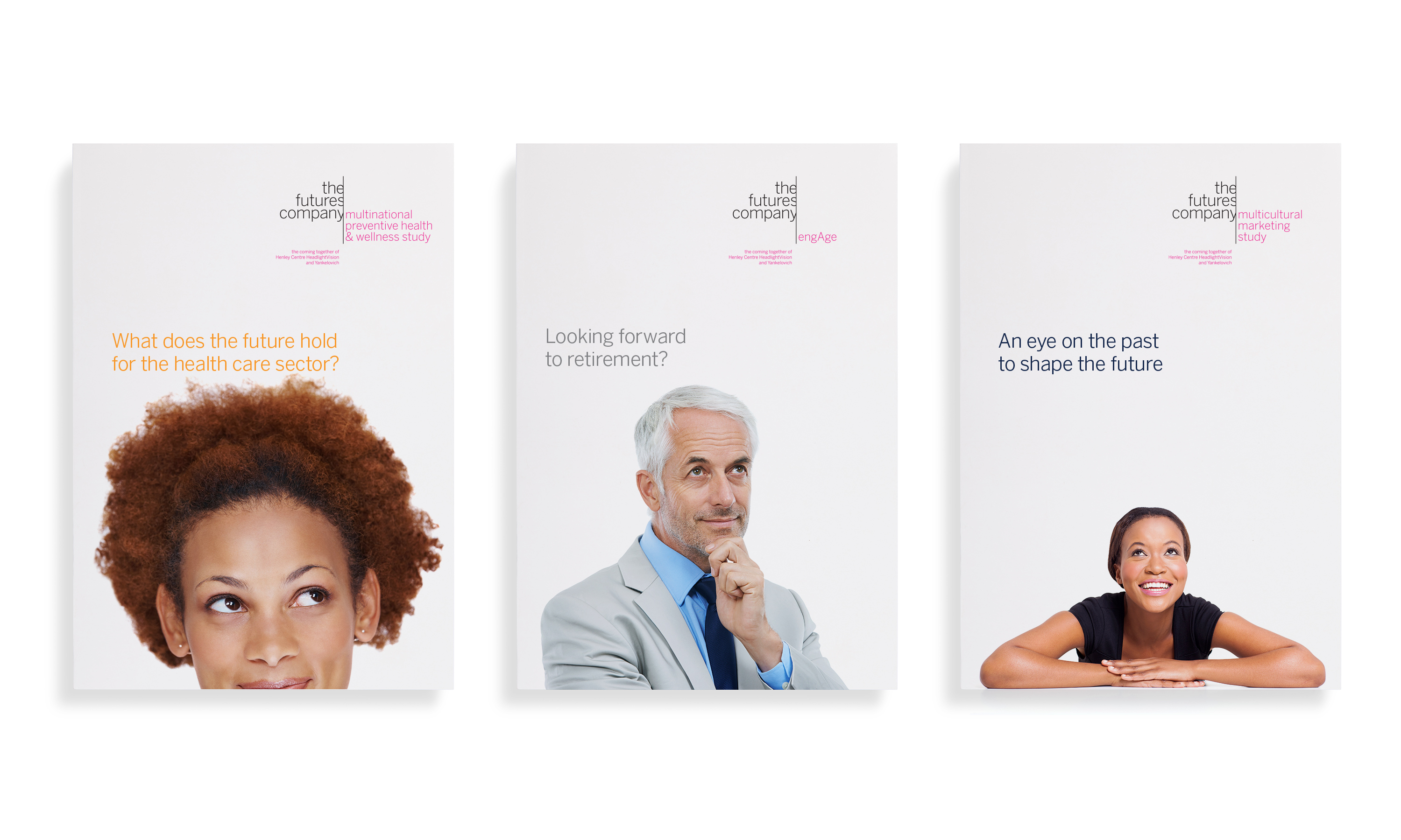
The Futures Company literature samples.
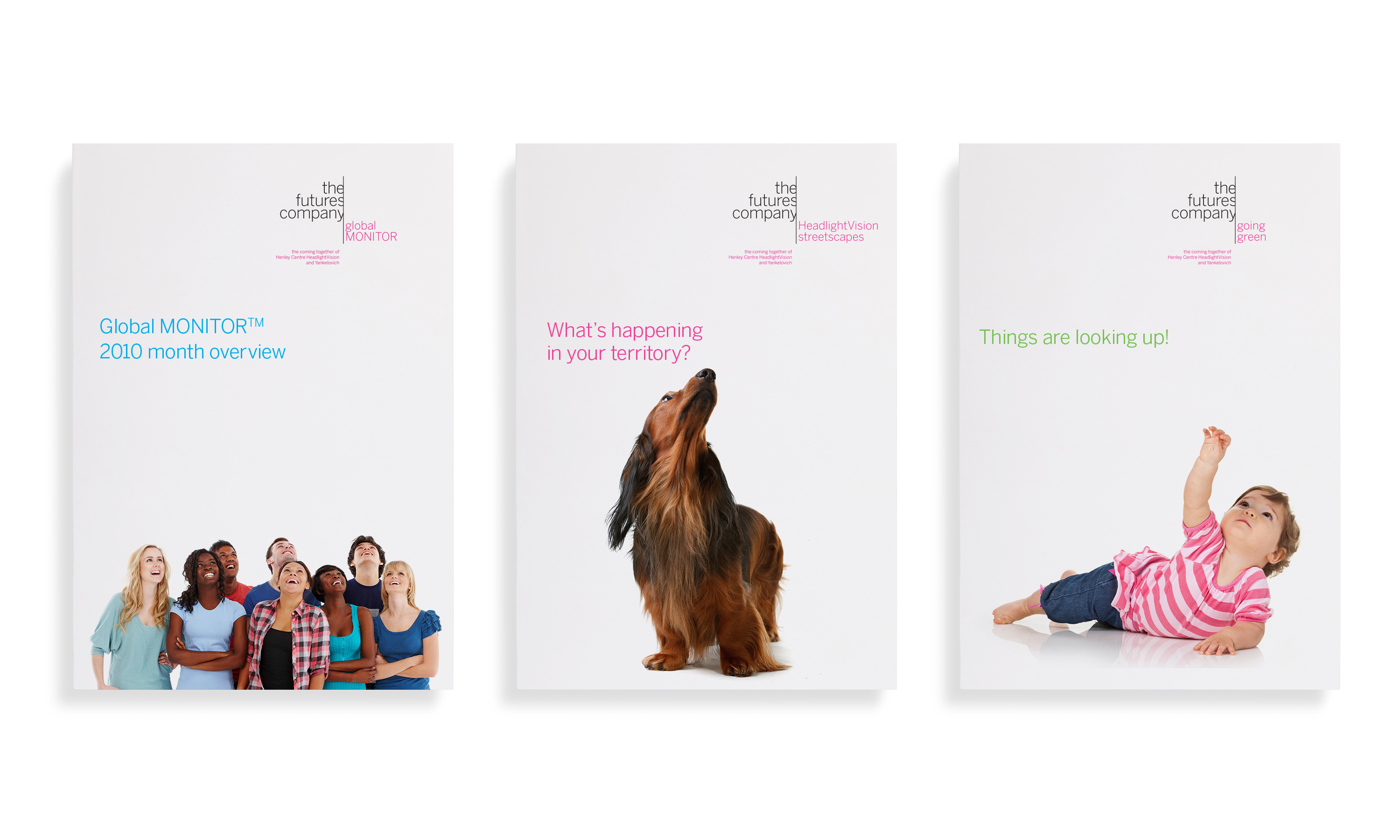
The Futures Company sub-brands.
The Futures Company stationery.
The Futures Company interior graphics.