Amec Foster Wheeler
Brand identity
When two become one…
Neon collaborated with BrandCap to create the new global brand identity for Amec Foster Wheeler, following the merger of UK-based Amec and US engineering group Foster Wheeler. With over 50,000 employees in more than 50 countries, the challenge was to unite two major engineering cultures under one confident, forward-looking brand.
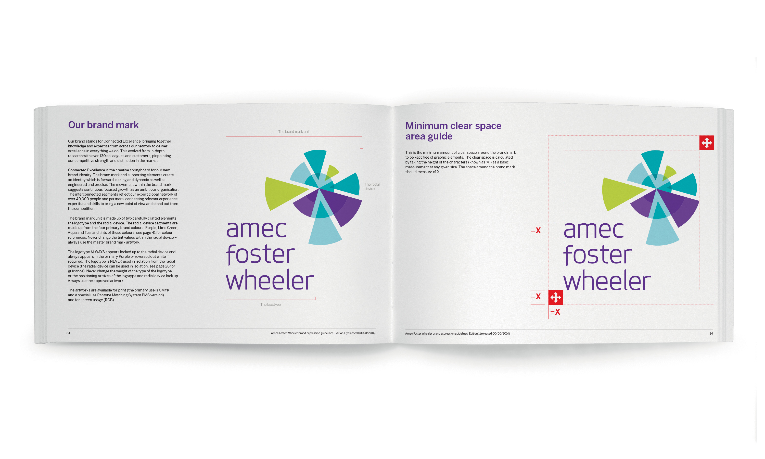
The brand idea, “Connected Excellence,” expressed the power of integration and collaboration at scale. From this, Neon developed a striking radial brand mark — its interlocking segments symbolising precision, teamwork and progress. The contemporary lowercase wordmark and unexpected palette of lime green and teal gave the brand freshness and humanity in a traditionally conservative sector.
The result was a unified global identity that inspired pride, optimism and a true sense of belonging across the newly merged business.
For the full long read case study, click here…
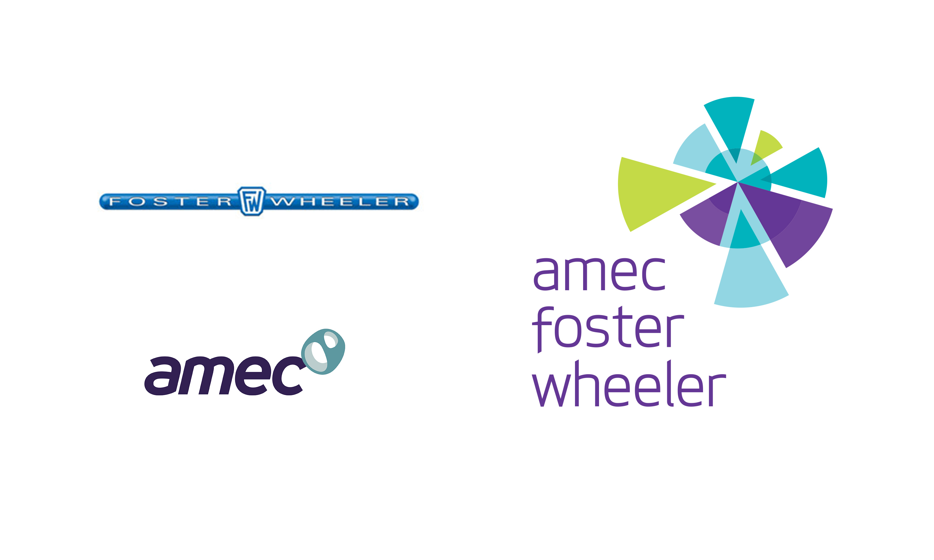
Mergers are never easy, and when two giants in the international engineering and construction industry came together – with the UK’s Amec acquiring the US-based Foster Wheeler – the challenges they faced were very big indeed..
Working with strategic branding consultants BrandCap, we set out to create a new unified brand that would make everyone involved in the new company – all 50,000 of them, in over 50 countries – feel good about being part of a much enlarged and truly global business.
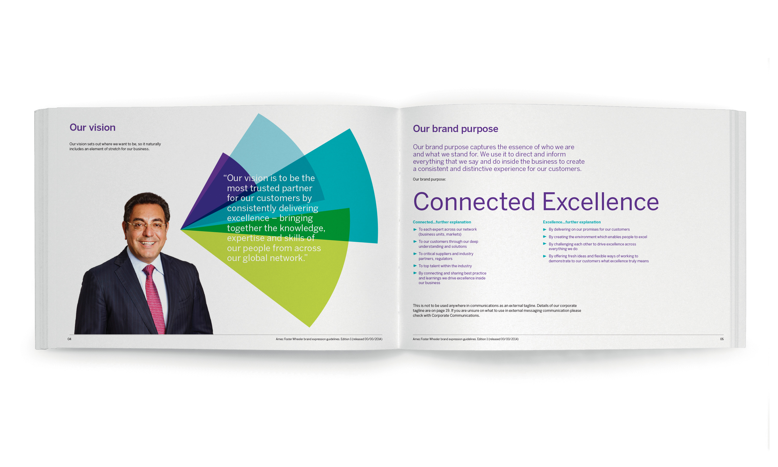
The brand idea.
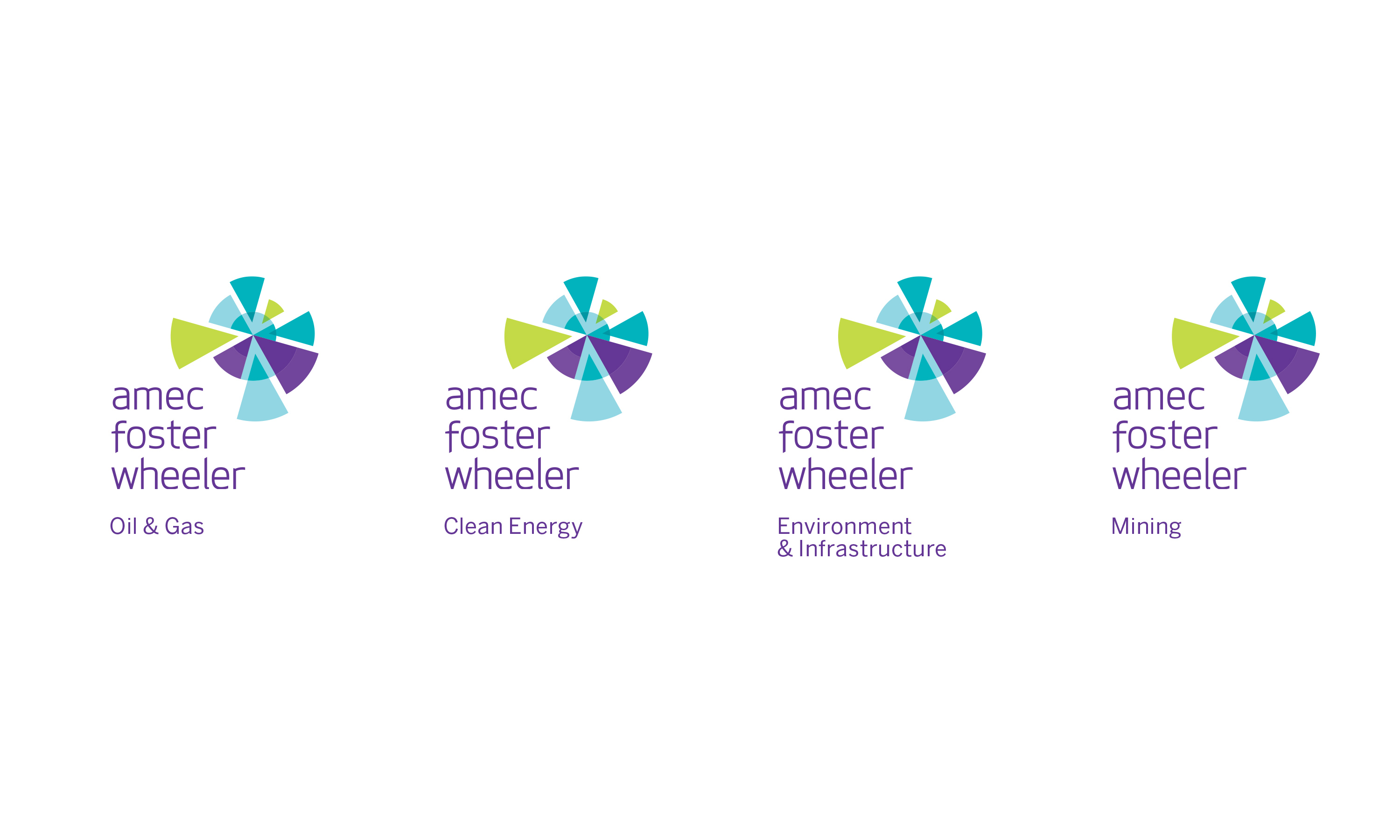
First came the brand idea: Connected Excellence. And, using that as a springboard, we went on to develop a powerful brand mark. The sense of movement created by our radial device suggests dynamism and growth, while the precision-interlocking of the segments reflects the company’s global expertise, and the integrated way in which it’s delivered.
Stacking the rather long name of the new business made it neater and easier to use. And our lower case logotype conveys a light, contemporary feel – as do the fresh, and distinctively non-macho colours. (You don’t see a lot of lime green and teal in the construction industry.)
A brand to bring people together
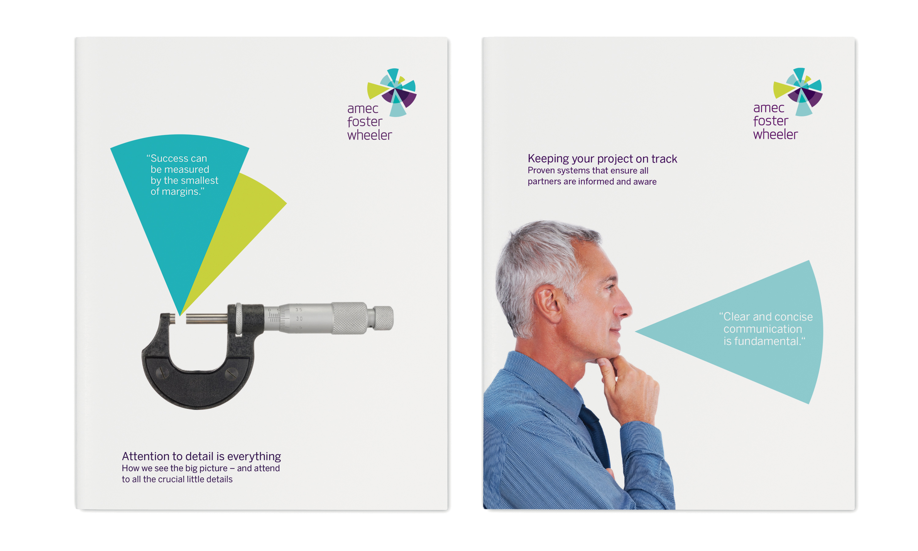
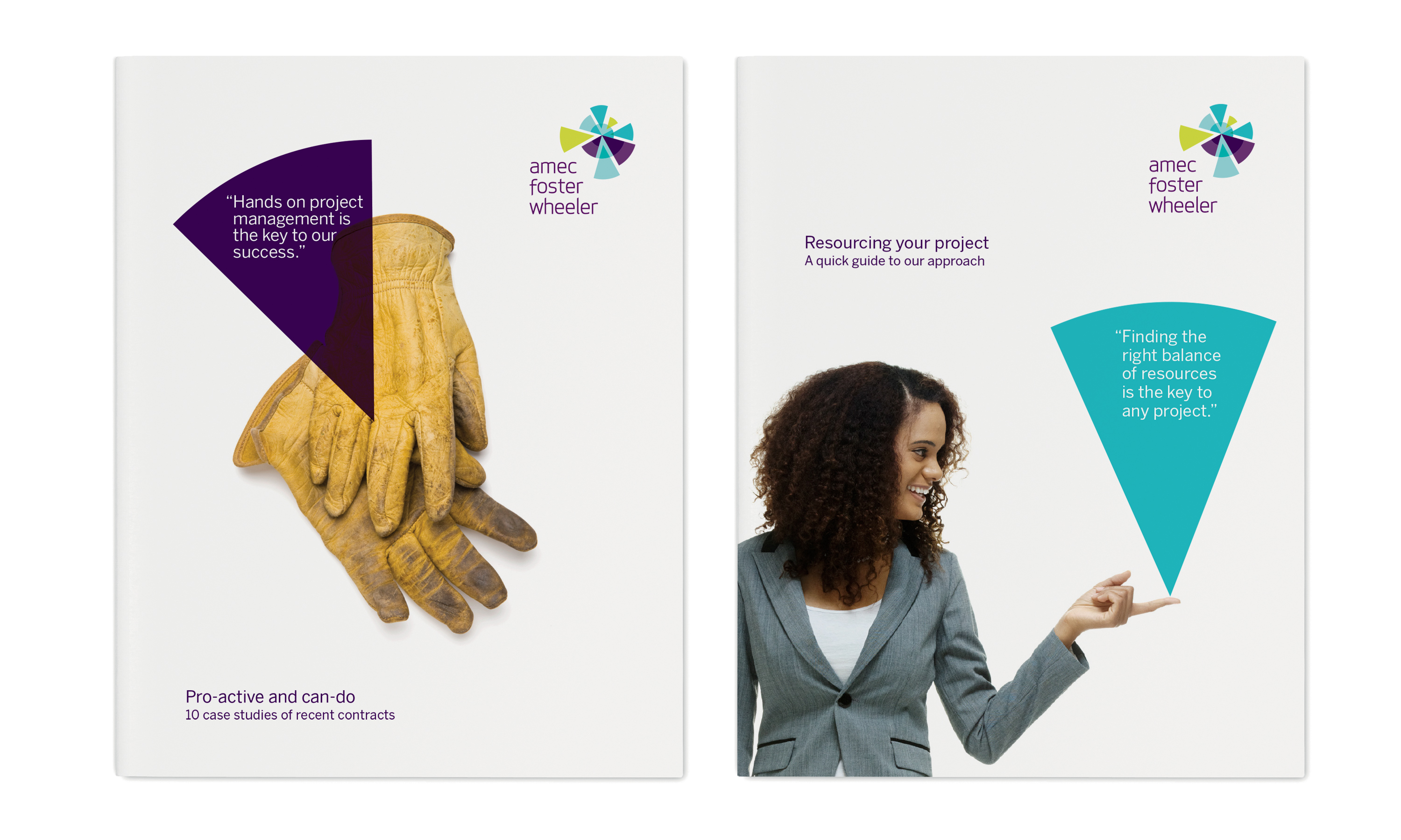
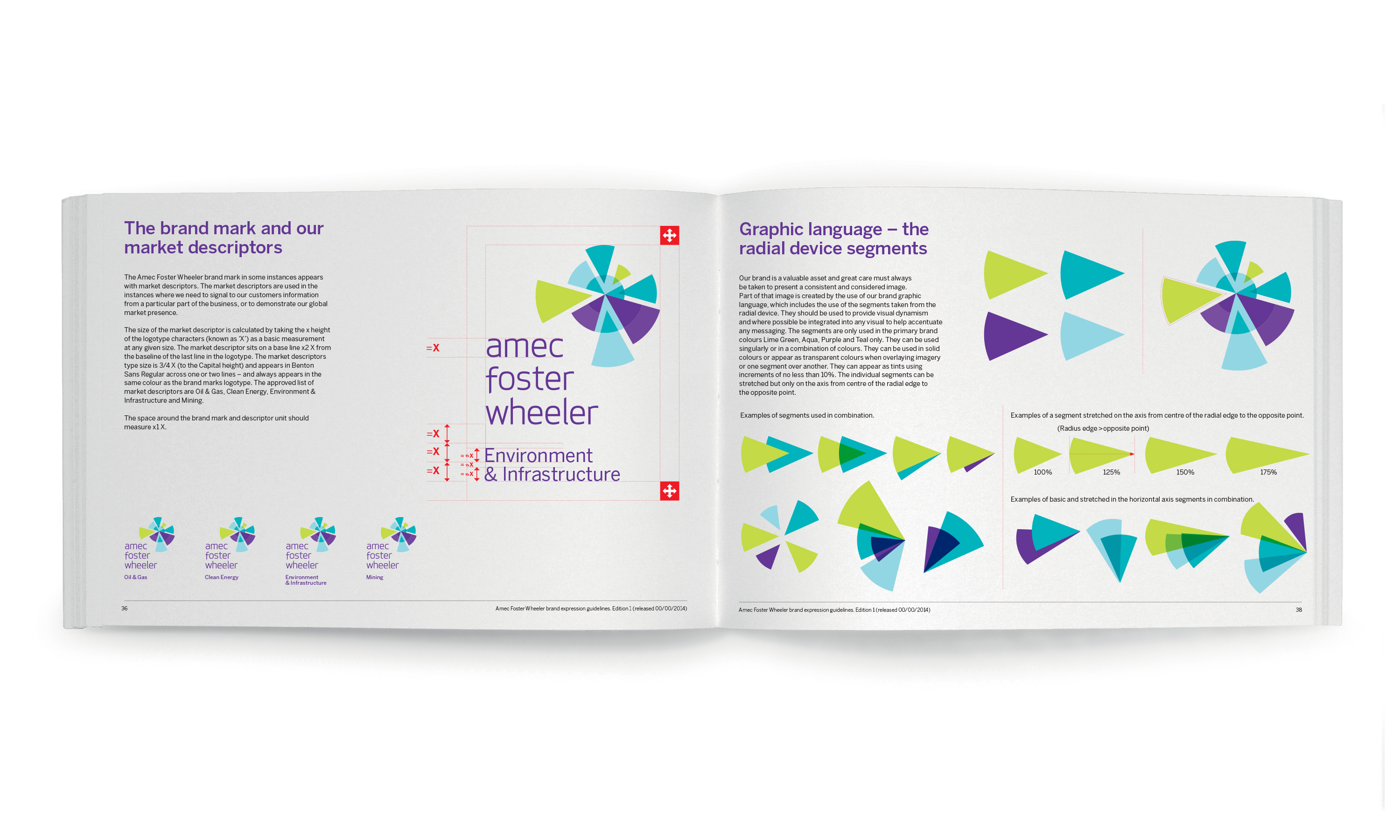
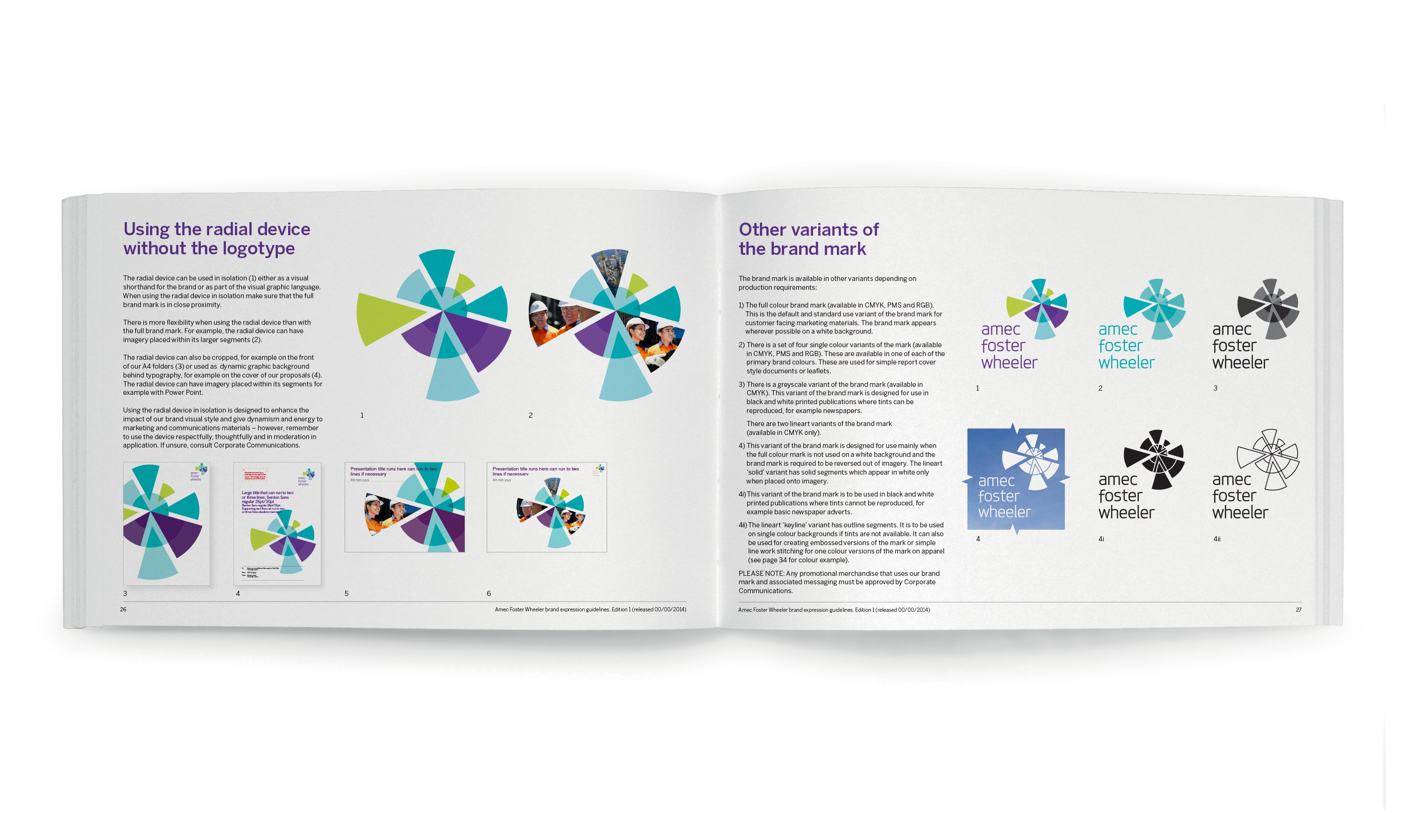
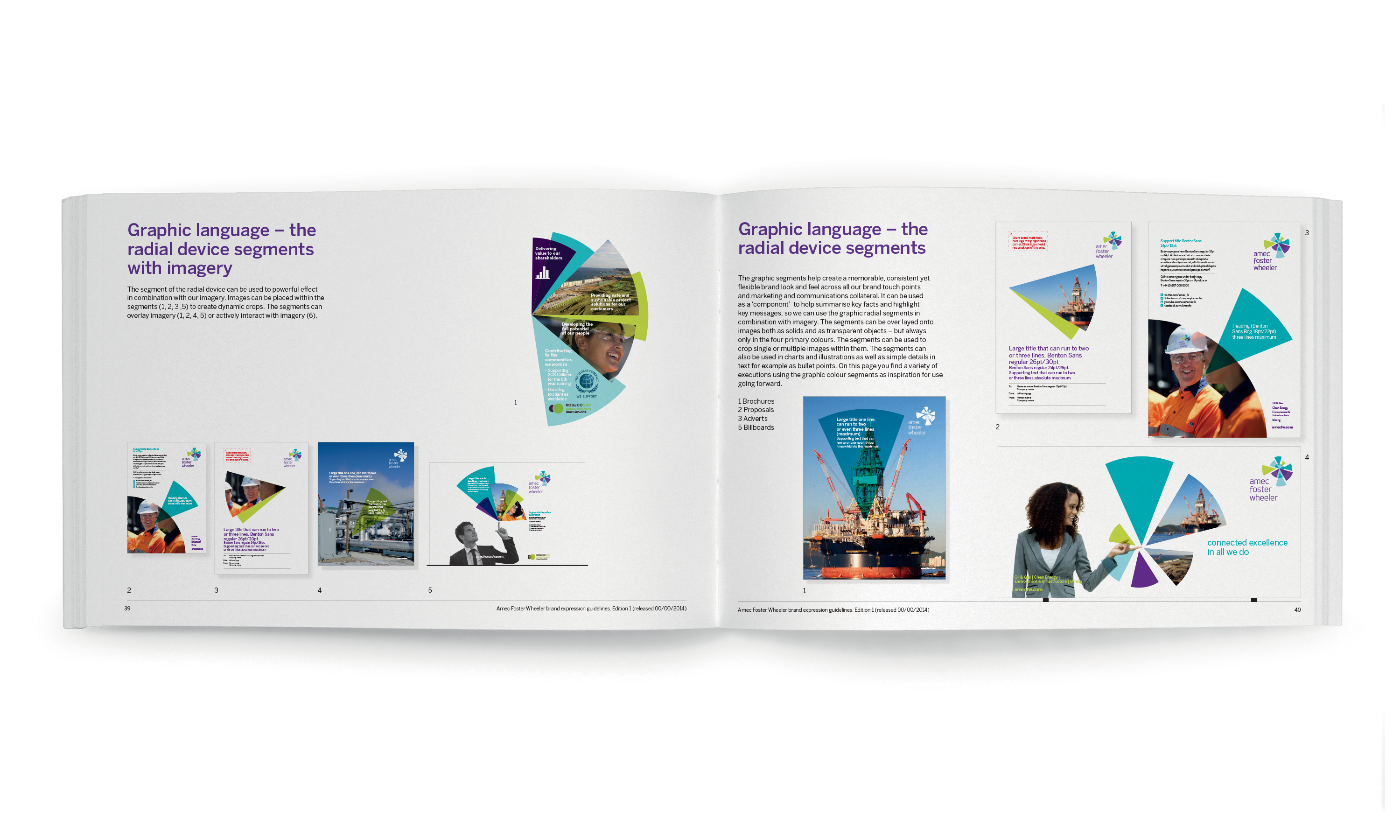
Another important component of the new identity was a dynamic and engaging visual language, springing directly from the brand mark.
Symbolic of the company’s project management expertise, the segments represent the bringing together of disparate elements, to create a harmonious whole. Used singly or in different overlapping combinations, depending on the application, they powerfully represent the merged company’s people and processes – in a way that has helped to give members of the team a sense of pride in and “ownership” of the new brand.
It’s still early days for Amec Foster Wheeler. But all the signs are that, across the company, the new brand has helped to generate a real Feelgood Factor, and a genuine belief that the two former rivals are stronger together.
(Read Less...)
Kind words…
“BrandCap and Neon have worked in partnership across a number of significant projects, from the global merger of two engineering companies in Amec Foster Wheeler to the rebrand of the largest private school network and of course BrandCap’s very own brand identity. Read More…
MANFRED ABRAHAM
Founder & Managing Partner
BrandCap
(Read Less...)
To find out more: [email protected] or call +44 (0)203 857 7656 Share this: Email, LinkedIn, Facebook, Download a PDF of this case study, follow us on Instagram or view our animations and movies on Vimeo
PROFESSIONAL SERVICES
Branding
PROJECT SUMMARY
Brand identity
Brand guidelines
Brand animation
Flagship literature
Literature scheme
Advertising templates
Signage
Interior graphics
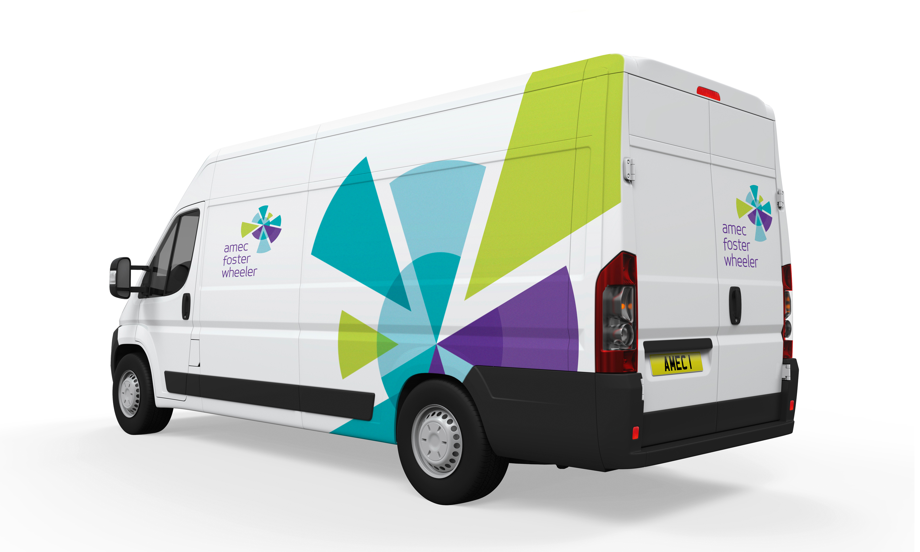
Vehicle livery
Exhibitions
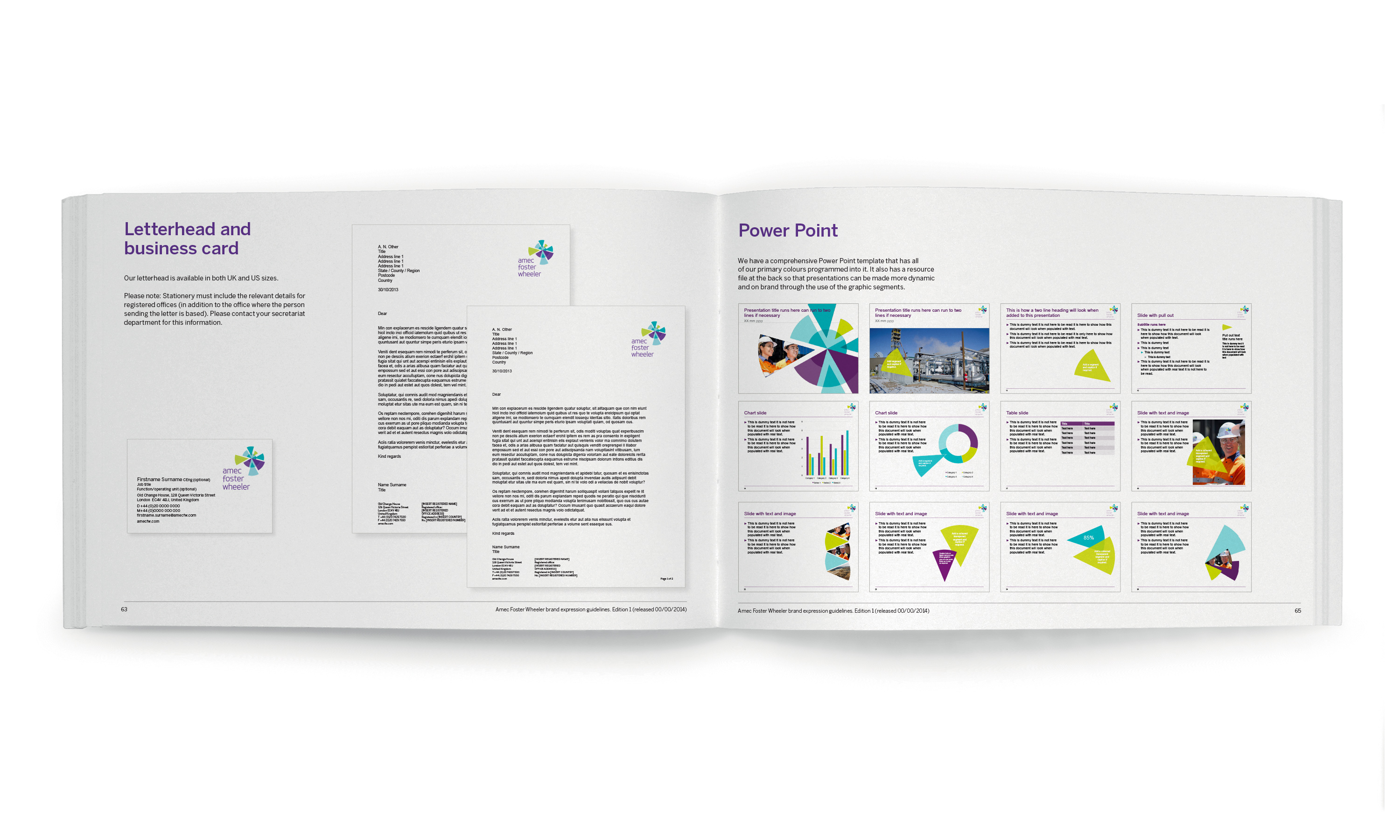
Stationery
Digital Templates
Power Point templates
Amec Foster Wheeler brand mark.

Amec Foster Wheeler brand mark with old pre-merger marks.
Amec Foster Wheeler brand mark animation.
Amec Foster Wheeler literature system.
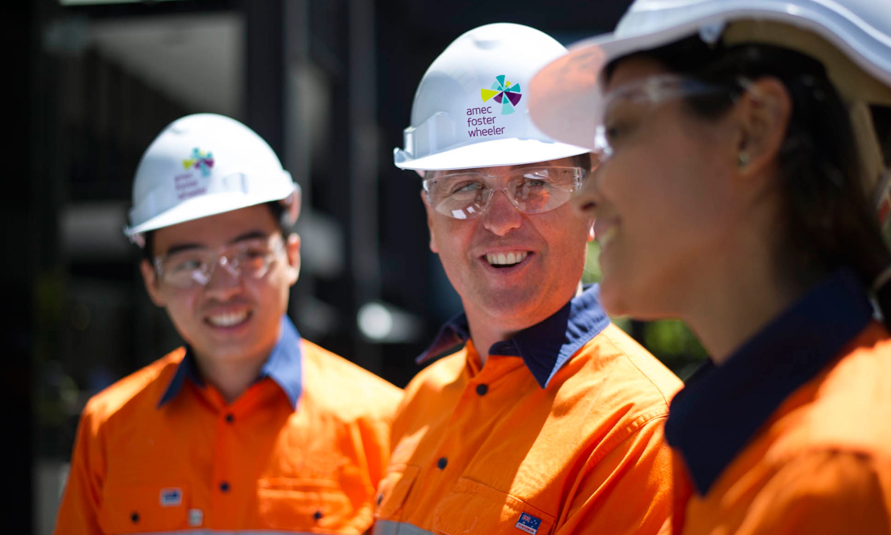
Amec Foster Wheeler health and safety apparel application.
Amec Foster Wheeler office wall graphics.

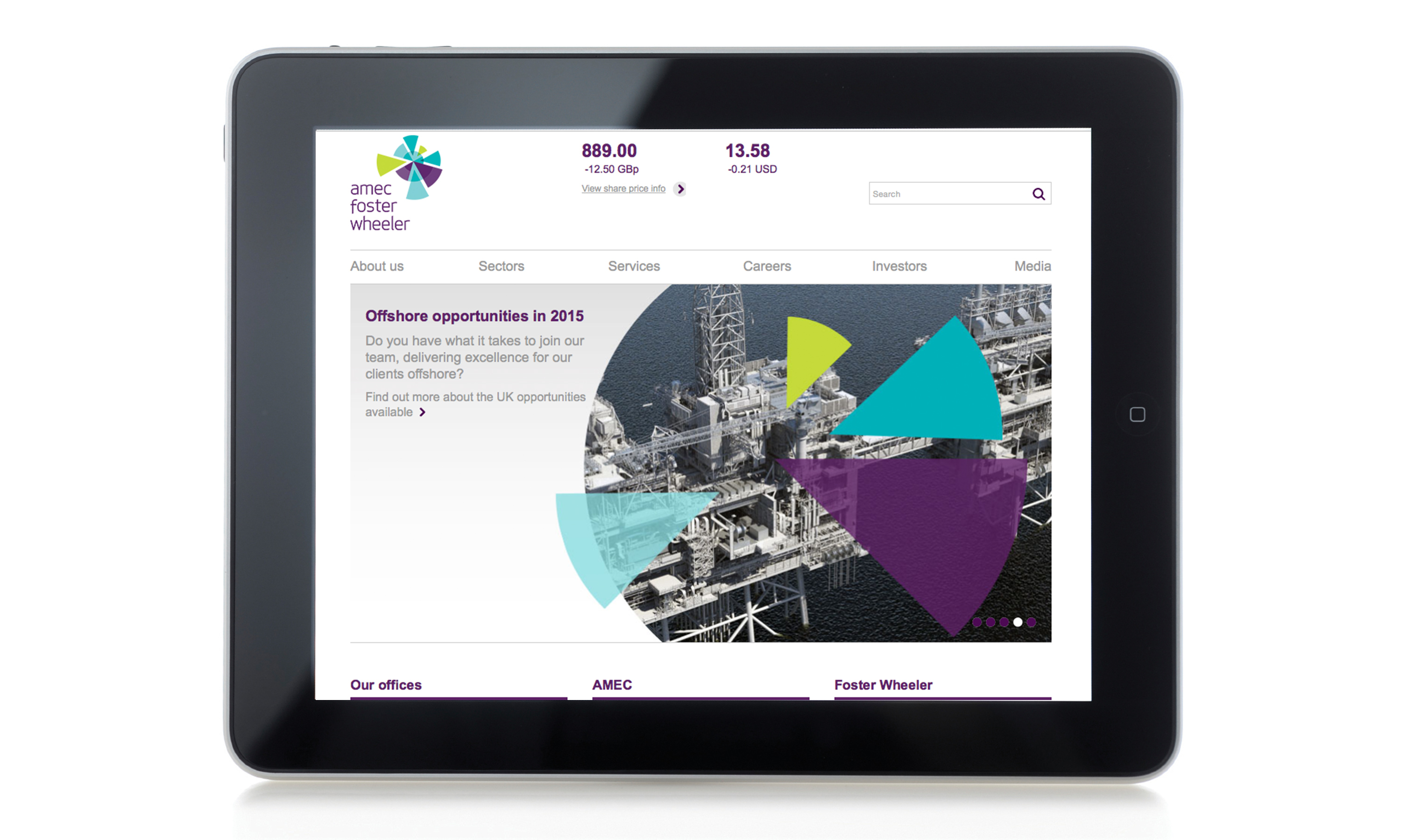
Amec Foster Wheeler website.
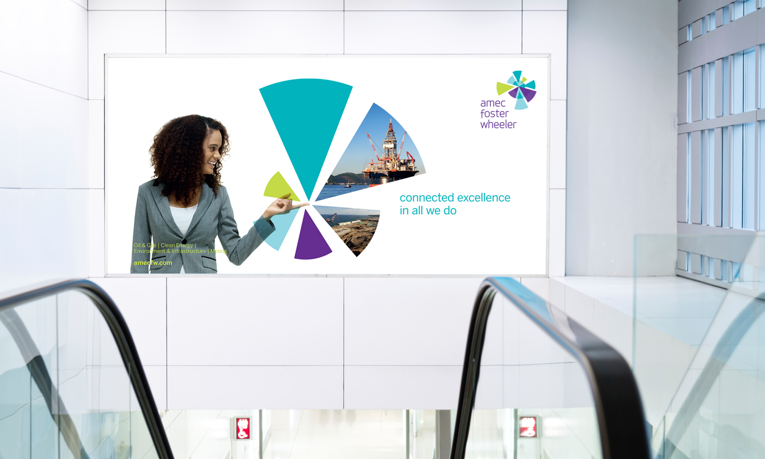
Amec Foster Wheeler brand awareness advertising.
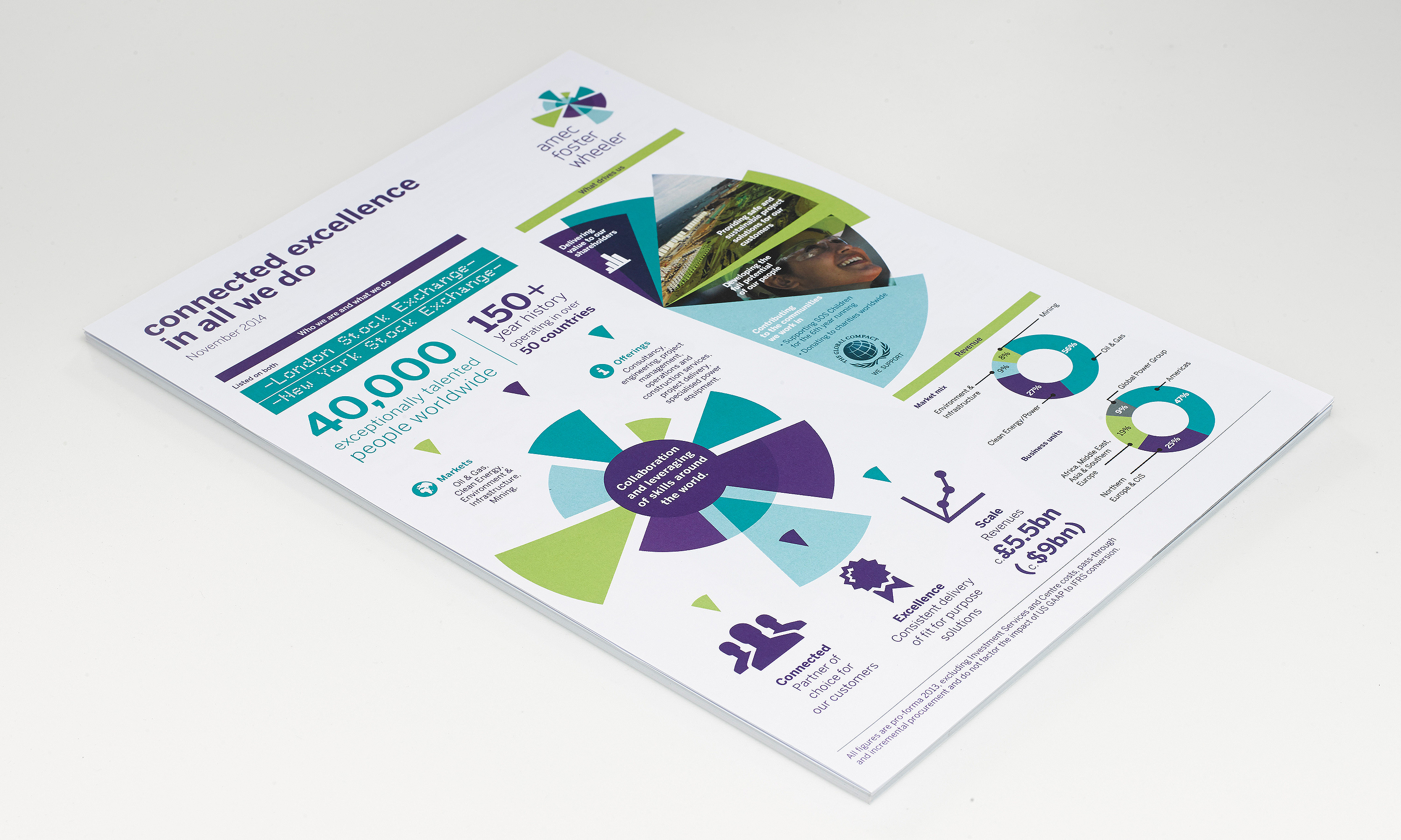
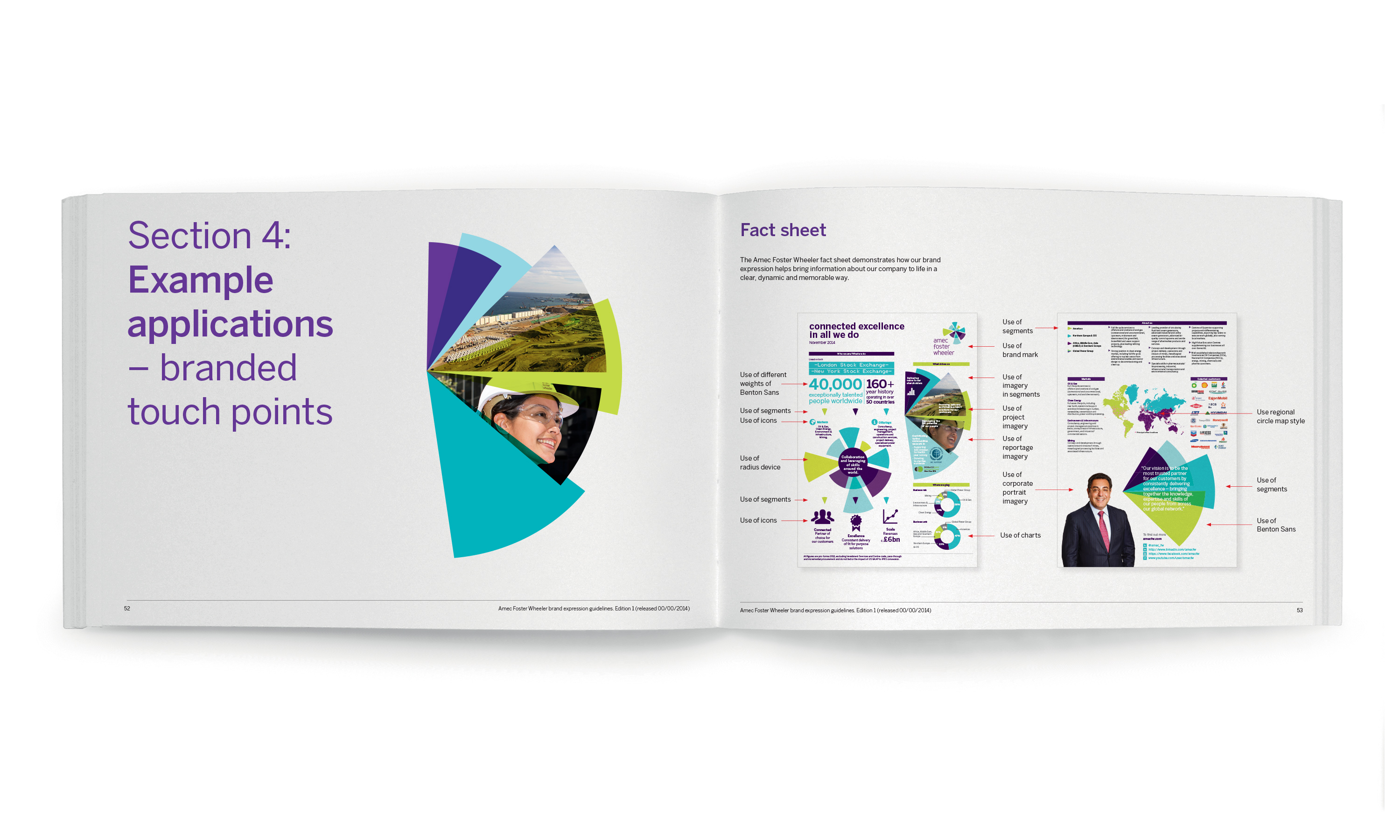
Amec Foster Wheeler launch investor fact sheet.
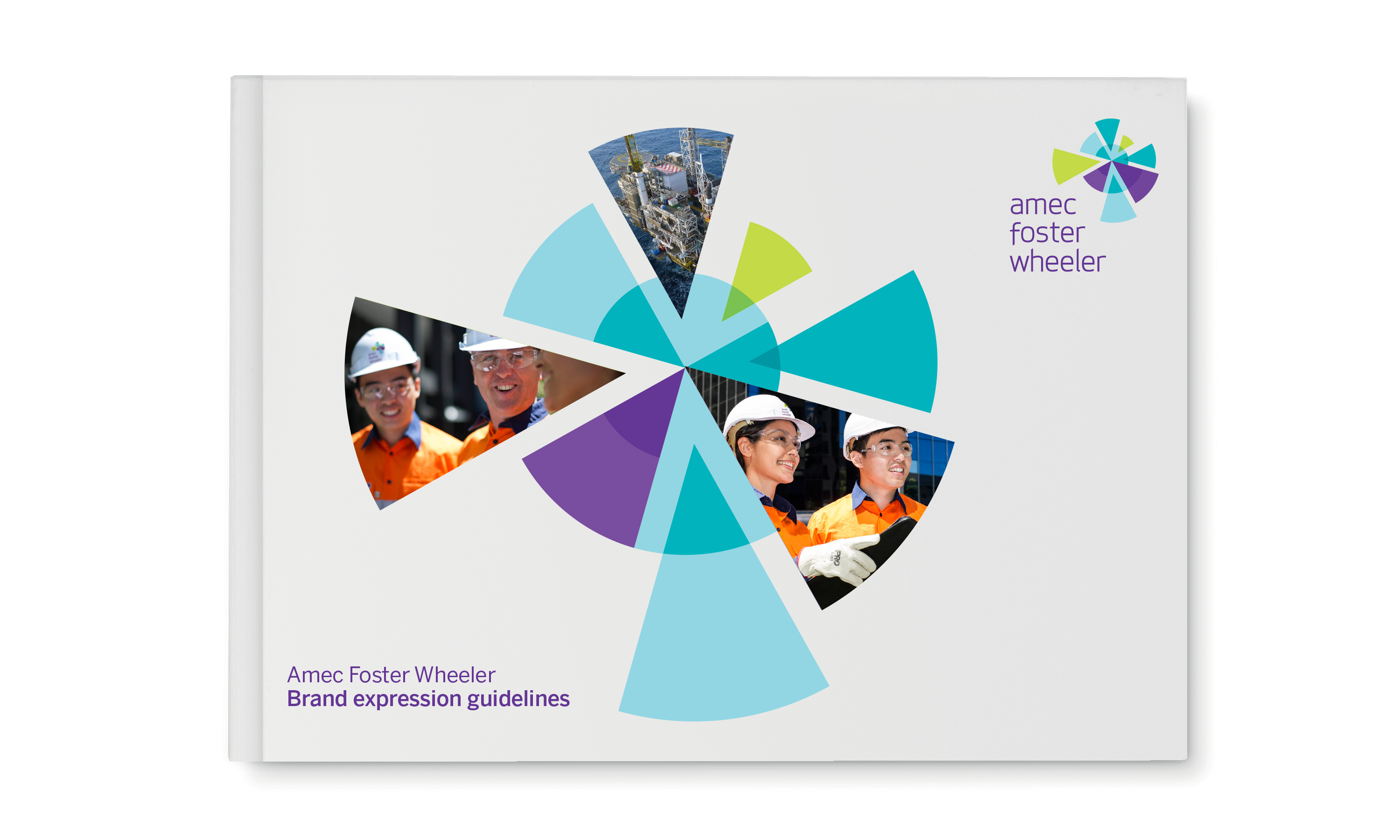
Amec Foster Wheeler guidelines.
Amec Foster Wheeler vehicle livery.
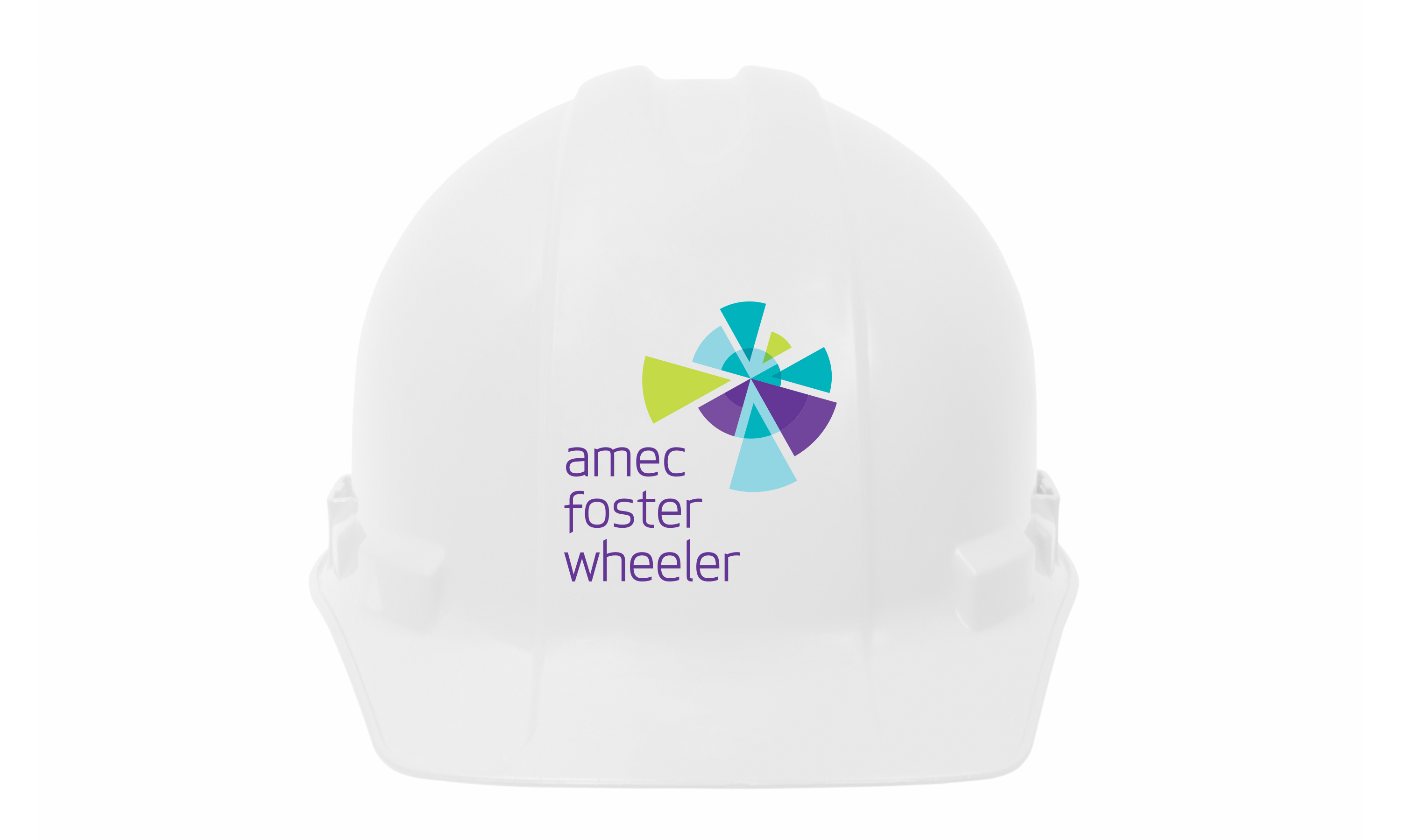
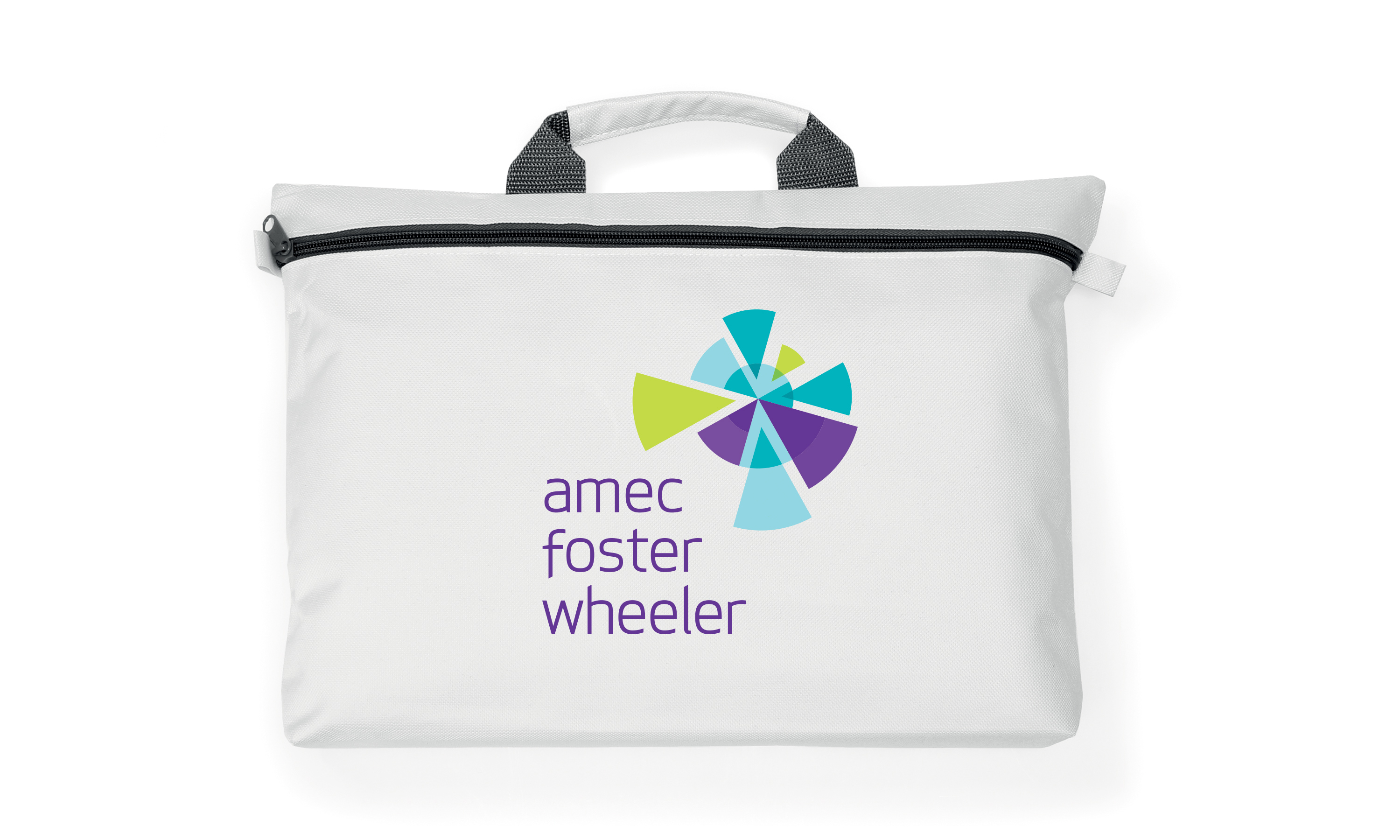
Amec Foster Wheeler site helmet and document bag.
Amec Foster Wheeler brand mark with area of expertise descriptors.