Bisham School
Brand identity
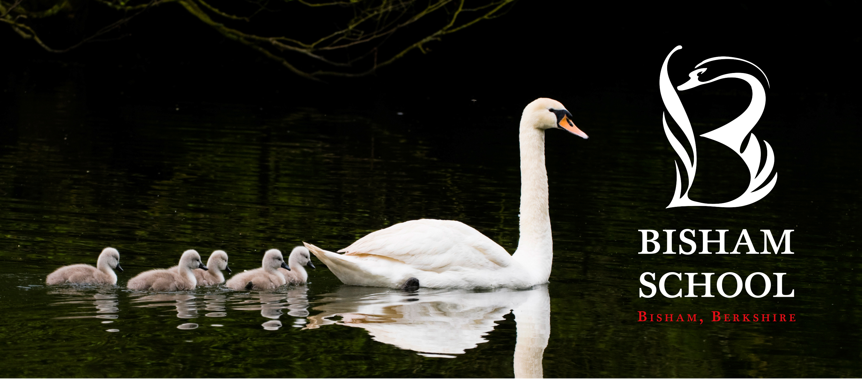
When Bisham CE Primary School near Marlow asked Neon Brand Consultancy to refresh their visual identity, we looked no further than the school’s most graceful neighbour — the swans that glide across the pond beside it.
While the swan had long featured informally in the school’s materials, we saw an opportunity to make it central to their brand identity. The result was an elegant new mark that captures both the natural beauty of Bisham’s setting and the calm confidence the school inspires in its pupils.
Simple, distinctive and full of quiet character, the new swan emblem gives Bisham School a timeless, uplifting identity that parents, staff and students have all embraced.
Kind words…
“Both elegant and clever, I love it” Read More…
ROSIE SCOTT
Trustee
Bisham School
(Read Less...)
To find out more: [email protected] or call +44 (0)203 857 7656 Share this: Email, LinkedIn, Facebook, Download a PDF of this case study, follow us on Instagram or view our animations and movies on Vimeo
EDUCATION
Brand identity
GRAPHIS INTERNATIONAL
Poster Annual 2016
Awarded ‘In book’
PROJECT SUMMARY
Brand identity
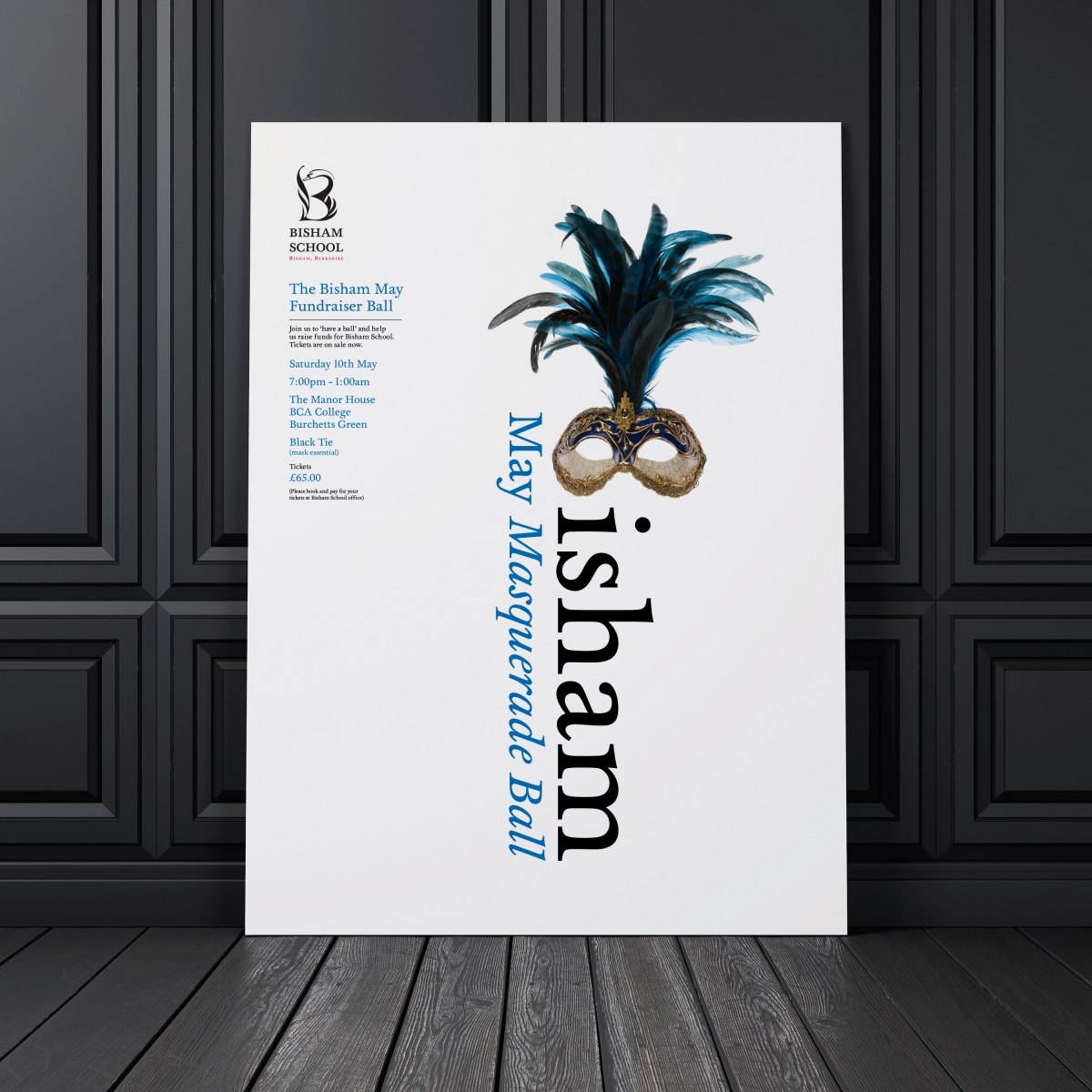
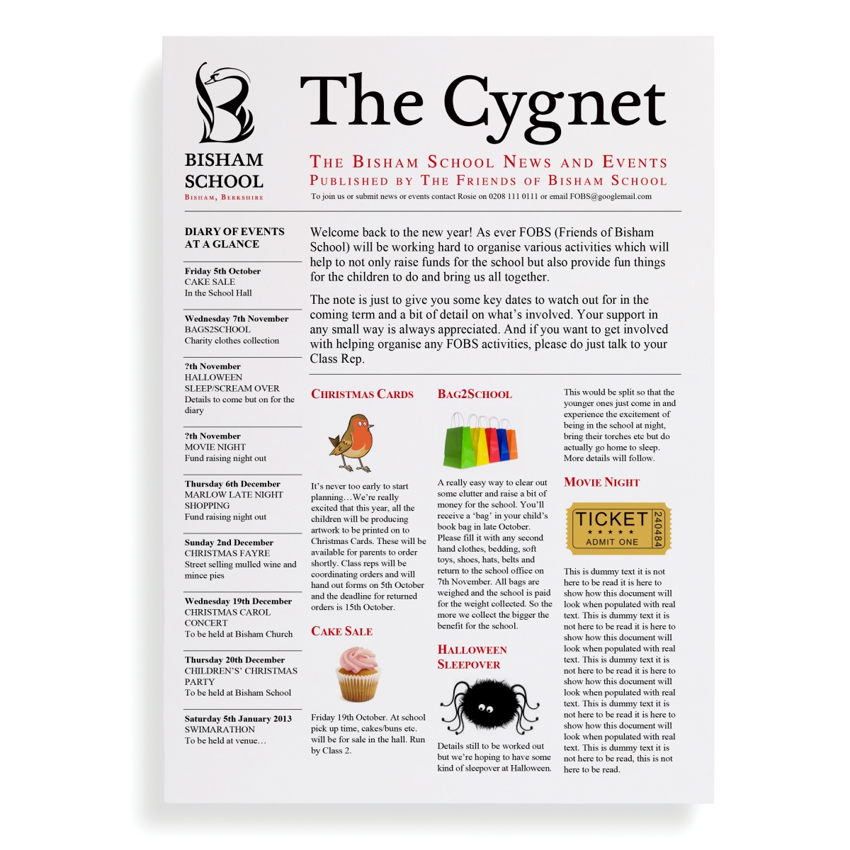
Posters
Bisham School brand mark detail.
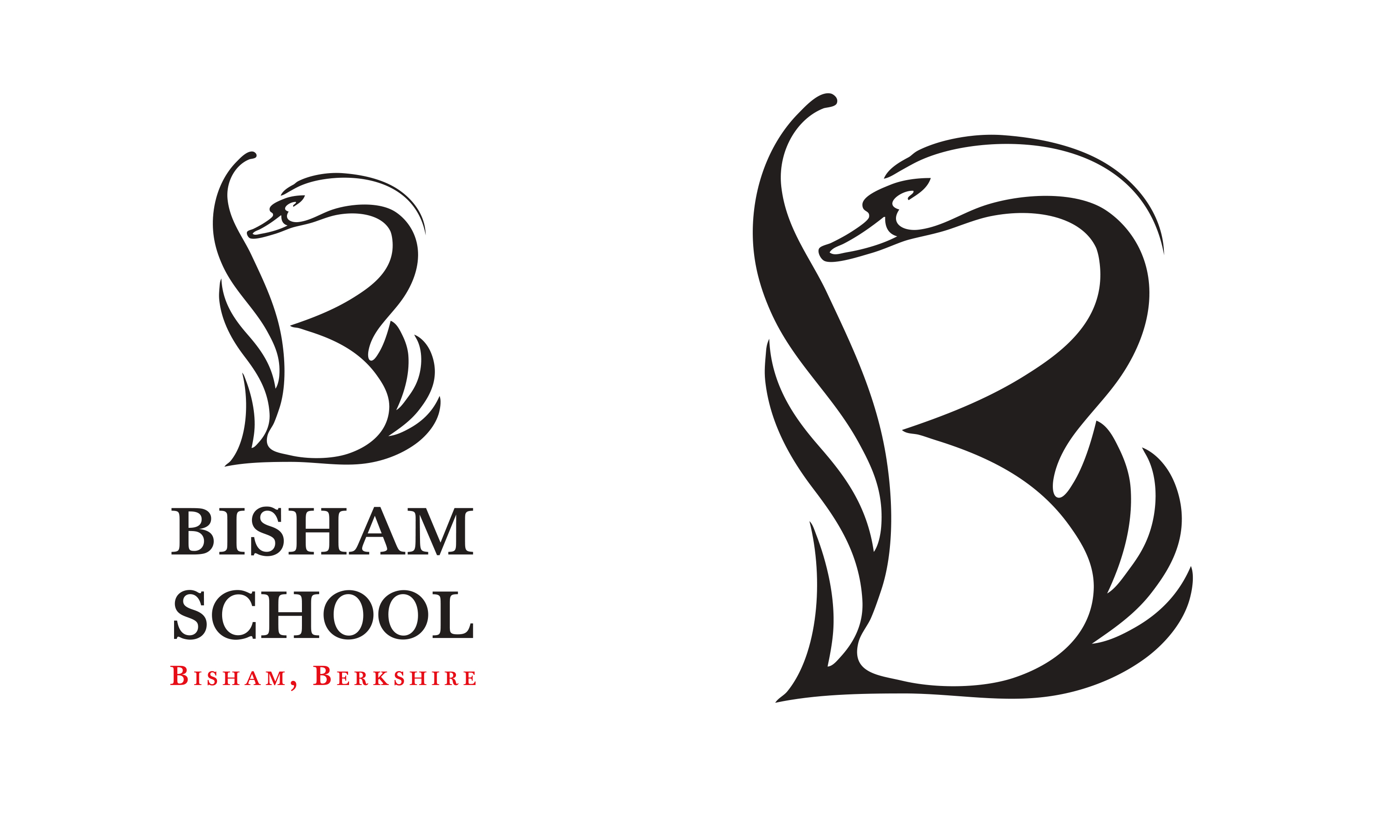
Bisham School brand mark.
Bisham School posters and newsletter.