Clarion Wealth Planning
Website
Neon Brand Consultancy rebranded Clarion Wealth Planning, pioneers of true lifelong financial planning, creating a distinctive identity that unites emotional connection with rational confidence.
Targeting a discerning, high-net-worth audience, we positioned Clarion around the promise of “true lifelong financial planning for the serious business of life.” The new brandmark combines richly symbolic details – corn sheaves for reward and heritage, a compass for direction, and trumpets for clarity and cut-through – paired with a clean contemporary logotype and an amethyst-and-gold palette that evokes both luxury and trust.
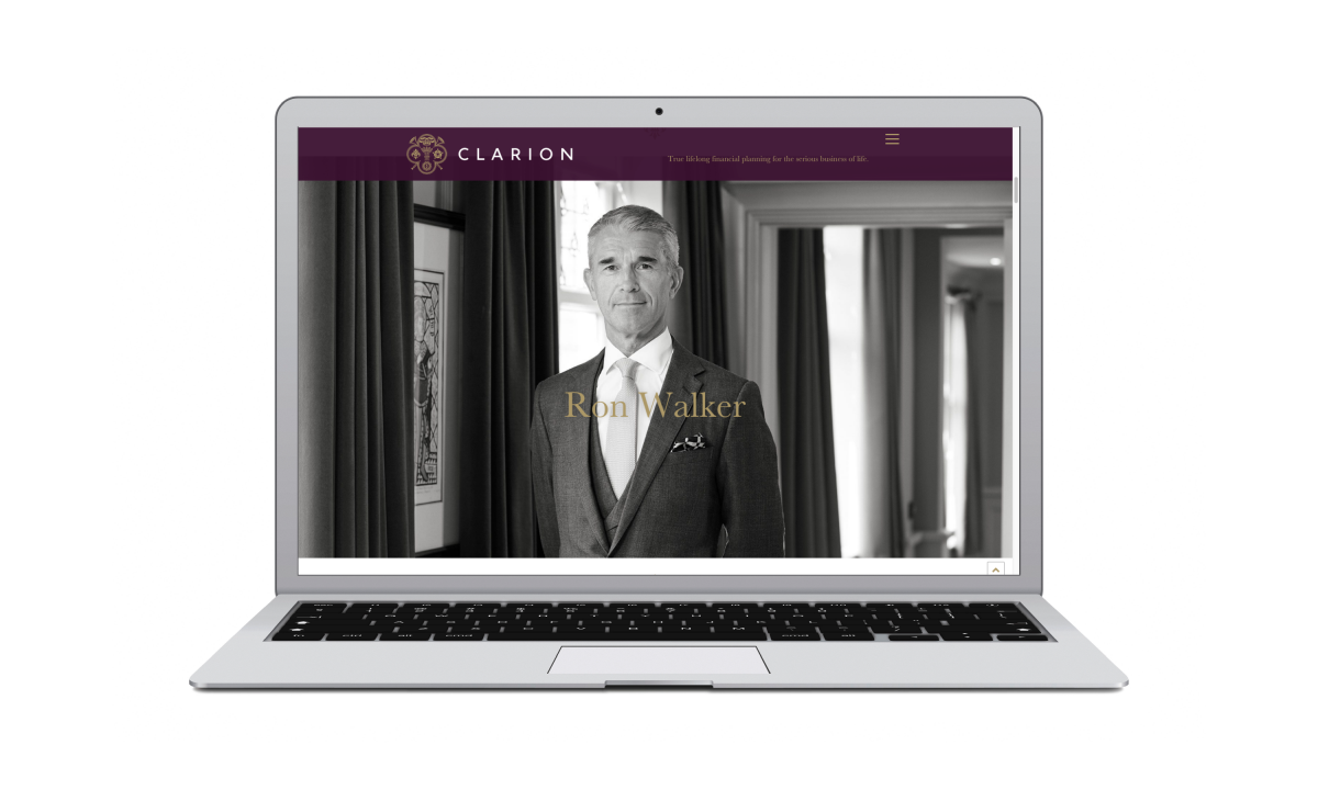
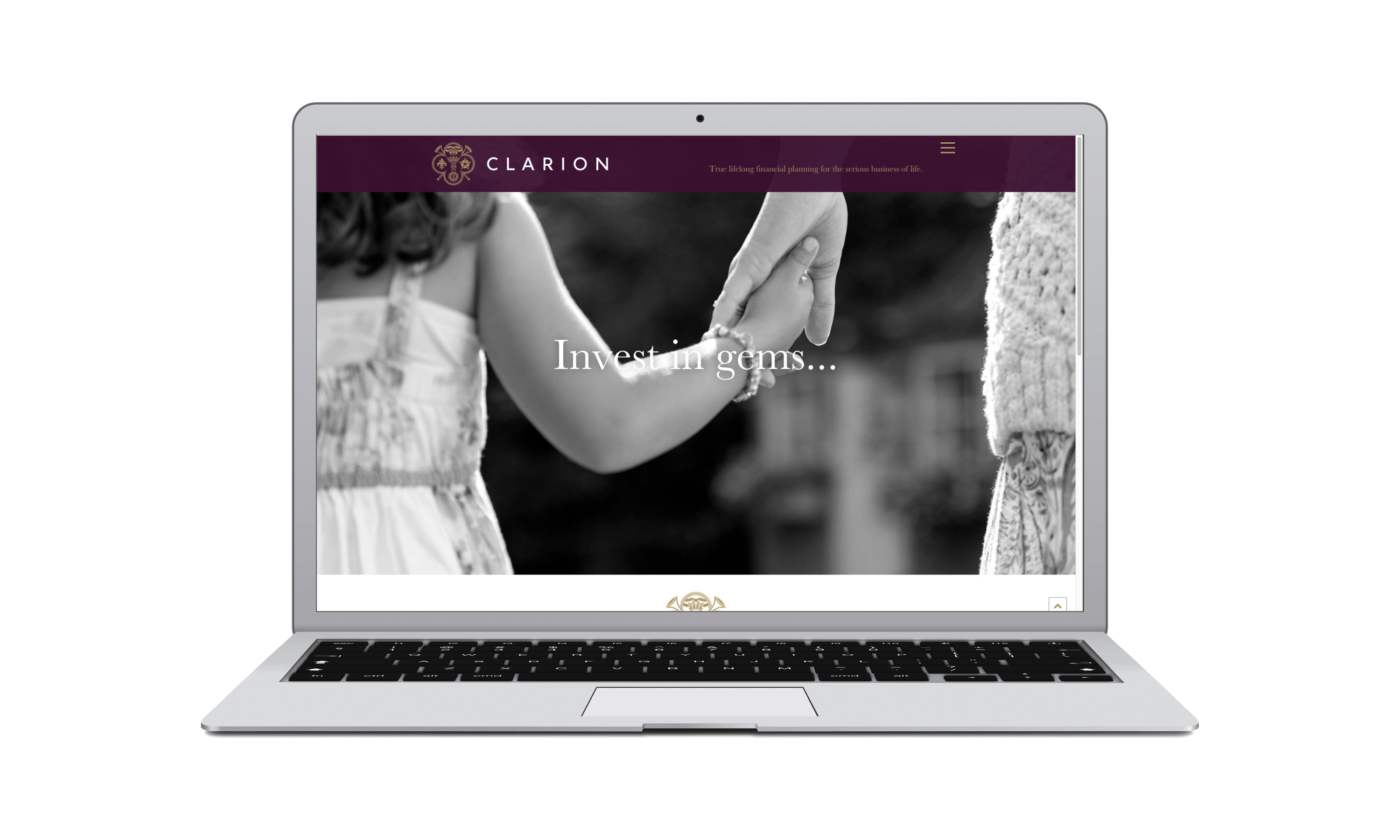
Our full redesign extended to a new website — conceived, written, designed, and built by Neon — optimised for clarity, warmth and SEO performance. Emotionally resonant black-and-white photography and confident, conversational copy brought the brand promise vividly to life.
The result: a refined, premium identity and online presence that sets Clarion apart as trusted advisers for those serious about life and legacy.
For the full long read case study, click here…
Why Neon
Clarion weren’t looking for a web supplier.
They were looking for a strategic partner who understood positioning at a premium level.
As a boutique wealth planning firm, their differentiation does not sit in product lists or technical explanations. It sits in judgement, discretion, experience and long-term relationships. Translating that nuance into digital form requires more than design capability — it requires brand strategy.
Neon was appointed because we:
Specialise in positioning-led brand consultancy
Work with premium and heritage-led organisations
Understand how boutique firms must differentiate from larger corporate competitors
Combine strategy, messaging, design and digital under one roof
Build websites as perception tools, not online brochures
For Clarion, this was not about modernising visuals.
It was about recalibrating how the firm is perceived.
The Challenge.
Clarion Wealth Planning had evolved.
Their client base, proposition and reputation had grown into something far more exclusive than their website suggested.
The old site:
• Looked like a conventional financial services firm
• Relied on generic stock imagery
• Focused heavily on technical services rather than client experience
• Contained too many pages with diluted messaging
Blended into a sea of similar advisory firms
For a boutique firm serving high-net-worth individuals and families, this created a disconnect.
The website needed to:
• Reflect Clarion’s premium positioning
• Attract the right type of client
• Communicate trust, discretion and heritage
• Reduce noise and increase clarity
• Improve search performance with properly structured content
Strategic Approach.
1. Positioning First, Design Second
Before design began, we clarified the role of the website.
Clarion were not trying to compete with national wealth management brands on scale.
They were reinforcing boutique exclusivity.
We defined key principles:
• Personal over corporate
• Discreet over promotional
• Editorial over sales-led
• Considered over cluttered
This strategic clarity informed every decision that followed.
2. Premium Visual Language
The new website uses:
• Black-and-white photography to convey timelessness
• Imagery reflecting the lifestyle and calibre of Clarion’s clients
• A restrained colour palette built around deep plum and gold accents
• Elegant serif typography to introduce authority and heritage
The visual direction aligns more closely with a private members’ club than a mainstream financial firm.
3. Simplified Architecture
The previous website attempted to cover every possible service in depth.
We reduced and refined.
The new structure:
• Streamlined page count
• Consolidated service information
• Created clearer user journeys
Prioritised quality of messaging over quantity of content
This improved usability and strengthened SEO by:
• Clarifying keyword themes
• Reducing cannibalisation
• Creating stronger core service pages
• Improving internal linking structure
4. Human-Centred Storytelling
Rather than leading with products, the site leads with people.
Key shifts:
• Prominent introduction to senior advisers
• Photography within real environments
• Messaging focused on long-term relationships
• Emphasis on “getting to know you”
This reframed Clarion from a service provider to a trusted long-term partner.
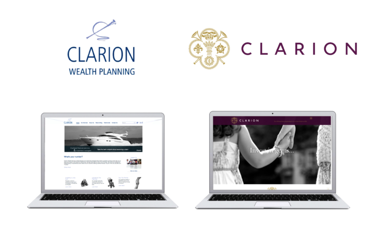
Old vs New
Old Website
• Generic stock imagery (yachts, abstract finance visuals)
• Service-heavy messaging
• Conventional blue corporate palette
• Competing visually with national brands
New Website
• Real, emotive photography
• Premium editorial tone
• Reduced navigation and clearer hierarchy
• Confident boutique positioning
The transformation elevated perception instantly.
Results & Impact
• Stronger alignment between brand and digital presence
• Clearer articulation of Clarion’s premium positioning
• Improved quality of inbound enquiries
• Enhanced SEO foundations
• A website that attracts the right client, not simply more traffic
The new Clarion website doesn’t try to look like the biggest firm in the room.
It looks like the most considered.
And for a boutique wealth planning firm, that distinction matters.
(Read Less...)
Kind words…
“Neon produced a fantastic website for Clarion, that perfectly reflects our new brand and the websites target audience. It pulls of that oh so hard to do neat trick of feeling timeless yet contemporary and has excellent premium service cues. Bravo. Read More…
RON WALKER
Founder
Clarion Wealth Planning
(Read Less...)
To find out more: [email protected] or call +44 (0)203 857 7656 Share this: Email, LinkedIn, Facebook, Download a PDF of this case study, follow us on Instagram or view our animations and movies on Vimeo
FINANCIAL SERVICES
Website
PROJECT SUMMARY
Website
Digital templates
Clarion Wealth Planning old vs new comparison.
Clarion website.