The Gemmological Association of Great Britain
Advertising & literature
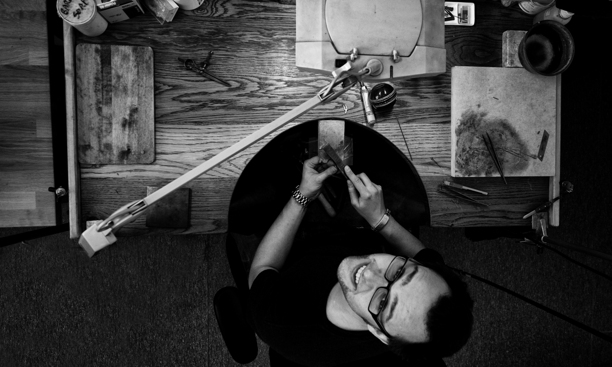
Adding a bit of sparkle.
Neon was commissioned by The Gemmological Association of Great Britain (Gem-A) to elevate their advertising and literature, following a recommendation from The Goldsmiths’ Company.
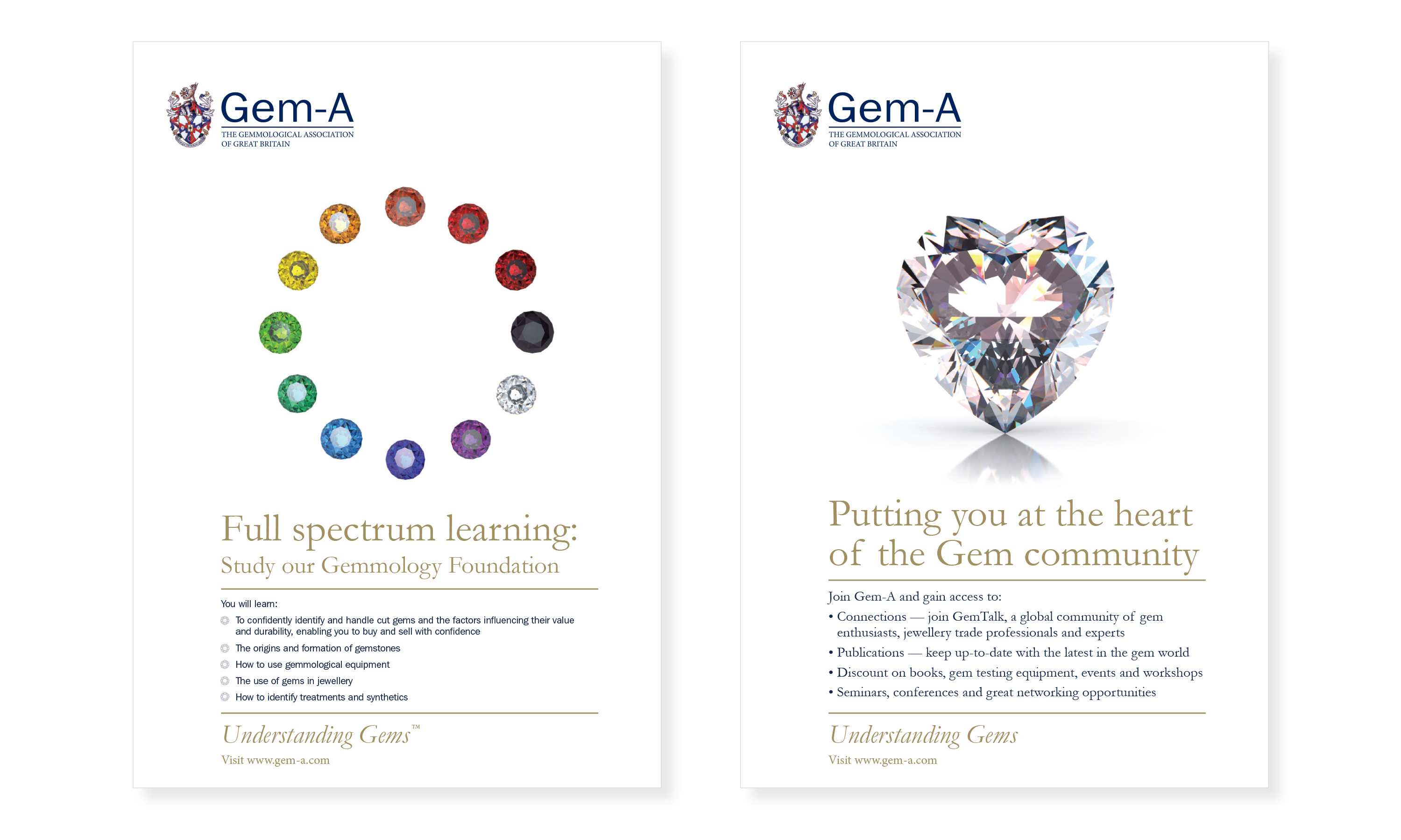
Their existing communications lacked coherence and the authority expected from an industry-leading body. Neon brought clarity, consistency and a touch of creative sparkle — uniting tone and visual identity across all materials. Elegant design details, such as jeweller’s loupes used as quotation marks, helped reinforce Gem-A’s expertise while adding charm and distinction.
The result was a confident, professional communications suite that strengthened Gem-A’s reputation as the authoritative voice of the gem and jewellery trade.
Kind words…
“Such a vast improvement to our branded communications compared to what has gone before. Read More…
GRAHAM ROBERTSON
Finance Director
The Gemological Association of Great Britain
(Read Less...)
To find out more: [email protected] or call +44 (0)203 857 7656 Share this: Email, LinkedIn, Facebook, Download a PDF of this case study, follow us on Instagram or view our animations and movies on Vimeo
CHARITY / TRADE BODY
Promotions
GRAPHIS INTERNATIONAL
Poster Annual 2016
Awarded ‘In book’
PROJECT SUMMARY
Art direction
Global conference signature
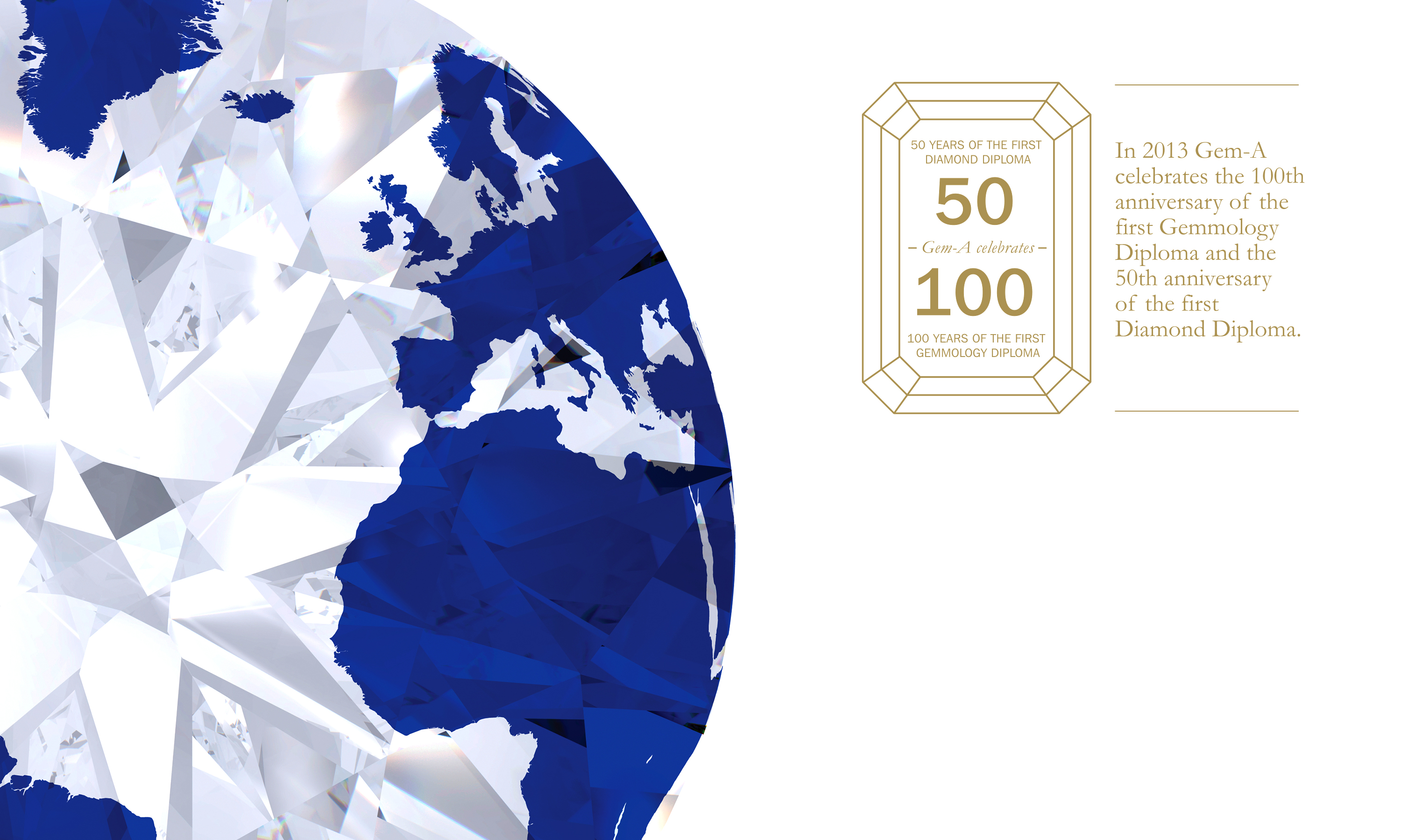
Anniversary mark
Advertising
Literature
Exhibitions
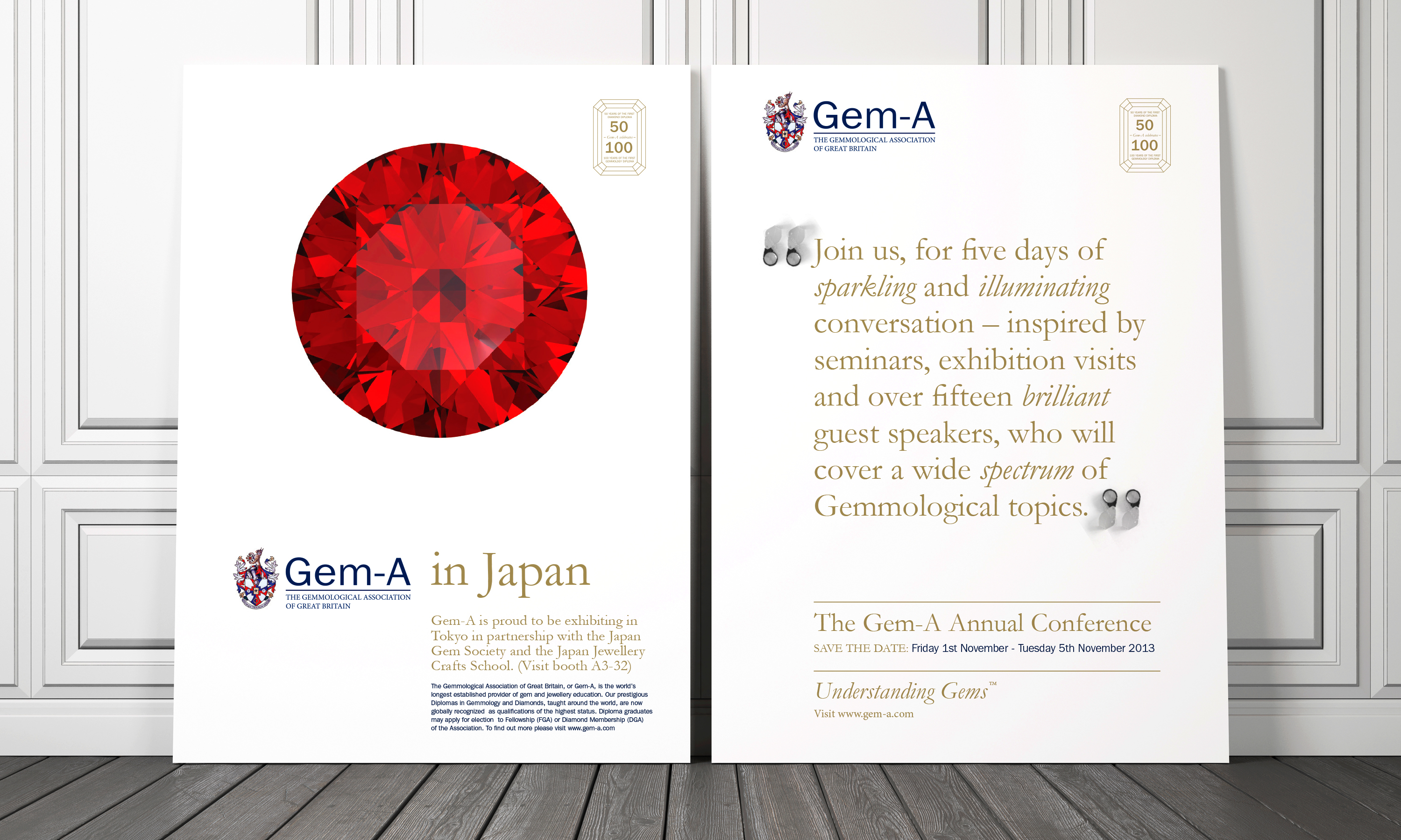
Gem-A global posters.
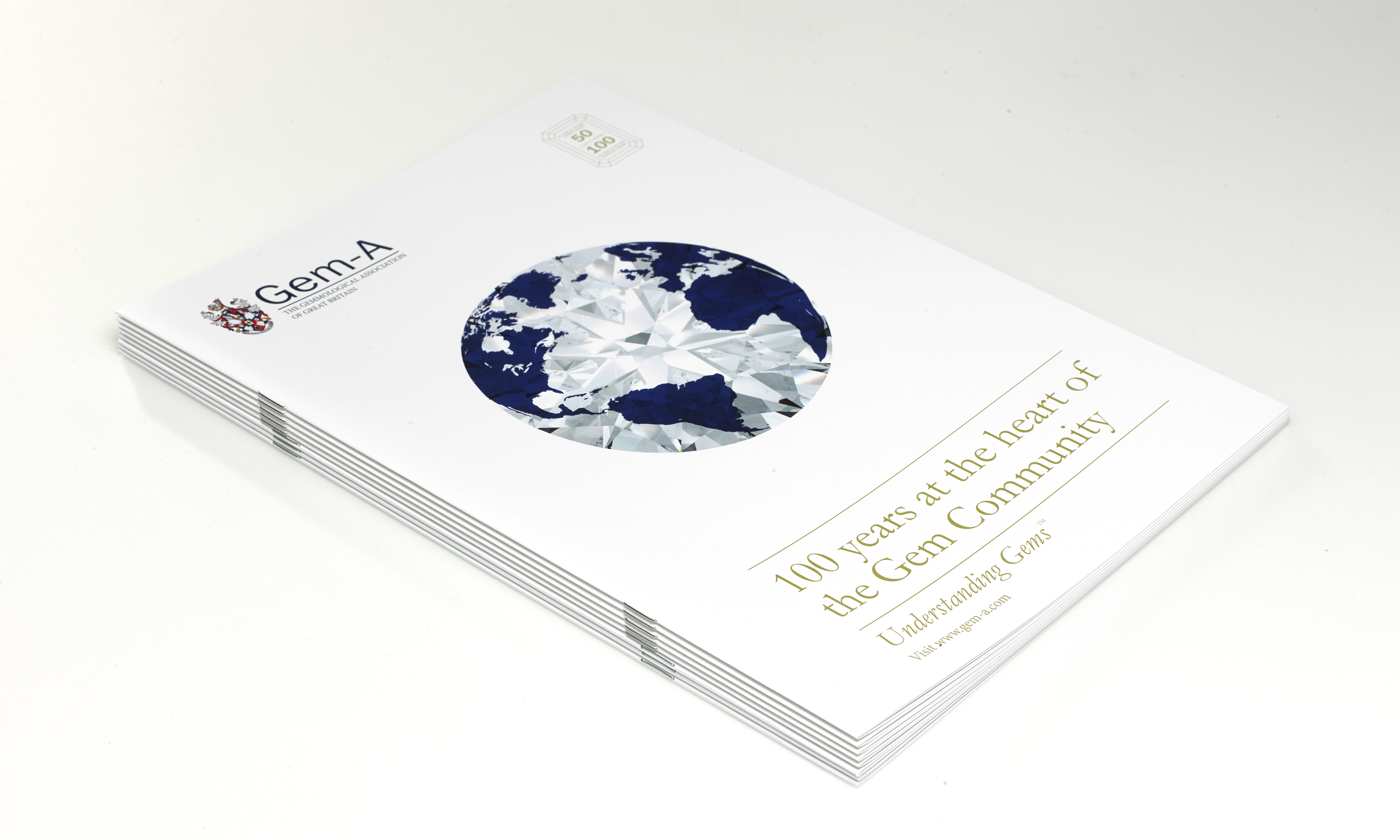
Gem-A global conference signature image and anniversary mark.
Gem-A global conference signature image detail.

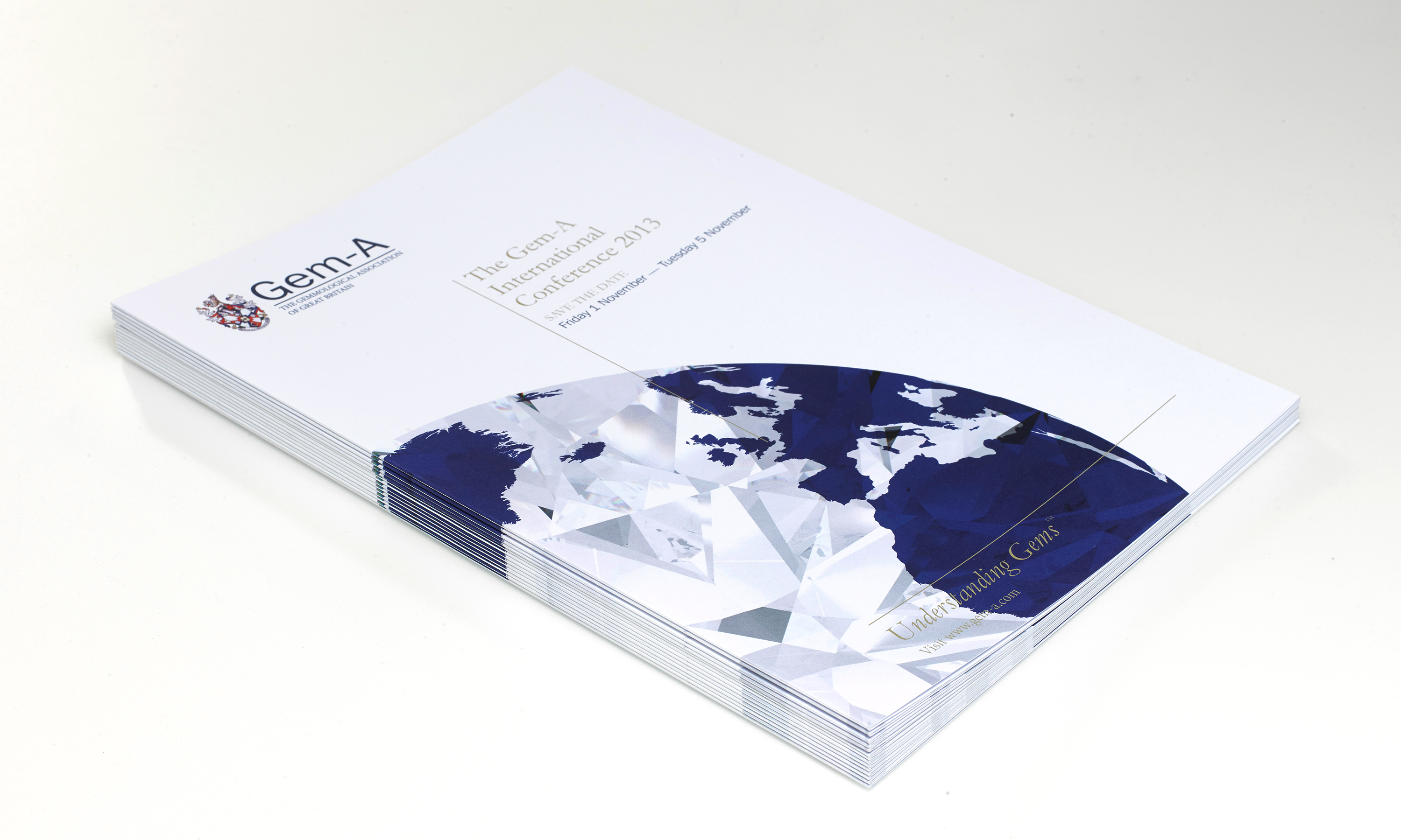
Gem-A global conference save the date mailer.
Gem-A global conference programme.
Gem-A trade journal advertising.