The Hoffman Institute
Website
Based upon a week-long retreat designed to facilitate personal change, the Hofmann Process is the only programme of its kind offering evidence-based transformational work proven to deliver lasting results. It’s delivered through the Hoffman Institute UK, and Neon’s redesign of their website is a conversion-focused UX and UI project.
The brief was to transform a content-heavy, emotionally sensitive website into a clear, intuitive, and SEO-optimised digital experience that supports both user confidence and business outcomes.
By combining strategic UX design, modern UI execution, and search-led structure, we redesigned the Hoffman Institute UK website to improve clarity, engagement, and conversion for a leading wellbeing and personal development organisation.
For the full long read case study, click here…
The challenge: complexity without clarity
The original Hoffman Institute UK website contained extensive educational content, testimonials, and event information. While rich in substance, the experience presented several UX challenges:
• Long, text heavy pages that were difficult to scan
• Multiple competing calls to action
• Inconsistent visual hierarchy across templates
• Dated UI patterns that reduced trust and credibility
• Limited guidance for first time users unfamiliar with the Hoffman Process
For a service centred on emotional wellbeing and personal transformation, the digital experience needed to feel calmer, more intuitive, and more decisive.
UX strategy: designing for intent and conversion
Neon’s UX strategy began with identifying user intent. Research showed that visitors typically arrive with one of three goals:
• Understand what the Hoffman Process is
• Assess whether it is right for them
• Take a clear next step toward participation
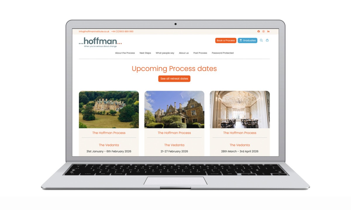
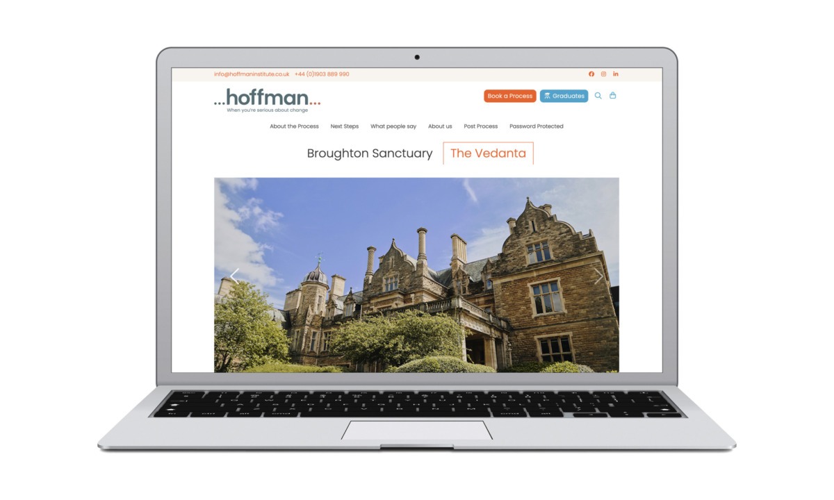
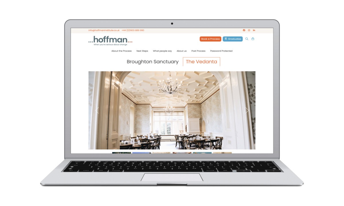
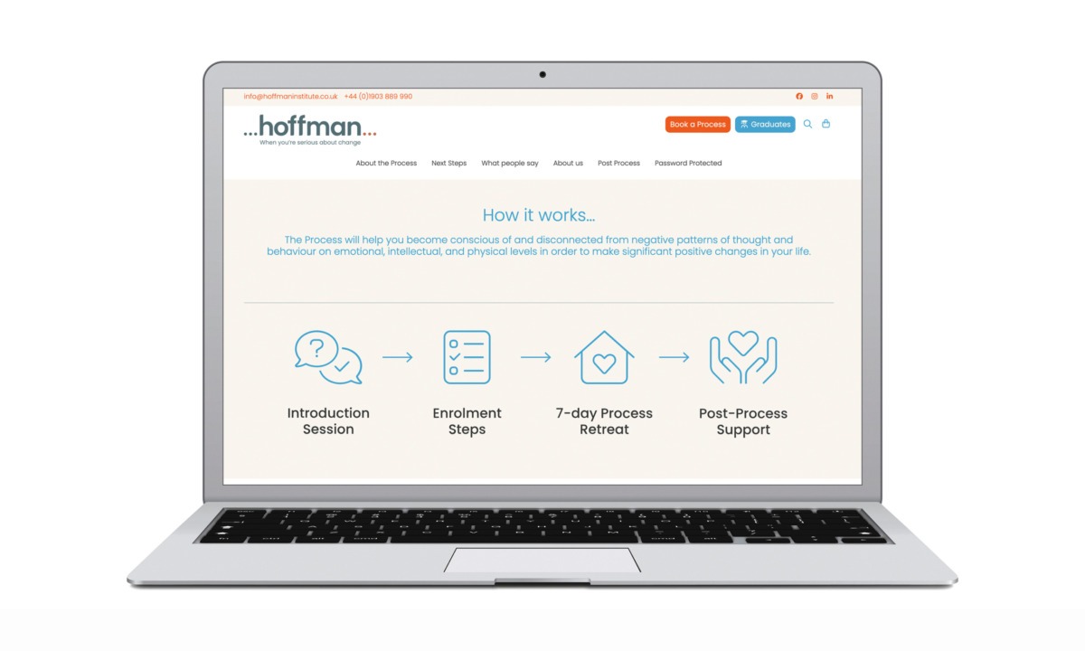
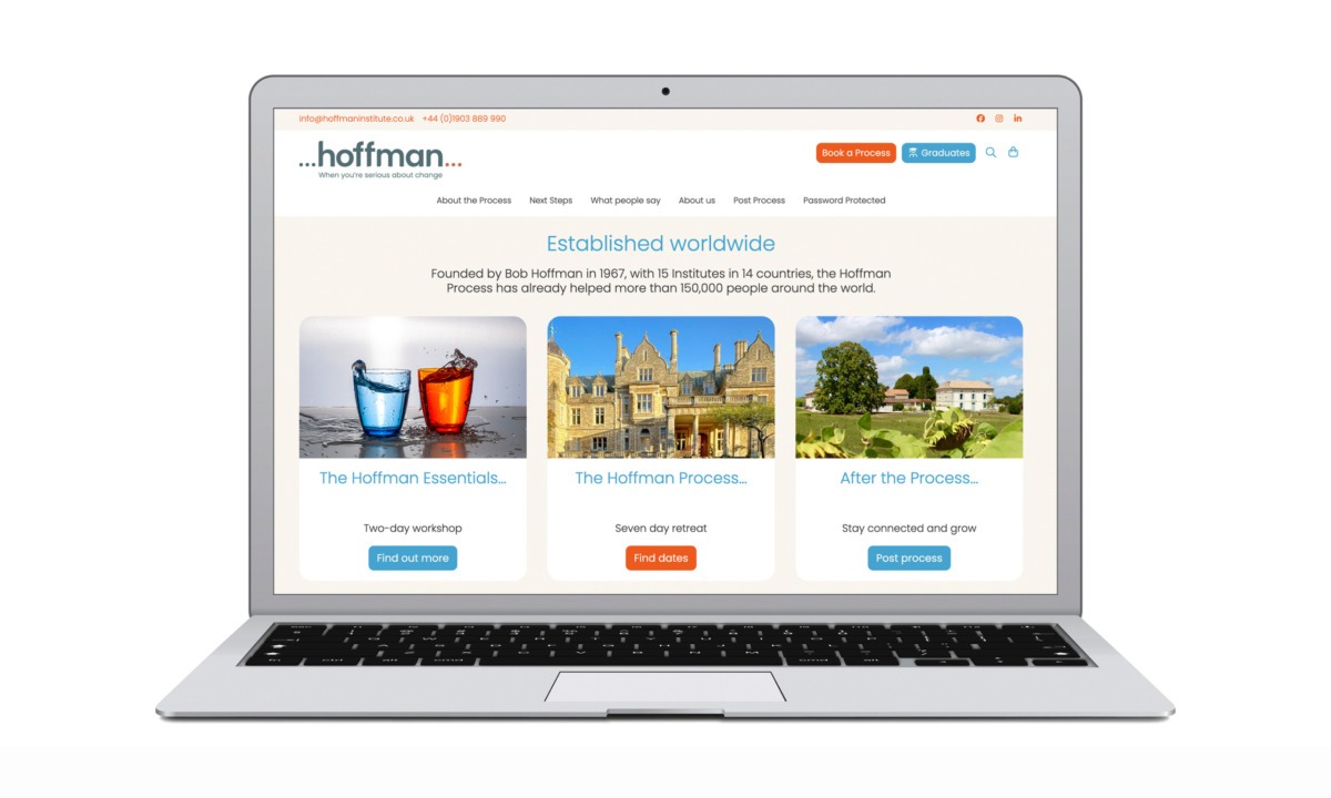
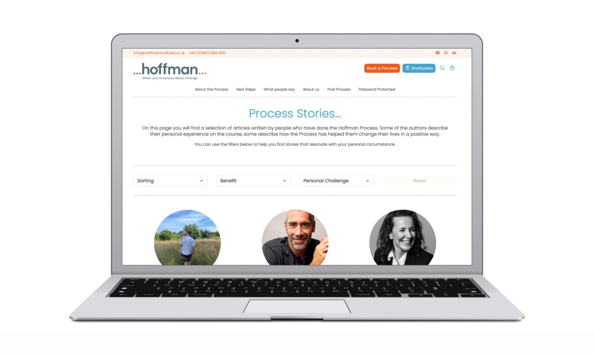
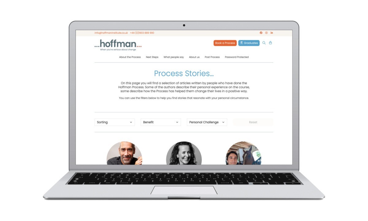
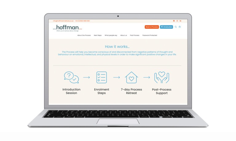
Simplified information architecture
The redesigned website introduces a clearer navigation structure that reduces cognitive load and improves way-finding:
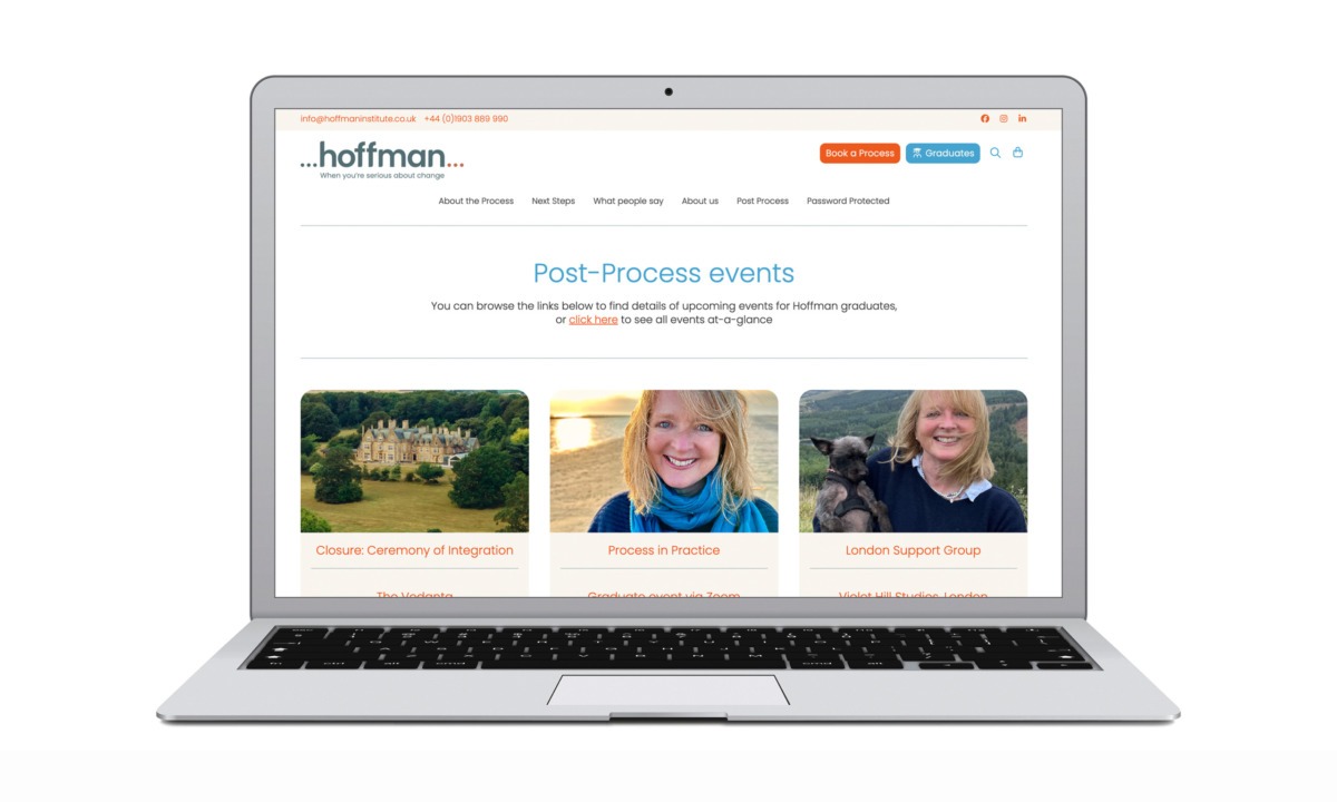
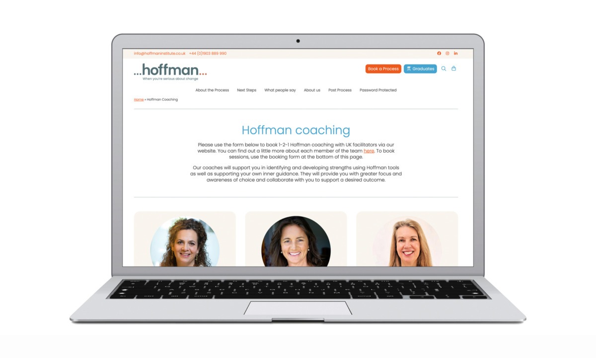
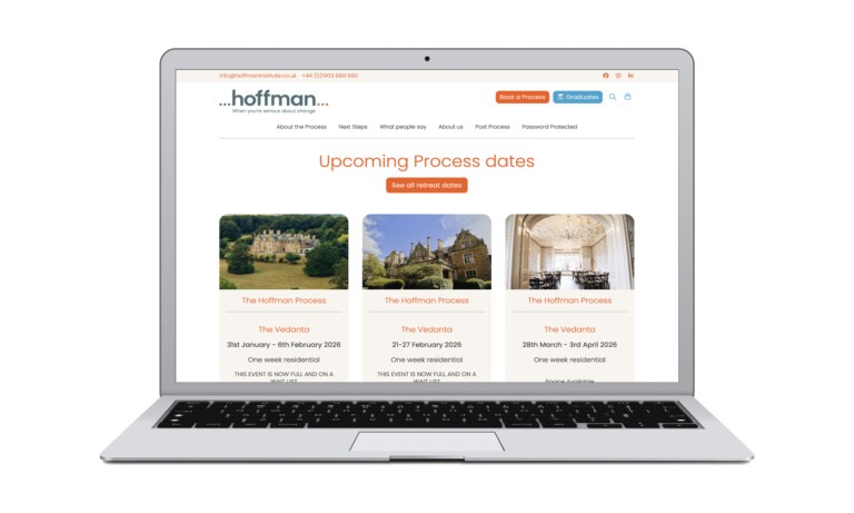
• Distinct pathways for New to Hoffman, About the Process, Dates & Events, and Post Process Support
• A dedicated Next Steps section that supports hesitant or early stage users
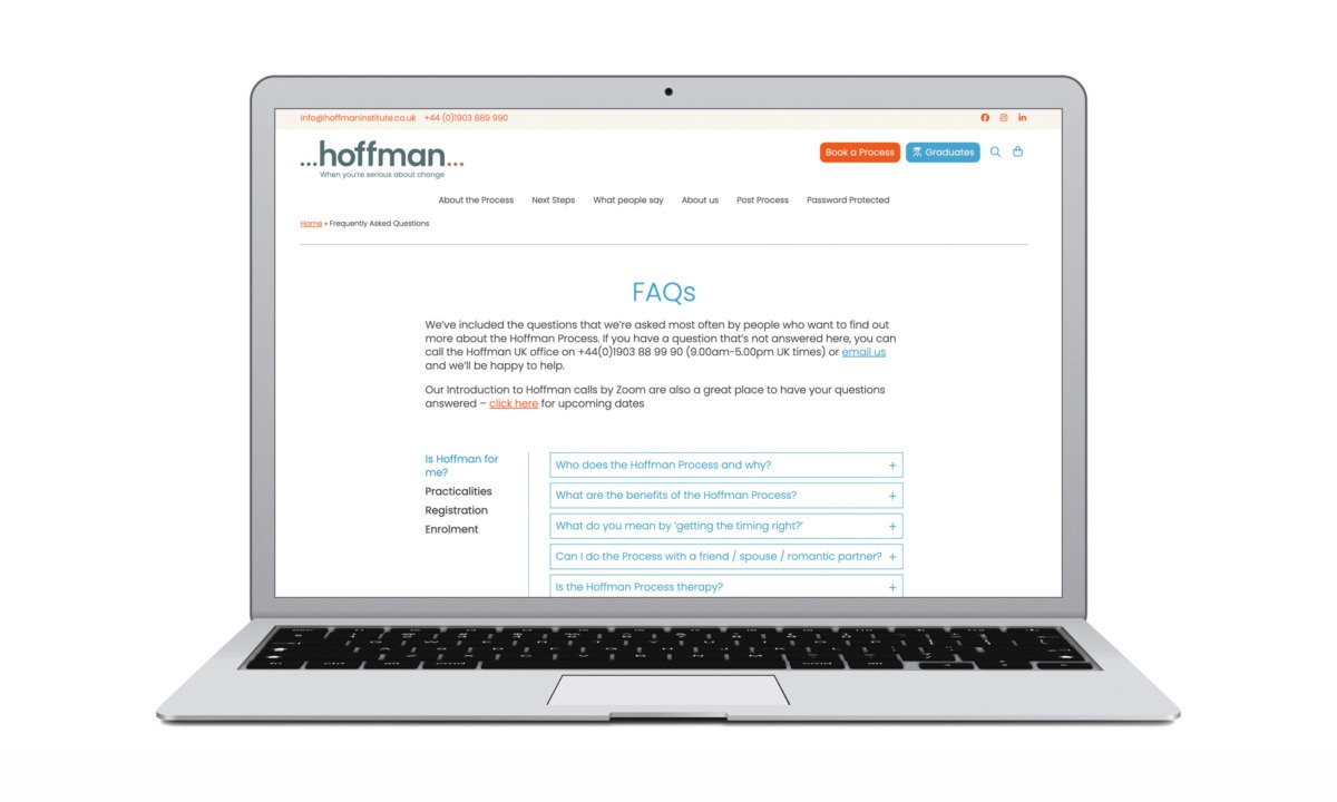
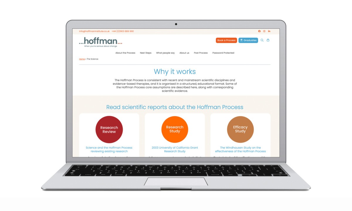
• Content broken into modular, scannable sections to improve comprehension
This structure allows users to move through the site at their own pace while always understanding what to do next.
Conversion led user journeys
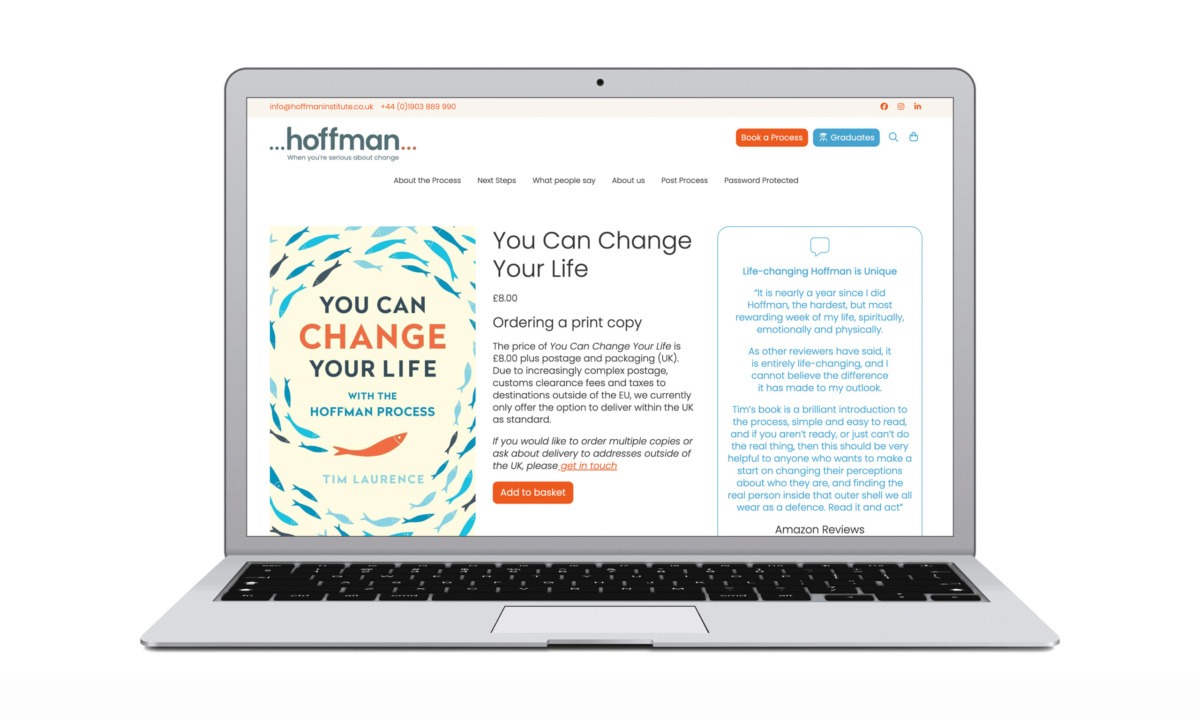
Key conversion actions — Register Online, Book a Free Consultation, and Join an Information Call — are now consistently placed and visually prioritised throughout the site. CTAs are contextual rather than aggressive, appearing at moments of readiness rather than interrupting the experience.
The result is a more confident decision making journey and improved conversion potential.
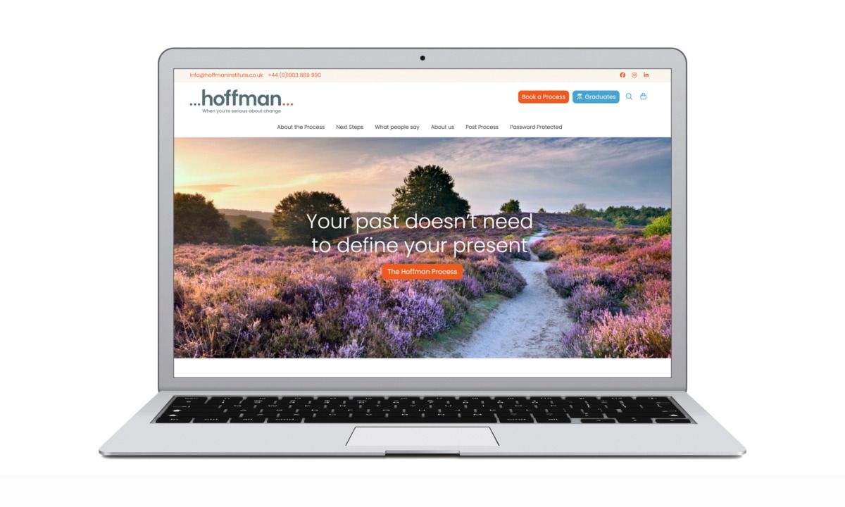
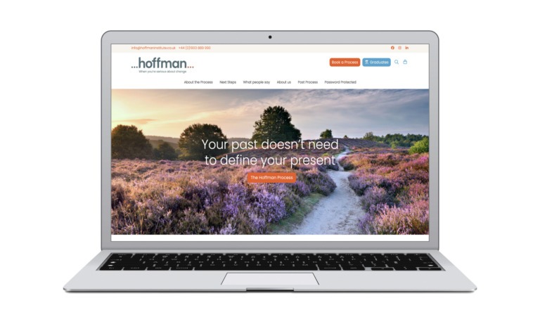
UI design: trust, calm, and modernity
The UI redesign brings the Hoffman Institute UK brand into a contemporary digital space while retaining its human, reflective tone.
Typography and layout
• Increased white space improves readability and emotional comfort
• Modern, accessible typography enhances trust and professionalism
• A stronger typographic hierarchy guides users naturally through long form content
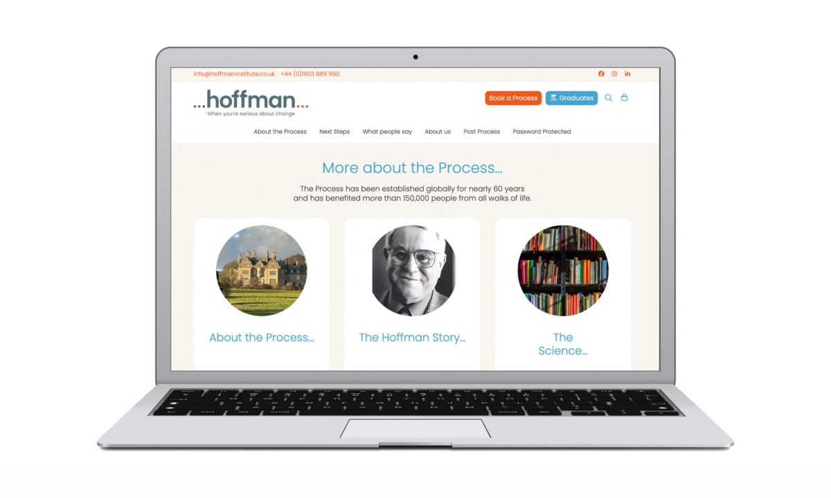
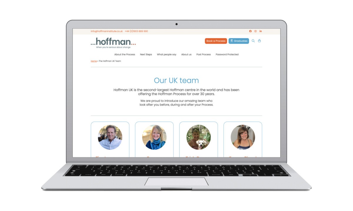
Visual language and imagery
The updated interface replaces abstract or outdated visuals with:
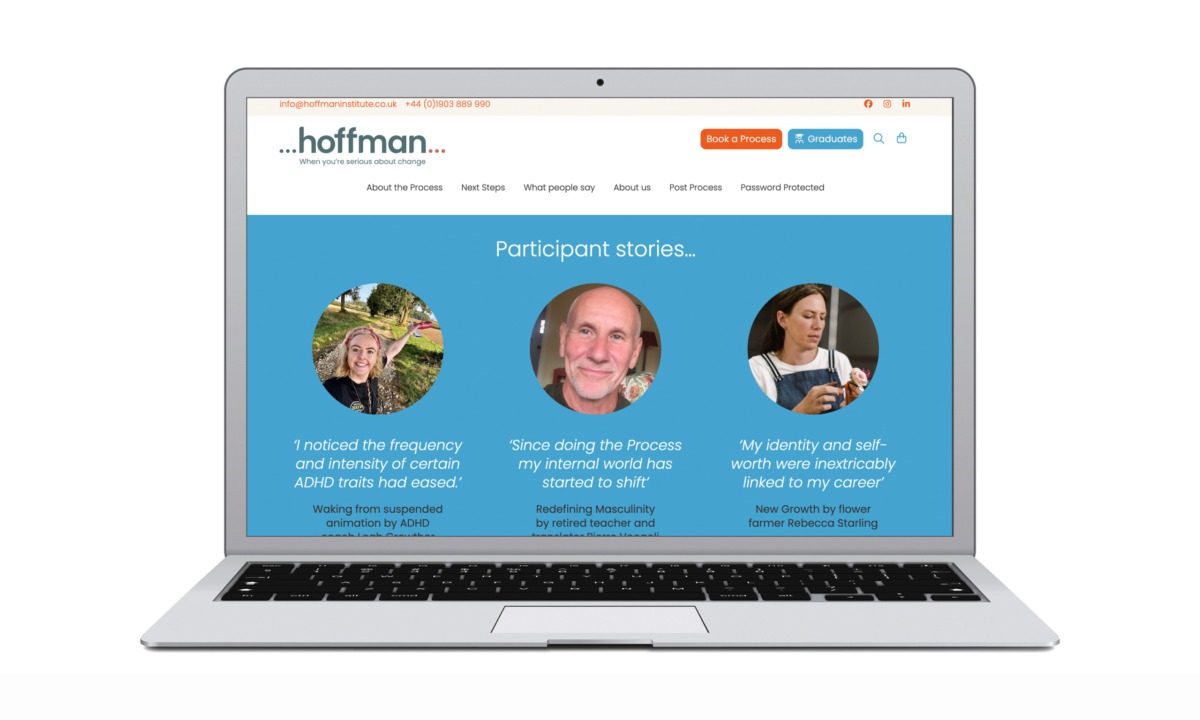
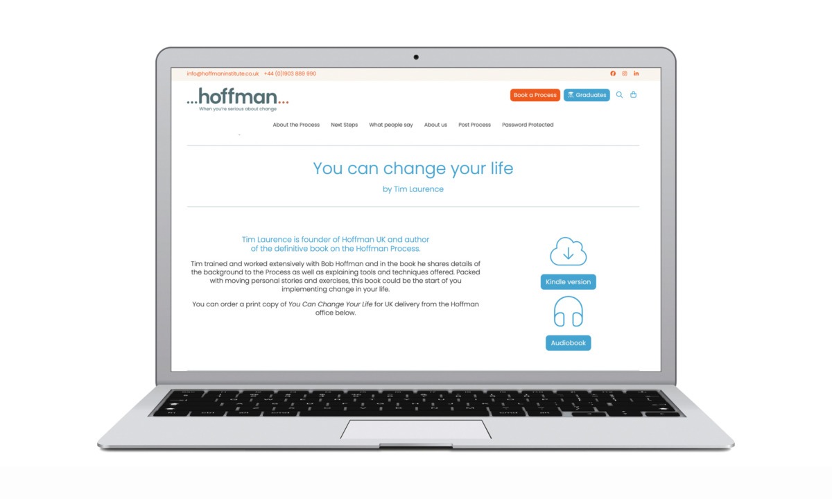
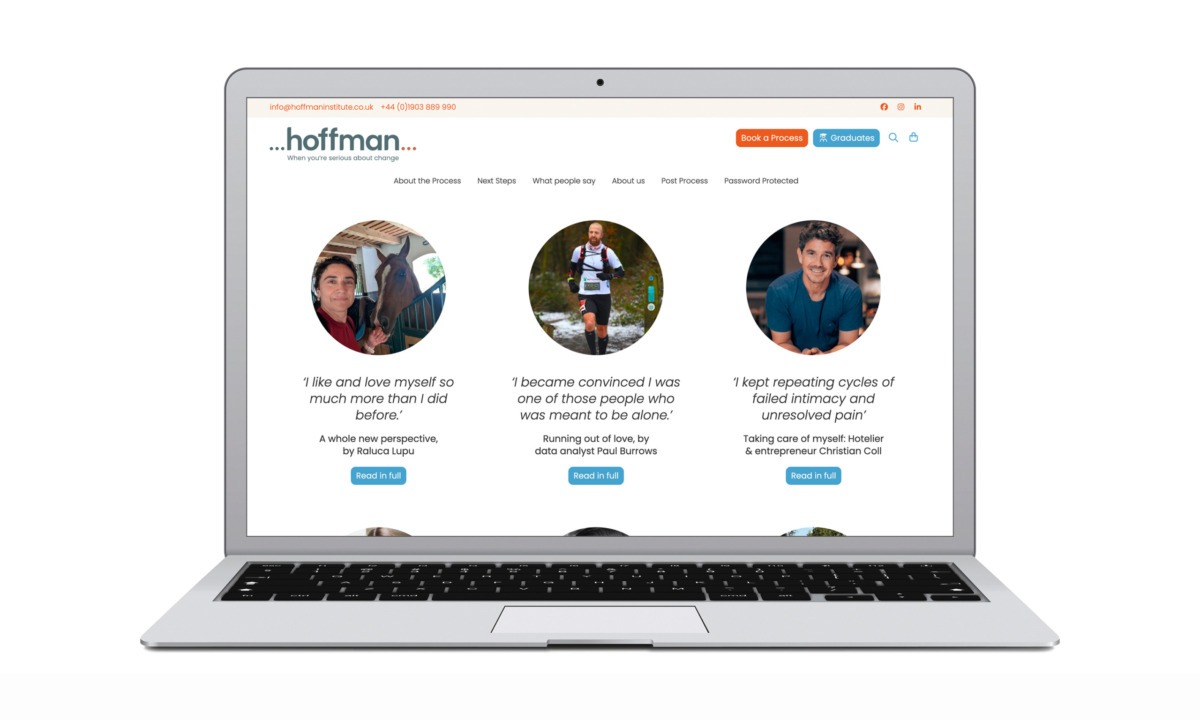
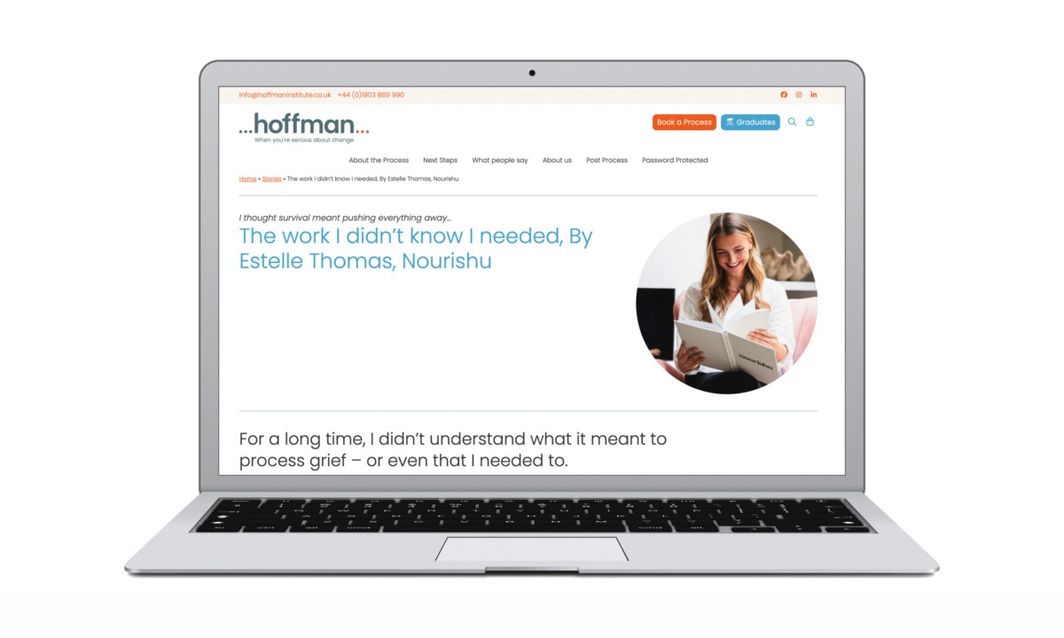
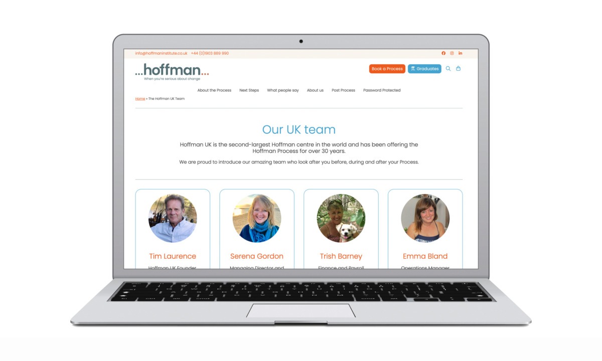
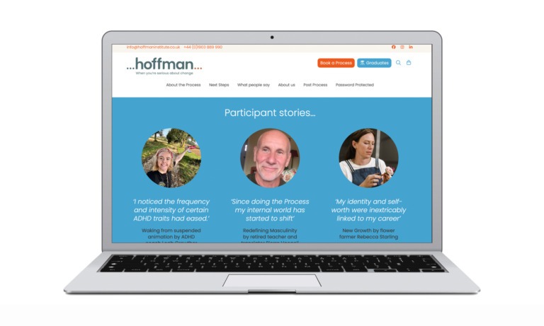
• Human centred photography
• Softer, more grounded colour palettes
• Imagery that supports themes of reflection, clarity, and transformation
These UI choices help reduce anxiety for first time visitors and create a sense of psychological safety — a critical factor in wellbeing focused UX design.
SEO friendly UX design
SEO considerations were integrated into the UX and UI redesign from the outset, supporting stronger organic visibility and engagement:
• Clear H1–H3 heading structures optimised for search intent
• Improved internal linking between educational content, event dates, and CTAs
• Faster load times through cleaner layouts and modern optimisation practices
• Scannable content blocks that reduce bounce rate and increase dwell time
By aligning UX design with SEO best practice, the new website supports both user needs and search engine performance.
Accessibility and trust signals
To further support conversion and inclusivity, the redesign strengthens accessibility and trust through:
• Clear contact details and transparent next steps
• Consistent UI patterns that reduce friction for less tech confident users
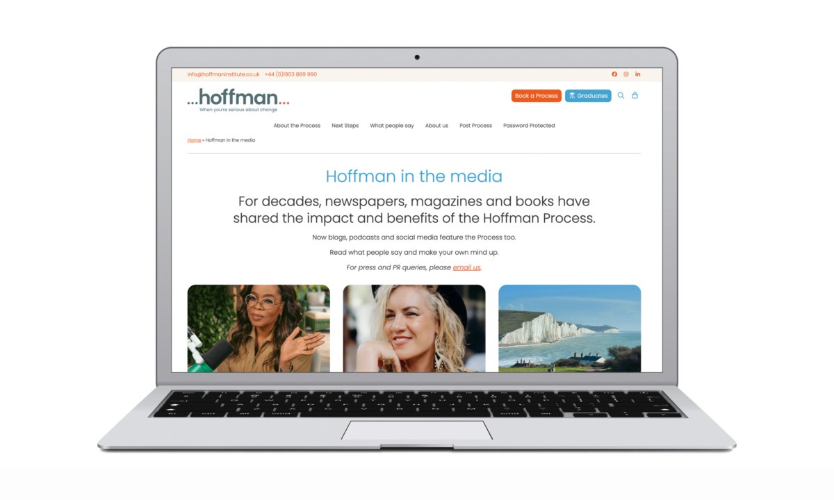
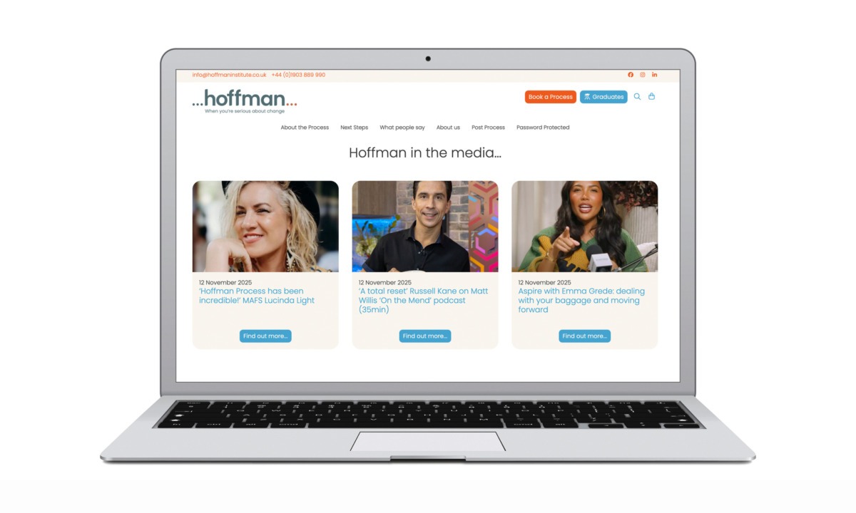
• Prominent social proof, including media features and testimonials
These elements reinforce credibility and help users feel supported throughout their decision making process.
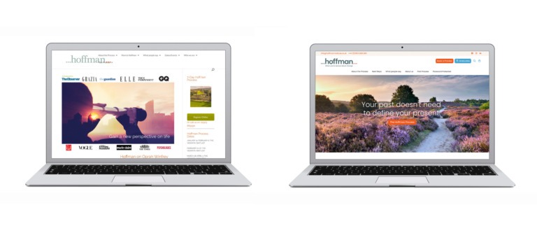
Before vs after UX: measuring the impact of redesign
Before: The old Hoffman Institute UK website
Before the redesign, the Hoffman Institute UK website contained valuable content but presented significant UX challenges:
• Long, uninterrupted blocks of text that reduced scannability
• Overloaded pages with competing calls to action
• Inconsistent layout and visual hierarchy across templates
• Dated UI elements that weakened trust and perceived credibility
• Unclear next steps for first-time or cautious users
Users often needed to work hard to understand what the Hoffman Process was and how to engage with it.
After: The new Hoffman Institute UK website by Neon
The redesigned website delivers a calmer, clearer, and more conversion-focused experience:
• Structured content modules that are easy to scan and absorb
• Clear prioritisation of primary user actions at every stage
• Consistent UI patterns that improve usability and confidence
• Contemporary typography and imagery aligned with wellbeing UX best practice
• Purposeful user journeys that guide visitors from curiosity to action
The result is a website that actively supports decision-making rather than overwhelming it.
Results: a clearer, more effective digital platform
The Hoffman Institute UK website redesign delivers measurable strategic value:
• Improved clarity for first time visitors
• More structured and confident user journeys
• Stronger alignment between brand values and digital execution
• Conversion focused UX without pressure based tactics
Neon Brand Consultants successfully translated a deeply human, offline experience into a modern, high performing digital platform.
Conclusion
This project highlights how effective UX and UI design go beyond aesthetics. By combining empathy led design thinking with conversion strategy and SEO friendly structure, Neon created a website that supports both emotional wellbeing and business outcomes.
For organisations in the personal development and wellbeing sector, the Hoffman Institute UK redesign demonstrates how thoughtful digital design can build trust, guide users, and drive meaningful action.
Kind words…
“. Read More…
DEBBIE KENNEDY
Head of Brand & Marketing
The Hoffman Institute
(Read Less...)
To find out more: [email protected] or call +44 (0)203 857 7656 Share this: Email, LinkedIn, Facebook, Download PDF, follow us on Instagram or view our animations and movies on Vimeo
WELLBEING
Website design
PROJECT SUMMARY
User research
Site structure design
User journeys
UX strategy
UI design
Site design
Build / programming
Content population
SEO
Digital assets
Hoffman Institue website.

Old website vs new.
Hoffman Institute website homepage.

Hoffman Institute website assorted pages.