Corney & Barrow
House Range
Following Neon’s successful rebrand for Corney & Barrow, one of the UK’s most prestigious independent wine merchants, we were invited to redesign their House Range of wines and spirits — a collection that had grown visually inconsistent over time.
Our challenge was to create a unified design system that would be unmistakably Corney & Barrow, reflecting the brand’s heritage, quality and provenance — while working within complex production constraints across multiple international bottlers.
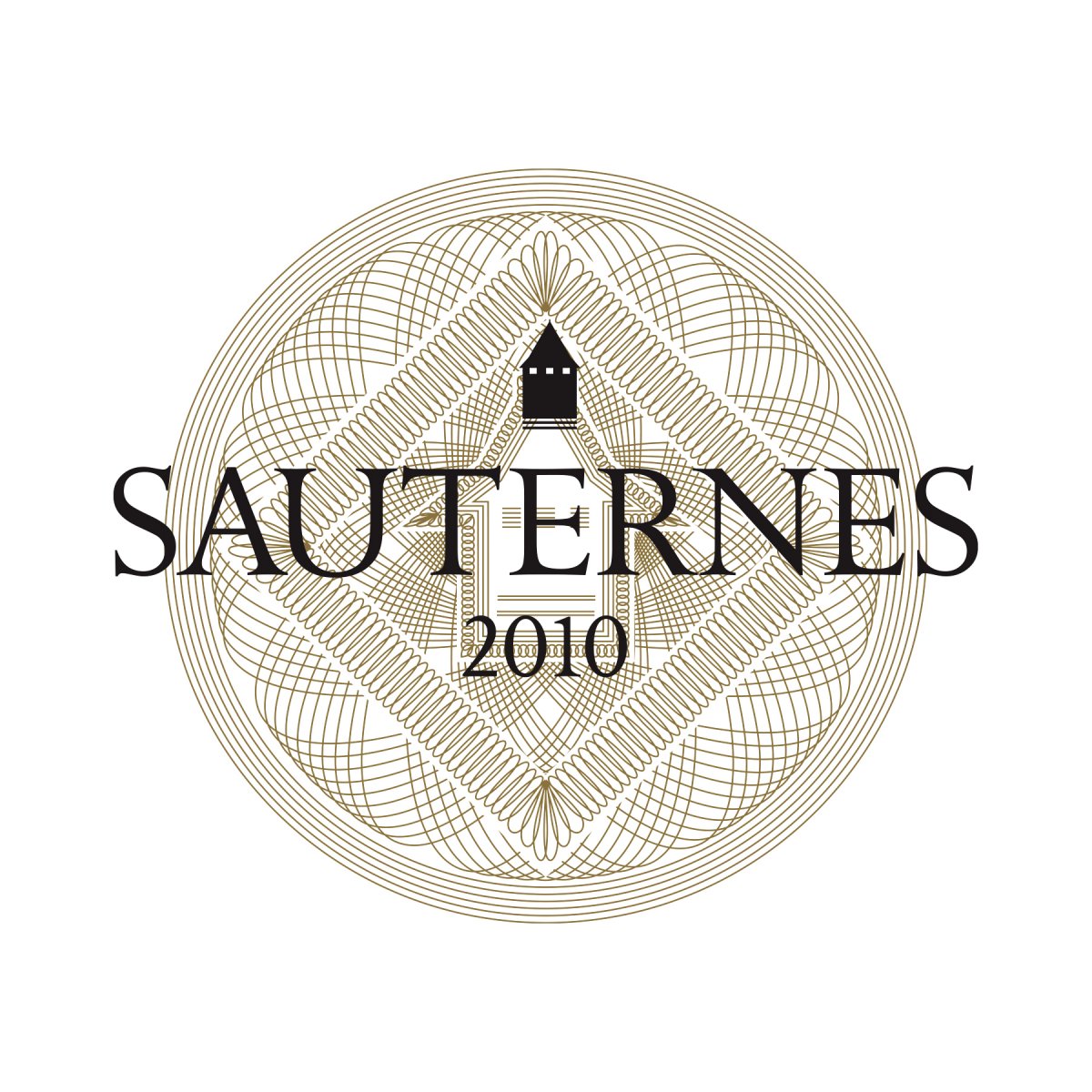
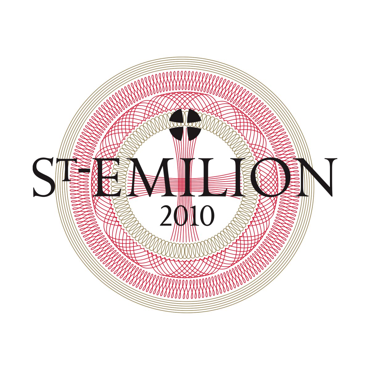
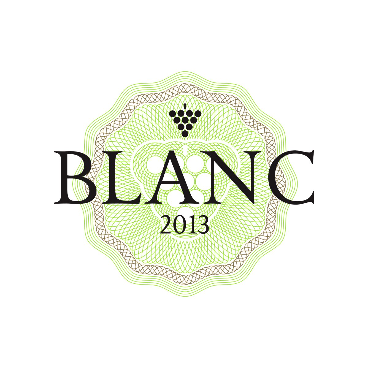
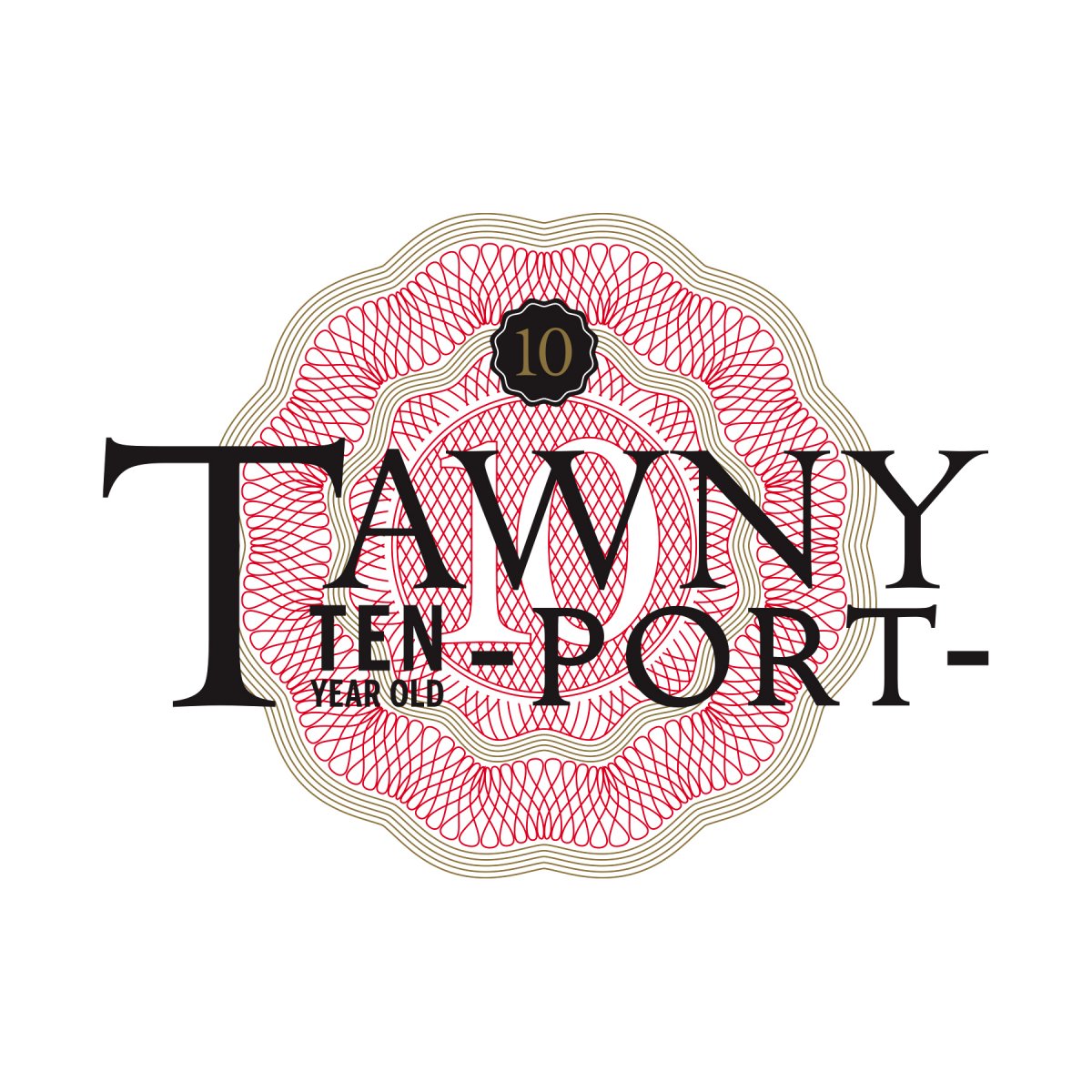
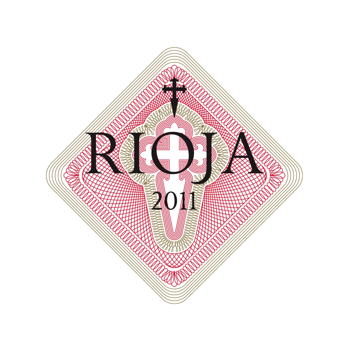
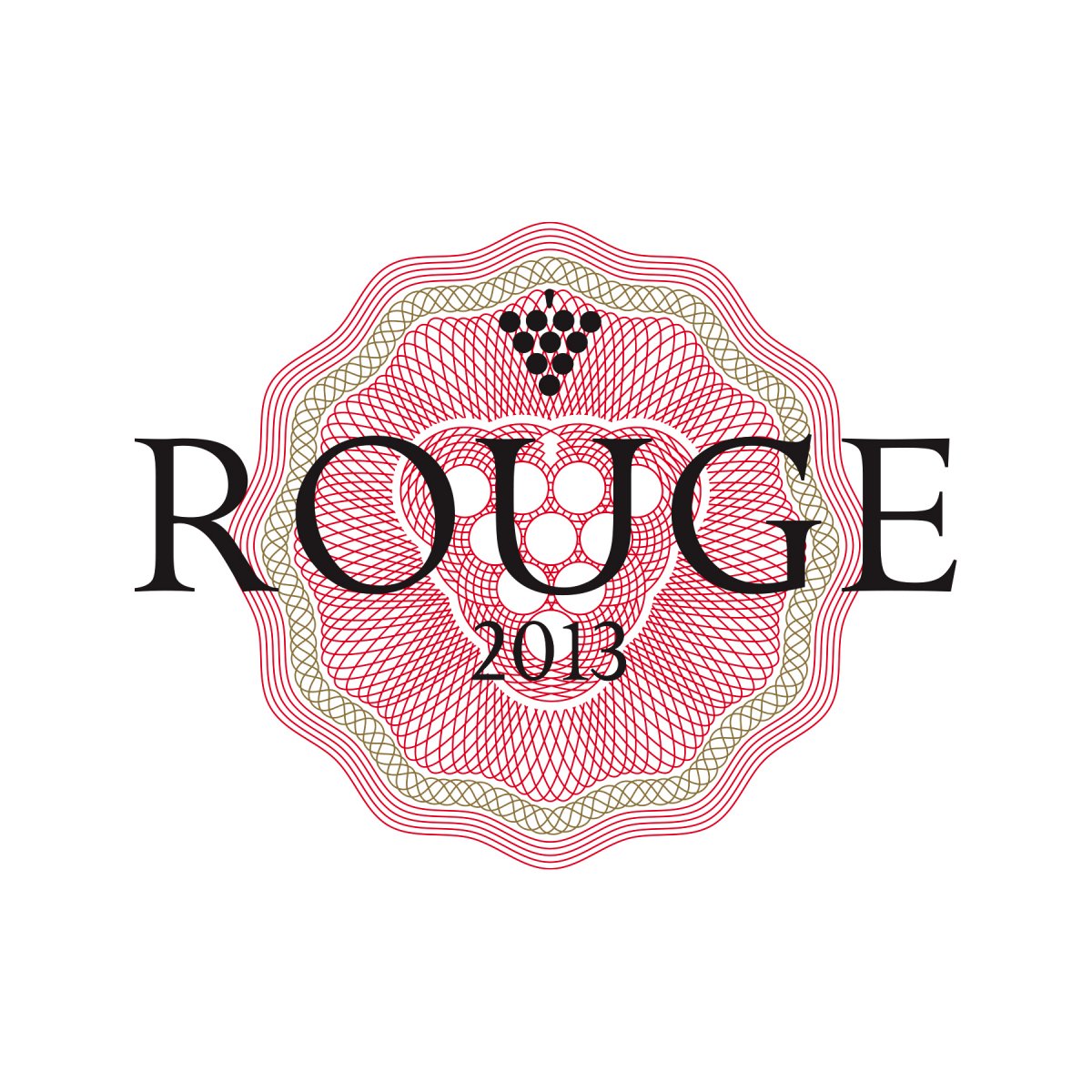
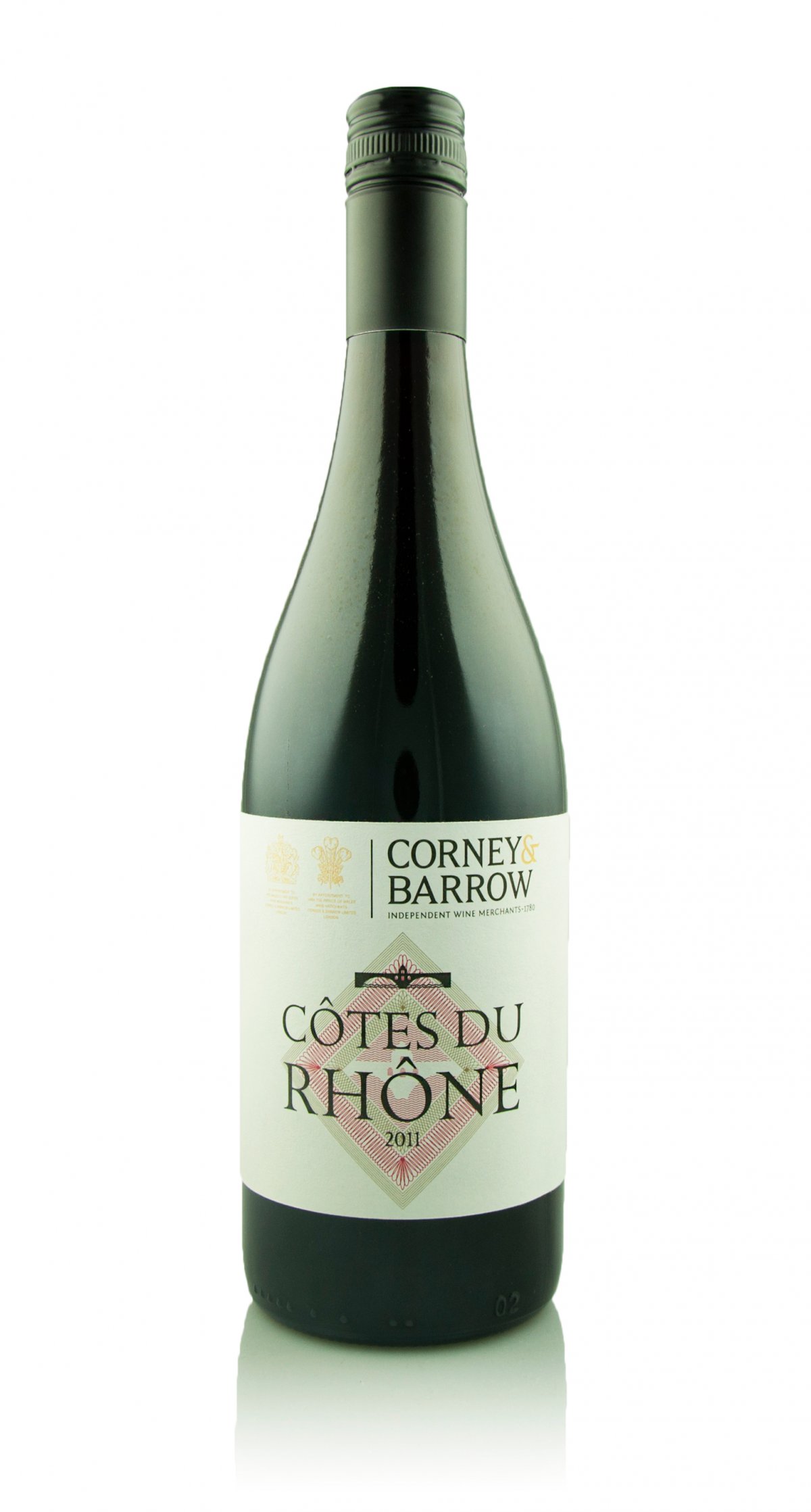
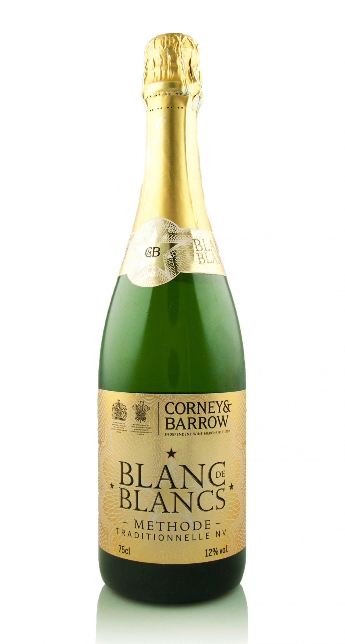
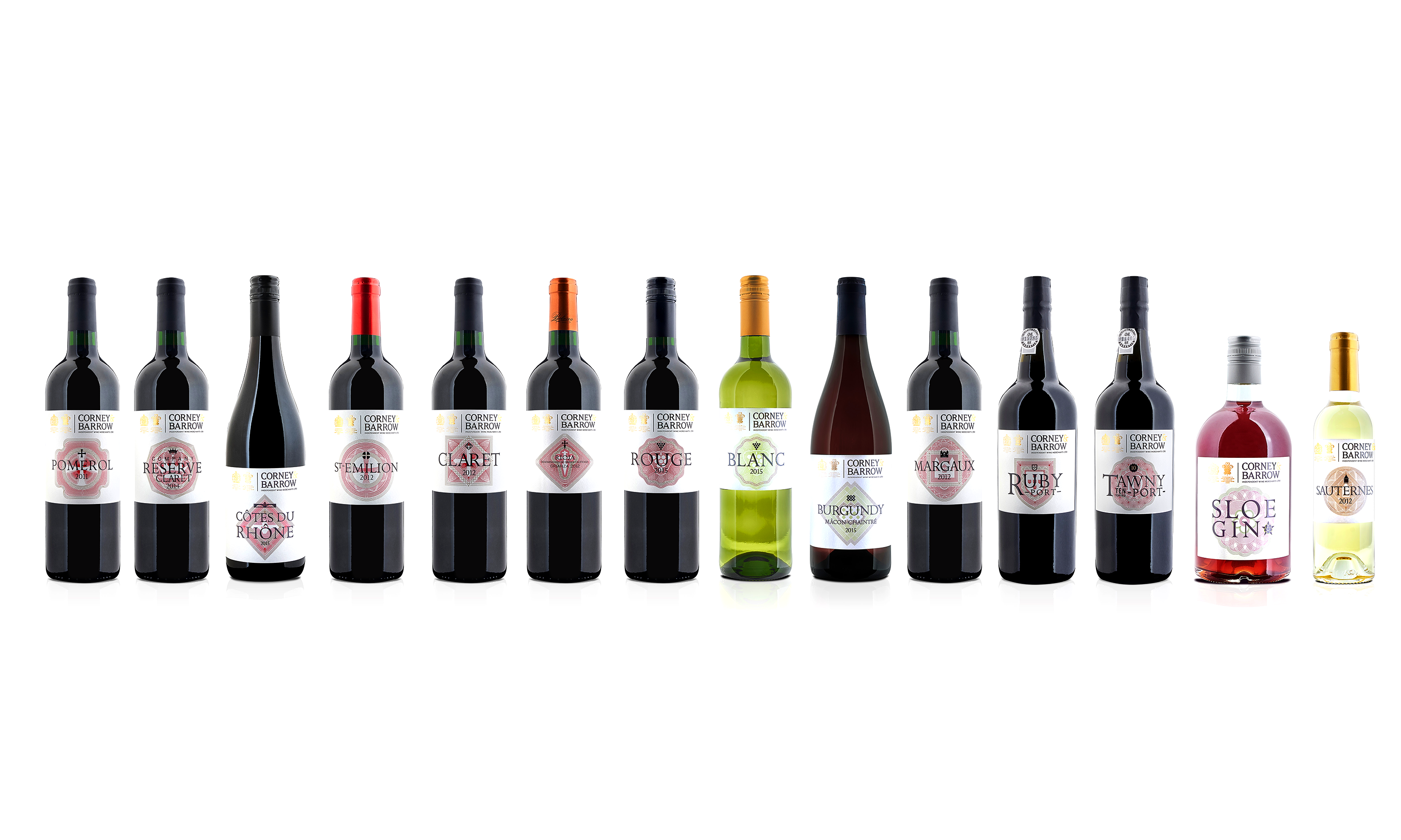
We began by stripping back and rationalising the existing labels, establishing a consistent typographic structure built on Corney & Barrow’s bespoke modern serif Golden Cockerel and clean Benton Sans. Then, through extensive research into each wine’s regional heritage, we created a set of ‘provenance icons’ — elegant line illustrations referencing local architecture, heraldry and geography — becoming unique seals of authenticity and pride.
Premium paper stocks, metallic foils and tactile varnishes completed the sensory experience, resulting in a collection that feels timeless, refined and distinctly Corney & Barrow.
The outcome? A beautifully cohesive House Range that balances consistency with individuality — the perfect toast to 235 years of excellence.
For the full long read case study, click here…
Communicating consistent excellence.
Following Neon’s successful branding project for Corney & Barrow, they invited us to redesign their House Range of wines and spirits. [collapse_btn target="my_panel"]Read More…[/collapse_btn]
[collapse_panel panel_id="my_panel"] Over time, the existing range had become visually tired and fragmented – so the goal was to create a unified range that would be unmistakably Corney & Barrow, conveying the provenance of the wines, and better reflecting their premium quality and price.A major challenge we faced was that each of the wines and spirits was bottled and labelled by different producers, all over the world. And the brief stipulated that we had to retain the current range of bottle structures, and in some cases also the label sizes, because of local limitations in terms of production and printing. Clearly, under these constraints, a consistent and cohesive would be hard to achieve.
We began by reviewing all the labels, stripping away unnecessary elements, to arrive at a common set of information applicable across the range. We also looked at simplifying the bewildering array of different designs, layouts and typefaces that, over time, had undermined any sense of a cohesive range.
Building on the firm foundations laid down by our rebranding, we came up with a new, unifying design concept featuring an elegantly expressive yet consistent typographic approach to labels – using Corney & Barrow’s new modern serif ‘Golden Cockerel’, supported by the clean sans serif ‘Benton Sans’ for the weights and measures, legal and back label product description text.
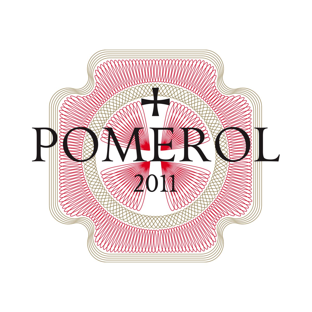
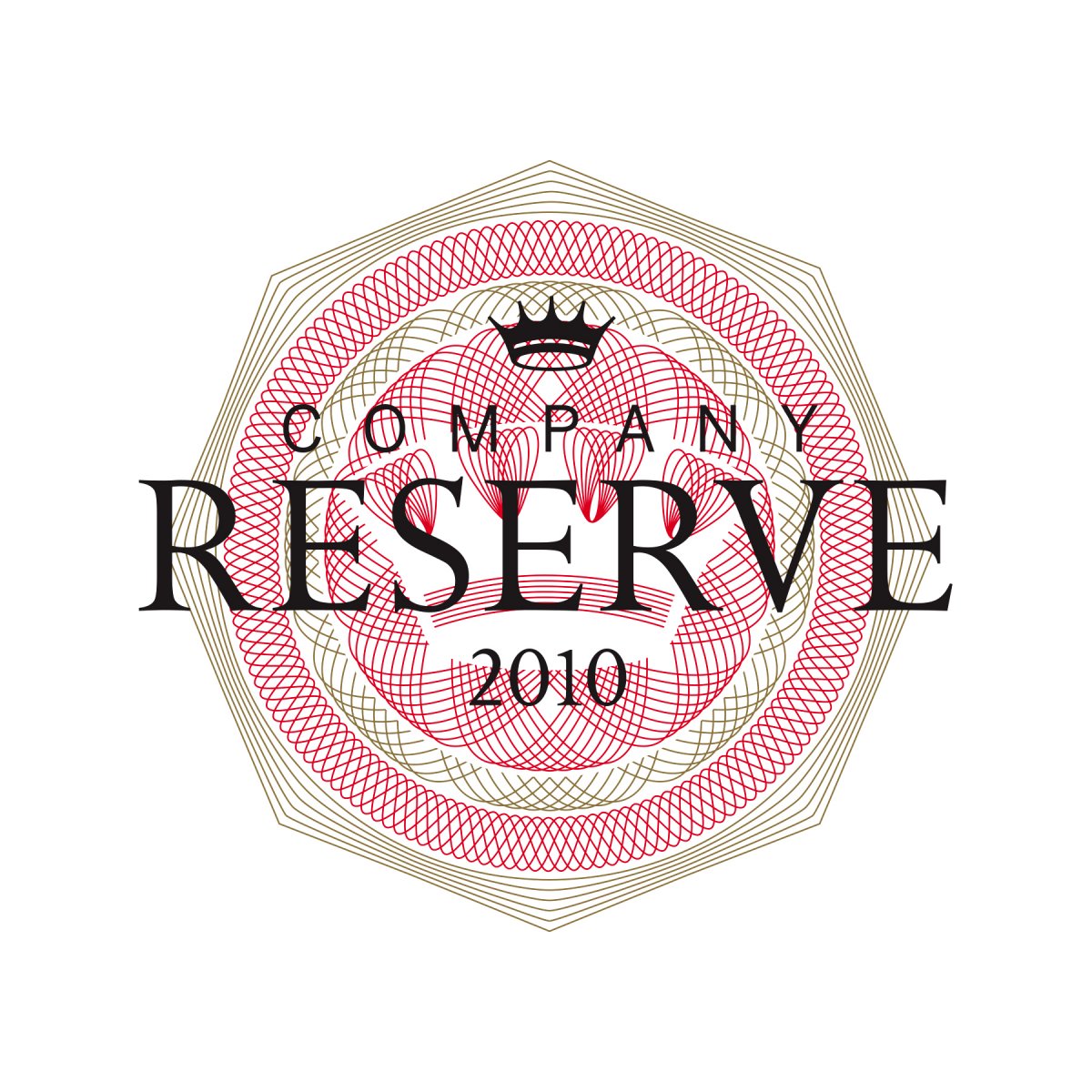
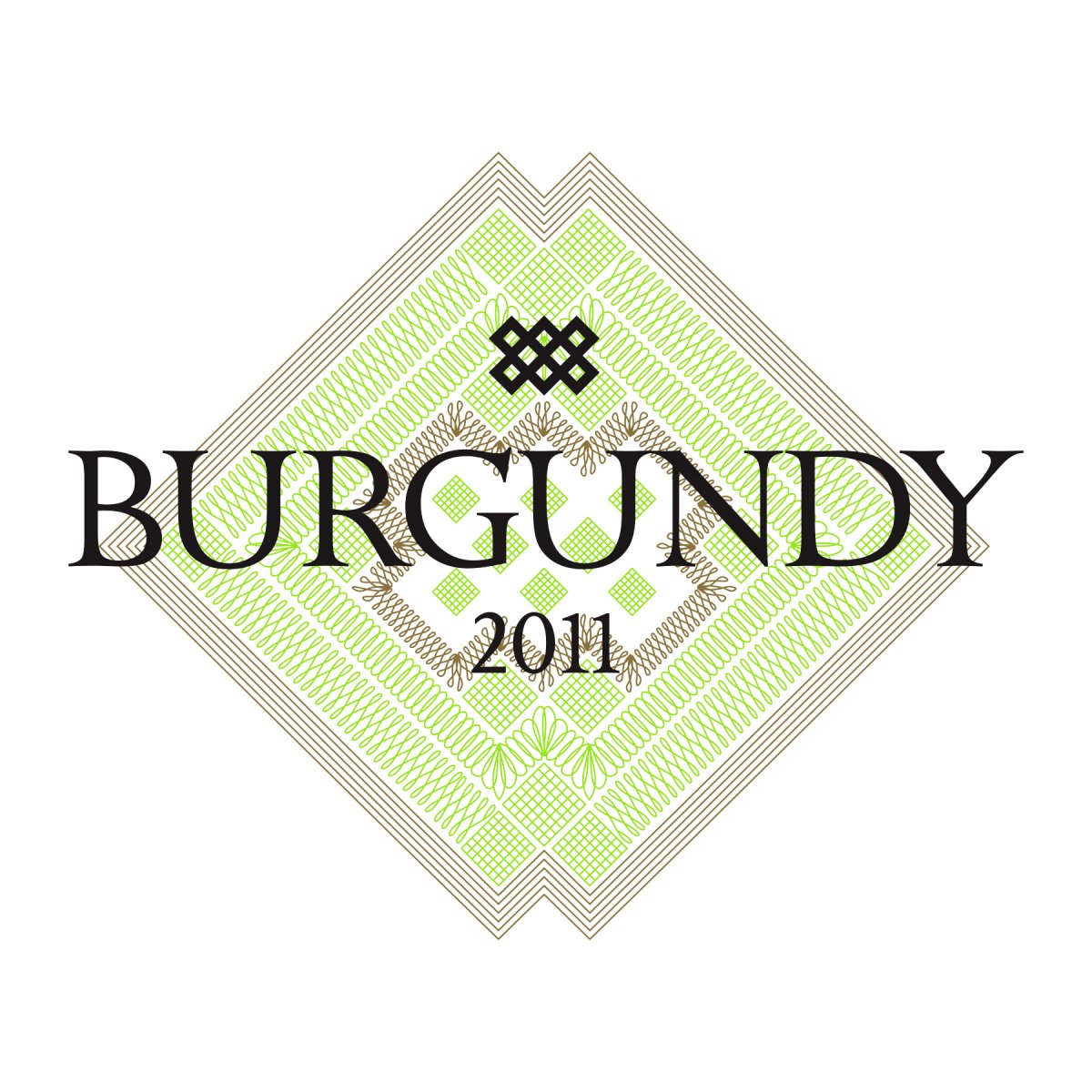
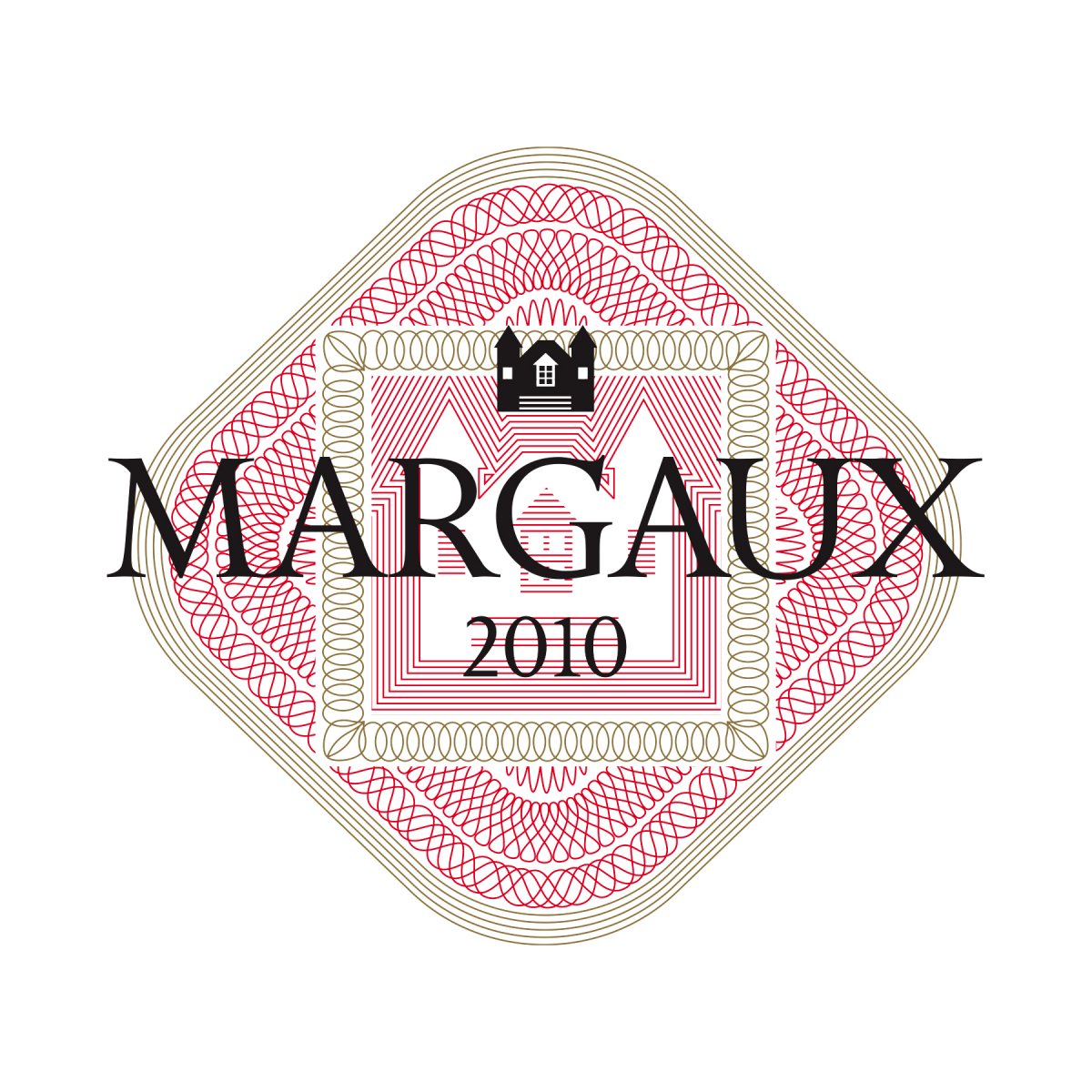
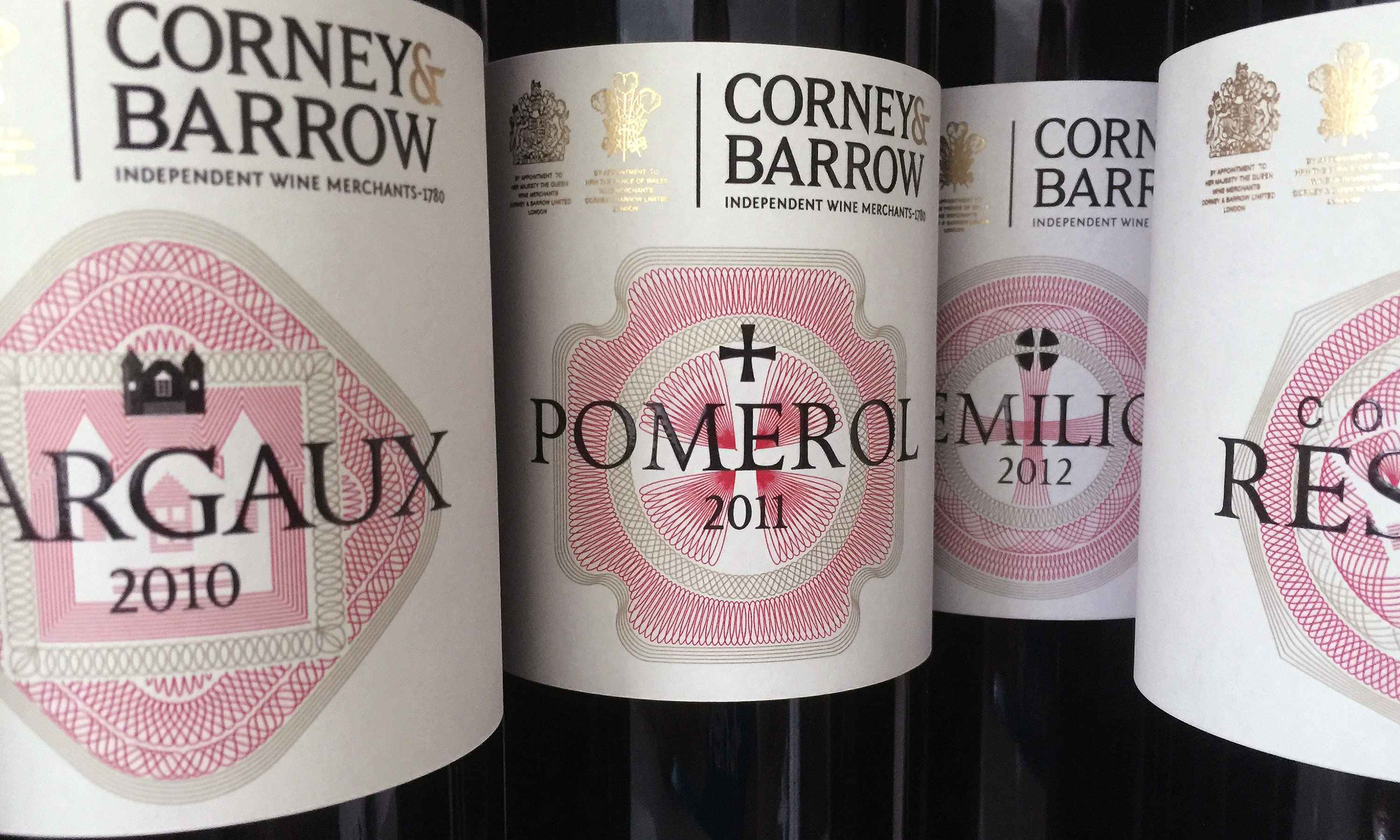
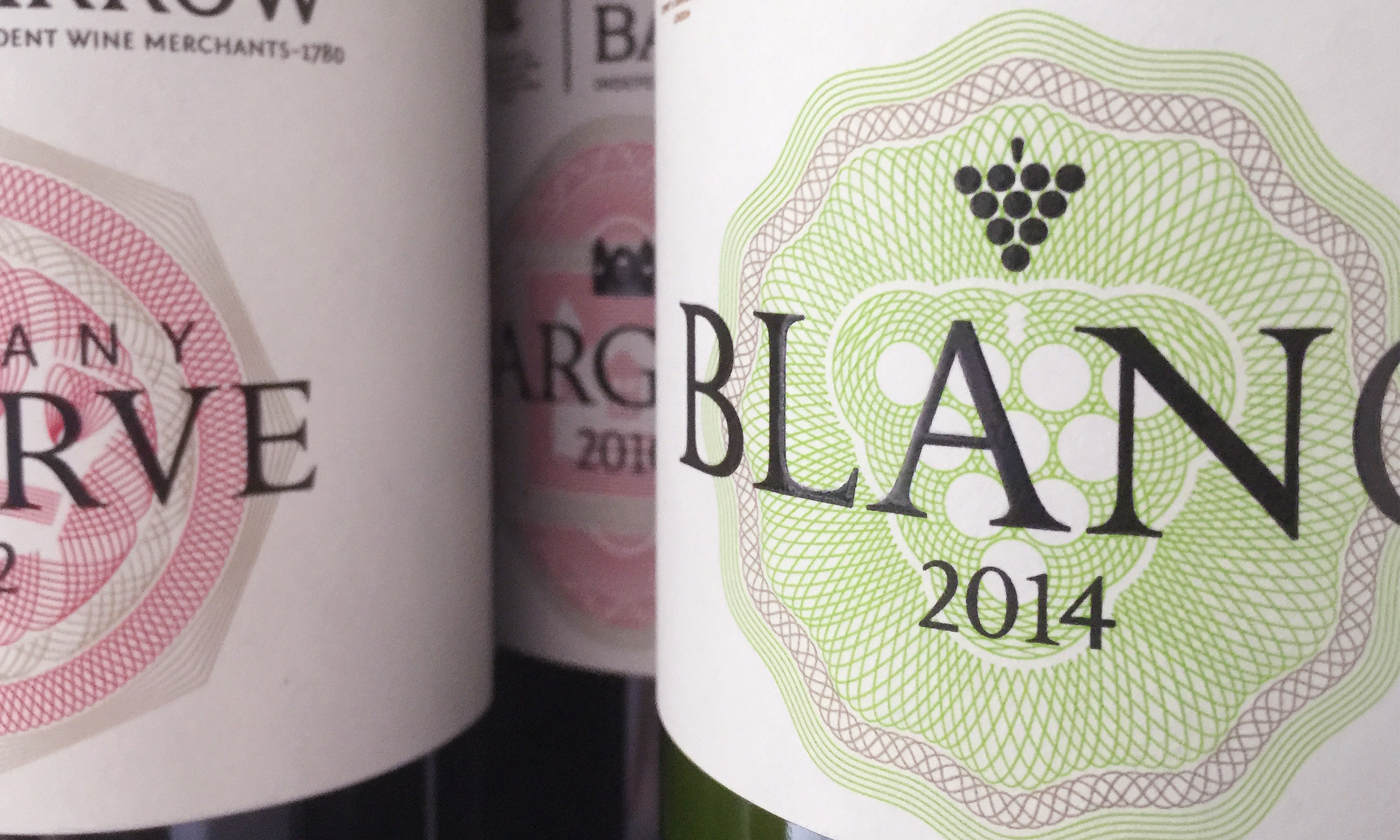
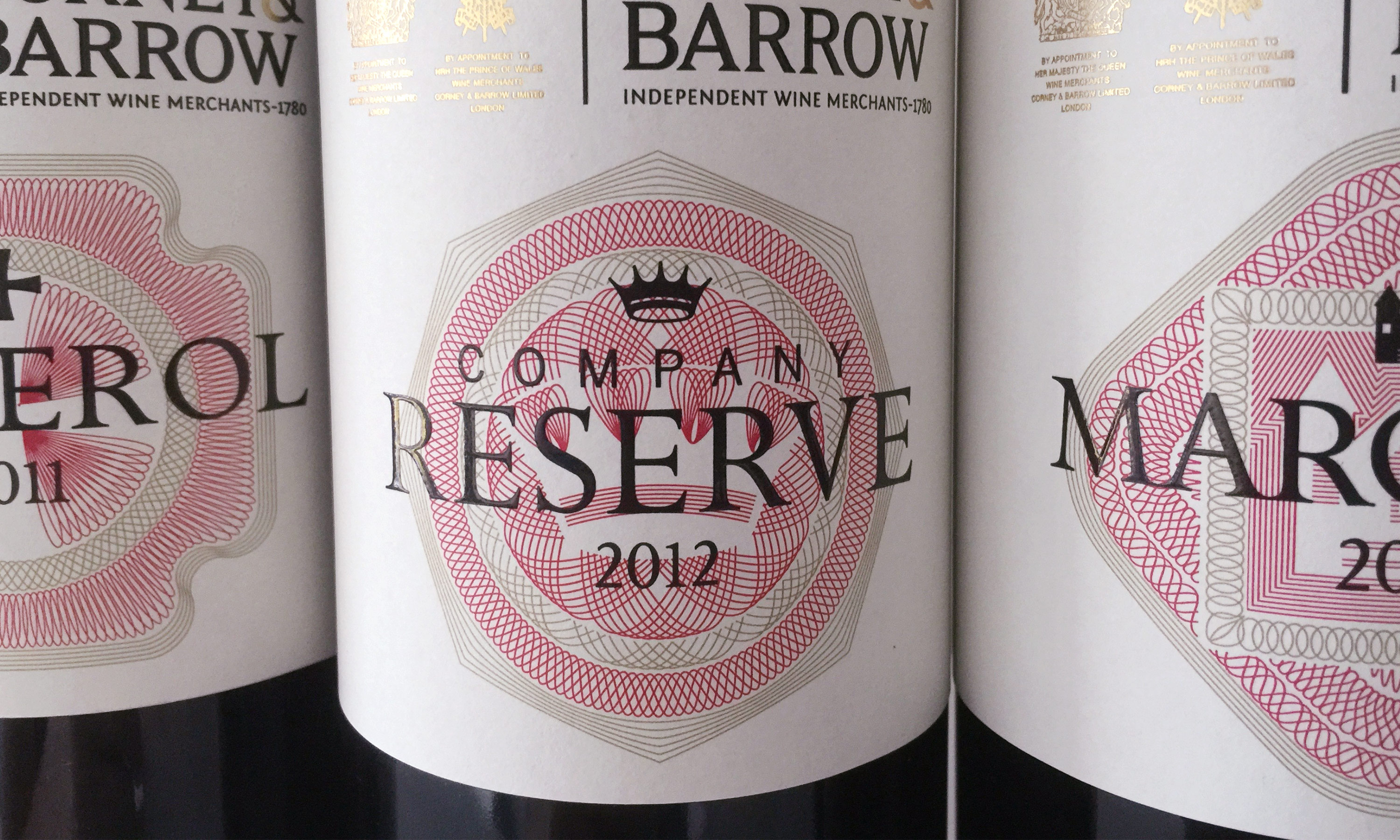
We then looked searchingly into the provenance of each product. And from this research we discovered a wealth of regional iconography, which we used to create a lovely set of illustrations – balancing fine detail with stripped back iconic simplicity. Appearing above the name of the product, as a seal of quality, these new ‘provenance icons’ ranged from unique roof tiling patterns found in Burgundy, to famous local landmarks, and elements taken from the producer’s Coats of Arms.
Our ‘provenance icons’ also became the basis of a new visual language for the labels; elaborated upon and recreated as beautifully crafted intricate line engraving seals. We then placed these behind the provenance icons and label typography to dynamically radiate out from the centre of the label, creating depth and detailing – as well as delivering premium cues through their detailed line work and rosette like qualities.
To help reflect the individual quality of each product, the line work for the seals used Corney & Barrow’s red and gold in combination with selected secondary colours. These colour combinations also subtly unified the range to create a distinctly Corney & Barrow look and feel.
The final step in creating a premium feel was to give very careful consideration to the print and production techniques to be applied to the labels – bearing in mind the varying abilities all the different producers, in regard to production quality.
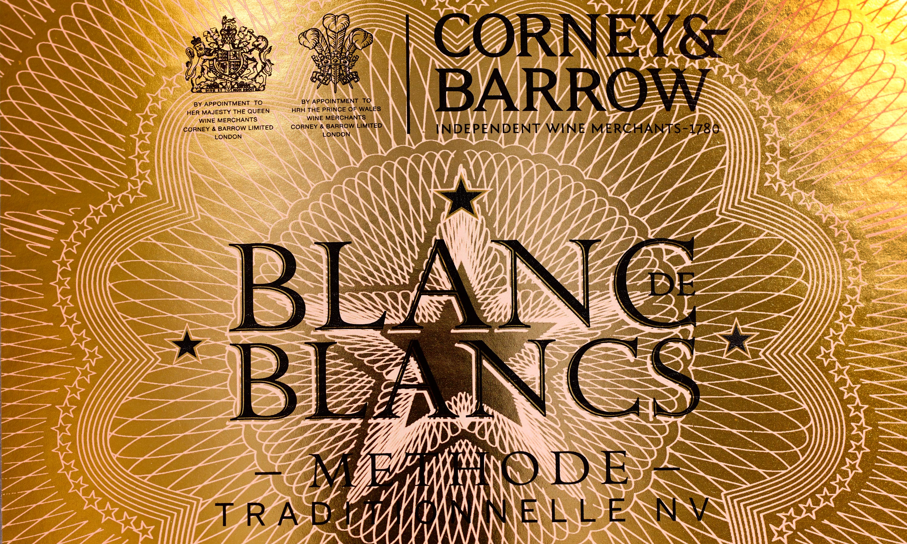
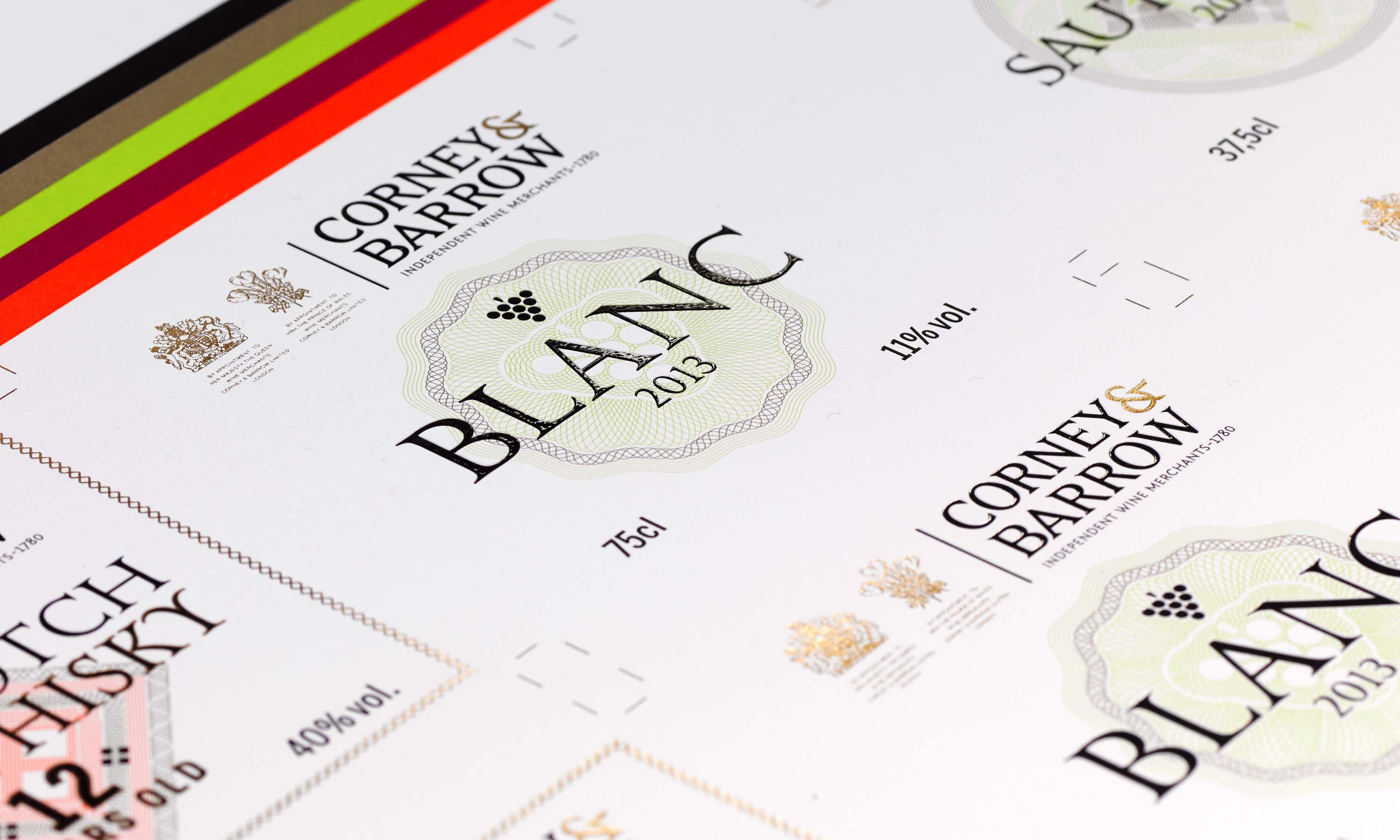
We selected a beautiful uncoated soft white paper stock for the front and back labels, which had a rich textured feel in the hand, while also complementing the clean and contemporary label design. And we used metallic gold foils for the Coats of Arms and brand mark, in combination with raised clear varnishing on the black provenance icons and label typography, to help deliver a real “sensory” award for customers running their fingers over the different textures while pouring the precious liquid.
The final result is a House Range which is unmistakably Corney & Barrow; cohesive-looking, yet as varied as the wines and spirits themselves; and, most importantly, fit in every respect to grace even the most elegant and refined dining table.
If reading about it has tempted you to raise a glass, might we suggest a visit to Corney & Barrow’s online store?
(Read Less...)
Kind words…
“It takes enormous effort to appear effortless. Read More…
In fact, this was the mother of all projects because if we were honest about it, below the surface of that distilled brief we wanted a whole lot more. And this was teased out gradually during the process of working with Dana: a sense of premium, just luxurious enough (‘it’s a House range, it can’t look too fancy!’), consistency while conveying in some way the provenance of each of the 15 wines in the range, a sense of wine values – these are wines after all, not perfumes or books. Oh and of course we needed to factor in our corporate logo with Royal Warrants. Plus freshness, clarity, stand out. Add into this mix that any design also needed to be adaptable to different bottle and label shapes and sizes, be relatively straightforward and cost-effective to produce, and to be able to incorporate future iterations. We were lucky to have in Dana that combination of self-assurance and humility, the sense of vision while simultaneously able to parachute down into the detail and magnify it. We have in the new design the timeless classic feel that we needed to take Corney & Barrow into the next 235 years. And like all great, sympathetic designs, it now feels as if we’ve had it for ever. Our customers tell us they feel special having a little of Corney & Barrow’s heritage on their table and the wines now make the perfect gift, over-delivering on their style and price point. We are currently in a mad rush to print our next set of labels, the first orders having sold out far quicker than we imagined.” REBECCA PALMER
Associate Director & Wine Buyer
Corney & Barrow
(Read Less...)
To find out more: [email protected] or call +44 (0)203 857 7656 Share this: Email, LinkedIn, Facebook, Download a PDF of this case study, follow us on Instagram or view our animations and movies on Vimeo
FOOD & BEVERAGE
Packaging
PROJECT SUMMARY
Range design
Icon design
Illustration
Print testing
Production consultancy
Copywriting
The Corney & Barrow House Range - C&B Christmas website promotion.

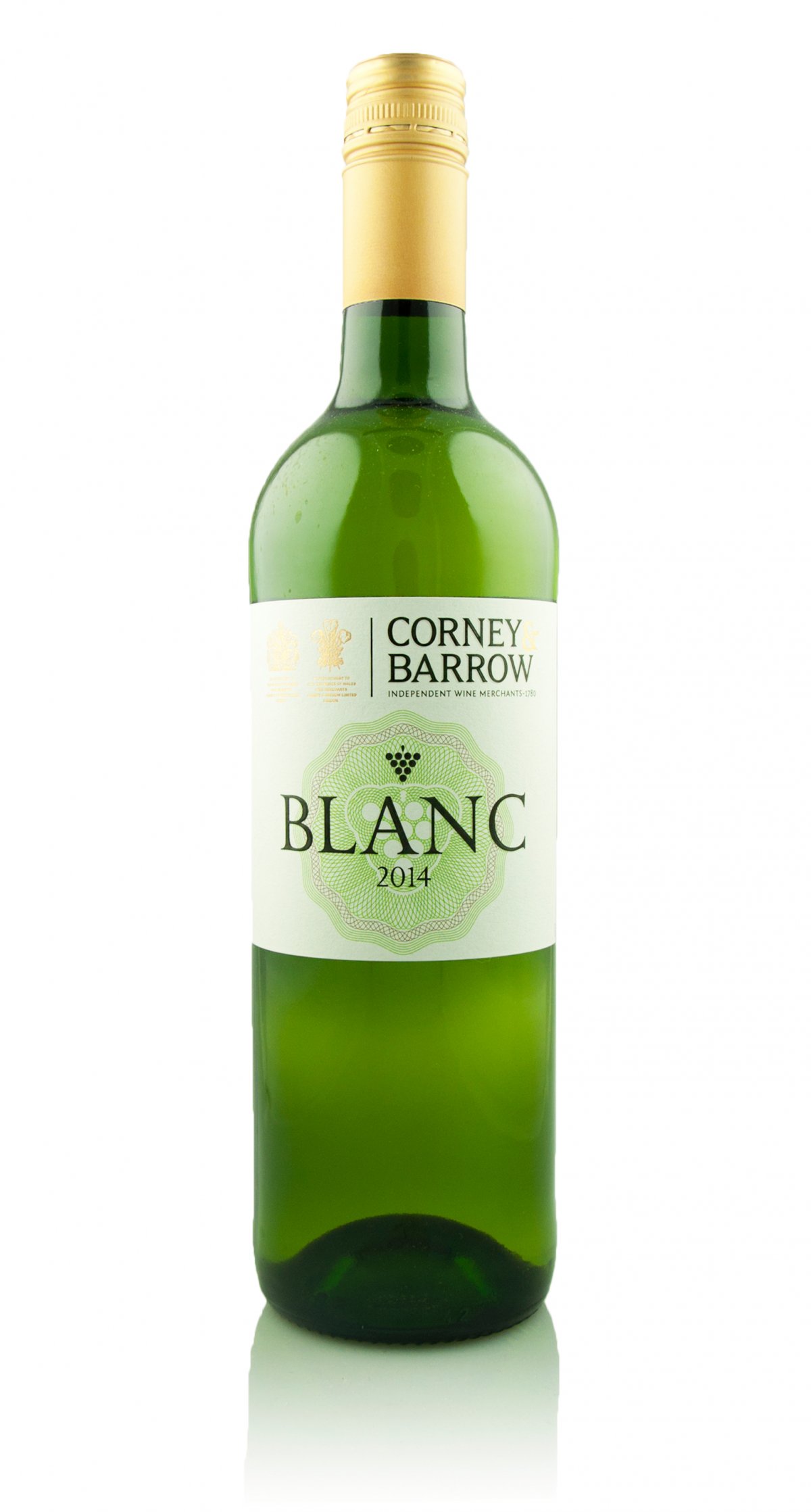
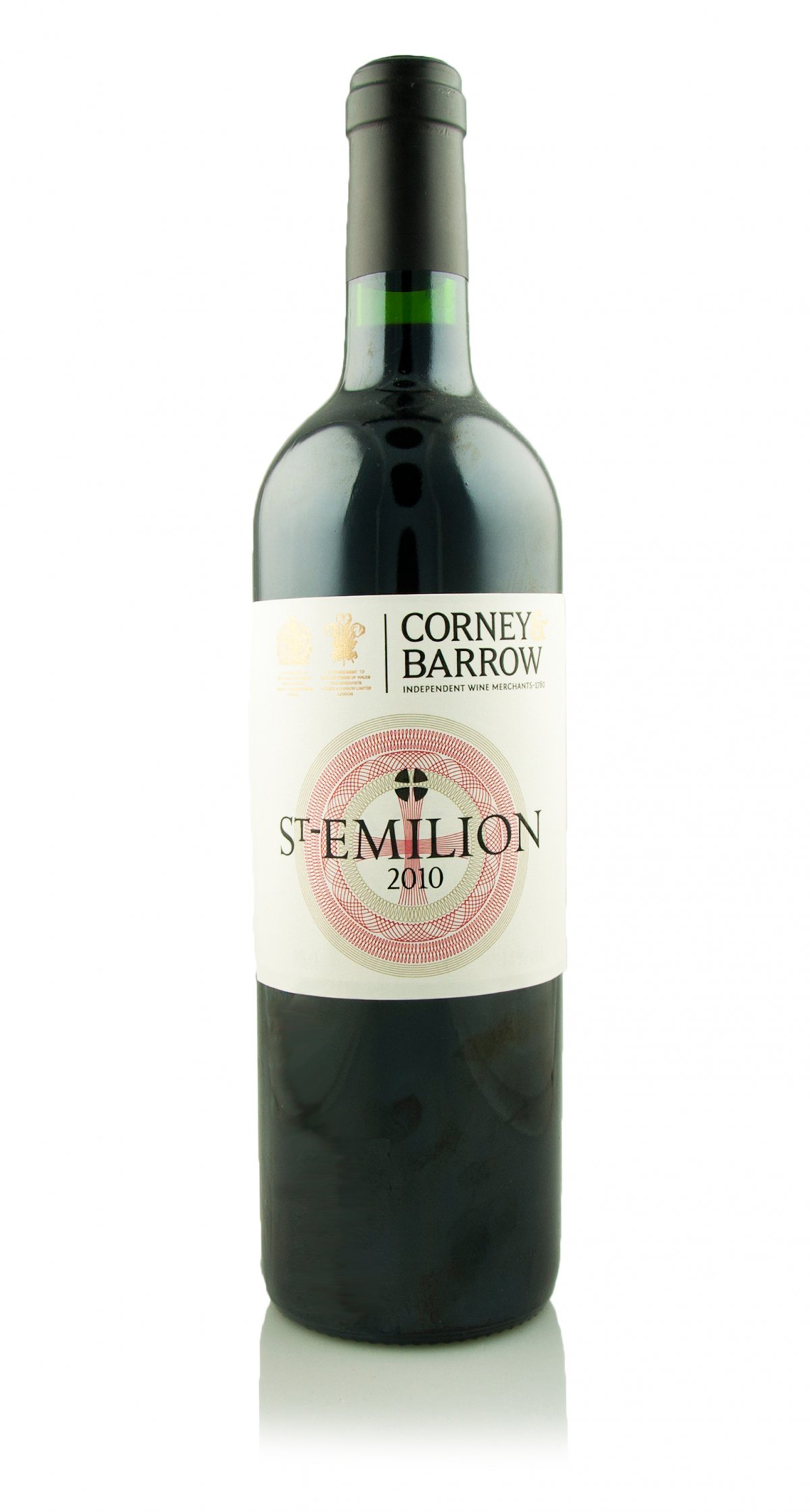
The Corney & Barrow House Range label details.
The Corney & Barrow House Range Blanc de Blancs sparkling wine detail.
The Corney & Barrow House Range as featured in Corney & Barrow Christmas catalogue.
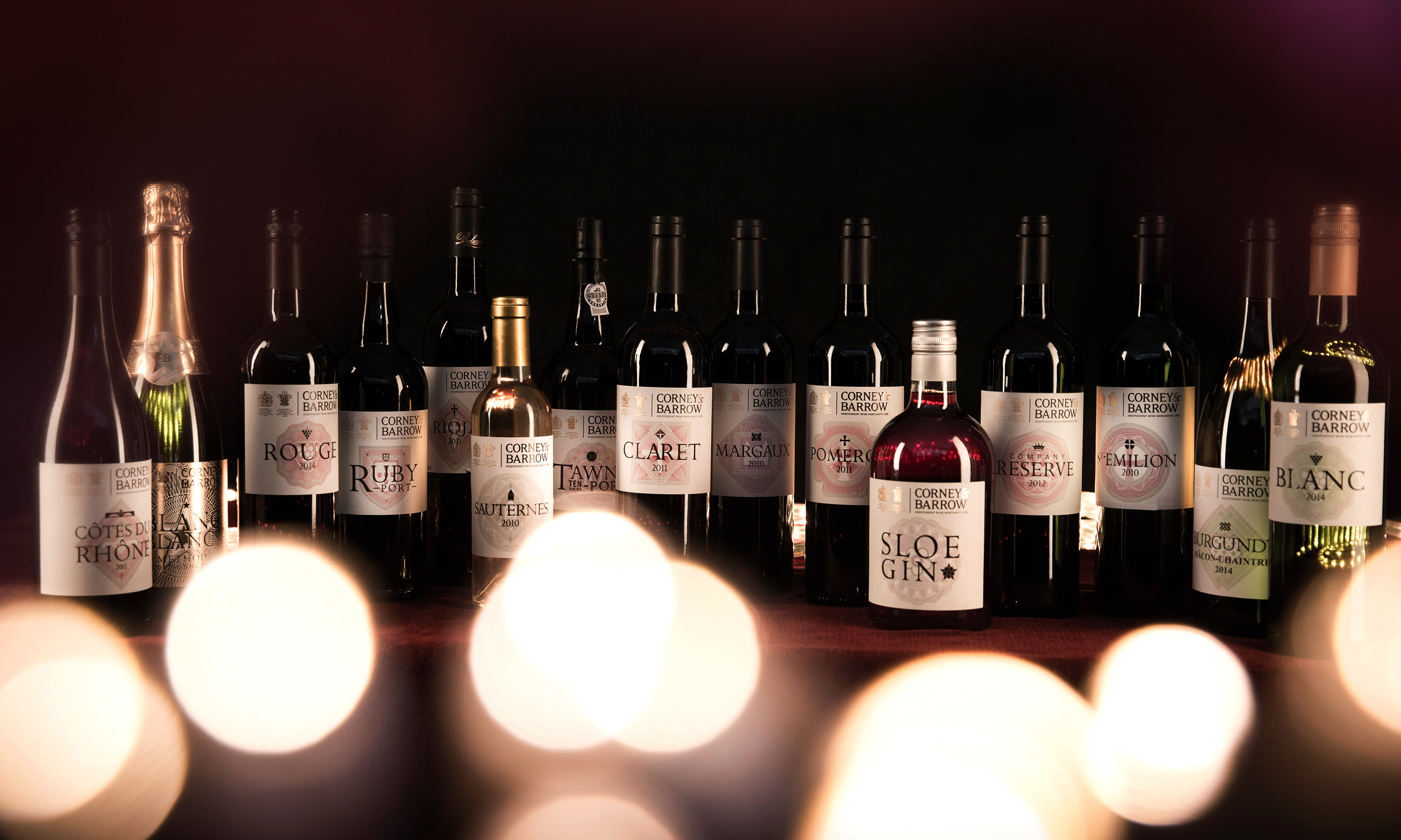
The Corney & Barrow House Range line up.
The Corney & Barrow House Range print test details – foils and raised varnishes.
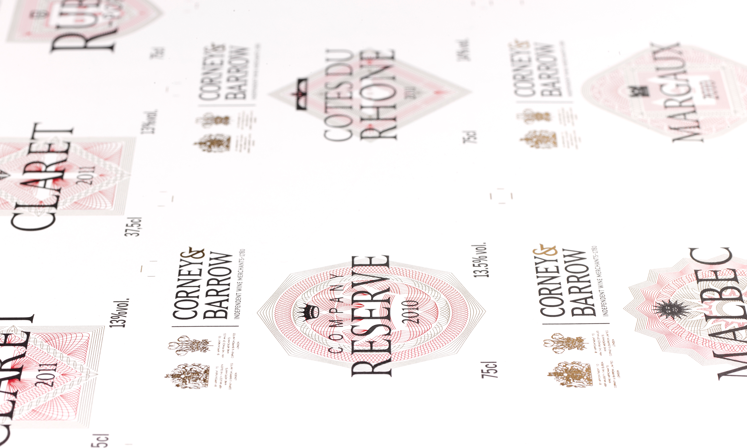
The Corney & Barrow House Range details with provenance icons line engravings.