Wise Daruma
Rebrand & website
Wise Daruma — Brand Identity
When consultant Laura Pelling came to us, her existing Wise Daruma brand lacked the gravitas to match her growing reputation.
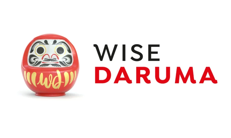
We re-imagined her Daruma icon from the ground up — creating a distinctive 3D model, bold new colour system, evolved logotype, and brand line “The wise listen, plan, and act with purpose.”
The result is a brand with greater impact, authenticity, and flexibility — giving Wise Daruma stronger visibility, more engagement on LinkedIn, and a noticeable uplift in client enquiries.
For the full long read case study, click here…
When Laura came to us with the existing branding for Wise Daruma, she felt it no longer reflected the gravitas and confidence of her consulting practice. Having grown her reputation as a strategic advisor and thought partner, she wanted an identity that could better communicate the quality, experience, and presence of her consultancy — something with more personality, symbolism, and standout.
The original logo featured a simple, cartoon-like Daruma icon which, while friendly, lacked the authenticity and depth behind the Japanese symbol it was inspired by. Laura had chosen the Daruma — a traditional Japanese talisman of perseverance and luck — because of its ritual significance: one eye is painted when a goal is set, and the other when it’s achieved. This concept mirrored the project-based nature of her consulting work, but the execution didn’t live up to the meaning.
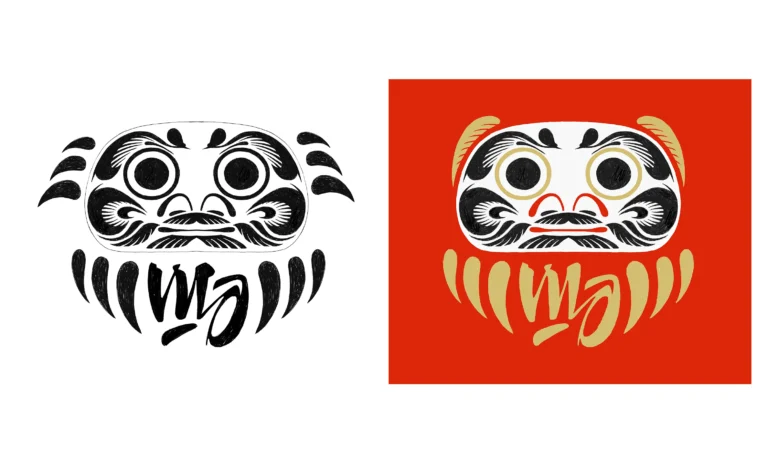
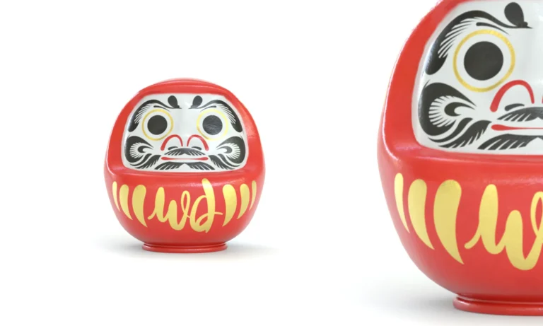
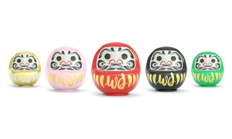
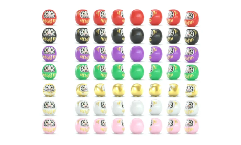
We began by exploring the true anatomy of a Daruma: its rounded, weighted form that always rights itself, the painted features inspired by Bodhidharma, and the rich spectrum of colours, each symbolising different aspirations — from prosperity and success to health and wisdom. To capture this authenticity, we created a detailed 3D model of the Daruma, allowing us to craft every element — from the brushwork of the eyebrows to the subtle sheen of lacquer. The new figure includes a gold brushstroke “WD” motif, seamlessly merging Laura’s initials into the Daruma’s body, grounding the identity in her ownership.
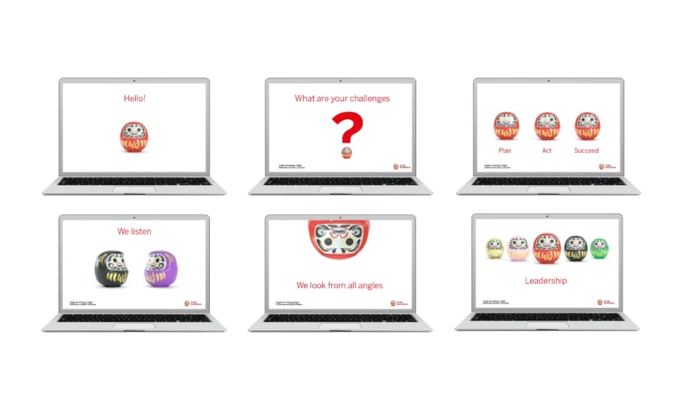
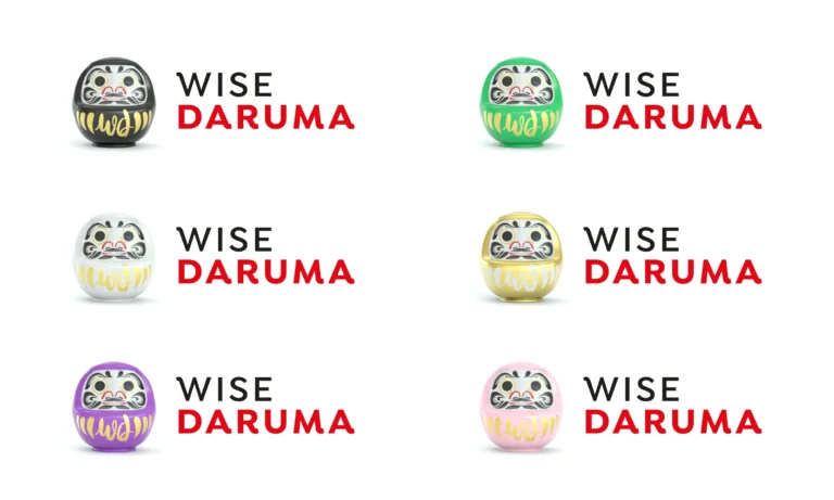
By designing our own Daruma model, we unlocked flexibility and playfulness in how the character could be used. The “little dudes,” as Laura affectionately calls them, can appear from multiple angles, in different colourways, or grouped together across communications, giving the brand both richness and adaptability. Each colour in the suite represents a distinct aspect of her offering: black for strategy, pink for C-suite consulting, purple for thought partnering, and green for executive coaching — creating a clear and cohesive visual system.
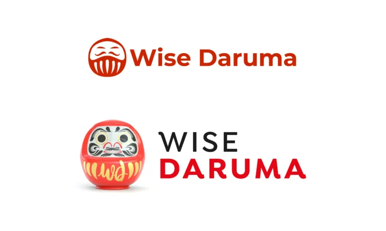
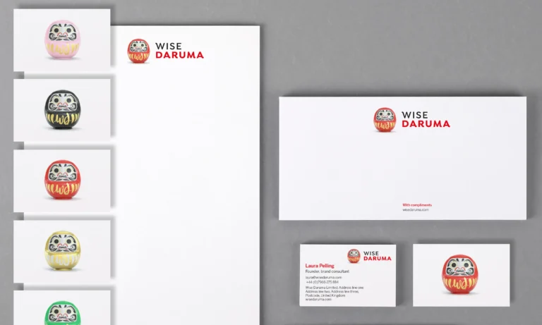
Alongside the new icon, we refined the logo unit, stacking the logotype with the Daruma to create a stronger, more balanced composition. The evolved logotype — now in uppercase with softened geometric flourishes — brings authority and clarity, ensuring excellent legibility at all scales. The result is a unified mark that feels confident, contemporary, and unmistakably Wise Daruma.
To complete the identity, we also created the brand line “The wise listen, plan, and act with purpose.” — a phrase that grew from our understanding of Laura’s consultancy approach and the traditional symbolism of the Daruma itself. It speaks to her strategic process of listening deeply, thinking deliberately, and acting decisively — while anchoring the brand in wisdom, clarity, and intent.
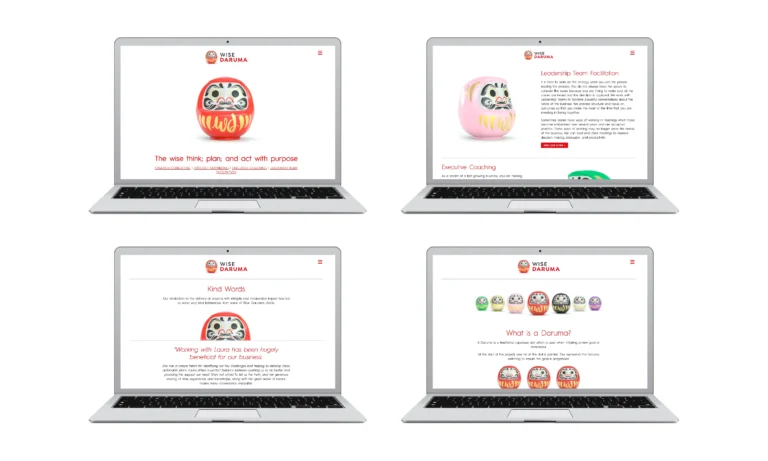
The new identity has since extended into Laura’s website, presentation templates, and LinkedIn presence, where the Daruma family continues to bring warmth and distinction. The brand has been met with fantastic feedback — both for its distinctive visual character and the way it perfectly embodies Laura’s philosophy and the spirit of perseverance that inspired it.
Explore the full brand and new website at wisedaruma.com
Kind words…
“I’m thrilled with the work, beautifully crafted and executed. Dana’s a joy to work with as ever, thoughtful, creative and always delivers outstanding work.”
LAURA PELLING
Strategy Director
Founder
To find out more: [email protected] or call +44 (0)203 857 7656 Share this: Email, LinkedIn, Facebook, Download a PDF of this case study, follow us on Instagram or view our animations and movies on Vimeo
PROFESSIONAL SERVICES
Branding
PROJECT SUMMARY
Strapline
Brand identity
Brand mark animation
Animations & end screens
Brand visual style
Digital templates
Stationery

