Category Archive: Dana Robertson
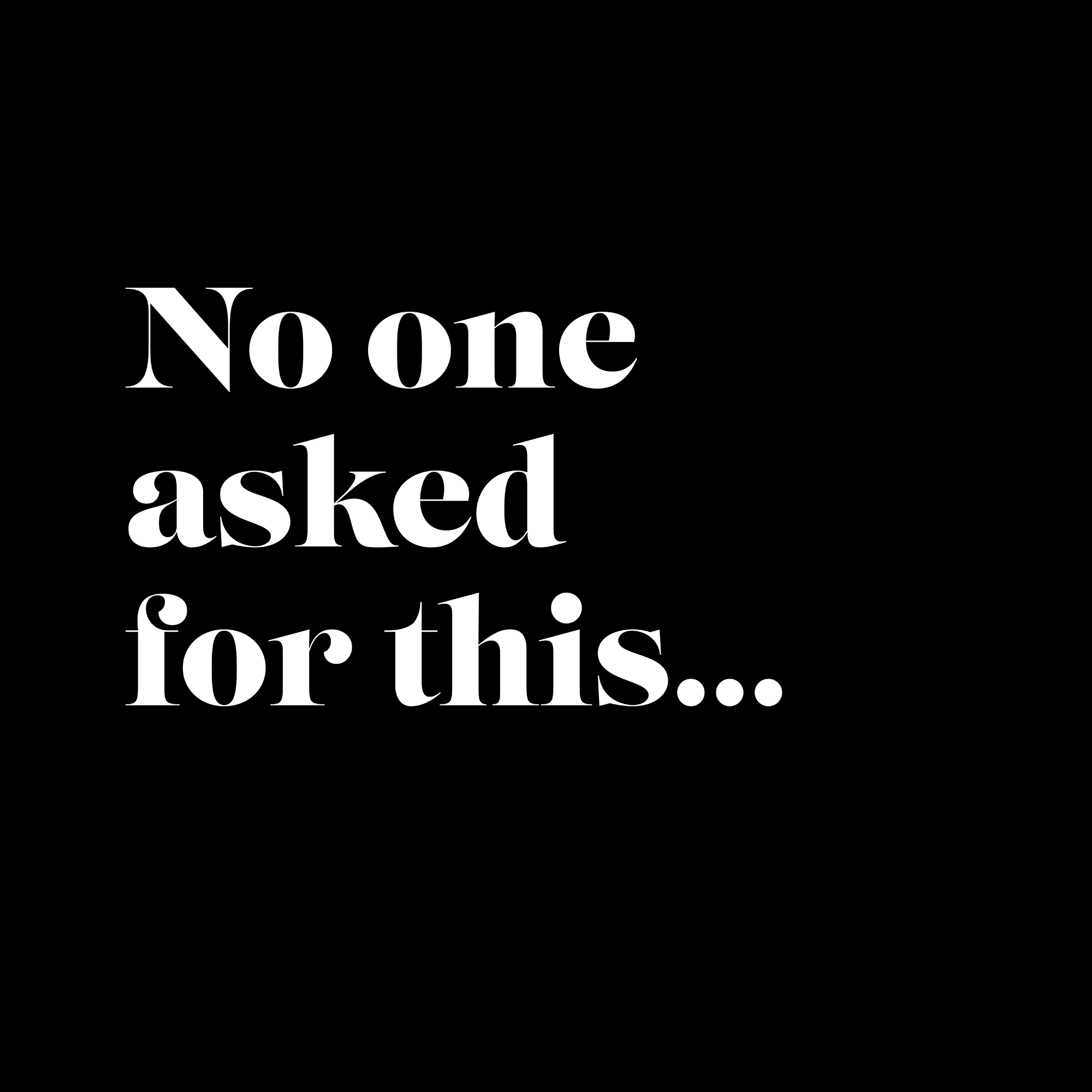
No one asked for this.
Dana Robertson explores why the best brand and campaign ideas aren’t always found in the brief itself, but in the opportunities hiding behind it. A reflection on creative thinking, client collaboration and uncovering ideas nobody asked for.
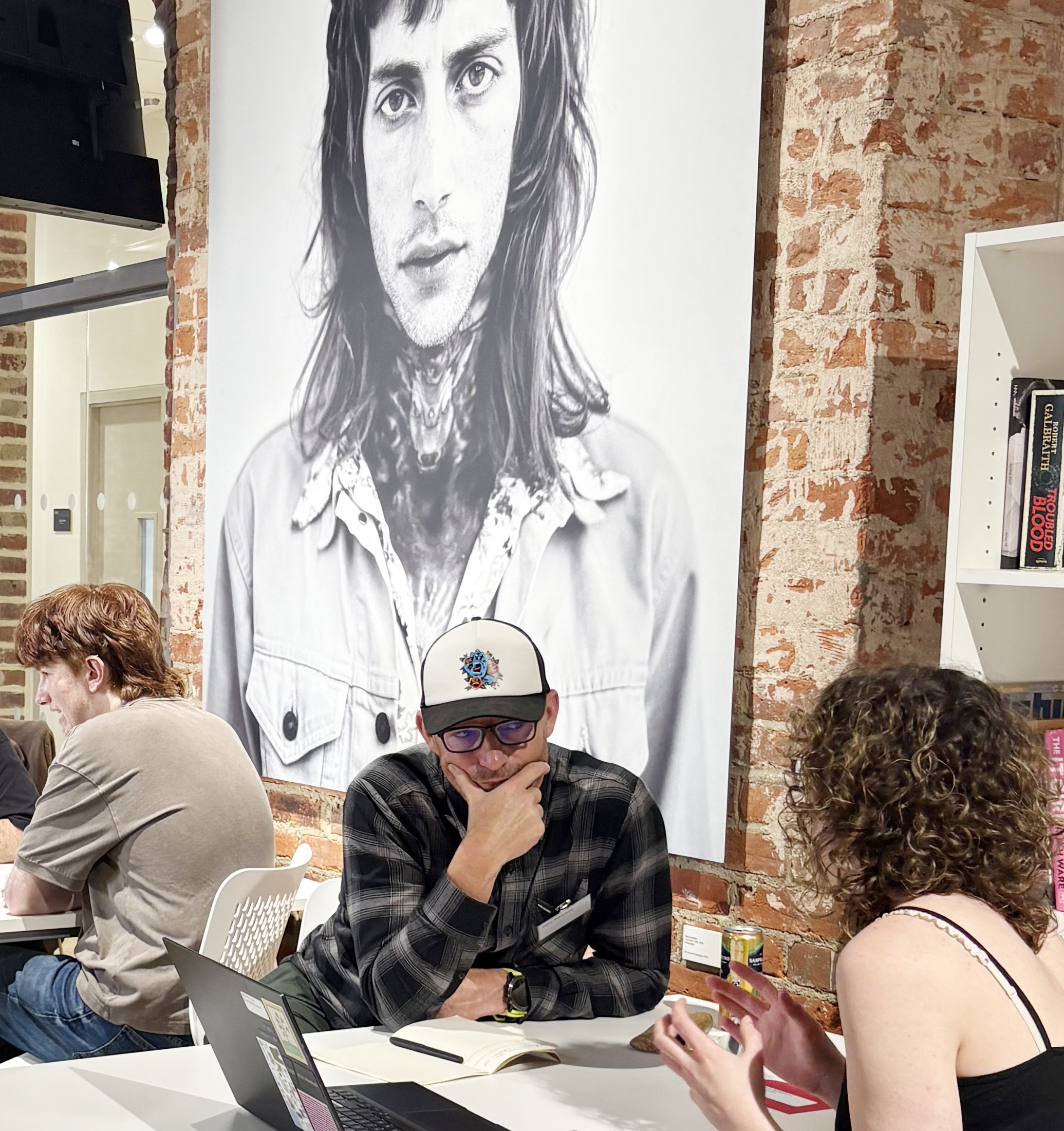
Portfolio reviews of 3rd year students at Norwich University of the Arts Big Book Crit.
Dana Robertson, award-winning brand designer and founder of Neon Creative, recently returned to Norwich University of the Arts to take part in the Big Book Crit, reviewing student portfolios and sharing industry insights with the next generation of creative talent.
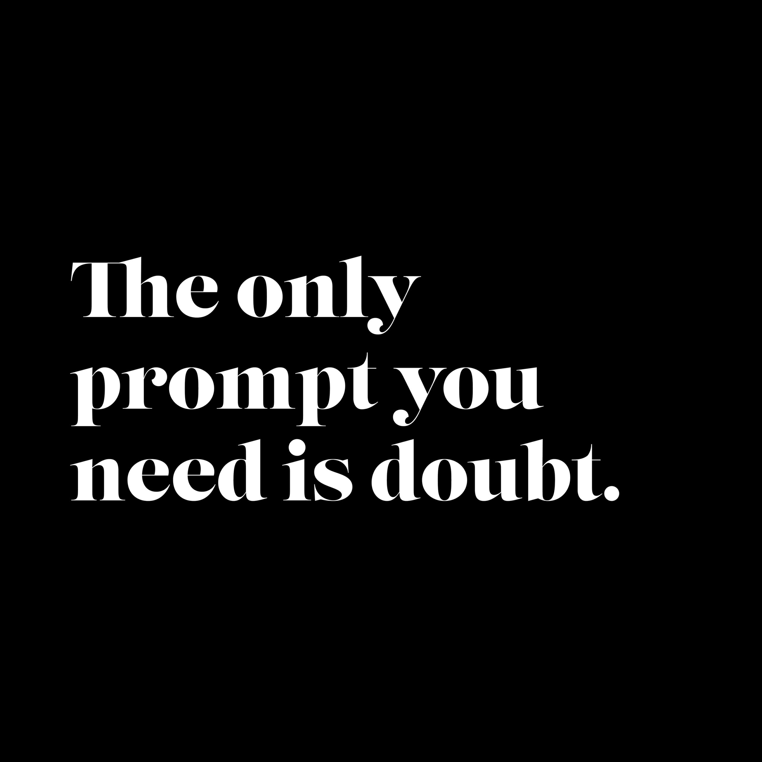
The only prompt you need is doubt.
Doubt has a valuable part to play in any creative project. That may sound counter-intuitive, when we know that clients come to us not only for brilliant brand thinking and compelling creative ideas, but also for clarity and conviction. But really good creatives always experience feelings of doubt. Not because they lack confidence, but because […]
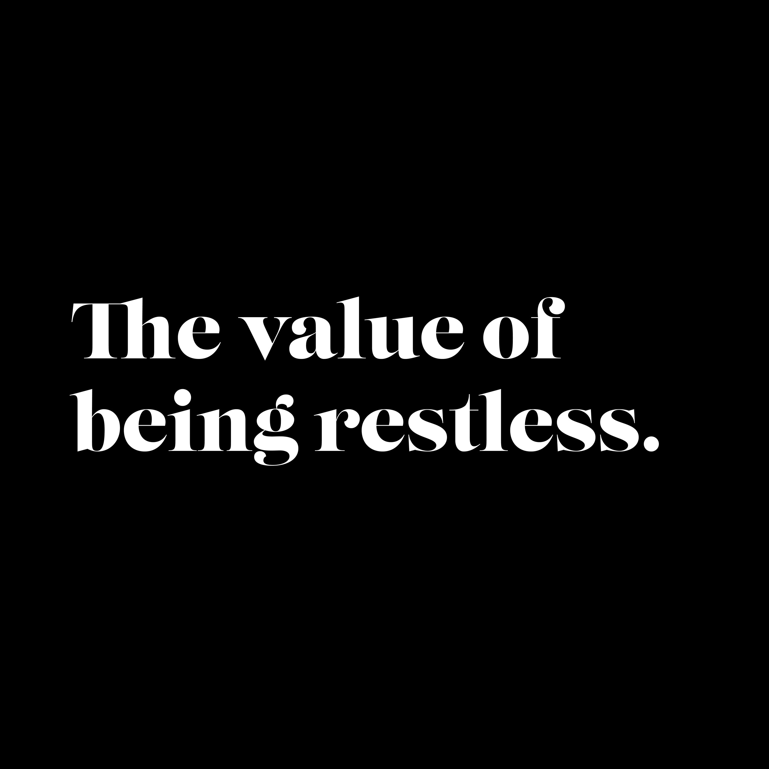
The value of being restless.
There’s a certain expectation that comes with this job. To think deeply. To guide or create serious brands and meaningful campaigns. To apply insight, craft and experience in a way that delivers something commercially effective and memorable. That’s the baseline. That’s what we’re commissioned to do – and we’re fine with that. But behind all […]
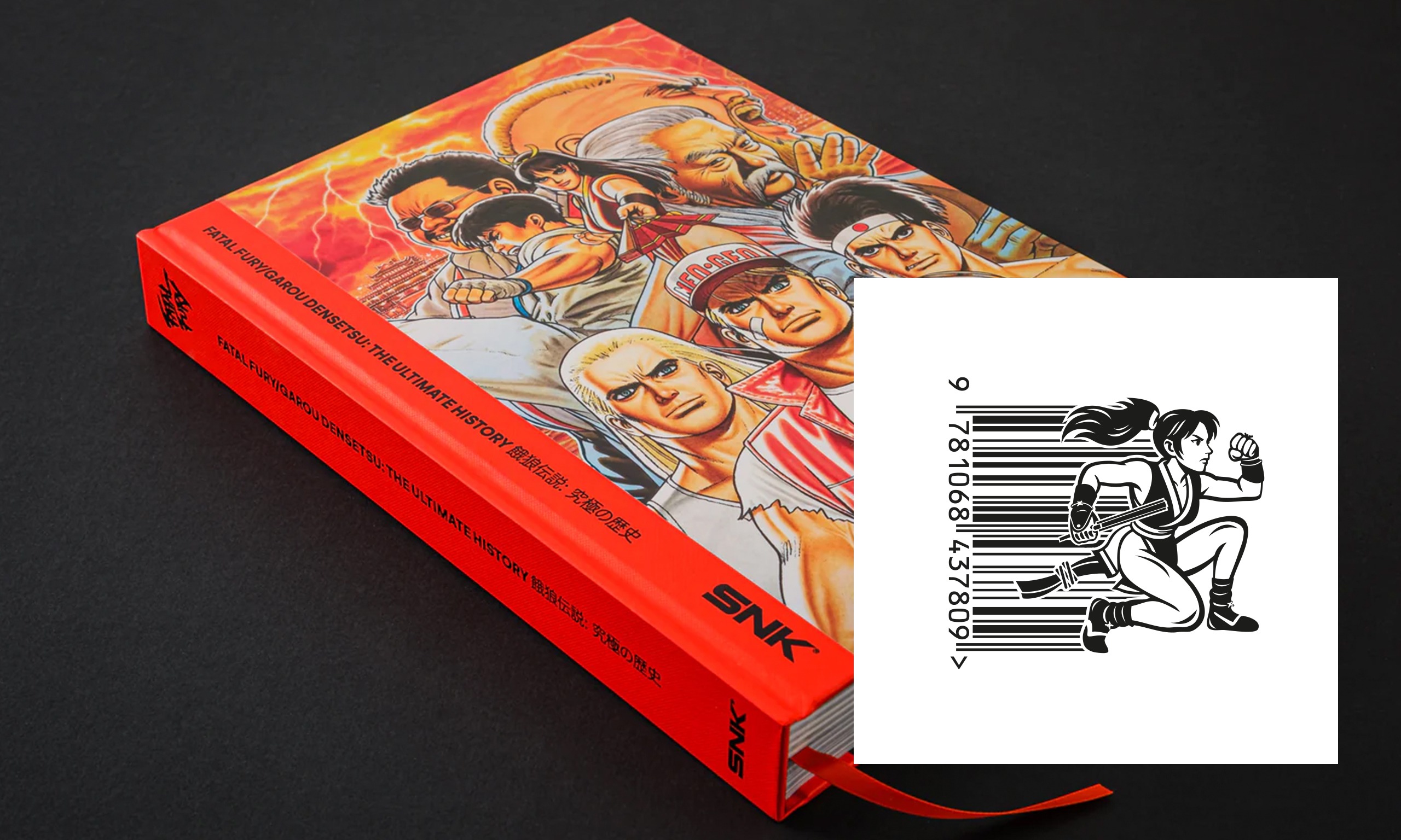
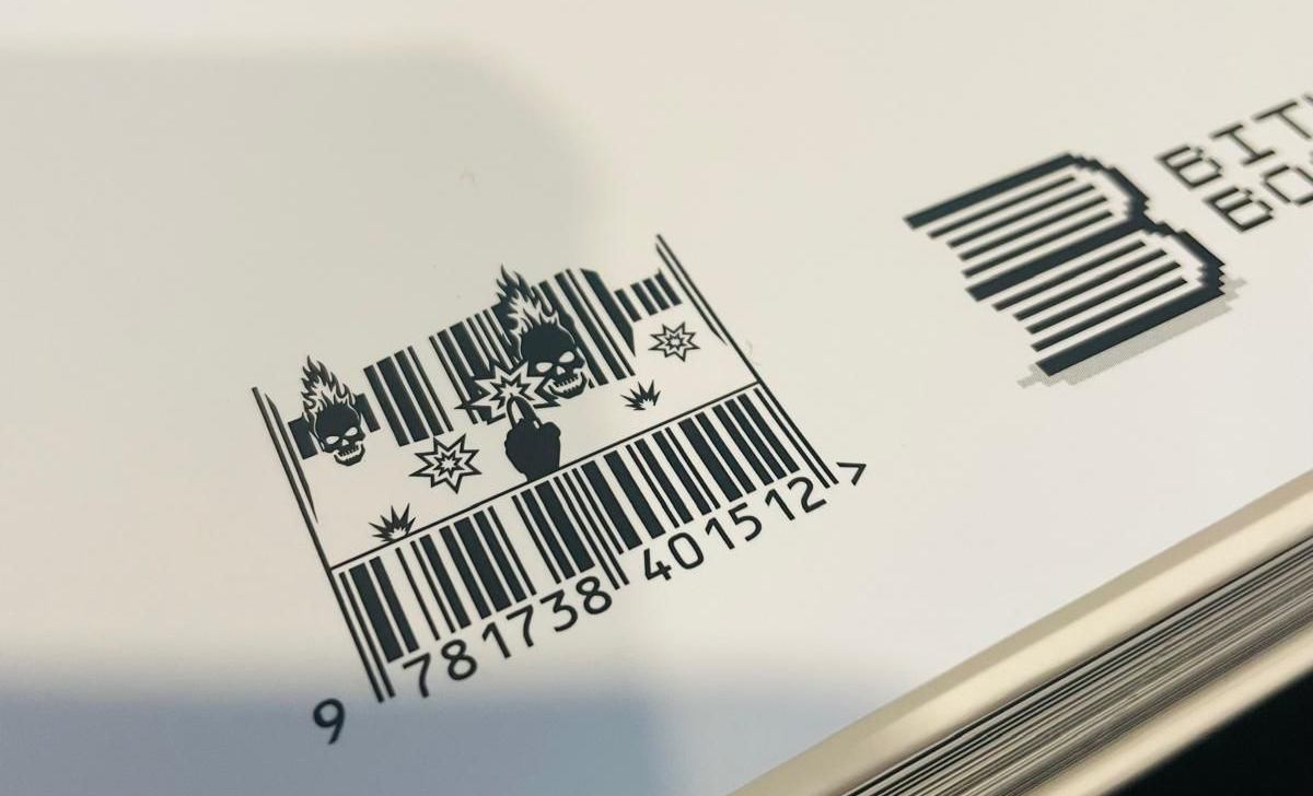
Barcode Fighters: Neon x Bitmap Books Return for Fatal Fury: Garou Densetsu – The Ultimate History
Our collaboration with Bitmap Books continues to evolve, and this time it’s packed with punches, nostalgia, and unmistakable SNK attitude. Following the success of our previous barcode collaborations, we’ve once again teamed up with the brilliant team at Bitmap Books to create bespoke illustrated barcodes for their latest release: Fatal Fury: Garou Densetsu – The […]
The gift of being present.
Being present. It sounds obvious, doesn’t it? But in a fast-moving, increasingly automated world, with constant time pressures bearing down on all of us, it’s something we have to actively work at. And in creative work, it matters more than ever. Because being present isn’t just about care. It’s about making sure the right problem […]
Uncomfortable. Truths.
Really good work rarely comes from a place of comfort. In the creative world, we often talk about alignment. Getting everyone on the same page, smoothing edges, removing friction. It sounds like progress. But the best results rarely come from harmony alone. They come from tension. The good kind. Built on honesty, respect and the […]
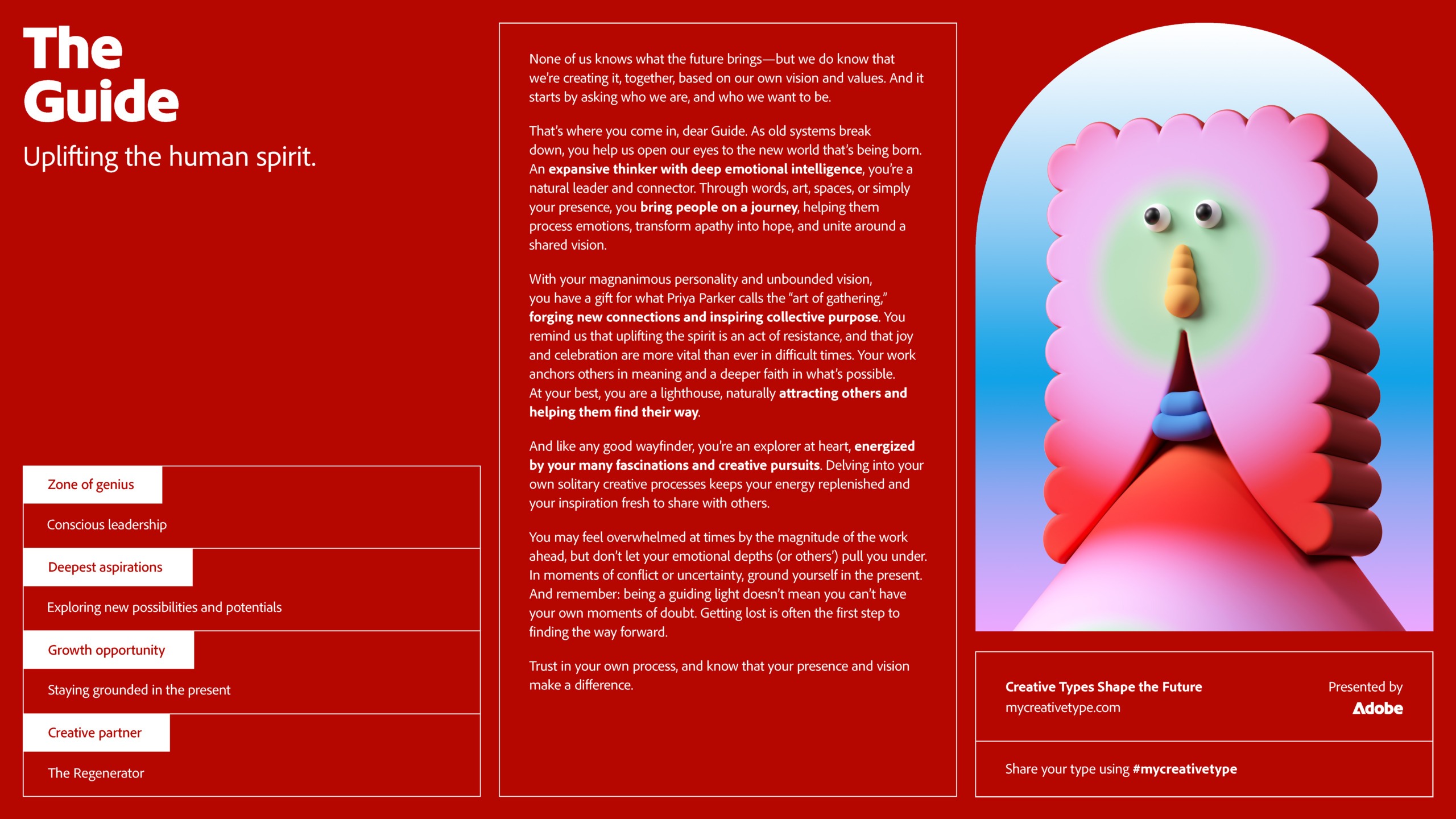
What kind of creative are you? Apparently… The Guide.
Most creatives have taken one of these tests at some point. What kind of thinker are you. What type of mind. What box you sit in. Usually, you take the result with a pinch of salt. But occasionally, something comes back that feels… uncomfortably accurate. I tried Adobe’s “What kind of creative are you?” test […]
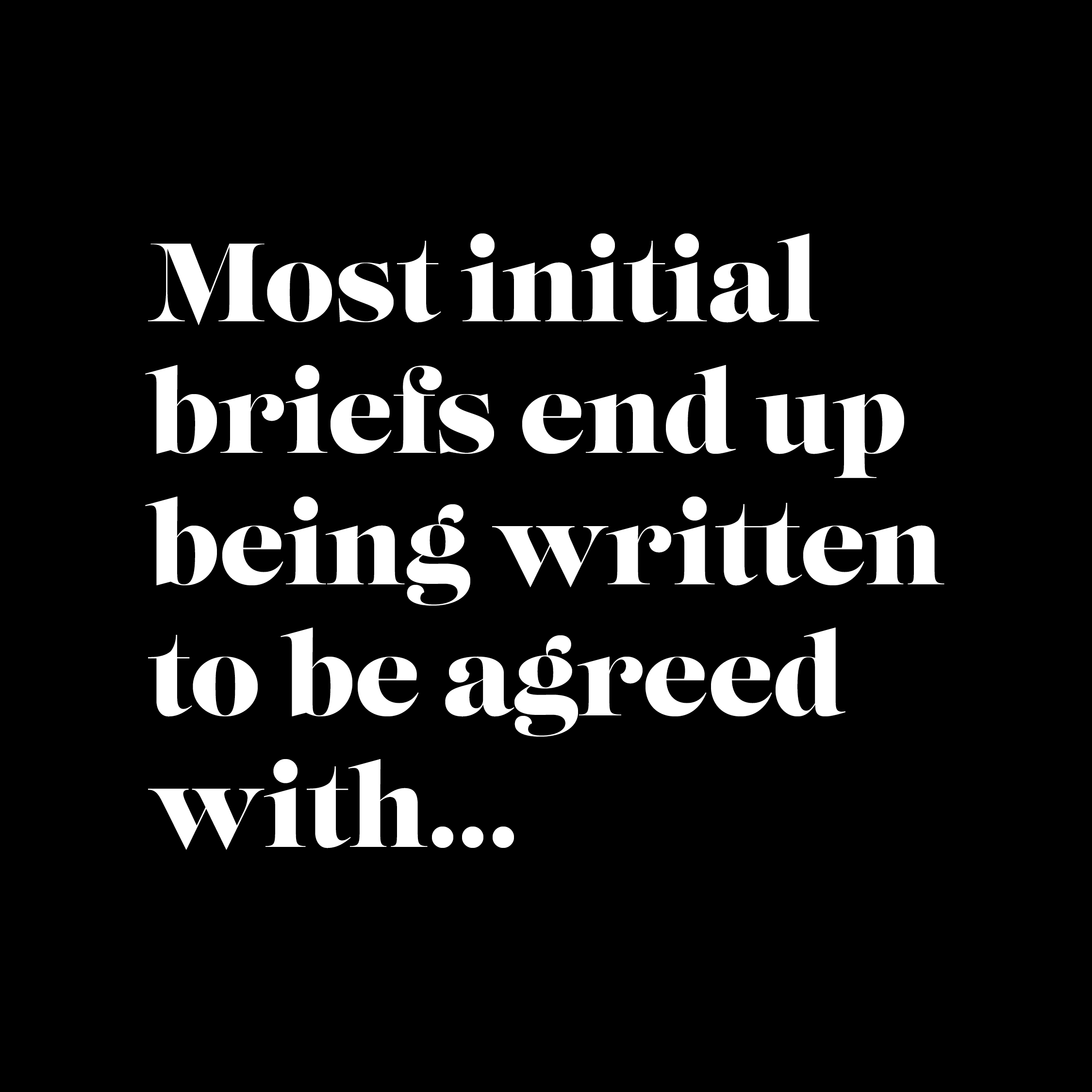
The value of a great brief?
It’s hard to exaggerate the importance of a good creative brief. Quite simply, it’s what inspires and enables creative people to produce their best work, and deliver the best results. A good brief helps shape everything that follows. The initial thinking. The overall direction. Even fine details of execution. Good briefs can often be a […]
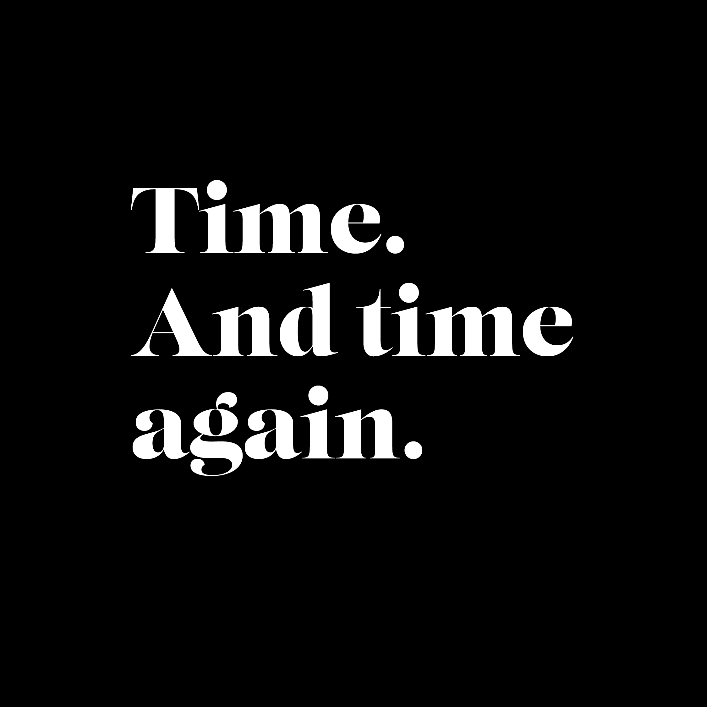
Time. And time again.
The value of time. In the creative world everything seems to be getting faster. Faster tools. Faster expectations. Faster decisions. And we are all good with that. That acceleration is good for business. But one thing has not changed. Great ideas, conceiving them, nurturing them and developing them, still take time. When discussing new projects […]
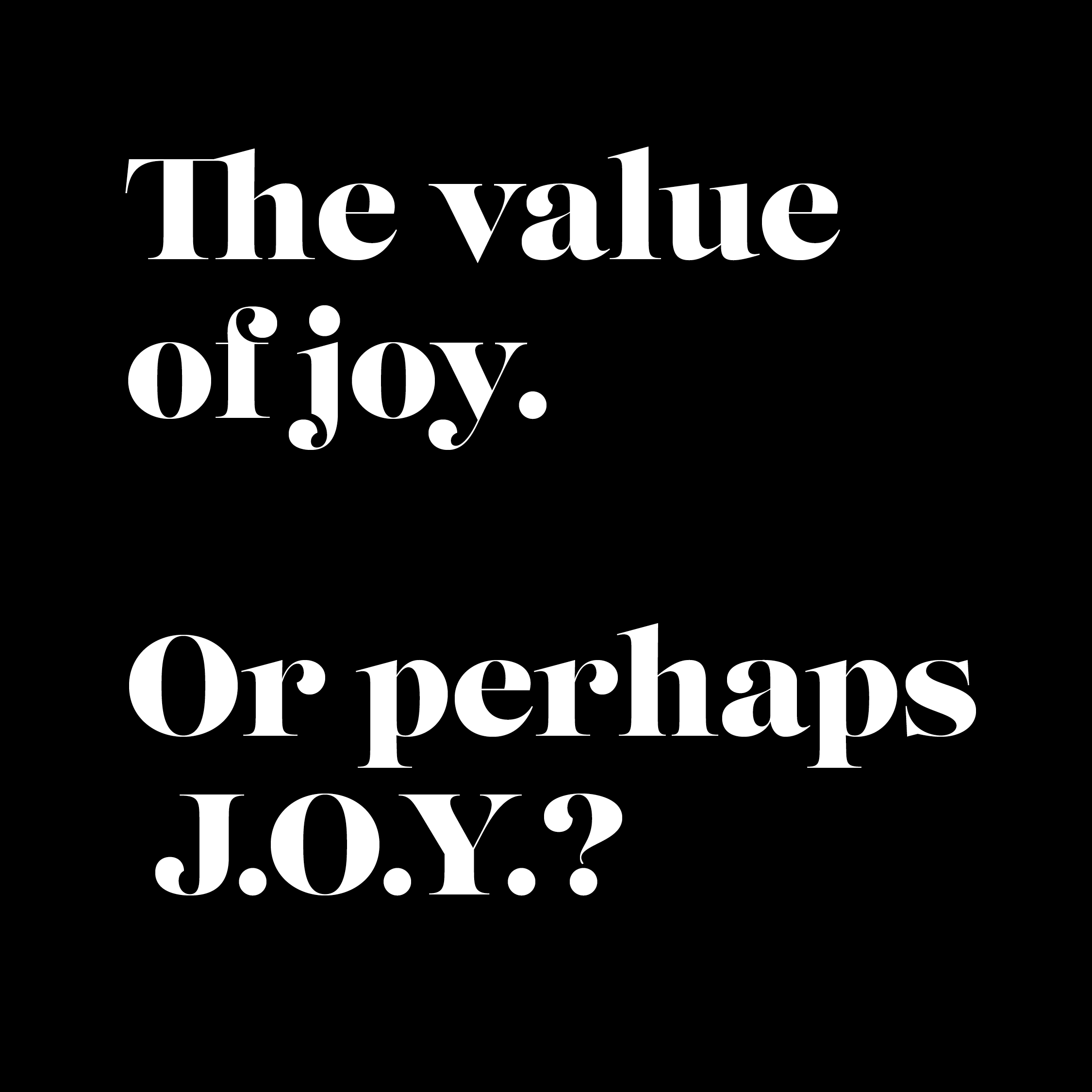
The value of joy. Or perhaps J.O.Y.?
Joy. It rarely appears in a branding brief. But it plays a part in almost all the most successful projects. True, on the surface branding and campaign conversations tend to focus on serious things: data, strategy, performance and objectives. But bubbling away just below that, if you’re lucky, there can be something less formal, less […]
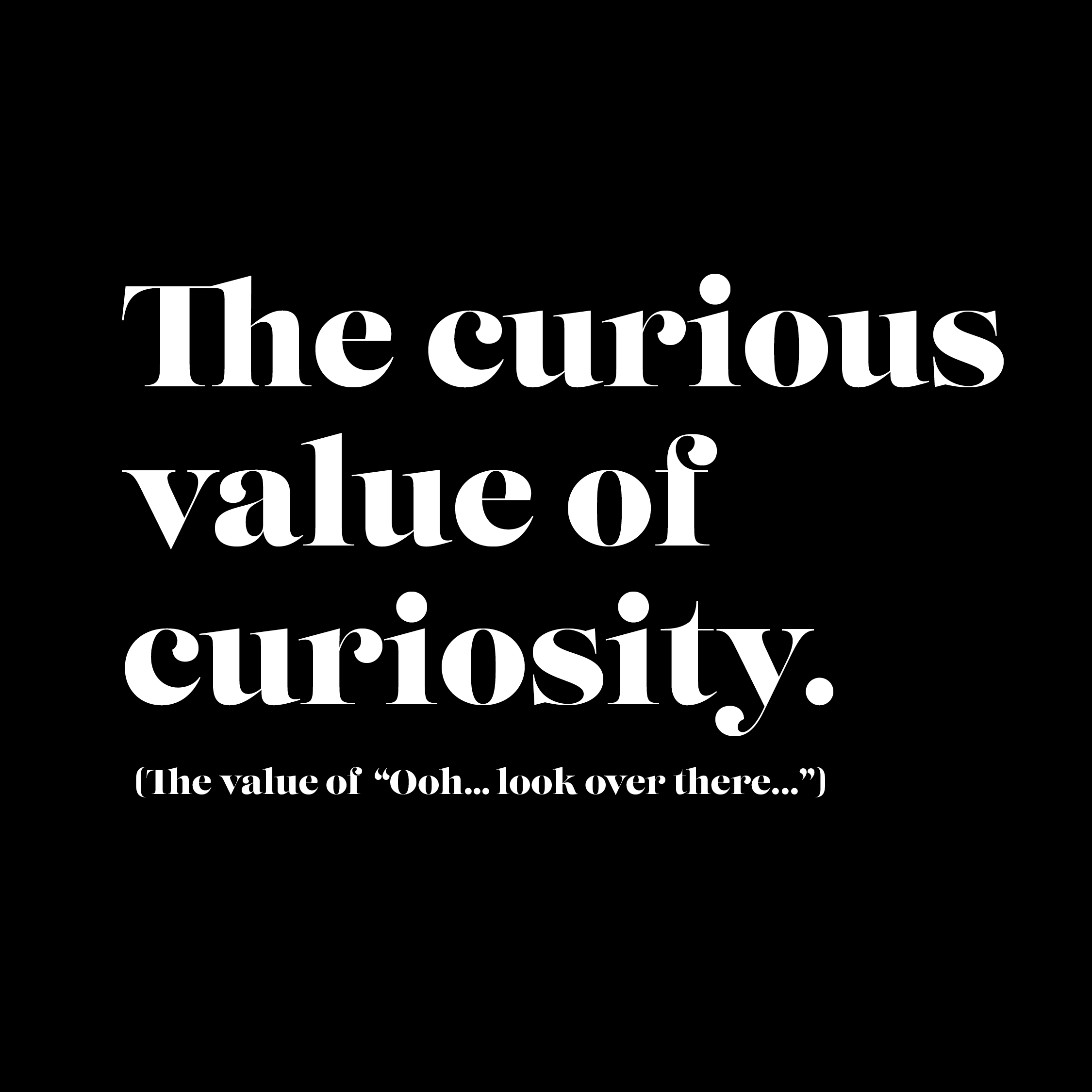
The curious value of curiosity. The value of “Ooh… look over there…”
Why human curiosity counts for more than ever, creatively and strategically. Creativity and curiosity have always gone hand in hand. In our branding and design work at Neon, curiosity takes different forms. Sometimes it can be structured and methodical, the leave-no-stone-unturned research that helps us gain an in-depth understanding of organisations, audiences and markets. At […]
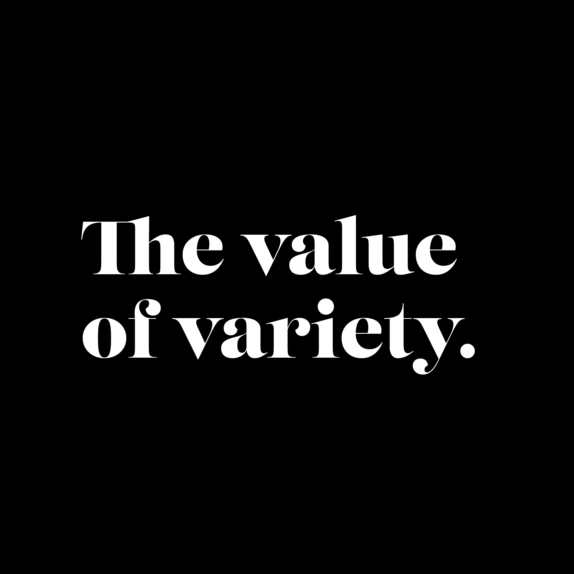
Variety in creative work isn’t just interesting. It adds real value.
The value of variety. One of the pleasures of working in branding and design is the wide range of challenges that come across our desk. Over time, that variety proves valuable not just for us, but for the brands we work with too. It does more than keep things interesting. It becomes a genuine creative […]
Bitmap Books – a brilliant little collab…
After discovering a while back that friend and former colleague Sam Dyer had started his own publishing house focusing on video games as Bitmap Books, we’ve been collab-ing with some great little details in regard to subject related barcode art. So it was lovely to see a LinkedIn post from Sam pop up in our feed […]
New brand identity for the London barristers Field Court Chambers.
Neon creates the new brand identity for London barristers Field Court Chambers. Neon Brand Consultancy has created a contemporary new brand identity for Field Court Chambers, part of the Honourable Society of Gray’s Inn — one of the four Inns of Court in London. Recommended via Neon’s long and successful creative relationship with Nabarro LLP […]
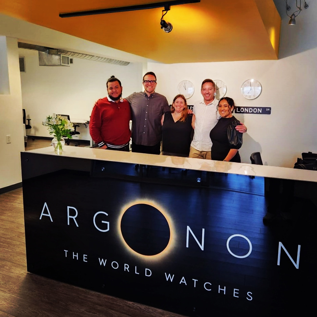
Argonon in the news…
Great to see our / Neon’s rebrand of Argonon Group being rolled out, shown here in good ol’ US of A… A fav project of ours, working with a real champion of creativity Argonon‘s CEO James Burstall If you would like to see more of how Argonon’s brand showcases its creative output and solves how to communicate such […]
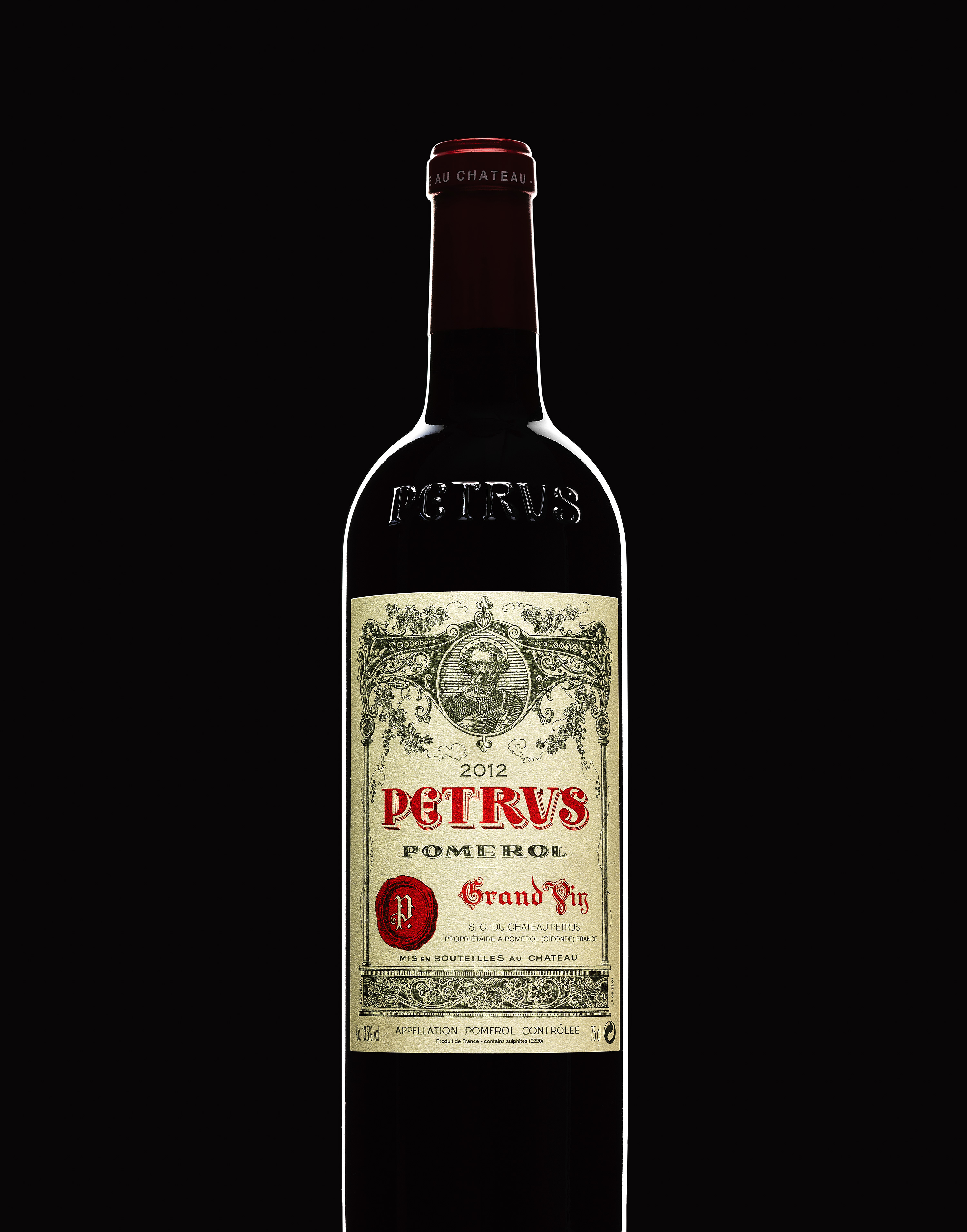
A single, exceptionally rare six-litre imperial of 1982 Pétrus, widely considered one of the greatest of all Bordeaux wines, set to go for up to $65,000.
Pétrus and Corney & Barrow featured in The Guardian — and in Neon’s design archive. Interesting seeing Petrus mentioned in The Guardian: “Billionaire Pierre Chen selling 25,000 bottles including burgundies valued at £156,000 and a very rare 1982 Pétrus” With The Guardian recently highlighting the sale of a rare six-litre imperial of 1982 Pétrus, valued […]
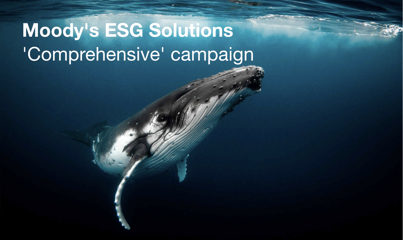
Our work for Moody’s helps win another pitch!
What a great way to start the week in being informed we’ve won another pitch – and all will be revealed when we can talk about it! And a big part of that pitch was our work for Moody’s, so we thoughts we’d share some of it here… Our projects during our longstanding relationship with […]
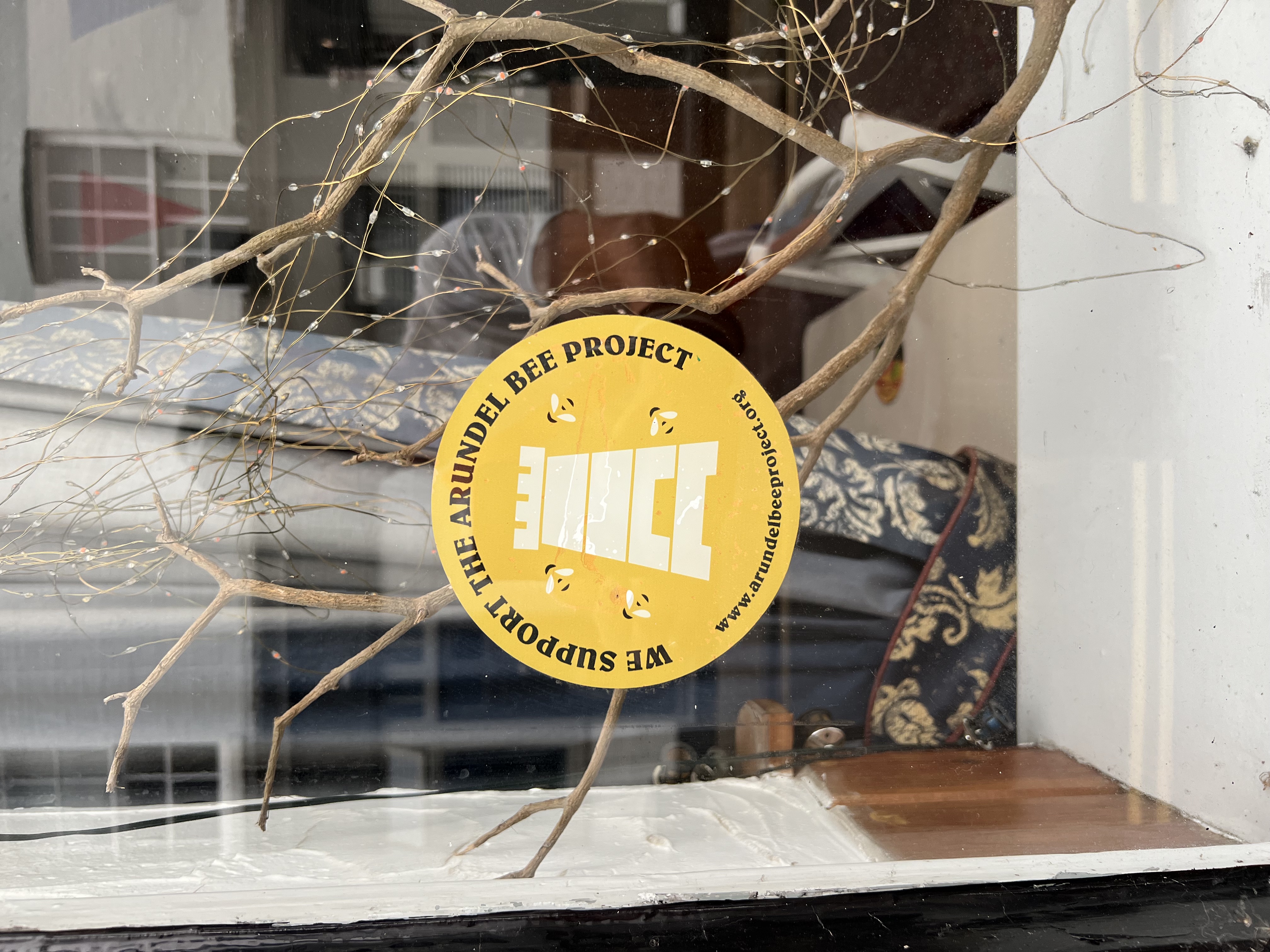
The Arundel Bee Project still buzzing…
Lovely to see on walk back home from London that the Arundel Bee Project is still going strong – a charming little pro bono project Neon completed a while back. The projects purpose is to help raise awareness of the benefits of a thriving bee community, support bee keepers and champion bee friendly planting initiatives […]
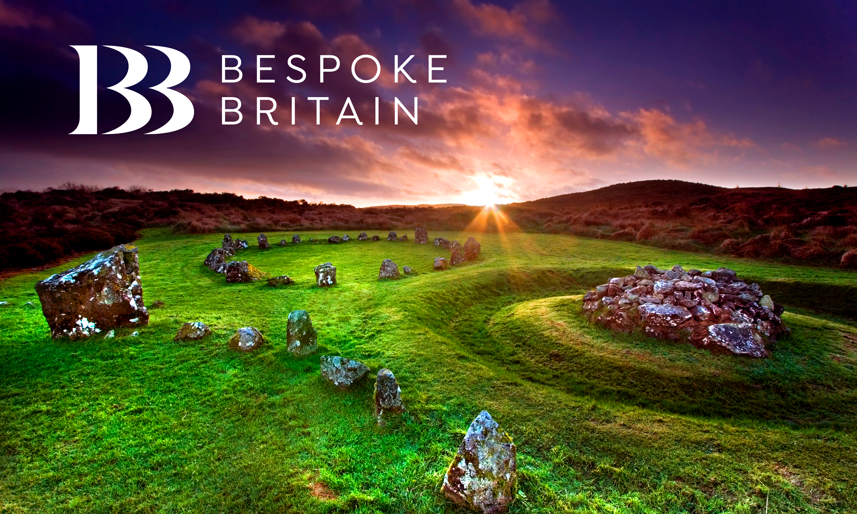
Bespoke Britain premium tour company branded by Neon.
Having just recommended them to a client visiting from the USA, we thought it was the perfect time to share our brand and website project for Bespoke Britain Tours — a one-stop-shop for beautifully put-together, meticulously planned tour packages and unique experiences across the UK, but especially in London. The project came about through a […]